
In 1975 Jack Esterson was just finishing up an architecture degree at the Pratt Institute in Brooklyn. He didn’t imagine that one day, 35 years later, he’d be asked to design its most ambitious structure yet. Christened Myrtle Hall, the six-story, 120,000-square-foot facility is the only LEED-certified (Gold, to be specific) academic building in Brooklyn. But the story of Myrtle Hall is about more than going green. It’s about how a sustainable building can be, in itself, a work of art. “Architecture is a form of communication,” says Esterson, one of two design partners at WASA/Studio A. “It can either communicate compassion and excitement and all these positive elements, or it can be uninspired. And for me to be brought back for this project is an exhilarating and unforgettable experience.” Here, gb&d explores the design elements vital to Myrtle Hall.

A. The white “ribbon” that wraps Myrtle Hall’s giant atrium is made of white porcelain-enameled aluminum panels, and shades the space for the majority of the day.
A. The “ribbon.” One of the most striking features is the elegant white “ribbon” that traces the vertical outline of the building’s giant atrium. “It’s meant to announce the entry to the building,” Esterson explains. It also has a very practical purpose: on the south side of the building, heat gain can be problematic. But instead of having louvers run across the atrium glazing, WASA/Studio A crafted the ribbon out of white porcelain-enameled aluminum panels and gave it a deep profile to shade the space for most of the day. “It casts a shadow in the morning and afternoon and protects the atrium from direct east-west sunlight for all but about a couple hours,” Esterson says.

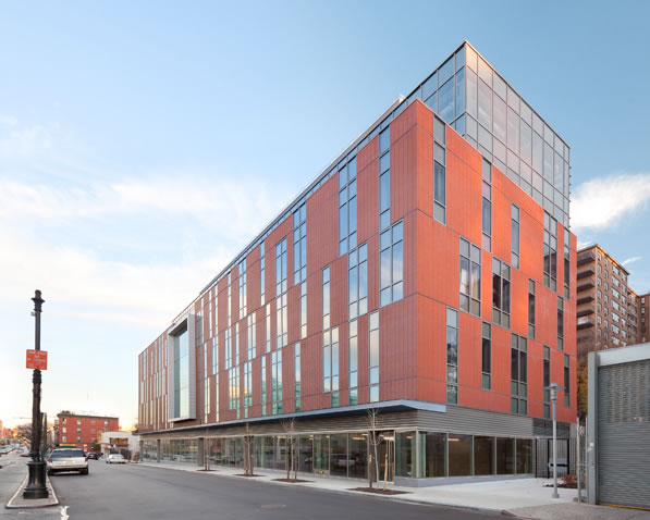
B. WASA/Studio A chose materials that would help Myrtle Hall blend well with with the existing structures in Brooklyn’s Clinton Hill neighborhood.
B. The streetscape. On one side of the street, planted pedestrian walkways create a striking green space, so to minimize the jarring sensation of a brick-and-steel building appearing suddenly, Esterson planted ivy on the walls to tie the structure visually to the natural landscape in the coming years. On another side, Myrtle Avenue cuts through the Clinton Hill neighborhood, whose 19th-century commercial buildings presented Esterson with a different challenge: to make his building feel as if it belongs. To accomplish that task, WASA/Studio A made specific choices regarding what kind of brick to use, matching its appearance to the surrounding structures.

C. Because of its giant picture windows, the building’s interior exhibition galleries can be seen from the street.
C. Natural light. “I always come back to light,” Esterson says. “Natural light comes at no expense. The way one allows natural light into a building is essential to us, and that’s where we always start.” In Myrtle Hall, you’re really never more than about 30 feet from outside light. During most of the day, the lights could be off without inhibiting any of the numerous activities occurring within the building.
D. Windows and signage. The building maintains a distinctly modern look, even with its nod to the surrounding Victorian-era neighborhood. A large part of this comes from the design and placement of its windows, which evoke a sense of almost computer-generated pixilation. “That sort of syncopation looks like it was done randomly on a computer,” Esterson says. “It wasn’t. We actually decided every single location by hand. It houses a school of digital art, and we wanted to express that.”
In the middle, the building is punctuated by a large picture window, emblazoned on which in etched, translucent glass is the giant “Pratt” moniker. The reason both the typography and the window are located there is simple. “When you walk by the building, especially at night, the thing glows and you can see all the student artwork,” Esterson says. “It’s a way to create connectivity with the community. If that window weren’t there, it would look more like an office building. It’s a way to brand the building.” Indeed, branding was essential to the space, so the signage was handled by a company called Archigrafika, which is run by one of the graphics faculty at Pratt and which therefore understands the institute’s design standards.

E. WASA/Studio A’s original color palette was more vivid but was simplified in order to showcase the students’ work.
E. Materials and energy. Esterson, a self-described colorist, initially envisioned vibrant interior accents, but when he showed his scheme to the decision-makers, they went pale. “They said, ‘We do white and gray,’” Esterson remembers with a laugh. “The color comes from the work of the students.” And so a color-neutral interior environment was born, with the students’ recently completed projects providing pops of color here and there as they are displayed. “It really turned out quite beautifully,” Esterson says. “It looks like a neutral vessel waiting to be filled with creativity, which I think is the right response for a building [designed as] an art school.”
The building’s greenest feature is its roof, 40 percent of which is planted with native foliage that reduces the need for irrigation. “With a building like this, there’s a lot of HVAC equipment on the roof,” Esterson says. “Whatever was left, we made green. That, of course, was not just for another LEED point but to help with water runoff and to increase the insulation value [on] the sixth floor.”