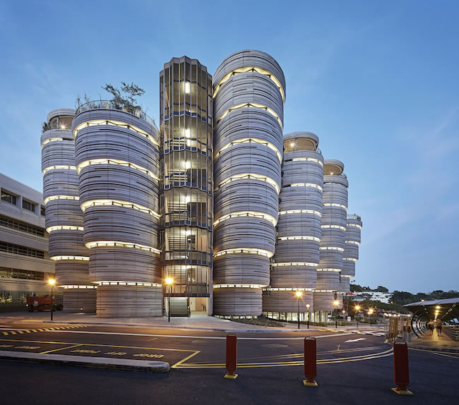
When Heatherwick Studio was awarded the task of drafting the “Learning Hub” for Nanyang Technological University in Singapore, Ole Smith wasn’t interested in simply redesigning the classroom—he was interested in redefining it. Smith aimed to ensure that the design of the hub positively influenced the condition of its occupants and fundamentally enhanced their interactions with each other and with the technologies at their disposal. We recently spoke to Smith to pick his brain about the significance of shapes, sizes, and colors.

The client on this project, a university, asked the architects to design the classrooms for a more modern approach to learning that speaks to collaboration, instead of a traditional box-like classroom.
gb&d: I understand the university asked you and your team for a design better suited for contemporary ways of learning versus the more traditional design of a box-like lecture room. How did you guys come up with the idea for the concept of these 12 towers with the rounded rooms?
PROJECT
Location Singapore
Client Nanyang Technological University Program University learning hub
Size 21,527 ft2 Certification Green Mark Platinum
TEAM
Design Consultant
Heatherwick Studios
Project Lead Ole Smith
Lead Architect CPG Consultants
Project Lead Vivien Leong
Main Contractor Newcon Builders
Sustainability Consultants CPG Consultants
Mechanical and Electrical Engineers Bescon Consulting Engineers
Civil and Structural Engineers T.Y. Lin International
Smith: The rounded rooms came after a visit to the university, which was designed in the ‘80s when this structuralist design style was quite modern. We designed with certain curvatures and used different pigments as well as a retardant. So once we started working on the building, we started using metric modeling to reduce the number of curvatures, because each of the classrooms are unique. We got something like 57 classrooms with different shapes. Then we had 1,050 panels with different façade pedants, so we decided to reduce the number of curvatures to 10 curvatures. Then we developed a system where you could inlay rubber strips in different positions to generate shapes and basically did each of the 1,050 panels onsite, based on our elevation switch.
gb&d: This building introduced several first-of-their-kind environmentally friendly features and solutions. Any that you’d like to speak on?
Smith: We got a lot of plants. We got two trees on the seventh floor, and we have lovely greenery. In Singapore, if you plant the right things, they will grow, and they’ll grow really tall. Levels seven and eight are both green roof gardens. On all balconies, we’ve got money plants, which are quite large. Then we’ve got a certain part of the façade panels that is made with reused aggregate to amplify the sustainable building message where we could.
We designed the building so that it’s kind of stepped upwards, and one of the reasons for that is we wanted to shade the light coming into the classroom because that just heats up the classroom and requires even more cooling.

The building is designed to be stepped upward because the designers wanted to shade the light coming into the classroom to avoid hot indoor temperatures.
All the glazing is facing the atrium, so it’s more about the building being opened onto itself and onto the other users so that all of the students in the building at the same time can communicate with each other across the atrium and around it, instead of looking out onto the other buildings—mainly because we wanted to minimize the sun coming in through the windows. That’s why the windows faced on the façade are quite small and the slab above them are always stepping out as a shading measure. We avoided having any shading system for the windows because we designed the building to create the shading itself.
gb&d: Can you talk a bit about the rooftop area?
Smith: On the eighth floor, we’ve got the green roof garden, which consists of two classrooms, and the rest is greenery and study space. On level seven we’ve got 23 trees, study space, and rooftop gardens. It’s quite nice and windy up there.
gb&d: What other sustainable design elements are at play here?
Smith: The mesh you see on the staircase is a bronze, and it’s called phosphorous bronze, which is slightly stronger than normal bronze. We were offered many types of bronze lookalikes that wouldn’t need treatment to keep it the way it was but we wanted to use bronze because it will age beautifully as bronze does. That was something new for the Asian market—letting them age and not covering them to keep them shiny. Bronze gets kind of dark brown, and it’s nice like that.
The paving on the floors are quartz and are in a kind of fan pattern. That’s kind of a pattern offset from the different classrooms, so it kind of interweaves. We’re quite pleased that we managed to get quartz stone in the end.

Twelve openings between the 12 towers generates cross-ventilation and allows for a nice breeze.

The Learning Hub shatters traditional notions of what a classroom should look like and how it should be organized.

