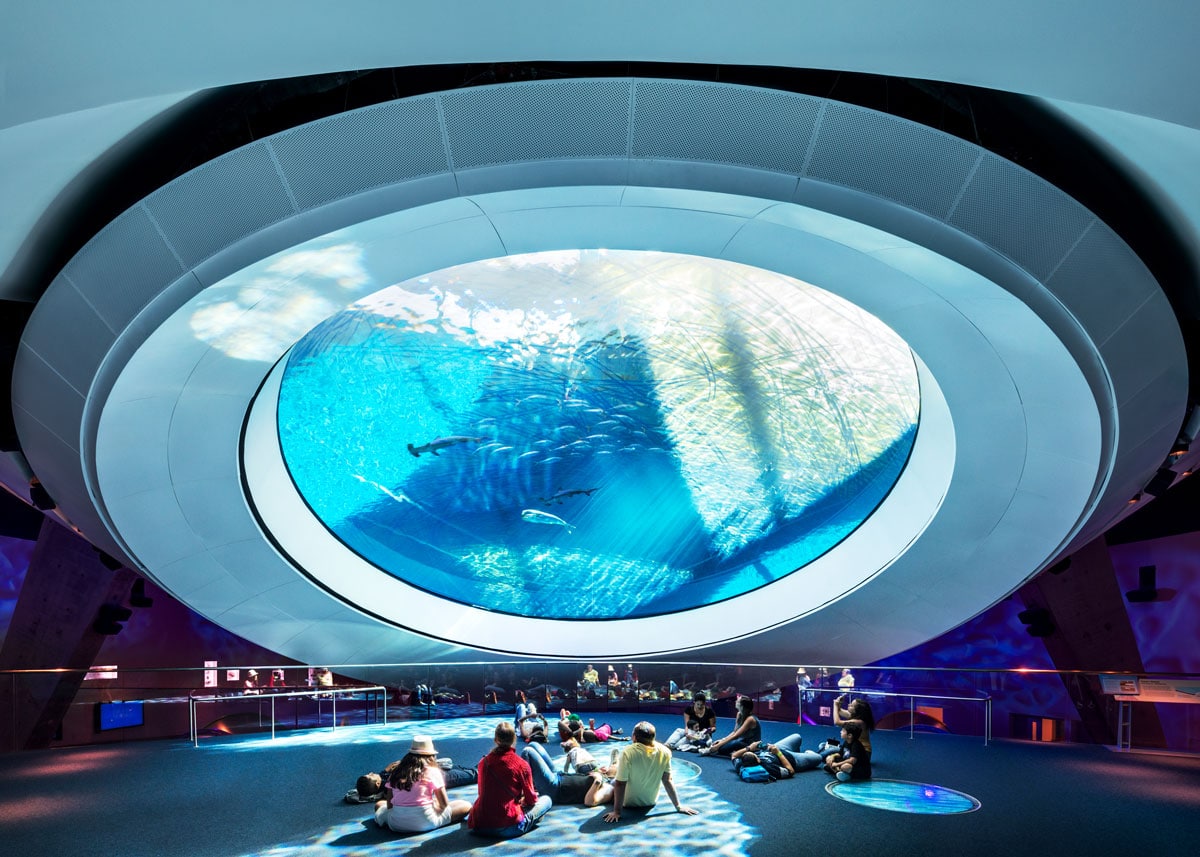
Since the Patricia and Phillip Frost Museum of Science building opened in 2017, it has become a place of discovery, excitement, and education for the community and visitors alike. [Photo: Rafael Gamo]
PROJECT: Patricia and Phillip Frost Museum of Science
LOCATION: Miami, FL
SIZE: 250,000 square feet
COMPLETEION: 2017
ARCHITECT: Grimshaw Architects, Vincent Chang
LANDSCAPE ARCHITECT: ArquitectonicaGEO
Environmental Design Consultant: Atelier Ten
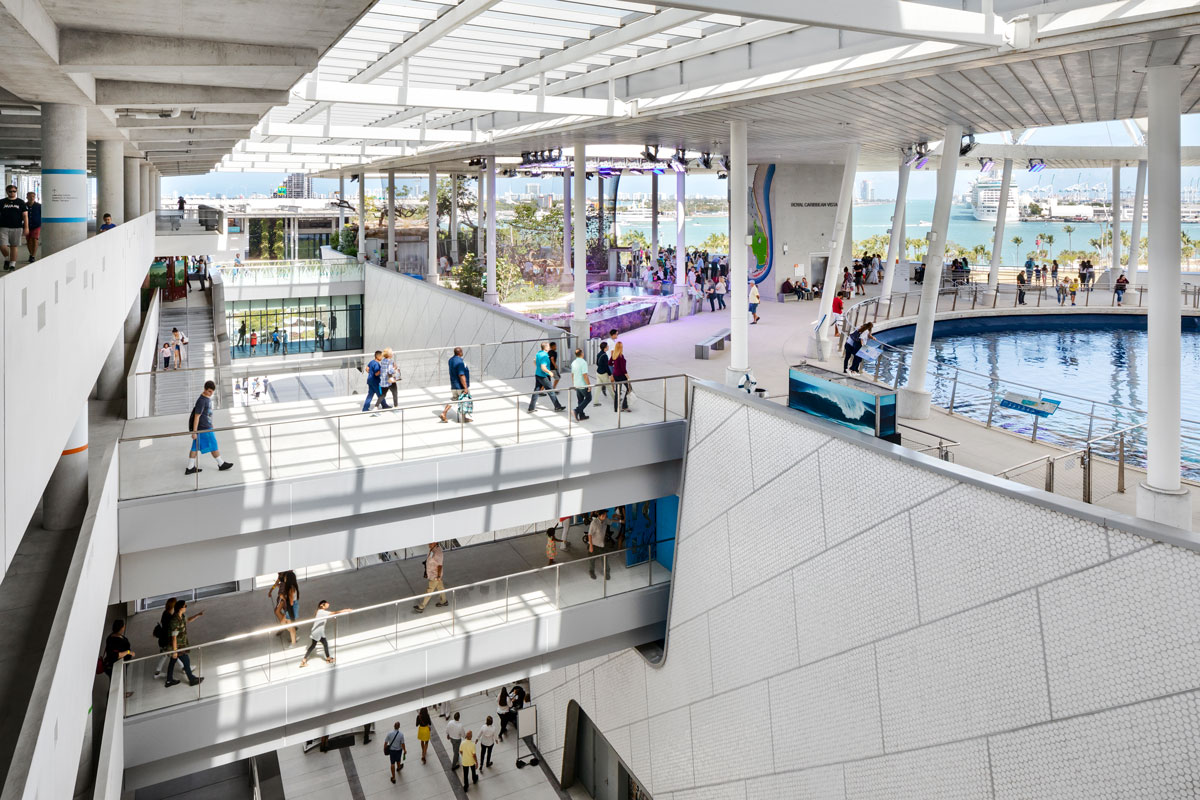
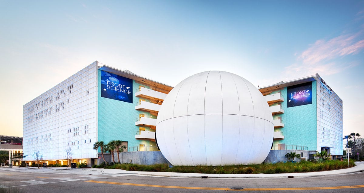
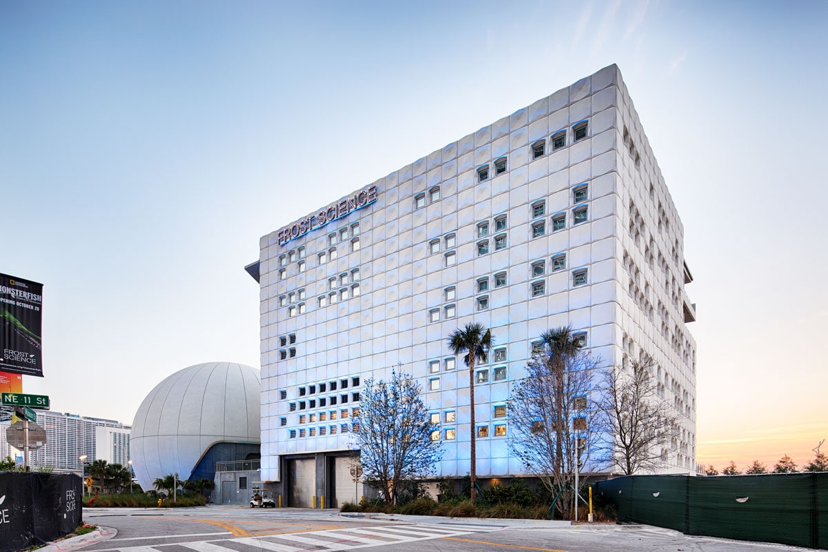
Standing on the Biscayne Bay in downtown Miami, the Patricia and Phillip Frost Museum of Science building reflects the area’s urban and natural life in its exhibits as well as its architecture. The four-building campus connected by exterior walkways and balconies includes an aquarium, planetarium, and science museum with plenty of carefully designed exterior exhibit and circulation spaces that take advantage of the ocean breezes for natural ventilation through the canyon-like structure.
Vincent Chang, group managing partner at Grimshaw Architects, says the museum was designed to be sustainable, adaptable, and welcoming to create a full experience for visitors to get excited about science and technology. The Frost Museum is expected to achieve LEED Gold certification for its energy-efficient design.
[Photo: Rafael Gamo]
gb&d: What is the mission behind the Frost Museum of Science development?
Chang: The existing Miami Science Museum or MiaSci—now the Frost Museum of Science—was a beloved institution embedded within the community but that had aged and become too small for the rapidly growing community of Miami. The mission of the Frost Science has always been to “inspire and connect people of all ages and backgrounds to enjoy science and technology, and to better understand ourselves and our world.” Presenting science in a manner that stimulates curiosity about the world around us and creating inclusivity in a fast-growing, multicultural city were fundamental to the mission of the project. Grimshaw was committed to preserving the historical precedents that were set out by the original founders to share experiential learning with an even greater number of Miami-Dade citizens and visitors while placing Frost Science on the map as a world-class learning institution.
[Photo: Rafael Gamo]
gb&d: What were your biggest priorities going into designing this space?
Chang: As much as possible, Grimshaw’s design is meant to be a welcoming, “living” building, relying not only on its architecture but the local environment as well to create a full experience. The natural world plays a huge role in making the architecture what it is, whether it’s the view to Biscayne Bay, the soft light of the golden hour on the curving façade of the aquarium building, or breezes funneling between the museum’s four distinct buildings creating visitor comfort even in the hot, humid summer months in the exterior exhibition spaces as well as all exterior building circulation. From a mechanical sense, the museum is eminently adaptable, capable of responding to the needs of evolving function or programmatic growth. Adaptability, with minimal disruption, is an essential part of the design, enabling the museum to integrate ever more sophisticated traveling exhibits and upgrade existing exhibits over time.
gb&d: How is sustainability incorporated into the design?
Chang: Grimshaw and Atelier Ten carried out a study funded by the Department of Energy in 2009 for Frost Science. The aim of the research was to optimize the physical shape of the building via iterative wind tunnel and computational fluid dynamics testing for thermal comfort—how people in the exterior spaces were going to feel. Grimshaw’s key design objective was to relocate as much of the building’s visitor program and its public circulation to unconditioned exterior shaded spaces in order to reduce the energy consumption of the building and improve the visitor experience (daylit, breezy outdoor spaces being generally more comfortable than air-conditioned black boxes). The trick was to use the uninterrupted prevailing winds coming in from the ocean and increase ambient breeze velocity through the public concourses by careful orientation of the building and shaping of its “canyon” forms, while avoiding shapes that would accelerate the wind unacceptably under hurricane conditions. The fine tuning of a “blow hole” in the building’s northwest corner, the leeward side, achieved the desired results and led to a distinctive architectural form informed by local climatic conditions. We have yet to do a critical quantitative post occupancy thermal comfort study, but a rough qualitative survey of stakeholders and visitors suggest this has been a huge success.
[Photo: Chad Baumer]
All exterior exhibit and circulation spaces are sheltered from rain and sunshine and, based on that optimization, exclusively naturally ventilated—which is also the case for the car park. A high-performance air conditioning system is fine-tuned to provide superior comfort at low energy for interior spaces. Meanwhile, a vegetated roof accompanies a constructed wetland adjacent to the building for control of stormwater runoff and to enhance site biodiversity.
gb&d: How do you hope the community interacts with this space?
Chang: We were hoping that this building might begin people’s journey into science. We asked ourselves, how can we draw people into the museum that may not typically be excited about science? We wanted the museum to become a place of discovery, excitement and education for the community and visitors alike. We’re confident its unique architecture paired with an exciting and diverse exhibition and attraction program can play a role in that.
At roughly 900,000 visitors to the museum in its first year, the Frost Science has far surpassed attendance expectations.
[Photo: Rafael Gamo]
[Photo: Rafael Gamo]
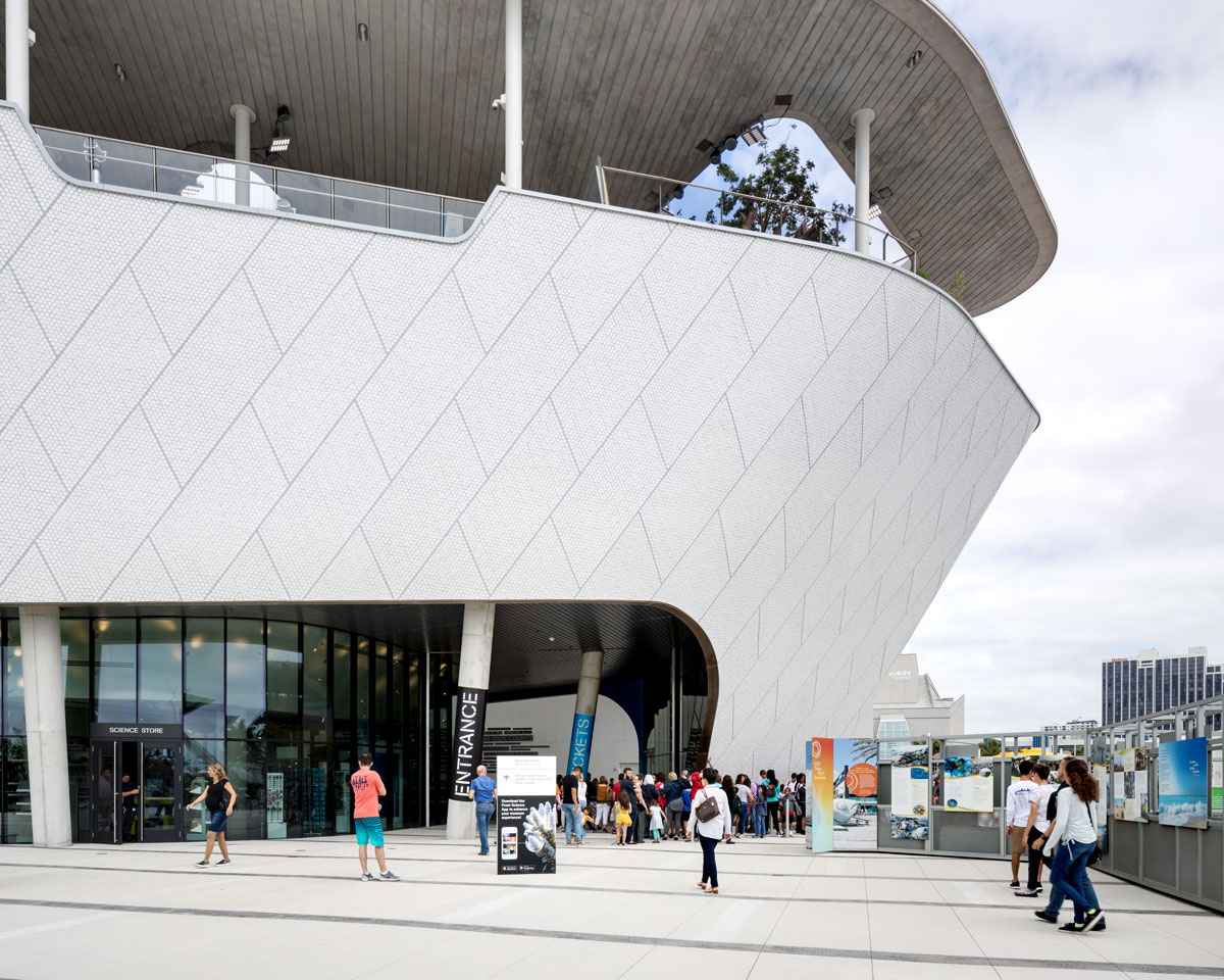
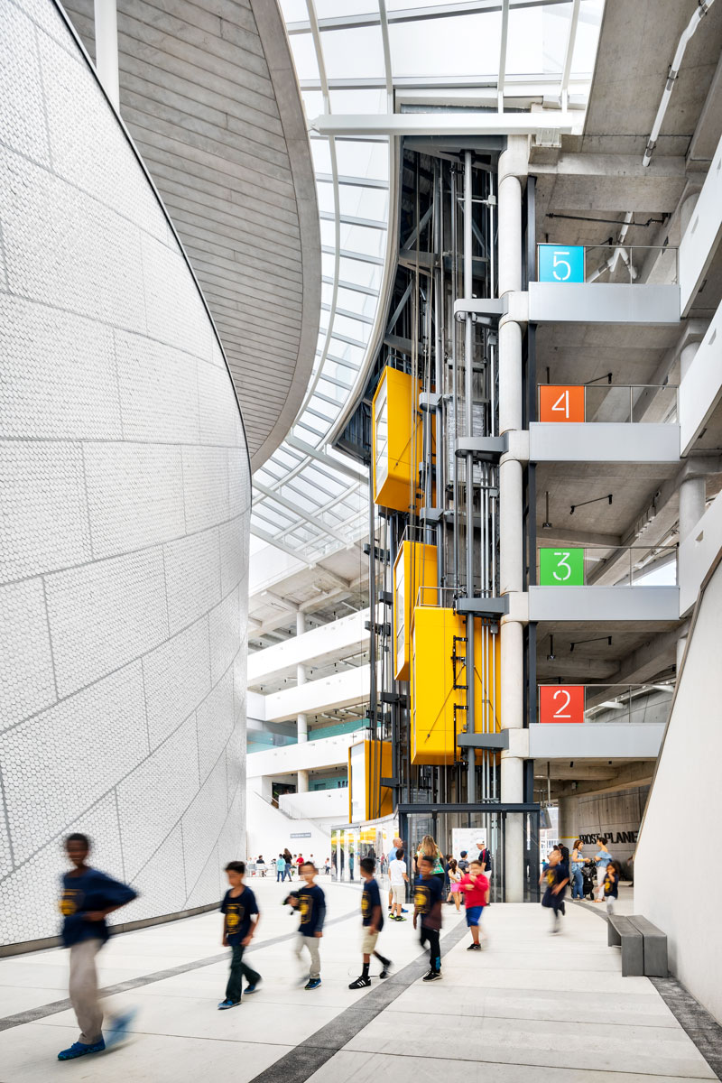
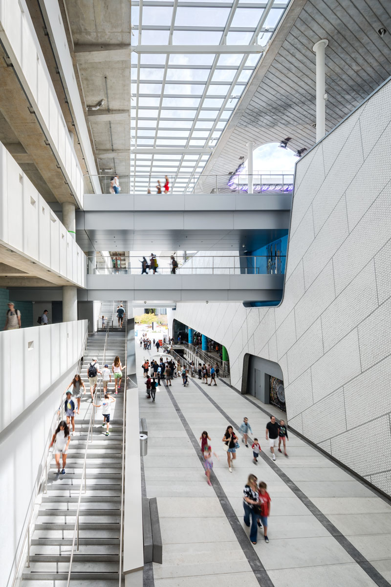
Chang: The building does not have a single “front door,” and the building does not have an “atrium” as one might expect from a museum. Frost Science is designed to be almost a campus, an array of buildings connected by exterior walkways and balconies. The entire public circulation of the building is in the exterior, inviting visitors to view the landscape of Miami as they weave in and out of interior spaces. This becomes a journey for the visitors—beginning on the top floor looking down into the Gulf Stream Aquarium and feeling the breeze coming in off Biscayne Bay. As visitors continue their journey to lower levels, they proceed “deeper” into the ocean, where the interiors are darker and new viewpoints into the aquatic habitats are visible.
The visitor is not only learning about science and local ecologies, but as they walk through the museum they understand the building, the institution is quite literally in and of the city. They see the physical environments from every walkway and exterior path. The views of Miami and the ocean and the prevailing winds coming off the water are just as much a part of the museum as the physical architecture itself.
gb&d: How can architects, planners, and developers create urban spaces that best serve their surrounding communities?
Chang: At the beginning stages of our research, MiaSci ran a “wonder wall” exercise asking children who visited the former museum to use stickers to vote for images that excited them most—giant staircases were the most popular! The final design showcases, stairs and ramps for gathering, drama as well as circulation.
[Photo: Chad Baumer]
A design process and framework which prioritizes rigorous research, participatory design workshops, and a full embrace of a regenerative sustainability model as the basis of design are all key in bringing the best design to communities.
gb&d: What aspect of the project are you most excited about?
Chang: It is quite exciting and rewarding to watch visitors respond to the museum; enjoying the views, the unique exhibition spaces, even aspects of the materiality of the building. When we were considering the magnitude and scale of the aquarium building, which is four stories high, we had to consider how to bring this building back to a human scale. How can we encourage people to want to approach the building and interact with it? How can we address such a large solid façade, with no windows due to strict program requirements, and break it down? For the façade, we custom designed circular glazed ceramic tiles that are 3 inches in diameter, which are roughly the size of the palm of a hand. When you see people walk up to the building and are clearly drawn to the materiality of the building it, running their fingers along the surface as they walk in. They are evidently experiencing the human and tactile connection we were hoping for.
