These creative centers incorporate sustainable design with the visitor experience in mind.
[Photo by Iwan BAAN]
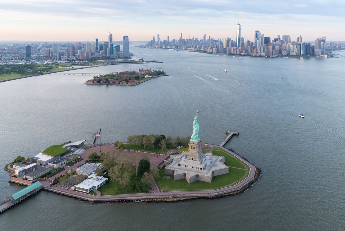
Nicholas Garrison, partner and design director at FXCollaborative, is the vision holder behind the new 26,000-square-foot Statue of Liberty Museum on Liberty Island.
Designing a museum next to the iconic Statue of Liberty compelled Garrison and his team to honor the statue’s history while creating an innovative and memorable experience for the millions of individuals who will visit the landmark. “It’s rare one does a building that as many as 4.5 million people a year will visit,” Garrison says. “Part of our response to both the project and the site was to think about that visitor experience and how to make it a joyous one.”
[Photo by Iwan BAAN]
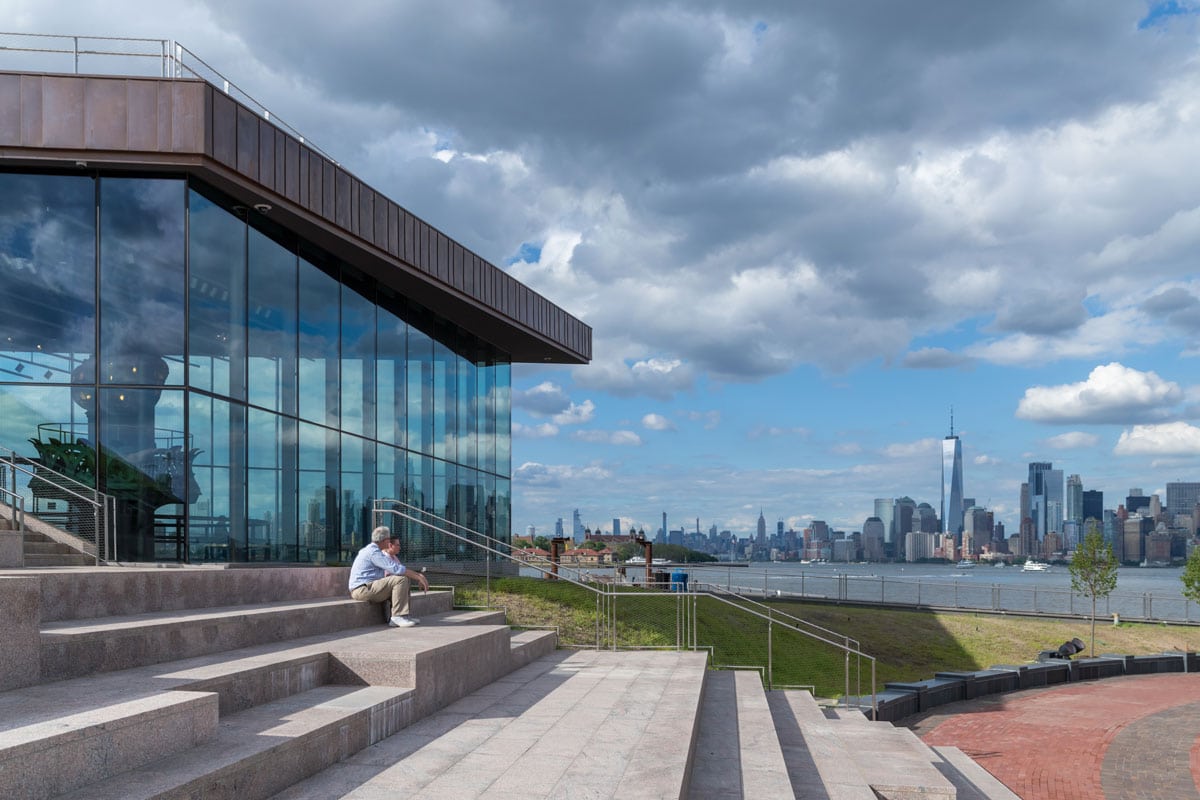
There’s only one Statue of Liberty, and as Garrison playfully articulates: “She’s there and she’s green.” Garrison’s sleek design complements the iconic statue in a way that is astonishingly attractive yet surprisingly non-competitive. His design works within the existing palate and textures found on the original monument and accompanying buildings in the park. In fact, as a nod to Lady Liberty’s past, he was able to incorporate the same Stony Creek granite architect Richard Morris Hunt used for the statue’s pedestal in 1884.
[Photo by Iwan BAAN]
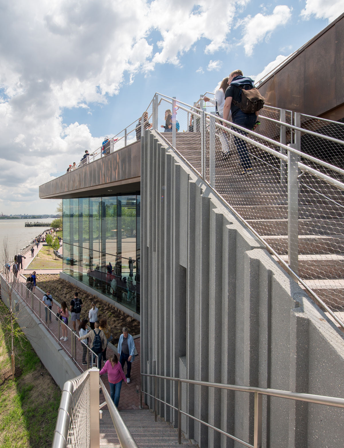
In addition to considering the past, The Statue of Liberty Museum also features ultramodern sustainable design elements like a green roof that merges the building with the park’s landscape. “The green roof is partly a literal extrusion of the ground down, but it’s also done in purposeful counterpoint to the more formal garden idea that the park was based on,” Garrison says. In 1939, after the National Park Service assumed control of the island as visitors starting flooding in, the master plan for the park was to do a French formal garden—much like one you might see at the monument parks in the nation’s capital. But Garrison didn’t want to repeat the formal suburban-like landscape. “What we did want to do was create a landscape for our time, which is more naturalized and resilient,” he says. “We seized on the idea of doing a meadow around the building that would change with the seasons and be planted with a variety of plant materials that would come and go as the seasons change.” The gardens, which feature native northeast materials, will create a more forgiving and balanced landscape that, once established, should require no irrigation.
[Photo by Iwan BAAN]
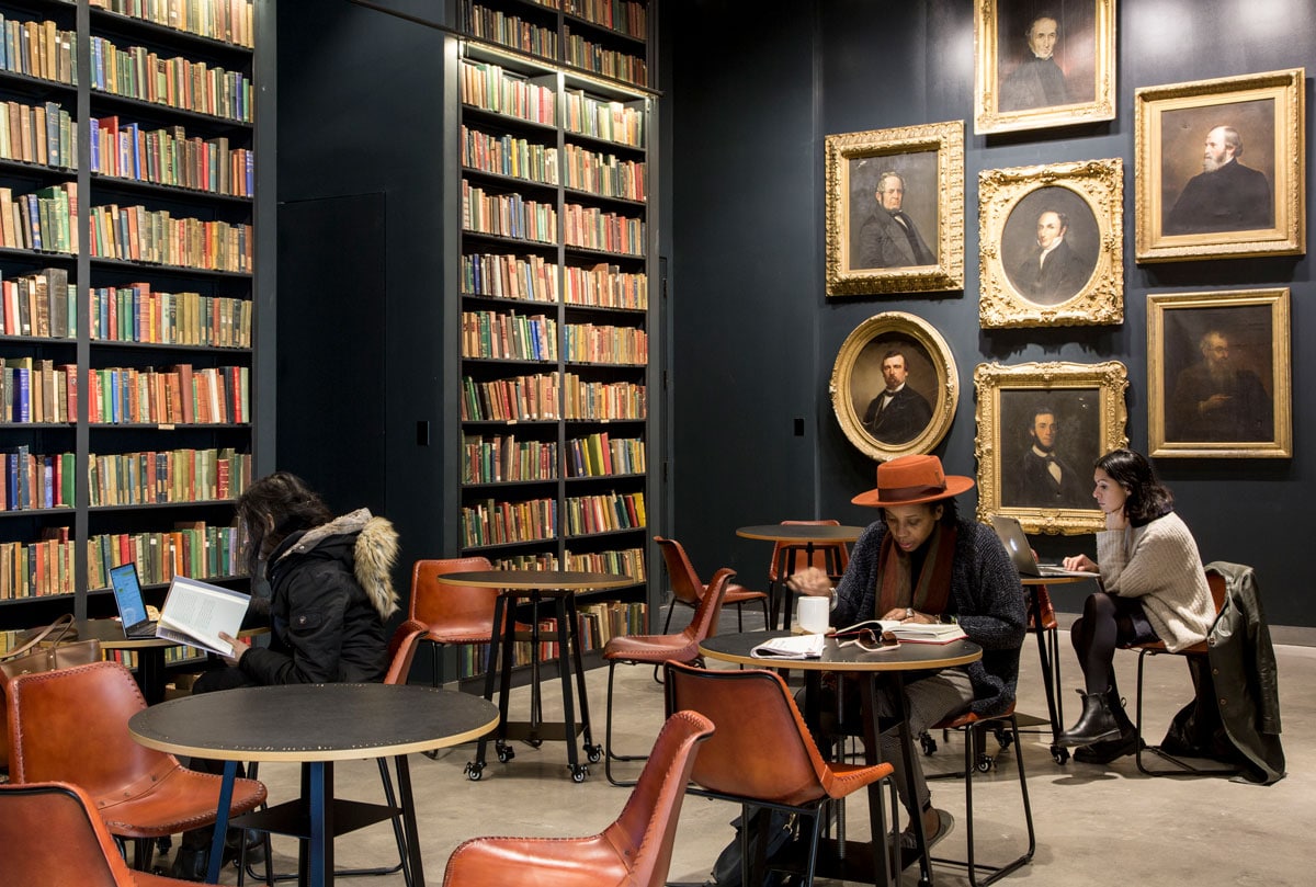
Floor to ceiling wall displays house books in circulation as well as the center’s 19th century collection. [Photo by Michelle Rose]
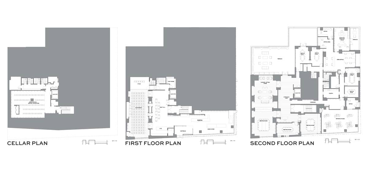
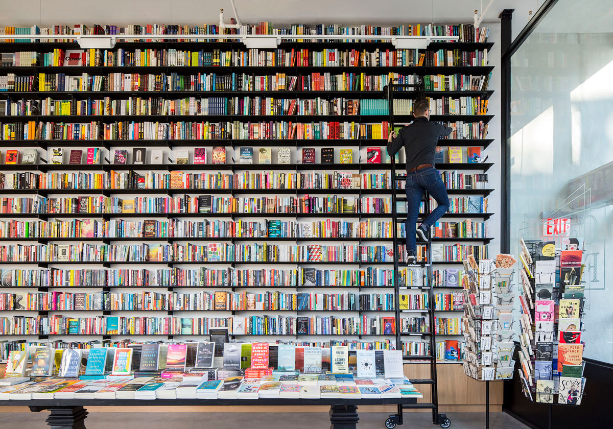
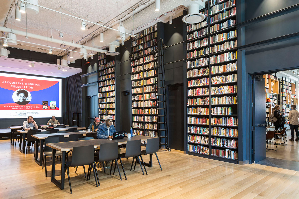
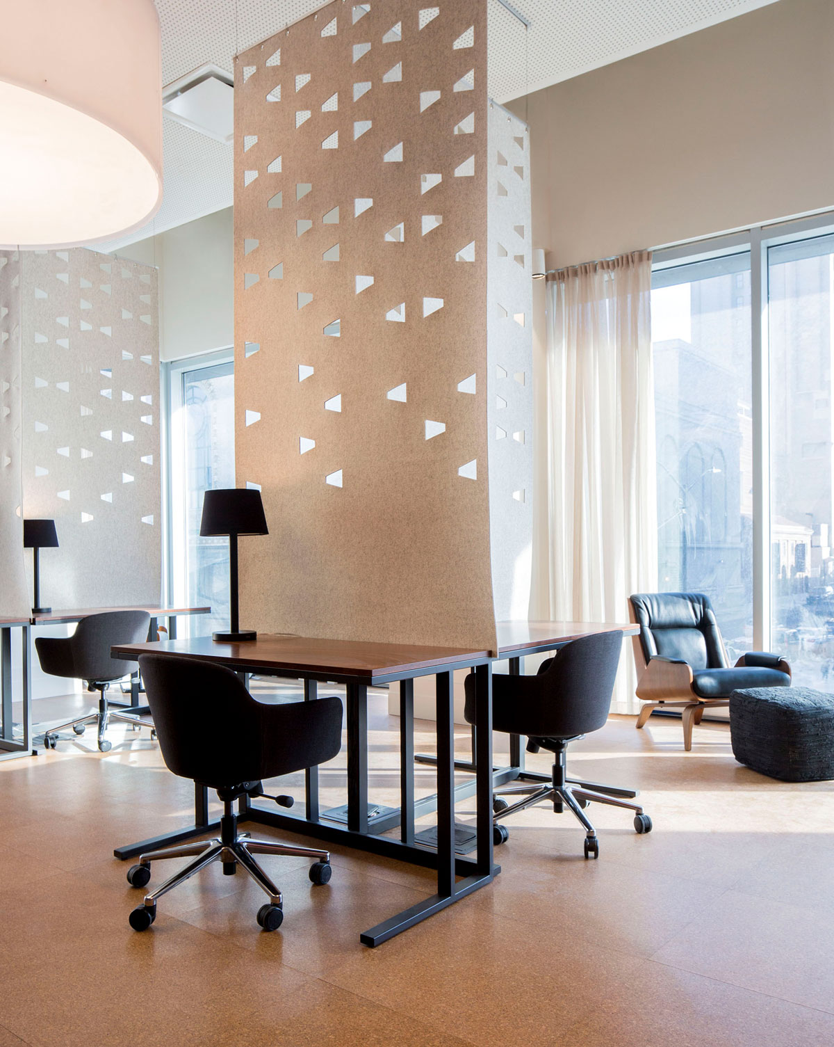
Not far from Liberty Island sits the new site for The Center for Fiction, a membership library with workspaces for writers, a curated bookstore, café, and a podcast studio. The Center for Fiction is in the lower levels of a recently developed multi-family residential building in the heart of Brooklyn’s art-centric neighborhood Fort Greene. Julie Nelson, partner at BKSK Architects, led the team that followed the client’s vision from construction to opening. “This is a space about writing fiction, reading fiction, discussing fiction, and bringing the community together under the umbrella of telling stories,” she says. “In addition to what you would expect in terms of energy performance, like lighting and water conservation initiatives, we really tried to focus on things that were particular to the center’s mission.” Nelson and her team incorporated non-traditional high-performance design elements like day-lighting and acoustic quality, which are particularly important in a space intended for highly focused work. The space diminishes footfall noise and absorbs voices to create a sense of quiet and peacefulness, particularly in the writer studios.
[Photo by Michelle Rose]
But The Center for Fiction did not focus on the digitalization of literature. Instead, the innovation came by way of reimagining the past. BKSK repurposed books as architecture with floor to ceiling displays throughout the center. Mark Jupiter, a custom furniture artist in Dumbo, made a bench from recycled books. The use of books as architecture “becomes something that connects to the writing community, becomes a kind of billboard to speak to the urban scale, and yet feels very personal and intimate. It’s funny how many people have told us how comfortable it is to be in the presence of books,” Nelson says. “In some ways, it’s a reversal of innovation.” Nelson suggests the reimaged book architecture provides a sort of tribute to traditional libraries by recognizing the need for calm, reflective spaces.
[Photo by Michelle Rose]
Although the center looks fairly traditional in some regard, you’ll also find many state-of-the-art aspects that keep the space feeling fresh and welcoming in the digital age—like the podcast studio for author talks and interviews. “We were trying to create a space that spoke to people who have been coming here for many years, but to a new home in Brooklyn, and to attract a wider and more diverse audience,” Nelson says. The center recently welcomed Salman Rushdie for an author talk and hosted a memorial service for Toni Morrison, both of which were recorded and released digitally.
[Photo by Michelle Rose]
BKSK’s interior design plan also included local materials and craftspeople, furthering that feeling of community and creativity in the space. Custom tables with literary quotations in the center’s café are constructed from PaperStone, a countertop-like material made from 100% post-consumer recycled paper, and the center’s custom neon signage was created by Lite Brite Neon Studio, another local artist.
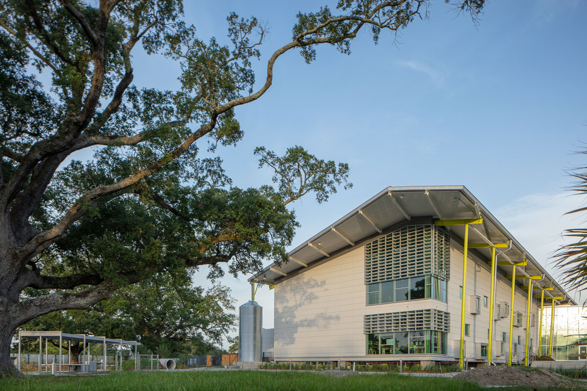
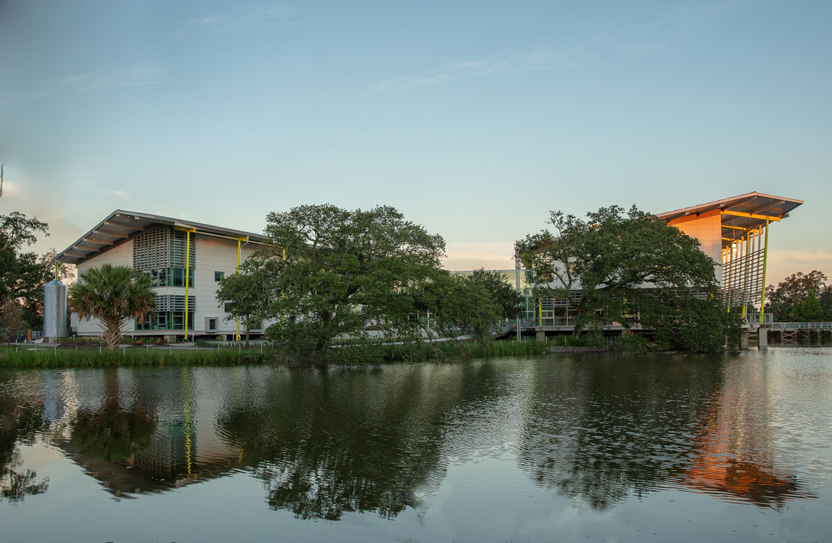
Mature live oaks line the museum, providing extra shade and cooling from the hot Louisiana sun.
[Photo by Neil Alexander]
Richard Franko, partner at Mithun, has a specific interest in buildings and landscapes that teach, so it’s no surprise he and his team were picked to design the new Louisiana Children’s Museum in New Orleans. The concept for the 56,400-square-foot design began in 2008 when Julia Bland, CEO of Louisiana Children’s Museum, set out to leave the original location in the Warehouse District for a new site in City Park that would allow children to interact with the bayou’s distinctive environment.
[Photo by Neil Alexander]
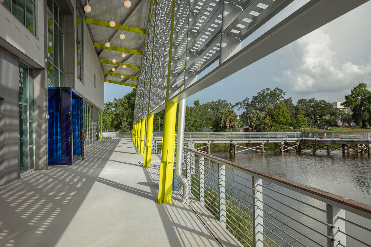
Because Louisiana has such a mixed terrain of water and land, Franko and his team sought to design a building that allowed visitors to travel from indoor to outdoor exhibits seamlessly. Museumgoers, for instance, might enter from over the water, travel into the museum for the 100-foot-long “Mighty Mississippi” exhibit, and return outside to explore the floating classroom barge or living shoreline.
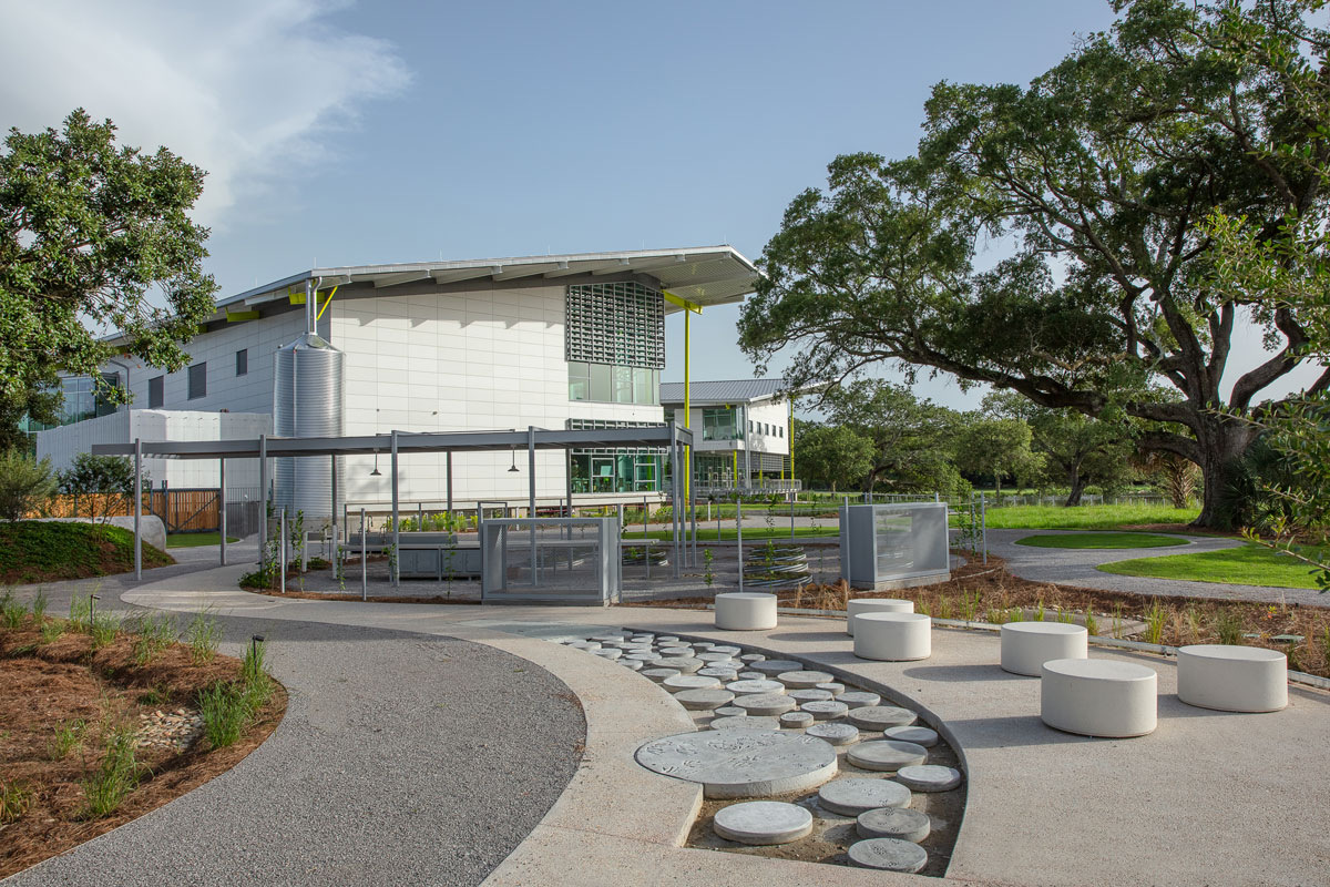
With post-Katrina concerns at the forefront, Franko elevated the building and designed the site to be able to take on inundation. “As that area becomes a receptor for stormwater during storm events, it will be able to accept water onsite and allow it to recede gradually,” he says. Mithun also designed an interactive area for children with a large cistern that collects rainwater for irrigation use. Additionally, the building’s curtain wall and façade are designed to meet New Orleans’ strict wind requirements.
[Photo by Neil Alexander]
The documentation work was still in process as of late summer 2019, but the building is expected to receive LEED Silver certification. Some of the sustainable design elements include passive shading on the south and west sides of the building to reduce heat gain, radiant cooling in the building’s slab, a dedicated outdoor air system, and the use of desiccant—a medium that aids in humidity reduction.
Perhaps the most important element of Franko’s sustainable design was the attention to the park’s topography. “What’s amazing about City Park is it has the largest collection of mature live oaks in the world, so we were really eager to make sure we respected the live oaks,” he says. The consideration of trees in the design and building siting created spectacular views from the outdoor café and also maintained the integrity of the some 750- to 900-year-old oaks.
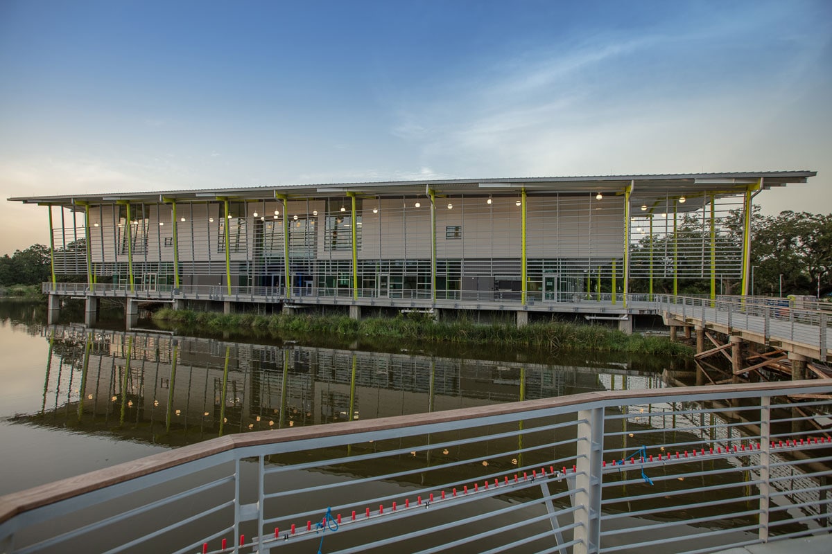
Photo by Neil Alexander
The Louisiana Children’s Museum opened at the end of August 2019 and is expected to see more than 250,000 visitors per year.
Statue of Liberty Museum
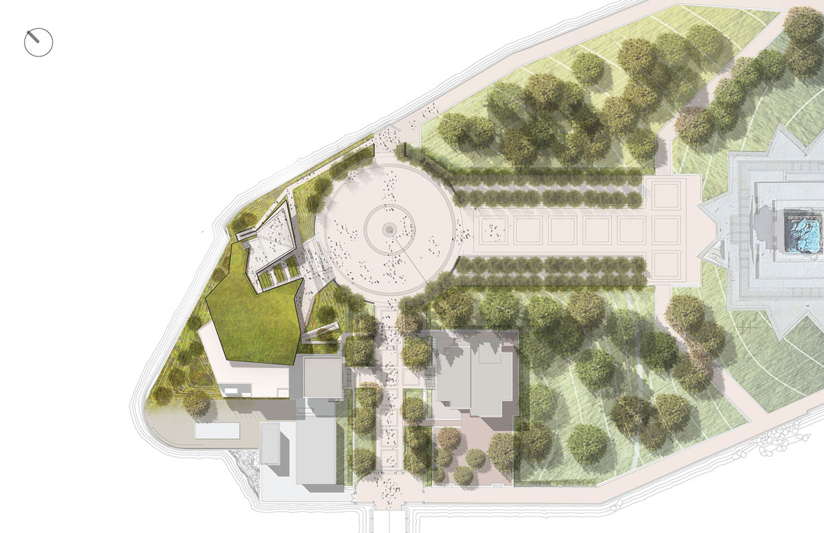
[Drawing courtesy of SOLM]
Location: New York City
Completion: 2019
Size: 26,000 square feet
Cost: $70 million
Lead Architect: FXCollaborative
Experience and Exhibition Design: ESI Design
Structural Engineer: DeSimone Consulting Engineers
MEP: Kohler Ronan
Civil Engineer: Langan Engineering
Construction Manager: Phelps Construction Group
Landscape Architect: Quennell Rothschild & Partners
Historic Preservation: Li/Saltzman Architects
The Center for Fiction
Location: Brooklyn
Completion: 2019
Size: 17,300 square feet
Lead Architect: BKSK Architects
Architect for Base Building: Dattner Architects
MEP Engineer: Dagher Engineering
Structural Engineer: Thornton Tomasetti
Lighting: HLB Lighting Design
Acoustics, AV, and IT: Cerami & Associates
Contractor: Archstone Builders
Interior Designer: BKSK Architects
Louisiana Children’s Museum
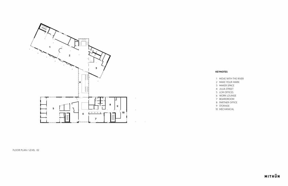
[Rendering courtesy of Mithun]
Location: New Orleans
Completion:2019
Size:56,400 square feet
Cost: $47.5 million
Lead Architect: Mithun
Collaborating Architect: Waggonner & Ball
Exhibit Design: Gyroscope
Engineer: ARUP
Contractor: Roy Anderson Corp.
Interior Designer: Mithun
Landscape Architect: Mithun

