Biophilia meets biopharmacy at the company’s sustainable, HOK-designed San Francisco facility.
[Photo: David Wakely]
PROJECT: AstraZeneca West Coast Center
LOCATION: San Francisco
SIZE: 105,000 square feet
COMPLETION:
INTERIOR DESIGNER: HOK
ENGINEERS: HOK
MECHANICAL CONTRACTOR: Therma
ELECTRICAL CONTRACTOR: Decker Electric
From research institutions to life science facilities, laboratories of all stripes tend to use disproportionately high amounts of energy relative to their square footage. So the bar was inherently high for HOK when they were tasked to design the interiors for AstraZeneca’s center for West Coast operations in San Francisco, an ambitious facility that positions research and development labs adjacent to administrative and creative staff in open-plan office spaces. Both HOK and their biopharmaceutical client wanted to not only slash energy usage but also warm up the traditional “sterile lab environment,” as Daniel Herriott, director of interior design at HOK’s San Francisco office, describes it.
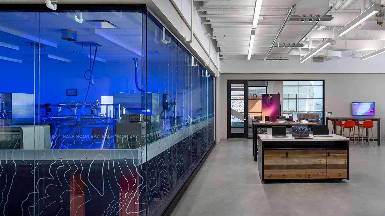
The result checks both boxes: energy-efficient, LEED Platinum–certified interiors that prioritize employee connectedness and comfort, with an added emphasis on daylighting. Indeed, nearly 100% of work areas are positioned in natural-lit zones, and the lab environments are outfitted with large windows that look out into breakout spaces and the outdoors beyond. That openness also promotes interaction and a sense of discovery. “One of our main objectives was to put science on display the moment you walk in the door and also create a user experience that was equaled between labs and [non-lab] workplaces,” Herriott says.
[Photo: David Wakely]
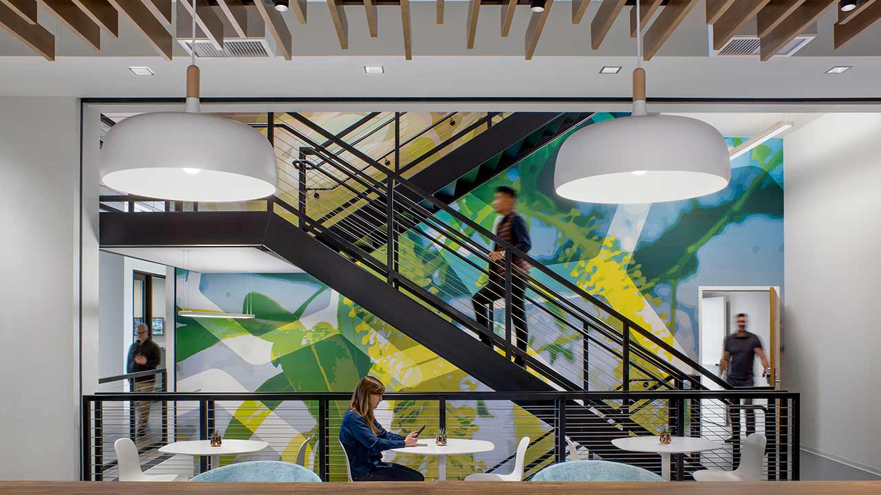
That sense of interaction is particularly unique in the West Coast center, which brings together four AstraZeneca organizations in the same building. R&D labs are traditionally cordoned off from administrative and other staff in separate facilities. Here, not only do they share a roof, but strategic, green design elements bring them even closer. In addition to the large lab windows, there are wooden ceiling panels that join the central lab core with cross-circulation points and breakout spaces. HOK also dramatically opened up a staircase, going from minimum-egress to monumental, simultaneously reducing elevator load, promoting well-being, and fostering exchange.
In terms of energy reduction, the design cut out unnecessary lab equipment, improved the core and shell, and reduced the site’s mechanical system capacity. The team paid great attention to the center’s plug load, as well, notes Erin Ezell, an HOK senior sustainable design specialist. All the research refrigeration equipment was replaced with the highest efficiency models available; all lights run on occupancy and daylight controls; and daylight harvesting systems and automated shades are installed around the perimeter. Water efficiency, locally sourced materials, and centralizing freezers into an efficient “farm” further add to energy savings.
Beyond the design, the tenants themselves are focused on sustainability. The company aims to be energy-, carbon-, and water-neutral by 2025, and, at the San Francisco site, submetering and measurement and verification programs will further the goal of efficiency into the future. “So they’ll continue to monitor and optimize energy and water use going forward,” Ezell says.
[Photo: David Wakely]
Put a Cork in It
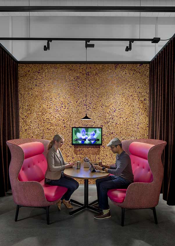
The design team used rapidly renewable materials like the eye-catching cork wall in a breakout area pictured above. “The general design for those spaces are quite homey; they move away from a typical corporate, commercial look and feel, to something a lot more comfortable,” says Daniel Herriott, director of interior design for HOK’s San Francisco office.
[Photo: David Wakely]
Sense of Place
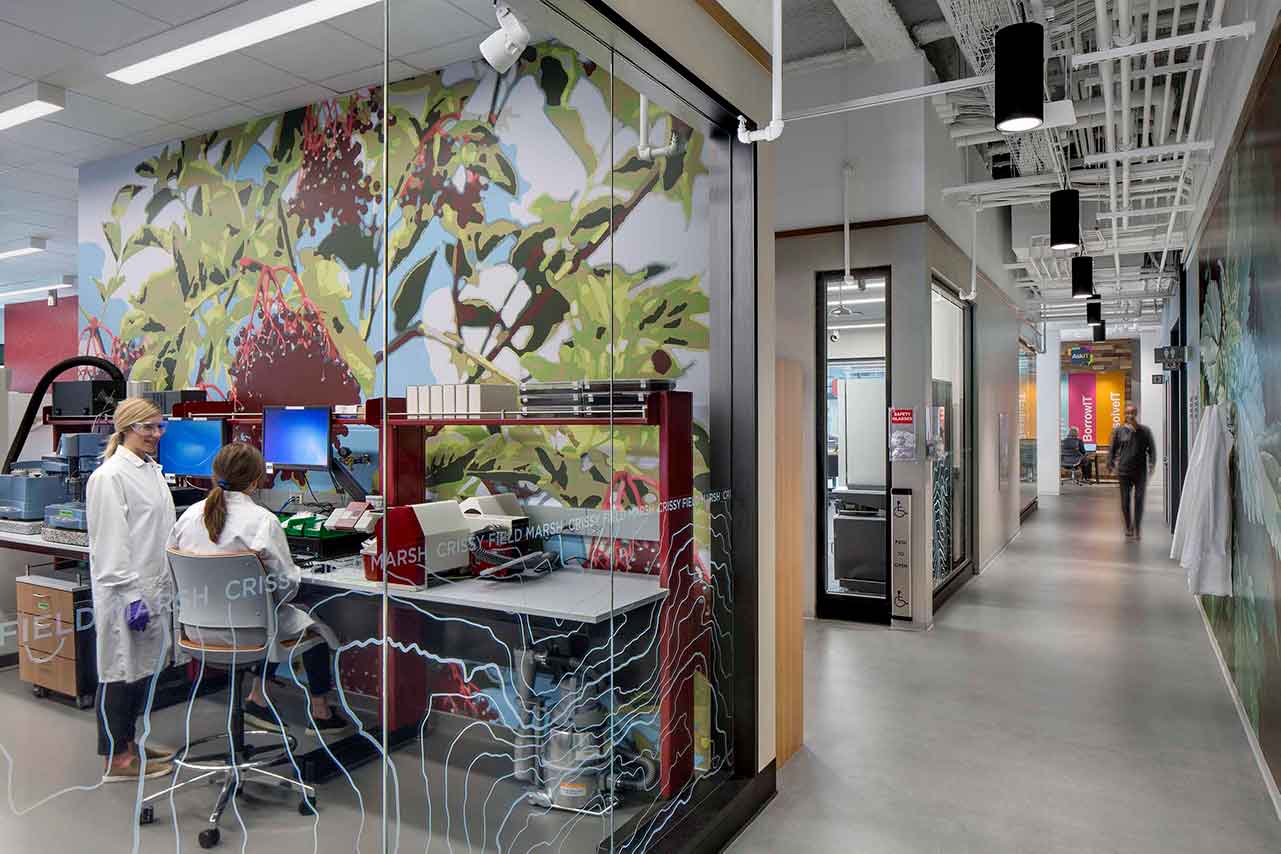
HOK directly nodded to the Bay Area and its native flora in its art and wayfinding choices. Topographic designs along glass walls namecheck local sites like Half Moon Bay and Crissy Field Marsh, and artwork references California plants that contain medicinal qualities. The references change from floor to floor, providing subtle, almost subconscious designations of space. “If a building’s too samey, too coherent, it can be confusing,” Herriott says.
[Photo: David Wakely]
Seen but Not Heard
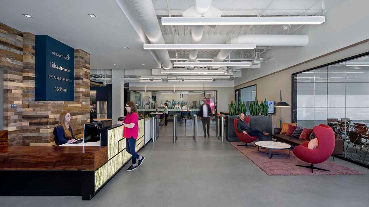
AstraZeneca wanted its labs at the San Francisco center to be visible and accessible showcases, but the work done within couldn’t be disruptive to nearby employees, so acoustic control was imperative. A lab located directly off the reception area includes a cyclone machine used in the development of inhalant medicines that suspends particulates in the air. It “sounds like a jet engine,” but thanks to smart sound control, the volume stays inside, says Herriott, who brought acoustic knowledge from having designed TV and radio sets for the BBC.
[Photo: David Wakely]
Lab Flora
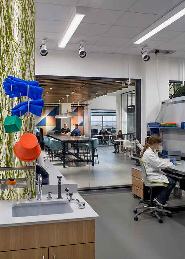
The center is dotted with planters and greenery throughout the office space, but bringing live plants inside a lab setting is “always a concern” due to contamination fears, Ezell says. But the transparent design allows scientists to view plants in the adjacent office space plus look out to the nearby San Francisco Bay. Inside the lab, 3form material safely combines plant matter with acrylic material, “so those plants can be expressed without contaminating the space as well,” Ezell says.
