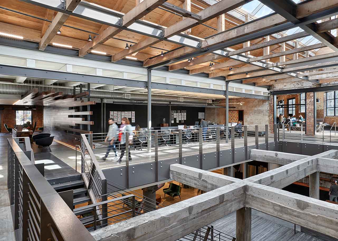
Natural light pours through the atrium at the Fitzco / Momentum / Weber Shandwick office. The site is a 100-year-old former slaughterhouse in Stockyards Atlanta, converted into office space. [Photo: Garrett Rowland]
Recent offices for Slack, Autodesk, and three media agencies illustrate how character and infrastructure combine to make spaces worth saving.
When you’re talking office design, it doesn’t take long before the conversation turns to the concept of office hell. Fewer than 10 minutes into our recent chat, Michael Leckie, the principal architect at Leckie Studio Architecture + Design, invokes the twin pop-cultural totems of soul-crushing workplaces: The Office and Office Space. “Unfortunately, the standard so-called office space throughout the majority of North America became a very dystopian environment: acoustic T-bar ceiling, cubicles, and just no feeling or character.”
It’s no wonder then that businesses—especially those in creative industries—gravitated toward renovating older industrial buildings, rich with history and personality, and eschewed cookie-cutter ground-ups when developing their office environments. At the same time, these old spaces would hardly make strong candidates for office-space adaptive reuse if their only selling point were charm; they need to deliver functionally. So what makes an old warehouse—or in one recent conversion, an old slaughterhouse—good fodder for contemporary office space?
![[Photo: Ema Peter]](https://gbdmagazine.com/wp-content/uploads/2019/04/Leckie-Studio-Slack-Headquarters-Top-View.jpg)
Leckie’s Slack Headquarters [Photo: Ema Peter]
Project: Slack
Location: Vancouver
Completion: 2016
Size: 12,000 square feet
Architect: Leckie Studio Architecture + Design
Mechanical & Electrical Consultant: Integral
Contractor: Powers Construction, CDC Construction
Lighting Fixtures: Molo Design
Endless Possibility
Leckie in 2016 completed the transformation of an old Vancouver warehouse into the regional offices for Slack Technologies, the cloud-based messaging service that, in its own way, has changed the way a lot of work gets done. He points to early 20th century industrial sites’ durability and penchant for open spaces in particular as standout reuse selling points.
“Traditional warehouse spaces were designed in a very robust manner,” he says. “They were originally designed to be flexible and adaptable, with large spans between beams. Because we’re in the Pacific Northwest, we see a lot of beautiful heavy timber beams. In other industrialized cities, you see a similar thing, but maybe with concrete or brick or load-bearing masonry. Regardless of the materiality, the nature of the space and its intended use was always the same; there was a flexibility, large scale of space, and robust structure.”
And it’s vital that offices facilitate employee mobility, Leckie says. “Most creative workplaces are highly collaborative environments, so the design fundamentally starts with the open-plan concept. When you have spaces that were originally designed to be large and open, you can see the natural synergy that happens.”
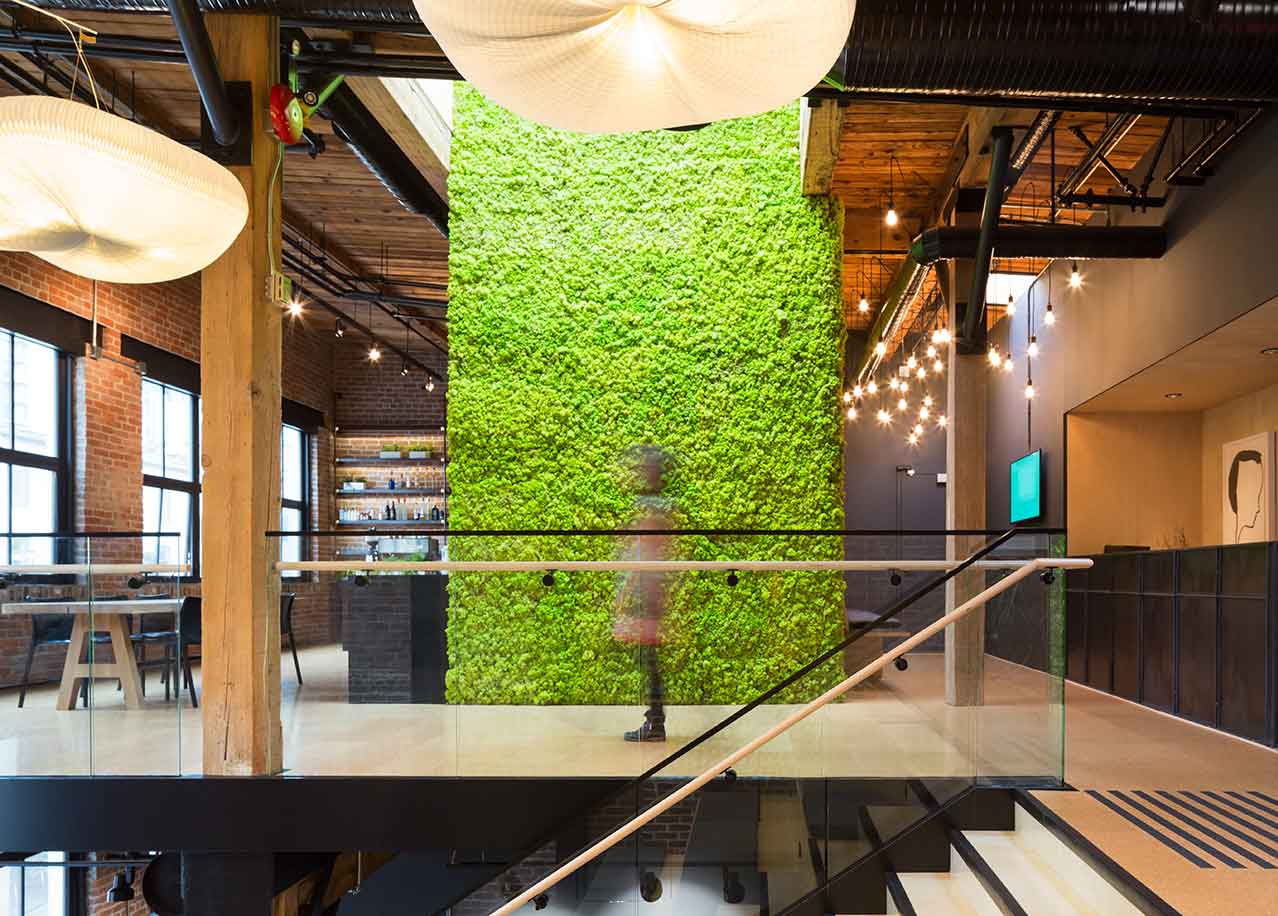
Cloud-like pendants light up the statement bleacher staircase at Slack. [Photo: Ema Peter]
Up for the Challenge
A few hundred miles south from Vancouver down Highway 5, you’ll find the regional offices of Autodesk, a company that builds software for architecture, engineering, and construction. The Portland office resides in the historic Towne Storage Building, a former paper mill that dates back to 1916. Dietrich Wieland, a principal architect and director of sustainability at Mackenzie Architects, which constructed the office’s interiors, is blunt with a counterargument: “[Industrial sites] are often inherently not great candidates [for adaptive reuse].” Noise control in particular is a challenge. “A lot of these buildings are all wood-framed, which makes for a beautiful structure but is technically challenging from an acoustical perspective.” The project also needed new MEPFS, seismic upgrades, and core and shell renovations, which were completed by LRS Architects. But when you consider the potential alternative—the historic building had stability issues and likely needed major structural fixes to avoid future teardown—the investment makes sense. And there were indeed functional boons embedded within the structure, including abundant daylight and good floor-to-floor heights.
The need for unrestricted space was also key for Erin Greer, studio director for Gensler, when asked about the firm’s recent adaptive reuse project for media agencies Fitzco, Momentum, and Weber Shandwick in Atlanta. The team transformed an old slaughterhouse that had long ago fallen into disrepair, taking advantage of a massive floor plate by stitching together three buildings—namely by breaking through the thick masonry walls that once divided the spaces.
That barrier-free expansiveness is vital to operations. “Research shows the more people can see and be seen, the more interactions they have with colleagues, which leads to increased collaboration, which leads directly to more innovation,” Greer says. The brands that operate in the building are sister agencies, and they conduct business side by side in a pooled-together space. In a sense, it literalizes the way the media industry has evolved recently. “As larger holding companies acquire boutique firms and look to leverage their collective power, there’s been a shift to more holistic campaigns,” Greer says. “Smaller agencies have recognized the need to break down silos of formerly separate workflows in order to stay ahead of the curve.” Hence the position of each firm adjacent to one another within a contiguous space.
Project: Autodesk
Location: Portland, OR
Completion: 2018
Size: 60,000 square feet
MEP: Glumac
Contractor: Fortis Construction
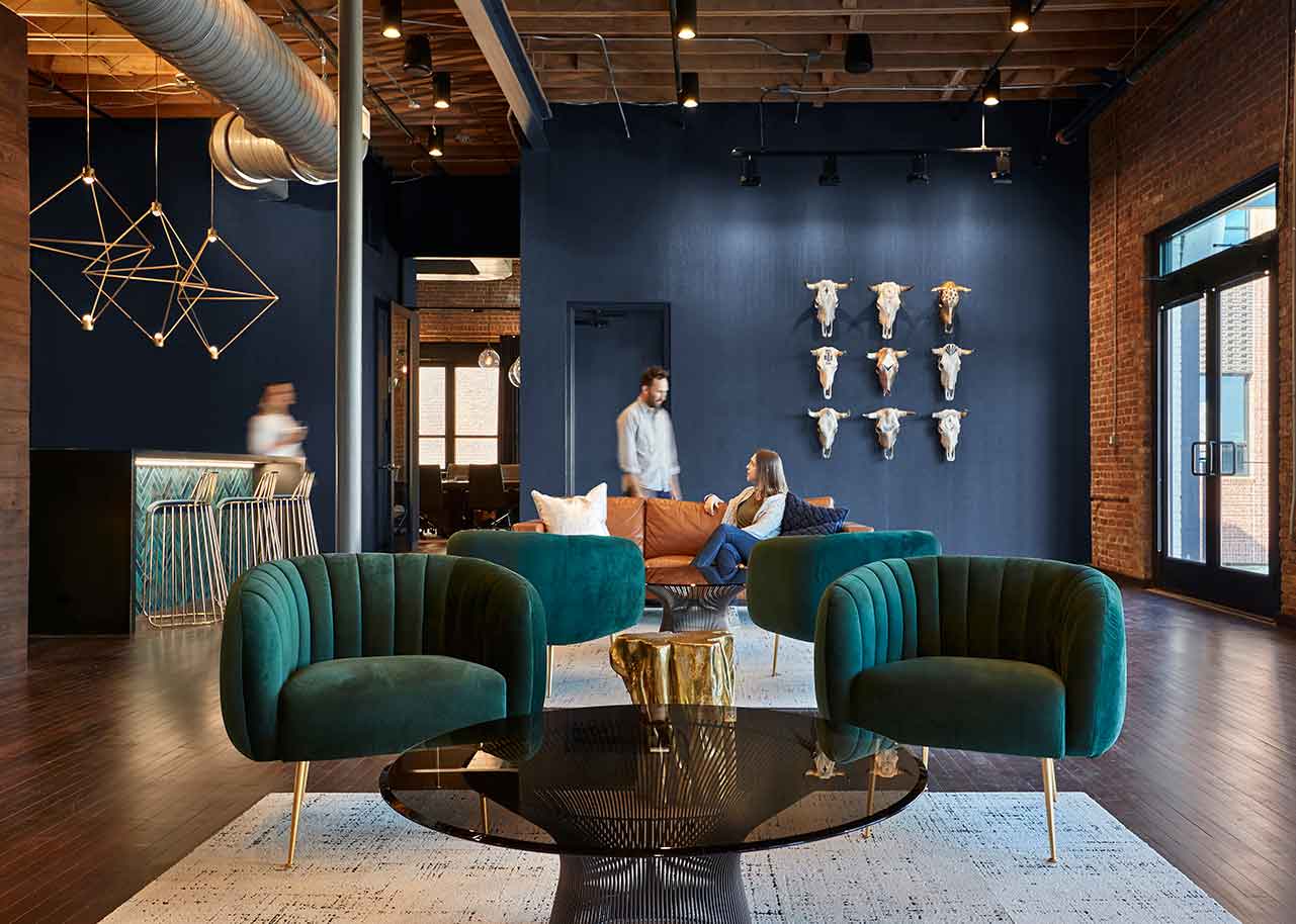
Architecture firm Gensler stitched together three buildings to transform an old industrial site in Atlanta into spacious offices for three media agencies:.Fitzco, Momentum, and Weber Shandwick [Photo: Garrett Rowland]
The project—which won a Best of the Best Award from the Georgia chapter of the International Interior Design Association—furthers the sense of communalism with a welcoming front porch, open reception area and café, collaborative conference spaces near the central atrium, and a shared floor for hosting clients. The massive atrium allows daylight to pour through and reach each.
Not coincidentally, Slack similarly pursued a non-sequestered setup to help foster interaction, and also to break down any sense of a pecking order, according to Leckie. Even Founder Stewart Butterfield works from a standard desk within the open office environment, alongside other employees. The building sports an ambitious architectural insert that spans all three floors, plus large-scale bleacher seating, the aforementioned open plan, and a kitchen/bar area strategically positioned at the top—“the nicest spot in the space”—to promote employee circulation—all elements designed to prevent silo effects and resist hierarchies.
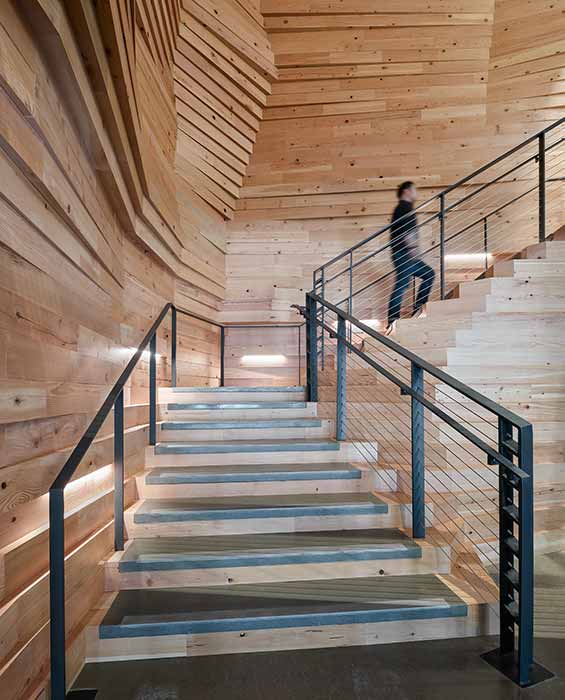
Mackenzie Architects transformed a former paper mill for Autodesk. [Photo: Christian Columbres]
A Sense of Place
But aside from strict functionalism, the benefits of industrial-to-commercial reuse is undeniable for Greer. So much competition exists between employers for qualified candidates in creative fields—there’s “a war for talent,” she says—that fostering “that sense of creativity and authenticity becomes really important” when companies look to attract and keep elite talent. “You want to bring out creativity, make people feel like they’re in an environment that’s different, that isn’t a glass office building, but has a fabric of history … The juxtaposition of old and new is really exciting for employees,” she says.
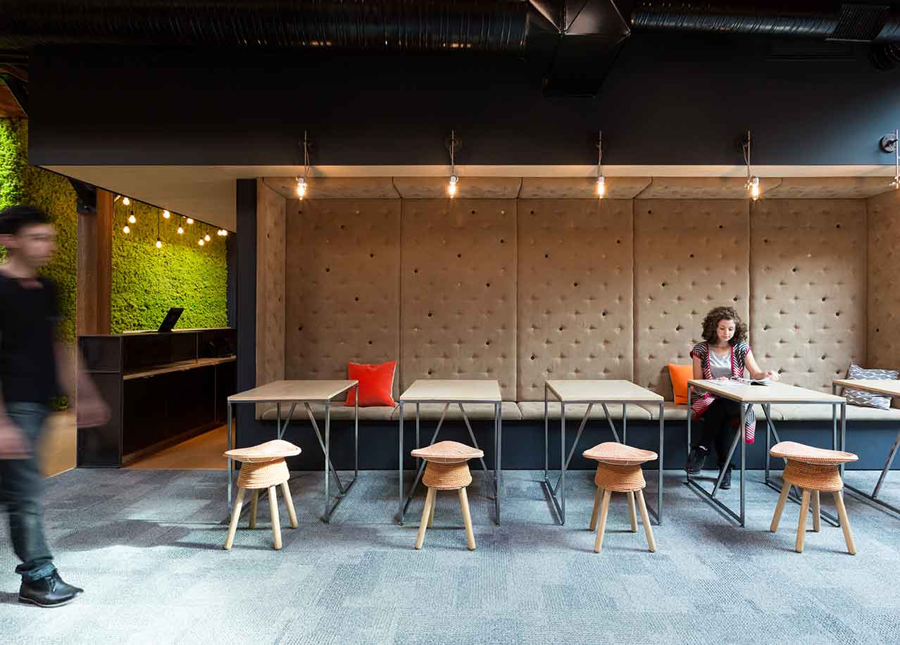
Slack by Leckie Studio [Photo: Ema Peter]
Of course, no building exists in a vacuum, and these projects all illustrate how the relationship between history, neighborhood, and design can become entangled within a site. The Slack office, for instance, is part of a broader, long-term transformation of its Yaletown neighborhood—a one-time industrial hotbed that was the westernmost stop on the Canadian Pacific Railway—that dates back to at least 1986, when the area hosted the World’s Fair. A number of post-industrial adaptive reuse projects cluster immediately around the office, including several by Leckie: Karameller, across the street from Slack, located inside a very similar, former industrial building, and the Small Victory Bakery, around the corner, which features heavy timber left exposed by the firm. “The connection details, materiality, all these things, they make up the kind of space people want to be in. There’s a deeper appreciation for these spaces and the experience they provide,” Leckie says.
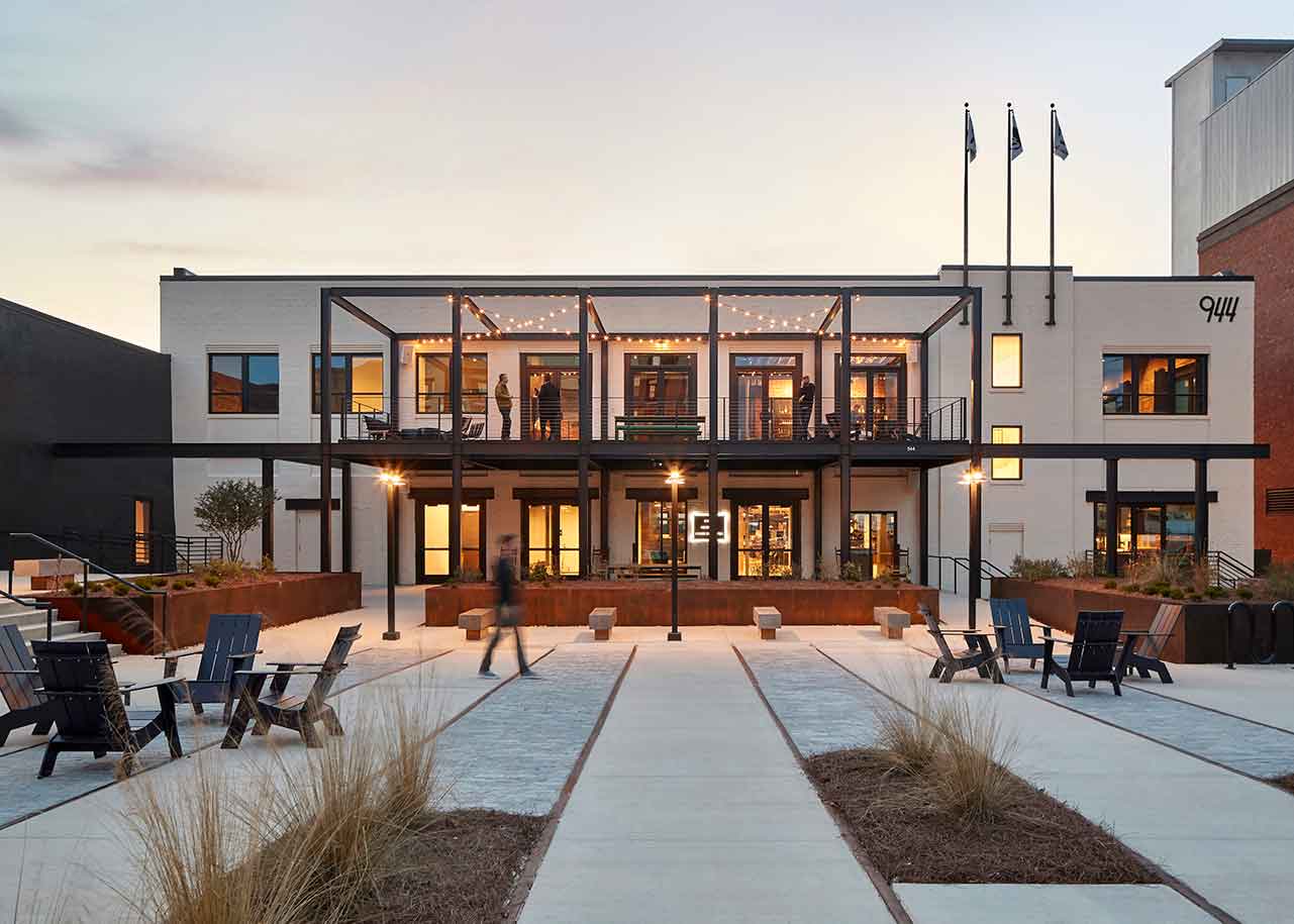
Gensler favored a “hospitality-forward” approach for the Fitzco / Momentum / Weber Shandwick office, with shared meeting spaces to complement the open-plan workspaces. [Photo: Garrett Rowland]
Project: Fitzco / Momentum / Weber Shandwick
Location: Atlanta
Completion: 2017
Size: 53,404 square feet
Architect: Gensler
Engineers: M2 Structural, Newcomb & Boyd
Contractor: Gay Construction Company
Lighting: One Lux Studio
Gensler’s media agency project also takes up residence in a historic railroad focal point, at the foot of the Howell Interlocking Historic District, a convergence point of four rail lines that abuts the Marietta Street Artery neighborhood—a former industrial area that continues to be adapted into urban amenities. Such transitions are hardly uncommon in major metros, but the preservationist instinct in Atlanta may have deeper significance than just following a trend. The city’s architectural style is difficult to pin down, and retaining the built environment’s character feels even more crucial. “A lot of newer products coming online, they’re not what you’d think of as iconic architecture or architecture that represents place, so you layer onto Atlanta’s uniqueness of different neighborhoods and communities,” Greer says.
Further underscoring the old-meets-new nature of the site is its position near the Atlanta Beltline—the extensive rail-to-trail conversion of the miles-long railroad corridor that encircles the city’s core and represents one of the biggest urban redevelopment/public parks programs in the country.
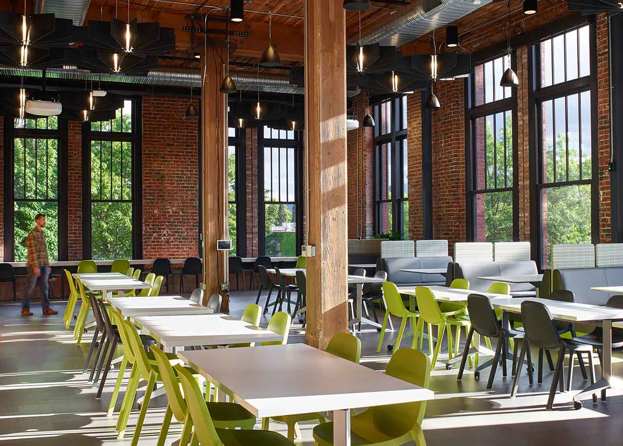
Mackenzie Architects’ Autodesk [Photo: Christian Columbres]
There was a similar drive by Leckie and Mackenzie to instill a sense of place into their Slack and Autodesk designs. Mackenzie made a conscious effort to promote Portland’s local artisan culture within the Autodesk project, bringing in local makers to assist on branding and graphics, custom furniture, and lighting; and tiny house–themed conference rooms nod to the city’s famous craft movement, Wieland notes. At the Slack office, the team left timber materials exposed, brought in a statement piece moss wall, and installed cloud-shaped MOLO lights above the bleacher stairs—nods to the temperate rainforest environment of the Pacific Northwest.
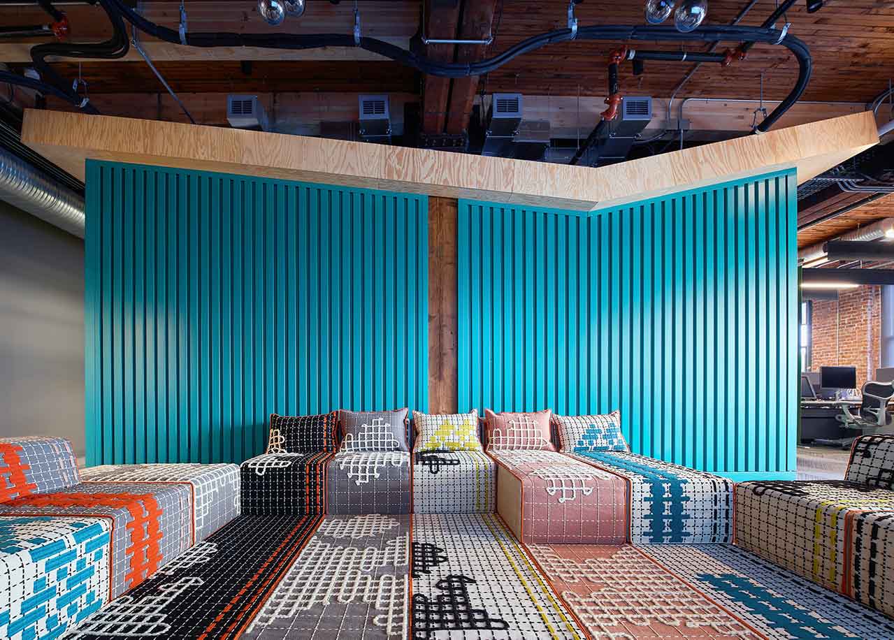
Portland’s historic Towne Storage Building was converted into beautiful office space for Autodesk with clever seating and breakout areas. [Photo: Christian Columbres]
That combination of open-plan utility, historic character, and environmental acknowledgement proves potent when considering an old industrial site’s contemporary office potential. “There’s a soulfulness in the character you just can’t imitate,” Leckie says.
