Scene
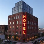
Located in the historic Williamsburg neighborhood of Brooklyn, the new Wythe Hotel raises its nostalgic brick and modern glass façade eight stories above the street level. Named as the Best Hotel Under 100 Rooms by Travel & Leisure magazine in 2013, the hotel is Morris Adjmi Architects’ latest gut rehab masterpiece. It was not, like most masterpieces, a simple or certain endeavor.

When the client purchased the building, this area was outside the ‘hip’ district of Williamsburg in Brooklyn, but the hotel now sits solidly in the middle of a wildly popular scene filled with galleries and restaurants, including Reynard, the hotel’s own restaurant, which serves a seasonal menu. Photo: Mark Mahaney
In 1901, the building was first constructed as a cooperage, or barrel-making facility, and was later redone for a window treatment manufacturer. It served as a storage or manufacturing facility most of its life, making its transformation into a hotel especially difficult. But Morris Adjmi, founder of Morris Adjmi Architects, saw the hotel as a project rife with opportunities. “We took advantage of [the building] by peeling away layers to go back to the original beautiful structure,” he says.
Adjmi’s practice has experience working on projects in historic districts, and his philosophy about architecture and cities reflects this. “Something is always changing, even the historical context,” he says. “There’s an opportunity to take the essence of that history and rethink how that gets recontextualized over time. With the hotel, we tried to look at a building and create a dialogue between what we added and what was there historically.”
Design
Construction on the hotel began in the first quarter of 2011 and ended in May 2012, but Adjmi admits that this stretched-out schedule offered the benefit of more time to test the brick blasting and create 3-D mock ups, which isn’t often the case. The overall aim was to reuse the building, which called for an upgrade of the building envelope. “The idea of juxtaposing something new and historic is the type of work I do, so we had to figure out the right tone of intervention,” he says. “Being able to take a building in disrepair and make it something that respects its past was really what this project was all about.”
The hotel’s west façade features an enormous factory window as a reference to the building’s original purpose but is repositioned for incredible views from the guest rooms. To achieve this, Adjmi and his team shaved 20 feet of brick off the back of the building and put in a glass factory window wall that opens up to dramatic views of Manhattan. On the east side of the building, the guest rooms feature punched openings reminiscent of the original windows.
For the three-floor addition on top of the building, Adjmi wanted to keep the new elements simple and rational. “I didn’t want it to compete with the architecture of the original brick building,” he says. “What really gives the hotel warmth are the brick walls. We took a lot of care to figure out what was the right amount of removal of paint and mortar and blasted the ceilings to expose the wood.”

The pale blue guest room wallpaper was designed by a local illustrator, Dan Funderburgh, and hand-screened by Brooklyn-based Flavor Paper. Photo: Mark Mahaney
Like many buildings of yesteryear, the hotel structure has tall ceilings with windows placed too high up on the wall for anyone to catch a view. Adjmi solved this by building the floor up 20 inches, so guests can enjoy the view even while lying in bed. The addition allowed Adjmi to pour a new concrete slab with radiant floor heating. The absence of radiators makes the rooms feel larger, and the floors were left exposed. “With warm wood ceilings and a concrete floor, it’s the inverse of what you normally see,” he says. Cork was used in the hallways because of its acoustic properties, its ease of maintenance, and eco-friendly nature—and because the client had vetoed the use of any carpet in the hotel.
Details
To discover the hotel’s true personality, one only has to look to its details. More than 6,000 square feet of wood removed from the structure has taken on new life more than a century later as beds and desks for the hotel, all thanks to the craftsmanship of local artisans. “We used what was on the inside to introduce elements that relate to the building’s architecture,” Adjmi says. “While the building physically contains pieces of the original structure, spiritually, it’s connected to artisans currently living in the area. The hotel’s aesthetic is aligned with the Williamsburg area, so the hotel really feels rooted in its place.”
Adjmi points out the importance of the carefully selected details, like the Ann Sacks tiles, vintage bathroom mirrors, Lefroy Brooks faucets and washbasin stands, and the welded neon lettering that makes up the hotel’s five-story sign, which was created by local artist Tom Fruin. For Adjmi, one of the especially attractive details of the hotel can be found in the back bar where the window faces Manhattan. “As you look over the line of bottles that create their own skyline,” he says, “you also see the skyline of Manhattan.”

