Story at a glance:
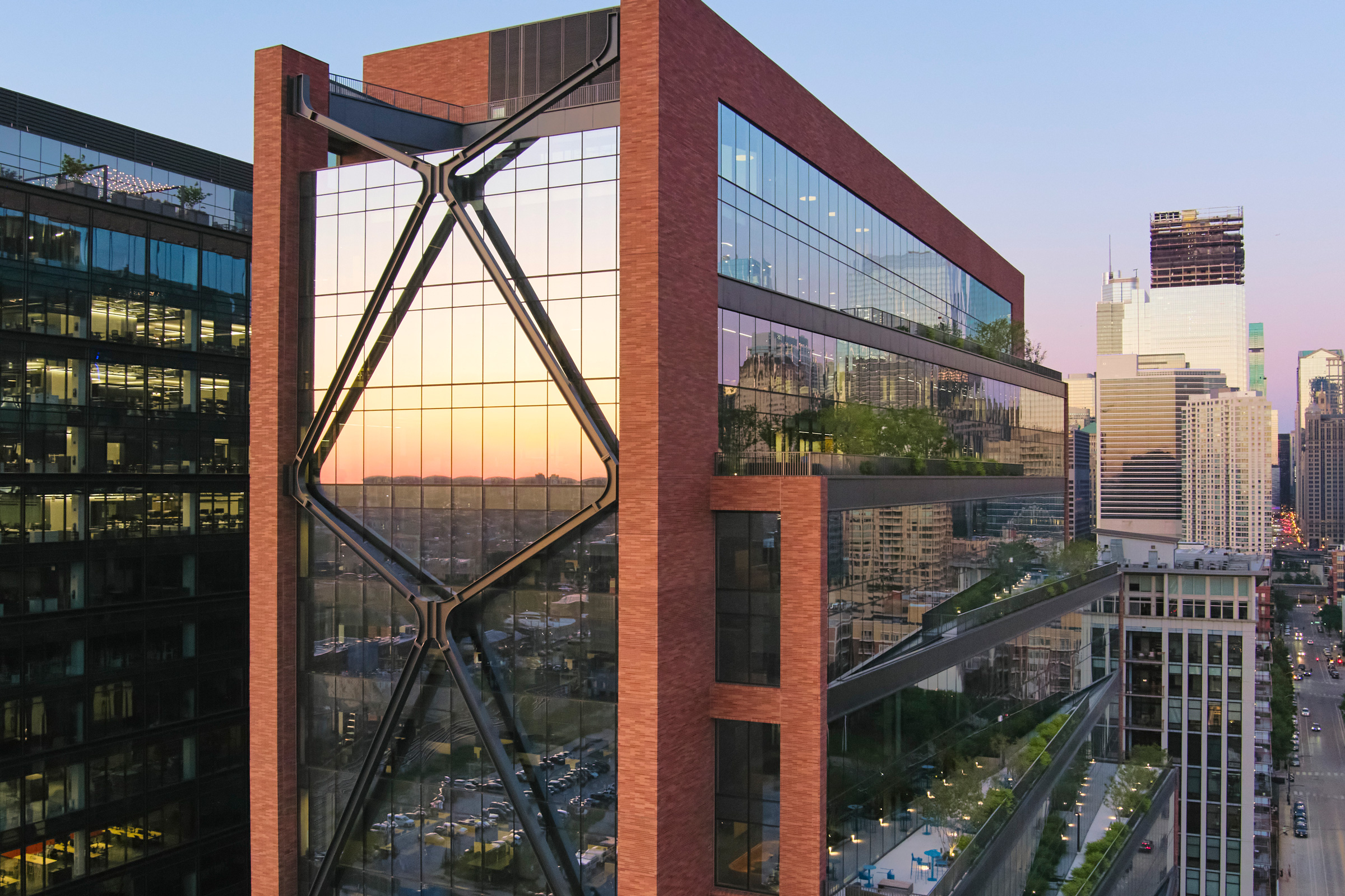
- The SOM-designed 800 Fulton Market project in Chicago is defined by its X-braced facade—an evolution that dates back to the Hancock Tower.
- Combined with an offset cantilevered core made of glass, the structural system allows for large, open floor plates and flexible, light-filled workspaces.
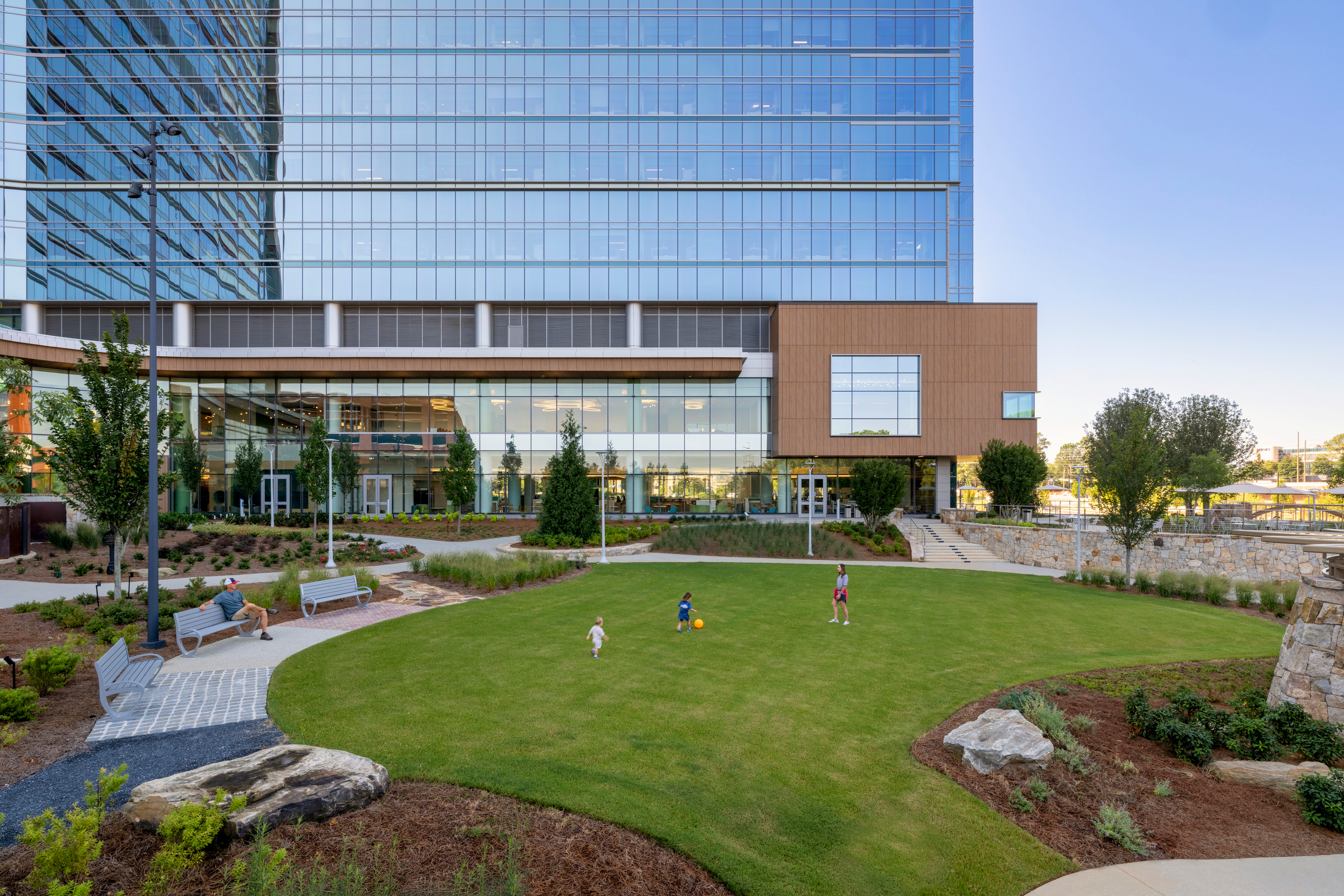
- The design respects the history of the formerly industrial area in palette and material while meeting the project’s modern needs.
Flexible floor plates and innovative braces are just some of the award-winning design strategies of Skidmore, Owings & Merrill (SOM)—dating all the way back to their iconic use of a brace for the John Hancock Tower, built in 1970.
Today these key design elements are also on full display at 800 Fulton Market in Chicago—an eye-catching project in the heart of a destination neighborhood. The Fulton Market area has changed drastically in the last decade, from its early days as a meatpacking district and industrial area to a bustling area of tech and corporate headquarters (McDonald’s, Google), nice hotels, and fine dining and bars.
The Challenges
The design respects the history of the formerly industrial area in palette and material while meeting the project’s modern needs. Photo by Dave Burk
When SOM was tasked with designing a mixed-use office building right beside the iconic metal Fulton Market sign, they were challenged with how to make a modern, meaningful building while honoring the history of the low-rise streetscape and connecting to the higher-density commercial district to the north. Ultimately the 19-story 800 Fulton Market was designed with a series of setbacks and landscaped terraces, carefully proportioned to relate to the rhythm and scale of the area.
“We’re right next to the historic district,” says Kevin Rodenkirch, associate principal at SOM. “That defined how we started the project, because when we met with all these community groups, they all asked, ‘Did you look at the existing building? Did you think about preservation?’ We did. We spent a lot of time considering that.”
The original building was in bad shape, with half of the floors inside broken out and even a frozen pond the team had to carefully walk around. “It was pretty rough,” Rodenkirch says. “It really came down to how do you fit a half-million square feet of office into a district that’s more than 100 years old with two- to three-story buildings? That was one of the drivers for how we shaped the form.”
The Solutions
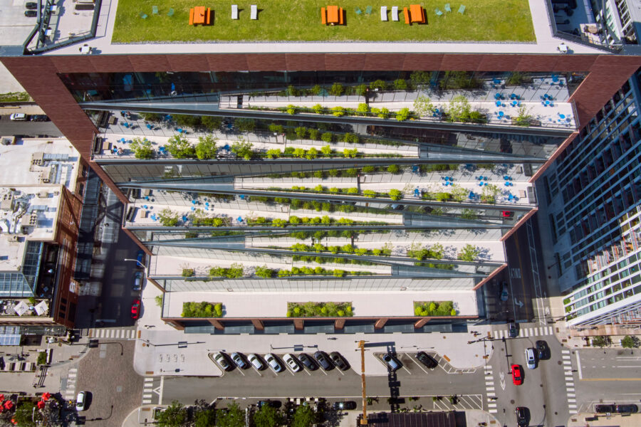
The building at 800 Fulton Market rises in stepped terraces that create generous, landscaped outdoor spaces with native planting and trees. Photo by Dave Burk
The series of setbacks helped to respect the scale of the neighborhood and, while the project was still quite large, SOM was able to create 60-foot long span floors and use post-tensioning (PT) to make the ceiling sandwich thinner.
“The market at the time was all these giant buildings—up to 45,000 square feet floor plates. If you look down the street at Google, they take these massive floor plates. Everybody thought that’s what the market wanted, but we started asking, ‘Are you sure that’s what the market wants? Is that what everybody wants or is it just to get the major tech companies to come and fill the space?’” Rodenkirch says.
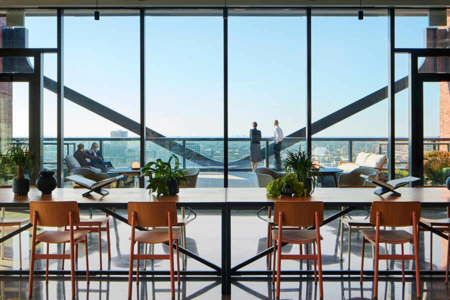
SOM wanted to create a more flexible space. “That’s part of why we started stepping the building. That 60-foot clear zone is consistent all the way up so you always have the space. It allows a lot of room to change with it, and then as you march up the building the floor plates are different so you have a super flexible building, but you can still have a 35,000-square-foot floor plate near the bottom.”
John Deere took the 35,000-square-foot project on the fourth floor, the interior of which SOM completed in January 2024, while the smaller floor plates at the top are now home to a dental group.
The design team kept the beams fairly shallow and, with deep floor plates, extra ceiling height helped to bring daylight inside so the design didn’t feel imposing. “Pushing the core to the north helped us a lot because a lot of those functions, like mechanical spaces, don’t need views. We could pack those walls with insulation and bring our window-to-wall ratio down,” Rodenkirch says.
The X-Braced Facade
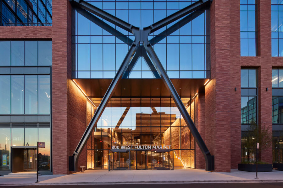
The SOM-designed 800 Fulton Market project in Chicago is defined by its X-braced facade—an evolution that dates back to the Hancock Tower. Photo by Dave Burk
In designing this PT strategy, Rodenkirch says SOM’s structural team realized if they cantilevered the core on the north it would be more balanced and efficient. “That is pretty unique because the core generally is your lateral system, then we cantilever both sides. It’s all balancing off of these edges. By doing that we had no lateral system, so that’s where the brace came into play.”
Rodenkirch laughs, saying some people ask if that brace is just for looks. While it’s engaging, it’s also important. “It is real, it has value, but it was all because we cantilevered this core so we needed that lateral system.”
Innovative bracing goes back to the early SOM days. “The Hancock design was the start of it. That was a defining move,” Rodenkirch says.
The team used a high-strength plate and let it bend. It’s constantly bending.
The SOM team took a similar bracing approach on 100 Mount Street in North Sydney in Australia. There the exterior brace is nearly twice as tall as at 800 Fulton, designed in part to counter high wind; it’s essentially the first generation of the brace seen in Fulton Market. The team translated that idea for 800 Fulton, taking the same brace and modifying the design for Chicago’s weather. “The team used a high-strength plate and let it bend. It’s constantly bending.”
The brace is possible in large part because Lendlease, who was the construction manager for the building, found strong, 100ksi, Swiss-made steel in Pennsylvania. “The fact that it was in Pennsylvania meant it was feasible for this project because buying it from Switzerland would have been crazy,” Rodenkirch says. “They took plates, milled it into this dog bone shape, and welded it together. That was a long process. We did mockups. We looked at the finish quality, the weld quality, even the paint because it’s all exposed. In theory on a really cold day it can move in eight inches and then on a really hot day out eight inches. There can be 16 inches of movement. It’s wild.”
SOM’s Hong Kong office is working on the next iteration of the brace now.
More Sustainability

Photo by Dave Burk
The market in the area was incredibly competitive when SOM first began designing 800 Fulton Market; buildings were going up at every turn and so much was planned. “It was like, ‘What are you doing to differentiate between all of these other buildings?’ To us it was the performance of the building.”
A nearby project was LEED Gold, but the SOM team knew they could do better. Ultimately they achieved LEED Platinum. “We wanted to say there’s no other building in Fulton Market that performs this well,” Rodenkirch says.
The SOM team also wanted to see just how energy-efficient they could make the project. Instead of using a conventional boiler and chiller system like most Chicago office buildings, the project uses a water-cooled Variable Refrigerant Flow (VRF) system at 800 Fulton Market, which allowed for heat recovery. That allowed the project to earn more LEED points when coupled with a window-wall ratio that is optimized for its orientation. “If you keep the window-wall ratio under 60% and you use VRF, you can get 12 points in energy,” Rodenkirch says. “In the end we ended up with 54% window-wall ratio and the VRF, and we got exactly 12 points.”
He says modeling helps a lot to achieve ambitious goals. “Getting the window-wall ratio right and getting the right mechanical system, we dropped way down in predicted energy use.”
Timeless Aesthetics
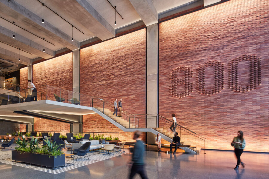
In the lobby of the SOM-designed 800 Fulton Market project, the brickwork was all hand-laid; one architect spent a week working to create the “800” without cutting any bricks. Photo by Dave Burk
As for the look of the building, the SOM team knew they wanted to stay true to the historic character of the area. “We knew there was a palette we wanted to work with for the neighborhood,” Rodenkirch says.
The style of brick across Fulton Market varies; at any turn you’ll find buildings with deep reds, light reds, black, or yellow brick, but while there was no one particular color, the area was certainly defined by the material. “To us brick was the answer.”
After what seemed like countless mockups, the team landed on a mix of four brick colors throughout the design. That brickwork as well as plentiful black metal helped the building fit in with its environment. “We use a lot of formed metal. It gives it depth and a little bit of character.”
In the lobby, the brickwork was all hand-laid; one architect spent a week working to create the “800” without cutting any bricks. “It was a huge amount of effort,” Rodenkirch says. “You get the craft of the masonry, and then the floor is all terrazzo, which is beautiful.”
The mezzanine, he says, is also a highlight. And outside, of course, is a huge value to developers and occupants alike. “You get the developer to invest more money and fit them out, and then you tenants get to use them. At the top of the building we said, ‘Why stop at terraces? Why not just make the whole roof accessible?’”
Project Details
Project: 800 Fulton Market
Location: Chicago
Completion: 2021
Size: 37,576 square feet
Architect: SOM
Certfications: LEED Platinum, WELL

