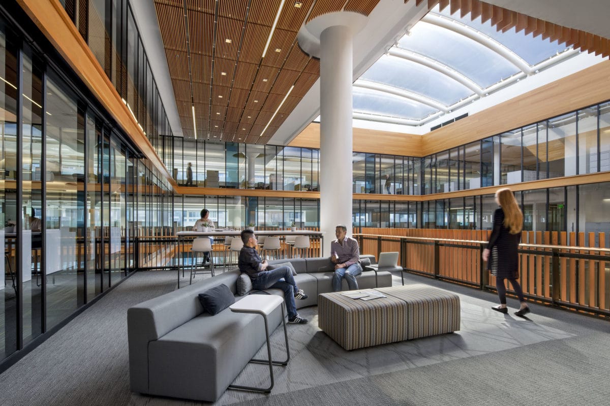
Perkins+Will transforms a Bay Area warehouse into an innovative, light-filled workplace. [Photo: David Wakely]
“When you first saw this big bunker, you’d think only its mother would love it,” says Gary Tierney, project manager at Perkins+Will. “But every building can be beautiful if it has good bones.”
And good bones is exactly what this formerly deserted, cavernous warehouse had when Perkins+Will set out to adapt it into the new Bay Area Metro Center, a warm, welcoming space full of light and energy. Completed in 2016, the Bay Area Metro Center is now a collaborative workspace.
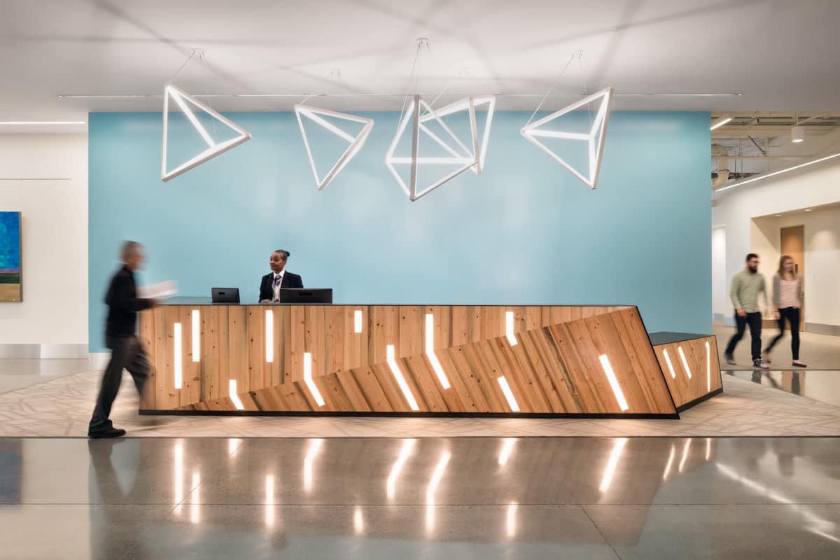
[Photo: Blake Marvin]
A Dynamic History
The U.S. Department of Defense originally built the warehouse in 1942 to be used as a military tank assembly plant. Because the warehouse’s ground floor had to be large enough to accommodate freight trains passing through for loading and unloading, it occupied an entire city block and stood tall at eight stories.
During World War II, the warehouse was mainly used for military storage. Then, in 1948, the U.S. Postal Service (USPS) purchased the space to be used as the main mail sorting office for San Francisco. Known as the Rincon Annex, the branch handled all U.S. military mail. In the late 1990s, the USPS sold the building to an organization intending to create a server farm—but the organization ended up not needing the space.
In the coming years, the warehouse was mostly unused until the police department began using it for target training. In 2010, the Bay Area Headquarters Authority (BAHA) acquired the warehouse, planning to adapt it into a collaborative workspace.
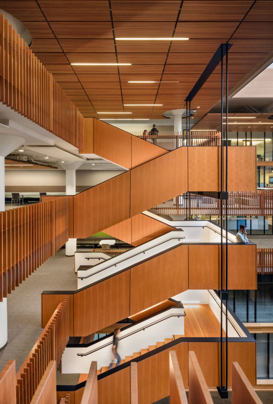
The floating stairway opens up the space and fosters a sense of community. [Photo: Blake Marvin]
Promoting Collaboration
“Perkins+Will took us through the whole process to understand our values and how we all functioned and operated as companies,” says Andrew Fremier, deputy executive director of operations at the Metropolitan Transportation Commission (MTC). “We were hoping to eliminate barriers to promote working together. They walked us through how we could open up the space to create a collaborative environment.”
The Bay Area Headquarters Authority envisioned the building as the operating center for their coalition of four regional governmental agencies—the Metropolitan Transportation Commission, the Bay Area Air Quality Management District, the Association of Bay Area Governments, and the Bay Conservation and Development Commission. Not only did BAHA want to foster teamwork between the agencies, they also wanted to consolidate resources and increase efficiency.
“What you had was four regional planning agencies brought together under one roof,” Tierney says. “They might work for different agencies, but they’re all interested in doing what is best for the region.” Before the agencies were scattered at locations throughout the Bay Area. Fortunately, the existing structure was already large enough to house them under one roof—a great opportunity to bring them together physically and in terms of cooperation.
“A lot of times when you do these big projects, the precedent drawings never match the actual drawings. But the building space is even better than the schematics that we started with, and personally for me, working in the space is extremely exciting,” Fremier says. “It doesn’t feel like a government building, but it’s not too grandiose. It’s very much built to scale for a government agency but it carries itself with more flair than that.”
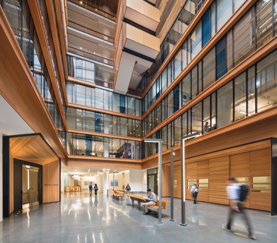
Like a geode, the building faces in toward the soaring atrium. [Photo: Blake Marvin]
Seeing the Warehouse in a New Light
“Our first thought was, how do you bring daylight into the center of the building?” Tierney says. “It was a very sturdy, utilitarian World War II warehouse with an acre-and-a-half of floor space, but there was no daylight at the center—it was pitch black.”
With this challenge arose the center’s most striking feature: the soaring atrium. Luckily, the building’s pre-existing large floor plates could easily accommodate this centerpiece. Thanks to the atrium in the center of the building, what was once a darkened warehouse with low ceilings is now a welcoming, light-filled space that fosters unity across multiple floors. Like a geode, the building faces in toward the atrium, whose terraces create a sense of openness and connectivity.
“In order to deal with the light issue, we went with 30% office space and 70% workspaces, which is the exact opposite of our previous workplace,” Fremier says. “But you don’t feel like you’re working on top of each other. The collaborative spaces are all well-used. When you walk around, you see people spread out in all different parts of the collaborative area.”
Perkins+Will designed the atrium’s floating stairway down to the smallest detail. “We wanted to encourage people to use the suspended stairs to create a space for serendipitous encounters,” Tierney says. “We designed the railings so you didn’t get vertigo and the ledge on top of the railing tilts slightly inward, so coffee would spill inward instead of outward.” Now, workers can greet each other on the floating stairs with the skylight shining above.
The atrium also helped in terms of the seismic structure of the space. “The atrium was used as a means to reduce the mass of the building so we could take care of seismic retrofitting without having to install interior shear walls,” Tierney says. An alternative to the usual solid, central core, the atrium offers unimpeded views, both toward the center of the building and the exterior windows, so workers can feel connected to both the indoors and outdoors. “When you’re in one of the office spaces, whether you’re looking into the atrium or through the windows outside, it feels open and full of natural light. The quality of light is not diminished by the skylight.”
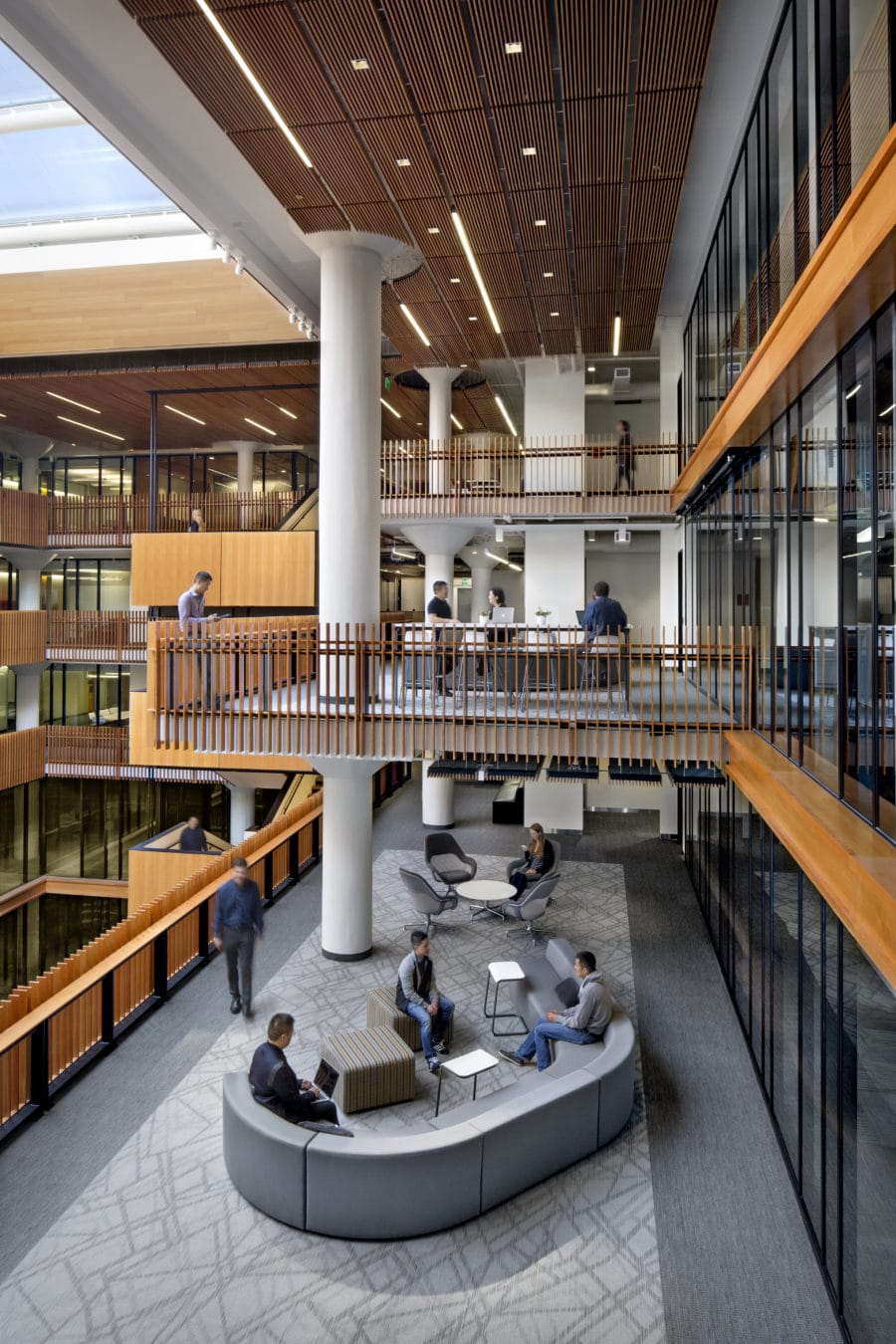
The skylight changed the dark, cavernous space into a light-filled workplace. [Photo: David Wakely]
Open to the Public
Perkins+Will designed the ground floor with plenty of public space in mind. “The ground floor becomes a public space, which is perfect for regional planning agencies who have public commissions and hearings. There’s a very gracious shared boardroom and space for the media,” Tierney says.
The lower level of the center has many conference rooms, green rooms, and breakout spaces. And there are rotating exhibits outside the meeting areas. The center also includes a bike storage room, two libraries, and a ground-floor retail space to increase foot traffic and liven up the atmosphere. Workers have several dining options for lunch, and they can take a break from the daily grind at one of the inviting coffee bars. Employees also can congregate on the rooftop deck or one of the many open workspaces. “The cafe we support in the ground floor is run by a nonprofit that hires developmentally disabled adults,” Fremier says. “We are continuing to develop ways to connect with the neighborhood—we want to participate in the community, not just be there.”
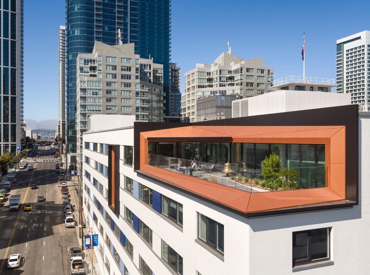
Employees can enjoy beautiful views of Bay Bridge from the rooftop deck. [Photo: Blake Marvin]
A Greener Way to Build
“We used an existing building, which is one of the greenest things you can do,” says Gary Szeto, project manager at the MTC. “The project landed in the LEED Gold range. We considered everything, even site selection—we’re a half-mile from all public transit in the city.”
The Perkins+Will team also used many recycled materials. “The building reflects the history of the bay area through using repurposed wood,” Fremier says. Wooden pilings from the 1930s, uncovered from the torn-down Transbay Terminal were used for finishes in the main boardroom, entire walls in the reception area, as well as desktops and tables. The team also had miles of wooden bumper rails from when the building was a post office. They used the recycled wood for several finishes. “Seeing the raw wood with the white concrete makes for a very approachable space,” Tierney says. “The concrete columns are strong and sturdy and you feel like you have real materials around you—it’s a nice balance. That’s what makes the space feel so rich and warm.”
Perkins+Will also took advantage of daylighting to make the project greener and decrease the center’s energy usage. By structurally reinforcing the building’s exterior shell, they created wider walls and deeper window sills that created light shelves. The light shelves and the skylight provide passive heating and a pleasant, well-lit ambiance. “With a really robust building like this, you have to let the building speak for itself. Now people walk in and see an eight-story skylight—people really remember it,” Tierney says.
The adaptive reuse of this warehouse is an impressive feat in green design—it saved this 500,000-square-foot building from being moved to a landfill. “The main message is that if you have an older building, take a look at it before you start tearing it down, and see what you can do,” Tierney says. “Because with adaptive reuse you can do something effective, elegant, and simple while keeping the character of the original building.”

