APT Architecture is on a mission to create responsive, sustainable projects that encourage connectivity.

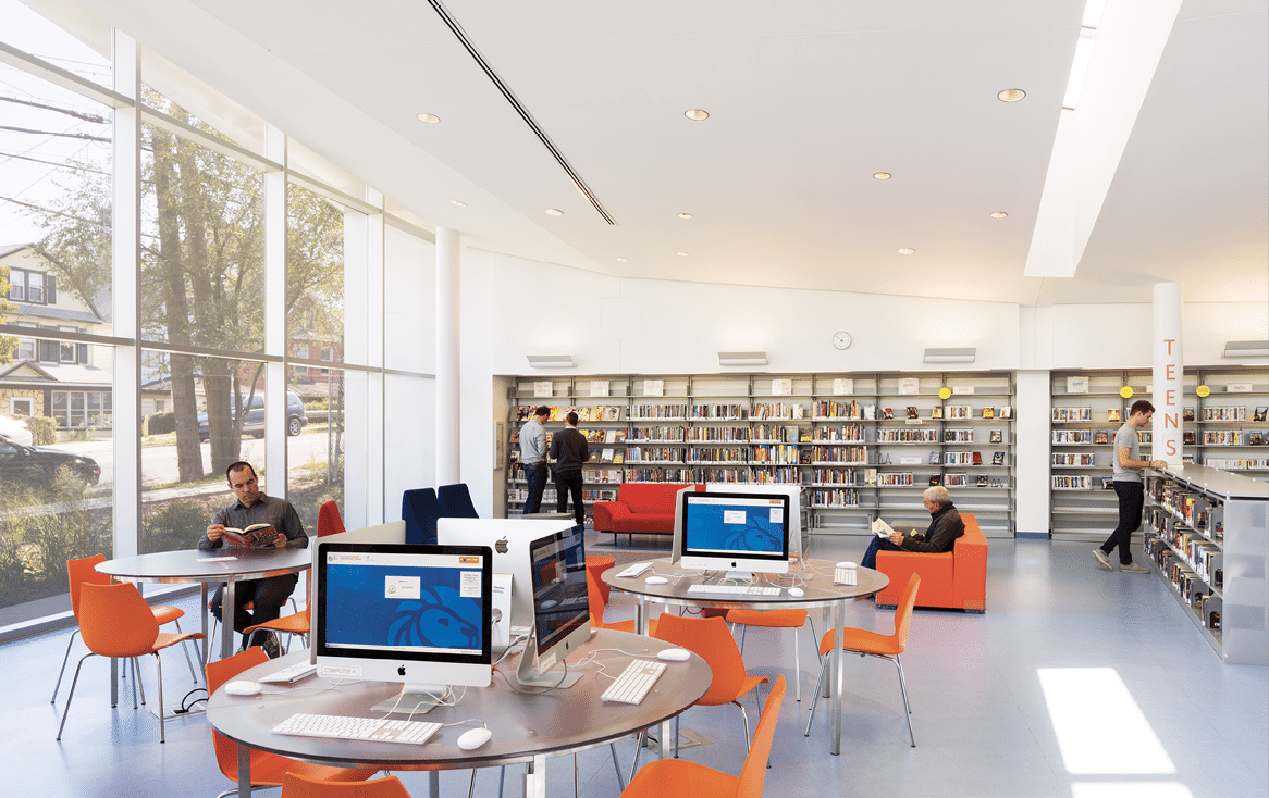
The Mariners Harbor Branch Library is like a second home for patrons. [Photo: Albert Vecerka/Esto]
Anna Torriani and Lorenzo Pagnamenta, founding partners and design principals at Atelier Pagnamenta Torriani, or APT Architecture, aren’t your average New York City architects. They create responsive architecture that encourages community growth and engagement.
Sustainable design is second nature for APT. “We grew up in Switzerland, where sustainability is part of the culture,” Torriani says. The firm uses healthy materials, natural daylight, and passive design techniques, and their holistic design strategy promotes sustainability beyond prescribed codes or regulations like LEED. “We aren’t applying a cookie-cutter approach,” Pagnamenta says. “We really try to understand what the client’s goals are in creating spaces that serve the community.”
The Process
Every project begins with research. “The first thing we do is research the context in-depth—meaning the geography, the history, the culture, and the users,” Torriani says. Then, the duo creates a responsive design concept based on what they’ve learned about their client’s needs and the surrounding environment.
“One common denominator in all our projects is natural daylight and how it is introduced in the spaces,” Pagnamenta says. APT aims to diffuse light in study spaces like schools and libraries and use passive technology like natural ventilation and gray water whenever possible. Building materials are selected with care, and APT focuses on natural finishes while avoiding artificial materials. “We choose the best materials we can, depending naturally on the budget,” Torriani says. “We prefer materials that are sustainable and long-lasting.”

[Photo: Albert Vecerka/Esto]
Designing for Community
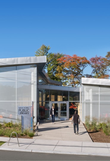
APT makes neighborhoods stronger by designing sustainable communal spaces like the award-winning Mariners Harbor Branch Library, the first civic building in the neighborhood. This New York Public Library project helped to revitalize the Mariners Harbor neighborhood in Staten Island. “The new library is always full and people love it. It’s like their home,” Torriani says. “If you design something beautiful in an underserved area it makes a huge difference for the community.”
The library resembles an oyster shell with a mother-of-pearl interior—a tribute to the neighborhood’s maritime heritage. The exterior is clad in natural zinc, which forms a textured gray patina over time. APT couldn’t use side windows because of zoning, but overcame the challenge by maximizing diffused daylight using glazed surfaces. An energy-efficient lighting control system regulates artificial lights according to the natural light levels. And the glass roof lets in natural light, too. The building also has a public terrace overlooking the garden.
FROM OUR NOV+DEC 2018 ISSUE

The preferred publication of leading green professionals.

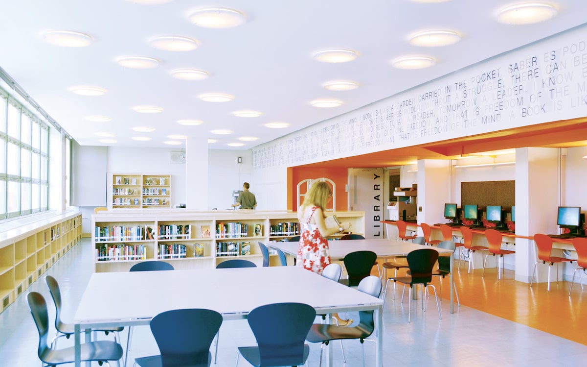
Designed by APT Architecture, Park East Library is a bright and welcoming space for high school students to study. [Photo: Courtesy of APT Architecture]
Designing for Students
APT has also created projects for the NYC public school system. Before renovation, Park East High School’s library was in need of an upgrade—with carpet and wood paneling from the ’70s. “It didn’t have the architect’s eye at all,” says Suzy Ort, assistant principal at Park East. But now, she says, the library takes your breath away.
Faculty at the high school knew the project could have huge impact. “It was meant to change the culture of our school. Anna and Lorenzo really respected our mission,” Ort says. “They’re incredible architects. They were all about understanding our needs and then explaining their process to us in respectful ways.” Ort says APT was very hands-on, even inviting her to their studio, going above and beyond what she’s experienced with other designers. “Anna and Lorenzo were very responsive, and logistically, it was one of the best managed projects we’ve done,” she says.
But the library also needed to be versatile. Half of Park East’s student body doesn’t have access to the internet at home, so the library had to be a welcoming place to get work done before and after school. Teachers also needed a sophisticated space to hold meetings. The new library met all of these needs and more. Ort says its design is unlike anything else in the building. She enjoys seeing her students flourish there while experiencing the art of architecture for the first time.
No detail was too small for this design team either. APT created a sloped ceiling to hide exposed ducts and air conditioning. Angled lines of the flooring’s geometric pattern also make the space feel continuous. “The space feels fluid and longer because your eye follows the break in the two flooring patterns,” Ort says. “The design is so warm, simple, and beautiful.” Since the renovation, the school hosts all of its welcoming and recruitment events in the library. “It’s nice for the kids to have a space where they feel valued. They feel like they’re not an afterthought, and they deserve to have something beautiful,” Ort says.

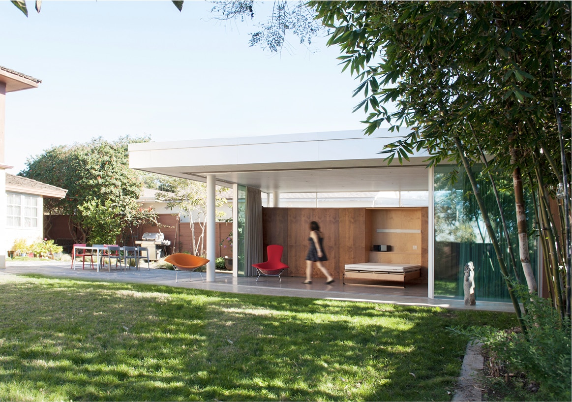
FB Pavilion has a small carbon footprint, but plenty of room to entertain guests. [Photo: Courtesy of APT Architecture]
Designing for Home
APT also designs sustainable residential projects. For the FB Pavilion in San Diego, they preserved outdoor space with an energy-efficient renovation. For them, efficiency and functionality come first—bigger isn’t always better.
The property comprised a large addition with a garage and guest room. When Torriani and Pagnamenta visited the site for the first time, they knew it had to go. “Apart from the size and proportion to the rest of the building, it was blocking the sun and the ocean breeze from the west,” Torriani says.
It took awhile to convince the clients to demolish the structure, but they were happy with the outcome. In its place, APT built an efficient unit with a smaller carbon footprint, transforming the client’s backyard into a livable entertaining space. The new, open pavilion takes advantage of the southern California breeze—and it’s a place people want to spend time. “We reduced the total square footage, but the usable area increased by a lot,” Pagnamenta says. They also recently installed solar panels to cover all of the property’s electricity needs, including an electric car.

