Backgrounder/
When Minskoff Grant Realty & Management Corp. (MGR) sought to bring its 25,000-square-foot strip mall, originally constructed in the 1950s, into modern times, the owners asked Cooper Joseph Studio to give the façade a new look. Completed in 2002, that design brought a number of national tenants to the mall and made Cooper Joseph Studio the natural choice when MGR was ready to move forward with a more significant renovation and addition in 2009.
Challenge/
MGR’s goal was to provide substantially more rental space while maintaining the aesthetically pleasing unity of the building. Cooper Joseph Studio was in charge of a comprehensive renovation that included site redesign, a renovation of one end of the building itself, and a two-story addition that added 13,500 square feet to the 25,000-square-foot property. But the look of the shopping center was so precise—and complete in its own right—that the large volume and height of the addition was a significant architectural challenge.
Solution/
Cooper Joseph Studio met the challenge by using a limited palette of materials to unify new and existing façade elements. “It’s all about aluminum,” Joseph says. Specifically, the 2002 renovation used one-eighth-inch-thick bands of anodized aluminum bent over brackets and mounted to the original brick façade to create an undulating modern cornice above the front of the shopping center.

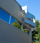
The undulating aluminum sunscreen on Wykagyl Shopping Center’s new upper level.
When Cooper Joseph Studio designed the steel-frame addition, it placed corrugated aluminum panels over the entire building, with a few well-considered areas of undulating panels, similar to the first phase of work. At the same time, the façade was made richer in concept and form by the use of perforated, corrugated aluminum over the front windows, which acts as a sunscreen and shields nighttime office workers from onlookers in the parking lot. “Essentially, we created a system that integrates the aluminum strips, adding an exciting series of new elements to the vocabulary, all while keeping the massing simple,” Joseph says. “The panels also create a more visually appealing interior. Inside, the lobby, fire stairs, and accent walls are saturated in orange, providing warmth against the cool metal.” The signage panels are dynamic elements as well, reflecting the sun’s changes throughout the day.
Cooper Joseph Studio’s design choices also made the building more sustainable. The curved shape of the undulating modern cornice gives the façade structural stability, allowing the architects to use very little material. The aluminum building skin is highly reflective, and the building is well insulated, which keeps it cool in summer months and increases its energy efficiency. The undulating aluminum panels have the same effect, keeping the blazing summer sun away from the interior without the use of window shades. Other renovations included a landscaping plan that added more trees—reducing the heat-island effect—and a storm-water-management system. Lighting upgrades are shielded in order to reduce light pollution.In the end, the building was completed on time and on budget. “Stringent value engineering and schedule management were part of an integrated architectural- and engineering-design process,” says Joseph, who notes that ultimately the building achieved its goal. “Rental levels met the owner’s needs while maintaining high occupancy, and the community has an elegant building.”

A view showing the building’s extensive use of aluminum.

