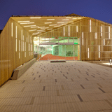
The decade-old warehouse at the southeastern edge of campus had no notion that it was destined to become Claremont University Consortium’s (CUC) new administrative hub. The transformation from a simply functional facility housing a workshop to an architecturally stunning, LEED Silver-certified, cheerful work environment was to be executed by Lewis.Tsurumaki.Lewis Architects and spectacularly lit by Lumen Architecture. With offices just a few hundred feet away from each other in New York City, the two firms worked in close collaboration to bring something to life out of the existing, unbecoming space in Southern California, blurring the line between where one discipline ends and the other begins.

This fusion of architecture and lighting is most evident on the façade. A golden screen of narrow cedar slats sweeps along the side of the building with white LED lights pegged in at random intervals to create an ultra-modern shell covering the existing building. The gaps between the slats allow glimpses of the original structure, particularly near the windows, where they expand to
allow more sunlight through. The wooden skeleton widens at the entrance to frame the entryway. In the back of the building, the skeleton morphs into a brise soleil shade for the outdoor café. During the day, those exposed Plexineon White 1X fixtures are camouflaged, but at night they set the building and the Sonoran Desert shrubs aglow.
The interior weaves sunlight and electric light together—with sunlight stealing the show. Because the HVAC and mechanical systems are located in the warehouse’s ceiling, skylights really weren’t an option. “There was not really an opportunity to just puncture the ceiling and let the sun come through,” says Francesca Bastianini, a designer at Lumen. Solatubes, however, would be perfect.

In the cafe, a baffle system, wrapped in recycled plastic-bottle felt, obscures the ceiling’s mechanical systems but allows pendants lights to enter the space.
Solatubes are basically the skylight’s chimney-shaped cousins. There are 168 of them installed on the roof of the building today, and each reflective-capped dome conducts the sunlight down into a space through ultra-reflective tubing. These gain an advantage against the skylight when it comes to low-angle sunlight because Solatubes can easily grab small amounts of light and still diffuse bright, direct midday sun. In the Claremont building, the Solatubes are interspersed with circular fluorescent fixtures, similar in shape to the Solatubes but distinguishable by a slightly warmer color temperature—which was actually the client’s choice, explains Nelson Jenkins, principal and founder of Lumen Architecture. “At first, we thought we would match the electric light and daylight in terms of color temperature, but [the client] actually wanted to have a difference so that people would know which one was electric and which one was daylight,” Jenkins says.

The digital garden installation surrounding the meeting space is by Brooklyn artist Jason Krugman and consists of more than 6,000 bicolor LED pixel boards.

A lighting model measuring artificial and natural light.
Suspended beneath the fixtures is a system of baffles, another gesture that screens the building’s original components. Through these abstracted cloud shapes, which are wrapped in recycled felt, the light is constantly changing in subtle ways. As clouds pass overhead, light shifts within the diaphanous baffle structure, connecting the CUC employees to the outdoors as they work.
The subtle partnership between sunlight and electricity had to be managed thoughtfully because too many green hopes are dashed to pieces when an automated system gets to be so annoying that office workers plaster duct tape over the sensors. Lumen chose the Lutron Ecosystem; as photocells and occupancy sensors pick up on the level of light, the system imperceptibly intensifies or dims the fluorescents to balance out the Solatubes as needed. With all the electric lighting on, the CUC building’s system averages about one watt per square foot and far less when the fluorescents are dimmed during the day.
It started with a warehouse, and, in some ways, a warehouse it remains today. But the end result—a fusion of modern, sustainable architecture with an old, functional space—builds upon what was already there to make something more imaginative. “There’s a peekaboo type of effect,” Jenkins says. “You can see the structure in the final rendition of the building, yet it’s still beautiful. You’re not covering it up but bringing out a quality in the space that’s quite special.”

