Story at a glance:
- Good daylighting offers better quality light, which in return reduces eye strain and eye and brain fatigue.
- Daylight also boosts serotonin production, reducing stress, anxiety, and depression.
- Solatube and Kingspan Light + Air transform classrooms, colleges, and more with translucent walls, “sticky spaces,” and more.
Reduced eye strain, less fatigue, and overall improved student performance—these are just some of the proven benefits of daylighting in educational spaces. A study published by the Alexandria Engineering Journal showed that when considering all design factors in educational facilities—temperature, acoustics, carbon dioxide emissions, lighting, and more—daylight has the greatest impact on overall student progress. “It’s really interesting. There are a lot of studies that prove that,” says Neall Digert, vice president of innovation and market development at Kingspan Light + Air.
Daylight has a profound impact on improving both student and teacher well-being, according to a study conducted by the Lighting Research Center. Daylight exposure can improve circadian rhythms—enhancing alertness, sustained energy, sleep quality, and overall health. Daylight also improves thermal performance and energy efficiency, as less energy is required from electrical lighting.
Digert has been studying light for decades. He started out studying structural engineering, lighting, and energy and focused his Ph.D. on the biological and psychological impacts associated with daylight. We recently talked with Digert about the importance of various types of light, as well as looked at case study examples of some of today’s most exciting solutions in action.
How does daylight affect us?
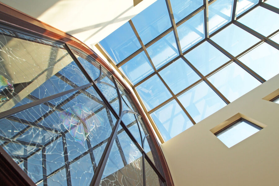
KlearSky Metal Framed Glass Skylights are seen here at a project in Fargo, North Dakota. Photo courtesy of Kingspan Light + Air
We have two important visual cues—the first one being that we want the subtle rise and fall of illumination in a naturally lit space. It’s very important to us from a mental fatigue standpoint and even engagement.
There’s also the subtle spectral content variation. That drives our neurotransmitter production and ensures we have fully transitioned students who, as we know, can be a little lethargic in the mornings. The presence of daylight is key to resynchronizing their brains and their body clocks to the day and engaging them. Key neurotransmitters are produced that affect alertness, concentration, and even physical coordination. That transitions students from the nighttime melatonin hormonal cascade to the daytime serotonin neurotransmitter and hormonal cascade. That’s what daylight really does.
How important is the shifting of light?
Subtle variation is key. We don’t want drastic shifting patterns of light in the classroom. That’s going to be problematic. We want the subtle variation—so subtle they don’t necessarily see it. It doesn’t call attention to itself.
Our brains are designed to process that very subtle temporal information, and that’s what keeps the young student’s brain awake and engaged with the teacher.
How have studies proven the importance of daylight?
The Alexandria Engineering Journal showed that when we had quality daylight we saw reduced eye strain and eye and brain fatigue. Prior to that study, what really changed school design was a key study done by the Heschong Mahone Group (HMG). This was a study I was part of back in the late ’90s, initially published in 1999. It was pivotal because it was the first time we had a huge population sample. Historically you’d look at really small sample sizes of 20 or maybe 50 or 100 if you were lucky. This study was so far-reaching it incorporated standardized student test scores for 21,000 elementary school students. And for the first time we were looking at schools in very diverse climates—schools in Colorado, the East Coast, and the Pacific Northwest.
The school districts that participated were districts with daylit and non-daylit prototypical classroom designs within the same district so we could easily compare and contrast the quality or presence of daylight and views on student performance. What we found was that in those environments, when we look at the standardized test scores, we saw students in daylight spaces progress 20% faster in math tests, and 26% faster in reading tests than their non-daylit counterparts.
How have window sizes evolved in classrooms?
In that study, for every classroom and group of students who participated we—we being the subjective experts on the panel—rated the access to daylight on a scale of zero to five, five being a beautifully robust daylit classroom. If we had a classroom with a punched window, which was the norm in classroom design back in the day, that was a one at best.
As we added more views—windows coupled with dedicated daylight glazing—that improved. We had beautiful ’50s classroom designs in the Pacific Northwest that were truly designed to maximize daylight. They had beautiful daylight and vision glass on one side of the classroom, flooding the classroom with nice, soft daylight. That was the benchmark back in the day, as the need for simplified designs evolved.
Were there ever “windowless” classrooms?
At some point we started to see classroom design have more windowless environments because windows were seen as a distraction for students. Similarly, schools started to think of windows as a vandal risk.
By the late 1990s classrooms had less daylight than was mandated for prison cells. That HMG study was pivotal because it was the first time we started looking at historic school design with 21st century school design. We started to apply these beautiful top lighting scenarios with vision glass. That’s when we started seeing this great correlation of how the presence of daylight with proper views drastically changed classroom performance.
Not only do we see significant increases in student performance on standardized test scores, but also a presence of daylight was shown to have an equal to or more significant impact on student performance than students in accelerated or gifted programs—students who had access to the best teaching and educational resources a school could give them. That redefined how classrooms were designed.
How can daylighting be applied in schools today?
There has been a significant shift in school design. The teaching area of the classroom is important, but creating a sense of community and a welcoming environment where students can gather for informal discussions is just as important. That’s where we start to see the concept of what we call a “sticky space.” We have these gathering spaces students are drawn to subconsciously—where they sit down, they converse, they share ideas. It’s an incredibly important communal space, and it becomes a collaborative learning environment that’s very different from a classroom.
How do you create a “sticky space?”
We do that by creating these beautiful puddles of daylight. We can do that with top lighting or with artfully applied sidelighting daylight strategies.
In a sticky space we might have the ability to allow more directionality to the light. Perhaps we’ll have a beautifully glazed sidewall where we have a transitory beam of light coming through because we want to create something a little bit more natural. If it’s a large space we may have windows that provide beautiful views to the outside coupled with beautifully translucent walls or ceiling systems that light the space, but we still have that glimpse of the exterior.
How does Arizona State University use “sticky spaces?”
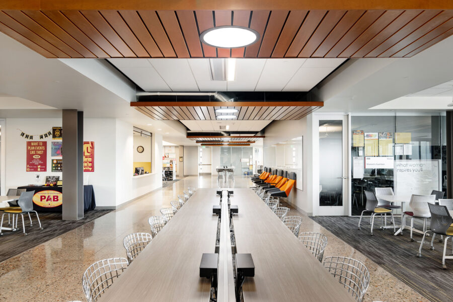
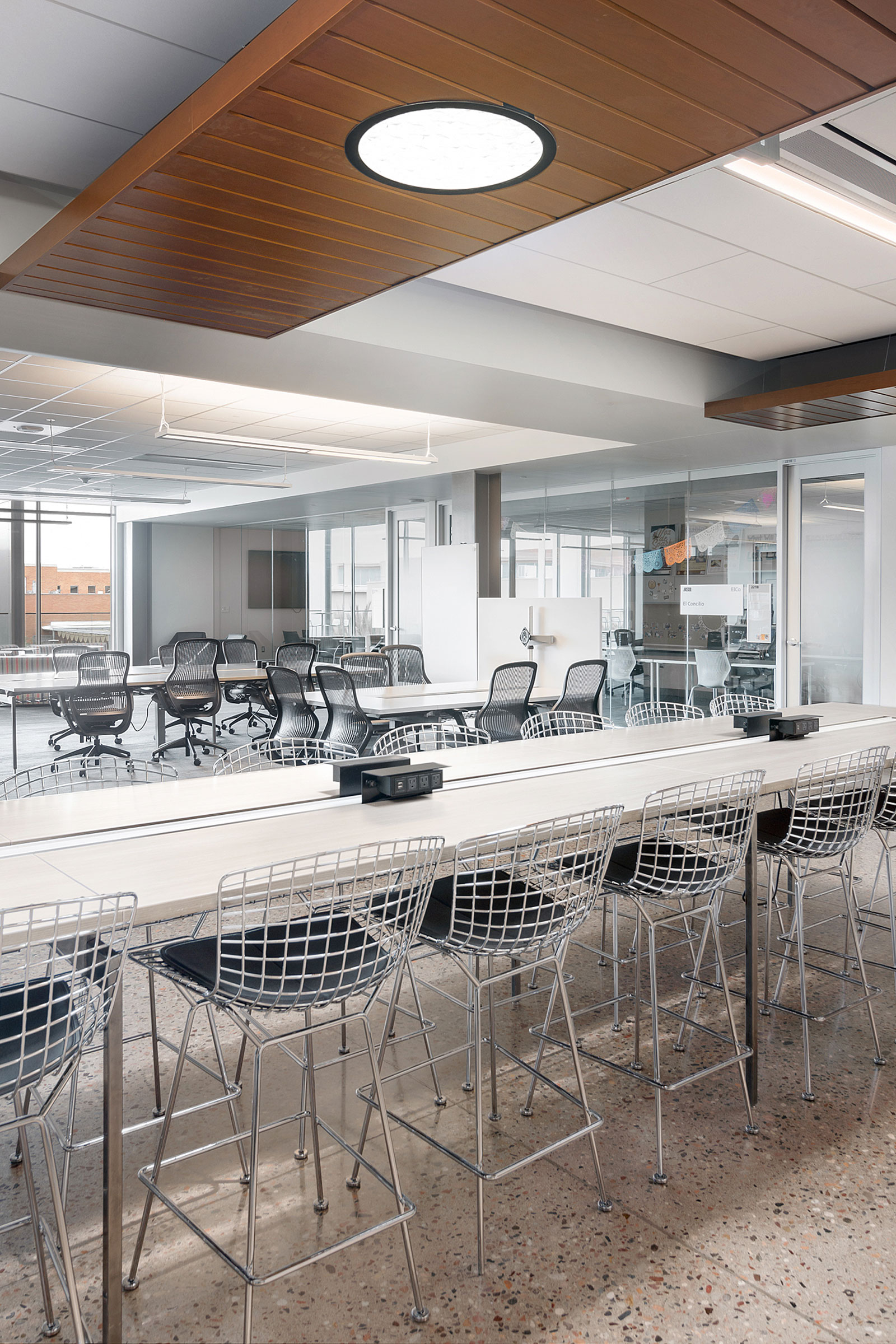
The ASU campus in Tempe uses TDDs, or tubular daylighting devices. Photo courtesy of Solatube International
When we have a beautifully daylit space we have to balance the interior opaque architecture with any apertures to the outside. We want to soften contrast ratios between walls and ceilings and windows and skylights. We can do that in a lot of fun ways.
The Arizona State University (ASU) student pavilion in Tempe is particularly meaningful. That building is LEED Platinum, and it was also a net zero energy building. It’s three stories, and it was one of the first applications of these sticky space concepts.
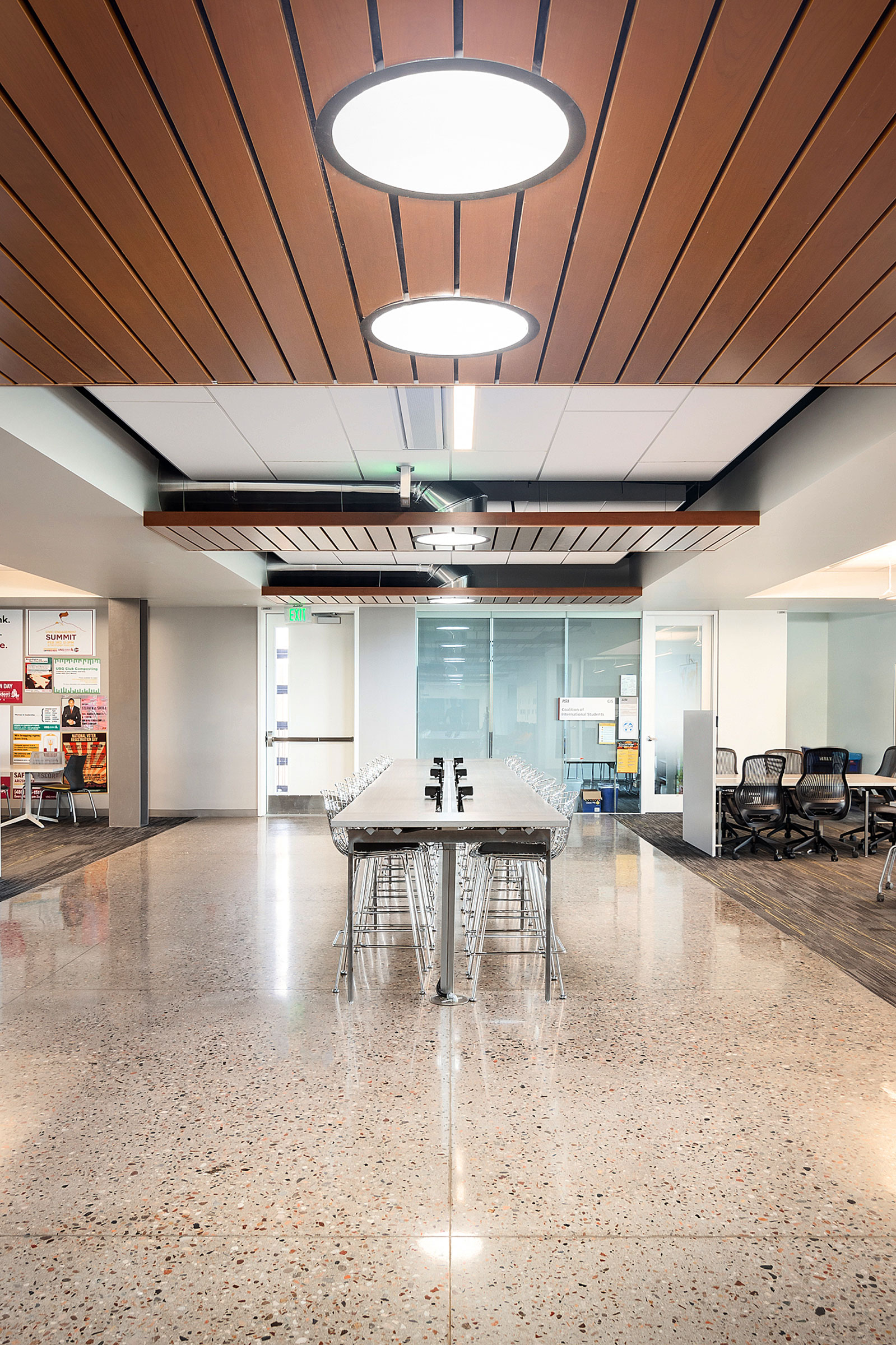
All the corridors in the building are beautifully daylit. The corridors are at the center of the building. Classrooms and enclosed spaces are pushed to the outside perimeters so they have access to views. In the sticky spaces these hallways and corridors have seating areas and long, linear tables where students can gather and chat, have lunch, do whatever they want to do. Those spaces use top lighting daylit with Solatube products.
Since it’s a net zero building it makes heavy use of PV on the roof. People always think PV and daylight don’t mix; that’s 100% false. When we use the Solatube product, we can easily integrate the daylighting module into the PV module. We can group all of the Solatube apertures in one small area where they don’t impede on the PV layout and where the PV doesn’t shade the daylighting system’s rooftop domes. We can elevate the domes up to the level of a photovoltaic array so they aren’t being shadowed, and we can group all the apertures into one small area, collect the daylight, and fan it out through the building from that point using the redirection capabilities and the ducting capabilities of a TDD, or tubular daylighting device.
How did ASU use TDDs?
- The ASU student pavilion uses top lighting daylit with Solatube products. Photo courtesy of Solatube International
- Beautifully daylit sticky spaces are highlighted with daylight all day at ASU. Photo courtesy of Solatube International
That’s exactly what ASU did. They grouped all of the apertures into key areas that fit within the PV array and then used the optical “ductwork” to duct the daylight down through multiple stories in interstitial walls of the building, turning it horizontally into the ceiling plane or the plenum space above the occupied zone, and turning the product again to drop it into the ceiling where the architect needed the daylight as a light source.
What is the result of daylight at ASU?
These beautifully daylit sticky spaces are highlighted with daylight all day. You get these very important visual cues. Even though there aren’t views to the outside, it becomes this really fun space students inherently understand as being different from an electrically lit corridor. That could not have been done without the Kingspan family of products.
How can other Kingspan products bring light in?
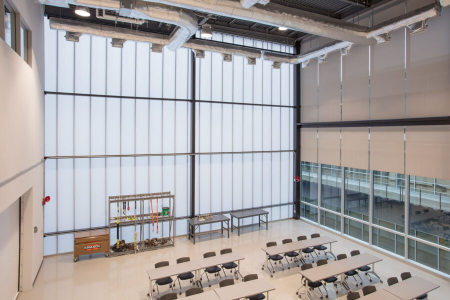
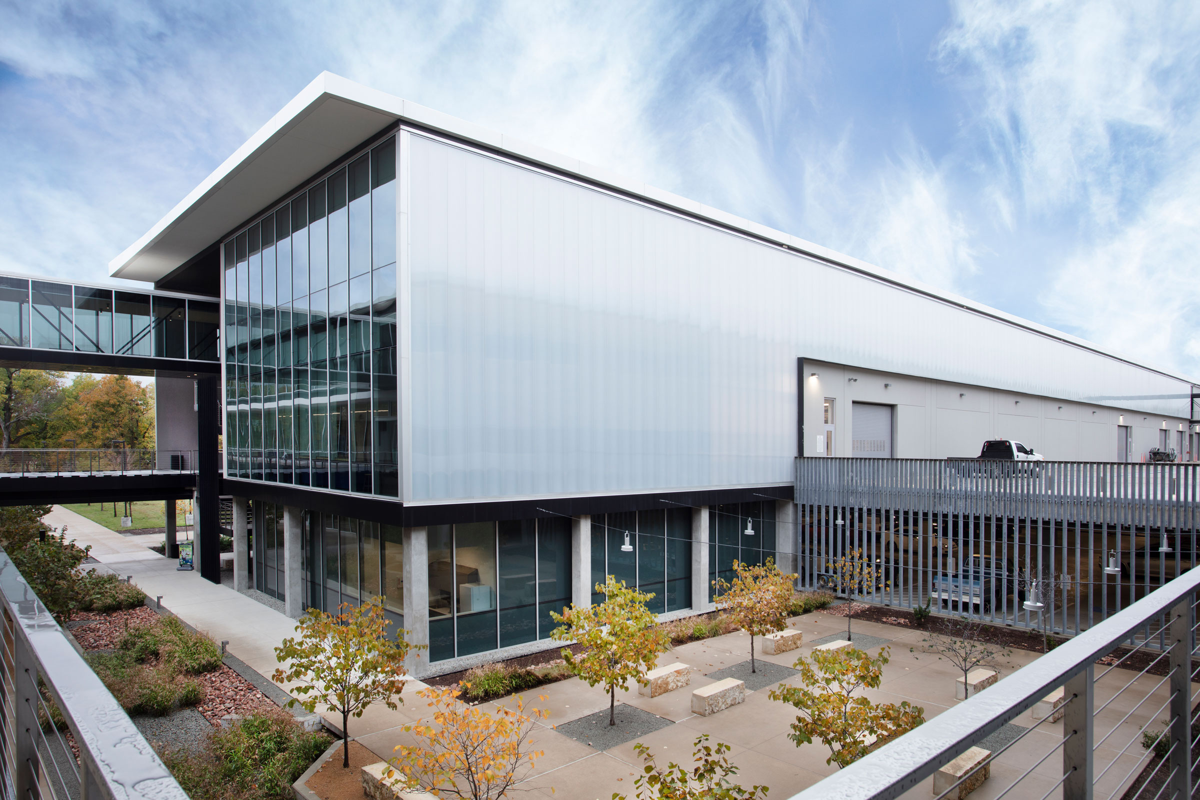
The Kingspan UniQuad product allows for large monolithic building skins to be fully translucent with carefully balanced interior daylight illumination, like at Collin College Technical Center. Photo courtesy of Kingspan Light + Air
Another really interesting solution was used at Collin College, a technical campus in Allen, Texas. This is a really fun project because we use translucent walls to provide balanced daylight within the interior spaces. This building has a central spine, and the classroom wings become like appendages to the main building axis. You end up with these glorious spaces with floor to ceiling glazed, translucent walls.
What are the benefits of translucent walls?
When we have classrooms or large gathering spaces where students have to sit, we don’t want shifting patterns of light. The architect at Collin College combatted that by using our UniQuad polycarbonate system. That Kingspan UniQuad product allows for these large monolithic building skins to be fully translucent with carefully balanced interior daylight illumination.
Think of it as a standard wall; you have an outer surface, inner surface, and interior structure. These panels run literally from the sill plate of the floor to the top of the parapet wall. It’s fully translucent, which is very cool. The walls become this very soft source of illumination. It allows us to have these large spaces and this psychological connection with spectral content variation of daylight, but we don’t have the shifting patterns of light that become problematic.
How can UniQuad integrate with other solutions?
That system can also integrate with curtain wall window systems. With an integrated glazed curtain wall system, windows with views coexist within a beautifully translucent wall system. Now the wall and the window have the same brightness, nearly eliminating the potential for glare associated with the carefully curated views to the outside.
By night, since the Collin College building’s skin is this translucent system, the building becomes a glowing beacon. Think about the school being the center of a community—this truly does become that. It becomes a luminous box people are gravitated toward.
How can daylight be used in adaptive reuse?
With Covid we see a lot of changing populations. People moved to new locations, away from cities, and in the process a lot of buildings are no longer being used as originally intended. There’s a shopping mall that’s a great example. Austin Community College acquired a 1 million square foot mall—the Highland Mall—a windowless building. Nothing was there.
How did you bring light into the mall-turned-college?
- Austin Community College used to be shopping mall. Photo courtesy of Kingspan Light + Air
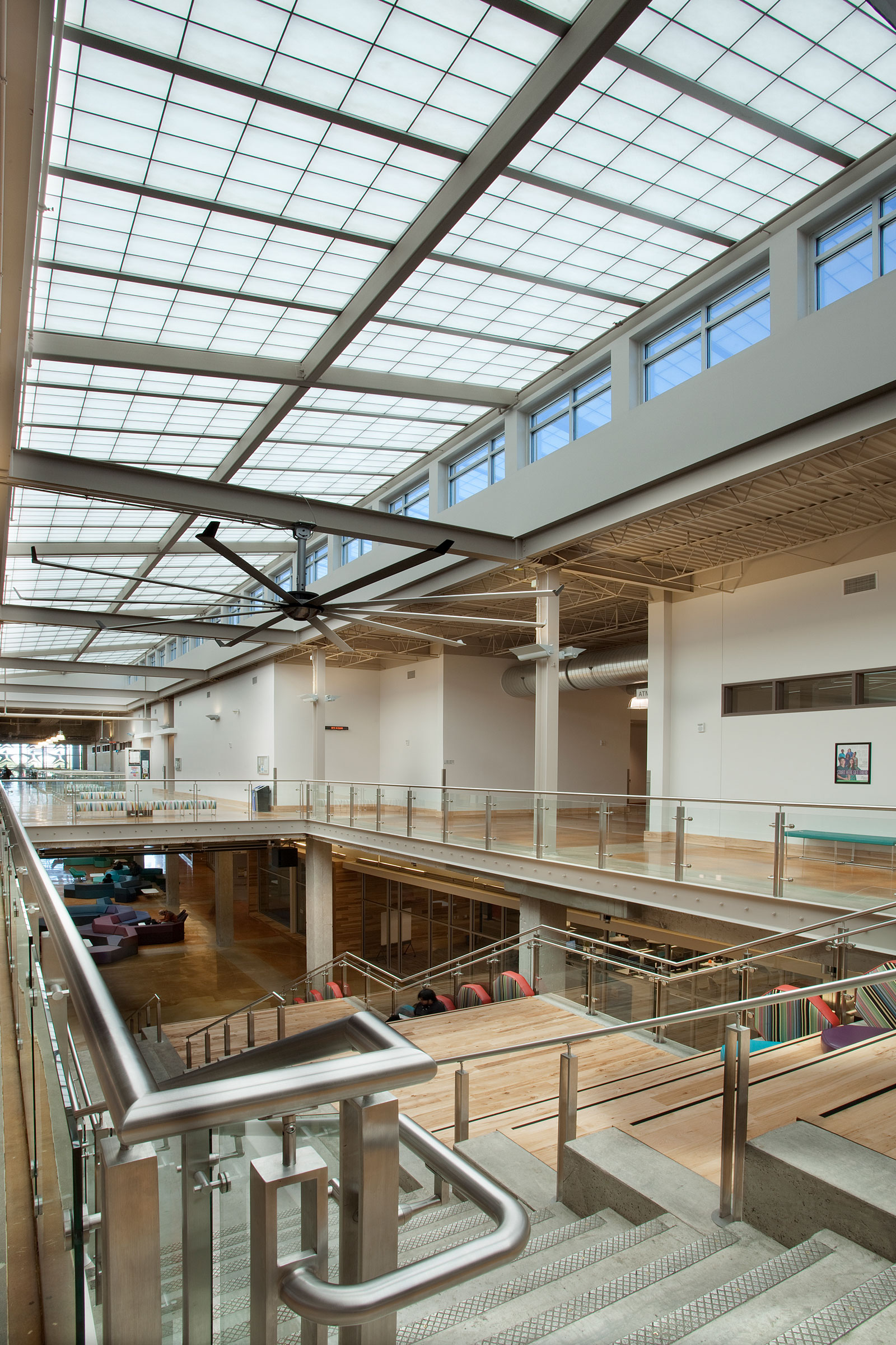
- Natural light fills Austin Community College. Photo courtesy of Kingspan Light + Air
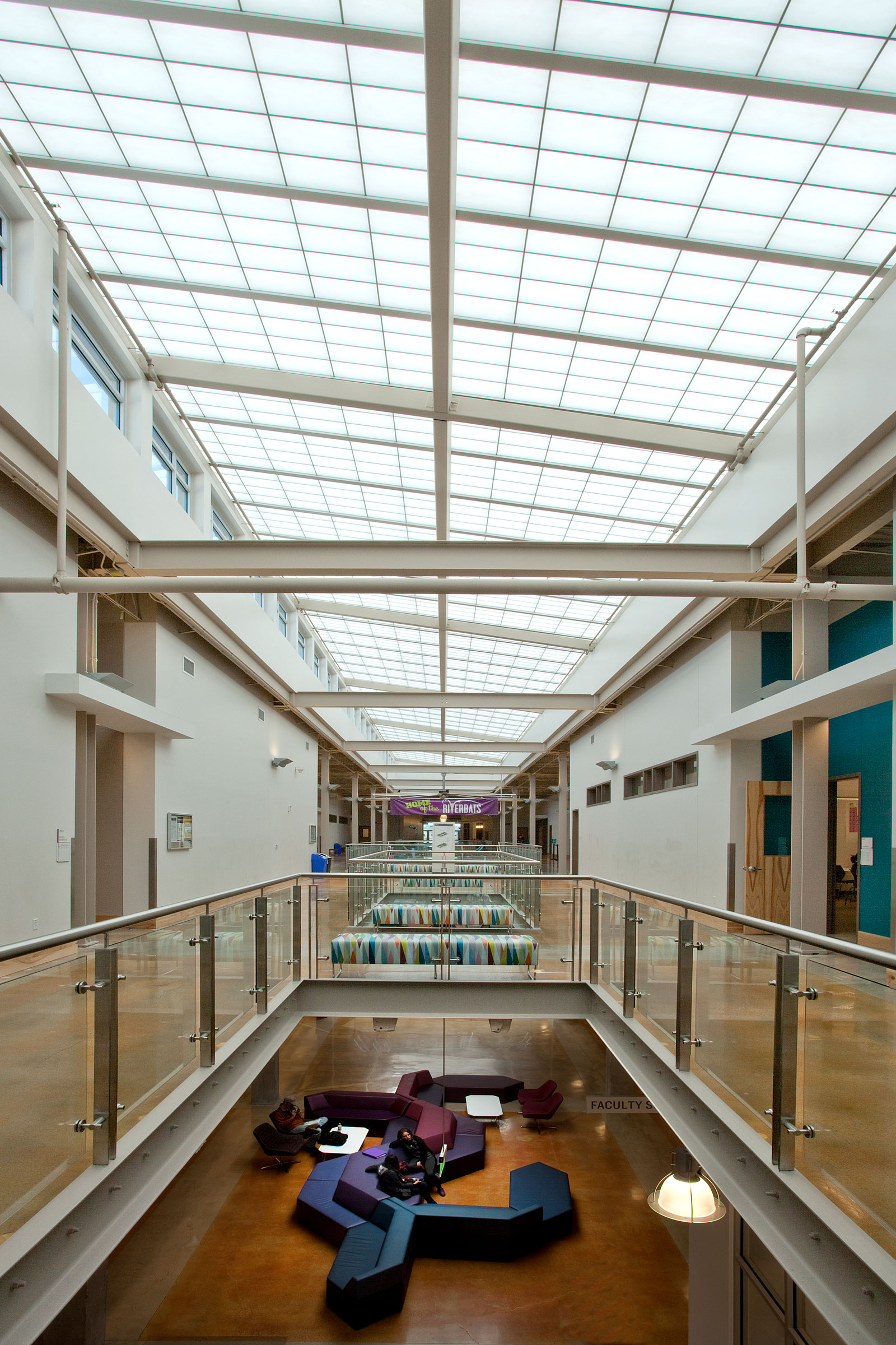
The architects (Barnes Gromatzky Kosarek Architects, Perkins&Will) took the perimeter stores and turned those into classrooms. For the circulation spaces in the center of this multi-story building, they cut away the concrete structure and introduced beautifully toplit translucent products. They used our UniGrid fiberglass reinforced panels (FRP). It has an internal aluminum grid that supports an insulated translucent skylight system. It almost looks like a shoji screen because you have this veiled view of the internal structure. It is high-performing because it can be insulated.
We can change the surface characteristics of the exterior and interior translucent surfaces, but in using these large monolithic surfaces to daylight the building, you also create beautiful sticky spaces within the central core of this building.
When you look down this incredibly long, linear circulation and sticky space, they ended that corridor with floor to ceiling, transparent view glass to the outside. If there was no top lighting using the translucent skylight, that window wall would become an incredible source of glare. When that window becomes too bright relative to the interior architecture, it elicits the fight or flight response because we start to notice shapes—we can see people silhouetted by the window, and we can’t tell whether they are friends or foes. By having this beautifully glazed window balanced by this robustly daylit volume, there is no contrast. You can view people at the end of the hallway perfectly, you can see expressions, and you can have these beautiful views to nature outside—all because of this incredible top lighting scenario.
Adaptive reuse is a key need today, and we see schools struggling with how they can inexpensively create new campus space using adaptive reuse. Well, here we go. It’s a beautiful space and a perfect learning environment. And it’s very sustainable because we’re not building a new structure. We’re using an existing structure.

