Story at a glance:
- The design of the new Community Commons at the University of Denver is inspired by the surrounding geology.
- It was important for the architects to create a space the students can interact with and make their own.
- Five bioretention ponds and two underground detention systems collect 100% of the stormwater that falls on the site.
When Moore Ruble Yudell was approached to design a new community hub for the University of Denver, they wanted to make a space that belonged to the students. The school was seeing an influx of first-generation students, and it wanted to create a space for students to feel welcomed. “The place is yours. You can mess with it,” says Jeanne Chen, a design principal at Moore Ruble Yudell.
Moore Ruble Yudell collaborated with the Office of the University Architect to create a space that was open and inviting, while at the same time being harmonious with the historic campus.
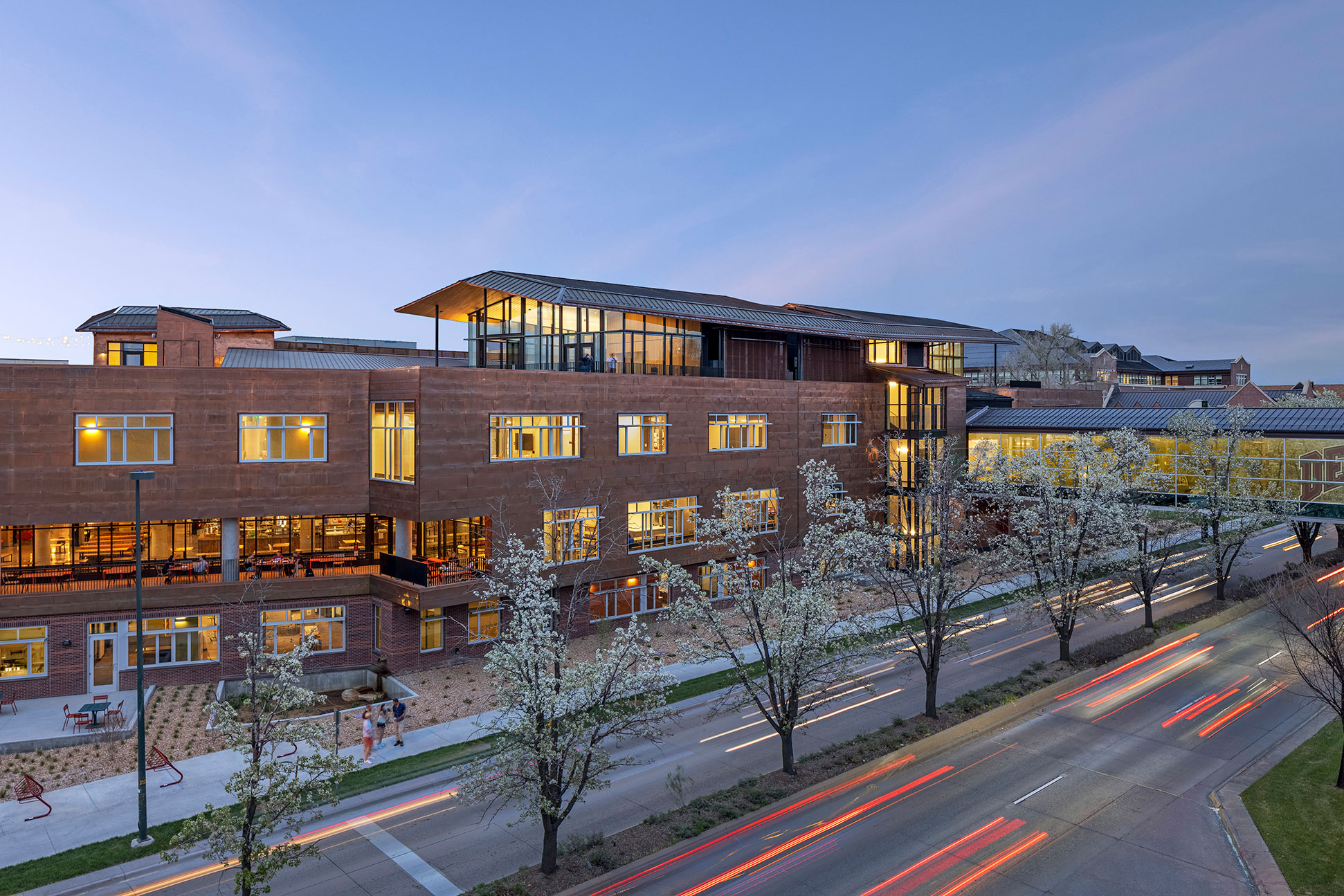
Next to a busy road at the heart of campus, the four-story Community Commons combines a number of student services—including dining, an art gallery, and lounge areas as well as the Center for Sustainability, the Center for Community Engagement, the Cultural Center, and other student advising and support services. Putting all the resources in one central location, the team hoped to create a space for students to “feel like this place is theirs, and it supports them.”
Sustainability
The design team took a holistic approach to sustainability, thinking not just about the building itself but also the ways they connect to health and well-being for the students—from healthy food to diversity, equity, and inclusion. “Those are all building blocks of creating this experiential environment for students, that really are concerned with their whole path and experience from their freshman year in school to when they graduate,” Chen says.
Food
Through conversation with students, the design team found the food was a major point of connection across cultures. Students have the option to purchase from a cafe or smoothie shop on the first floor, or enjoy a buffet lunch on the roof. But the main dining area on the second floor offers nine micro-restaurants. The school wanted to make sure the food they served was healthy and represented the diverse food culture of the student body.
Traditionally the floor would be closed off when the restaurants stopped serving, but the design team convinced the university to keep the floor open to allow students to use the space for other purposes, like studying or meeting with friends, well into the evening.
“It might not have been the first way they would have thought to run the services, but they opened themselves up to that idea and saw the benefits of it,” Chen says.
Canyon-Inspired
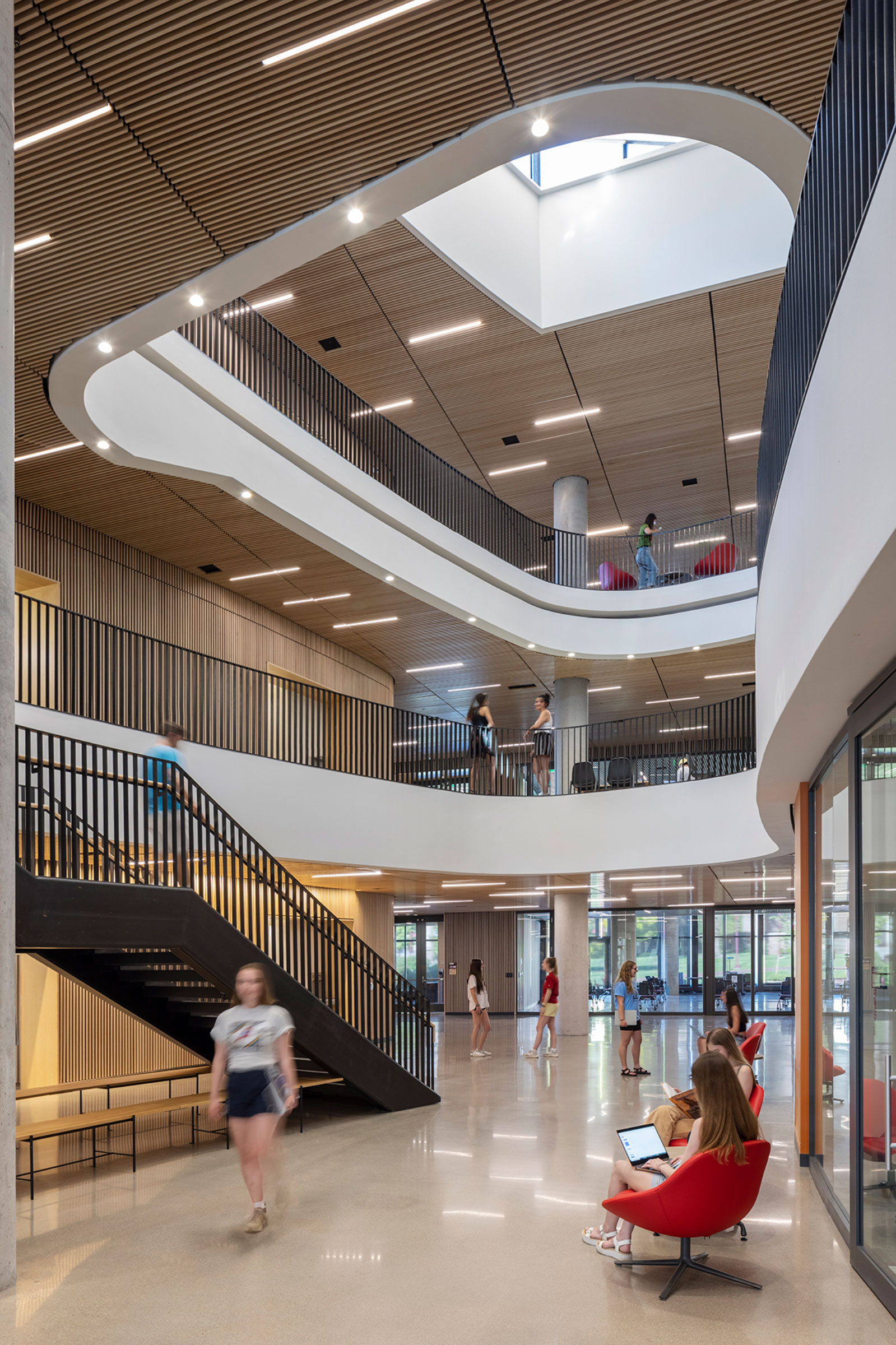
Inspired by canyons, curved cutouts in the middle of the building allows occupants to see each other horizontally and vertically. Photo by Frank Ooms
Taking inspiration from the canyons of the region, a soft curved cutout in the center of the building provides a flow path connecting the nearby campus green to the new first-year residence hall. On the upper levels, a series of organic-shaped openings creates a space where people can see each other vertically and horizontally. The different levels are connected by a social stair. “It really encourages people to go up and down to see each other and to be very active,” Chen says.
While this shape feels seamless, it posed a major challenge to the architects. “You don’t actually notice there’s a lot of gymnastics going on, but in reality there’s a lot of intention and effort in order to deliver a single building that has these openings in the middle,” says Blake Patten, a project manager at Moore Ruble Yudell. The team needed to find a way to incorporate the mechanical and structural systems around the openings.
Wood
Looking up from the canyon space, the wood-slat ceilings combined with the organic shapes of the cutouts create a natural feeling atmosphere. “Wood-slat ceilings and walls help a lot with the acoustic performance in spaces, but also exude that sense of warmth and an inviting spirit in a building,” Patten says.
Ventilation
The wood-slat wall system is also used to conceal the displacement ventilation system, while allowing for airflow. The displacement system brings fresh air from the low level and distributes it to the higher levels and takes out dirty air from above. Putting the system in the wall rather than in the ground, the occupants get a pool of fresh air right where they are breathing from. “It’s much more efficient,” Patten says.
Along with the slow moving air displacement system, the building also has operable windows throughout. “The idea of comfort and well-being were very important in the way that we design,” Chen says. The ability for someone to open their own window gives them a level of self control, she says.
Light
Natural light and white interiors make the space feel airy. Windows run along the entire north-facing side of the top level of the canyon space, flooding the space with daylight. Equitable access to daylight was an important idea of the project. “Daylight gives you a sense of orientation and it changes throughout the day, so it makes the space feel very alive,” Chen says.
Copper
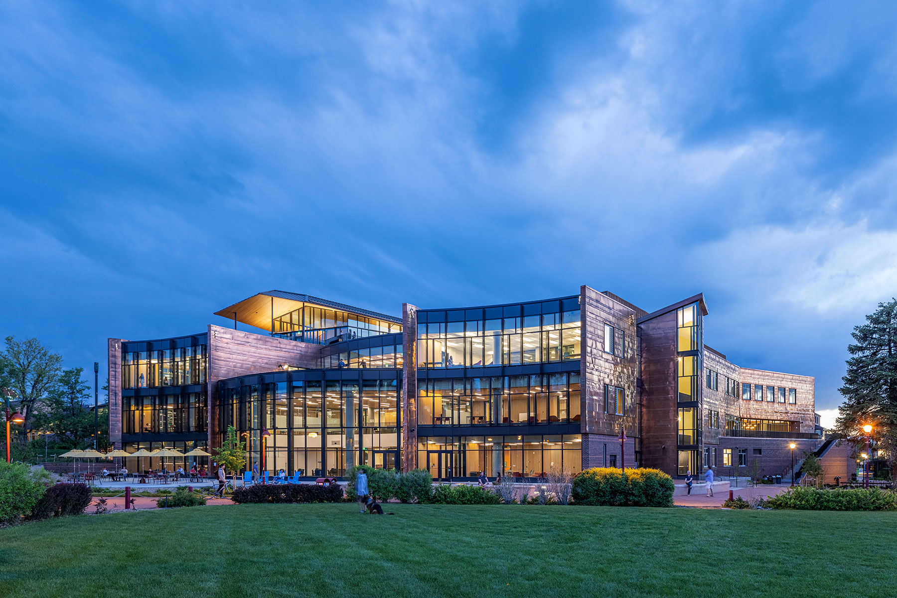
Anti-microbial, locally sourced, exterior copper cladding connects the building to the region. Photo by Frank Ooms
On the outside, the geological theme continues with copper cladding. “We wanted to play with the idea of using the local material and creating this pattern that just evokes that sense of geology,” Chen says. A similar banded pattern is created using bricks on the lower level and is seen in the first-year residence hall.
Indoor/Outdoor
The design team worked to create spaces that blend the indoors and outdoors, not just on the ground floor but at every level. Large windows and a rooftop terrace provide 360-degree views of the surrounding area.
Furniture
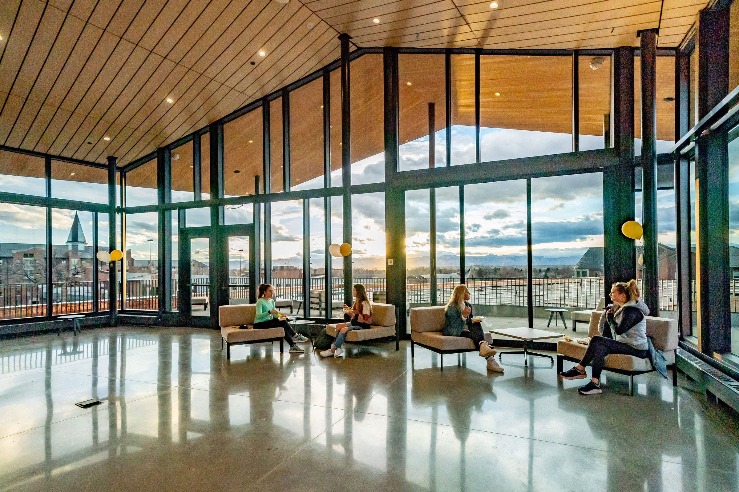
360-degree views of the region are available at the roof pavilion. Photo by Wayne Armstrong
Indoor and outdoor seating are available in the dining areas. Much of the furniture is suitable for both indoor and outdoor use. “That connection is so important, so we also wanted to build in that flexibility,” Chen says. The team also considered durability and ease of maintenance in their furniture selection. They also wanted to use local materials, including reclaimed wood, and wanted to feature fabrics that represented the diverse, multicultural student body.
In other projects outdoor furniture is sometimes bolted down to prevent theft, but it was very important for the students to be able to move and interact with the furniture. Going back to one of the goals of the project to create space that students can make their own, the team wanted to convey that message through furniture as well, Chen says.
Green Roof
Continuing to blend indoors and outdoors, a floor-to-ceiling glass pavilion connects to the largest green roof on campus. “The roof is really a fifth elevation,” Chen says.
Usually rooftop access is restricted on many campuses, but it was really important for students to be able to experience the space in this project. Choosing hearty, low maintenance plants, the university and its students are continuing to experiment and see how they can scale and improve the project. The plants have a two-year irrigation cycle, but after the first two years, they can survive with the anticipated rainfall.
Water
Along with the green roof, the building also has five bioretention ponds and two underground detention systems. This allows the building to collect and filter all the stormwater before it gets to the municipal water system.
“Denver’s climate can be kind of harsh. There are 300 days of sunshine a year, but when it rains it really rains,” Chen says. These retention systems play a huge role in delaying the release of water by 24 to 48 hours, reducing the burden on the municipal system.
Water conservation was also important. Using low-flow kitchen equipment, toilets, showers, and faucets, the project reduced indoor water use by 45% compared to the LEED New Construction V4 baseline.
Energy
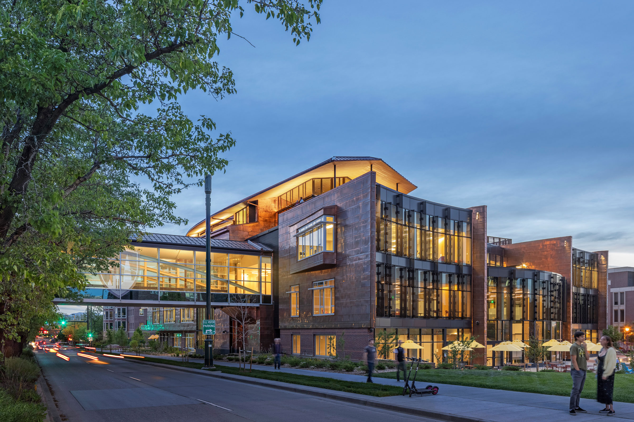
Strategically placed fins reduce the solar heat gain in the building. Photo by Frank Ooms
The building was able to reduce energy use by 49% from the baseline through responsive planning and high-performance systems. One way that shows up is through the shading system.
“We do have a lot of glass, so we really wanted to control the amount of daylight that came into the building to make the building more energy-efficient,” Chen says. Vertical and horizontal fins are placed based on the building orientation to reduce heat gain.
Those fins also have an unexpected benefit. “It kind of creates these little nooks. Students like to sit between them because it creates a little more intimate space,” Chen says.
Adaptability
“We’re quite proud that it was able to serve needs we didn’t even know existed when we were designing it,” Chen says. For example, the multi-use forum space wasn’t conceived of as a classroom, but the university found that it was a suitable space to hold classes in the spring of 2021, while maintaining social distancing protocols. “You could arrange furniture in a space like this in order to meet that need. I think it really speaks to the adaptability and flexibility of a building like this,” Patten says.
When Patten went to see the building, he met a student who frequented the art gallery. “This was the place where she would come to write papers and have quiet decompression time almost every day. I was there for three days, and sure enough she was there every single day.”
The student told him she has her dorm space, but this felt more like home to her. “That really spoke to one of the initial goals of the project: helping first-year students feel like they’re at home,” he says.

