DeBartolo Architects boosted Fervor Creative’s usable square footage—and added numerous energy-saving elements.

DeBartolo Architects, who led the Fervor Creative renovation, has garnered numerous AIA awards for their preservationist-informed work. [Photo: Jason Roehner]
PROJECT: Fervor Creative
LOCATION: Scottsdale
SIZE: 4,500 square feet
COMPLETION: 2018
LEAD ARCHITECT: DeBartolo Architects
ENGINEERS: DeBartolo Architects
GENERAL CONTRACTOR: The Construction Zone
PROJECT TEAM: Jack DeBartolo III, Jeff Kershaw
When Fervor Creative first reached out about revamping its offices in Scottsdale, Arizona, hoping to maximize space, the graphic design and branding agency imagined it would be a small remodeling project. The modest two-story space had served the team decently, if not flawlessly, as the firm’s profile grew along with its client list, which now includes the likes of NASA and Arizona State University. But as the team walked through with Jack DeBartolo III, who founded the acclaimed DeBartolo Architects along with his father in Phoenix in 1996, it became clear that the building was rather awkward—“geometrically tortured,” as DeBartolo describes it—and a more comprehensive response was necessary.
“Response” is a key word. DeBartolo, whose firm has landed several AIA awards for its strongly preservationist-informed buildings, says “respond” is the word his firm uses most regularly, as they take pains to carefully research a given site and contemplate its unique nexus of “place, people, and purpose.” It’s an impulse that informs their strongly purpose-driven work and matured in the early-to-mid years of the firm, when it built a school and orphanage in Ethiopia and brought graduate students there to consider how important it is that architecture truly satisfies people’s needs. “Within that context, our whole purpose is to take on projects where we can make a really unique difference and bring a transformative quality through architecture,” DeBartolo says.

[Photo: Jason Roehner]
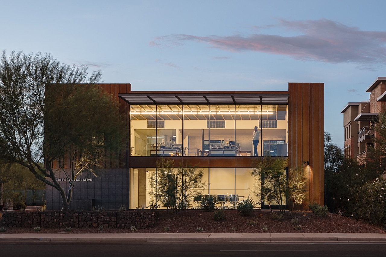
The Fervor project was at once transformative and preservationist. DeBartolo expanded the original usable square footage from roughly 3,000 to 4,500 square feet, most notably by revamping the upper level, where “the geometry didn’t take full advantage of the footprint of the building,” according to DeBartolo. At the same time, the firm preserved the existing masonry block and some of the original masonry walls, along with two bathrooms. Everything else was gutted and replanned. “The exterior volume was a rather simple rectangle, but with numerous angular lines, other architects had overcomplicated what could have been a relatively simple, small building.”
The result changed the way work gets done at Fervor. The agency had tried to integrate game rooms, lounges, and other more social areas in the building before, but there was a problem: Employees rarely used the spaces. Now, brainstorming areas are full, breakout spaces are active, and secondary rooms function as great places to meet clients—vital for a company like Fervor, which eschews the traditional account management structure in favor of full design focus, according to Don Newlen, a principal member of the firm.
The new office opened in July 2018, roughly coinciding with Fervor’s 20th anniversary, and it fits the agency’s work ethos: welcoming, detailed, and not heavily self-branded. It wasn’t trying to make a statement, Newlen says. Instead, the design—which was built from a deeply collaborative process—paradoxically does make something of a statement: one that prizes sustainability and functionalism.

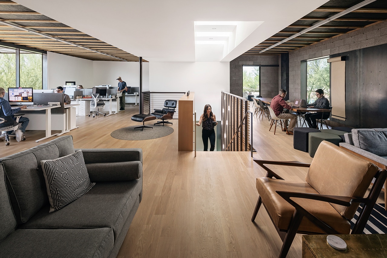
The skylight shines down over the staircase, a simple-yet-effective room divider for the upper level. [Photo: Jason Roehner]
A Flood of Natural Light
An innovative skylight floods the upper floor with daylight. Builders installed a series of skylights between roof joints, combining three standard-sized skylights to create one uniform opening large “enough to be a lantern for the level,” DeBartolo says. The maneuver was accomplished on a modest budget and—thanks to its positioning above the stairs—add to the staircase’s new life as a necessary, natural element of separation for the office. The lights are positioned so employees get side light for most of the day and don’t have to contend with harsh screen glare.
Office-Conducive Acoustics
Fervor transitioned to an open office environment, so it was important to manage the noise levels of suddenly having a dozen-plus employees working in a single space. DeBartolo created an entirely acoustical ceiling by exposing the building’s thermal insulation with duct liner below it. “It created a quiet interior that’s acoustically warm but highly functional and modern,” he says. “Acoustics are important to us and don’t generally get a lot of press when discussing office design.”

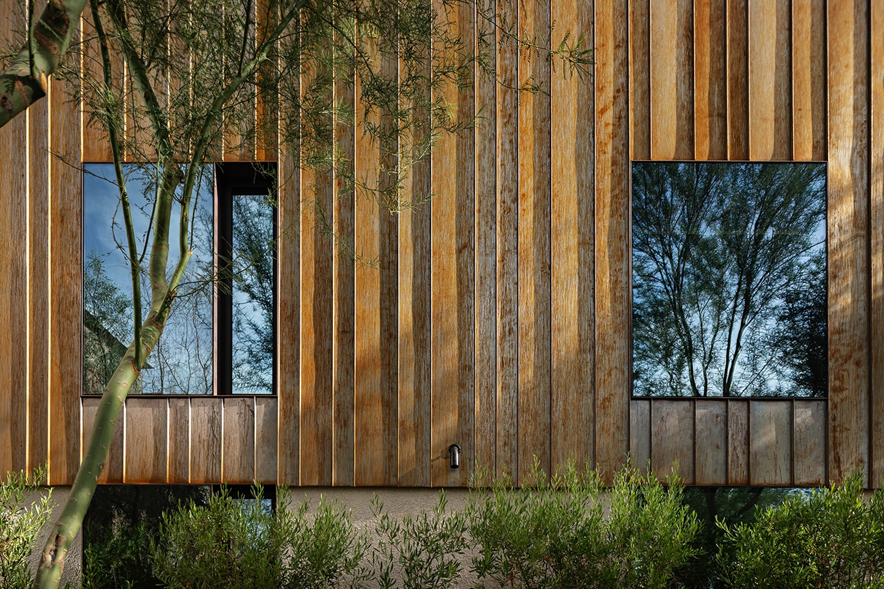
The corten-metal exterior, which gains character as it weathers, is a hand-in-glove fit for the sunny Scottsdale environment. [Photo: Jason Roehner]
Corten Metal Exterior
Aside from glass, the main material in the new Fervor studio is steel. Here, DeBartolo and his go-to contractors, the architecture-sympathetic contractors at Construction Zone, employed steel in a deliberately structural fashion, using it as the glazing window wall. The third key material is corten metal, which wraps around the revamped upper level. The metal looks great as it naturally weathers, which is no problem in the Arizona sun. But there’s another benefit: no paint necessary. Unlike many builders in the state, DeBartolo prefers to use as little paint as possible, he says, especially for exteriors.
Slotted, Simplified Stairs
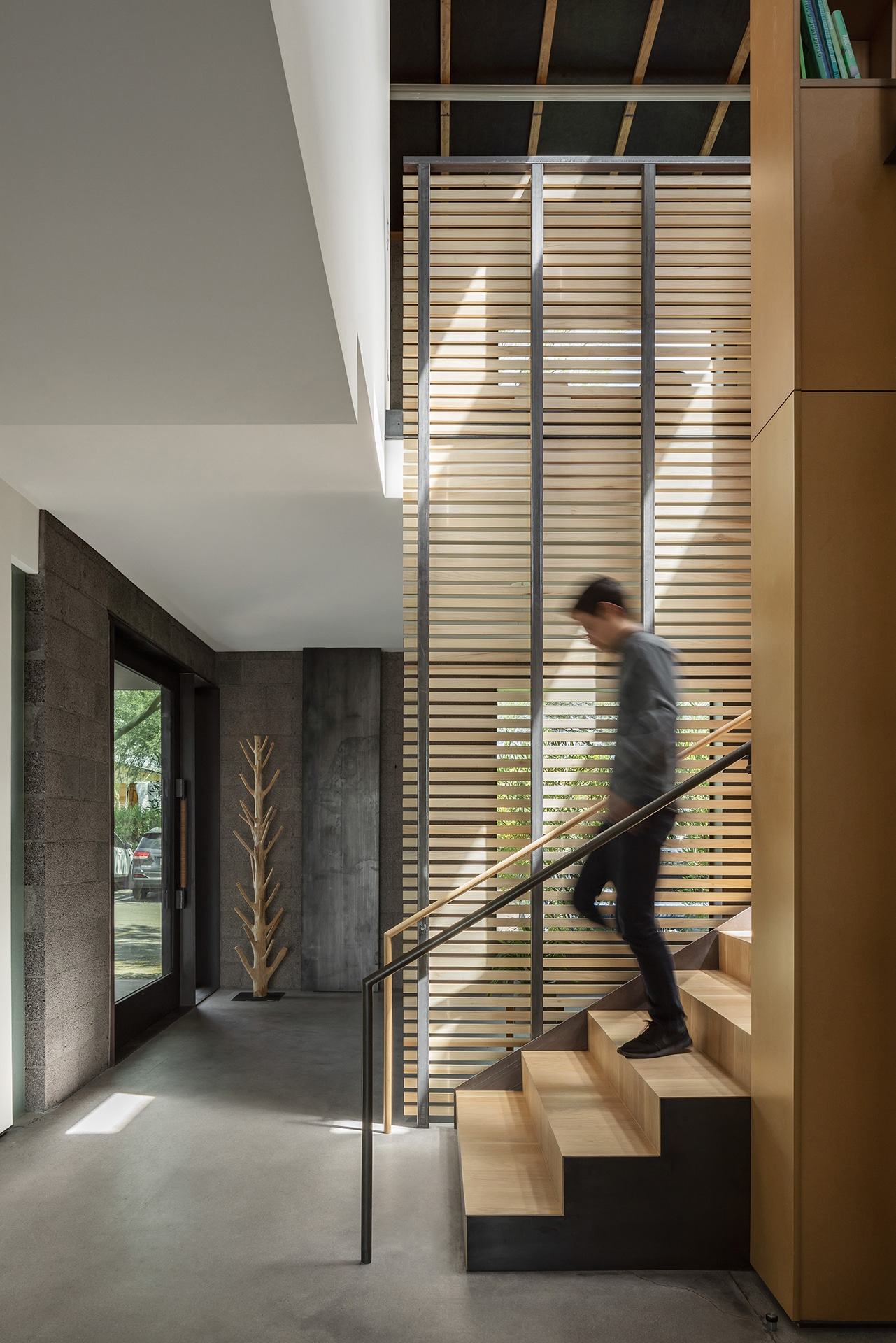
The original stairs leading from level one stretched up at a long, 45-degree angle, an uncharacteristically “too clever” design. Usually the problem is too little thought, DeBartolo says. A rebuilt, resituated slot staircase maximizes the upper-level floor plan, a boon that prompted Fervor employees to move from the first floor to an upstairs open office. Wood louvers along the stairs connect the upper and lower floors for a sense of continuity. The addition of large windows means not only plenty of natural light, but also excellent views of Scottsdale.
