Story at a glance:
- The right lighting, comfortable seating, and beautiful views are just part of what makes patients comfortable.
- Design leaders at Cedars-Sinai were surprised by some of the input they got from making mockup rooms.
- Each Cedars-Sinai facility strives to emphasize an appropriate sense of place in its community.
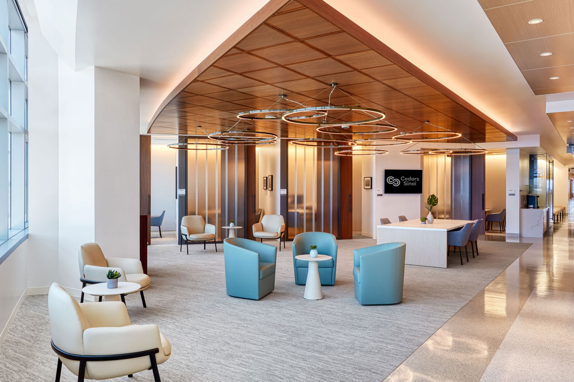
The right colors, comfortable and patient-centric lighting, and access to the outdoors are some of the ways the design team at Cedars-Sinai makes patients feel at home in their designs.
“We want our patients to feel comfortable and confident when they walk into a Cedars-Sinai facility, knowing they’re going to receive the highest and most advanced level of care,” says Zeke Triana, vice president of facilities and design at Cedars-Sinai. Triana worked as an architect specializing in health care design for many years before joining Cedars-Sinai nearly 15 years ago.
Part of the Community
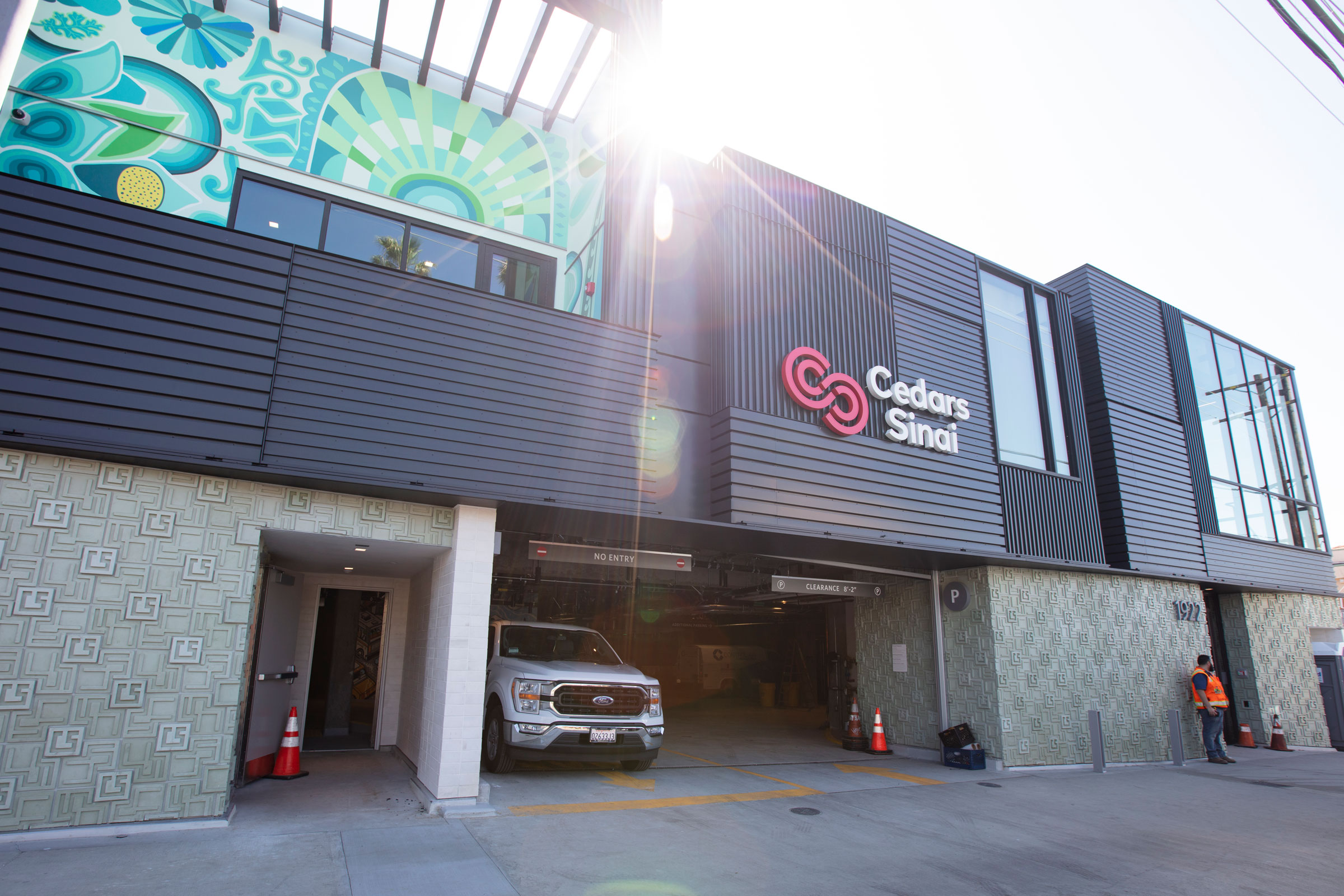
A new urgent care facility in the Los Feliz/Silver Lake area has a mural from a local artist inspired by the indigenous people who lived there and the local flower marts. Photo courtesy of Cedars-Sinai
Triana says the design team puts patients at the center of everything, and they want their locations to feel true to the neighborhoods they’re in. A new urgent care facility in the Los Feliz/Silver Lake area—a lively retail area—is one example, he says. “Cedars-Sinai wanted to be part of that neighborhood and to feel like they truly belonged there,” he says.
As such, the new building’s architecture makes reference to some of the area’s known monuments—like the Griffith Observatory and Frank Lloyd Wright’s Hollyhock House. “We created our own block pattern inspired by Frank Lloyd Wright and the Hollyhock House, and we used some of the colors from the Hollyhock House to color this block. It’s sort of a greenish-blue color, something Frank Lloyd Wright never did, but we combined color and the textile block pattern to create the base of this urgent care.”
The new center also has a mural from a local artist inspired by the indigenous people who lived there and the local flower marts. “Cedars-Sinai envisioned a building that is grounded in the neighborhood,” Triana says. “You could never duplicate that building elsewhere in the community. It’s rooted in the Los Feliz/Silver Lake area and inspired by some of the beautiful architecture.”
Triana says the hospital’s designs celebrate the region’s diversity, as each facility is designed to belong. “When you walk in, you feel the total environment has been curated for you, and the details really matter,” he says. “From how you access the campus to how you park to how you get to your destination to the artwork, landscaping, lighting—everything has been curated so you get that total experience. That really does create, we believe, an environment where healing can take place.”
Patient-Centric Design
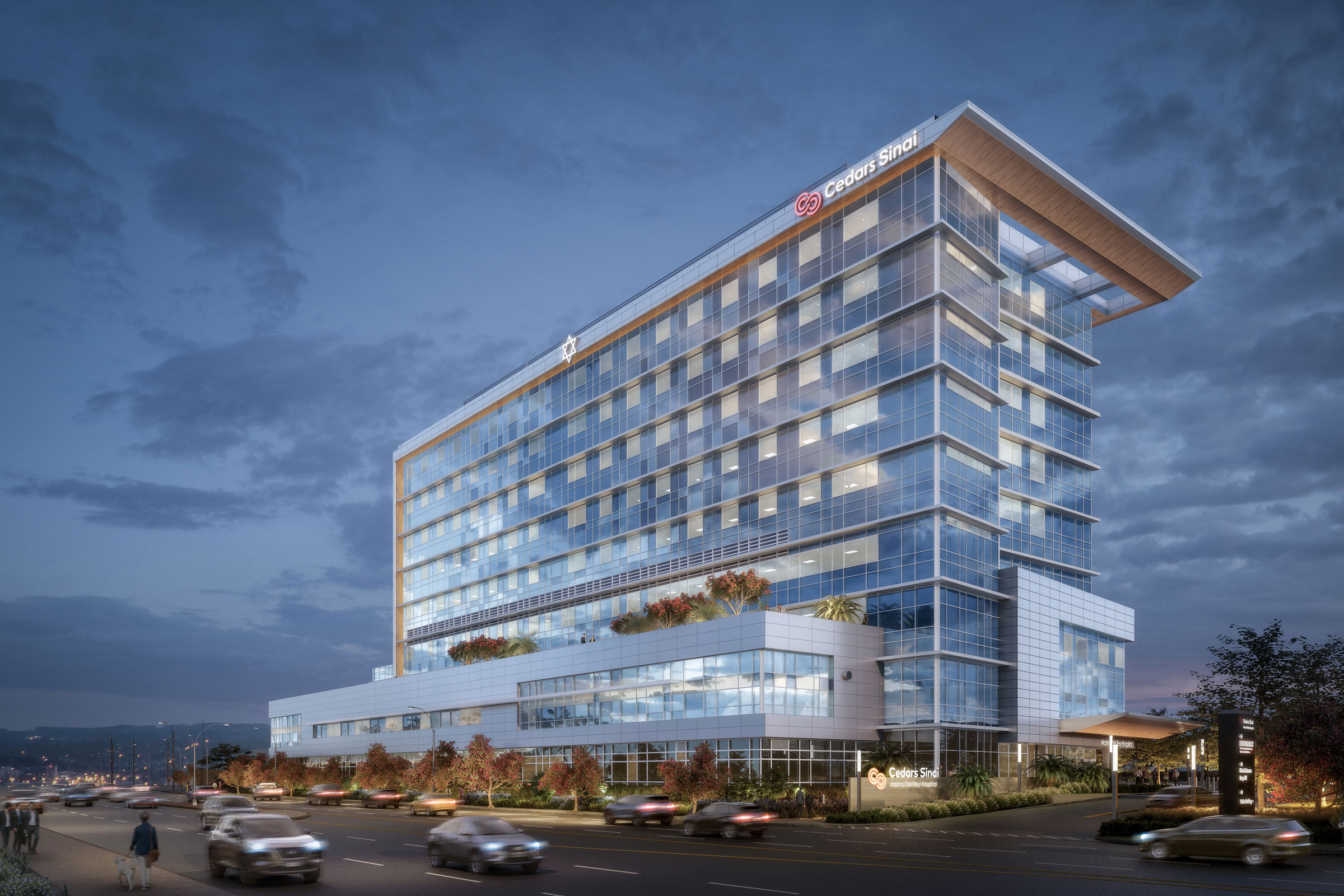
Cedars-Sinai is building a new hospital at Marina del Rey to replace an existing hospital there. The new design was inspired by the colors and landscape of the coast. The exterior’s windows appear in different colors, so when the sun hits the glass, the building exterior almost appears as waves or a beautiful sunset. Rendering courtesy of Cedars-Sinai
In all of its designs, Cedars-Sinai strives to think about the patient. At the new urgent care center, high ceilings and plentiful windows provide a feeling of openness with views of the observatory. Cedars-Sinai is also building a new hospital at Marina del Rey to replace an existing hospital there. The new design was inspired by the colors and landscape of the coast. The exterior’s windows appear in different colors, so when the sun hits the glass, the building exterior almost appears as waves or a beautiful sunset.
“It’s that local context that we felt was important. It makes it of the neighborhood,” Triana says. “That level of what I’ll call design sophistication is what we are after—where people then begin to feel proud of their health center in their community. It’s not cookie-cutter.”
Using local colors, inspiration, and even materials also helps to ground the project in the neighborhood while reflecting the hospital’s values. “It’s timeless, it’s diverse, it’s advanced and sophisticated. That’s the total environment we’re trying to portray. We hope that makes people at ease, makes them a little bit more comfortable, and reduces anxiety,” Triana says.
Testing Patient Design
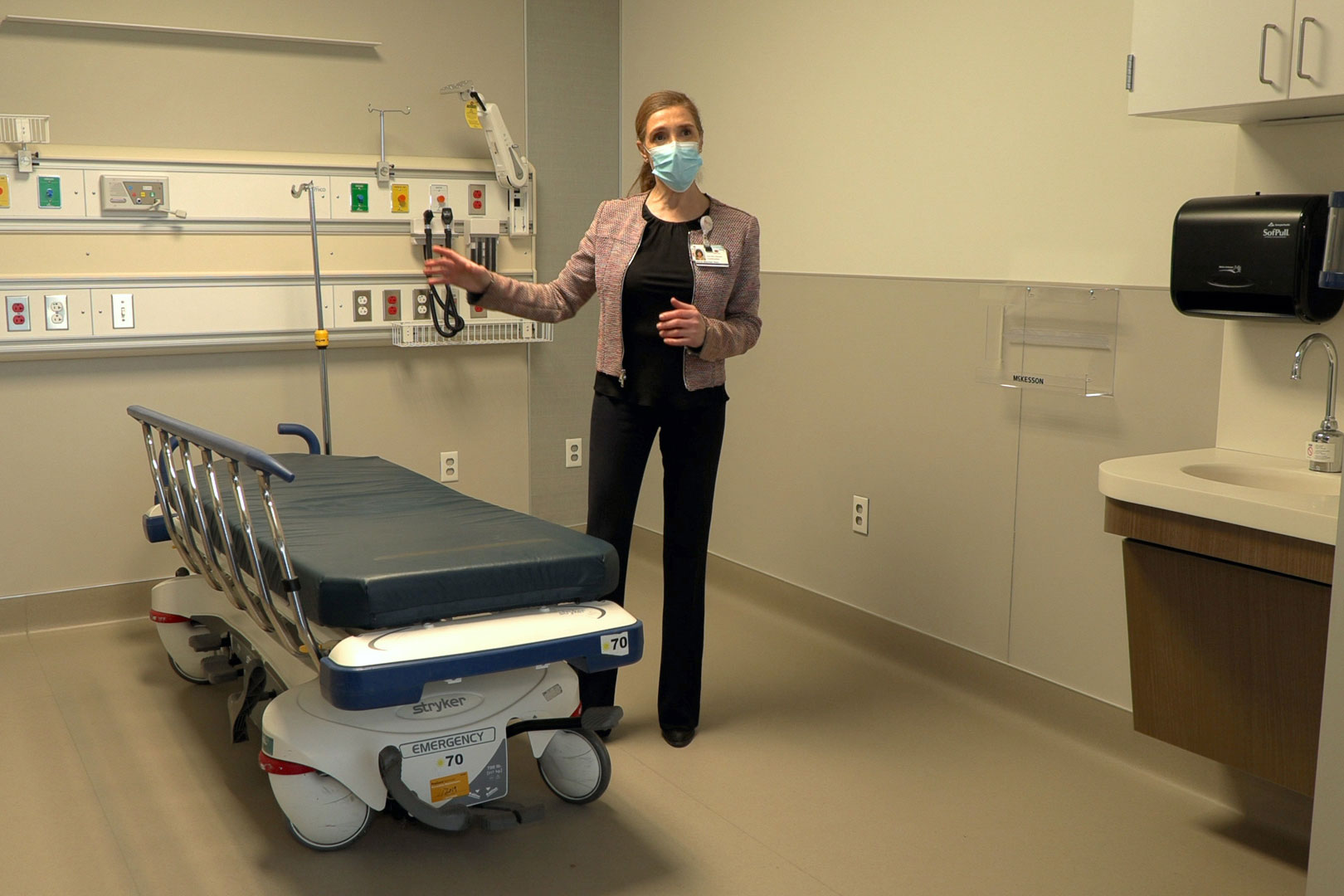
For the new Marina del Rey hospital, architects had the opportunity to build a hospital from scratch and get feedback with mock patient rooms. Photo courtesy of Cedars-Sinai
For the new Marina del Rey hospital, architects had the rare opportunity to build a hospital from scratch and get feedback with mock patient rooms. That feedback ranged from layout—staff stood inside an ER exam room and asked architects to rotate the bed and head wall 90 degrees so they could directly face the patient’s head from the doorway—to where electrical outlets were placed. “We have a patient advisory council that provides input on our designs or mockup rooms,” Triana says. “By incorporating that into the design process we have a better outcome.”
The council includes everyone from architects to nurses, physicians, and other health professionals. The design team mocked up several types of exam rooms for the new hospital. Some surprising discussion centered around placement of the toilets—should they go nearer the window side of the room or nearer the hallway? Triana was surprised to learn people wanted the toilet on the exterior wall. That placement provided enough room for a large window while giving patients more access to their clinical team. “They didn’t want to be isolated from the nurses,” he says. “That surprised us because when you have the opportunity to have this fantastic view twice as big in your room we thought they’d choose that, but actually because they’re there for different reasons—it’s not like a hotel—they wanted the balance between the view and visibility to the clinical team.”
It’s that kind of feedback that will ultimately make the high-tech rebuild of the current two-story, 50-year-old hospital a success. The new hospital is scheduled to open in 2026. Triana is grateful for the experience. “If we had not done that we’d build this hospital, and it wouldn’t be what they wanted. It was our philosophy to build it right the first time.”
Sustainable Details
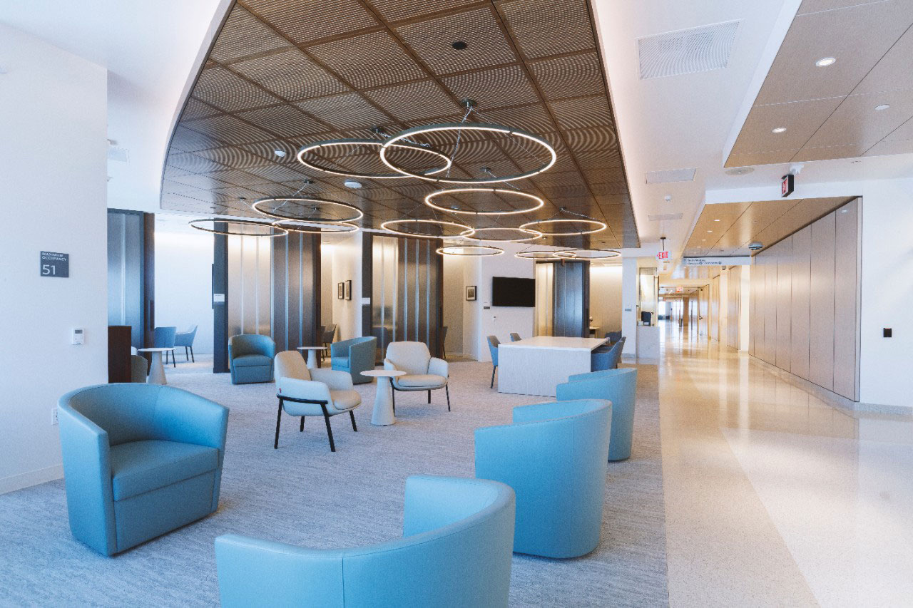
Adult waiting rooms are infused with soothing lighting and seats safely distanced from each other. Photo courtesy of Cedars-Sinai
Green design is also part of the Cedars-Sinai mission. The new Marina del Rey hospital is being designed to LEED Gold standards, but Triana says they’re also actively working to make their existing buildings more sustainable. “There’s a lot that can be done with existing buildings to improve the environment. Part of our social responsibility is not just looking ahead to new buildings but looking back at what we can do at our existing stock.”
Lighting across Cedars-Sinai–owned facilities has been updated to LED, with many fluorescent lights eliminated. Air conditioning turns off when not in use. They completed a successful water project, filtering underground water to use for industrial purposes like in their energy center cooling towers. The program saves millions of gallons of water and has garnered awards from the Los Angeles Department of Water and Power. “It’s those opportunities—not just a shiny new object like a new building—but there are more opportunities in these areas we would like to continue to explore,” Triana says. The underground water project also had a three-year payback.
Triana emphasizes that good planning in design doesn’t cost more and can save a lot of money in the long run. Part of Cedar-Sinai’s philosophy is to use what’s available—including natural light. “How can we utilize exterior windows and natural light and try to bring as much controlled daylight into a space, so you can reduce dependency on artificial lighting, even LEDs? How can you use what’s available to you in a passive way to design your space?”
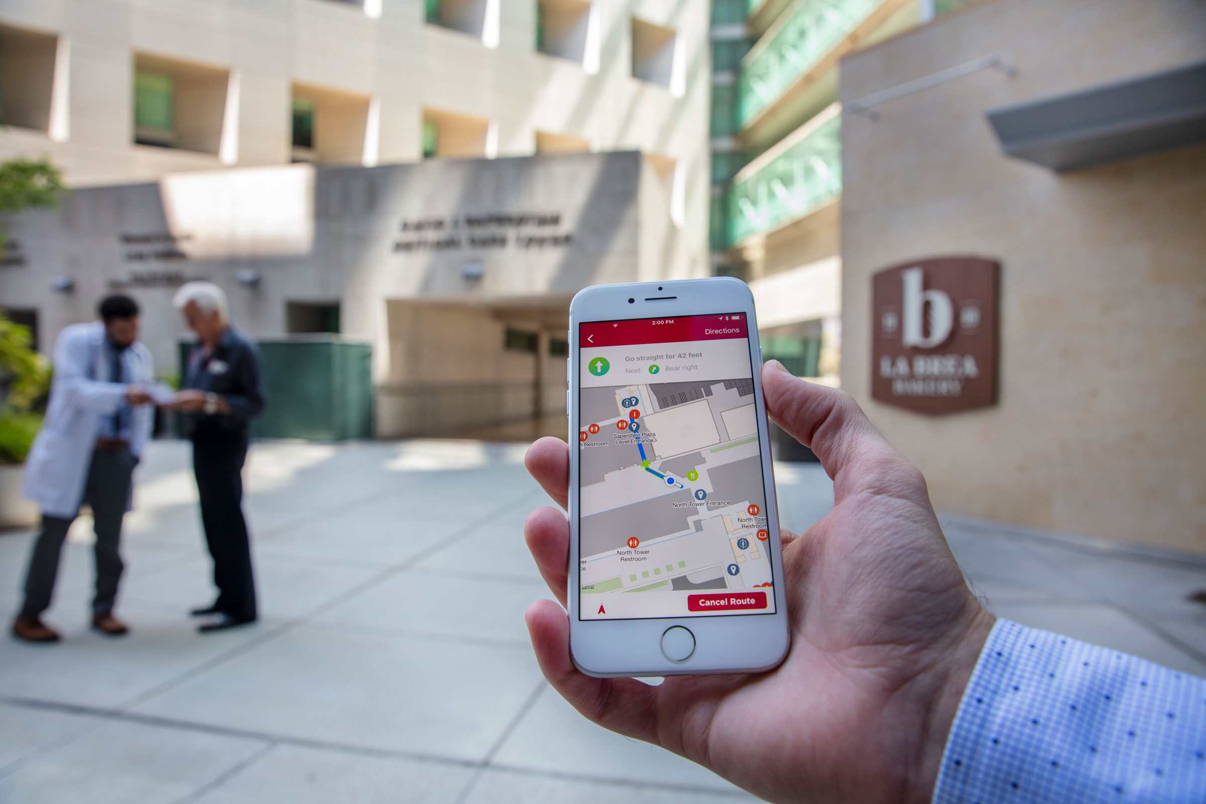
Wayfinding and what Cedars-Sinai calls intuitive access is another part of making health care facilities more patient-centric. “It goes beyond just signage,” Triana says. Cedars-Sinai even has an app. Photo courtesy of Cedars-Sinai
He uses his own office in LA as an example. When the team had an opportunity to design a new interior space for their department, they chose not to put offices along the perimeter window, where there are 360-degree views from the 20th floor. “We wanted to bring as much daylight as deep into the space as possible, so everybody had access to natural light and these spectacular views,” Triana says. “Designing these open floor plans you see in office spaces really do create a very pleasant environment. That’s all available to you—and it’s free if you think about it. You just have to design it right.”
They also chose simple materials, letting the beauty of the views and natural light do the work instead of competing with the area’s natural splendor. “We introduced some lighter colors into the space and simple artwork. It’s incredible. We walk people through our space and they think we spent a lot of money, but we didn’t,” he says. “You don’t need marble and stone and elaborate materials anymore in an office setting.”
The same conversation happens when designing across their facilities. At Marina del Rey, they were particularly interested in saving energy. They ultimately decided to use chilled beams, essentially running cold water piping instead of forcing cold air to cool the space. “Forcing air through a ceiling requires a higher floor height. When you’re using a chilled beam, it can be a lower floor height, so the overall height of the building is less—so you’re using less materials on the exterior wall and so forth.”
Future Health Care Design
Triana says Cedars-Sinai was the first to provide all private rooms in the 1970s to patients. “Now it’s part of the expectation, and in fact it’s part of safe clinical care.” He says the group’s decisions look at what most promotes health and recovery, and that’s evolved to include things like diversity of place and sustainability. “Our patients in Los Angeles demand these things of us.”
It’s hard to design a building in LA that’s not sustainable, as the city has committed to all new buildings being net zero carbon by 2030. “The net zero pledge made recently will further enhance that, but it’s just part of good design now—being responsible. All of those things didn’t used to be part of the vocabulary for patient care, but I think that’s what’s exciting about the intersection of architecture and its impact on health outcomes.”

