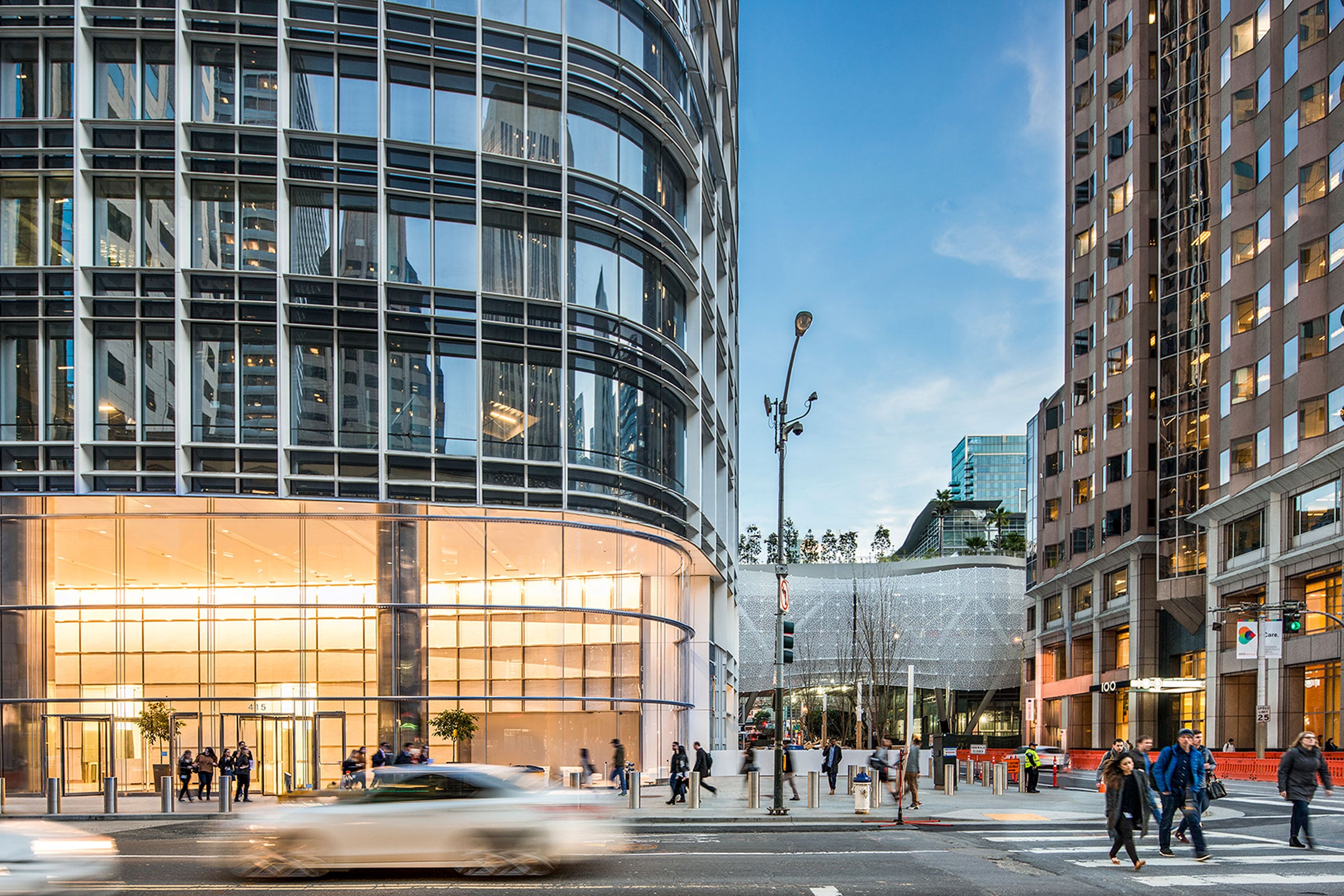
Salesforce Tower has 10 feet of uninterrupted glass windows on each floor, with metal sunshades on the exterior to reduce solar gain. Photo by Vittoria Zupicich
San Francisco is a city known for its landmarks—the Golden Gate Bridge, the Transamerica Pyramid Center, and Coit Tower to name a few. But one of the newest high-rises to grace the city’s skyline has transformed its center of gravity and provided a new focal point for the entire Bay Area.
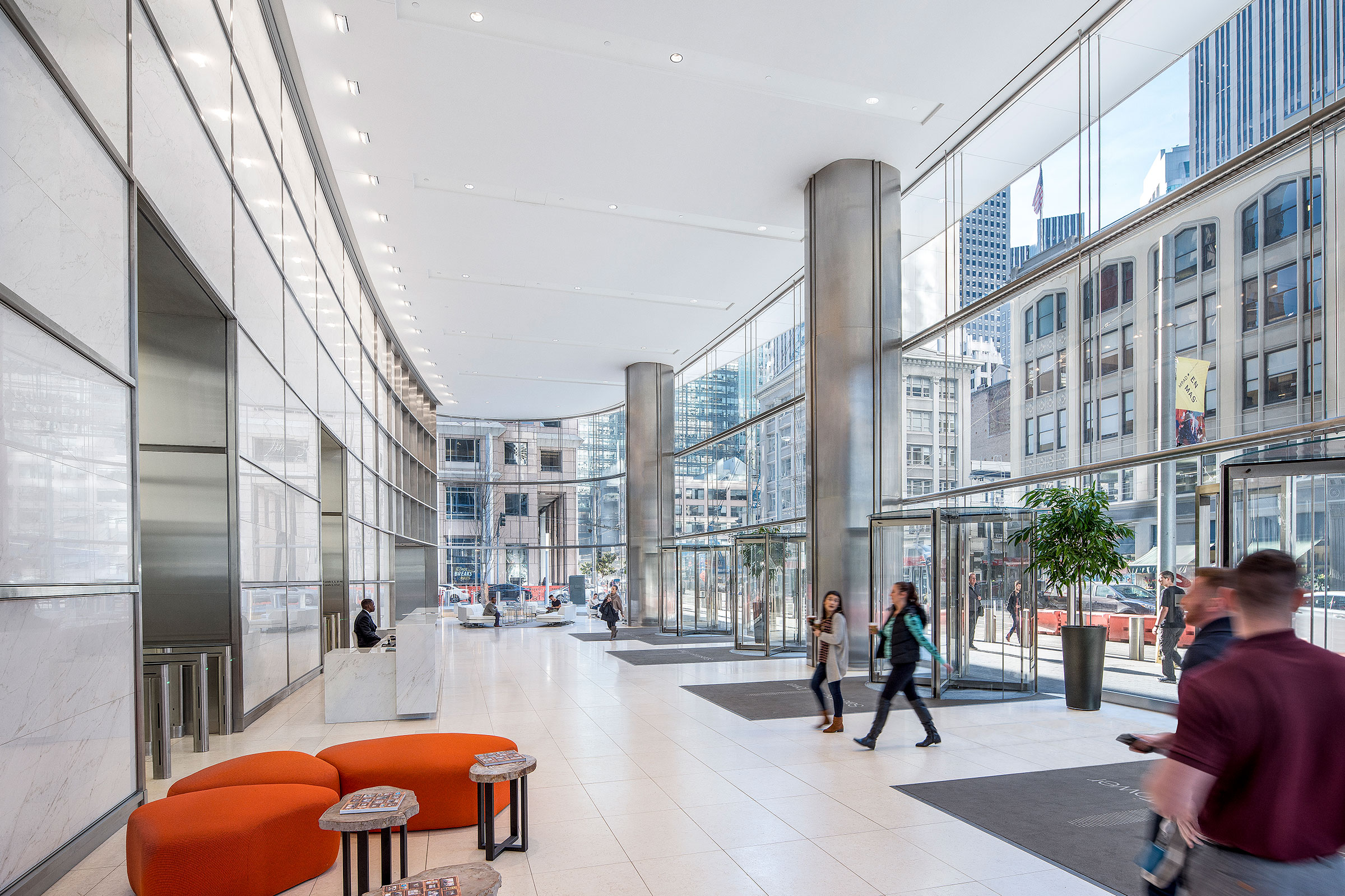
Photo by Vittoria Zupicich
Designed by Pelli Clarke Pelli Architects, Salesforce Tower was inaugurated as San Francisco’s tallest building with much fanfare in 2018. “When you have the opportunity to design the tallest building in a city, you have a civic and a social responsibility,” says Ed Dionne, principal at Pelli Clarke Pelli Architects. “That’s the mindset we took to this project.” And while it may be a new landmark for those who view the building from afar, Salesforce Tower’s interior space incorporates the flexible and sustainable features that embody the office of the future.
Breaking the Rules
Along with the Salesforce Transit Center that adjoins it, the tower was originally conceived in 2007 as part of a plan to revitalize the neighborhood around the now-demolished San Francisco Transbay Terminal. According to Dionne, the city and the Transbay Joint Powers Authority needed to go big with the office portion of the project in order to finance the transit center. There was just one problem. “In the 1970s the voters enacted a citywide height limit because they didn’t want San Francisco to turn into Manhattan,” Dionne says.
In order to gain public approval for removing the height limit, “the city and transit authority realized they needed to gain momentum behind the project, so they created a sort of spectacle out of the process,” Dionne says. This took the form of a highly publicized joint architect/developer competition to build the proposal. After many months of presentations and reiterations, and multiple rounds of competitor eliminations, Pelli Clarke Pelli and their development partner Hines were chosen. “What we had was a real opportunity to turn this into a functional, thriving neighborhood,” Dionne says.

Photo by Vittoria Zupicich
Inspiring Design
Nearly 13 years after the competition, Salesforce Tower finally soars over San Francisco, reaching an apex of 1,070 feet. The clear glass and bright metal exterior finishes combine to form a facade that changes in color throughout the day. In peak daylight the tower evokes the slender white obelisks that anchored the great cities of antiquity. In fact, the obelisk was a primary inspiration for Pelli Clarke Pelli. “We wanted to pay respects to and join the ranks of buildings like the Transamerica Center, giving an impression of a white tower sloping to reach lightly into the sky,” Dionne says.
SEE ALSO: Modular Office Solutions from SnapCab May Be Just What We Needed
The top 170 feet of the tower is unoccupied and features an art installation by San Francisco native James Campbell. This unprecedented array of 11,000 LED fixtures utilizes indirect light to display low-resolution color imagery across the peak of the building each night. Cameras across the city capture elements of urban life, which are then featured along the LEDs on rotation.
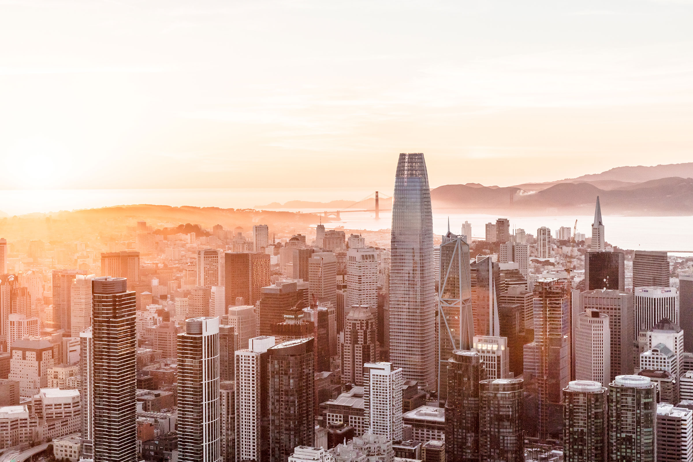
Photo by Jason O’Rear
Endless Possibility
Inside the tower is approximately 1.4 million square feet of office space, much of it currently occupied by the building’s namesake anchor tenant. And while the exterior design of the building was carefully curated to respect the surrounding cityscape, the interior was conceived as a blank slate that would remain flexible for tenants well into the future.
“We try to allow for as much flexibility as possible for tenants to lay out their space,” Dionne says. “Trends in office layout come and go. A building needs to have the ability to learn from the changing of these trends and allow all possible conceptions to happen within a space.”
For example, in the past large corner offices were a high priority, while companies of late have turned to value having extensive communal areas. In order to facilitate changing trends, a space must be free of obstacles. “What you don’t see [inside Salesforce Tower] is actually more important. There are no outriggers, or other things that would dictate how the space is used,” Dionne says. But regardless of the current trends in office design, “access to daylight will always be key.”
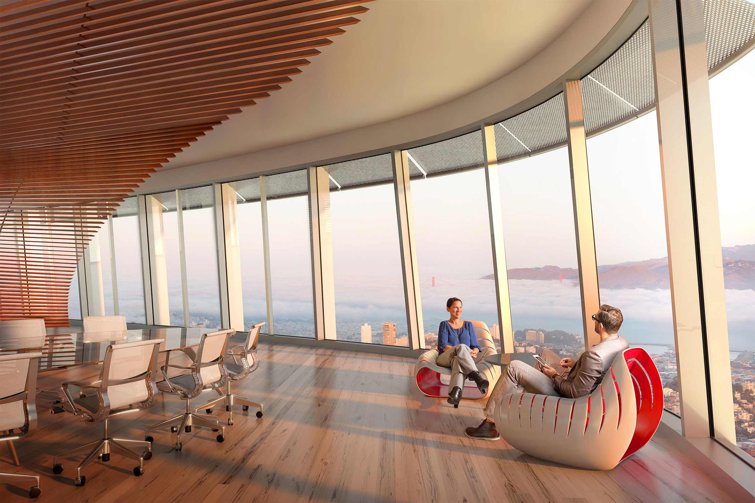
Inside Salesforce Tower is more than 1 million square feet of flexible office space. Photo by SteelBlue
Light & Air
Salesforce Tower features 10 feet of uninterrupted glass windows on each floor, complete with metal sunshades on the exterior that reduce solar gain and thus energy consumption. With LEED Platinum certification, the high-rise reaches the pinnacle of urban sustainability. “It’s also the largest backwater recycling project in the US,” Dionne says. And 100% of toilet and faucet water is recycled, reducing the building’s water footprint by 76%.
Access to fresh air was another priority for Pelli Clarke Pelli—both inside and outside the tower. High-efficiency air handlers bring fresh air into the building, where it’s filtered and distributed through a raised floor system. Unique to most high-rises, tenants of Salesforce Tower have direct access to a beautifully curated 5.4-acre urban park that sits atop the adjacent transit center. “The tower and the transit center are symbiotically linked, and together have transformed an entire neighborhood of one of our greatest cities.”
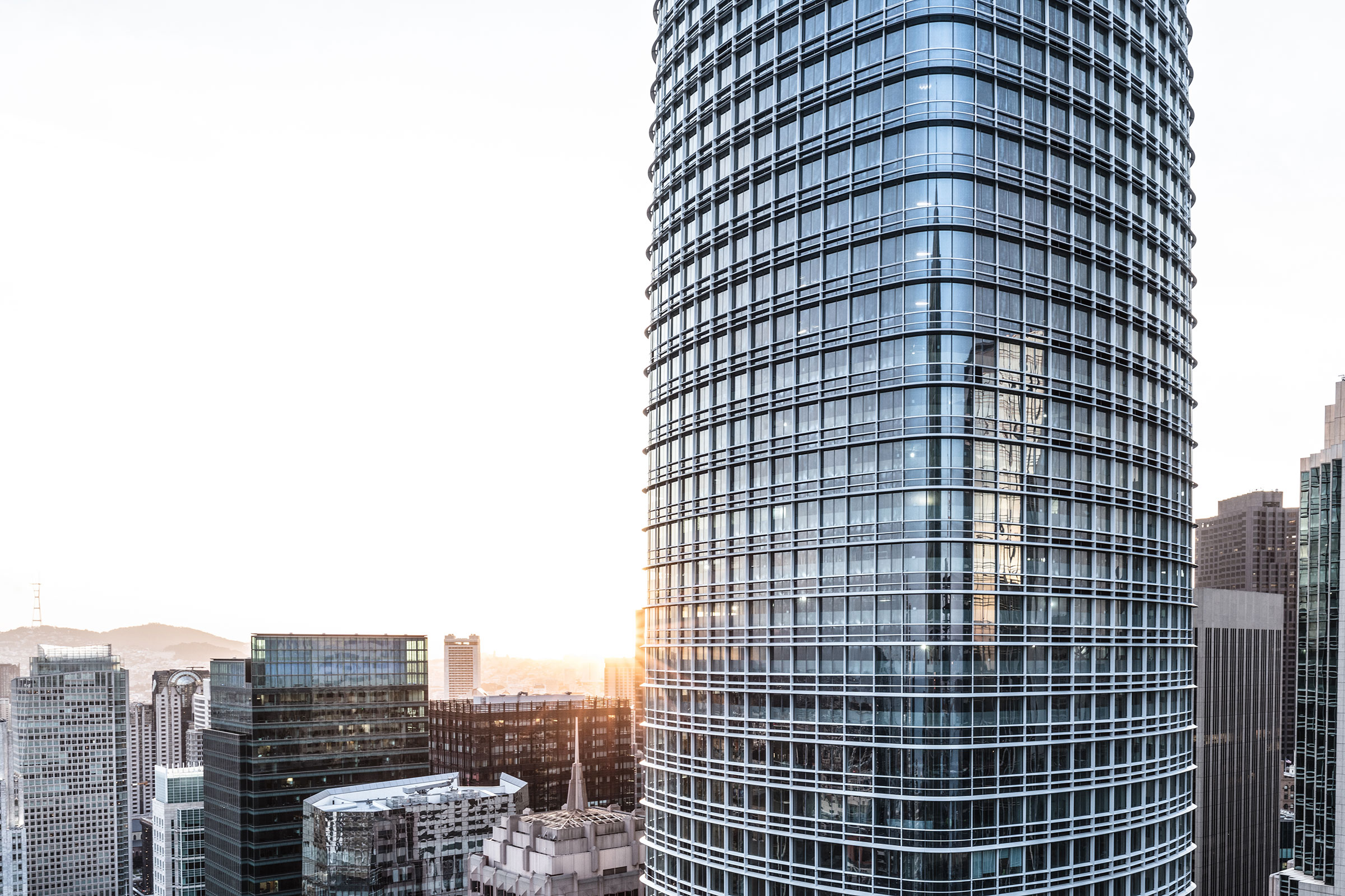
Photo by Jason O’Rear
Project: Sales Force Tower
Location: San Francisco
Completion: 2018
Size: 1.4 million square feet
Height: $121.6 million
Architect: Stantec, The Design Partnership
Owner/Developer: Boston Properties, Inc., Hines Interests LP
Civil Engineer: BKF Engineers
Structural Engineer: MKA Engineers
Contractor: Clark Construction and Hatheway Dwindle
Facade Consultant: Morrison Hershfield

