Story at a glance:
- The fundamentals of design in architecture differ project to project—there is no one-design-fits-all solution.
- Studio W Architects uses a three-step approach to streamline the design direction of every project.
- Using this approach, Studio W’s office redesign plays up the design principles of scale and form.
In this modern age where access to information is a mouse click away, one can encounter numerous design theories and a variety of fundamentals or principles of design in architecture. The design theories, principles, and fundamentals of design will differ from source-to-source, firm-to-firm, and even between individual designers.
With so many fundamentals of design to choose from—scale, color, form, pattern, hierarchy, texture, order, balance—it is inevitable to ask, “Why are there so many?” and “Which ones should I apply to my project?”
Although there is no simple answer, there is a logical explanation: Designers need a large set of parameters to generate ideas. By expanding one’s choices, the creativity level and potential of a creative mind also expand. It is like giving a child access to a 64-pack instead of an 8-pack of crayons. It increases the design possibilities exponentially, unlocks creativity, and ultimately makes it a more enjoyable process. A design solution is rarely one-size-fits-all, in the same way there is no one “right way” to color a coloring book.

Courtesy of Studio W Architects
Design fundamentals, much like crayons in that 64-pack, become the basis of design. A good designer can creatively mix, match, and integrate available options. These fundamental design decisions then visually manifest into a tangible solution for the client and, ideally, lead to the expected outcome: a great design.
Below are the basic trio of approaches we use at Studio W Architects that guide our design process with clients and help streamline the direction of design fundamentals:
1. Definition
Defining the problem and identifying what works and what does not work, which allows the designer to pick the appropriate approach to a solution.
2. Empathy
Understanding your audience, what they like and dislike, and to what they positively respond. Are they into color? Do they like grandeur and scale? Are they attracted to symmetry? Do they want something stylized or something simple? Do they gravitate towards an efficient or minimalist design?
3. Iteration
The need to provide multiple (at least two) design options to the client and explaining each option through the theories that have been applied. Accepting that a design can continuously change throughout the process because there is always an opportunity to improve on a design.

Courtesy of Studio W Architects
Design fundamentals should not be a hindrance to the profession of architecture. They are guiding principles that are part of the design process. Adopting those principles allows architects and designers to talk eloquently about designs without resorting to platitudes or hollow explanations to clients, nor should design principles be unyielding, as design constantly evolves. Even with a particular design, there will typically be multiple iterations before gaining final approval, and the applied fundamentals should be fluid enough to adapt to these changes.
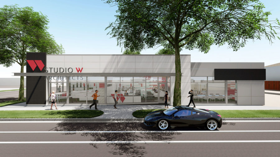
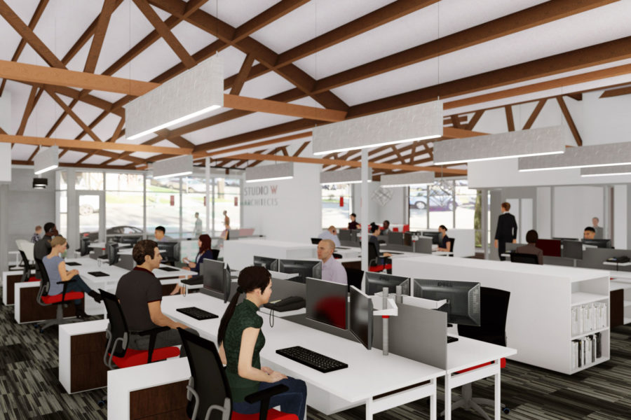
As an example, we adopted fundamental principles for the design of Studio W Architects’ Sacramento office building at 1930 H Street in midtown Sacramento. Our approach was to work within the context of the neighborhood in terms of scale and form.

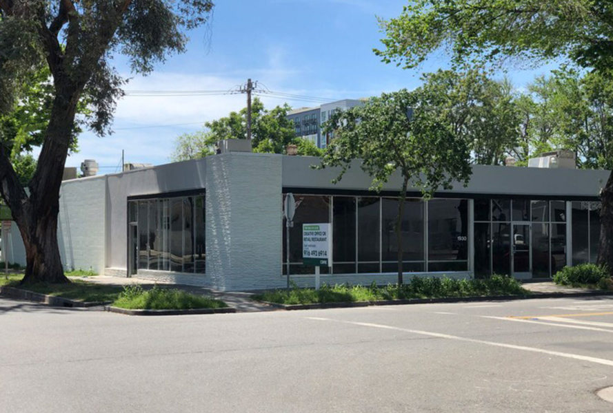
The existing building at 1930 H Street was built in the 1950s and categorically falls in the mid-century modern style with minimal building embellishments and a low-profile elevation. Courtesy of Studio W Architects
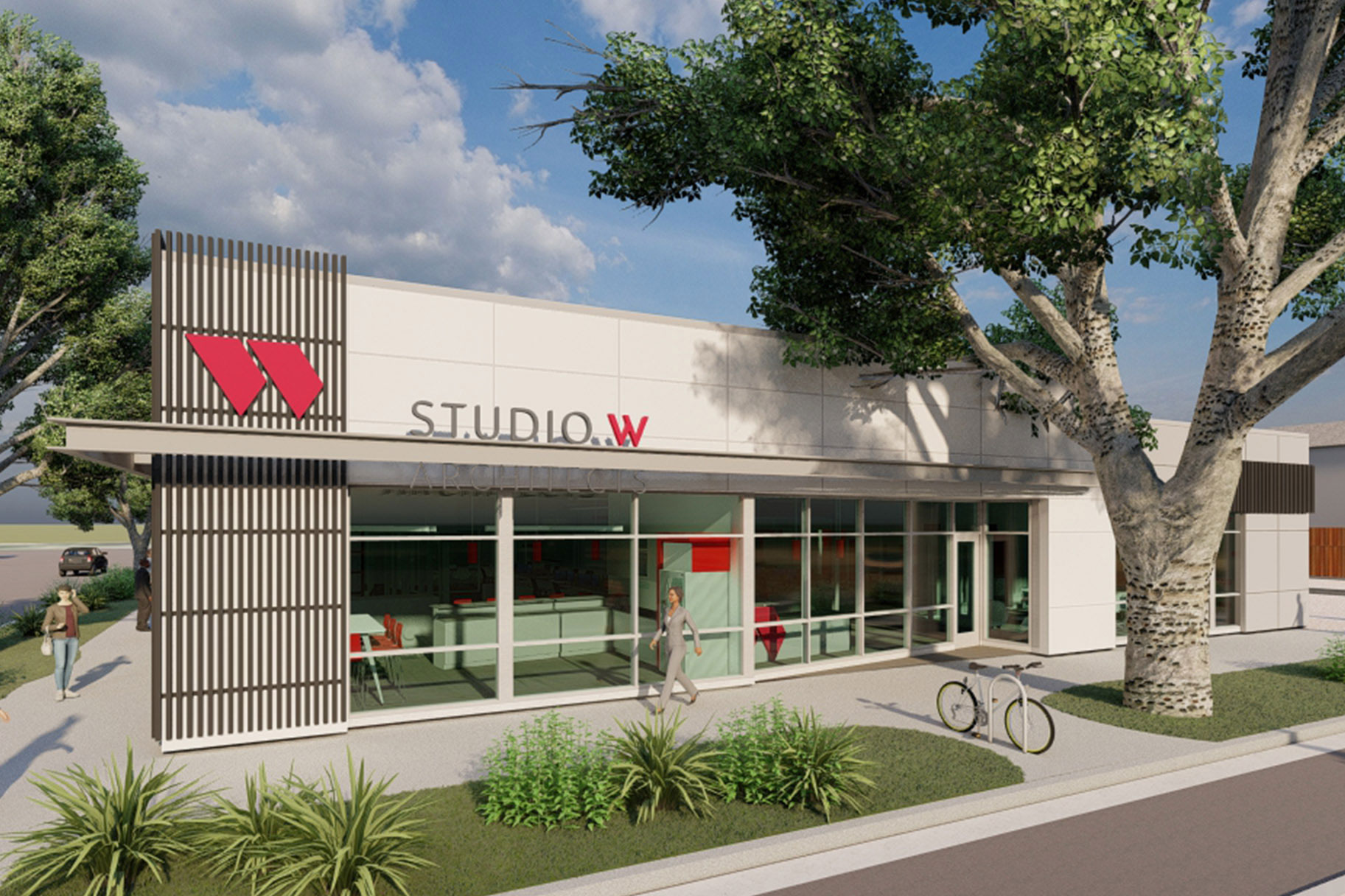
To enhance the facade, we played with the hierarchy of elements. The existing building was too flat all around. By increasing the parapet height and having it wrap around, helped define the corner. Likewise, this assisted in defining the entry. Consequently, it also presented an opportunity for signage. The addition of the asymmetric parapet anchored the building on the left side which created a balance with the large tree to the right.

