Story at a glance:
- The Gensler Seattle Office at 1200 6th Avenue underwent a redesign of its entire 15,000-square-foot fifth floor of the Park Place building.
- The new concept centers around the idea of a workshop where employees feel comfortable sharing ideas and experimenting.
- Flexible design was key, while repurposing furniture gave pieces that may have ended up in the landfill a new and exciting life.
Gensler has designed some of the most impressive and respected buildings in the world—from international airport projects to global headquarters to stadiums and more. Their designs influence the way we live and work today and, as the largest architecture firm in the world (both in revenue and number of architects, with offices in 50-plus cities worldwide), they are committed to steering the sustainability conversation.
Given that nearly two-thirds of the buildings that exist today will still exist in 2050, the path to design resilience must include adaptive reuse, write Gail Napell and Anne Bretaña on Gensler’s blog. By renovating existing buildings and repurposing materials, developers can decrease both the amount of carbon and the amount of debris and waste going into landfill, they write.
The time is now, according to Architecture 2030. “If we do not achieve a 65% reduction in total global emissions by 2030 we will have lost the opportunity to meet the 1.5/2 ℃ warming threshold and climate change will become irreversible. The immediate focus for embodied carbon reductions must therefore be on the next decade.”
Repurposing and reusing sustainable building materials and implementing flexible design are key to reducing global emissions. We recently talked to Gensler Seattle’s managing directors Ryan Haines and Kristin Jensen about how their recent office redesign is a testament to innovative adaptive reuse.
Gensler Seattle Office Gets a Makeover
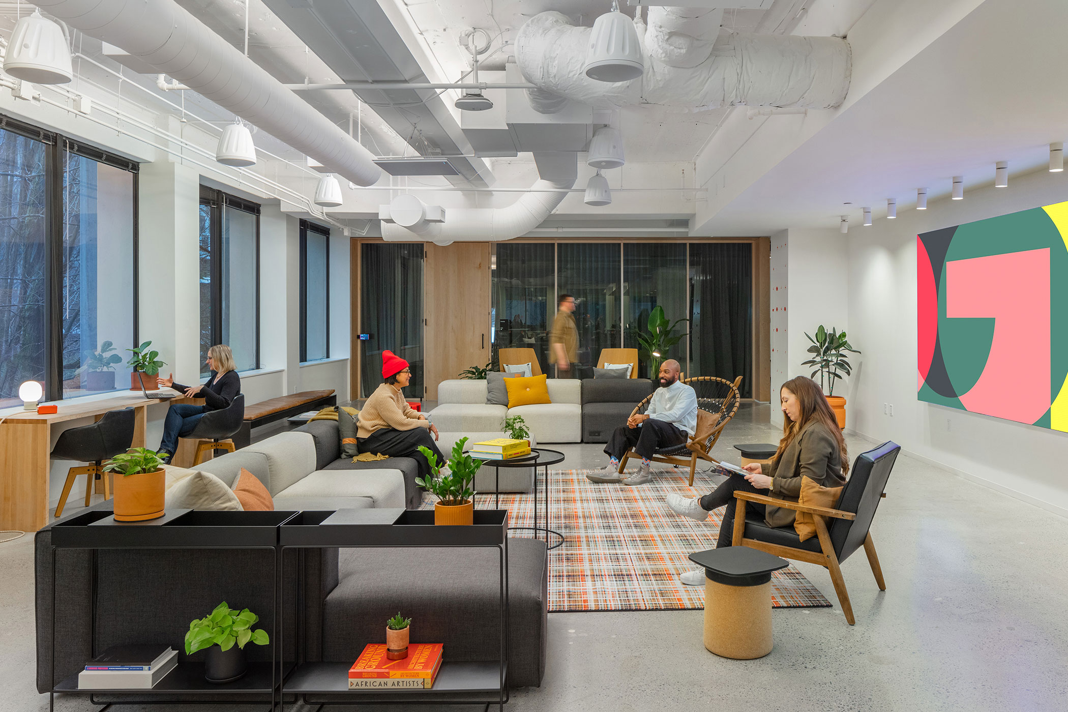
The Gensler Seattle team’s resilience goals resulted in diverting 22,039 pounds from the landfill and avoided 8.5 total metric tons of greenhouse gases. Photo by Heywood Chan Photography
It’s almost become expected—commercial interior designs replaced every 10 or even seven years. Interiors often have a much shorter “shelf life” than the buildings themselves, but it doesn’t have to be that way.
“Part of the resilience story is to not tear down the whole office,” Haines says, pointing to their own successful Seattle Gensler office renovation in 2023. He says the new office feels “recognizable but different,” with renewed vigor, excitement, and opportunity.
Gensler started talking about making significant changes in the Seattle office in 2017, as the team had grown and needs evolved. The way people worked was changing, and employees wanted different types of places to work and collaborate in.
Part of the resilience story is to not tear down the whole office.
“We implemented pilot studies and leveraged survey data about where employees best focus, collaborate, mentor, learn, and grow,” Haines says. They set out to design for flexibility with an emphasis on improved ways to work both remotely and together.
The team initially designed and documented a complete renovation of the 15,000-square-foot space, but the pandemic had other plans. New ways of working and financial constraints required reimagining the overall strategy. With limited resources, the team saw an opportunity for an even more resilient approach.
Instead of demolishing the entire floor, new space types and functionalities were integrated while minimizing environmental impact. Ultimately Gensler’s design team was able to reuse 99% of the carpeting, 63% of ceilings, 62% of furniture (reused or salvaged from vintage shops), 60% of light fixtures, and 44% of walls—significantly reducing waste as well as the embodied carbon associated with making new products. Ample recycling and composting and an efficient HVAC system added to the team’s environmentally focused goals.
The Mission
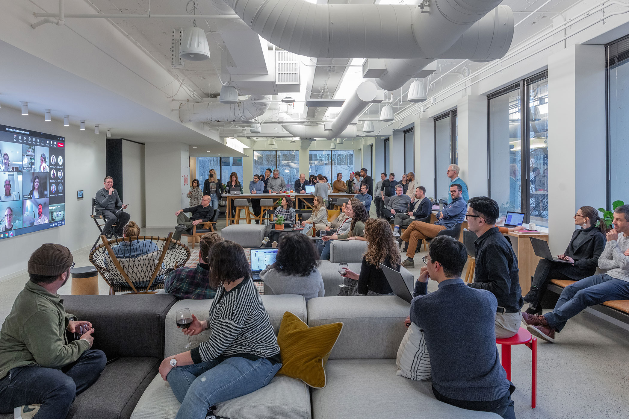
Merge is a large social space outfitted with the latest technology so staff can work, collaborate, and socialize in person or virtually on a 118-by-66.5-inch screen. Photo by Heywood Chan Photography
“It started out as a means to expand our space slightly and make the office more efficient overall,” Jensen says. Before the pandemic the Seattle team was using nearly 90% of the fifth floor of the Park Place building. They expanded their lease to encompass the entire floor and planned to be more efficient by utilizing the corridors and common areas, but when Covid struck, they realized they needed to pivot. Resiliency and efficiency remained key goals, but the team began to reconsider what work could look like.
“We were already on an activity-based workplace path, but how is that amplified by hybrid work and new levels of virtual engagement that didn’t exist before?” Jensen says. They doubled down on sustainability. “It was a heightened goal and an opportunity we knew would be achievable by reusing more things. That would make it more cost effective and more sustainable at the same time.”
Haines says the design benefits were many. “There are multiple reasons to not just tear everything out and start from scratch. Cost is one, carbon footprint, and throwing away all that in the waste stream is another.”
Collaboration Meets Resilience with Flexible Spaces
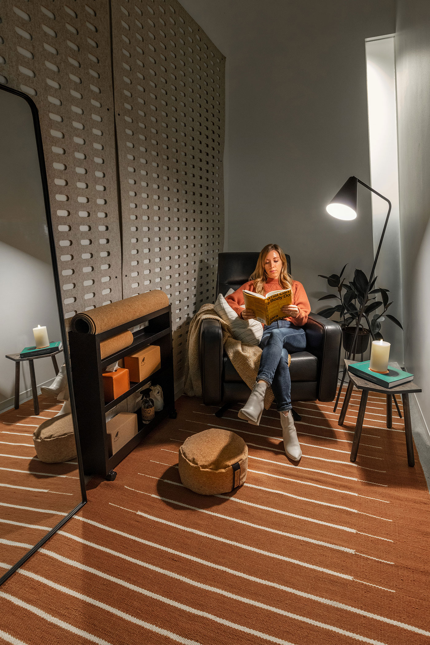
- Inside the Wellness Room at the Gensler Seattle office. Photo by Heywood Chan Photography
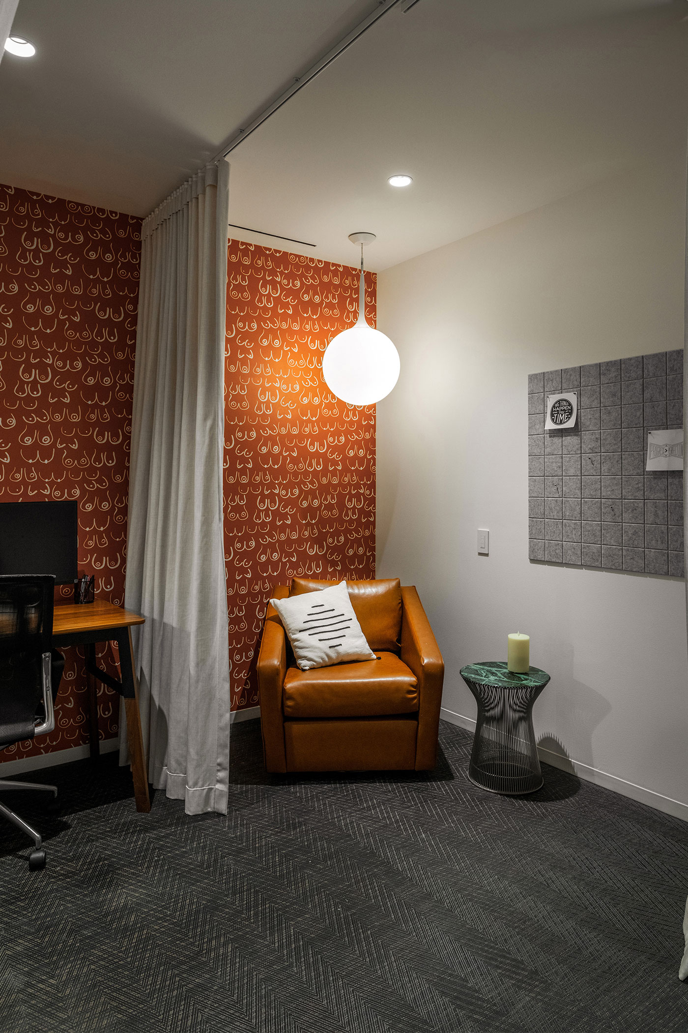
- Inside the Mother’s Room at the Gensler Seattle office. Photo by Heywood Chan Photography
Activity-based work often means a greater sense of openness, Haines says. “Private office-sized spaces” convert nicely to small huddle or focus rooms, phone rooms, and other more modern and flexible workspace. “There’s a propensity to be able to do that, but you have to have the wherewithal to know in the design process to not just wipe things clean and start from scratch,” he says. “It’s looking at how to repurpose those spaces in an effective way while still meeting the requirements of a client or, in our case, our own desire to work differently.”
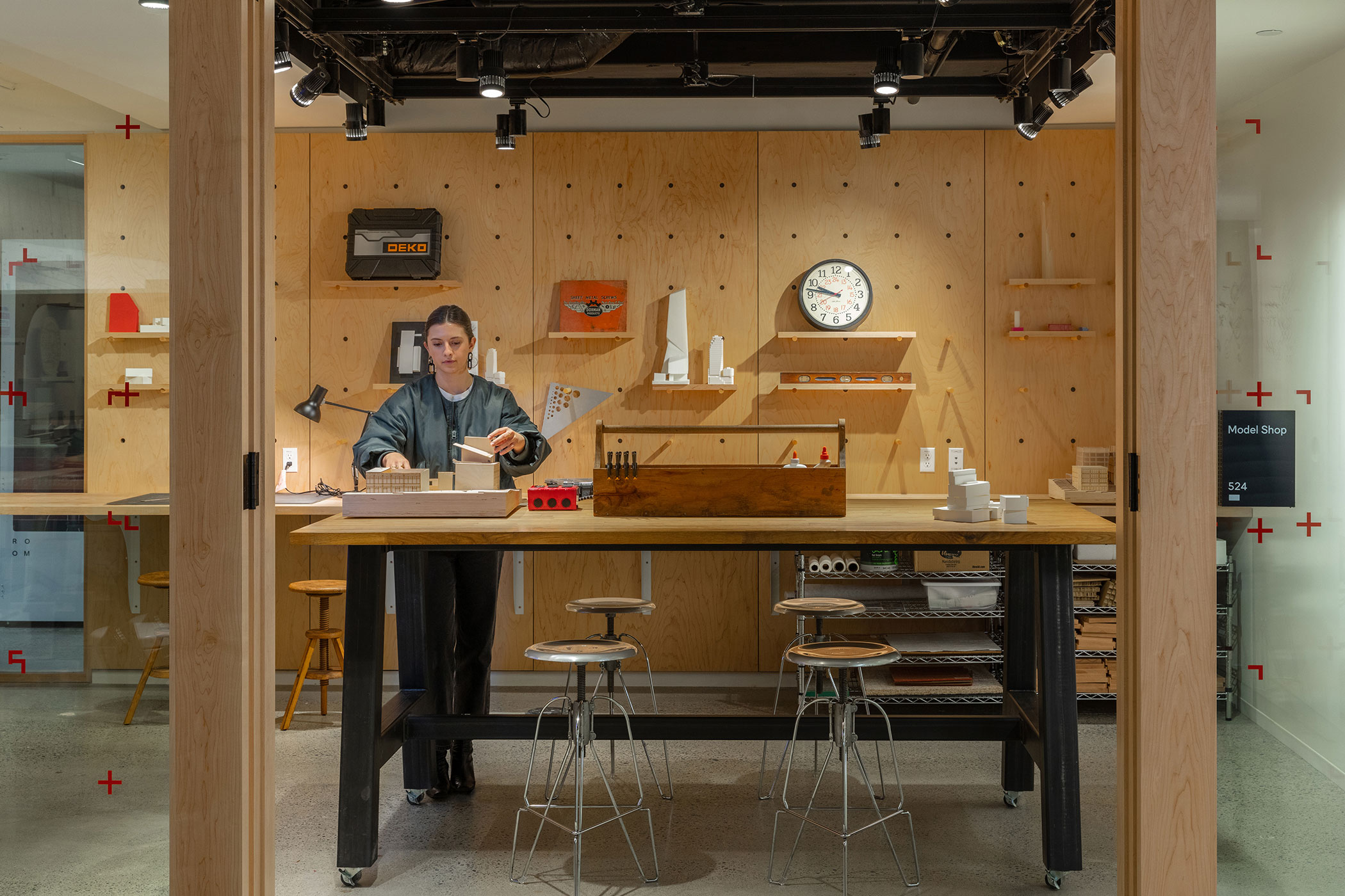
The light-filled perimeter of the office was one of several conference rooms before—a fairly standard space just a few years ago. “We added that plywood back wall and changed the furniture so much more is on wheels,” Haines says. The now flexible workspace is reinforced by the wood aesthetic that carried over from the old project and emphasizes the “workshop” feel.
“Our new office concept centers around the idea of a Workshop—a non-precious, scrappy space to experiment, tinker, share ideas, and evolve,” Jensen says. “We envisioned the office as a center of activity to collaborate and shape the culture while fulfilling the critical human need of socializing and developing meaningful relationships.”
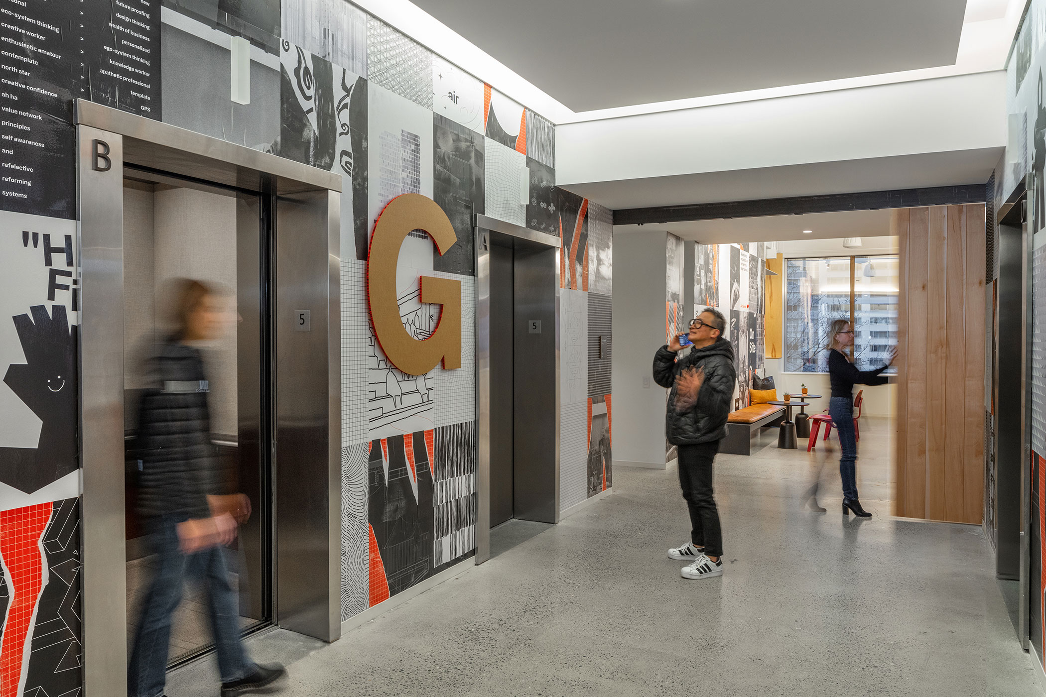
From the moment you get off the elevator you know you’re in the Gensler Seattle office. The elevator lobby is branded with graphics as an evolving display of sketches, designs, and musings. Photo by Heywood Chan Photography
Haines says the plywood goes a long way to reinforcing this idea. “You’re not seeing really expensive wall materials and such. And the movable shelving can live and change over time in terms of what’s on the walls, what’s on the shelf, what’s important to staff, what’s relevant. It’s a much more flexible, non-precious aesthetic overall. Everything is on wheels in the whole space—including in the kitchen.”
Spaces can change dramatically based on needs, say, if Gensler is hosting a large event versus a more intimate meeting. More comfortable lounge furniture adds to the flexible, collaborative feeling while providing the types of work opportunities you can’t get from home.
The office went from having nearly a one-to-one ratio of desks to people to a space with essentially two zones, Jensen says. Employees (there are more than 100) can work at one of the 40-some sit-stand desks with monitors when they need to focus on more individual work, or they can spend time in one of the more open areas—like Merge, the Nest, lab areas, lounge areas, the model shop, or even the podcast booth. There’s also a wellness room where you can meditate or just find a moment of quiet, a mother’s room with space for multiple mothers, and individual phone booths.
The large area called Merge is home to a giant monitor where anyone can call in remotely to work with the team onsite and feel more connected. “That’s enabled a lot of content sharing,” Haines says. “It’s also a really meaningful part of the experience of presenters in our space. You can have successful engagements instead of when, even if you have a big space with a relatively big flat screen panel, it’s still pretty unreasonable for 90% of the people in the room. Investing in that large screen makes the content much more immersive and accessible. That’s been a good investment.”
Accommodating Different Work Styles
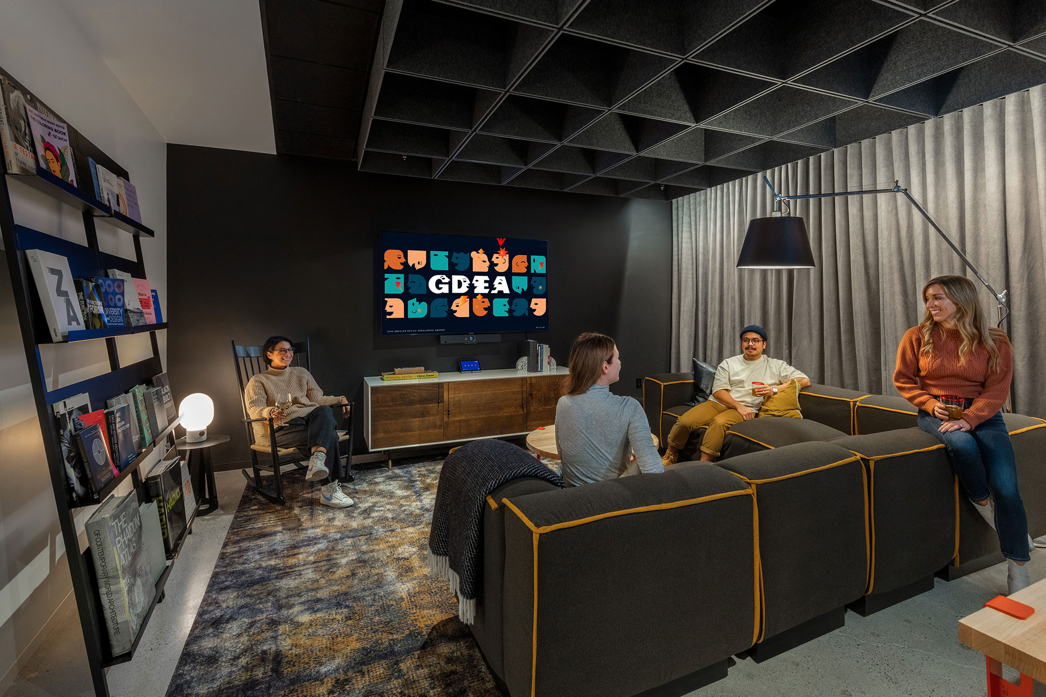
The Nest is another meeting or work area with lower lighting and a more comfortable living room style. Photo by Heywood Chan Photography
Gensler has long had modern video conferencing in key spaces, but the need for most firms grew even more after the pandemic. “We all got more savvy with AV and tech and Teams and Zoom and what have you,” Haines says. The Seattle office focused on exploring the differences and needs in tech and collaboration whether someone was at home or in the office. They wanted to ensure, for example, that anyone calling into a meeting didn’t feel left out. “How do you make that meeting experience, even if we are in the office, an enjoyable experience and a fundamentally fair experience?”
The Gensler design team wanted to remove that old experience of being the ignored person on a call when not in the room. “There was a tremendous amount of potential for that to play out as a return of that experience, and that’s not equitable. It also penalizes those who are quieter or have other diverse considerations to consider,” Haines says. “That doesn’t make them an ineffective member of the team.”
They set up dual screens to ensure that even while sharing content you can see everyone’s faces clearly. Haines says the ability to see and read body language was key, and top-notch lighting, cameras, and mics were crucial. “There’s always room to keep innovating in that space, but ultimately we’re trying to make the hybrid experience relatively stress-free so you can come into the office and feel engaged in those interactions.”
Staff can also find a quieter place to work called the Nest. There lights are kept fairly dim. “People go in there if they prefer a quieter, darker space,” Jensen says.
Haines says the Nest was designed to be moody. At one point it was even called the Speakeasy. Once people started coming into the office, though, they realized staff didn’t just want to hang out there; they wanted to work there on their laptops, away from other well-lit spaces at times.
“It gives some reprieve. That is one of the spaces that really resonates with people that you don’t see in many office spaces. You can almost feel people’s blood pressure go down when they walk in. There’s something to be learned big picture there,” Haines says. It can also be turned into a fully functional meeting room if needed.
Making More Sustainable Choices
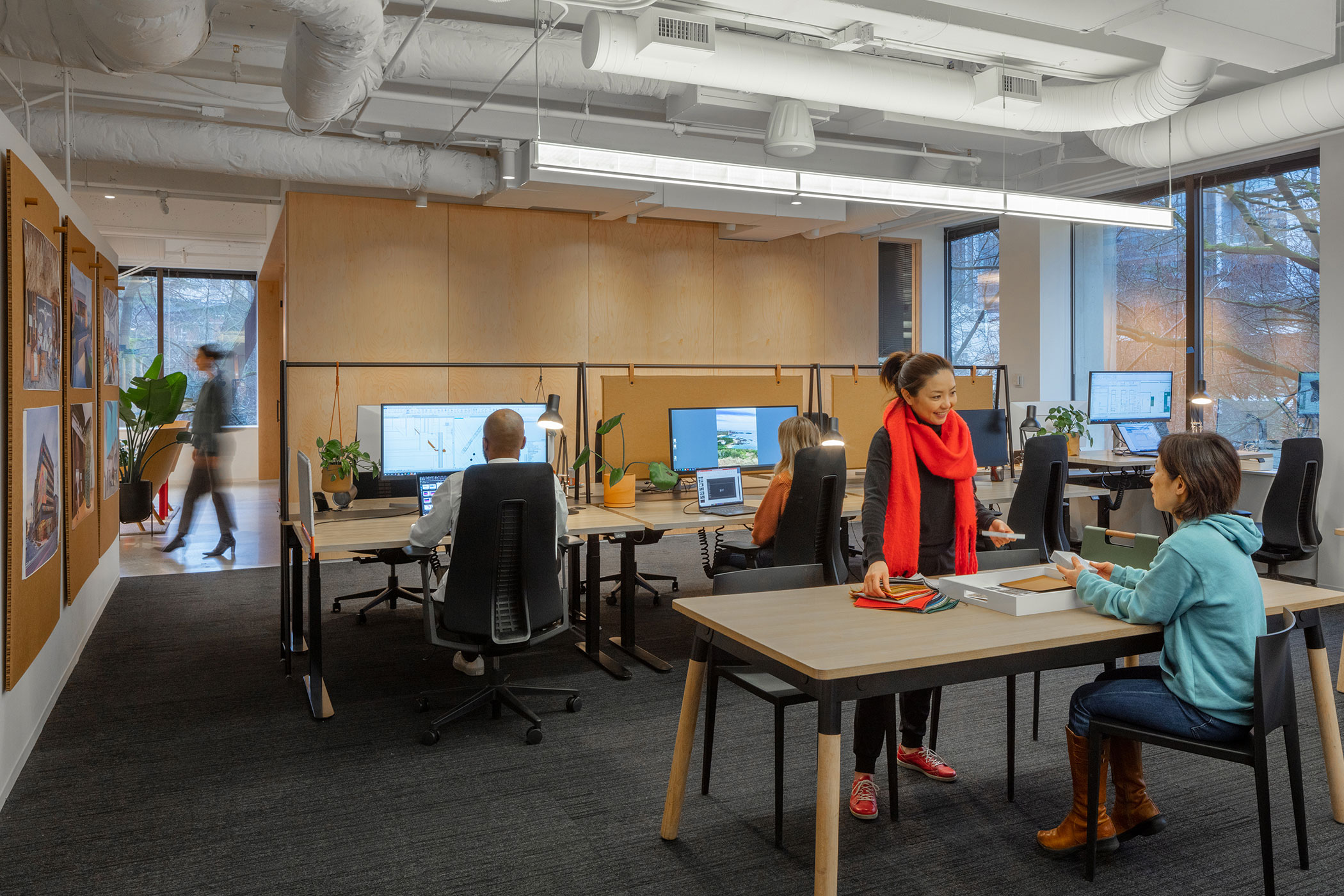
Traditional workstations with ergonomic sit-stand desks are mixed with collaboration tables. Photo by Heywood Chan Photography
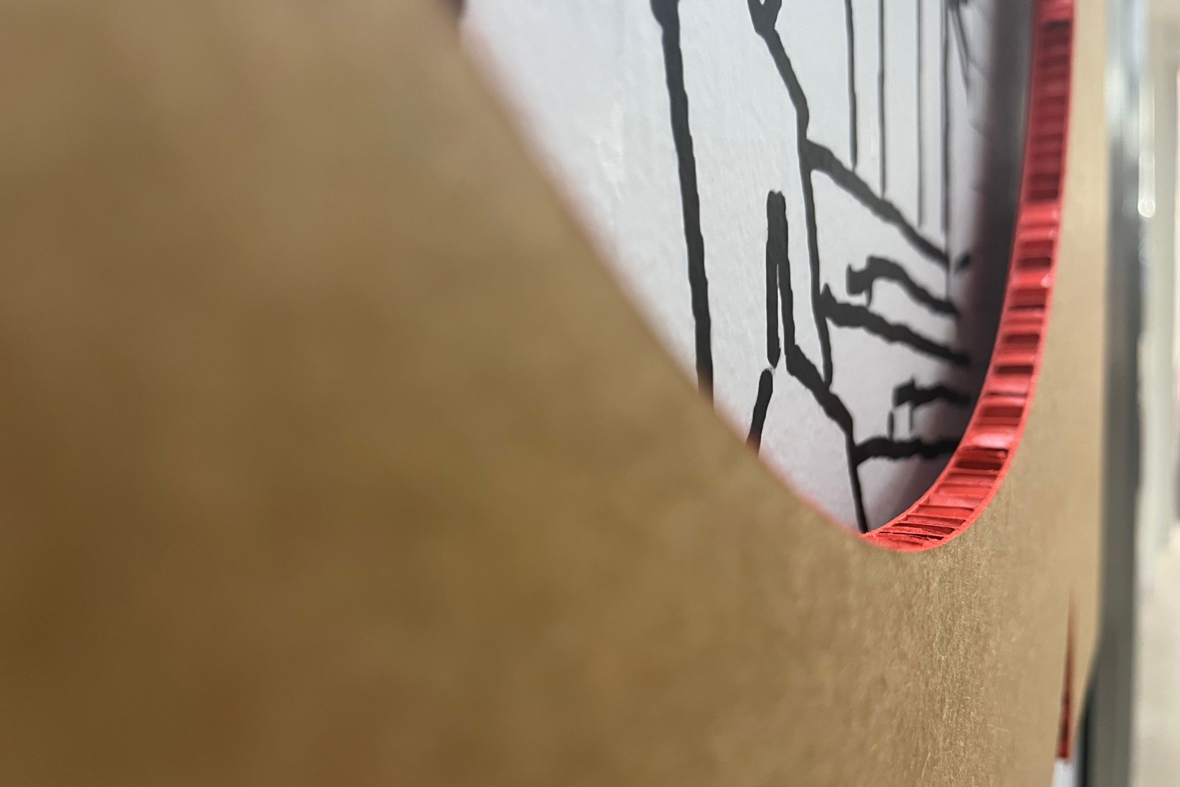
Net-positive embodied carbon branding and signage were created by the Gensler Brand team. Photo by Heywood Chan Photography
Much of the furniture across the project was repurposed, refinished, or upgraded to extend its useful life, Jensen says. The design team even sourced vintage pieces like a bar they refinished and painted matte black for the Nest. They re-cushioned mid-century modern chairs from the thrift store. Old tables from Gensler’s San Francisco office were refinished and given new life in Seattle, too. “We’ve had those tables for more than 10 years,” Jensen says.
The “workshop” feel extends across the entire floor. “Because it’s an area that’s non-precious it didn’t require everything to be so perfect. You don’t have to have four matching chairs for it to work,” Jensen says. “It exudes this ability to be eclectic, which suits the reuse story.”
Part of the resilience story is also clear in Gensler’s branding and signage. All of the graphics are wheatpasted, with posters of sketches, screenshots, and musings lining the entry walls. Haines says the walls provide a snapshot of the office culture at any moment and keep the space fresh at low cost. Recyclable cardboard was chosen for code and wayfinding signage, with simple braille tape that reinforces the theme and minimized carbon. “It’s completely compostable, and it changes over time in a very unconscious kind of ‘flyer on the telephone pole’ kind of way. I like the expressiveness of that and the resilience story behind it,” he says.

