Story at a glance:
- The California House is designed as a glass pavilion split into three main zones.
- After one year of use, the house generates more electricity than it uses.
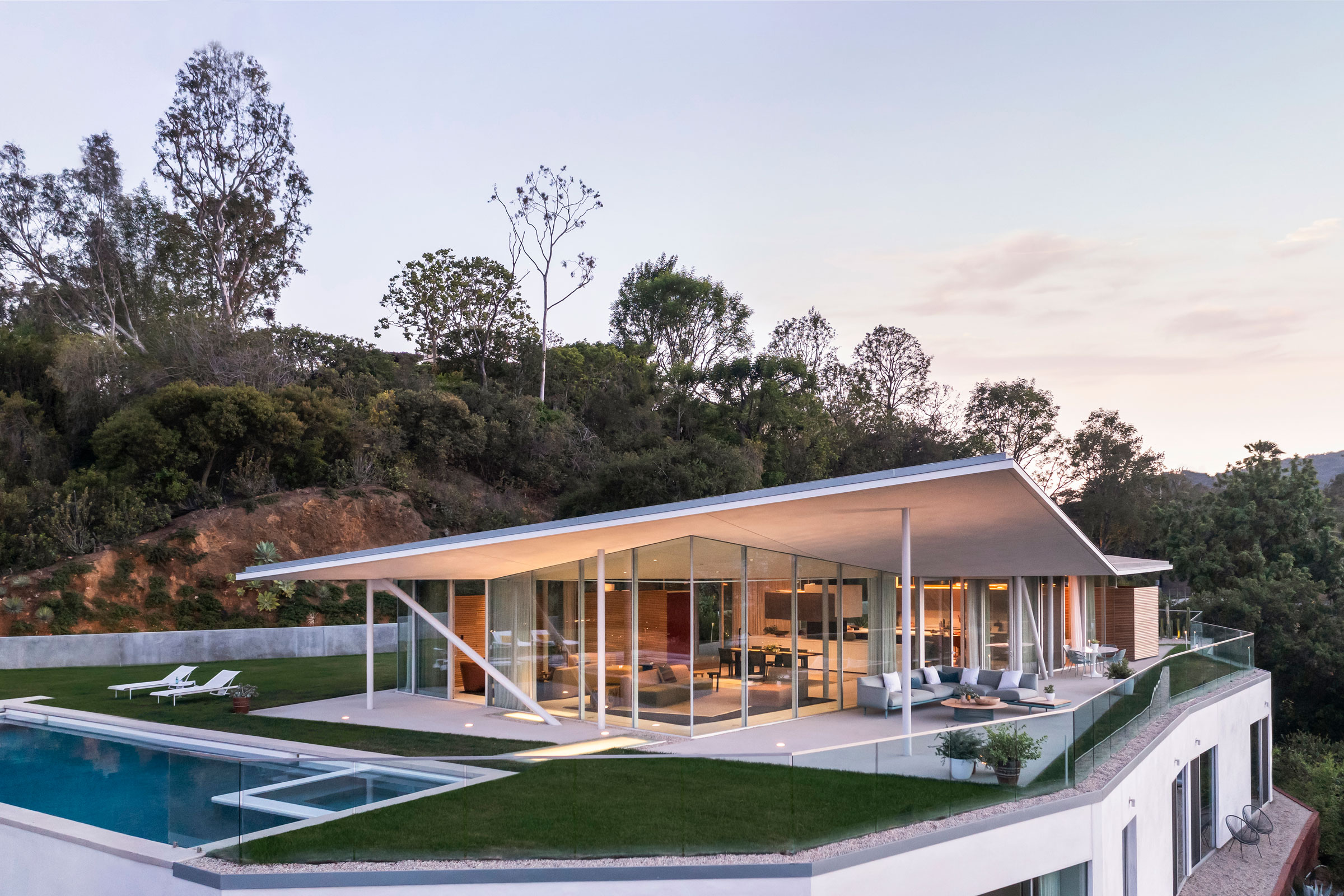
Upon arrival down a private road, the California House is approachable on the horizon with an angular roofline that continues the same lines as the distant and surrounding hills. The glass pavilion evokes memories of mid-century case study architecture as seen through a modern lens, and belies a hidden house beneath that is sculpted into the hillside.
California House is a modern feat of design and engineering yet appears to be effortlessly simple, proving the notion that so often simplicity is the most complex thing to achieve. From the moment I visited the site, I envisioned a house that would be informed by the contours of the surrounding landscape, sitting on over an acre of steep hillside land that abuts Santa Monica Conservancy wildlands.
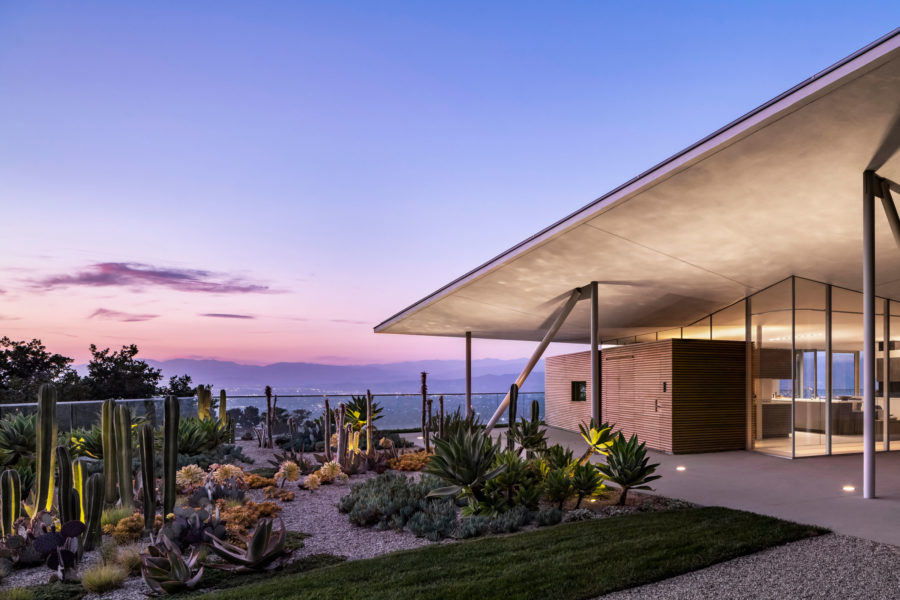
The California House is a modern interpretation of case study architecture. The modest glass pavilion with floating roof belies a hidden house below. Photo by Paul Vu Photography
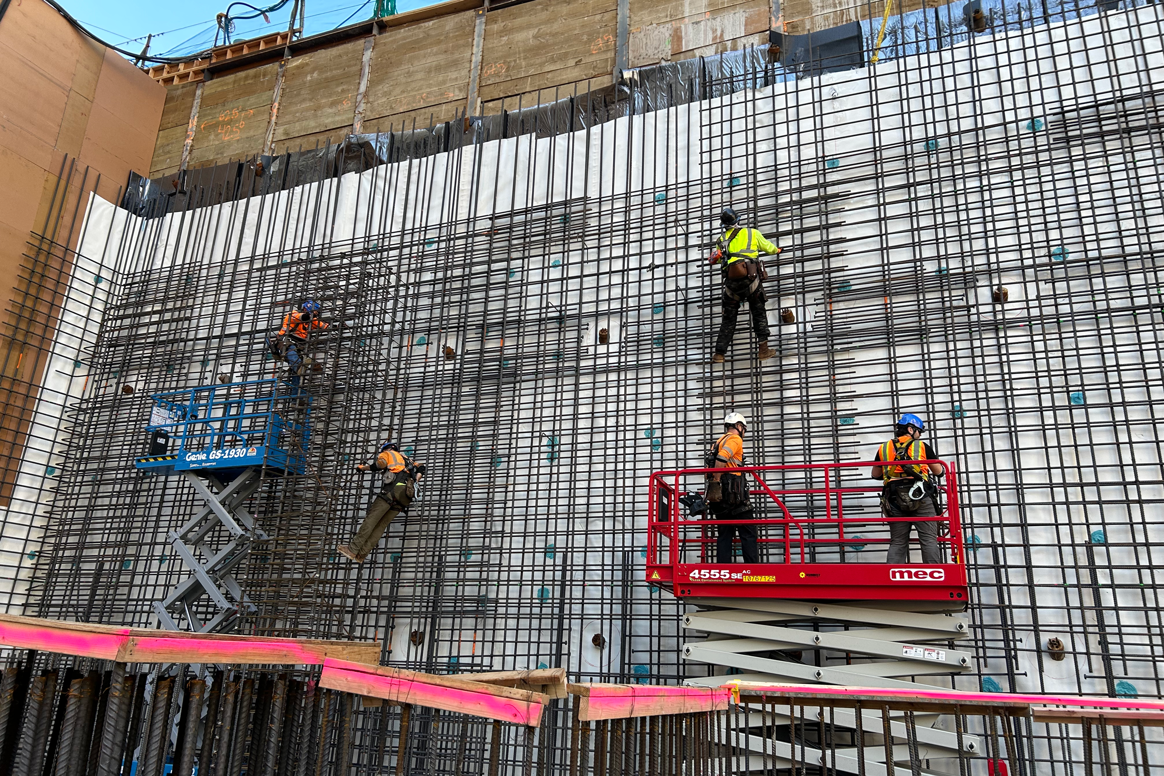
Before building the house, GLUCK+ excavated the site, sculpting the landscape and moving enormous amounts of earth rather than trucking it offsite, a creative work around for complicated local building ordinances. Once the land was reshaped, GLUCK+ built a flat plinth that is secured with 30-foot-deep concrete piles, not unlike a bridge or a roadway.
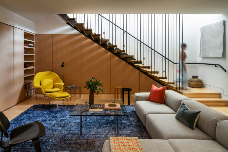
Photo by Paul Vu Photography
The glass pavilion houses all of the public programs of the house, which are divided into three main zones. The living space offers expansive views and opens onto shaded terraces along three sides. A sculptural pillar at the center of the space is the only point of connection between the floor and the ceiling, serving as storage and a graceful way to hide the home’s electrical wiring. Everywhere else the ceiling floats above floor-to-ceiling glass windows.
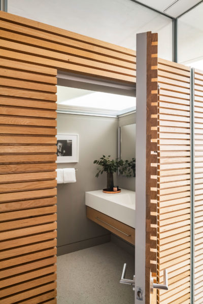
Steel pillars around the perimeter of the pavilion provide the structural skeleton for what is otherwise a weightless and light-filled space. The open kitchen flows into an informal dining space that the family uses as the daily meeting space. Behind the main kitchen block, a butler galley hides the fridges, a small office, a powder room, and ample pantries and storage.
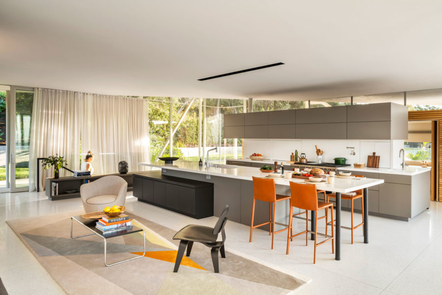
Photo by Paul Vu Photography
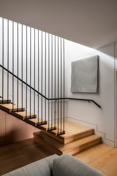
On the lower level, the hidden house beneath hosts private spaces, including bedrooms, offices, family room, a private screening room, and access to the garage and gym. Careful orientation on a slightly different axis to the upper level gives the private spaces on the lower level expansive views and access to the outdoors via private terraces and a garden path that leads back up to the main pool deck and garden.
- Photo by Paul Vu Photography
- Photo by Paul Vu Photography
While performative aspects of the house were not necessarily part of the initial conversations with the client, GLUCK+ makes sustainability an intrinsic part of all of its designs. The folded overhanging roof was designed to create shade at any point in the day and offers enough space to discreetly house solar panels. Generated electricity can be bought and sold to the grid based on need. Large sliding glass doors allow for cross-ventilation. Thermal mass of earth helps insulate the lower level of the home and regulate temperature. The house is carefully zoned, allowing separate HVAC systems to remain off for large parts of the year. All lighting in the house is LED, and the garage hosts an electric car charger that acts as an emergency generator. Stormwater is collected and used for drip irrigation.
The proof is in the pudding, or in this case, the monthly bills. After one year of use, the house generates more electricity than it uses.
California House is a deceptively simple house with incredibly complex underpinnings, and the mastery is in making it all look so easy.

