Photo by Mark Herboth
Health care facilities meet the adapting needs of patients and physicians.
1. UC Gardner Neuroscience Institute by Perkins and Will
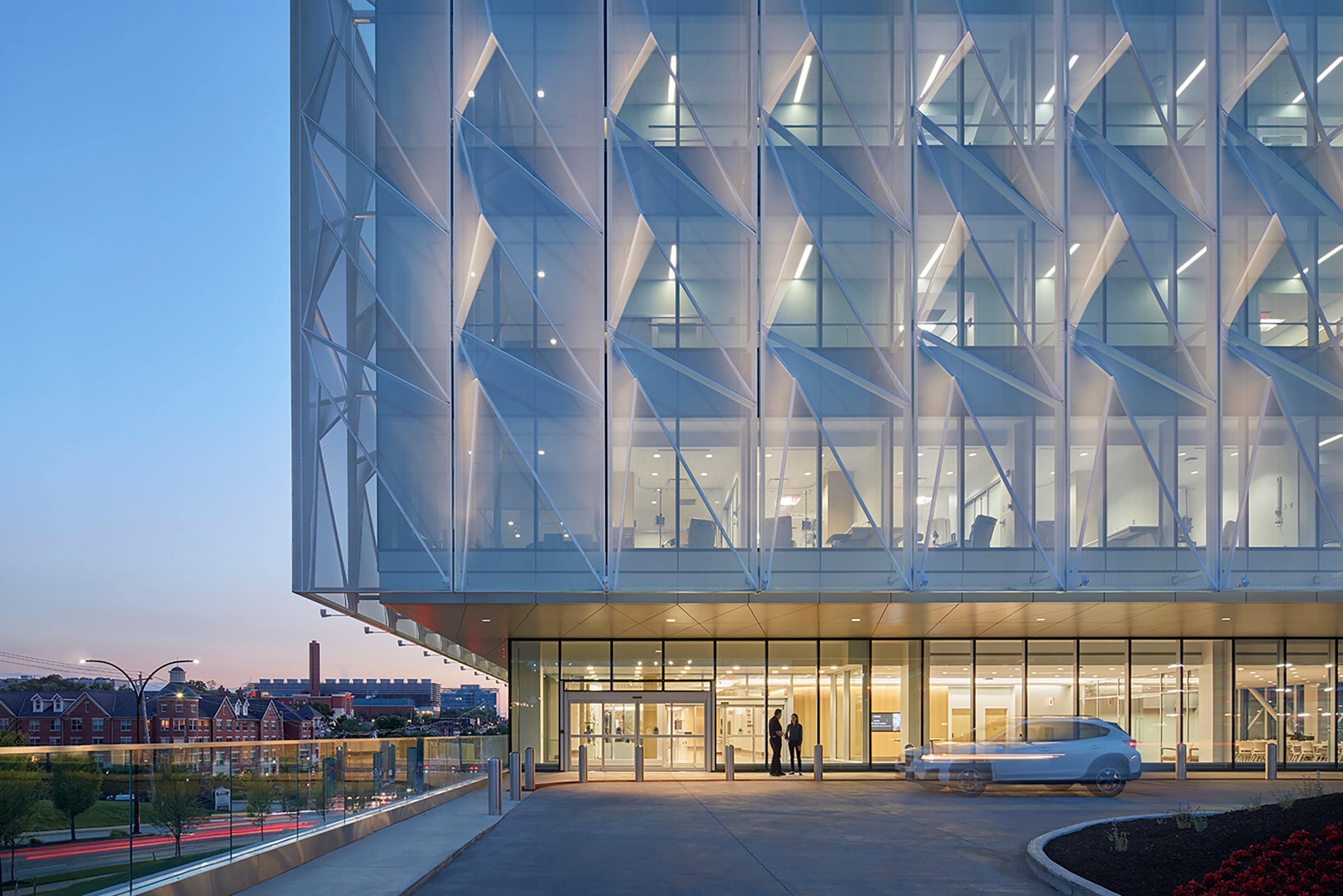
Jerry Johnson and Amy Sickeler of Perkins and Will combined their shared interest in health care, education, and research design to deliver a patient-centered facility for the University of Cincinnati Gardner Neuroscience Institute. The duo saw past the vacant 1970s hotel and was inspired by the site’s biggest challenge—a steep slope that spans the entire city block.
The main vision—to create a place for people to gather—came from the Gardner family, who wanted to have a home for patients, staff, and clinicians to learn about neurological disorders. The Gardner’s vision became a barometer for Johnson and Sickeler’s design discussions, and the team was able to bring 15 centers of excellence previously scattered across UC Health’s campus into one central facility.
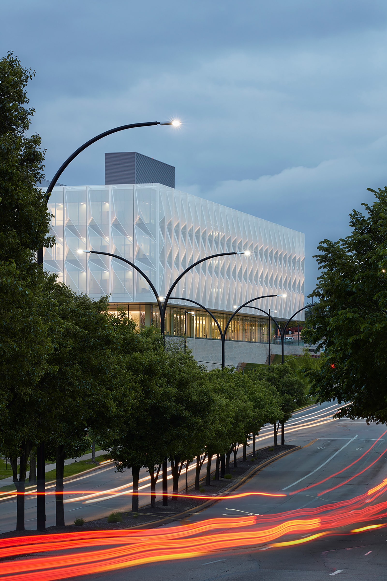
Photo by Mark Herboth
Johnson describes the design as “a simple glass box on a limestone plinth.” But the simplistic design was intentional, and it checked several non-negotiable’s for the patient advisory group, like the 80,000-square-foot parking facility that allows patients to go right from their parking spot to the appropriate clinical floor, individual bathroom stalls with sliding doors for mobility needs, and geometric tensile mesh around the building’s exterior that filters daylight for patients who are sensitive to high-contrast light. “It’s all just design,” Sickeler says. “It’s taking a problem and trying to make spaces better.”
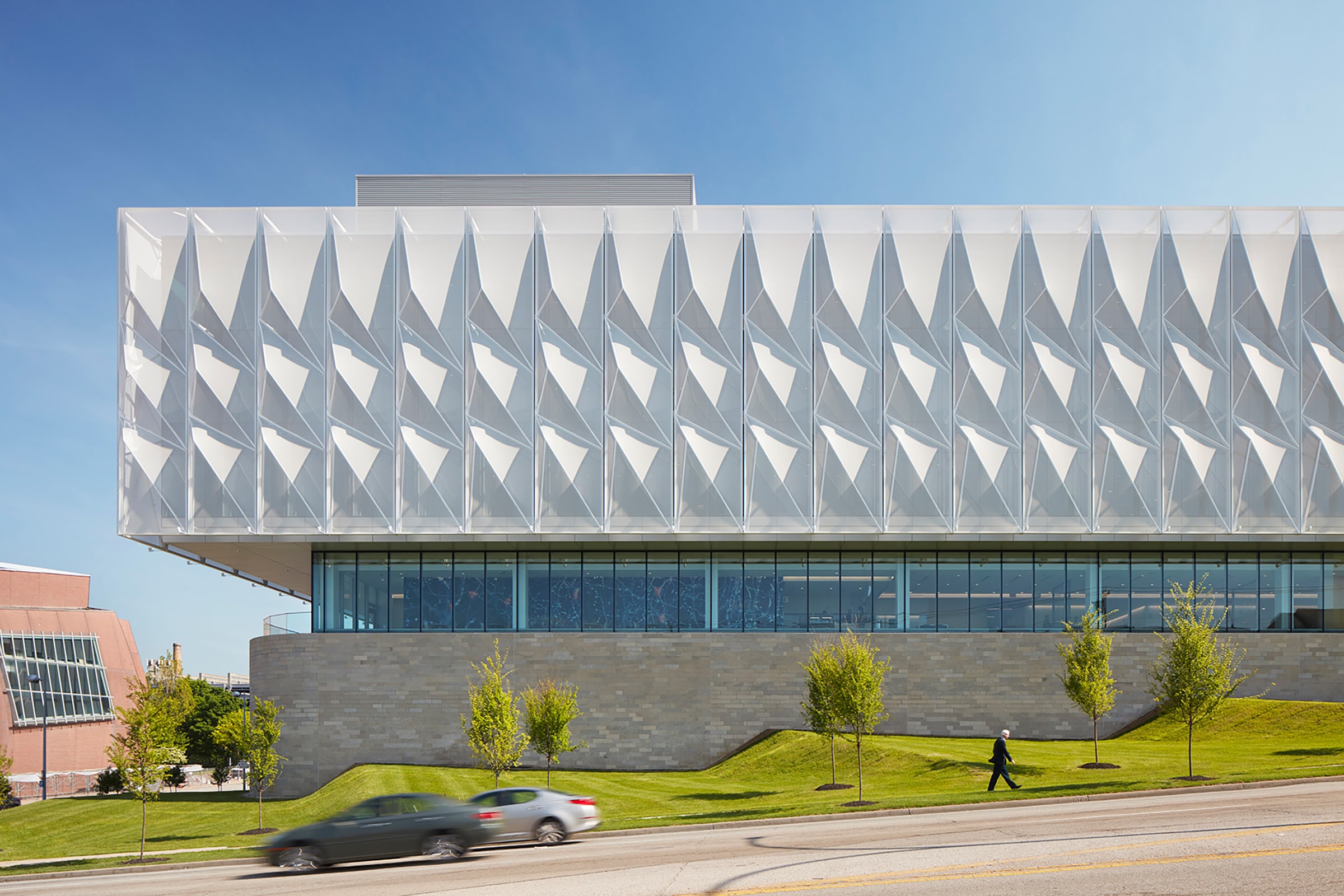
Tensile mesh scrim acts as the building’s outdoor blinds and offers soft, museum quality lighting inside the institute. Photo by Mark Herboth
The team stayed away from traditional, segmented workspaces for physicians and staff and designed a communal break area that allows employees from all clinics to interact, train, and take breaks in one bright, central space. “We said to ourselves, ‘Can we just take the walls off?’” Sickeler recalls.
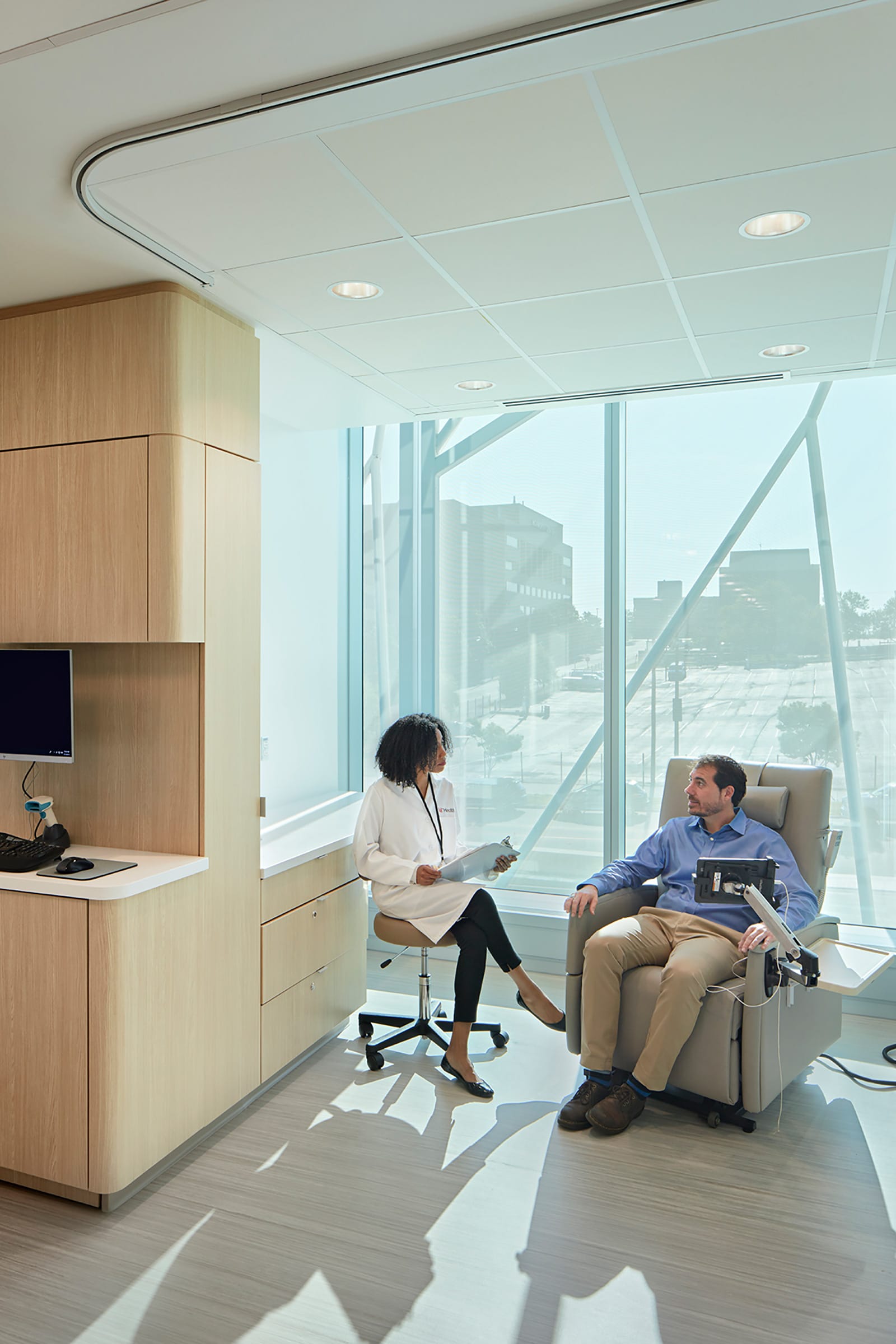
Photo by Mark Herboth
The workspace was originally intended to be mobile, giving physicians the capability to move from shared spaces into clinical or private rooms. “The idea was nobody owns a desk, but that’s shifting a little bit,” Sickeler says. “People want to own their desks, and post COVID-19 we might find that coming to pass.”
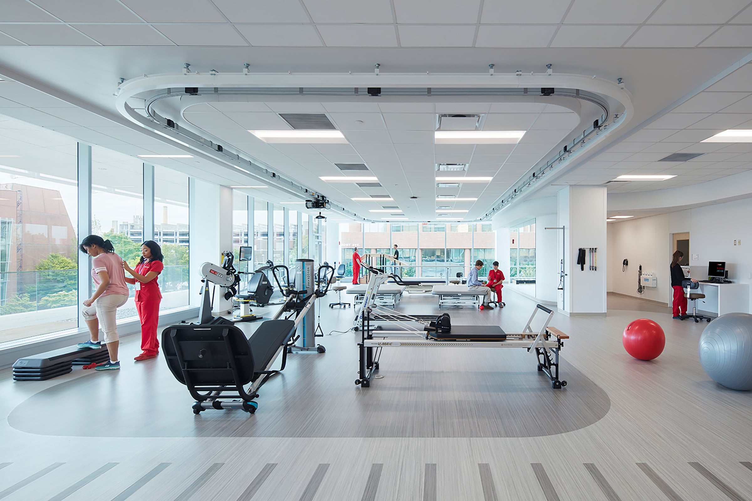
Photo by Mark Herboth
The UC Gardner Neuroscience Institute features outside corridors that help with wayfinding by keeping patients connected to outdoor landmarks. Keeping the corridors on the perimeter allowed the team to design exam rooms inboard, which conveniently eliminates the need for costly blackout curtains. To reduce heat gain Johnson wrapped a geometric tensile around the building. “You could look at it like we put the blinds on the outside,” he says. “We did,” interjects Sickeler. “It almost was an exact budget swap.” The interesting outer scrim, the signature element of the building, came about as a way to create diffused light for patients but ended up being a remarkable architectural feature that significantly cuts down on the building’s solar gain.
UC Gardner Neuroscience Institute
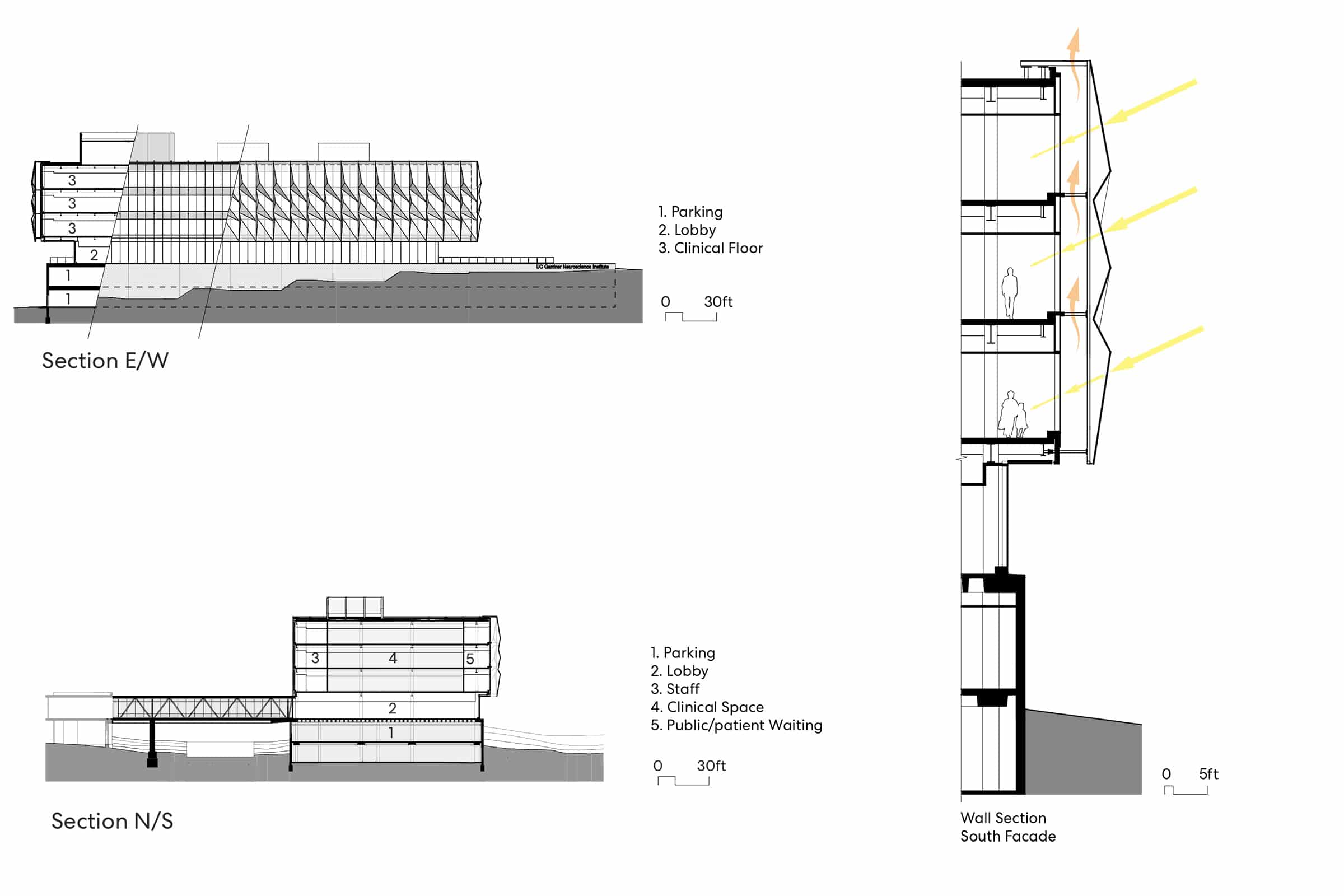
Drawing courtesy of Perkins and Will
Location: Cincinnati
Completion Date: April 2019
Size: 114,000 square feet
Architect: Perkins and Will
Structural Engineer: Shell + Meyer Associates
Mechanical + Electrical Engineer: Heapy Engineering
Contractor: Messer Construction Company
Civil Engineer: The Kleingers Group
Construction Manager: Hplex Solutions, Inc
Curtain Wall: Pioneer Cladding & Glazing Systems
Tensile Mesh: Valmex facade by Mehler Texnologies/Structurflex
2. Arcadia Trails INTEGRIS Center for Addiction Recovery by HKS Architects
In Oklahoma, Jamie Castillo, senior interior designer at HKS, designs healing spaces using the nature around them. Her recent project, Arcadia Trails INTEGRIS Center for Addiction Recovery, is a response to the state’s overwhelming need for a substance abuse and addiction recovery center.
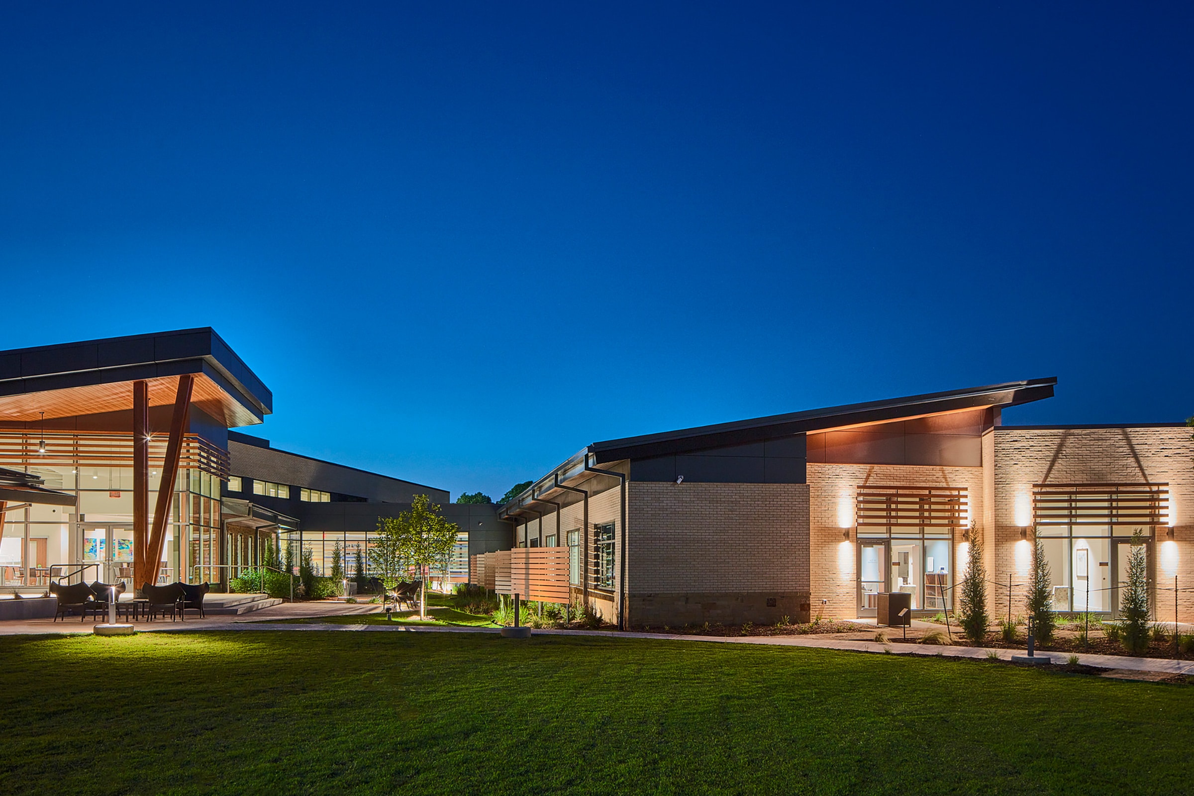
The facility projects a lower, more modern profile with its eased roofline and horizontal louvers. Photo by Daryl Shields
The 60,000-square-foot, split-level building is positioned on a sloping terrain between a busy stretch of Interstate 35 and a serene oak grove. Although the building shares a campus with INTEGRIS Health Edmond hospital, Arcadia Trails was designed to feel more like a nature retreat than a rehabilitation facility. “Part of the initial issue was how to work within the landscape of where the facility was going to be zoned because it’s a forested area on a hill,” Castillo says. To that end, the unique sloping terrain prompted a split-level design that implements the site’s geography to craft both private patient rooms and inviting public areas in the center. Visitors and families, for instance, enter through a conference center that faces the medical campus, while residents have a secluded entry that’s intuitive with the building’s natural surroundings.
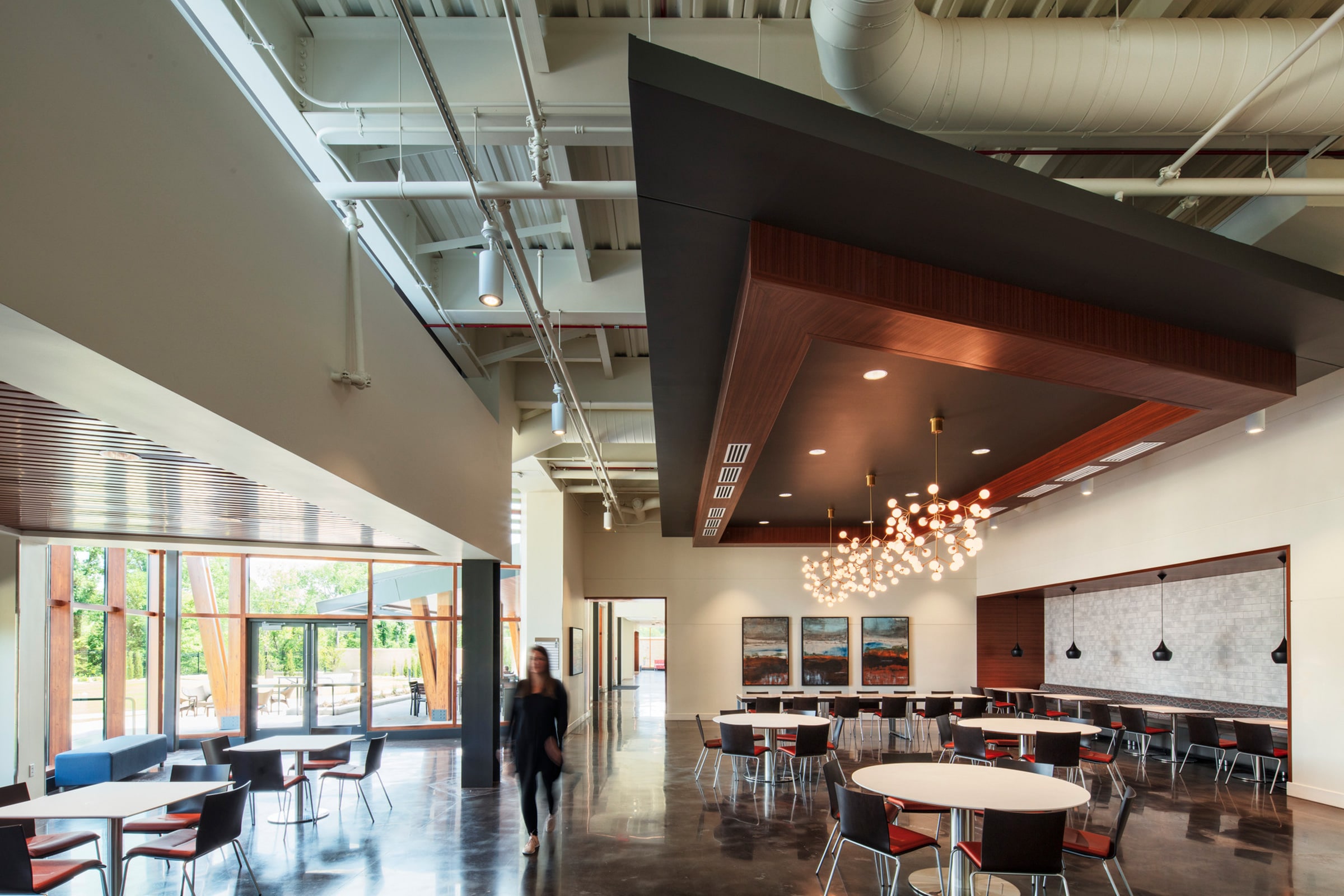
Photo by Daryl Shields
The center’s main entrance is south facing and the building is nestled in trees, so the team knew one of their biggest design challenges would be pulling in natural light. After several light studies HKS was able to understand the building’s interaction with the sun and build a clever, calm design that communicates with nature. “The design team drew inspiration from the site’s natural surroundings in order to cultivate a sense of calm and tranquility within each interior space,” Castillo says. Large windows draw in natural light and bring the outdoors into the 40 mid-century style rooms. “The use of locally sourced stone, timber column overhangs, and wood planks further enhances the structure’s place within the surrounding hillside.”
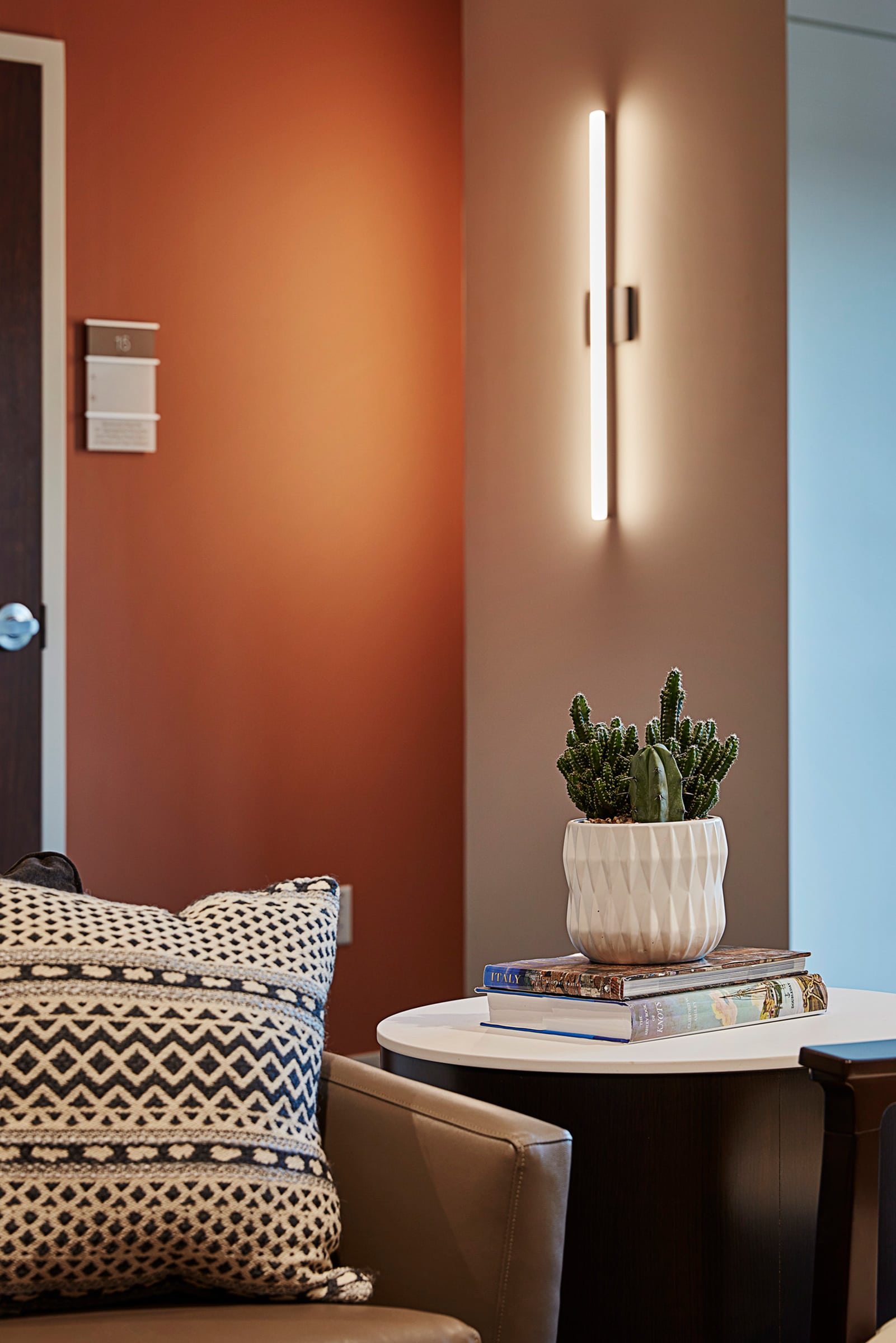
Photo by Daryl Shields
The design became an extension of the center’s overall purpose to promote mental, spiritual, and physical healing. “Arcadia Trails’ mission is to take the residents on a journey of health and wellness pulled aside from their day-to-day, so they are spending the night for as long as it takes them to heal,” Castillo says. The center’s layout provides different modalities for therapists and staff members, including private therapy offices, group therapy areas with varying furniture layouts, and outdoor healing gardens.
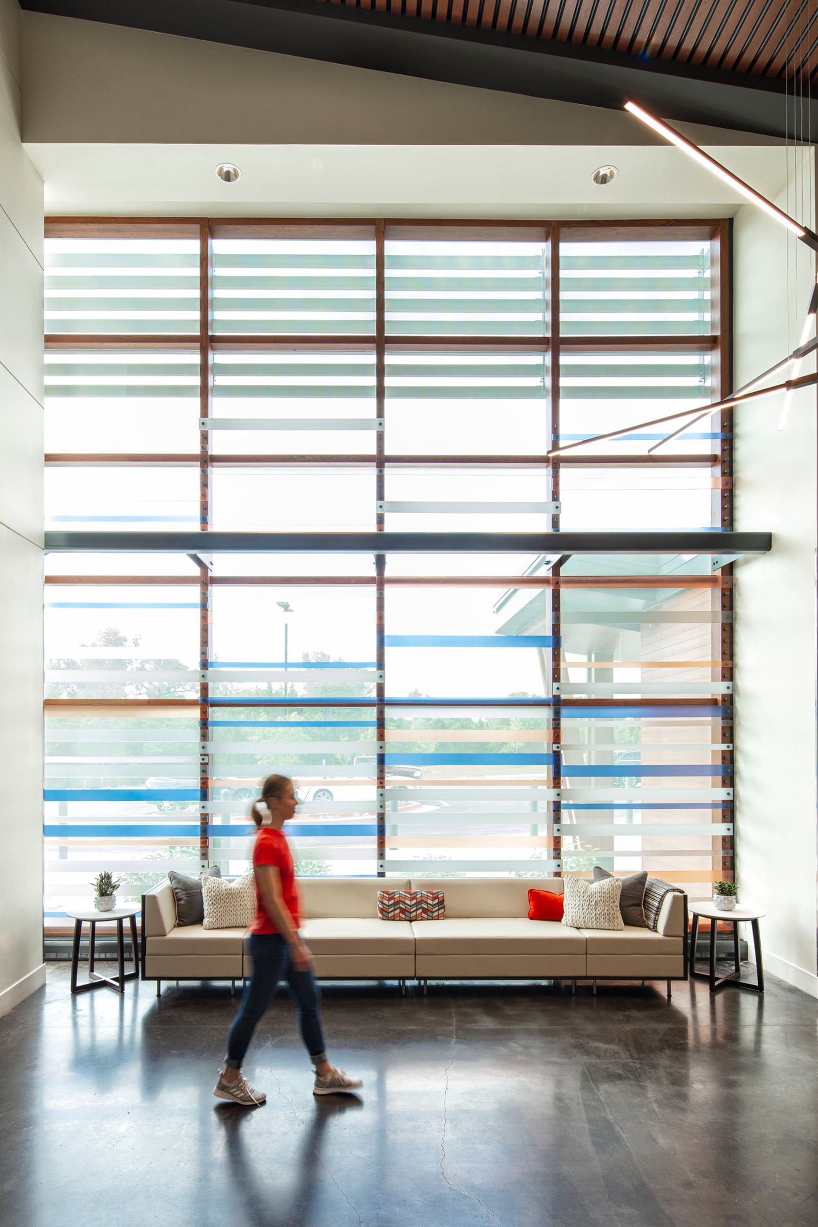
Photo by Daryl Shields
Arcadia Trails INTEGRIS Center for Addiction Recovery
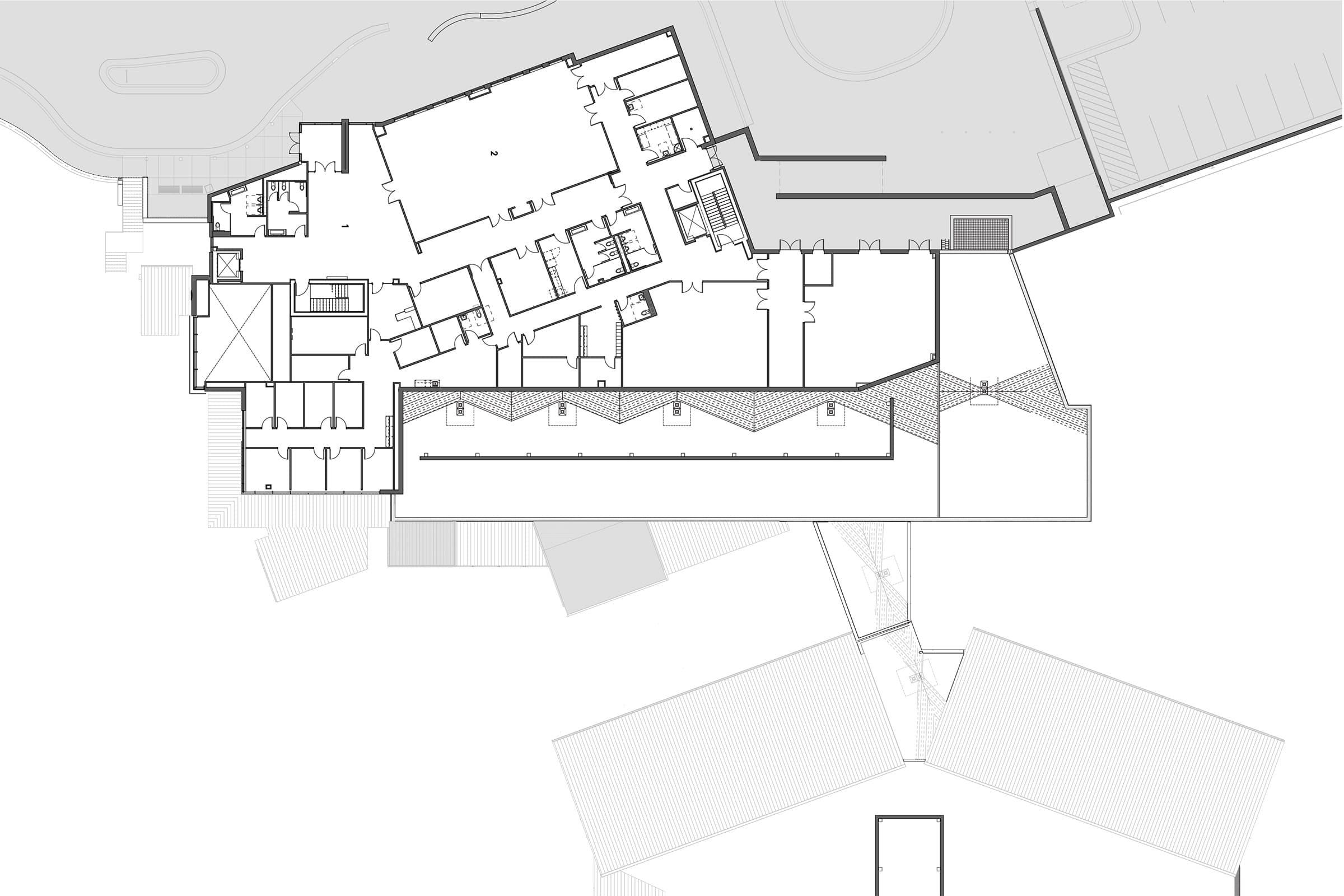
Drawing courtesy of HKS Architects
Location: Austin
Completion: Summer 2019
Size: 81,000 square feet
Cost: $23,522,4993
Architect: HKS Architects
MEP Engineer: WSP
Civil Engineer: MKEC
Contractor: Robins & Morton
Kitchen Designer: SDI
Interior Designer: HKS Architects
Landscape Architect: MKEC
3. UCSF Bakar Precision Cancer Medicine Building by Stantec
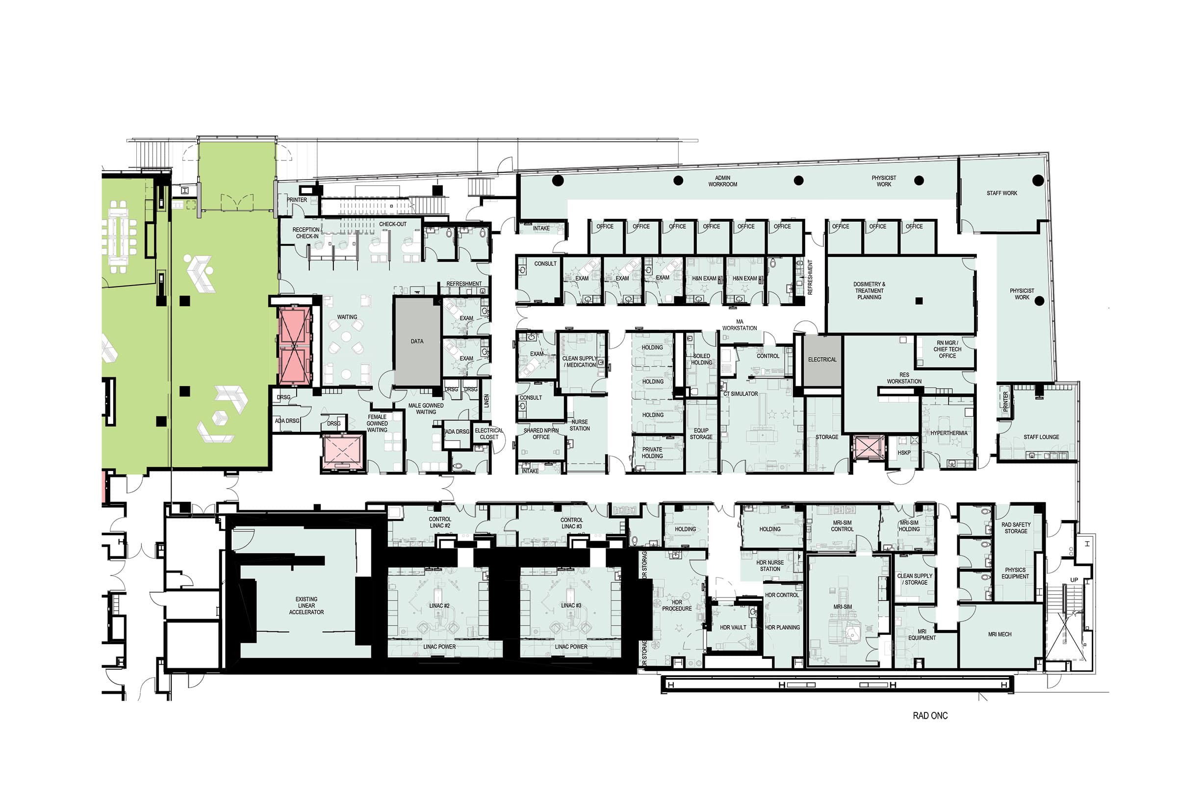
Stantec is using its expertise to meet the needs of patients, physicians, and students in the Bay Area. The LEED Gold–certified UCSF Bakar Precision Cancer Medicine Building (PCMB) is a 180,000-square-foot outpatient cancer center with 120 rooms for exams and consults, 45 infusion rooms for chemotherapy treatment, 19 imaging modalities, and two linear accelerator vaults for the radiology oncology department. The impressive new center designed by Stantec creates a central hub for patients receiving cancer treatment, which eases the burden of traveling across San Francisco for various clinical appointments and treatments. “On a high level, this project is allowing the three different campuses that have individual departments to really come into one building,” says Stantec’s project manager, Scott Shaver. “UCSF really saw this as an opportunity to serve the majority of their cancer treatment in one place.”
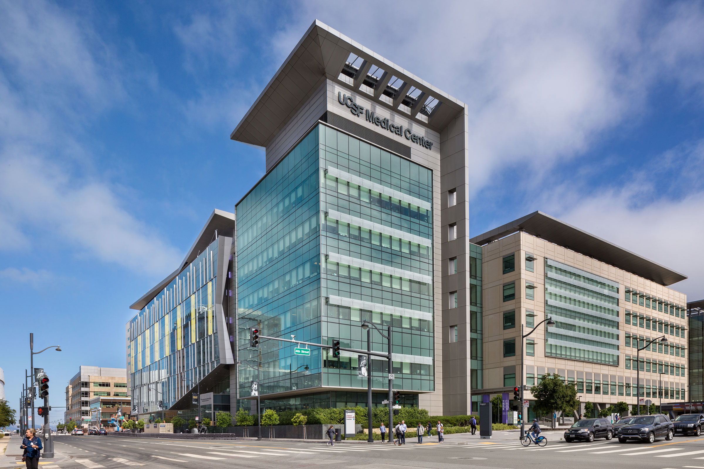
Stantec designed the new outpatient cancer center to act as a central hub for patients receiving cancer treatment. Photo by David Wakely
UCSF wanted to ensure every decision made in the design plan contributed to the overall mission to cure cancer. To support those efforts, the team had to pay attention to the many parts that go into providing meaningful, innovative care. “The patient experience is one thing, but how well can we support the staff in giving their care?” says Erik Hanson, principal and health care sector leader at Stantec. “How well can they learn and grow from the research that’s being brought in the process of giving care?” Those questions led to an integrated design between patient care, physician research, and sustainability, with each factor driving and influencing the other.
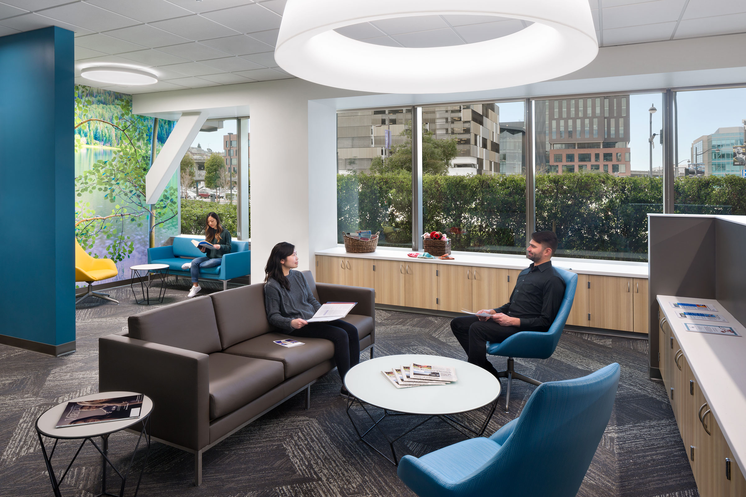
Photo by David Wakely
The zero-lot line site offered many challenges for the team but also led to some of their more creative sustainable components, like the custom-designed bioretention planters that are more than eight feet in depth in order to create a proper filtration system. The creative idea required impressive collaboration with the project’s civil and structural engineers as well as the landscape architect. “Getting the three LEED points for that was one of the big accomplishments,” Shaver says.
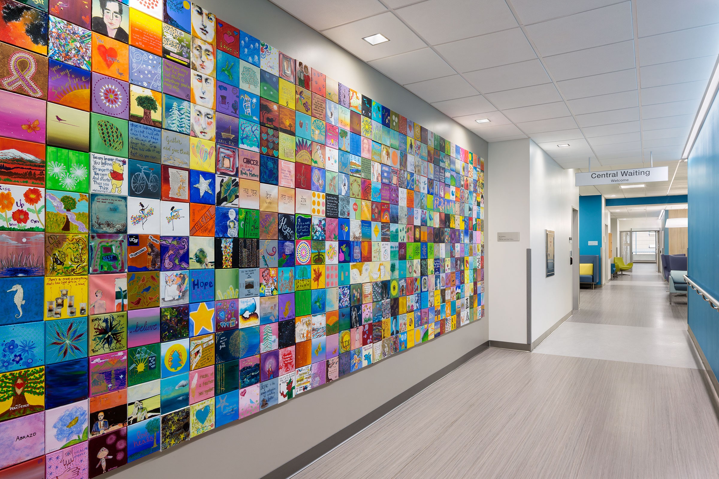
Photo by David Wakely
In addition to making impressive strides in sustainable design, Stantec is also considering how its role in health care design might change in a post COVID-19 world. “It has been very busy responding to a lot of surge in emergency conditions,” Hanson says. Now the team is thinking about buildings as systems that process people, considering how future design plans might prepare for future crises.
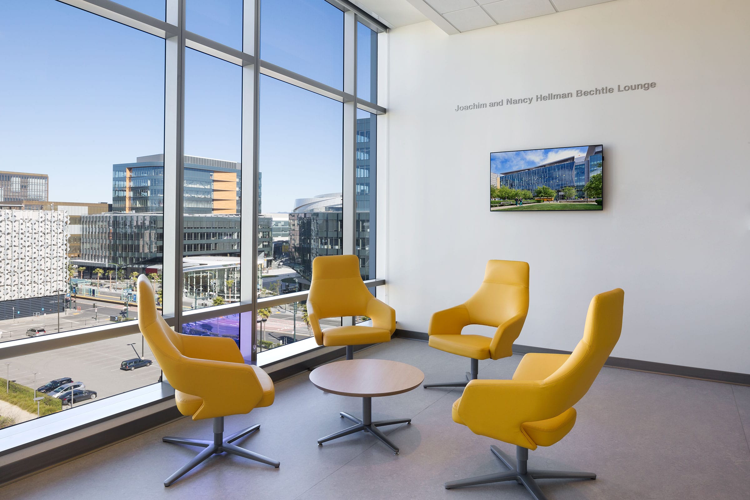
Photo by David Wakely
UCSF Bakar Precision Cancer Medicine Building
Drawing courtesy of Stantec
Location: San Francisco
Completion: September 2019
Size: 179,000 square feet
Cost(Construction): $154,200,000
Architect: Stantec
Structural Engineer: Rutherford + Chekne
Construction Management/Project Management: Cambridge CM
Design Build Mechanical/Plumbing: Southland
Design Build Electrical: Cupertino Electric
Contractor: Rudolph and SLetten
Landscape Architect: CMG Landscape Architecture
