This award-winning design director in Chicago takes an “inside-out” approach to architecture.
When John Hopkins was growing up on a farm in Michigan, he was always building things. “I built a lot of forts and things out of old refrigerator boxes. It seems like I was always creating structures,” he says. He didn’t have any family in architecture, didn’t even know what it was, and yet he spent his time drawing house plans. “It was this weird thing that just came out of me,” Hopkins says. “Architecture has been a very specific path for me.”
That path took a right turn when Hopkins fell into interior architecture at his first job after college. “I realized, ‘How didn’t I know about this? It suits me so well,’” he says. “I feel like my interest in architecture is so human-centric. I feel like I’m the hand or the pen that makes clients hopes and dreams realized in their spaces.”
-

- Photo courtesy of IA Interior Architects
Over the span of his 30-year career, corporate architecture has been where Hopkins shines. He’s been design director at IA Interior Architects for the past 13 years, but if it wasn’t for one of his early jobs at HOK, a leader in sustainable design, his commitment to sustainability might not be as present in his work. “Working with some of those brilliant minds early on, I’ve taken their mantra through the rest of my career,” he says.
“For many years LEED was the driver, but there were also things that seemed like we were missing as interior architects. I don’t think we realized what that was until the WELL Building Standard came along,” Hopkins says. “With different factors around nourishment, fitness, and comfort, it was like a light bulb went off. What we do as the interior folks on a project—so much is focused on those aspects: the health and well-being of an individual, beyond the health and well-being of a building.”
1. Capital One Cafe State Street
-
- Photo by Garrett Rowland
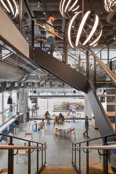
For those walking into the Capital One Bank on Chicago’s State Street expecting a tidy row of bankers, you’ll immediately think you’re in the wrong place. “Capital One is a bank that doesn’t want to be a bank,” Hopkins says. “They want to think of everything differently.” As such, the two-level space functions as a cafe and open work area, with its banking features corralled into one corner.
One of the cafe’s most notable features are walls that open up to the iconic Chicago street. The client team, based on the East Coast, wanted to open up as many walls as possible—an idea that left Hopkins and his IA team with some hesitation. “Their first gut reaction was to put in the biggest mechanical system that can manage any type of outdoor temperature and humidity,” he says. “To us that was extremely wasteful in terms of energy. In Chicago we’re going to have this type of weather and that type of weather, so you can’t assume every summery day you’re going to have those walls open,” Hopkins says.
They posed their concern and came up with an alternative. Working with the engineers on the project, they set certain criteria for the outside temperature and humidity. When those conditions are met, then the walls can be opened, creating a more energy-efficient, comfortable space to eat, work, and bank in.
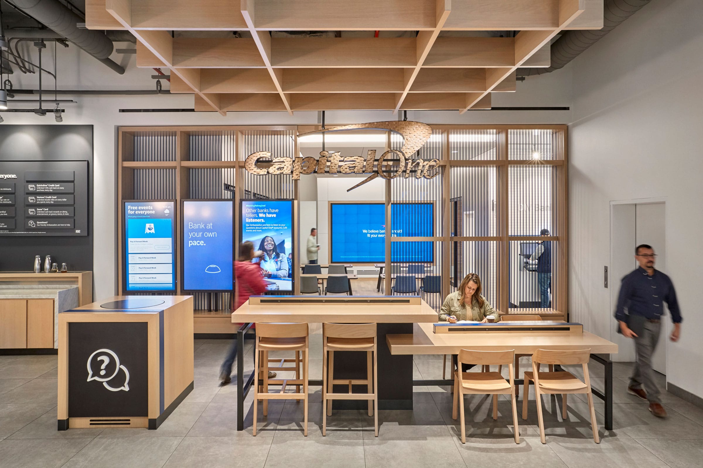
Photo by Garrett Rowland
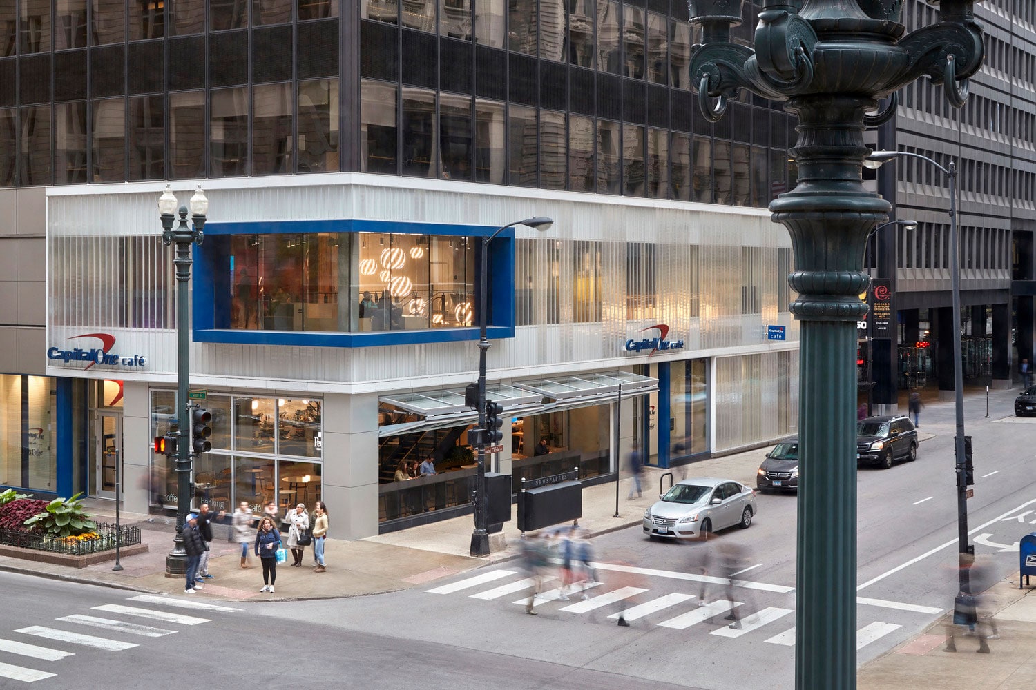
Photo by Garrett Rowland
Project: Capital One Cafe State Street
Location: Chicago
Completion: May 2019
Size: 10,250 square feet
MEP Engineer: ESD
Structural Engineer: Sowlat
Contractor: Bulley & Andrews
Interior Designer: IA Interior Architects
2. Whirlpool Headquarters
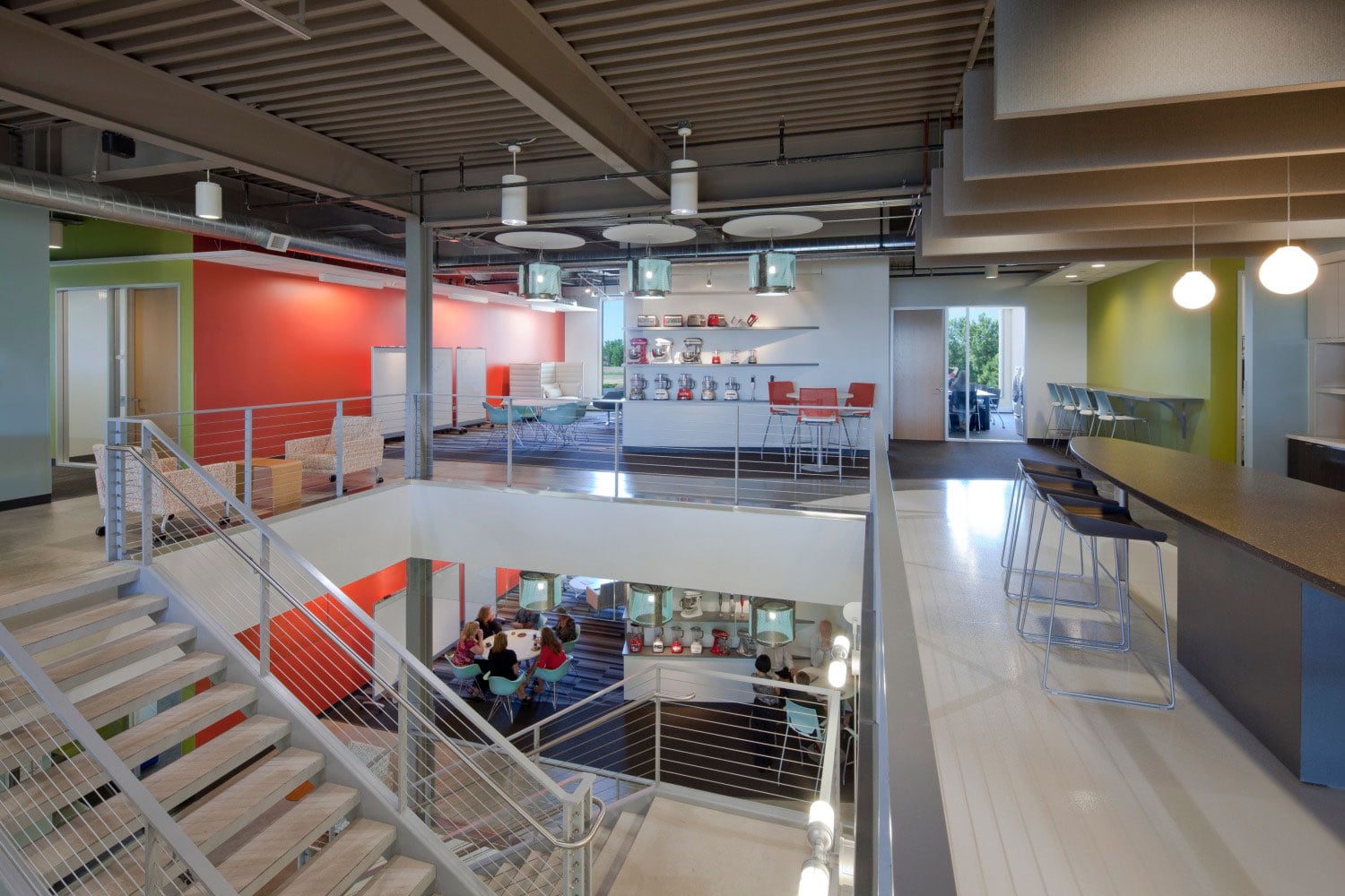
Photo by Paul Morgan
“I had been working with Whirlpool seven years prior to this project, so I knew them very well,” Hopkins says. “They were always quite hesitant to move the needle forward in terms of transforming the workplace.” That is, until the North American headquarters project. Hopkins and his team were tasked with combining Whirlpool’s eight buildings into one major work hub.
“The biggest success for IA was the reduced material inventory that’s incorporated into that building,” Hopkins says. “Our approach was to minimize the number of layers that get applied to the core and shell structure. Being a new construction building, we worked with the core and shell architects to say, ‘OK, that core concrete wall doesn’t need to be covered in drywall. We can expose that concrete.’” The partitions in the space are also 90% demountable to “provide flexibility and resiliency to allow change to happen over the future.” Because the building was next to a river, Hopkins also wanted to offer views of the landscape, which meant daylight became a big factor in its design. “We were very focused on the organization of the space so daylight can be appreciated by everyone.”
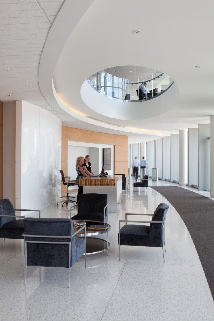
Photo by Paul Morgan
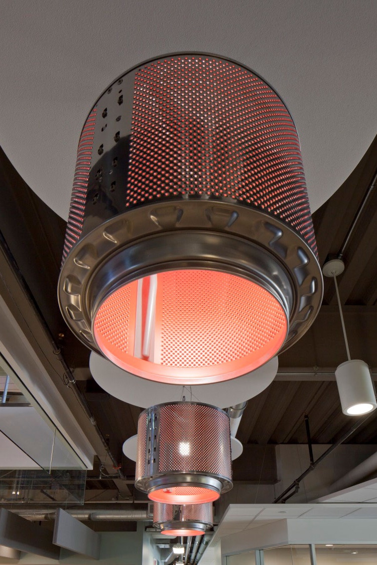
Photo by Paul Morgan
Project: Whirlpool Headquarters
Location: Benton Harbor, Michigan
Completion: 2011
Size: 320,000 square feet
Lead Architect: IA Interior Architects
Collaborating Architect: Epstein
MEP Engineer: Epstein
Contractor: Pepper Construction
Interior Designer: IA Interior Architects
Landscape Architect: Arquitectonica
3. S2G Ventures
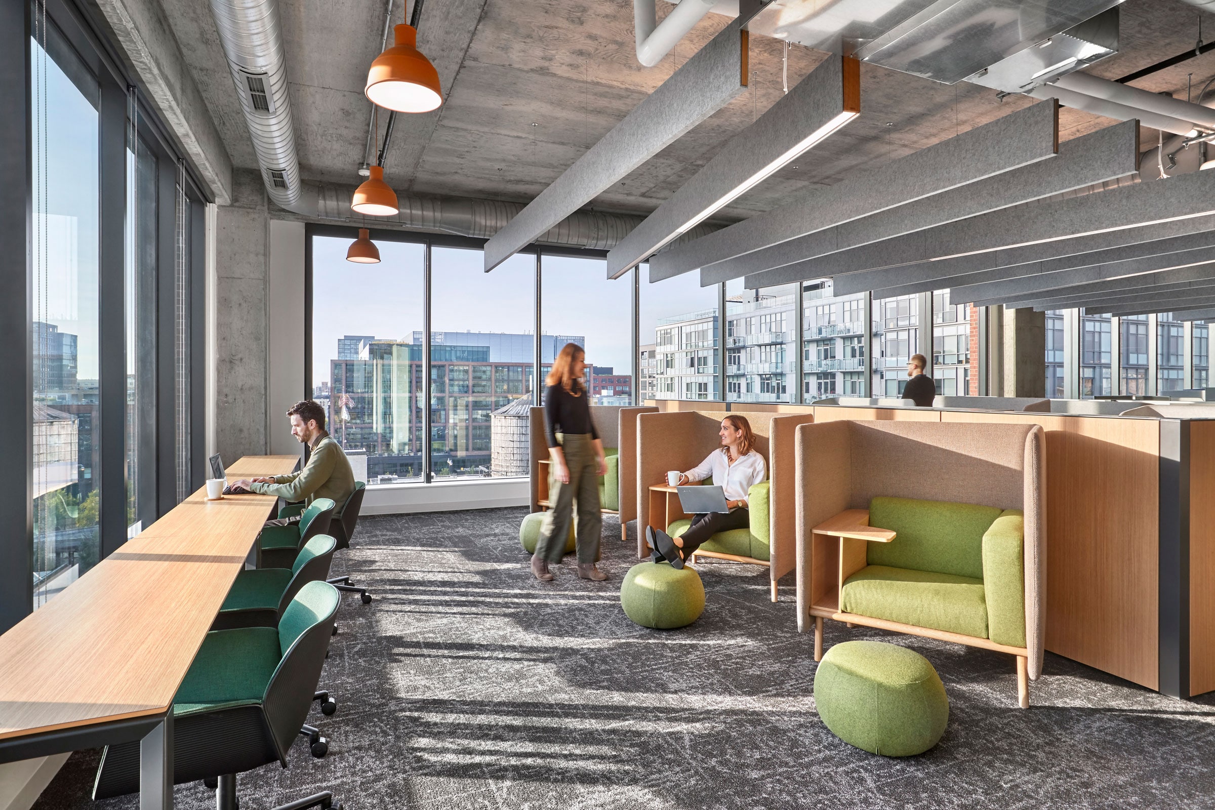
Photo by Garrett Rowland
For S2G Ventures, a sustainable agriculture venture capital group, sustainability was top of mind from Day 1. Hopkins says the intimate project—originally only 8,000 square feet, but which grew to 10,000 square feet—was unique in that the group was planning to expand and needed a flexible space to support future transformation. “Because they were a fairly young group and were expecting change, we looked at products that weren’t guaranteed to last 30 years because those products tend to have a lot more durable, less recycled content,” Hopkins says. The result was an urban oasis that balanced the industrial grittiness of Chicago’s Fulton Market with warm colors and textures inspired by nature. Reclaimed wood was used for the reception desk and conference tables, while coffee tables put Buckhorn, an invasive plant banned in Chicago, to good use. Private offices were also pulled away from the exterior to bring in more natural light and cultivate a sense of togetherness for the growing team.
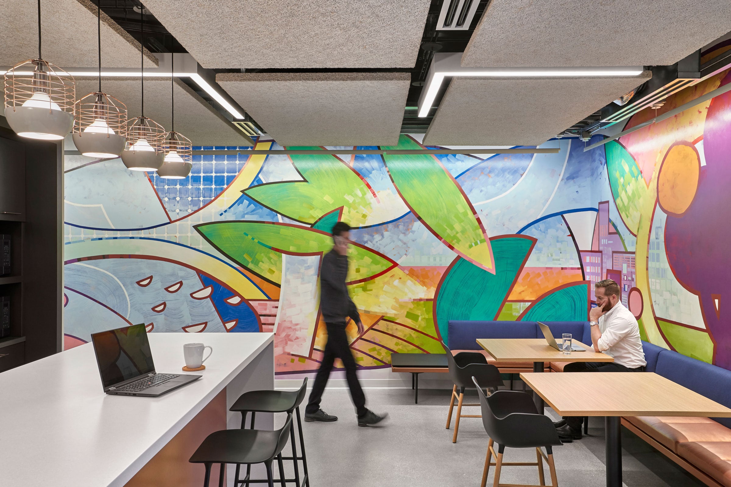
Photo by Garrett Rowland
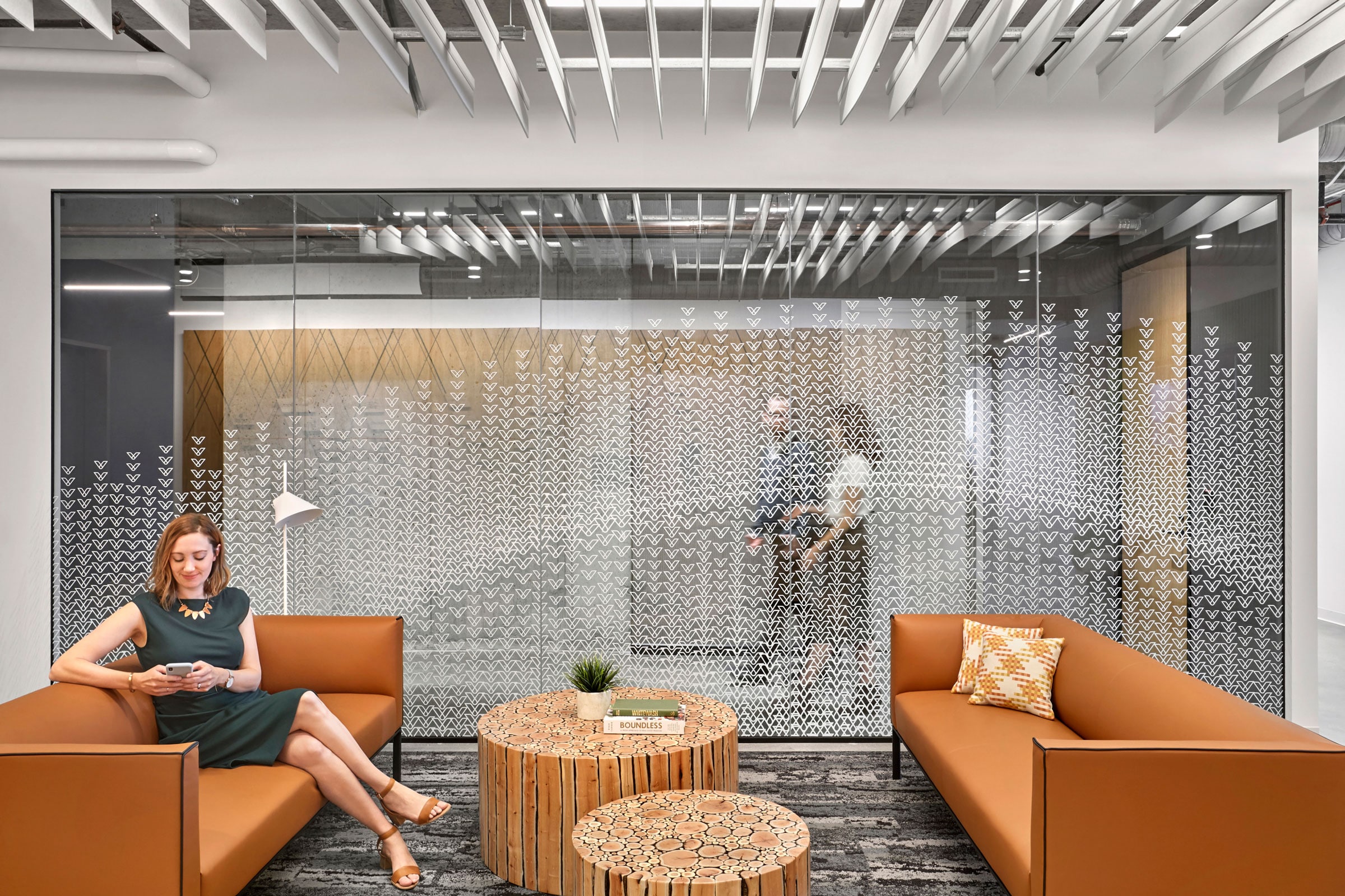
Photo by Garrett Rowland

