Story at a glance:
- EstudioHerreros designed the new museum—one of the world’s largest museums dedicated to a single artist.
- Norway’s changing light inspired the design of the tower-shaped museum clad in recycled aluminum and glass.
- Low-carbon concrete, a compact shape, high-quality windows, and natural ventilation save energy.
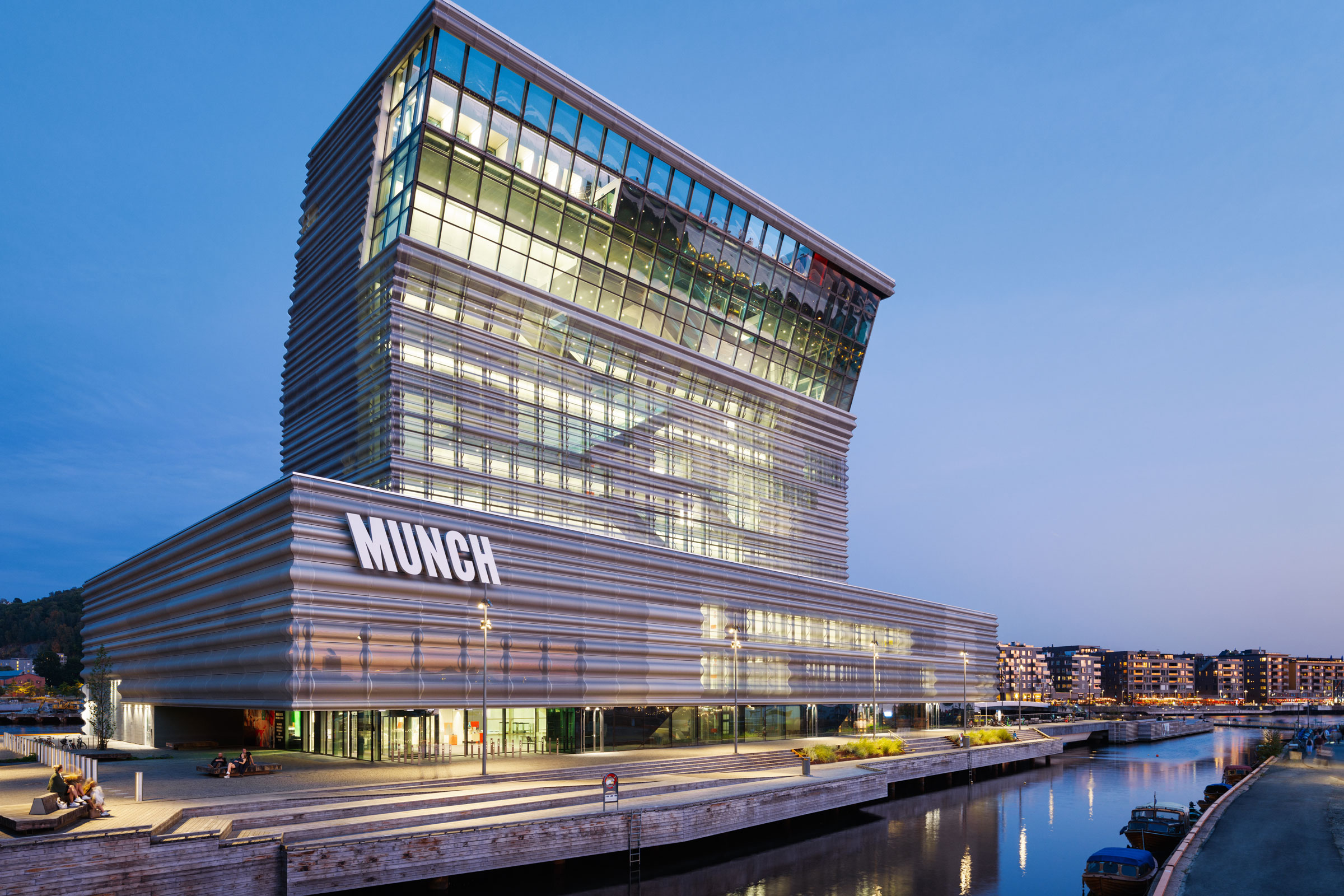
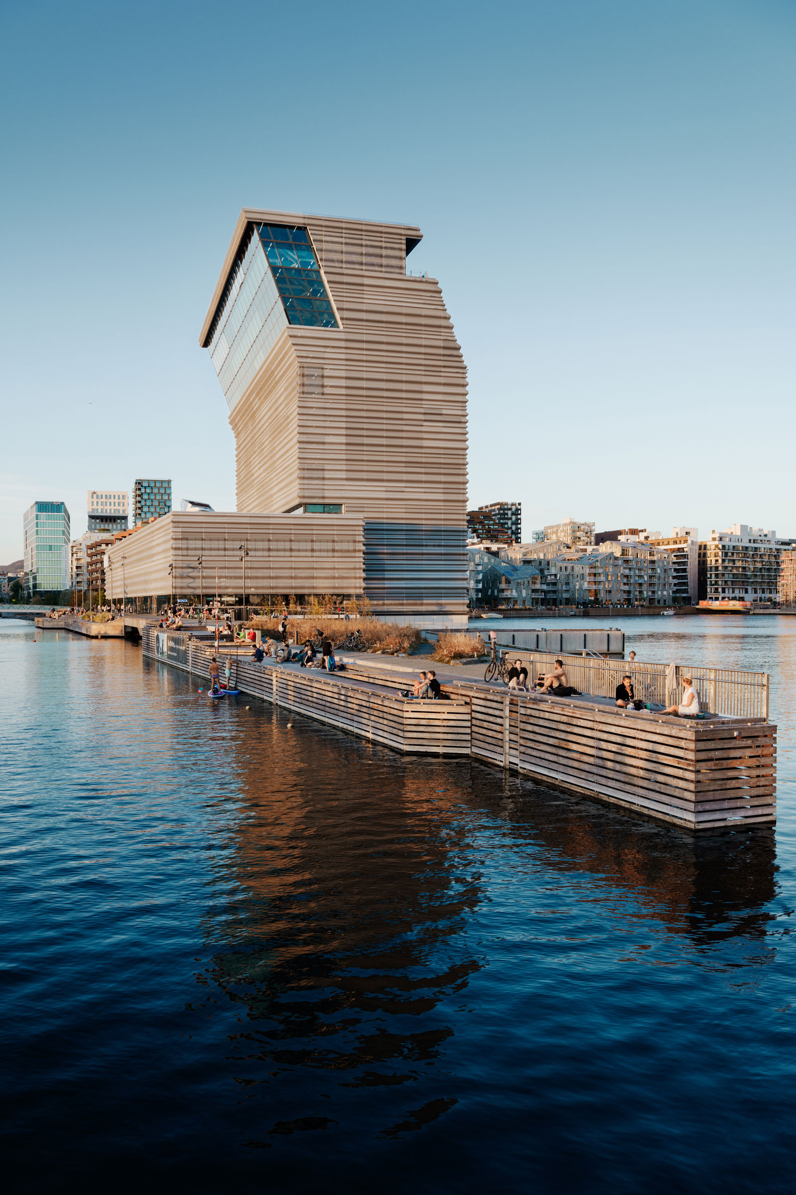
The Munch Museum is a nod, a wave, a wink over Oslo. Its design respects the history of the area while celebrating meaningful development—like the Oslo Opera House and the new National Museum nearby—and the natural beauty of the Oslofjord in front of it.
“This idea of bend was a gesture toward the city center, nodding toward the city center,” says Jens Richter, partner at EstudioHerreros, the architecture firm that designed the Munch Museum, opened in October 2021. “It’s a kind of wink toward all these important historic sites in Oslo.”
Richter, whose firm has offices in Madrid, New York, and Mexico City, was honored when they won the international competition to design a prestigious Norwegian museum and immerse themselves in a different world. Instead of conjuring up images of traditional Norwegian architecture—perhaps a low structure made of wood, for example—they thought about what else makes the region special. “We wanted to see it from the outside with curious eyes. What does it actually mean to be in Norway and to look into the future?” Richter said.
- The project was built directly into the water, as the ground in the area—historically where the Norwegian wood industry was based—was very soft. The building sits on more than 300 piles on the bedrock 200 feet below the building in the water. “Technically speaking that was quite challenging—to resolve this construction in the water.” Photo by Einar Aslaksen
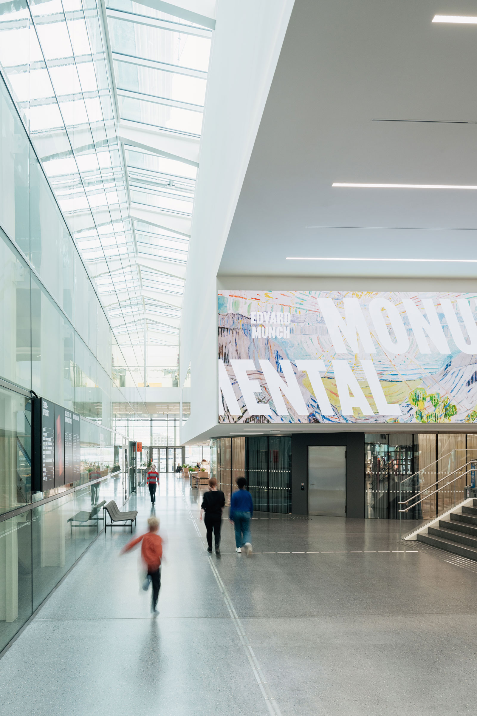
- “The idea is of the museum as a house where everybody can come, where the threshold is so low people are not afraid to come in,” Richter says. “The whole vestibule section is open to the public. It is an extension of the public space, where you can meet a friend for coffee. That was very important to us.” Photo by Einar Aslaksen
They focused in part on the Norwegian light, and the result is spectacular. The tower-shaped museum is clad in glass and recycled, perforated aluminum panels of varying degrees of translucency, reflecting different lighting conditions. Edvard Munch, the famous Norwegian artist known for The Scream, donated more than 27,000 of his works to the city upon his death on the condition that they be accessible to all people of Oslo and the world in one place. The new museum also hosts major temporary exhibits exploring Munch’s influence on other artists.
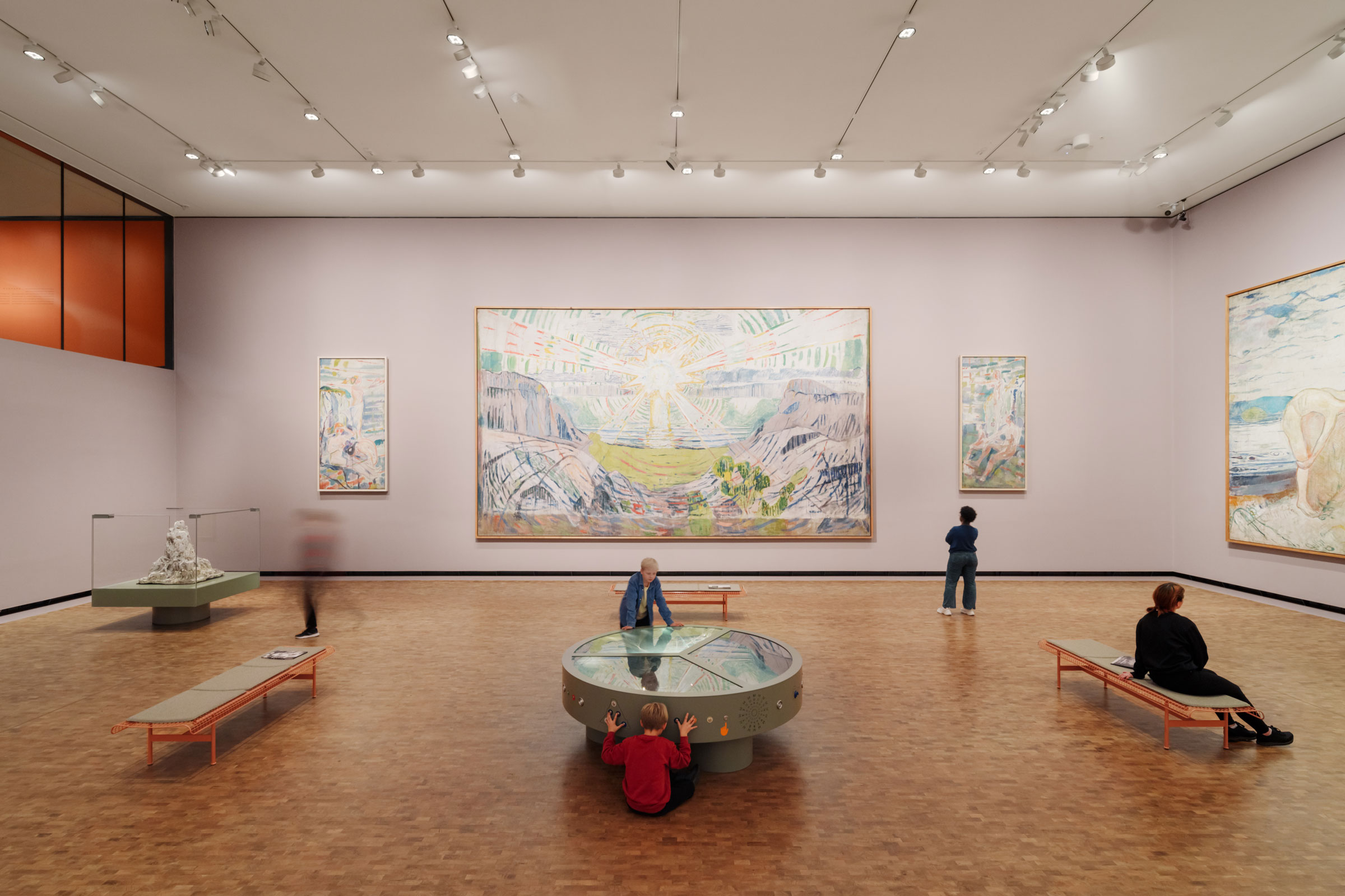
Edvard Munch, the famous Norwegian artist known for The Scream, donated more than 27,000 of his works to the city upon his death on the condition that they be accessible to all people of Oslo and the world in one place. The new museum also hosts major temporary exhibits exploring Munch’s influence on other artists.
Photo by Einar Aslaksen
When the competition to design the museum launched back in 2008, the Oslo waterfront felt much more industrial; it was still home to many shipping containers. Richter says the firm didn’t want to compete with the Snøhetta-designed Opera House nearby, now an award-winning fixture in Oslo, as it was the first building to reconnect the city center with the fjords. Instead, EstudioHerreros wanted to build on that beauty and excitement. “Now when you are there you see this beautiful promenade along the water. All this is following this idea of the fjord city, where people reconnect and rediscover this edge that was formerly occupied by the harbor.”
The competition focused a lot on how architects would imagine this very centrally located place, walking distance from Oslo’s busy Central Station and just in between the historic city center and Aker Brygge, now a popular pier and cultural center that hosts events and is populated with outdoor eateries. EstudioHerreros continues that feeling of community.
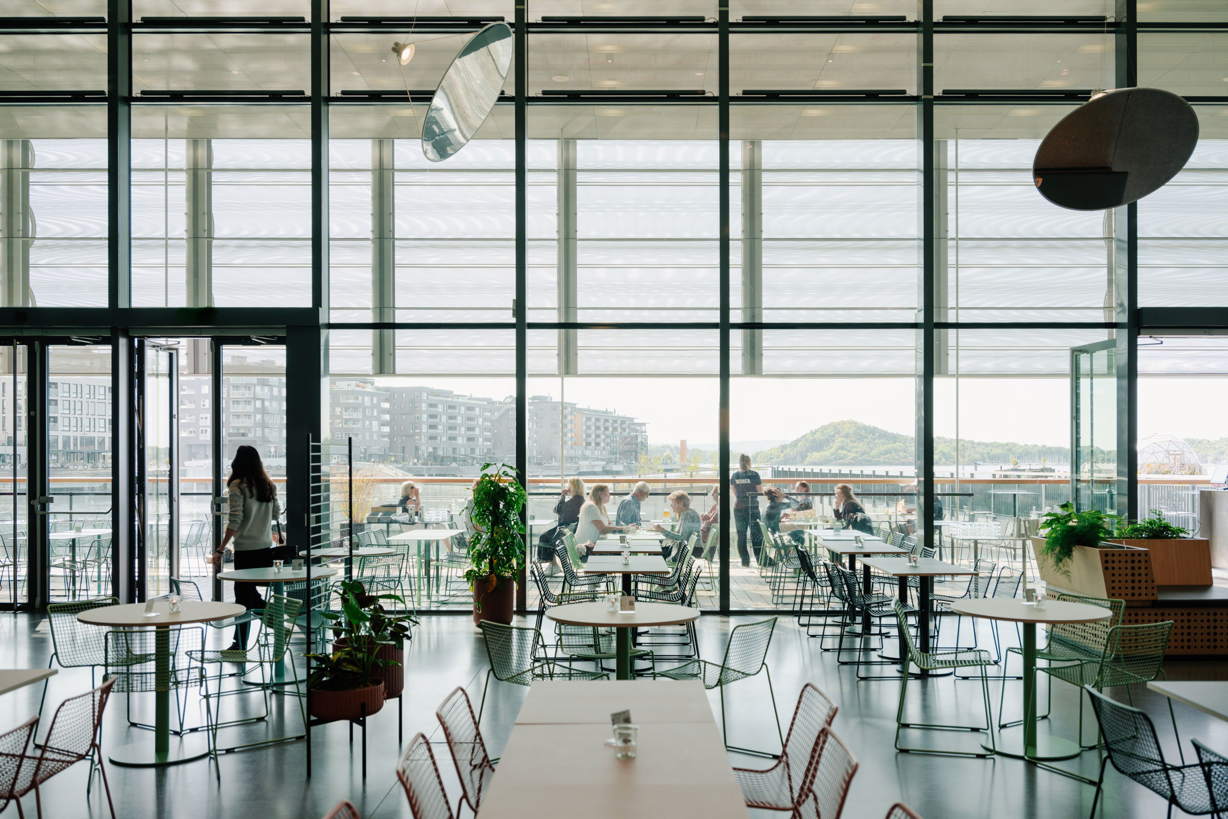
The museum has an auditorium, a cinema, a vibrant children’s department with classes, a library, a cafe, a 12th floor restaurant with viewing platform, and, of course, a museum shop. “All these programs around the main lobby are accessible to everybody,” Richter says. Photo by Einar Aslaksen
Richter says people today don’t just use museums to see an art exhibition, so museums themselves have to invent new programs to stay relevant and make sure the local population spends time there, too. They didn’t want it to be a once in a lifetime experience, but rather to design a place you’d want to go many times. The museum has an auditorium, a cinema, a vibrant children’s department with classes, a library, a café, a 12th floor restaurant with viewing platform, and, of course, a museum shop. “All these programs around the main lobby are accessible to everybody,” Richter says.
He says parts of the museum ensure Munch’s collection remains contemporary and relevant for today’s discussions. “The idea is of the museum as a house where everybody can come, where the threshold is so low people are not afraid to come in,” Richter says. “The whole vestibule section is open to the public. It is an extension of the public space, where you can meet a friend for coffee. That was very important to us.”
Sustainability was also very important to EstudioHerreros, as the project was designed to meet passive house standards. “We have been working with strategies to reduce energy consumption of buildings and reduce the carbon footprints for many years. We try to apply this to all our projects, whether it’s a single-family house, an office building, or a museum,” Richter says.
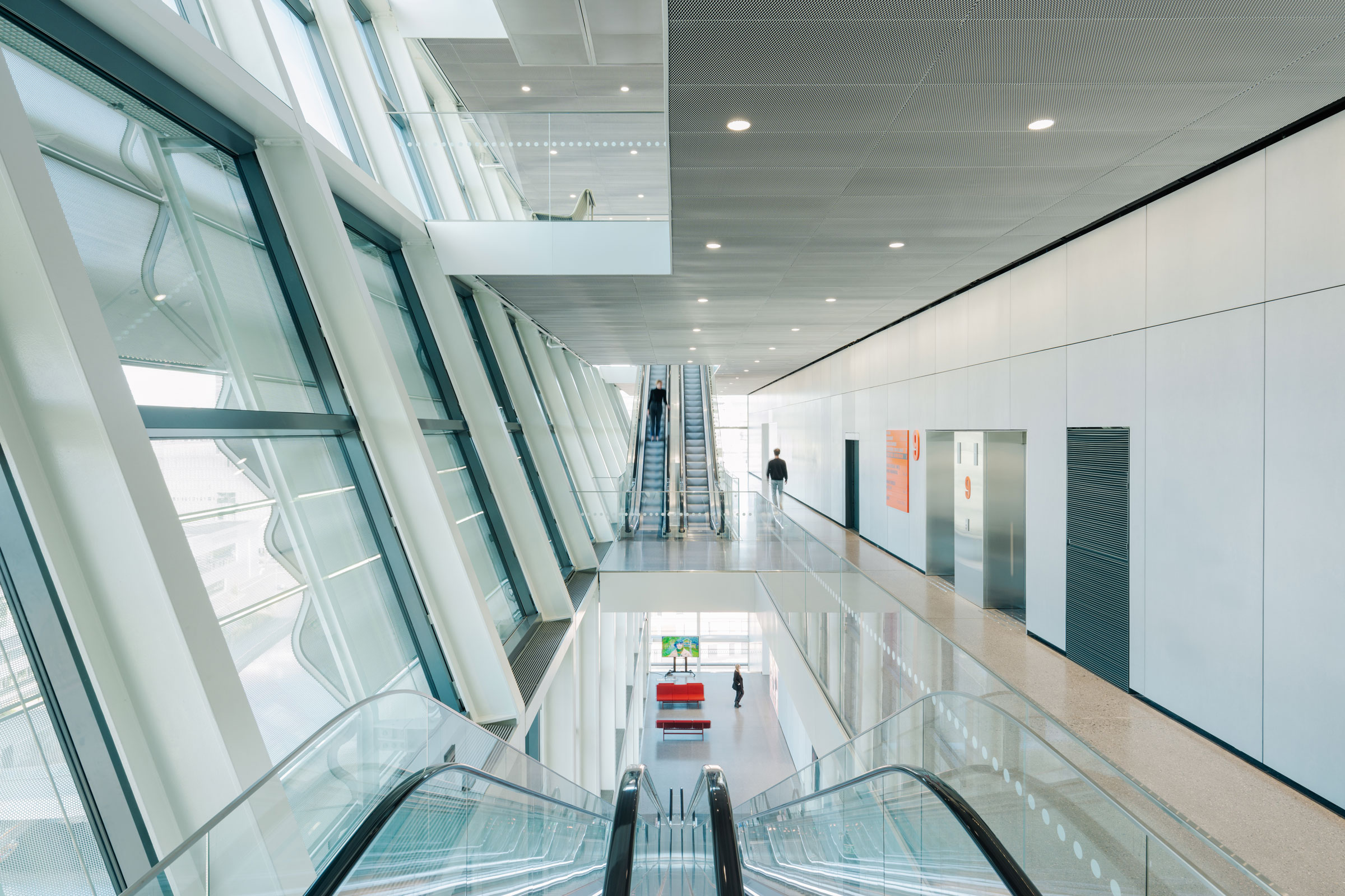
The museum’s vertical design also avoids that often-experienced sensation of going from exhibit to exhibit without daylight, tiring visitors out. Instead, you move up the museum from exhibition to exhibition, each time reentering a front area lined with windows. “You always get back to the facade where you have these amazing views of Oslo.” Photo by Einar Aslaksen
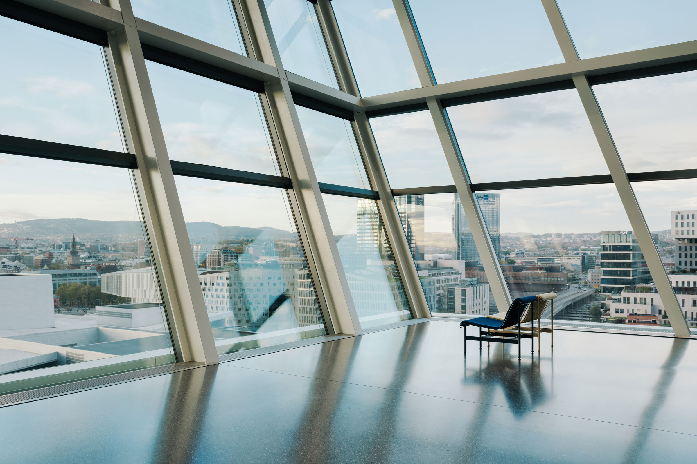
Low-carbon concrete, a compact shape, high-quality windows, and natural ventilation save energy. The building is connected to a district-heating system and a seawater cooling plant and features an energy control system that optimizes energy consumption. The building has no parking spaces, given its location close to the city’s largest public transport hub and 100 cycle-parking spaces. Photo by Einar Aslaksen
The museum is structured in three major parts—the lower part is the podium, then you have the museum tower, and then there’s what Richter calls the dynamic part, or the circulation area of the museum, with a large facade oriented toward the city. This separates the art from other areas of the museum and allows for a fluctuating temperature—those areas where people walk along the facade and enjoy views of Oslo. On the contrary, the humidity and temperature in the exhibition rooms must be 100% stable. In the circulation areas, EstudioHerreros used natural ventilation, taking advantage of the nice waterfront breeze when they can to cool the space, as slits open in the facade. The facades, finished in perforated aluminum with different degrees of transparency, also offer an ever-changing view of the museum from the outside, as the building reacts to the changing light of Oslo.
The museum’s vertical design also avoids that often-experienced sensation of going from exhibit to exhibit without daylight, tiring visitors out. Instead, you move up the museum from exhibition to exhibition, each time reentering a front area lined with windows. “You always get back to the facade where you have these amazing views of Oslo.”
Project Credits
Project: Munch Museum
Location: Oslo
Completion: October 2021
Size: 283,000 square feet
Architect: EstudioHerreros
Local Architect: LPO Arkitekter
Furniture: Vestre
Doors: Boon Edam, Daloc
Facades: Bollinger + Grohmann
Landscape Architects: Thorbjörn Andersson, SLA Landscape
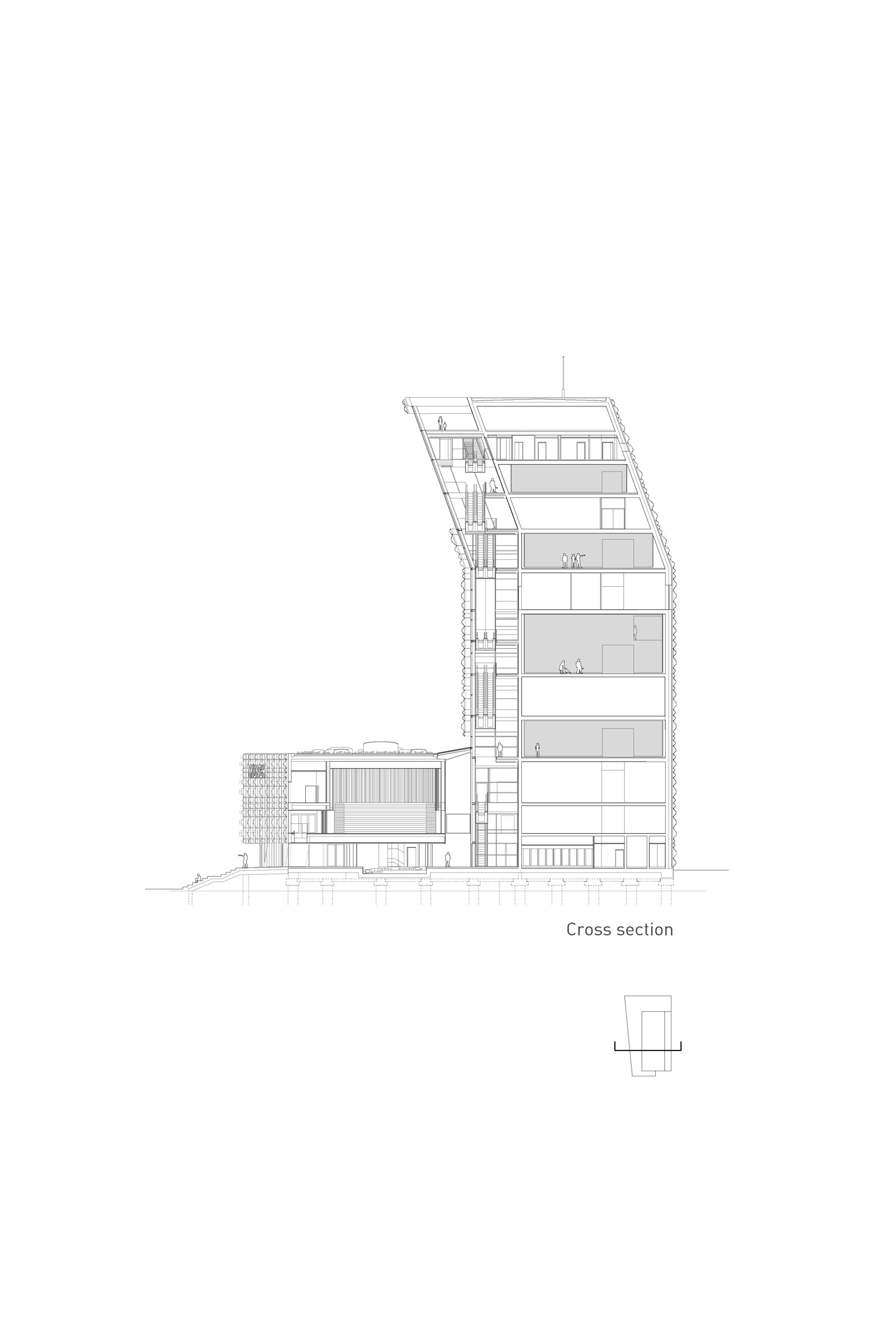
Cross section of Munch Museum. Drawing courtesy of EstudioHerreros
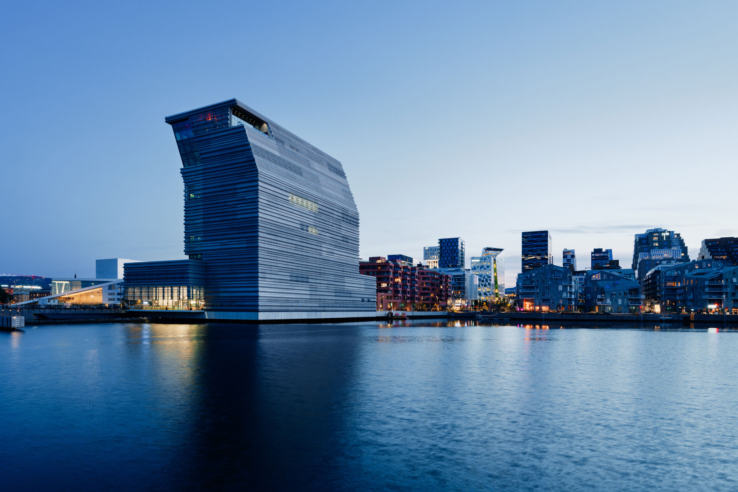
EstudioHerreros designed the Munch Museum to fit in an area of meaningful development—near the Oslo Opera House, the new National Museum, and more.
Photo by Einar Aslaksen
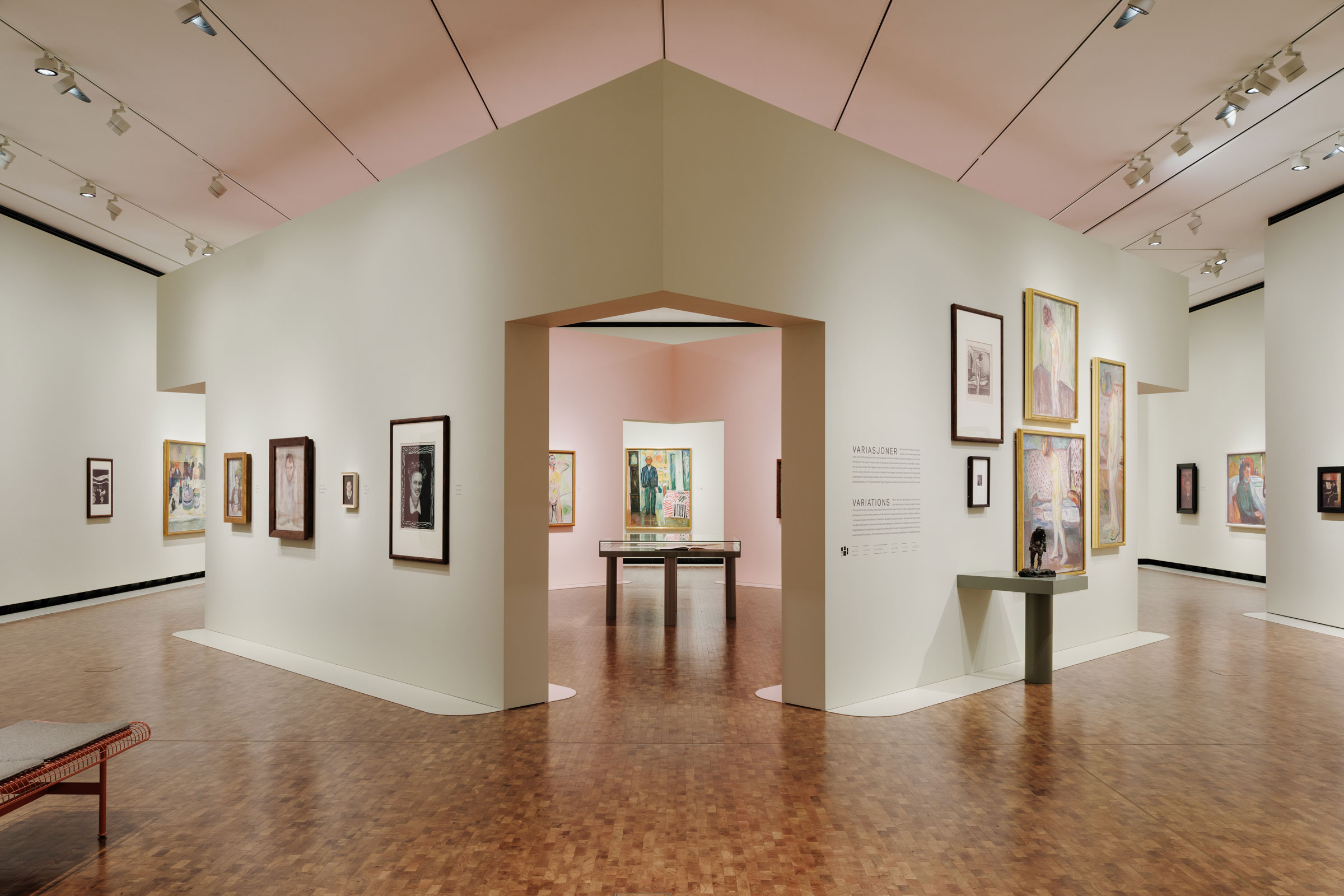
Low carbon concrete and reinforced, recycled steel make up the main structure of the Munch Museum. The architects focus on using Norwegian products where possible for the interior. Photo by Einar Aslaksen

