A Georgia architect sets out to build his family’s dream home.
[Photo: Alexander Herring]
PROJECT: Split Box House
LOCATION: Atlanta
SIZE: 4,878 square feet
COMPLETION: 2018
ARCHITECT: DiG Architects
STRUCTURAL ENGINEER: PEC Structural Engineering
CIVIL ENGINEER: Crescent View Engineering
CONTRACTOR: Post + Beam Builders
LANDSCAPE ARCHITECT: CORE Landscape
LIGHTING: Lighting Loft
GREEN ROOF: James Greenroofs
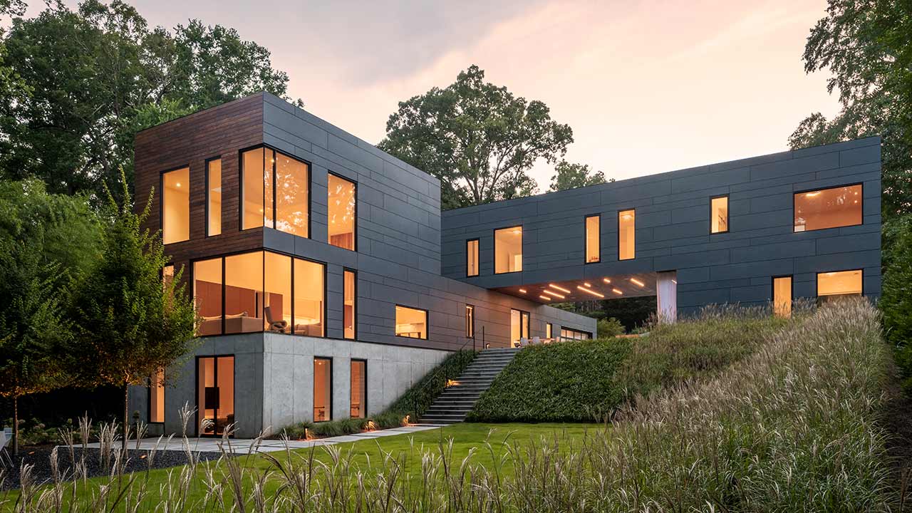
When architect David Goldschmidt and his family moved to Atlanta nearly a decade ago, they wanted a home for two working parents and three kids that served as an escape from the craziness of day-to-day life, but they never quite found the right place. “It took longer than we thought,” says Goldschmidt, principal of DiG Architects. “We wanted to build something—or I did, as an architect. My wife—I dragged her along for the ride.” They bought an existing house and knocked it down. Almost three years later, the property had a new, distinctive design: a split, stacked house.
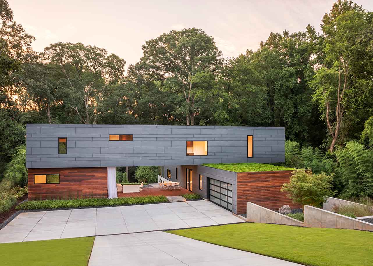
The minimalist house started out as a 22-foot-wide box before Goldschmidt divided it into two major sections—public and private—splitting the box into two Tetris-like shapes. He then rotated the private section 90 degrees to increase visibility of the surrounding woods.
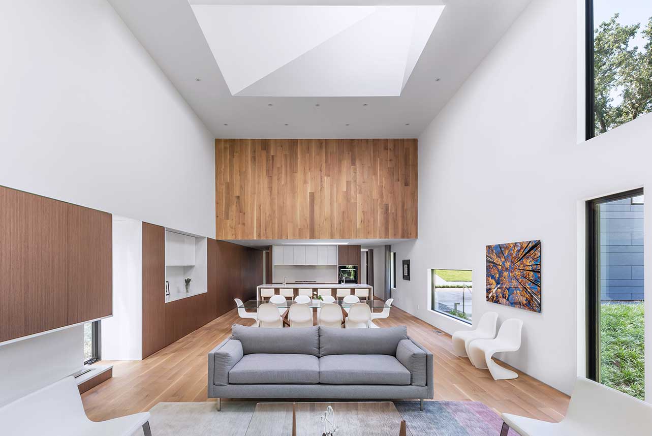
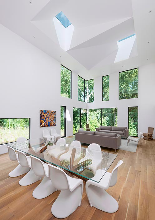
Goldschmidt also had sustainability in mind when building the house. The primary exerior, crafted with fiber cement board panels, was designed to minimize product waste. Six skylights and low-emissivity windows lessen the need for electricity during the day, and green roofs reduce stormwater runoff and improve air quality.
[Photo: Alexander Herring]
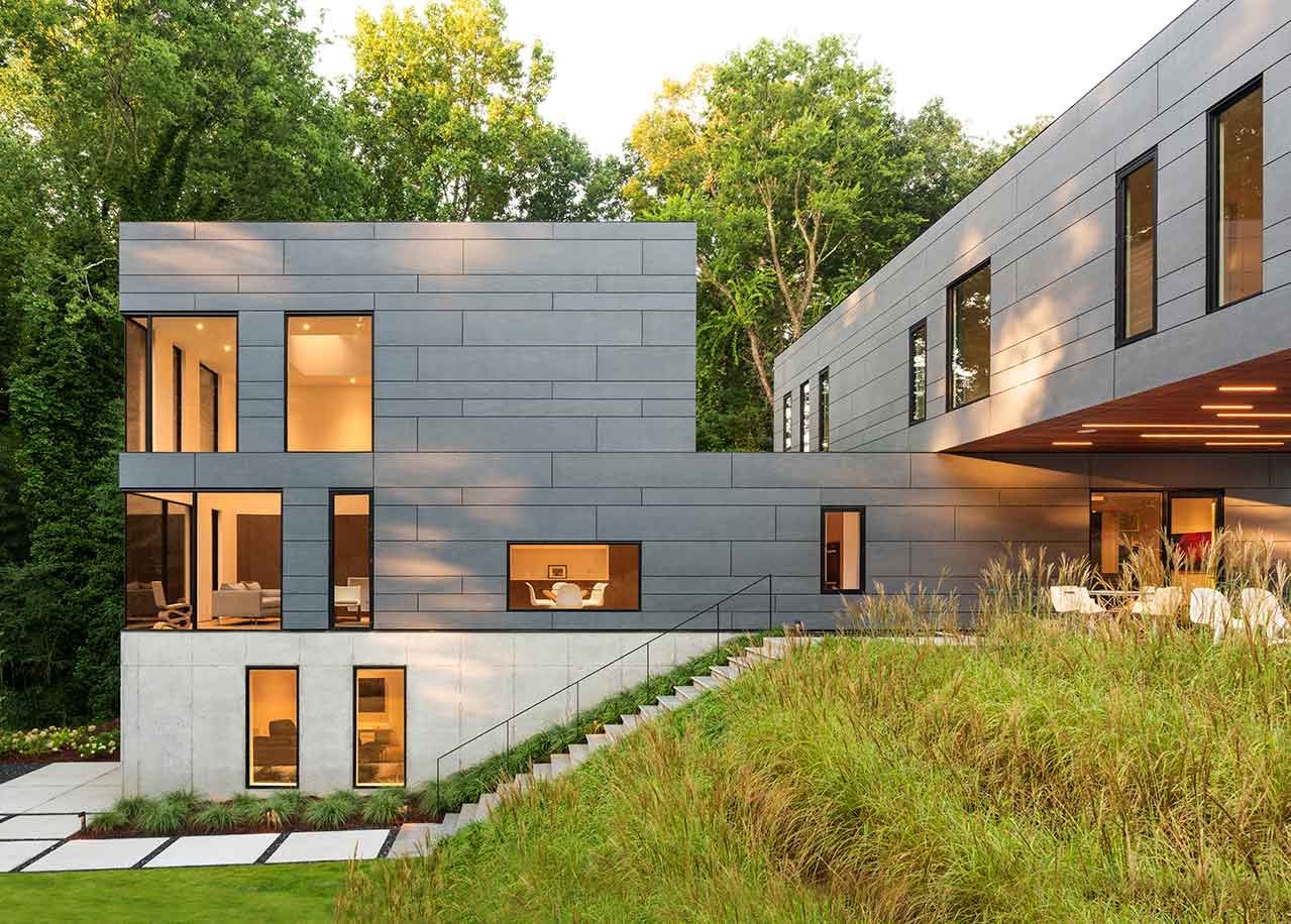
Built on a steep hill, the house’s location had a big influence over how Goldschmidt saw the project. “The context had a lot to do with the whole idea of the stacking,” he says. “I didn’t want to do the typical extruded, rectangular box; I didn’t feel like that felt right for the site, just in terms of the rolling hills, and how to integrate that into the building.”
The plot created a lot of challenges during the building process. When it rained, Goldschmidt says water would cascade down the hill, making it muddy and difficult to work. “The hill coming down was a challenge,” he says. “We talked about doing different things with it—having a bridge come across or something—but my wife wasn’t super excited about any of those.” The solution the family finally settled on was a descending “stair garden,” which eventually morphs into the house’s concrete base.
But the most important lesson Goldschmidt says he learned throughout the process didn’t come from the building itself. “Working with your family on a project is different than working with a client because you have a different relationship,” he says. “If you disagree with your client, you both go home—go your separate ways. But when it’s your family’s project, and your kids have influence and your wife has influence, it’s a totally different dynamic.”
To solve the inevitable disagreements he and his wife had throughout the project, Goldschmidt jokes that he came up with the perfect solution: “We did it democratically,” he says. “My wife had a vote, I had a vote, and the tying vote went to the architect.”
[Photo: Alexander Herring]
Up and Down
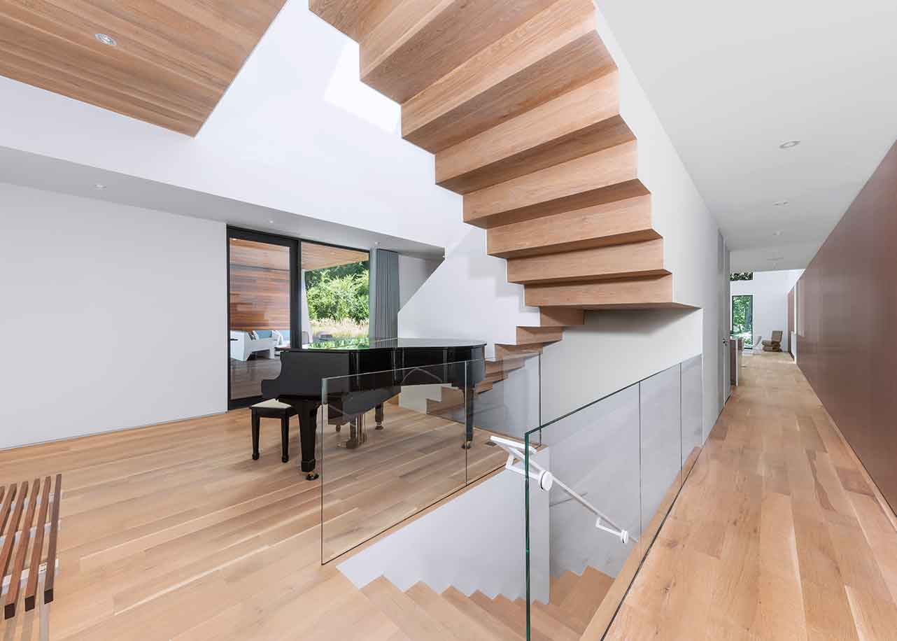
The design for the home’s main staircase did not come easily. “The staircase, believe it or not, I did the most versions on of anything in the entire house,” Architect David Goldschmidt says. “There were a million different iterations.” Goldschmidt knew he wanted to maintain the clean details of minimalism and found inspiration in M.C. Escher; Escher’s upside-down stairs have always fascinated him. The staircase’s final design was imagined around the idea that “when you cut something—even the exterior—it becomes a different material.” The white sides can be viewed as the original subject, and when you cut into it, the wooden stairs are exposed. This concept is displayed all around the house’s interior and exterior.
[Photo: Alexander Herring]
Whimsical Windows
Lots of thought went into the placement of the home’s windows, which were manufactured by Western Window Systems. In an effort to avoid the “repetitive, static, more traditional way where they’re all ducked in a row,” the whimsical windows throughout the house are more than visually captivating; each has a specific purpose. The window in the dining room is placed at sitting level, so anyone seated at the table has a clear view outside. In the master bedroom, the windows are placed so you can see the outdoors from bed.
[Photo: Alexander Herring]
Seeing Green
In creating the home’s split effect, part of the building’s roof ended up wholly visable to bypassers. Goldschmidt says standing on the street and looking down, all you could see was the roof’s white TPO. “I hate when you’re in houses or buildings and have this beautiful window, and you look out and see some awful roof, which actually happens a lot.” The green roof appeased Goldschmidt’s aesthetic desires and was also great for the environment, as it reduced stormwater runoff and energy consumption and improved air quality.
[Photo: Alexander Herring]
Let There Be Light
The skylights were designed with the hope of maximizing natural light and minimizing the need for electricity. “We never use electricity for any lights except for in the basement and certain spots where there are no windows,” Goldschmidt says. In warmer months, they can be opened to provide a natural flow of cool air throughout the home.
