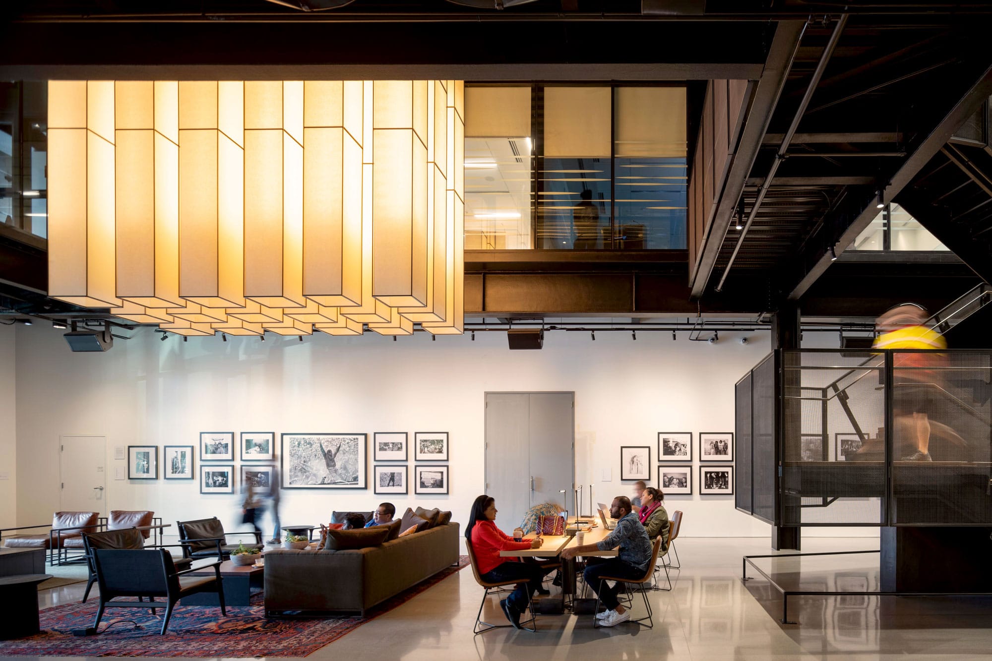
The LEED Gold 9th & Thomas was designed to be a neighborhood gathering place. A public lobby is home to a range of curated arts programming. Photo by Nic Lehoux
Eventually, we will return to the office. When we do, learn how design can inspire productivity and build community in these workspaces
1. Zoom HQ by Anacapa Architecture
You might be surprised to learn that one of today’s most cutting-edge companies is headquartered in a mid-century brick-and-mortar building.
Zoom, one of the world’s largest digital companies for video conferencing—and, let’s face it, a savior for many folks in the times of COVID-19—moved into a renovated four-story building in Santa Barbara in 2019, and the company’s new space is as impressive as its video sharing.
Dan Weber, lead architect and founder of Anacapa Architecture, is the visionary behind the urban rehab. He and his team were modernizing and rehabilitating the 1950s building to create three major tenant suites on a speculative basis when Zoom started scoping out the space for their southern California office.
Weber says he and the building’s owner, Christine Walker, put up quite the fight to get the company in downtown Santa Barbara. “There’s just not a lot of office space that’s at the scale that can support a global company like Zoom, and there’s all this pressure—economic, political, and bureaucratic—to have them relocate to the outskirts of town in one of the suburban areas where real estate is cheaper,” Weber says.
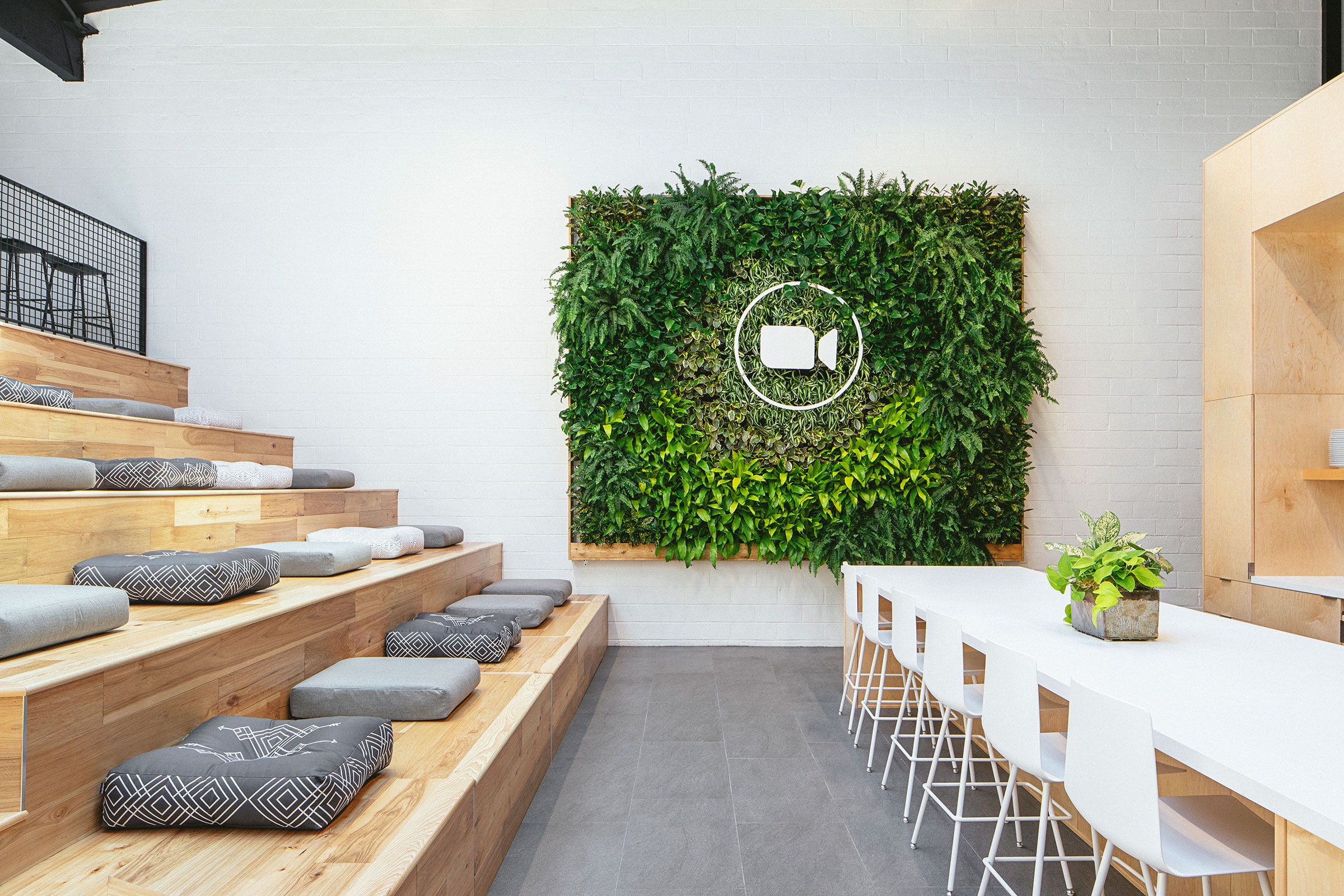
The four-story stairway at the Zoom headquarters doubles as seating and develops a centralized core in the split-level design. Photo by Erin Feinblatt
Building Zoom’s headquarters in a suburban area with less regulations would have given Weber and his team a bit more freedom with their design, but Weber says it was important to everyone involved that Zoom be downtown. “It helps enhance our community and keep really high paying jobs in Santa Barbara,” Weber says. Plus, the downtown location is environmentally friendly—the majority of Zoom’s staff has just a short walk for their commute to work.
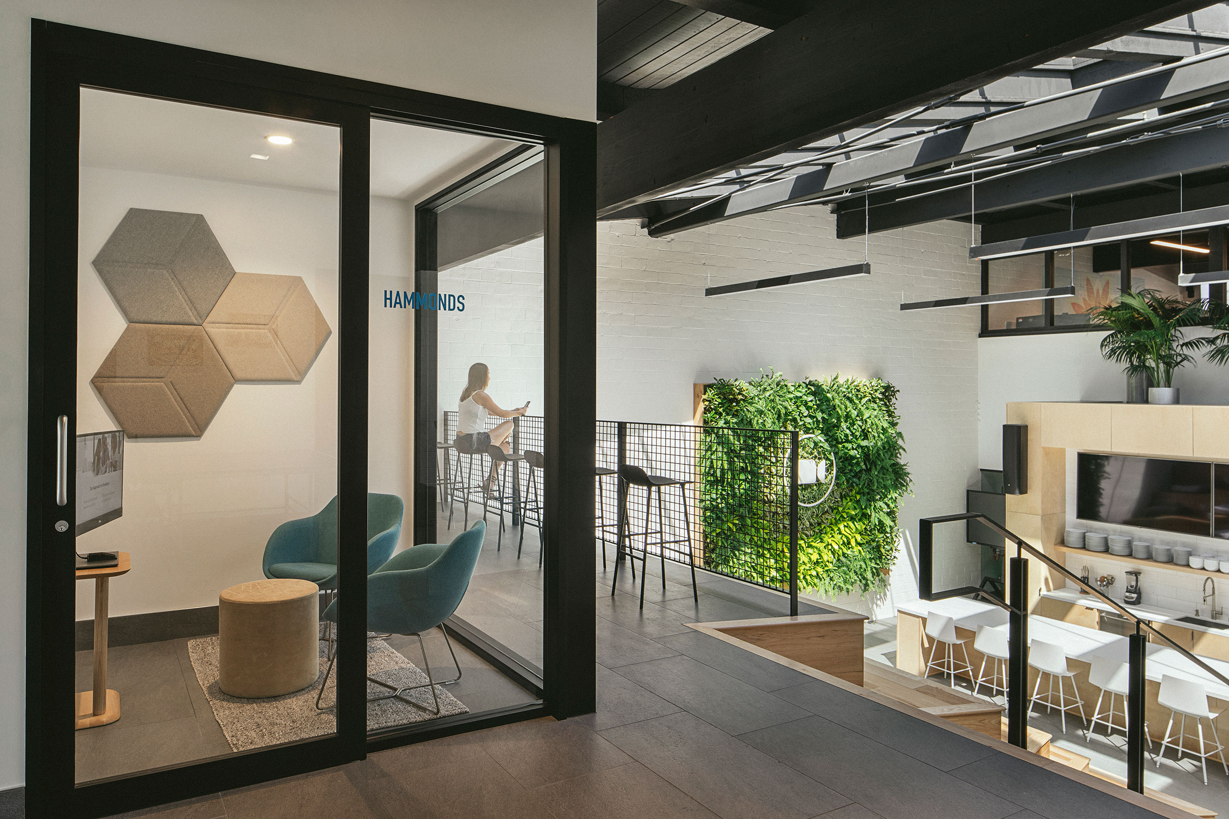
For Zoom, Anacapa Architecture improved a 1950s building’s energy efficiency by replacing all of the doors and windows, updating the HVAC, and using 100% LED lighting, among other things. Photo by Erin Feinblatt
Rehabilitating the aging building was the major sustainability feat of the project.
“Taking a building that was built in the 1950s and doing a really high-quality remodel with high-quality tenants in it,” Weber says. “We’re extending the life of that building by decades.” Anacapa enhanced the building’s energy performance by replacing all of the doors and windows, updating the HVAC, refinishing the south facing glazing, and using 100% LED lighting throughout the project.
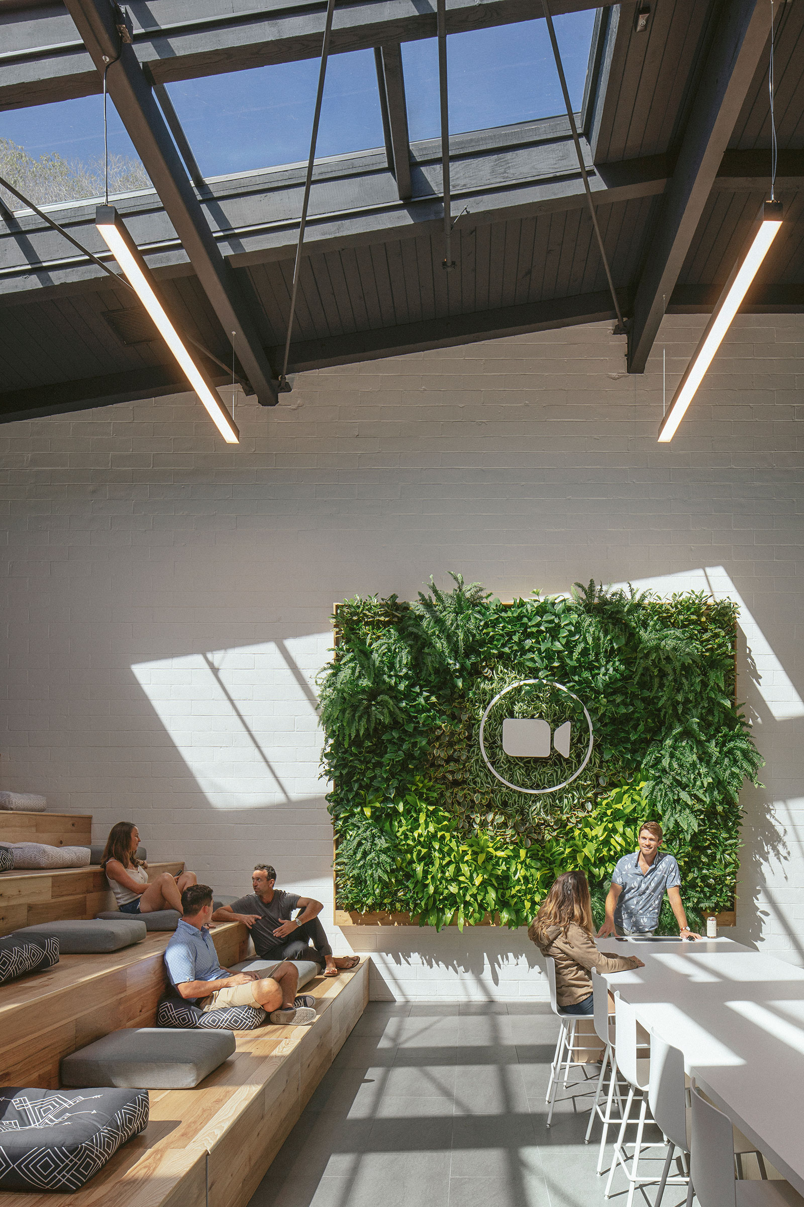
Zoom, one of the world’s largest digital companies for video conferencing—and, let’s face it, a savior for many folks in the times of COVID-19—moved into a renovated four-story building in Santa Barbara in 2019. Photo by Erin Feinblatt
The building itself is on a tricky slope, which meant there were significant level changes Weber had to design around. The split-level space was chopped into several outdated conference rooms.
The Anacapa team designed a stairway that connects the upper levels to the lower level in a creative way. “Above that stairway we utilized the existing skylight, which floods a ton of natural light into the space,” Weber says. “The space acts as a central core that enhances their community and the connection between people. It provides that fun sense of life and activity in the middle of the building.”
Zoom HQ
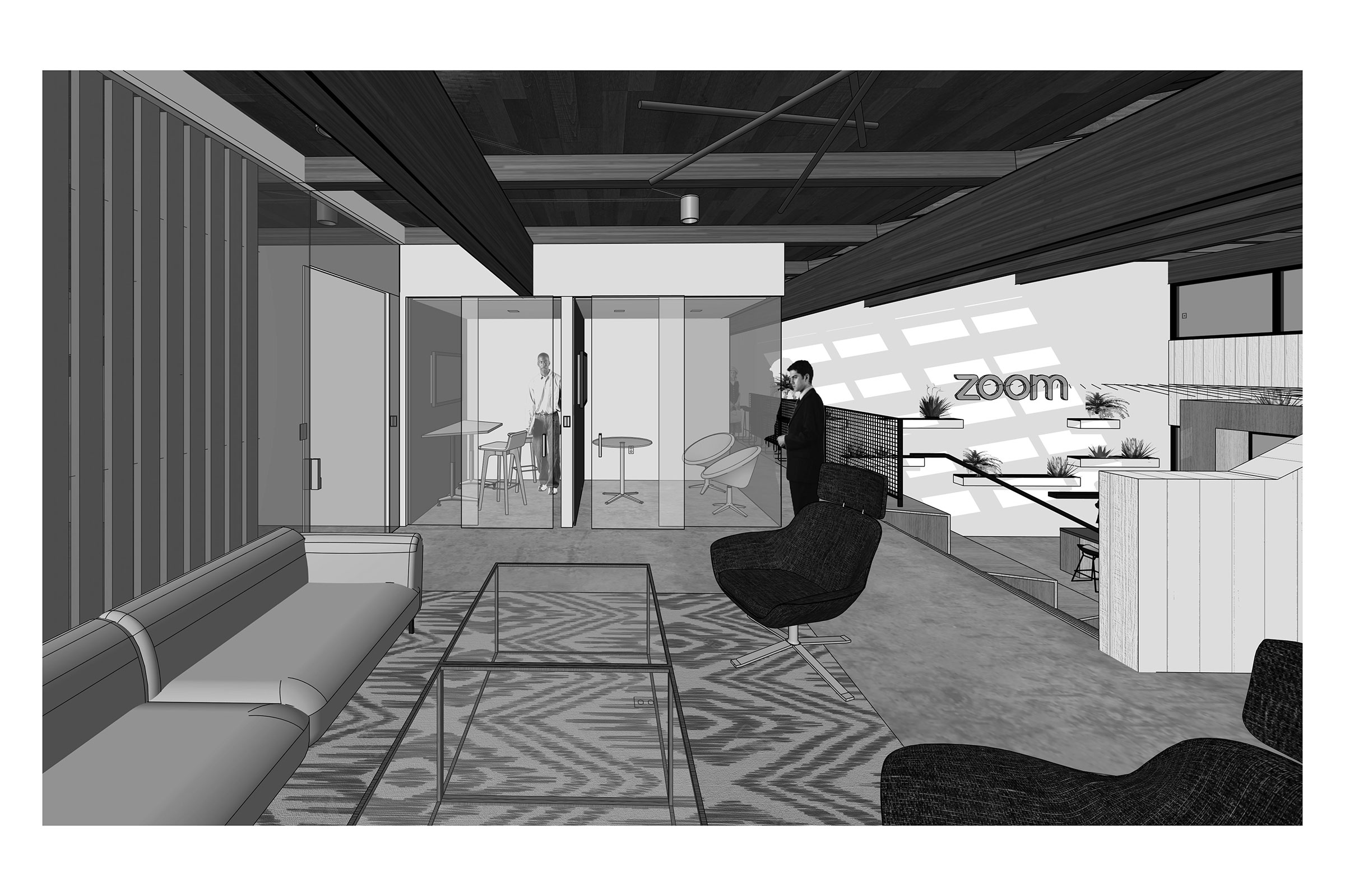
Location: Santa Barbara, CA
Completion Date: May 2019
Size: 7,000 square feet
Architect: Anacapa Architecture
Electrical Engineer: JMPE Electrical Engineering
Structural Engineer: Van Sande Structural Consultants
Mechanical Engineer: BMA Mechanical
Contractor: Bottenfield Construction
Interior Plants: Lush Elements
2. H-E-B/Favor by IA Interior Architects
In other aspiring office innovations, seasoned studio leader and designer Stephanie Long is the managing director at IA Interior Architects’ Austin office.
The innovative H-E-B Digital/Favor Delivery offices were one of the first projects IA’s Austin team was awarded after opening in 2017, and Long thought IA’s design director Manuel Navarro would be the perfect fit to lead the design concept. Long says Navarro is passionate about delivering inspiring spaces for his clients that reflect their strategic business goals and culture.
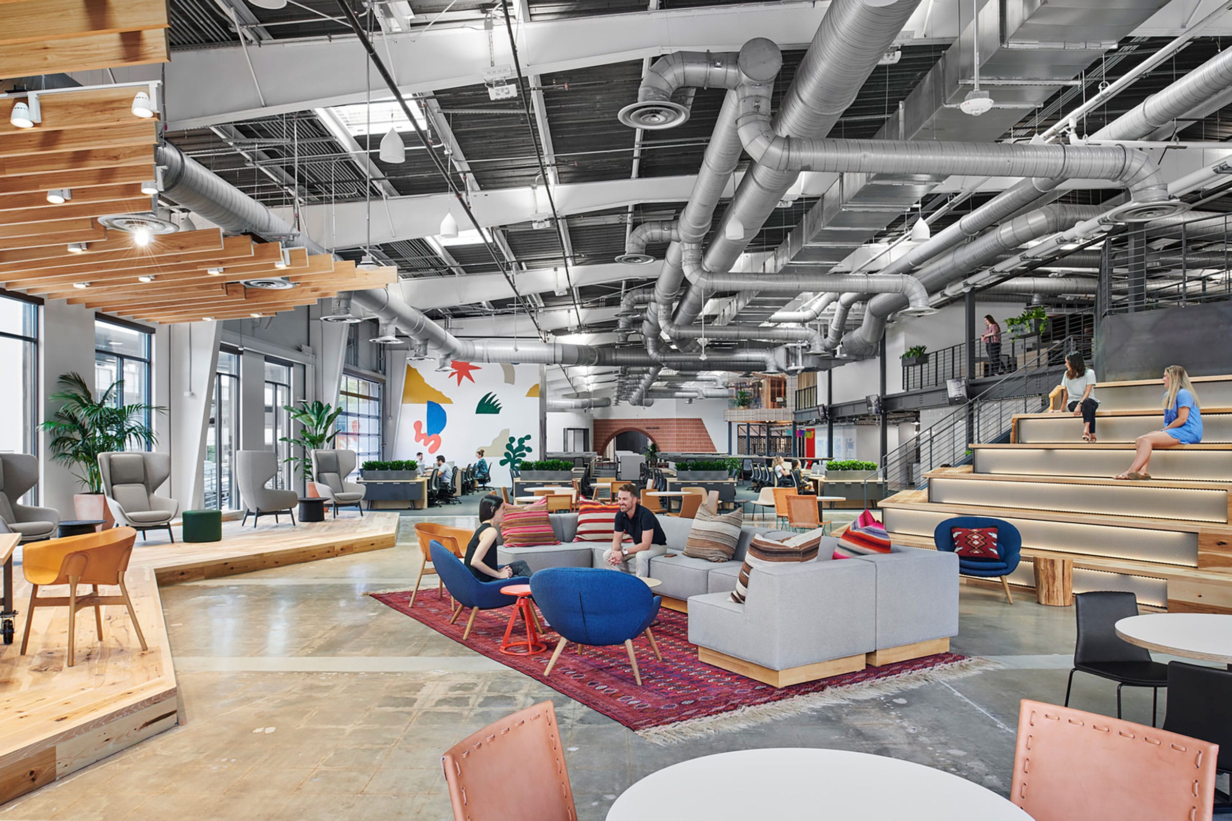
Pecan wood from Texas’ state tree is showcased in custom installations throughout H-E-B/Favor’s communal space designed by IA. Photo by Peter Molick
The renovated 81,000-square-foot warehouse, which used to serve as Austin’s first recycling center, now houses the Texas-bred superstore H-E-B and its recently acquired food delivery service Favor. “The biggest design challenge for this space, both functionally and aesthetically, was creating a cohesive work environment that supports two very different organizations with very different workstyles and heritage,” Navarro says.
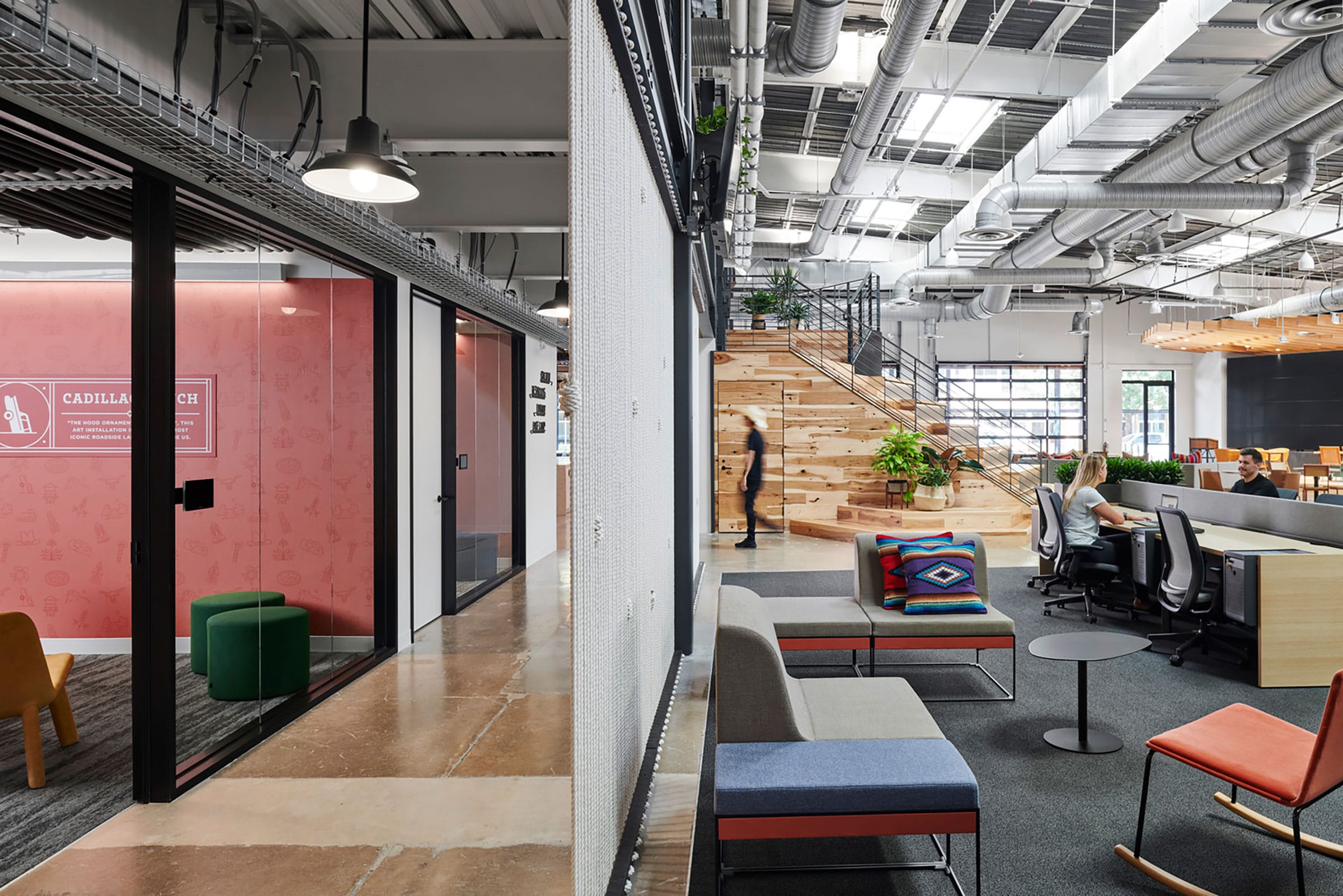
Photo by Peter Molick
The design works as a sort of melting pot that merges both companies with their main commonality—Texas pride.
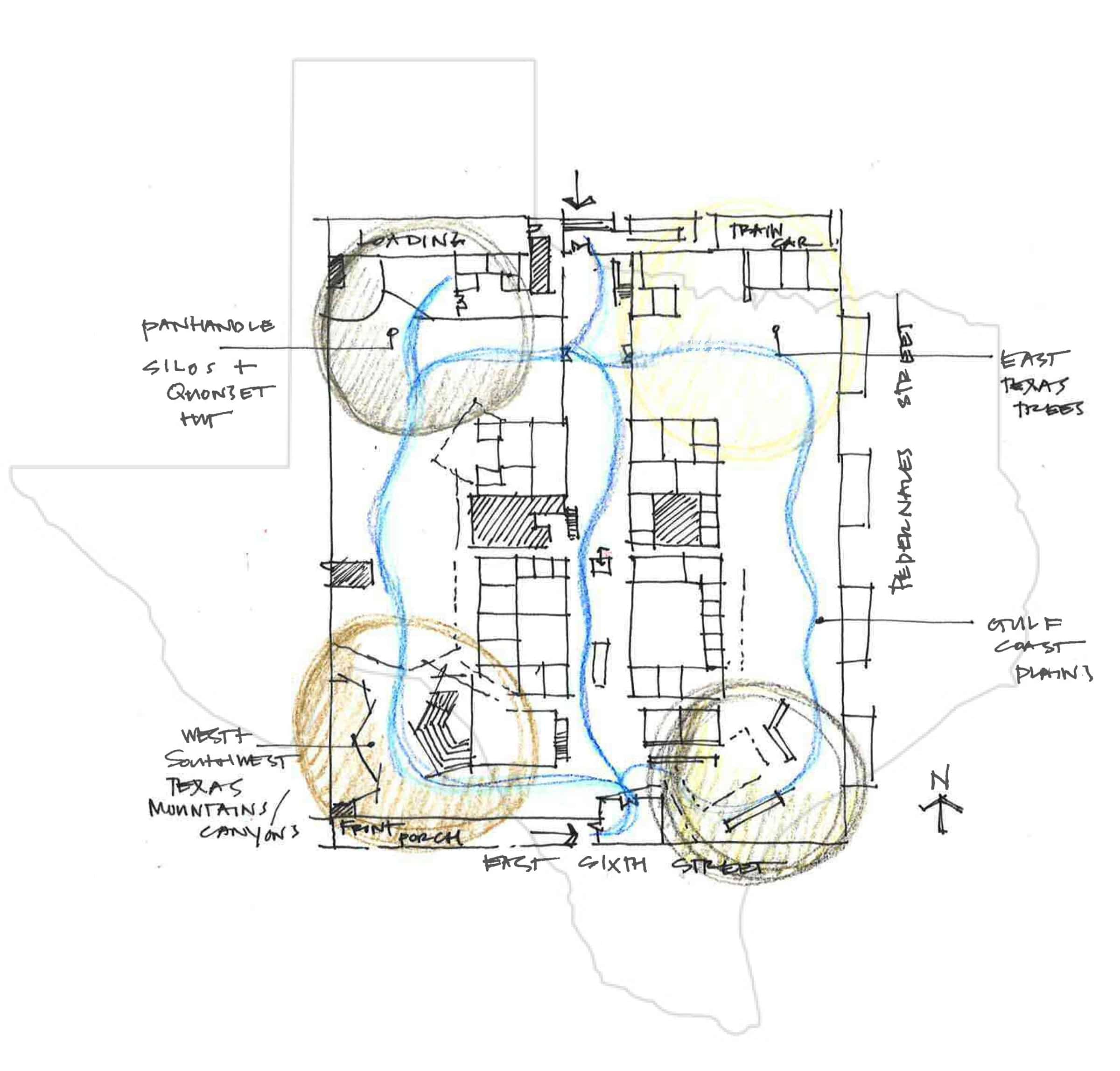
But don’t worry, you won’t see longhorns and hide on every wall. “We used Texas as a space planning strategy by superimposing the state map on top of the building shell,” Navarro says. “This broke up the large, mostly open plan into quadrants.”
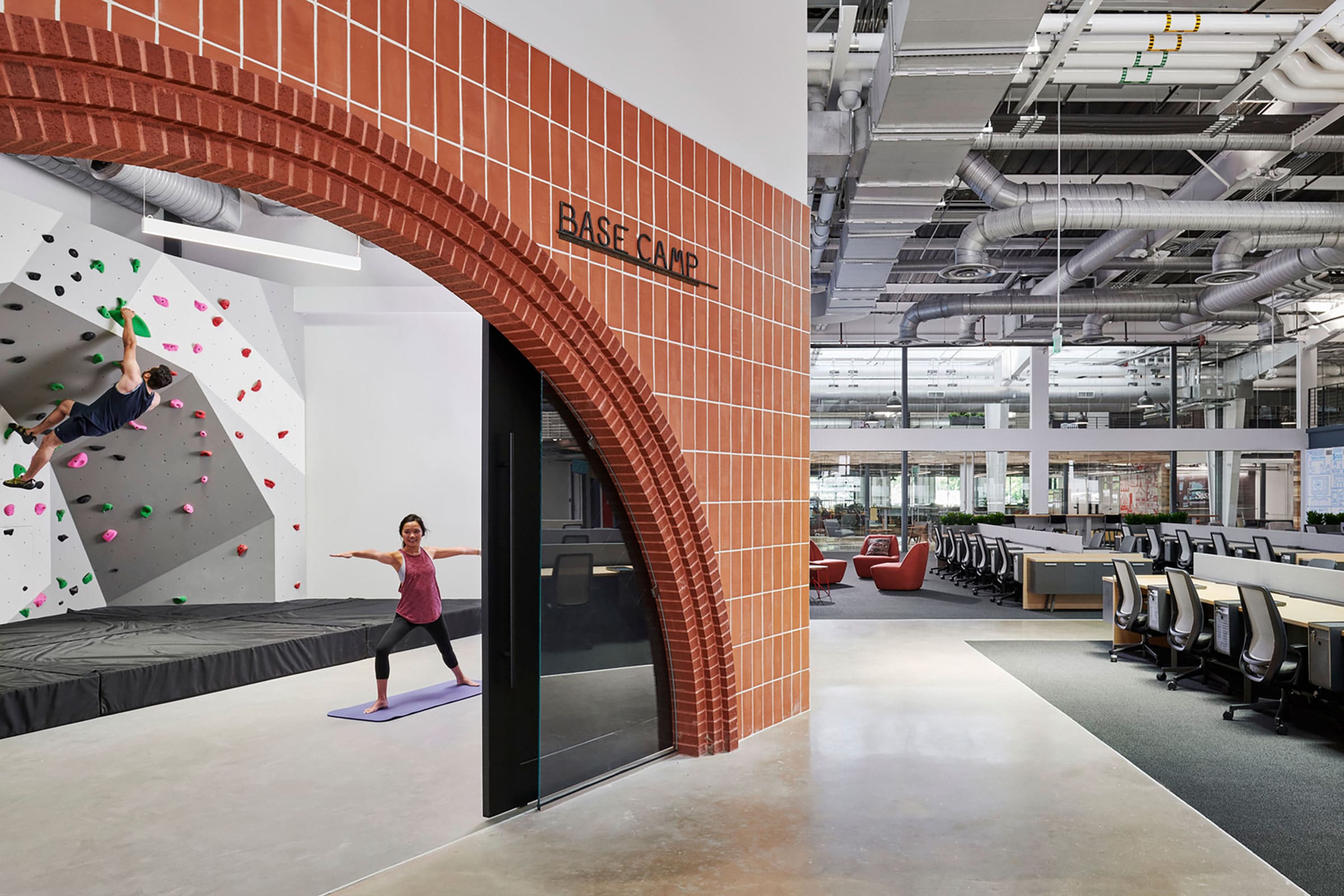
The rock wall, seen at the left, represents Palo Duro Canyon. Photo by Peter Molik
The design also incorporates tastefully curated Texas elements, like the large Hickory Pecan stair that represents the Trans-Pecos area of West Texas, a photo studio to resemble a grain silo akin to one found in the panhandle, and even a rock wall that represents Palo Duro Canyon.
The design also incorporated handmade furniture from Marfa and art from Texas-based makers and artists.
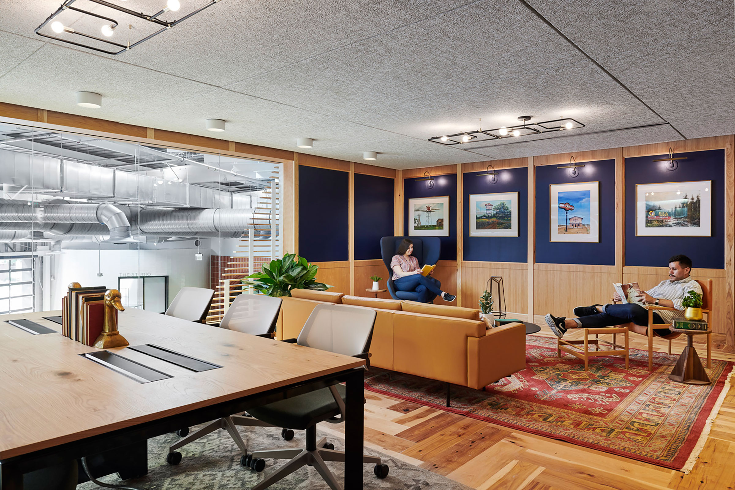
Photo by Peter Molick
Long and Navarro’s design has a fun and bespoke feel that pays homage to each company’s heritage. “We designed a few Easter eggs in the space that people will find as they wander,” Navarro says.
For example, the 750-square-foot boardroom, Kerrville, is the exact size of the first H-E-B store that was founded in the Texas city of the same name.
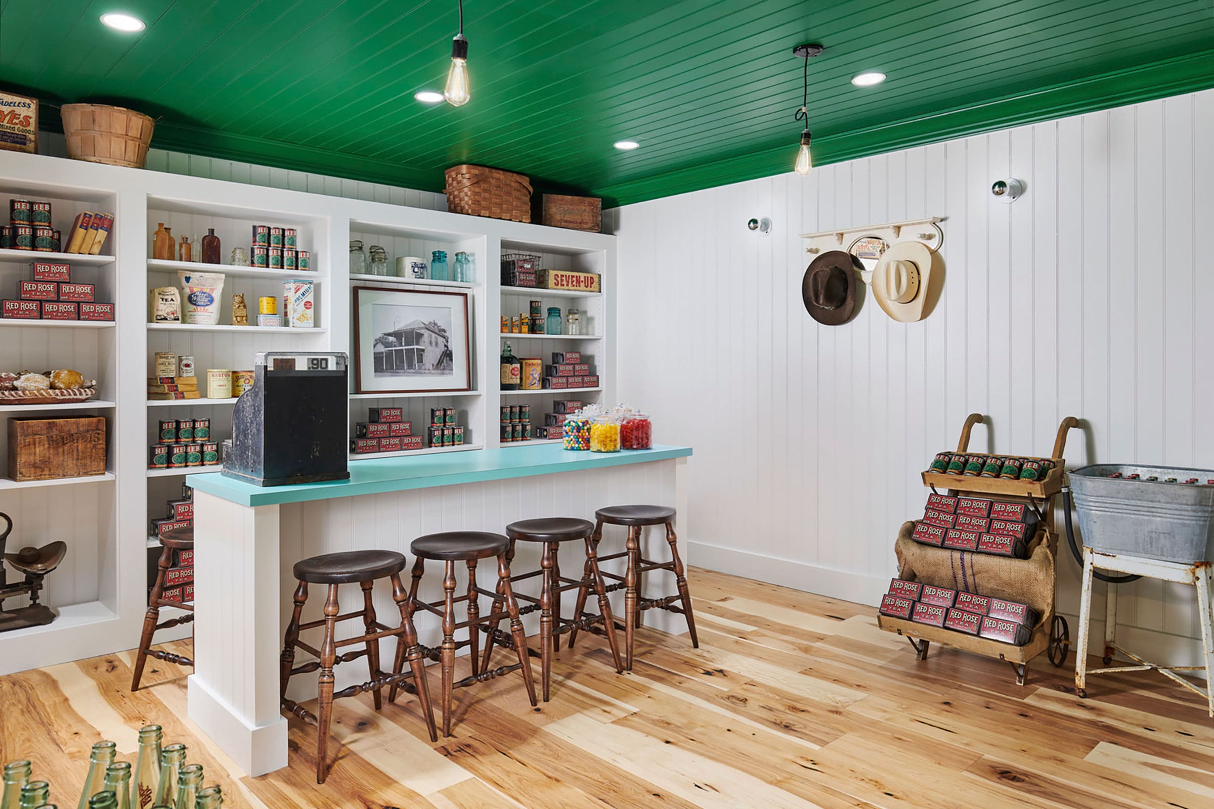
A replica of the first H-E-B store in a hidden room in the Austin headquarters, named after the year the store was founded in 1905. You can enter 1905 through a secret shelf that’s accessed in the “Beer Friday” bar. Photo by Peter Molick
H-E-B/Favor
Drawing courtesy of IA Interior Architects
Location: Austin
Completion: Summer 2019
Size: 81,000 square feet
Architect: IA Interior Architects
Interior Designer: IA Interior Architects
3. Olson Kundig’s 9th & Thomas
Up in the Pacific Northwest, Tom Kundig, principal and owner of Olson Kundig, works closely with project teams and clients to create buildings that respond to their surroundings. His recent project, 9th and Thomas, is a mixed-use building with retail and office spaces in what used to be the industrial hub of Seattle.
“This area of Seattle, South Lake Union, has seen a lot of change in recent years as industry moves out and technology moves in,” Kundig says. “It was important to us that the building ultimately contribute to the culture of the neighborhood.”

The LEED Gold 9th & Thomas was designed to be a neighborhood gathering place. A public lobby is home to a range of curated arts programming. Photo by Nic Lehoux
Unlike many structures that build around an elevator core, 9th & Thomas uses a side core that allows the space to adapt to change and preserve the open, flexible floor plates that modern office tenants want.
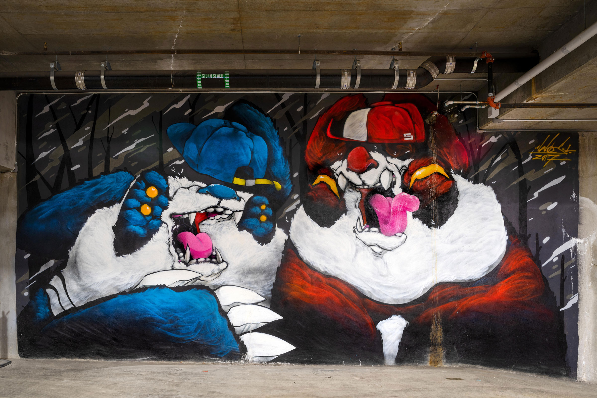
Photo by Nic Lehoux
The floor plan also allows the building to capture the lively community feel in all aspects, even its sustainable features.
The operable windows and movable shutters, for example, offer natural ventilation and adjustable lighting in the various spaces, and the green roof not only cuts down on the heat island effect but also encourages movement between indoor and outdoor spaces. “This isn’t a static building that goes dark at 5pm. It welcomes people inside. It engages with the street,” Kundig says.
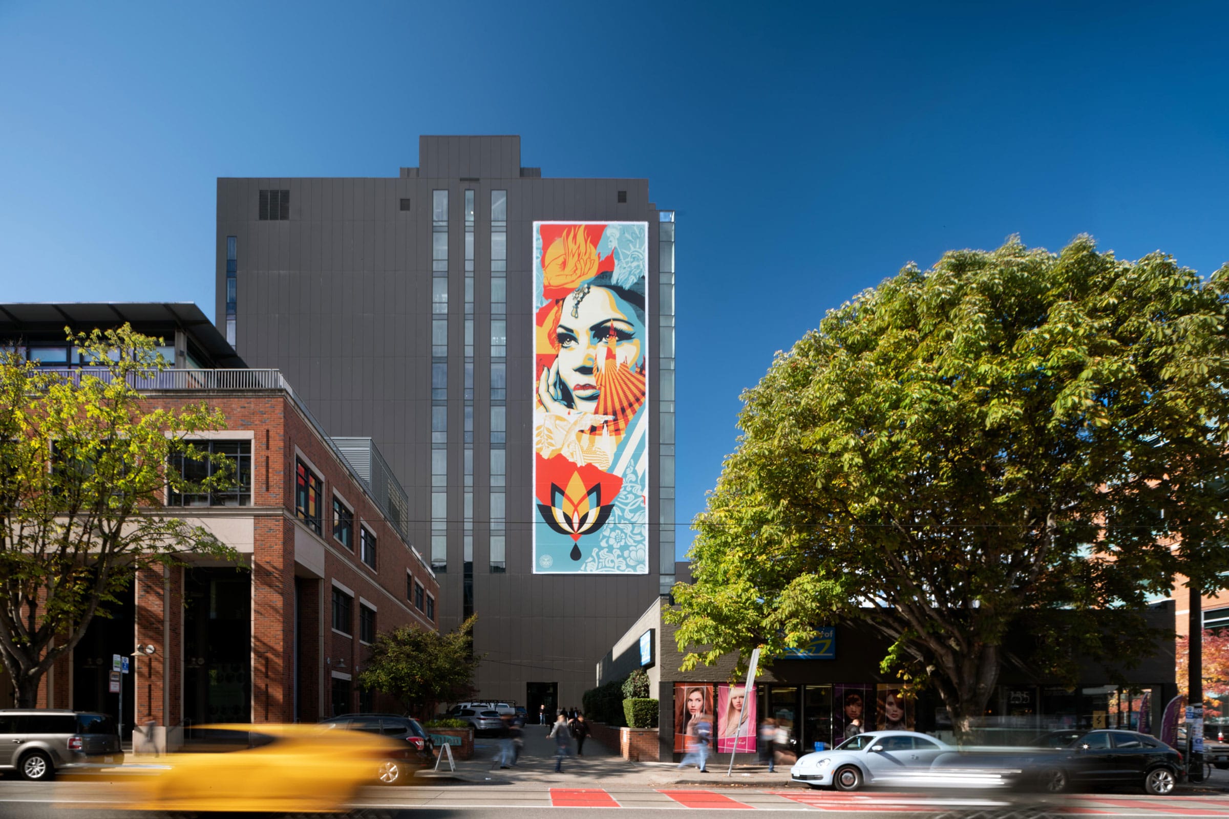
Exterior artwork by Shepard Fairey hangs from 9th & Thomas and further immerses the build- ing into the urban landscape. Photo by Nic Lehoux
The building has common and private porches and terraces throughout, which bring the outdoor spaces into the design and provide great views to the city. “That kind of immersion in the city, in the surrounding community, is really what this building is all about,” he says.
9th & Thomas
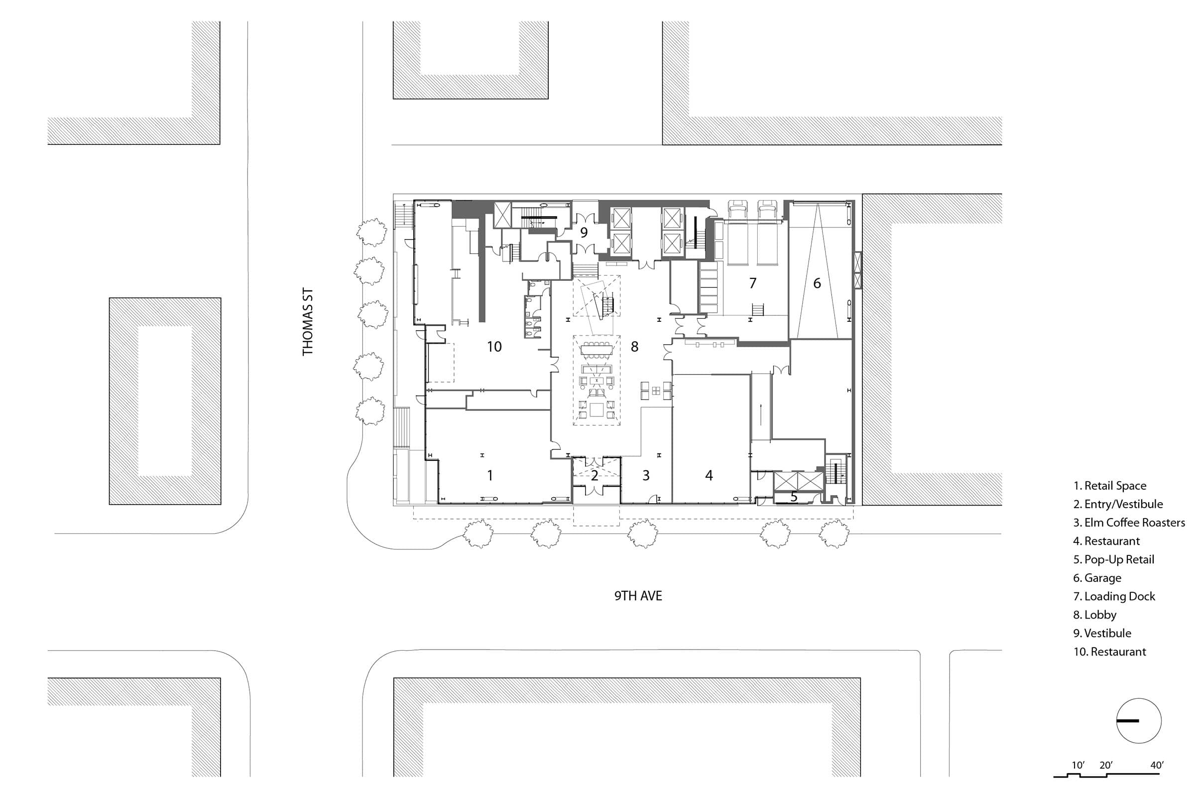
Location: Seattle
Completed: 2019
Size: 230,000 square feet
Architect: Olson Kundig
Landscape Architect: Site Workshop
