Story at a glance:
- How Sliding Glass Doors and Wood Panels Make a Difference
- What It Means to Design for Hygiene in Today’s Buildings
- An Architect’s Guide to Designing a Happy, Healthy Bathroom
Over the last couple of years a global shift to remote work has emptied out offices around the world. In the process workers have grown accustomed to the comforts and familiarity of home. And while many companies are increasingly requiring employees to be onsite at least part of the time, not everyone is enthusiastic about returning. As one recent headline summed up the situation, “Going Back to the Office: It Has to Be Worth It.”
Companies know that. In response, more of them are designing communal spaces that enhance employee connection and collaboration. Technically they’re offices, yes, but they’re nothing like the cubicle-filled holding tanks of old. Ideally they’re places people want to go rather than have to go.
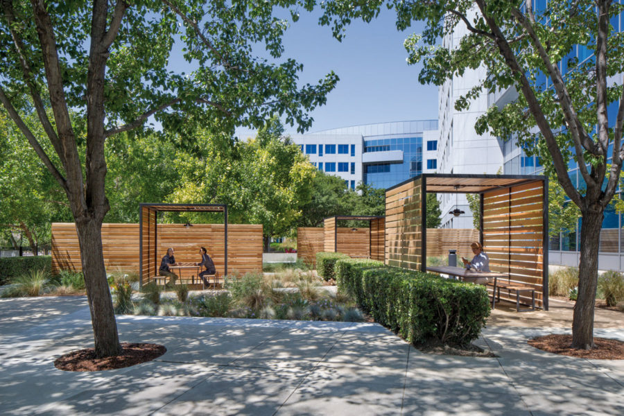
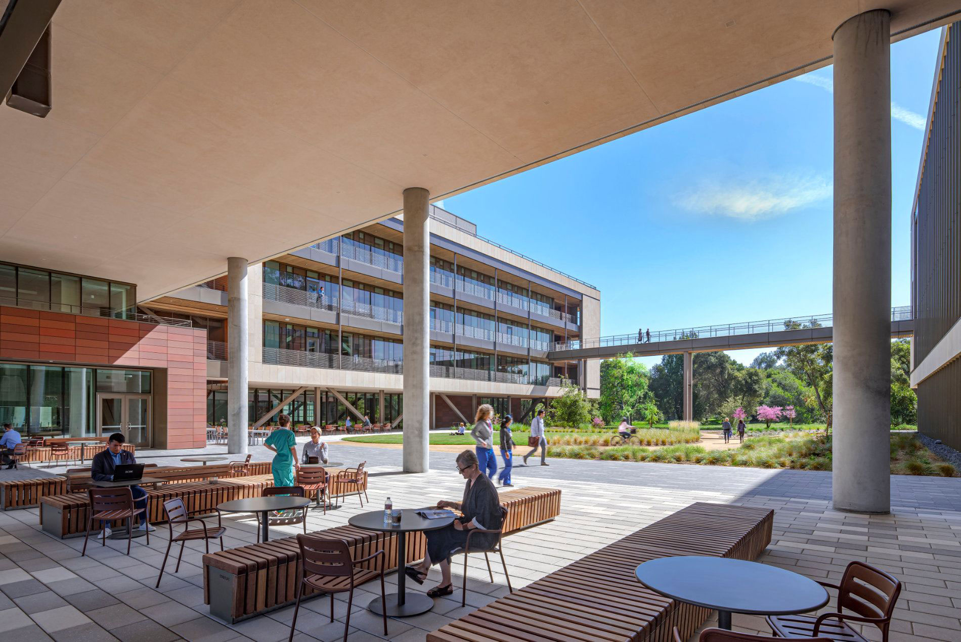
This HOK project for Patelco illustrates how access to outdoor environments in which people can work and socialize has become increasingly important. These informal spaces encourage interaction, help build relationships and provide important access to fresh air and daylight. Photo by David Wakely Photography
But creating more alluring environments—and they very much are environments—involves a lot more than simply rearranging the ergonomic furniture. That’s where hybrid office specialists like the design, architecture, engineering, and urban planning powerhouse HOK comes in.
“Workers are being asked to break their routine and go back to something that is unknown and unstable, and that is something most people aren’t comfortable with,” says Kay Sargent, director of HOK’s global workplace practice.
“Right now, in addition to a variety of work styles, we’re experiencing a wide spectrum of comfort and sensitivity. Everybody has a heightened sensitivity to their surroundings. Some are comfortable coming back together at the office; some aren’t.”
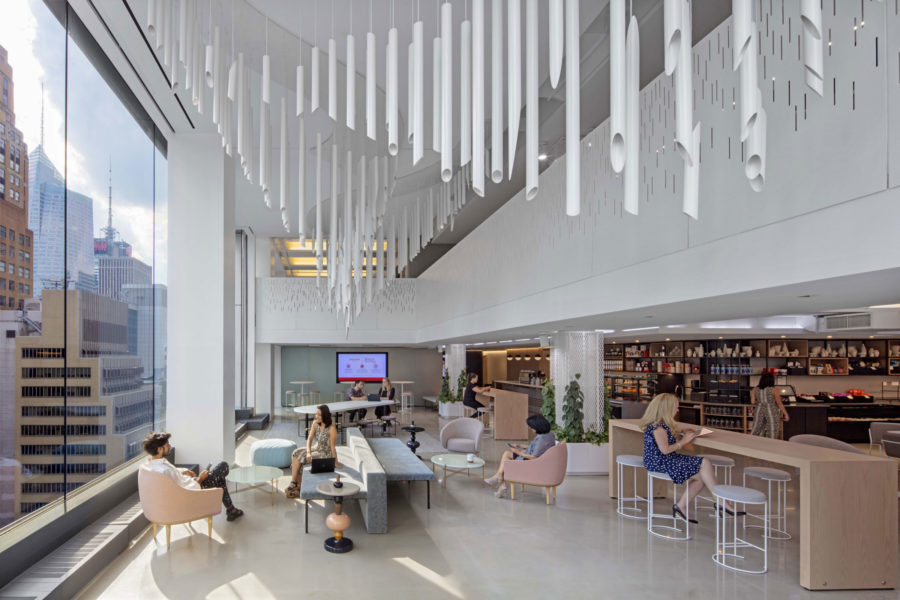
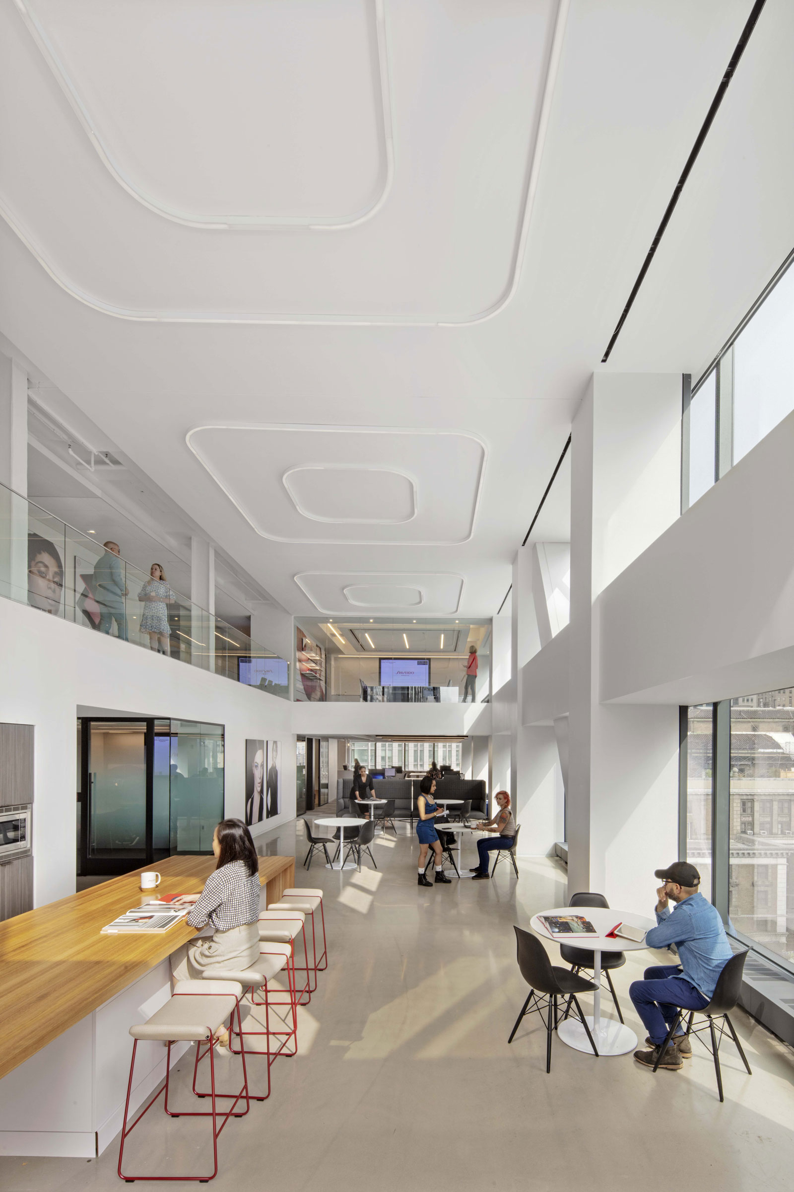
Inside Shiseido’s New York City headquarters, designed by HOK. Photo by Eric Laignel
The key, Sargent adds, is to create “enticing experiences” that make the office a meaningful destination. Employees can do focused, inspiring work with the right design model in place—and that includes making sure they feel safe, whether that’s because they’re protected behind beautiful glass walls or working productively and happily outside in nature.
Enticing experiences, Sargent says, includes a full spectrum of design considerations. “That means the arrival experience, the food and beverage experience, how you’re being treated within the space, the atmosphere, the mood, the vibe, the branding,” she says. “And also how easy it is to navigate the space. We need to consider all of those different factors in creating great workplaces going forward.”
There are even “lifestyle studios” where people can play with their pets, paint, do yoga, cook—anything they’d do at home during or after the workday. That way, nothing is left behind.
But even the most beautifully designed offices are falling short when it comes to taking that sort of ultra-holistic approach, Sargent says. Because workers have been away for many months, “there isn’t a lot of energy or buzz, so offices are very sterile, they’re very cold, they’re under-populated, and they just don’t feel right.”
HOK is working to remedy that. One of its most recent designs, the Stanford Center for Academic Medicine in Northern California, successfully marries form and function in a state-of-the-art space that’s welcoming, energizing, practical, and sustainable.
Seamlessly connected to its natural surroundings, the striking structure includes a west office wing that’s lifted above the ground to form a large, two-story porch below. That porch links the property’s Fredrick Law Olmsted-designed arboretum to Stanford Medicine’s hospitals and school.
Other notable attributes include:
20% of the built program repurposed outdoors through balconies, patios, and landscapes.
Fine-tuned “microclimates” that enable comfortable outdoor environments year-round to reduce building size.
Three narrow, interconnected office wings that rise above a central landscaped courtyard, forming a U-shaped building that provides views to nature from all vantage points.
Intentionally narrow internal wings with workspaces that are no more than 30 feet from a window for uniform natural light exposure.
Public access through an open-air breezeway, and connection to the arboretum’s trails.
Outdoor access from the office wings via walkways overlooking the courtyard, and bridges that traverse the courtyard edges.
Multiple outdoor spaces for working, socializing, and relaxing amid trees, landscaping, and public art.
A sustainable building design, including a curtain wall that minimizes glare while optimizing indoor thermal comfort and daylight.
Biophilic design inspired by the oak tree, whose foliage blocks direct sun while allowing filtered light and breezes to pass through.
“You don’t find a lot of white boxes in nature,” Sargent says. “We like organic spaces, we want to feel that connection, which has repeatedly been shown to help people feel healthier and more engaged, or to enhance creativity and set a positive mood. It’s water elements, it’s natural sounds, it’s natural materials, it’s organic shapes, it’s fractals. All of those things we find in nature create much richer experiences. We really need to start thinking about how we can better incorporate them to create more thriving workspaces.”
We really need to start thinking about how we can better incorporate them to create more thriving workspaces.
From productivity-enhancing laptop tools to bigger teleconferencing screens to more robust wireless networks, technology also plays a central role. But it should complement the environment so as to foster connection rather than encourage isolation. More than anything else, in fact, connection—to nature and to each other—is the ultimate goal.
“We’re social creatures. We thrive off being around other people. I can’t really invite clients or co-workers to my house, so it’s important to have a place where we can gather and connect.”
- Natural light floods Shiseido in NYC, designed by HOK. Photo by Eric Laignel
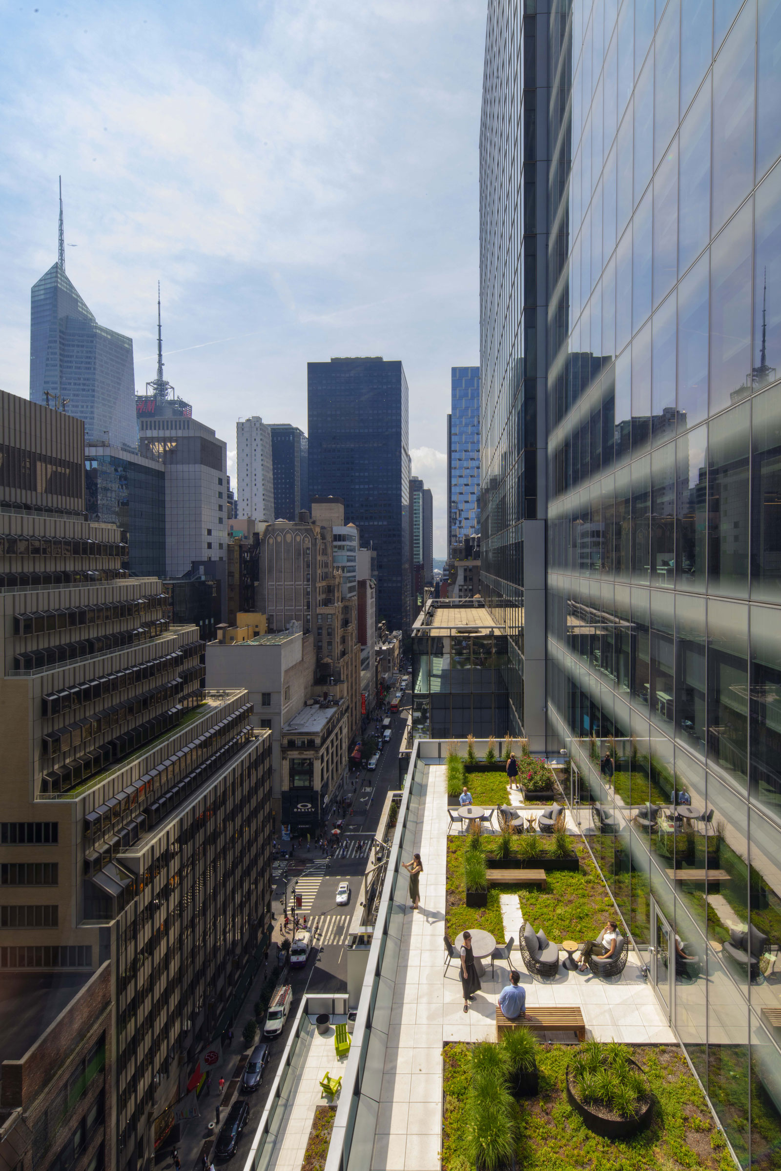
- Shiseido’s NYC headquarters incorporates terraces to bring nature to high-rise buildings. Photo by Eric Laignel
Amenities and services should serve the same purpose. Offering a variety of work settings, for instance, encourages movement and staves off the stagnancy that comes from sitting in one place all day. Easy access to tech specialists reduces computer and network issues that can interfere with workflow. In general, Sargent says, it’s all about helping people to better integrate with their company’s culture and brand by offering them things they can’t get at home. Because if you have everything you need at home, “You don’t ever need to leave it,” she says.
One thing HOK learned during the pandemic is that clients who had already embraced a “free-choice” environment fared much better than those who hadn’t. Not only did it become difficult to create any kind of meaningful social distancing in spaces that were essentially cubicle farms, but there were far fewer options for how and where to work. Right now, Sargent says, most of the firm’s clients “are looking to create environments that enable personal choice and options.” Besides there being “a wide spectrum of comfort and sensitivity” to consider, she says there’s a tremendously empowered workforce that’s more focused on what’s right for individuals over companies.
“The C-suite doesn’t want to be unsympathetic; they want to show empathy. But it’s also about balancing the needs of the business. In order to innovate, many of them really need to have people back in those places.”
With the help of HOK, they’re striving to make that transition pleasant rather than painful.
Opening New Doors to Workplace Design
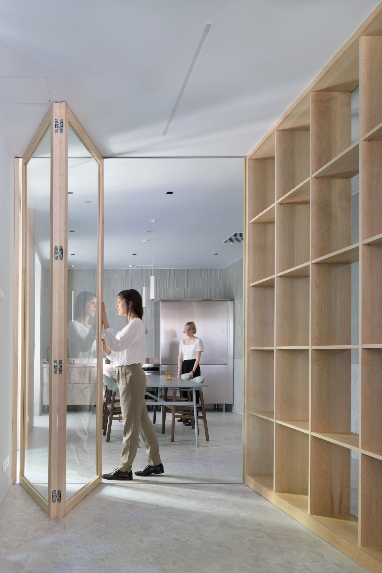
- Sliding doors from KLEIN combine form and function for today’s most modern offices. Photo by Javier de Paz Garcia
- SLID is a sliding door system design for wooden and metal doors. Easily divide rooms in high-end residential, commercial, and hospitality projects. SLID utilizes bi-parting or bi-passing wooden and metal doors to optimize clearance while utilizing a minimalist design. Photo courtesy of KLEIN
Adaptable. Sustainable. Durable. Beautiful. KLEIN’s revolutionary sliding glass, wood door, and partition systems embody all of those things. It’s one of many reasons why the company is still going strong after nearly 90 years.
Founded in Barcelona and headquartered in New Jersey, KLEIN guides customers through the life of a project from design to execution. When it comes to enhancing spaces with exciting designs and high-quality materials, KLEIN is in a class by itself. With an ever-expanding product line that’s designed by architects for architects and backed by rigorous R&D, the company is widely respected by countless clients in the commercial, residential, health care, and hospitality industries.
“We have a lot of architects who work daily with other architects and interior designers,” says KLEIN Managing Director for the Americas Lluís Ferrer. “Whether we do the design or the client approaches us with something in mind, we first ask them how they’re going to use their space—how they imagine themselves living in it. That way we can give them the best system for their specific and unique needs. And we can customize almost all of our products to suit any space.”
A Gallup.com article published last spring, “Going Back to Work in the Office: It Has to Be Worth It,” included some pointers for business leaders who want their employees back in the office on a full- or part-time basis. Before that happens, the story noted, several questions need to be addressed. Among them: “What is our workplace value proposition?” In other words, “How do we get people to want to work onsite? What does our workplace offer that enhances the employee experience?” Those questions are key to KLEIN’s current work. In creating interiors that reimagine today’s workspaces, KLEIN’s goal is to offer people more than what they previously had at the office or currently have at home. Something that’s both functional and inviting.
“Just imagine you’re going to the office again and suddenly you’re in this huge space. It might be an amazing space, but you don’t have this domestic scale you’ve become used to during the pandemic,” Ferrer says. “We’re able to bring this domestic scale into retail, hospitality, and office areas just by moving, opening, and closing our panels. That way people can work the way they want—collectively or individually—in a place that’s both safe and flexible.”
A great example of KLEIN’s cutting-edge form and function in action is a recent renovation of the Sunstone Hotel headquarters in Irvine, California. Working alongside architects from Gensler, KLEIN designed the space to achieve a large open work space, with extensive intra- and inter-departmental visual communication, without barriers between the different levels of function and assignment. In order to accomplish those things and maintain the desired open aesthetic, they installed KLEIN’s Rollglass+ with a black matte finish. The result is a space that’s both beautiful and practical.
KLEIN’s contemporary mobile and sliding glass or wood designs are all made with this phrase in mind: long life, loose fit. That means being highly adaptable to ensure maximum functionality and longevity as spaces evolve to serve different needs.
“If you’re working for an established company or corporation, it’s very likely that you spend the majority of the week at an office,” KLEIN notes in a recent blog post. “In the process of sending emails, attending weekly meetings, and racing to meet deadlines, have you ever stopped to think about how your environment is influencing your work and productivity?
“In a well-designed space, we don’t really notice the subtle details that make us feel good. We just know that the environment makes us feel happy, and that we are motivated to do our work. A workplace that is not well designed might elicit the opposite feeling. At KLEIN we have learned to pay extra attention to how our products influence and function in the workplace, because we know how interior design affects our workplace interactions.”
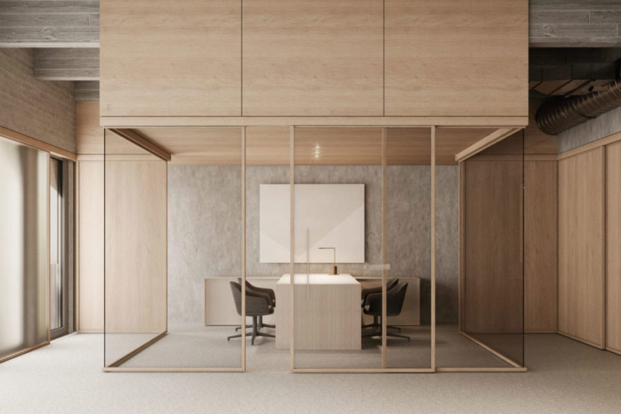
Sliding glass doors and wood panels from KLEIN’s NATURE system make a big impact in today’s changing workplace design. Photo courtesy of Klein USA
Their product NATURE, made with oak wood to give a feeling of warmth, provides additional well-being to workers. Say an office wants to host a large networking event or enhance inter/intra-departmental communication. Simply roll open KLEIN’s telescopic Extendo line of sliding glass doors, and in seconds there’s plenty of room to roam, connect, and collaborate. On the other hand, if the goal is to section off smaller areas for private meetings, video conferencing, or individual work that requires more concentration, Rollglass+ has it covered. Interior wood partitions and movable walls have the same effect.
There’s a strong sustainability component as well. NATURE is Cradle to Cradle–certified and, in the cases of Extendo and Rollglass+, nothing blocks the flow of natural light. That means lower energy costs and a constant feeling of openness—even in enclosed areas. As for the wood panels and partitions, there are no materials more sustainable than those made from nature. At KLEIN, environmental impact and human wellness are central to everything they do. “As an architect, you’re designing spaces that will have a huge impact on society,” Ferrer says. “Architects who want to work with us can be assured they’re getting a product that was designed with the future in mind.”
Klein is actively committed to protecting the environment; that’s why they also have a policy of constantly reducing their impact by improving production processes (ISO 14001) and designing products that have a positive effect on people and the planet.
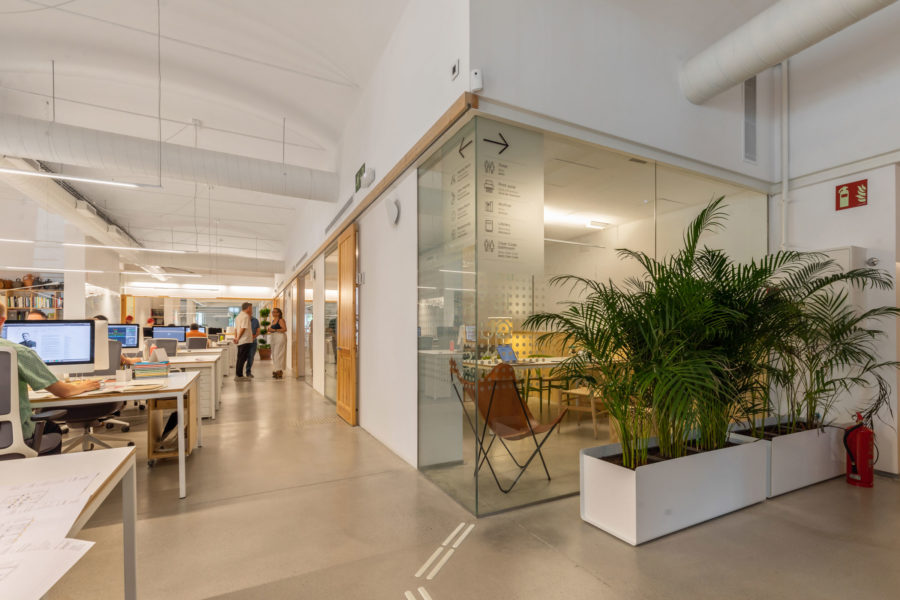
At PMMT Forward Thinking Healthcare Architecture in Barcelona, transparent and wood-framed glass panels and glass and wood sliding doors were installed to facilitate maximum efficiency, communication, and more. Photo courtesy of Klein USA
Perhaps the most ambitious and impressive project of KLEIN’s is the recently completed headquarters of PMMT Forward Thinking Healthcare Architecture in Barcelona. KLEIN’s transparent and wood-framed glass panels, glass and wood sliding doors, and other inventive features were installed throughout the space to facilitate maximum efficiency and communication, optimum circulation, and mixed spatial organization flows.
“The biggest challenge was figuring out how to adapt the space to our business model, which is centered around encouraging collective intelligence and innovation processes, and how to make sure the office truly reflected our values,” says Patricio Martinez, CEO of PMMT. “The sliding tracks allow us to play with a large work area, shared by the whole team, and a set of defined-use spaces that support team members’ different needs, depending on the circumstances.”
The firm’s 5,500-square-foot floor, designed to ensure everyone has full access to every room and feature, includes a non-hierarchical transversal space for team gathering, adjacent smaller rooms that are more private, and a brainstorming room. The brainstorming room has large sliding whiteboards that stack up on one wall and allow team members to express their thoughts visually while conserving space. Another large sliding panel, perpendicular to the whiteboards, acts as an entrance/exit and can also be written on if more surface area is required.
“At KLEIN, we’re proud of providing an excellent client experience over the past 90 years,” Ferrer says. “That includes creating flexible solutions for investors and real estate companies; quality products for architects, installers, and interior designers; and, of course, versatile and durable innovations for the final user. Above all our goal is to enhance the well-being of those who work in our fluid and adaptable spaces.”
Design for Hygiene in Today’s Buildings
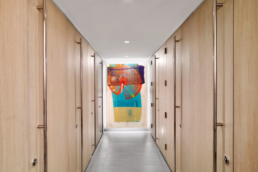
At White & Case, HOK fashioned high-end toilet partitions from quarter-sliced European oak veneer with an easy-to-clean matte finish. Photo by Eric Laignel
Imagine this: You meet with a prospective client and really hit it off, talking about all the ways your future partnership will benefit their company. But after they take a break to use the restroom, they return less enthusiastic than before. At first, you can’t figure out why. Then it hits you: the restroom. It’s hygienically questionable (at best), poorly lit, and stylistically outdated. But you never thought it mattered that much.
On the contrary, it matters a lot. First impressions are crucial. That goes for places and people alike. “Bathrooms are a reflection on the brand and the entire space,” says Christine Vandover, a senior project interior designer at HOK. “So you want them to feel comfortable, not cold and institutional.”
When HOK is brought in to design new restrooms or give old ones a major facelift, they work with all of this in mind. There’s always a blend of form and function—the former sometimes getting extra attention depending on which client-side person spearheads the project. One CEO, Vandover recalls, personally hosted separate planning meetings on restroom design to review all toilet accessory styles and materials. He also wanted to make sure the stalls were full height, felt private, and the restrooms looked first-class to match the design level of the rest of the space. Other company leaders, Vandover says, have taken a personal interest as well. That’s how crucial restrooms are.
Tiles & Grouting
Then, of course, there’s the ongoing global pandemic. More than two years into it, cleanliness—perceived and actual—has never been more important. It’s the main reason why, for instance, HOK uses darker-colored grouting that doesn’t show dirt as easily. And since larger tiles require less grouting, Vandover explains, they’re very popular right now for both walls and floors. The largest tiles can measure eight or nine feet high by three or four feet wide.
Durability & Materials
Like its wall counterpart, floor tiling must also be anti-slip and able to withstand years of abuse from user traffic and—this is key—repeated deep cleaning. Counters, too, are made from durable and germ-repelling non-porous materials (engineered stone, for instance) that hold up well under frequent scrubbing and near-constant wetness from sink splashing.
Hands-Free
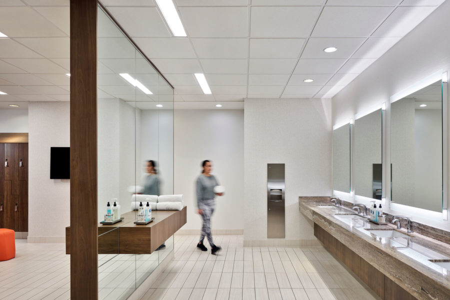
At Trammell Crow Center, HOK gave the hygiene-focused space a more boutique feel using wood and wood tones, plus full compartment toilets and shower facilities. Photo by Michael Robinson
On the subject of sinks, hands-free faucets are becoming the standard. So are soap and paper towel dispensers. Another hands-free paper towel dispenser typically is installed near the exit, along with a trash receptacle, so people aren’t forced to grip the door handle with just-washed hands (or stretched-out sleeves).
Thoughtful Design
Toilets also are hands-free and, especially in higher-end restrooms, located in stalls with partitions that extend all the way to the floor. Vandover says some clients (like the aforementioned CEO) have requested elegant stall walls rather than metal doors for a more luxurious feel. And the stalls are always equipped with at least one hook so occupants never have to set personal belongings on the floor. (No matter how clean a restroom is, the floor inside a stall is never pristine.) Foot pedal-operated entrance and exit doors are growing more common, too.
Despite the hygiene-centric functionality of these spaces, Vandover says, they’re almost always designed with human psychology in mind. That extends beyond germs to what she describes as “a hospitality experience.”
In addition to quality materials and smart design, creating a hospitality experience requires well-positioned lighting with a color temperature of between 3000- and 3500w. You don’t want a clean restroom to appear dirty. It’s also important for occupants to look their best. Because if you look good, the saying goes, you’ll feel good. “You want the light to face you, so you have fewer shadows on your face,” Vandover says. “You look healthier, and it makes you feel better when you see yourself. In corporate offices people are often getting ready for a presentation or a meeting. If the lighting is bad, they leave feeling less confident.”
Case Studies
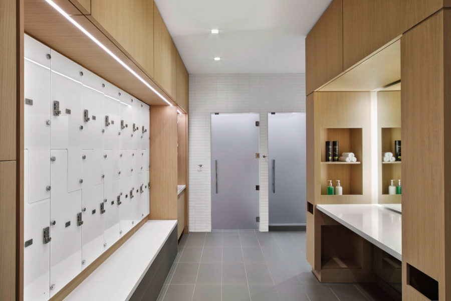
The White & Case bathroom also has storage lockers made from germ-repellant Hollman Model Z back-painted white glass. Photo by Eric Laignel
A couple of HOK’s recent projects include restroom redesigns for New York City-based White & Case law firm as well as the Trammell Crow Center in Dallas. At White & Case, HOK fashioned high-end toilet partitions from quarter-sliced European oak veneer with an easy-to-clean matte finish. In addition to custom millwork, the partitions feature Rockwood brushed stainless steel door pulls that are both rust-proof and stand up to repeated sanitizing. Flooring is Stone Source Merida Fog porcelain tile that can endure endless mopping, and storage lockers are made from germ-repellent Hollman Model Z back-painted white glass. Even the narrow bench in front of them is topped with bacteria-resistant non-porous Dupont Corian in Glacier White.
Other hygiene-friendly materials include Tydix-brushed stainless door pulls on the lockers, Daltile Unity porcelain floor tile in unpolished ash gray, and laminated glass entry/exit doors with a frosted interlayer that’s non-corrosive and mold-free.
For the post-modern Trammell Crow Center’s renovation and expansion, HOK incorporated materials from a previous design and gave the hygiene-focused space a more boutique feel using wood and wood tones, plus full compartment toilets and shower facilities.
Though they’re designed differently, the spaces have two things in common: cleanliness and comfort. “Restrooms are one of the main places where people want to feel safe,” Vandover says. “How you care for your bathrooms conveys how you care for your company, your people, and your brand.”
Designing a Happy, Healthy Bathroom
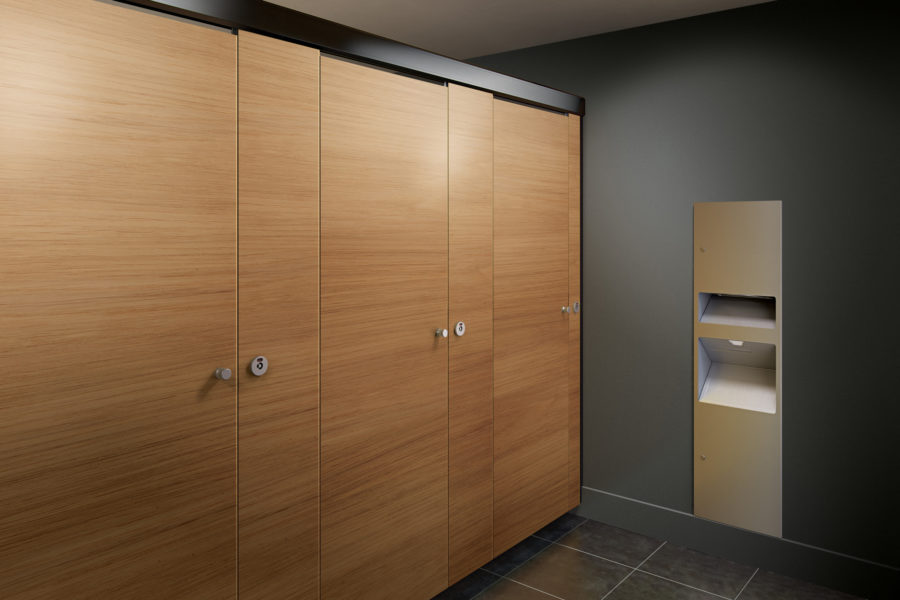
ASI’s Alpaco Collection, seen here, is ideal for the most aesthetically demanding applications. Photo courtesy of ASI
When people take car trips, they often plan stops around rest plazas, which have the cleanest restrooms. When commercial buildings rent out space, floors that have the nicest restrooms often rent first and for a higher price.
In other words, restrooms (or washrooms) matter—a lot. That’s certainly true at businesses of all kinds, whether office buildings, schools, hospitals, or restaurants, among others. Messy and unhygienic washrooms reflect poorly on management and owners. If so little care is given to the product selection and design of these highly trafficked places, how must they treat their customers and employees? Safety and comfort in the restroom reflect well on everything else that surrounds it—and conversely could detract from it.
“Restroom square footage itself may not generate revenue, but it surely accentuates the experience of the building, which in turn enhances revenue generation,” says Cyrus Boatwalla, head of global marketing and operations for ASI Group, the world’s leading manufacturer of commercial toilet partitions, washroom accessories, lockers, and visual display products. “I think people are recognizing that, but we’re also trying to educate them about why it’s important. Perception is a funny thing. If you walk into a five-star restaurant and the bathrooms aren’t up to par, studies have shown that people don’t return to those restaurants. They also talk about them negatively to family and friends.”
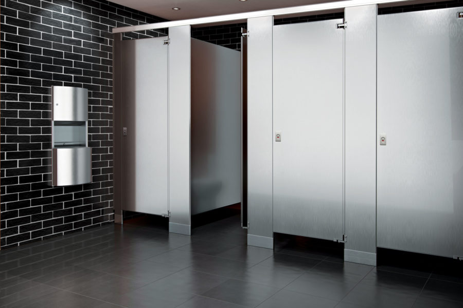
ASI’s stainless steel metal partitions complement any design scheme. By adding a textured finish, increased resistance to vandalism can be achieved. Available in all four mounting styles with stainless steel hardware. Photo courtesy of ASI
There are a few keys to making these important but often under-considered spaces inviting: Aesthetics, hygiene, and layout as well as product type and material selection —which are often closely interrelated. But it’s never a one-size-fits-all solution, Boatwalla says. Everything from fixtures to flooring must be determined on a case-by-case basis. What worked the last time or the time before that won’t necessarily work again, particularly if the spaces are vastly different in terms of who uses them and how.
“This is a space where you spend a lot of private moments,” he says. “Paying thoughtful attention to the design of the restrooms shows patrons we care about them enough to make this place comfortable, safe, hygienic, even aesthetically pleasing—all the things you would want out of your own living room.”
Regarding private moments, Boatwalla notes that privacy is more important than ever. “It’s not optional anymore; it’s standard.” Well aware of this societal shift, ASI offers an integrated privacy system for stainless steel or powder-coated metal partitions that eliminate the need for retrofitted components. That saves clients time and money. Here’s how it works: The integrated privacy components—built into the door during manufacturing—overlap the pilaster on the hinge and latch sides and allow the door to close flush with the pilaster, making sure all sightlines into the stall are blocked.
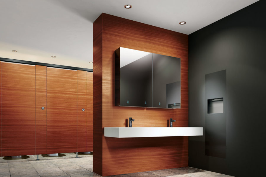
ASI’s Velare collection is a behind the mirror system designed to conceal clutter. The stainless steel cabinet houses a hands-free automatic soap dispenser and your choice of a paper towel dispenser or high-speed hand dryer, with a HEPA filter. Photo courtesy of ASI
As for key accessories like soap dispensers, touchless technology remains extremely popular. Some ASI models multitask—delivering both soap and waterless hand sanitizer. These dispensers are not limited by propriety consumables or brands and are therefore less vulnerable to supply chain disruptions, which have proven to be disastrous during the pandemic. That has an impact on both user experience and hygiene—not to mention profits from saving money on supplier contracts that may include more expensive consumables than what one would find in the open market.
Touchless paper towel dispensers (both recessed and surface-mounted) in every capacity and non-propriety paper configuration, from ASI’s different collections like Profile™, Simplicity™, Piatto™, or ROVAL™ model, are other favorites.
For the more ecologically minded, ASI offers an elegant and ultra-hygienic way to dry hands sans paper. The high-speed and ADA-compliant Turbo-Pro™ Automatic Hand Dryer features a HEPA filter that purifies the air before it dries. Housed in a separate chamber, the filter is easily removable and replaceable. Additionally, both air temperature and speed can be customized by the owner for optimal functionality and energy efficiency. Or maybe a hybrid model is better. Enter ASI’s Piatto 3-in-1 towel dispenser, dryer, and waste receptacle. (By the way, ASI has lots of waste receptacles to suit every need, from giant stadium bathrooms to small private ones.)
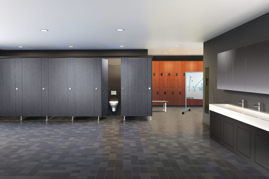
Photo courtesy of ASI
Increasingly, Boatwalla says, countertops are clear of dispensers or clutter of any kind; everything is hidden in mirrored cabinets and other sleek storage areas. That means less mess—and fewer germs—to clean. Clients are also opting for brighter colors on the walls, stalls, and doors to create a more inviting atmosphere. Bye bye, beige.
Besides what they contain, well-designed restrooms consider who they were built for and why while optimizing flow—or how occupants move around in the space. People should be able to dry their hands very close to where they washed them, for example, rather than walking several feet away and creating a potential slipping hazard by dripping water onto the floor. Likewise, lockers—available in a multitude of colors, styles, and materials from ASI Storage Solutions—should be close to showers. And if you’re going to install a paper towel dispenser near the door for more sanitary handle-grabbing purposes, make sure there’s a receptacle nearby to catch the refuse.
In the future, Boatwalla says, smartly designed restrooms may get even smarter—literally—by being connected to the Internet as many manufacturing plants are now. That way businesses will be able to more efficiently pinpoint resupply needs (in part by eliminating time-consuming manual checks) and more quickly respond to problems that arise by merely looking at a screen. But that’s down the road. Right now it’s about intelligent design, architecturally speaking.
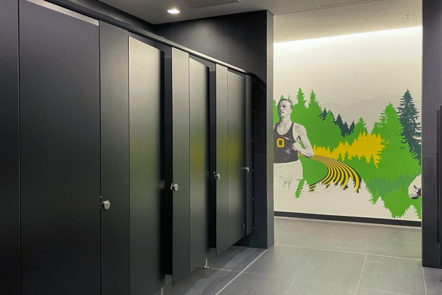
Photo courtesy of ASI
“People often don’t understand how they’d benefit from better restrooms,” Boatwalla says. “And frankly, more often than not, it doesn’t have to cost more. It just has to be thought through. Architects are especially busy today, and so they may use a specification that worked the last time or the time before. But buildings today are completely different than 20 or 30 years ago. You must use a fresh set of eyes, throw away your old specs, and start anew.”
ASI’s deep and varied product line provides what amounts to a huge palette for design creativity. As Boatwalla and any of the company’s experts would tell you, it’s just a matter of re-imagining how this often overlooked space can be a great asset rather than a major liability. That starts with knowing what works best for each individual client.
The common thread is vibe—how a restroom feels. No matter how they’re designed or where they’re located, restrooms should be oases of sorts—even, as the name connotes, restful. Because happier employees and more content customers translate to a healthier business and, ultimately, to a better bottom line.

