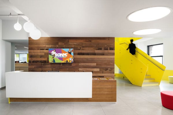
In the heart of Manhattan’s Civic Center—nestled between Tribeca and Chinatown—you’ll find many of the city’s most distinguished municipal buildings—towering masses of well-aged and sturdily refined architecture. Among the rows of concrete nobility is the 22-story Court Square Building located at 2 Lafayette Street, which recently became the newly renovated home to both the Department of Youth and Community Development (DYCD) and the Department for the Aging (DFTA) via the creative planning of BKSK Architects.

BKSK created a balance of a densely fitted primary workspace laid out throughout a generally spacious floor plan with conference rooms collected sporadically around the floor plan. PHOTO: JEFFREY TOTARO
The primary objectives for the project were simple enough. With the DYCD, “They wanted to consolidate their offices into a city-owned building,” says Joan Krevlin, partner-in-charge on the project, aiming merely to relocate and meet city requirements. Together with senior project manager Jenniece Centrella and sustainable design director Jennifer Preston, the team first launched a series of client meetings “to understand their own aspirational goals for their space,” rather than simply roll out rows of improved desk spaces. “We learned two things,” Krevlin recollects. “We learned that there were many different groups in the agency, and what they do there is manage public funds and allocate them toward programs for the benefit of community youth; and second, that they had a shared pride in the work they did and welcomed an opportunity to work more collaboratively.” This information would inform the BKSK team’s goal of pursuing an inviting and communal atmosphere.
In observing the Court Square Building floors across which the DYCD would be relocated, the team took note of possibilities for optimizing the department’s energy performance and sustainability features. One obstacle the team was confronted with immediately pertained to the building envelope, considering an architect can generally expect to have the entirety of the building to work with. But in the case of the Court Square Building’s 22 floors, BKSK was only working on seven, which restricted their options. The team, though, viewed it differently: as a novel challenge. “This was a really unique and fun opportunity to see how could we impact the sustainability of the building while only able to operate on a few floors within a larger structure,” Preston says. As a matter of good fortune, it was discovered that the windows in the building had actually been replaced relatively recently and performed adequately, with only minor setbacks. “What had happened was that the installation of the windows hadn’t insulated around the frame,” Preston explains, “so if one held their hand up to the glass, they wouldn’t feel much difference between inside and outside air temperature, but your hand up toward the frame, and you’ll immediately feel a draft of cold air coming in from the edges of the windows.” By peeling out sections of the wall finish where necessary and applying spray foam insulation around the frame, the building envelope—and thus human comfort—were neatly enhanced.

BKSK installed an automated shading device so as to absolve building occupants of the need to adjust the slats while keeping a privileged view of the city perpetually available. PHOTO: RAIMUND KOCH
In order for occupants of the Court Square Building to be able to effectively collaborate on projects with one another, they must first feel comfortable doing so. To animate the space, the team thoughtfully executed subtle, but meaningful, touches on a variety of factors that affect the human condition. “We wanted the space to be a little more holistic to comfort and set up something that the building can maintain and work with,” Centrella notes. Several green roof installations were implemented, many of which can be viewed from the conference room. Plus, architectural views from the windows in the building are markedly captivating, and the design team wanted occupants to be able to enjoy them at all times. “We noticed that when the early morning sunlight would seep in, it’d cause a lot of glare, so shades would be pulled in the morning,” Preston explains. “And by the time the sun had moved around the building and become less obtrusive, they’d forgotten that they could also pull the shade up and enjoy a bit of daylight and gorgeous architectural design.” The team installed an automated shading device so as to absolve building occupants of the need to adjust the slats while keeping a privileged view of the city perpetually available.

This workplace is slated to receive a LEED Gold certification with its focus on sustainable design and the pursuit of human comfort. PHOTO: RAIMUND KOCH
The irregular perimeter of the building was something that BKSK also used to their advantage. The floors themselves aren’t exactly sizable, and to boot, there were a certain number of city regulatory curtailments that do indeed concern desk size. “We used design to make the space feel bigger,” Krevlin says, which ultimately entailed a generally light floor plate as well as “workspaces grouped in a way that is efficient but that also compliments the perimeter shape, which was irregular.” The team converted spaces that weren’t being use into workspaces designed to accommodate larger groups working simultaneously. The result was a clever balance of a densely fitted primary workspace laid out throughout a generally spacious floor plan with conference rooms collected sporadically around the floor plan. The project is slated to receive a LEED Gold certification, underscoring the relationship between sustainable design and the pursuit of human comfort.
![]()

