Story at a glance:
- Solares Architecture structurally and aesthetically revamped a historic Toronto home.
- Large windows and dropped floors create a sense of openness.
- A sliding glass door between the kitchen and porch harmonizes the modern interior with lush greenery.
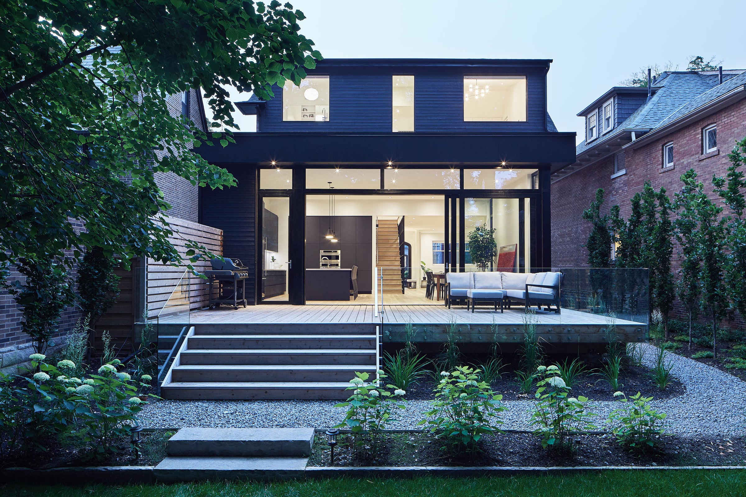
Photo by Nanne Springer
The bucolic Toronto neighborhood of Rosedale is lined with handsome pre-war homes, all of them “heritage” graded and many significantly upgraded—on the inside, that is. Any renovation in the neighborhood, when it’s allowed, must maintain a home’s original streetview appearance. That includes along the sides. And so it was with a stately brick house purchased by a Toronto couple who lived in England and wanted to move back home.
After a long process that involved lots of Skyping and structural revamping, including rebuilding the front porch and dropping floors to increase ceiling height, this home is now what you might call a modern classic.
“We like fairly normal materials—but put together very carefully,” says Tom Knezic, a principal at Solares Architecture who oversaw the project. “We’d rather do that than something really exotic. And from a sustainability perspective, we love being able to keep the existing structure. There’s also cultural value to that.”
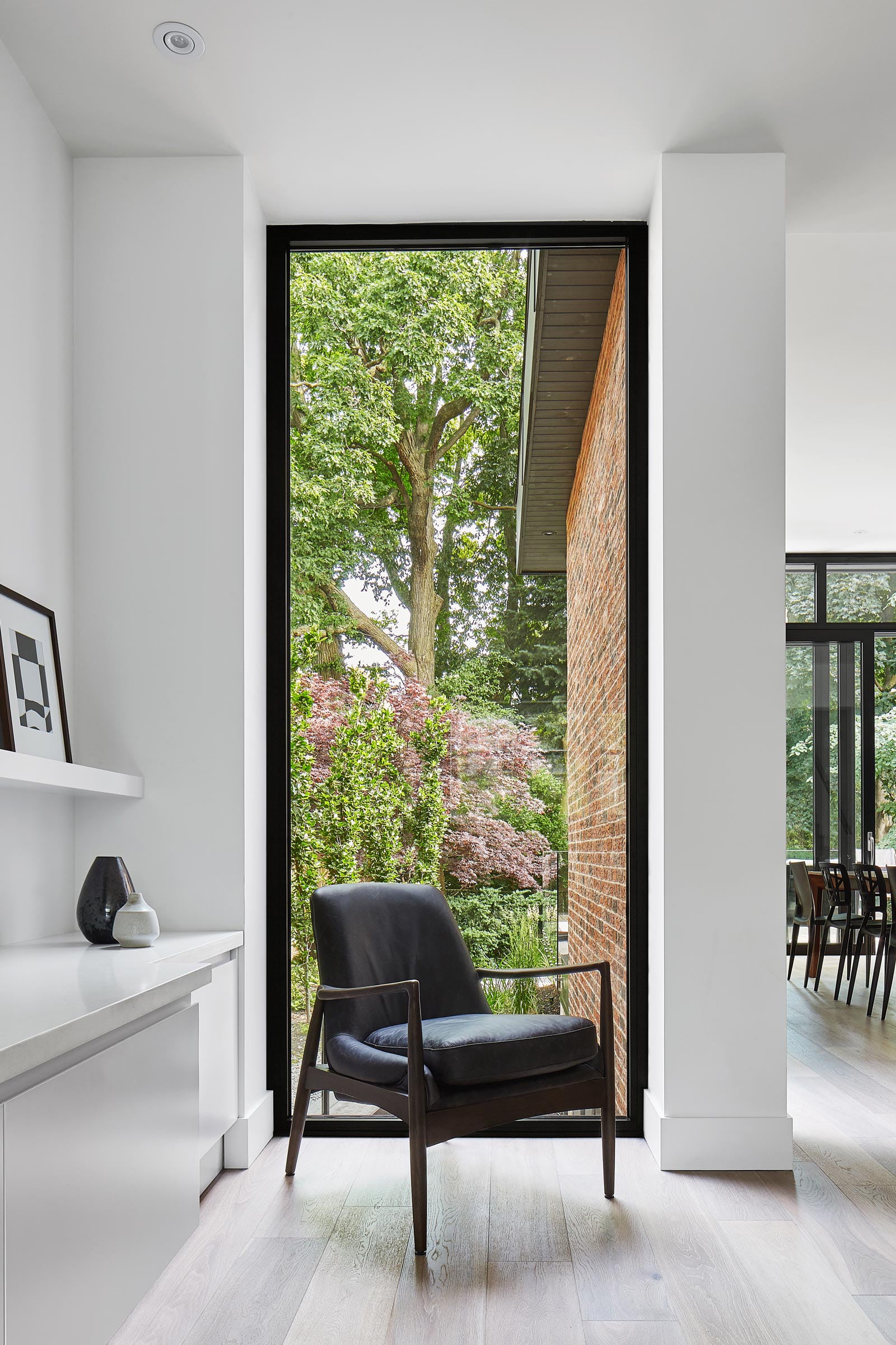
Large windows create a sense of openness inside the historic Toronto home, designed by Solares Architecture. Photo by Nanne Springer
Once his team got beyond the threshold, they had free reign to realize the client’s vision—besides the dropped floors, they tore down walls and installed large windows (among other transparent barriers) to create a much greater sense of openness. The result is an airy space with ultra-clean lines and a palpable sense of connectedness from room to room. That connectedness extends to the backyard deck, which seamlessly flows from the kitchen through a massive glass wall that binds the spaces while also acting as a barrier to rain, snow, and rodents.
“I think a connection to the outdoors is always important,” Knezic says. “It’s something contemporary residential designers should always be looking at. We really like having a transition space so you’re not just stepping out onto the lawn. You’re going from an indoor space to the deck, which has a connection to the outdoors, and then stepping off the deck into the yard.”
It all looks so simple, but of course it wasn’t. That’s the magic, Knezic says. “You’re not fixating on the architecture at all. You enjoy the space without always looking at the structural things that are happening around you.”
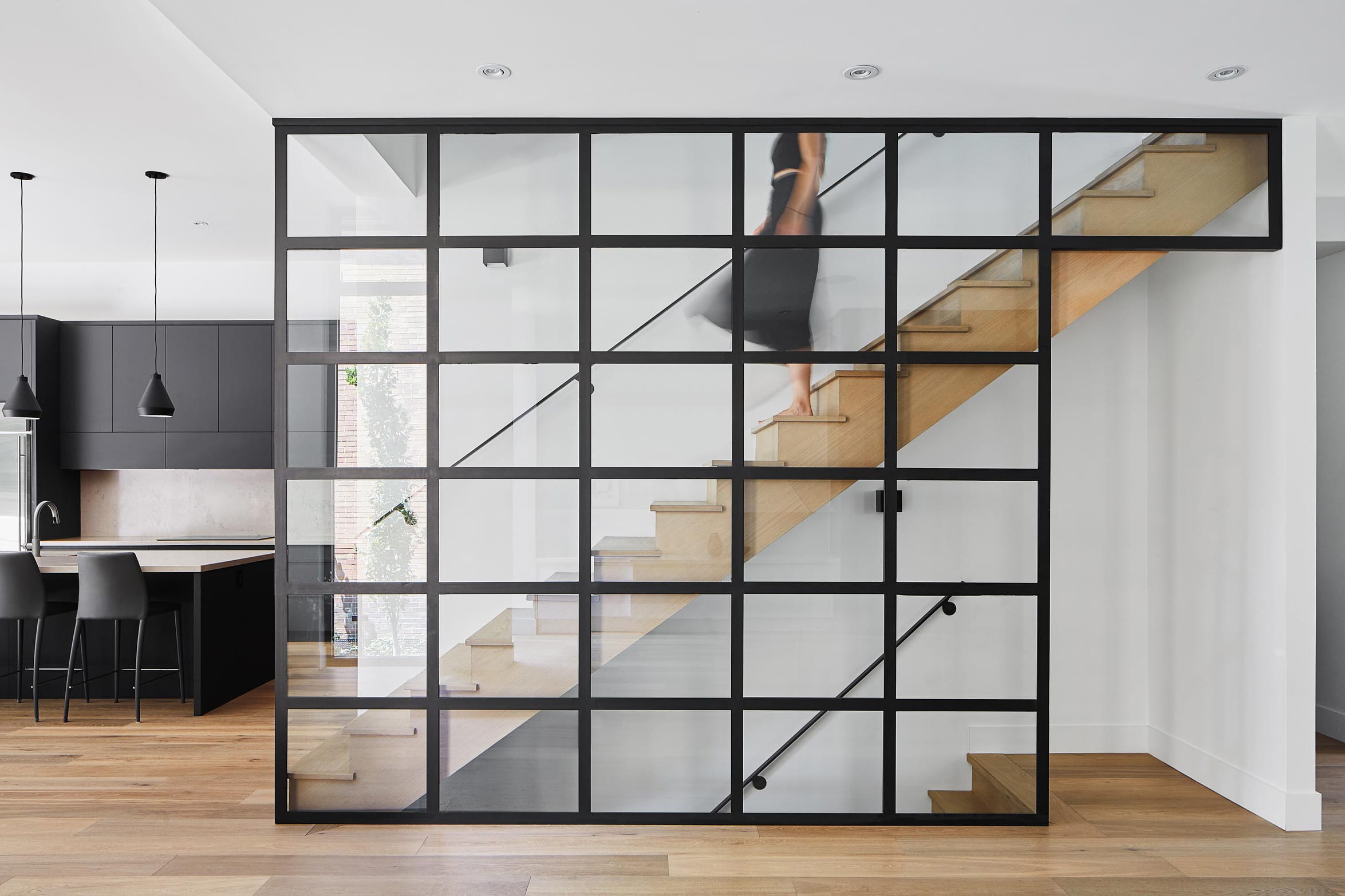
The glass screen along the staircase defines two spaces while also blending them. Photo by Nanne Springer
“We knew this was going to be the long view out of the living room, so this window gives you a chance to look south without having to look through the kitchen,” Knezic says. “You’re still connected to the outdoor area as well as what’s happening in the kitchen.” The glass screen along the staircase is another element that defines two spaces while also blending them.
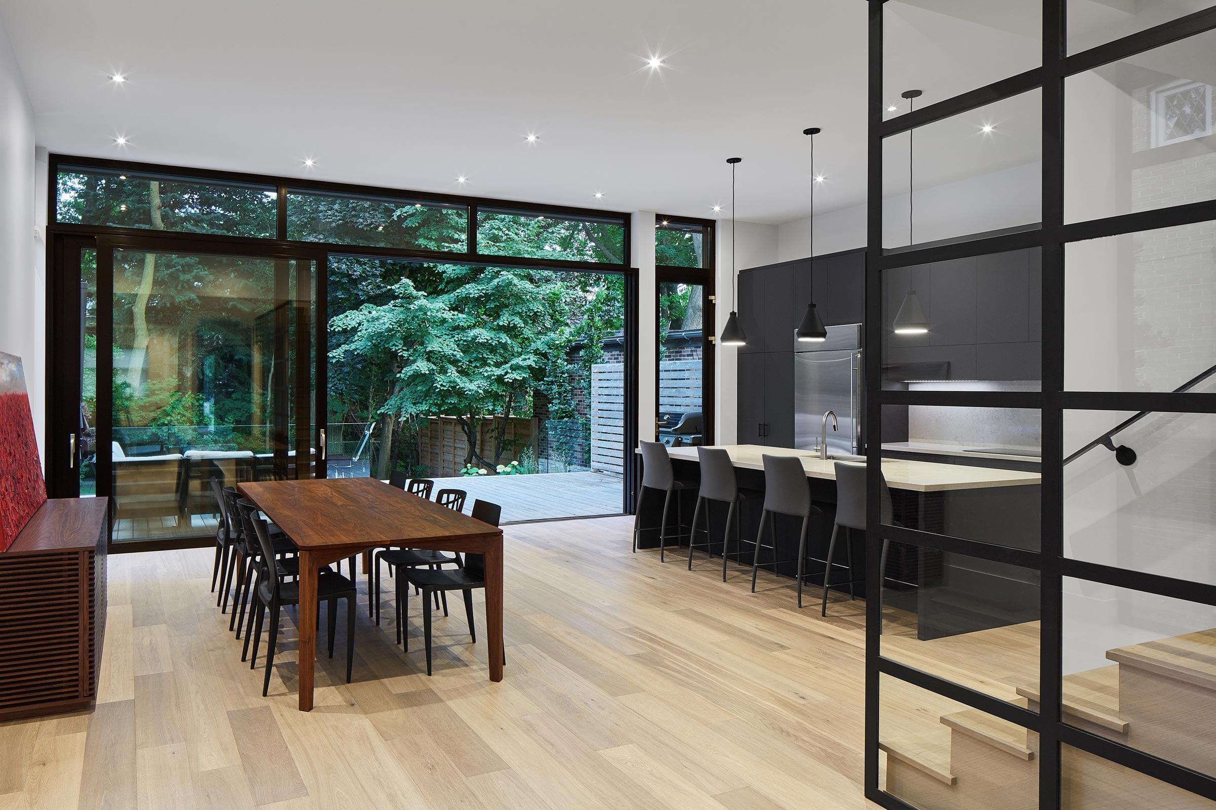
A south-facing sliding glass door connects the kitchen with the patio; the architect wanted to emphasize the fluidity between the indoors and outdoors. Photo by Nanne Springer
This south-facing sliding glass wall flows directly from the kitchen to the deck. Even the flooring grooves in each space are precisely aligned to create a sense of connectedness. “I really look at it as an indoor-outdoor living space,” Knezic says. “It’s a nice transition, whether you’re going from out to in or in to out. The deck is a really important feature of the house. I think of it as another room.”
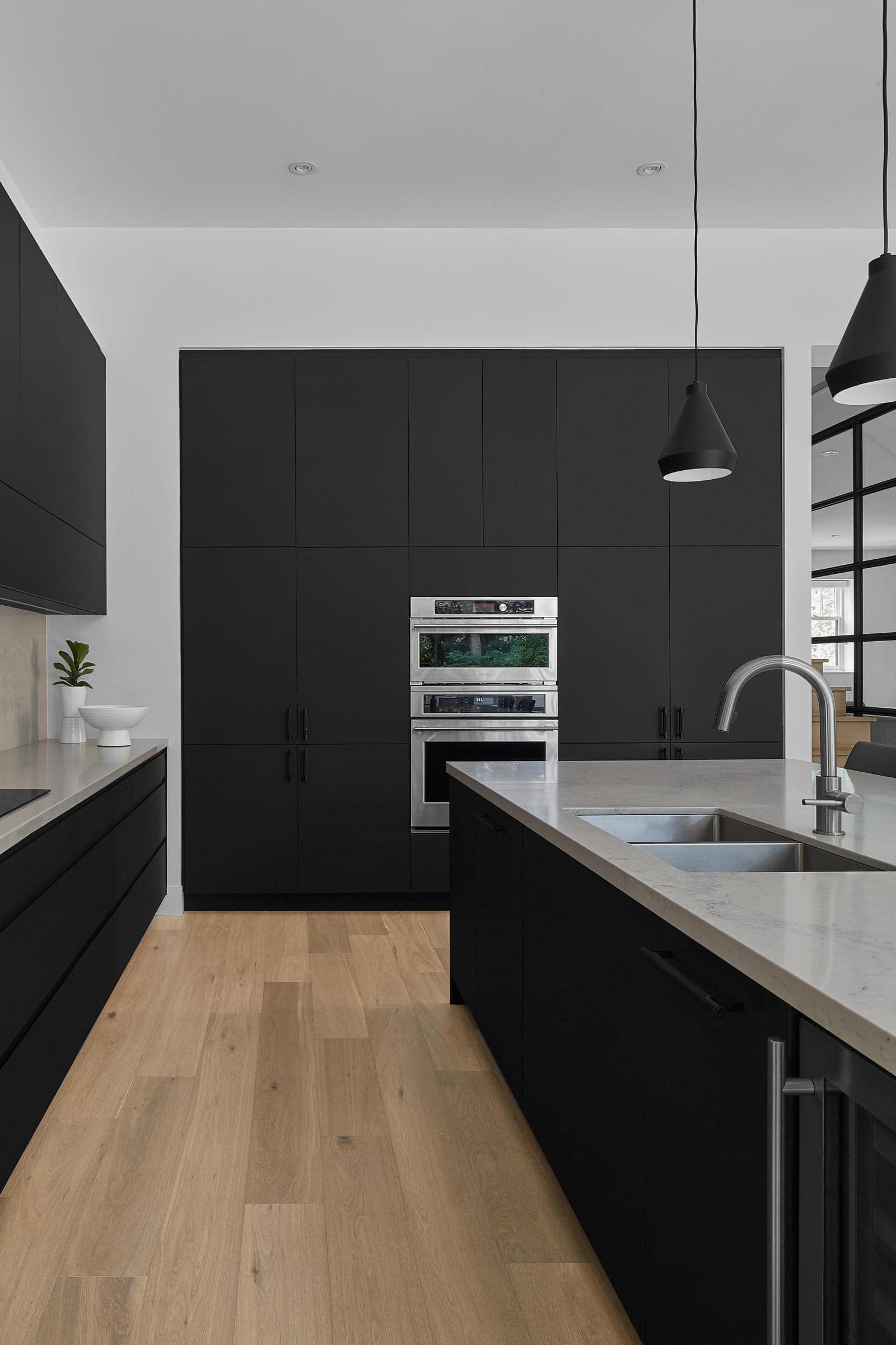
Made from a special Italian laminate product, a super-matte black “appliance garage” reduces clutter by storing various kitchen equipment. Photo by Nanne Springer
Outfitted with dual sinks and a cook top, the airy kitchen features nine-and-a-half-foot ceilings and is also linked with the outdoors—in this case, via the sliding glass wall. And its large island serves as a sort of “control center” around which all indoor activity revolves.
To the north, a roomy so-called “appliance garage” allows for the stowing of various kitchen implements—toaster, coffee maker, blender—while greatly reducing clutter, and the large pantry wall contains two built-in stoves. Made from a special Italian laminate product, it’s three-quarters-of-an-inch thick and sports a stylish super-matte black finish.
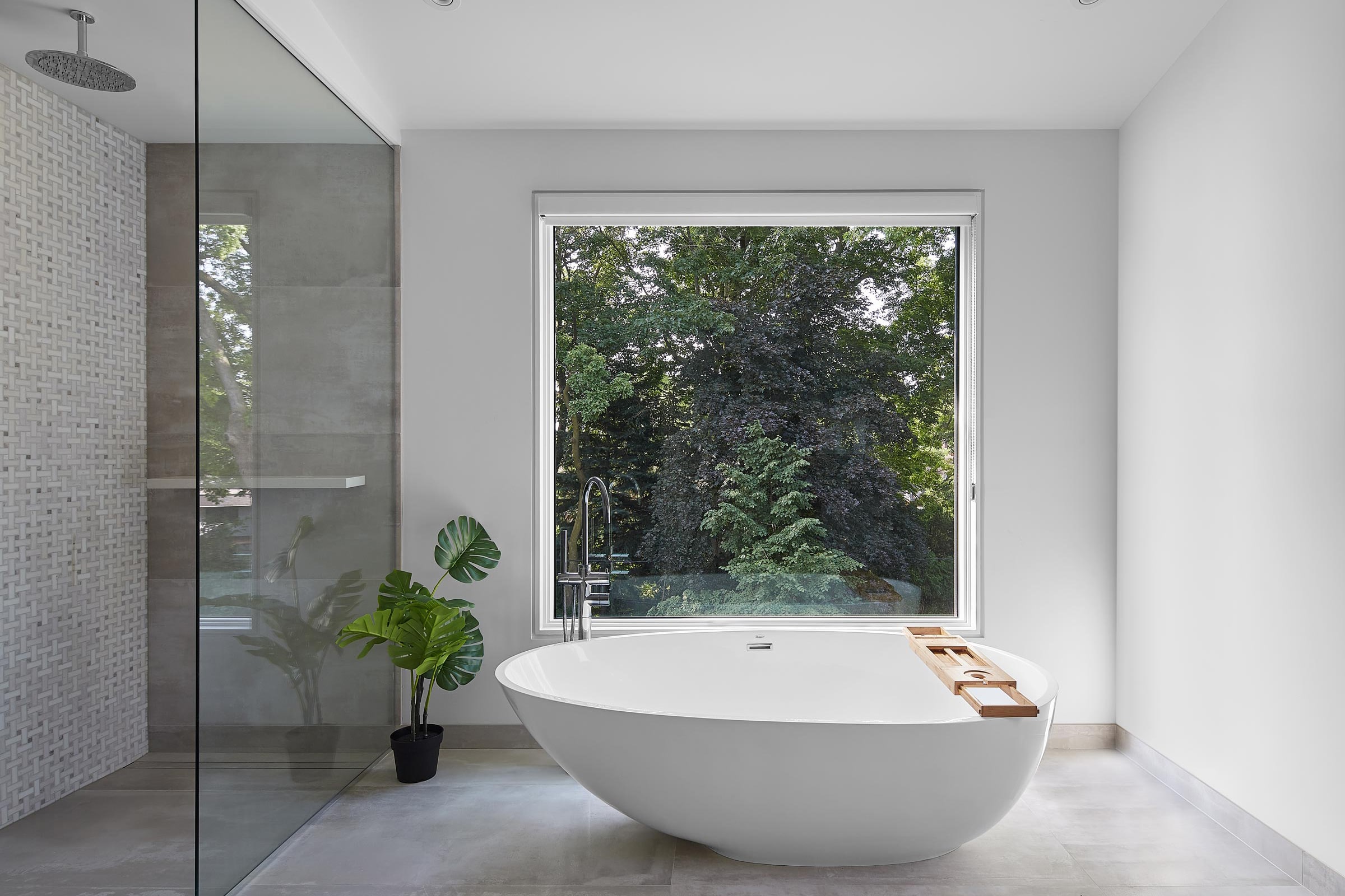
The master bathroom floors were reinforced with engineered lumber. The shower was sunken, and Architect Tom Knezic and his crew created a slope pan to help drainage. Photo by Nanne Springer
Hours of planning and labor went into making this handsome master bathroom—another space with a sweeping outdoor view—fully functional. The shower was sunken and a slope pan created to help drainage, and the existing floors were reinforced with engineered lumber. In order to properly sync everything, Knezic and his crew did some major reframing. As with many aspects of the home, what looks simple was actually quite complicated.
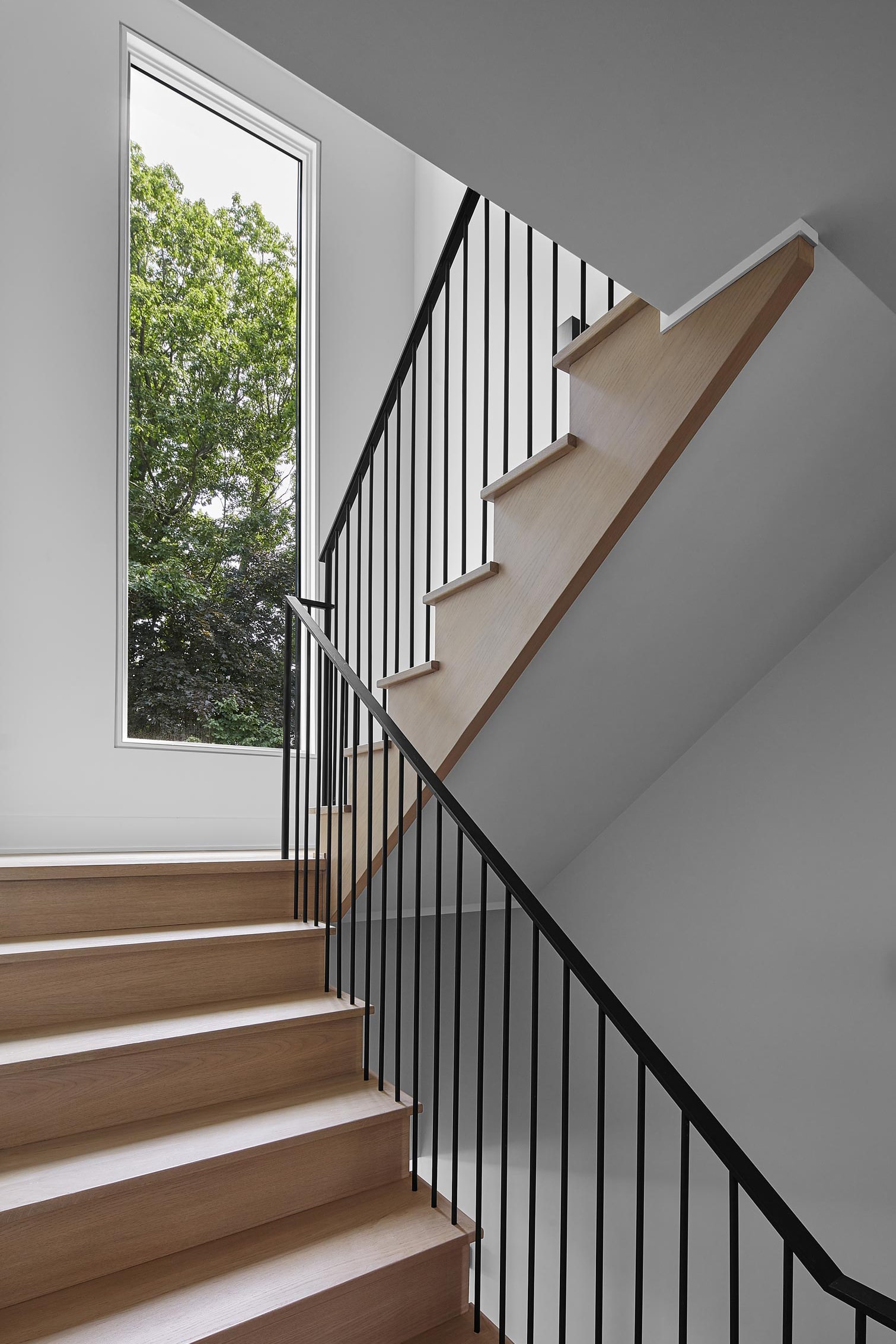
Although the owners of the home wished for a dramatic, curved staircase, the design team created something far more compact due to limited space. Photo by Nanne Springer
The owners envisioned a dramatic, curved staircase with a rail to match but limited space required something far more compact. It wasn’t an easy problem to solve, but Knezic is pleased with the solution his team devised—one that’s both functional and aesthetically pleasing.
“Railings are hard to get right,” he says. And this one was no exception. In the end, though, it allowed them to retain a sizable landing that’s flooded with natural light streaming in through an ultra-modern window.
Level 1 floor plan
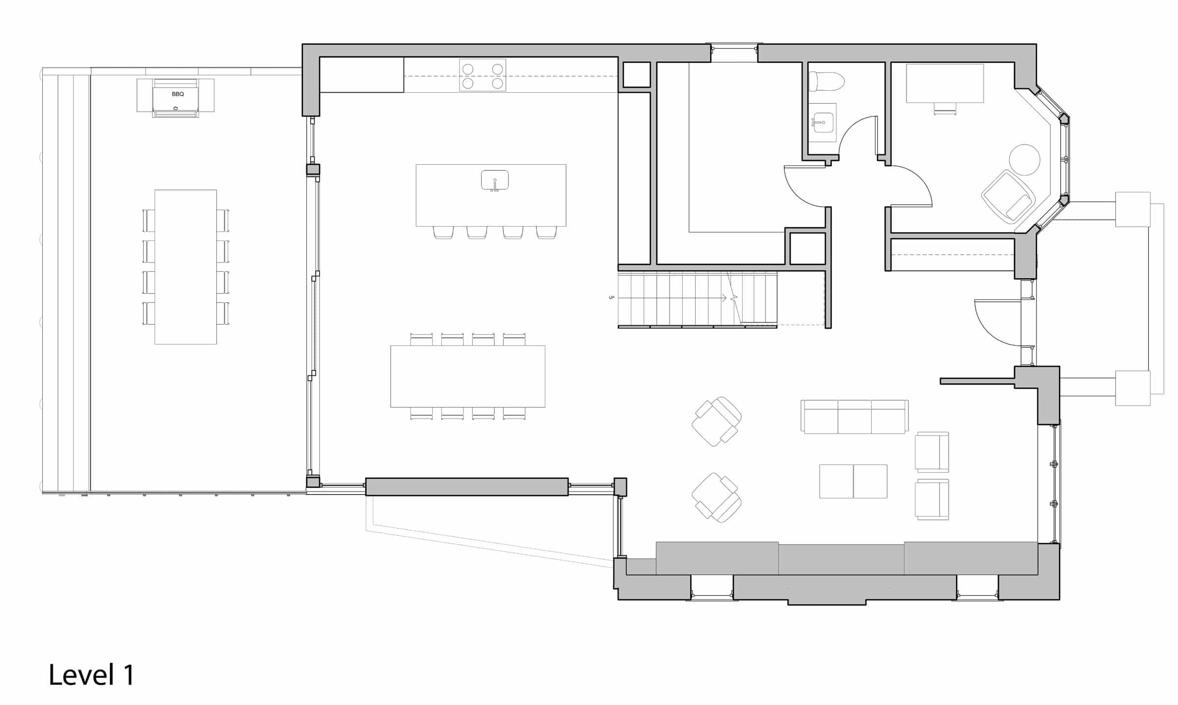
Drawing courtesy of Solares Architecture
Level 2 floor plan
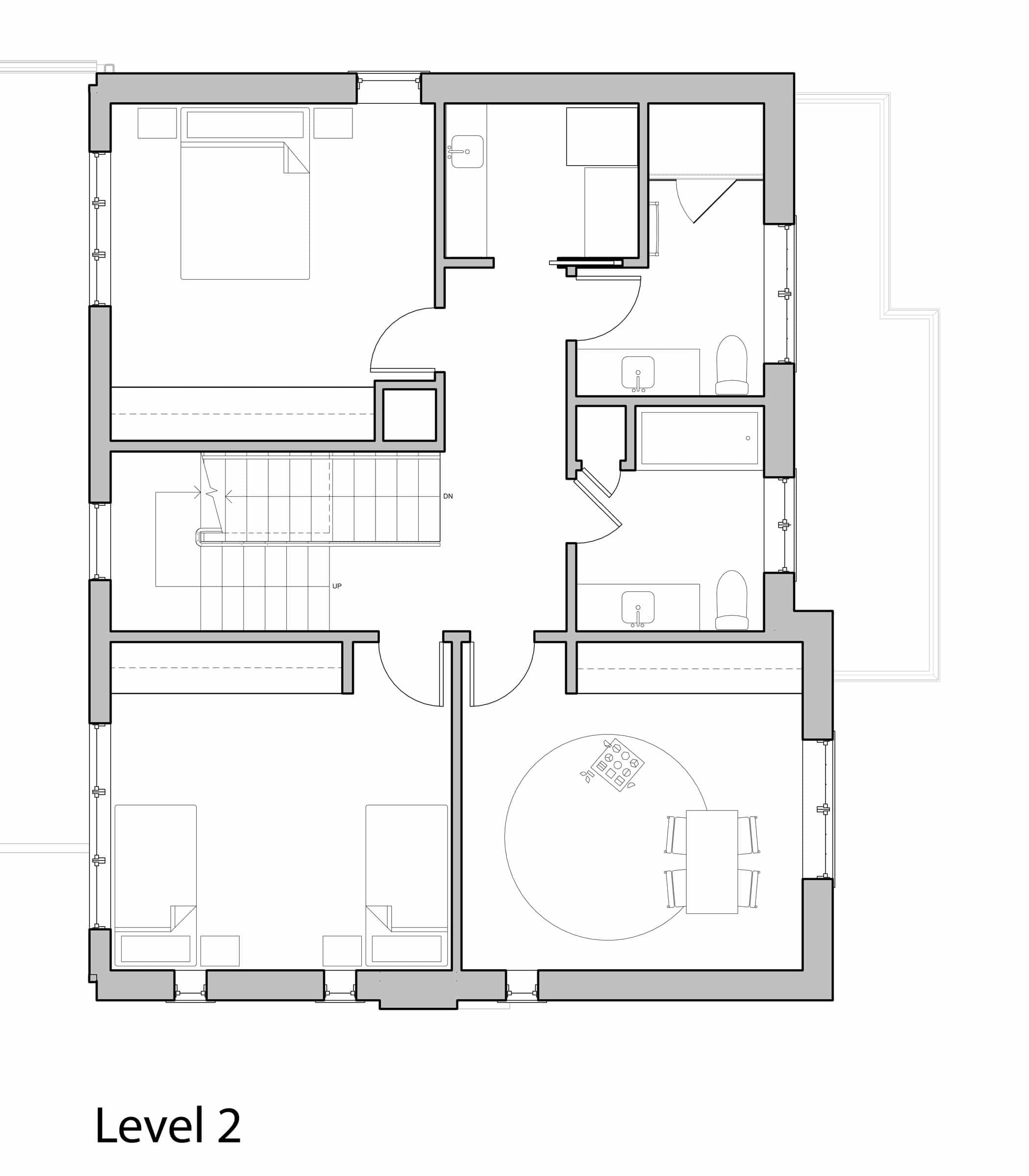
Drawing courtesy of Solares Architecture
Level 3 floor plan
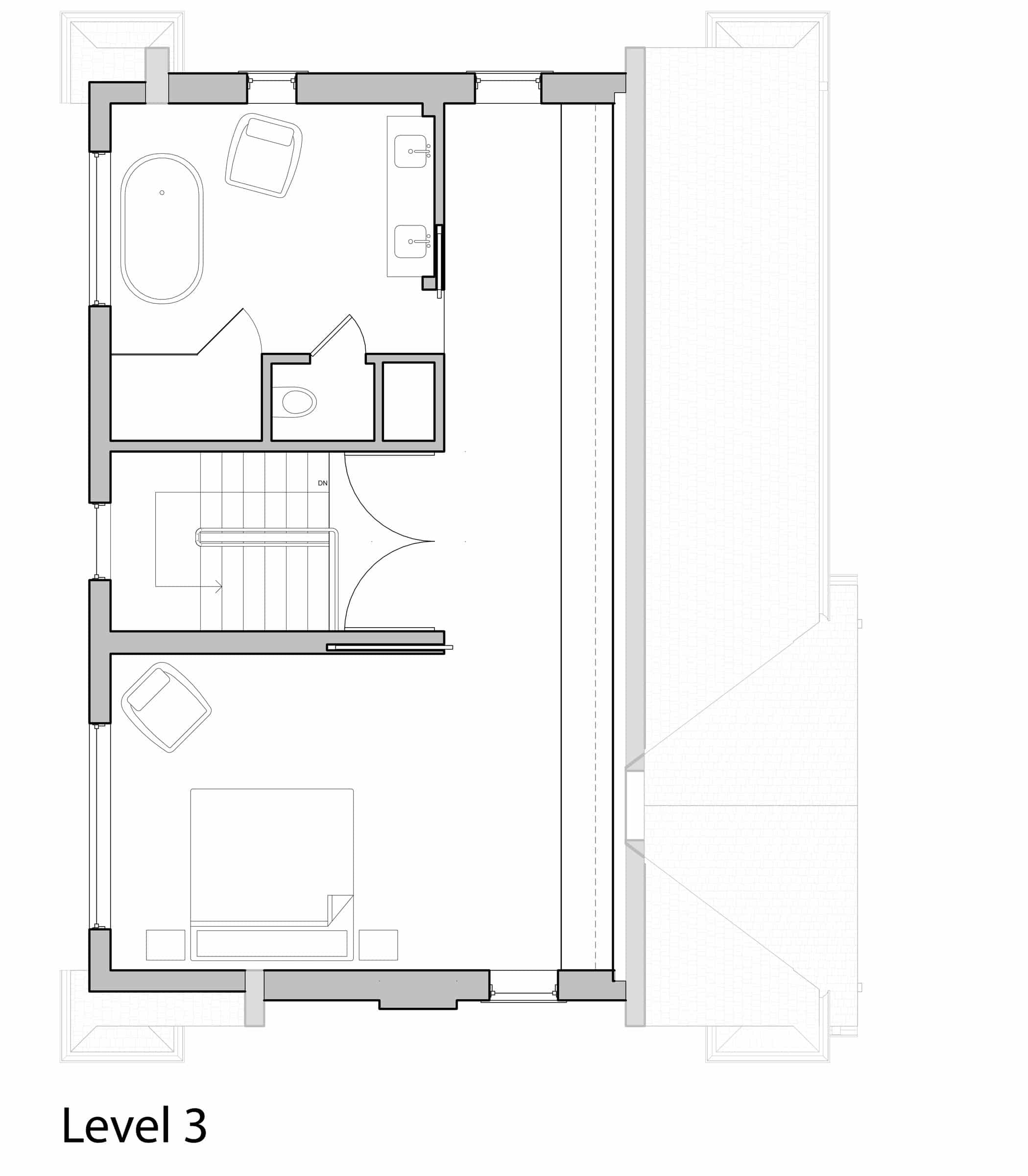
Drawing courtesy of Solares Architecture
Project: Rosedale Renovation
Location: Toronto
Completion: 2018
Size: 4,900 square feet
Architect: Solares Architecture
Structural Engineer: Moses
Structural Engineer HVAC: Renu Engineering
Contractor: Revive Contracting
Interior Design: Greg Mathers
Interior Decorator: Emily Hollis Interiors
Landscape Design: Chloe Philip Landscaping

