Story at a glance:
- Inside new affordable family apartments and creative spaces designed by Leddy Maytum Stacy Architects
- The design includes residential spaces, a childcare facility, and dedicated ground floor space for the arts.
- Casa Adelante 2828 16th Street in San Francisco was designed to be a vibrant, happy, helpful place.
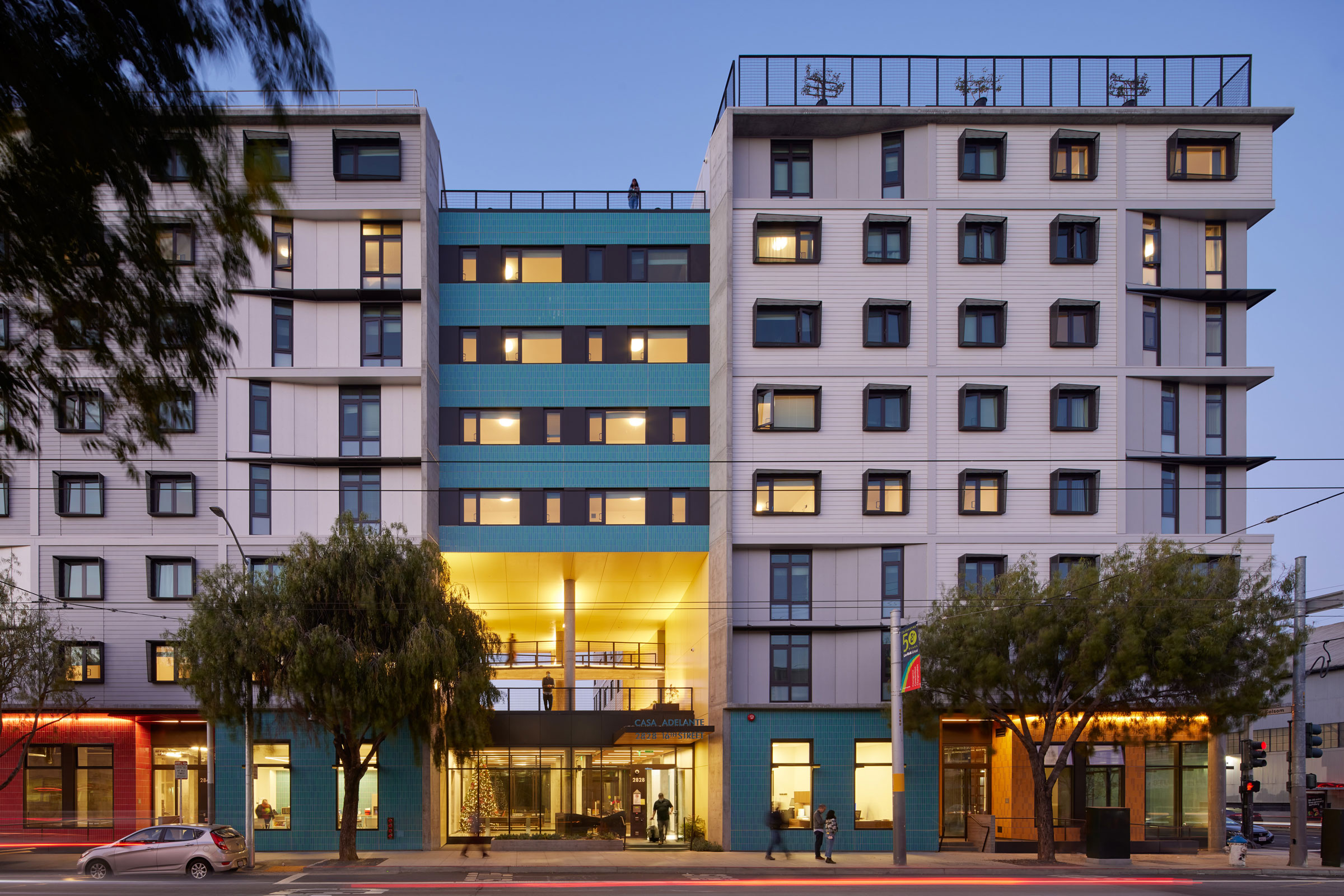
A light playfulness fills the Casa Adelante at 2828 16th Street project. From splashes of color on the facade to inviting outdoor areas at ground level and on the roof, the project is a positive response to a community need for family-centered homes, affordable arts space, and cultural preservation.
Casa Adelante 2828 16th Street is one of several Casa Adelante projects that are part of efforts to provide more affordable housing in San Francisco. This project in the Mission District is one of several in the area that were recently completed, with more in the works, according to Ryan Jang, principal at Leddy Maytum Stacy Architects (LMSA), who designed the project.
“It’s really about fighting displacement within another predominantly Latin American community,” Jang says. “It’s about what we with MEDA (Mission Economic Development Agency), our client, call cultural resilience and cultural preservation, fighting against gentrification and displacement so families can find a way to live affordably within the neighborhoods and community they’ve been a part of for a long time.”
The 143-unit development provides ground floor services for families—an art gallery, childcare center, and an organization to empower youth—while affordable family apartments surround colorful spaces. The seventh story and roof space above are dedicated to urban agriculture and food production for residents. The project also features a rooftop photovoltaic array and solar hot water array, targeting LEED Gold.
Designing for Resilience
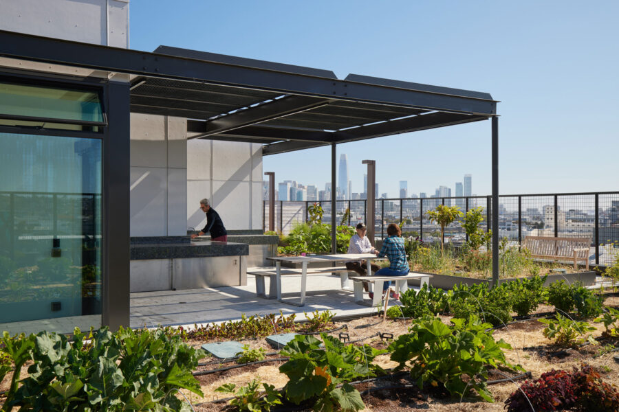
Landscape Forms MultipliCITY collection is at home on the rooftop deck alongside
stone counters from Absolute Black Granite. Photo by Bruce Damonte
The community and commercial spaces on the ground floor serve to emphasize the mission of cultural preservation, Jang says. Environmental sustainability was also important, as people from disenfranchised backgrounds might be more at risk should a natural disaster occur, he says.
Jang says LMSA wanted to emphasize resilience from the beginning. That meant including things one might traditionally think of with regard to a highly sustainable building, but also going beyond things like solar hot water panels to look at other areas of risk. They wanted to design for everything from an earthquake to flooding to civil unrest, as San Francisco faces all of these hazards. The architects worked with the owner and engineers to determine what they could do about each hazard to make the building more resilient.
As a result the team raised the building on the ground floor to come up above the floodplain. This was especially important considering the flooding California has experienced recently. “This winter the flood waters came up 18 inches or so—nearly to the front door,” Jang says. They raised the building a few inches above the 100-year floodplain.
Then they looked at HVAC and how that might work in the event of wildfires. “A lot of multifamily housing developments, particularly affordable housing in San Francisco, are going to a more localized solution with ventilation louvers on the side of the facade of the exterior wall, which provides fresh air to the units. In our case we decided to bring air in centrally through larger air handling units at the roof, such that they’re filtered at a pretty high filtration rate so clean, tempered air can always be delivered down into the units, and those filters can be easily changed by maintenance personnel instead of changing filters at each unit. To have filtered air flow down from the roof through the corridors and into each of the units is important in Northern California with fire danger becoming more prevalent every year.”
The ventilation system was paired with a small electric heater that helps to heat the building in the winter. Air is tempered at the roof air handling units and each resident has an individual heater to give them a bit more control in their unit.
Exterior Choices
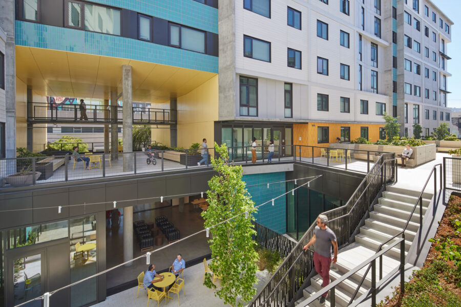
GLS Landscape | Architecture out of San Francisco designed the project’s landscaping, including a large inner court with greenery that connects to additional open space on the podium level. Photo by Bruce Damonte
The design team incorporated colorful tile to accent the exterior, pulling from colors in the Mission District. “One of its defining characteristics is this series of murals,” Jang says. “They bring a vibrancy and life to the neighborhood as a whole.”
Above the main 16th Street entry is a two-story portal, soon to be framed by a new, large mural later this year. “We really wanted to make the building an authentic representation of the folks who live within it.”
The colors of the exterior tile also frame the residential units. The windows that look out toward 16th Street have dynamically shaped sun shades. “The main long facade faces south, so we wanted to be sure to shade the windows as the sun moves throughout the day. They extend a little bit further both on top and toward the west on the vertical side to reduce heat gain into the windows and into the units.”
A lot of transit happens around the building, too, with buses running up and down the street and a lot of pedestrian, car, and bicycle traffic. The team wanted to bring some of that life inside the building while connecting people back to the community. “It’s a pretty active street within a neighborhood that is both residential and industrial at same time,” Jang says.
Bringing the Outside In
- Pops of color bring life and sense of playfulness to this affordable housing complex. Photo by Bruce Damonte
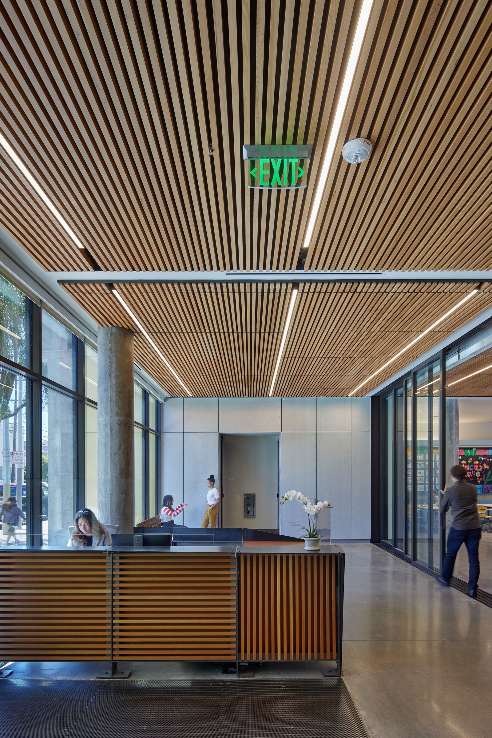
- 9Wood’s panelized linear ceiling system in solid western hemlock is seen throughout the space, often accompanied by Acousti-Tack’s fabric-wrapped panels with Guilford fabric. Photo by Bruce Damonte
“We really did want to bring that life from the streets up in and through the building,” Jang says.
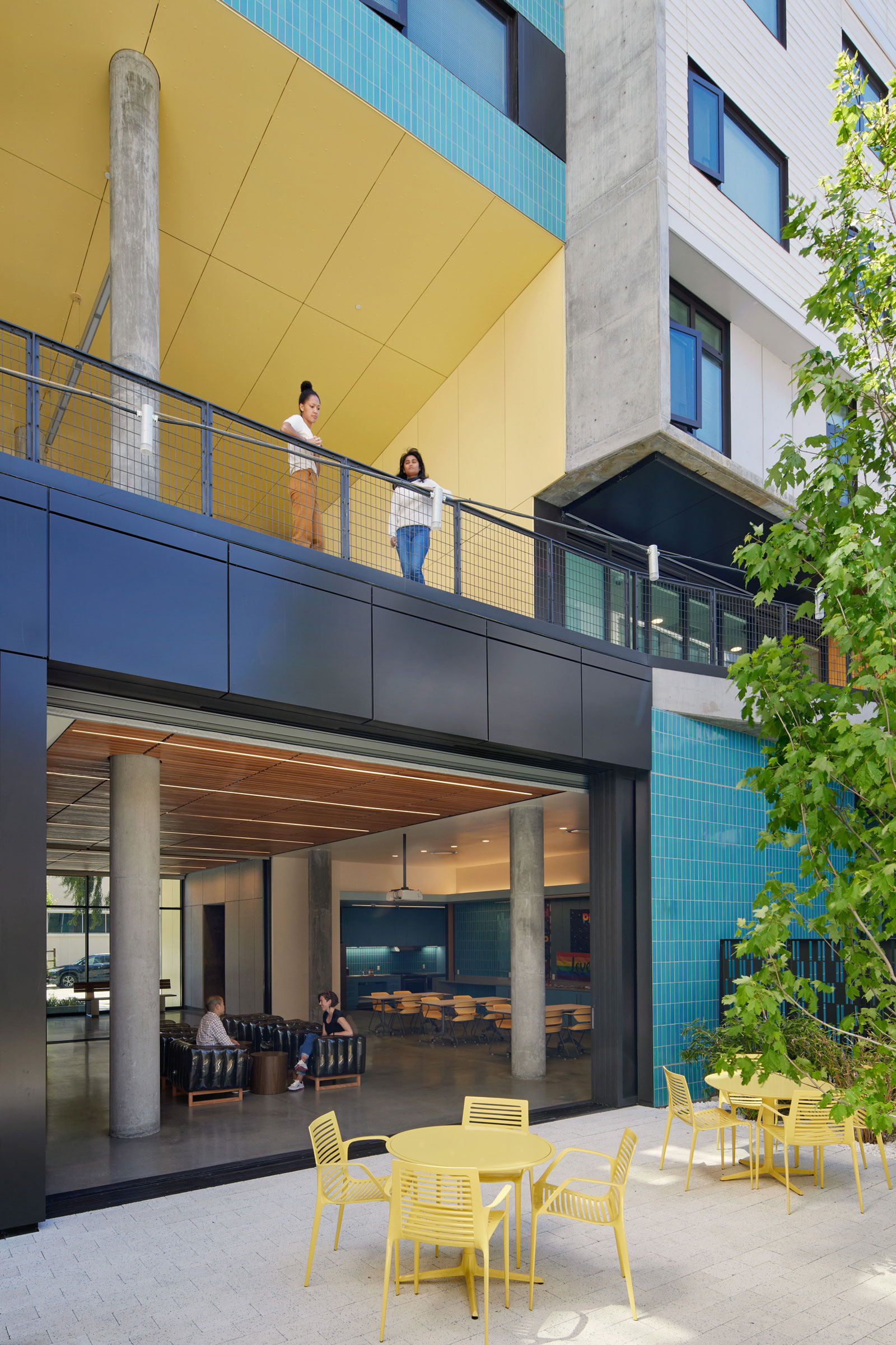
The two-story portal gives a glimpse of the residential open spaces beyond and above. Below the portal is the front lobby, which is characterized by an open transparent storefront, and behind that is a community room for residents to gather for meetings or even to watch cartoons, considering it’s a family building. “That leads to the inner court on the ground floor, from where the community room and some other offices get their light.”
The large inner court with tree is connected to additional open space on the podium level. There you’ll find residential open space and several large stormwater planters. “All of the water from the roof is routed through these lush planters that are relatively tall,” Jang says. “Since flooding is such a big concern in the area, they retain the water so that when the municipal system is overflowing like it does every year, the water from the impermeable surfaces on the roof do not contribute to that flooding. It slows the whole thing down.”
On the seventh story and roof space above, a large roof deck is filled with specially irrigated bed planters where seasonal vegetables are grown and distributed for free to residents here and at similar buildings in the city. “Food insecurity is a very big and valid concern for the populations the building serves. This idea of combining food and housing security together helps with these huge housing issues that are present in San Francisco and elsewhere,” Jang says.
Interior Design Choices
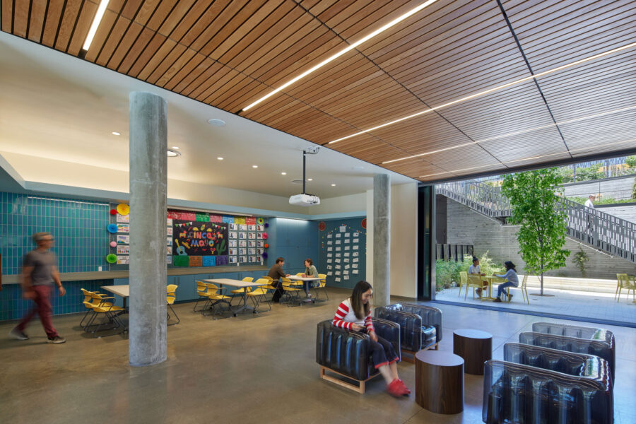
Mojow Yomi Eko’s inflatable thermoplastic polyurethane armchairs bring lighthearted comfort to public spaces. Photo by Bruce Damonte
Beyond the outdoor areas and plentiful greenery around the building, the project features plentiful wood as a way to warm up the space and use durable materials inside. It’s also helpful acoustically, Jang says. They used FSC-certified wood throughout the project.
LMSA wanted to emphasize wellness throughout—including being careful of what went into different the products they chose. They wanted to avoid petroleum as much as possible, for example. “We tried to keep things as natural and durable as possible—from the concrete floors to the metal in the reception desk to the wood ceilings to the fabric wrapped acoustical panels. It just seemed like a simple and healthy thing to do.”
They also wanted to have fun with the furniture. In the community room area you’ll find inflatable chairs. “This is a building for families and children and all sorts of people,” Jang says. “We wanted the community room and the furniture to be a little bit more playful—like the color on the outside of the building, a little more fun and less serious.”
The community room opens to the outdoor courtyard with a large sliding door and also the lobby, so all of the spaces on the ground floor are interconnected and easily transition into event space. Kids and families can spill out into bright areas and run around and have fun. “We really wanted the life of the interior building to be as dynamic and vibrant as the neighborhood itself,” Jang says.
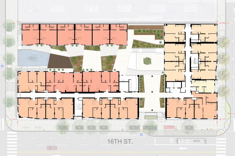
Second floor plan. Drawing courtesy of Leddy Maytum Stacy Architects
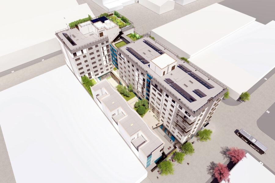
Drawing courtesy of Leddy Maytum Stacy Architects

