Story at a glance:
- UCLA Health plans for the future with comfortable spaces that offer easy transitions.
- The Calabasas facilities are one recent example of how modern, flexible furniture fits into design.
Flexible floor plans and a feeling of home are among the key design decisions that set UCLA Health facilities apart.
“We’ve been designing ambulatory clinics across Los Angeles for over 10 years now, and each community is unique. We are in the beach communities, we are in the suburban communities, and each one has a different look and feel,” says Amy Kraft, director of UCLA Health Real Estate Planning, Design & Construction.
What doesn’t change, Kraft says, is the quality of the design and the commitment to making people feel comfortable. Patients going to UCLA Health facilities know what to expect. “We want the patient, upon first arrival, to come in and have the confidence that they are at the right place because of the surrounding environment,” Kraft says.
Much work has been happening across UCLA Health facilities lately, including at the Calabasas facilities, with multiple tenant improvement projects completed recently—from a relocated primary care facility to new ophthalmology suites, an OBGYN and urology center, pediatrics, and more.
The Details
- Photo courtesy of UCLA Health
- Photo courtesy of UCLA Health
While beachfront communities may have more bright colors compared to slightly more timeless designs in suburban areas, Kraft says all of UCLA Health’s facilities are designed to be modern and comfortable. Beyond cheerful colors, comfortable seating and lighting round out every design, and UCLA Health continues to look for ways to make patients feel more relaxed during their visits.
Kraft says seating needs to be durable, stand up to cleaning supplies, and be considered across populations, as elderly or bariatric patients might need a little more help getting up, for example. “We don’t want to necessarily have a bariatric chair; we want them to feel comfortable as well.” She says UCLA Health strives to include furniture like loveseat type options, too, to provide various seating and something to please everyone.
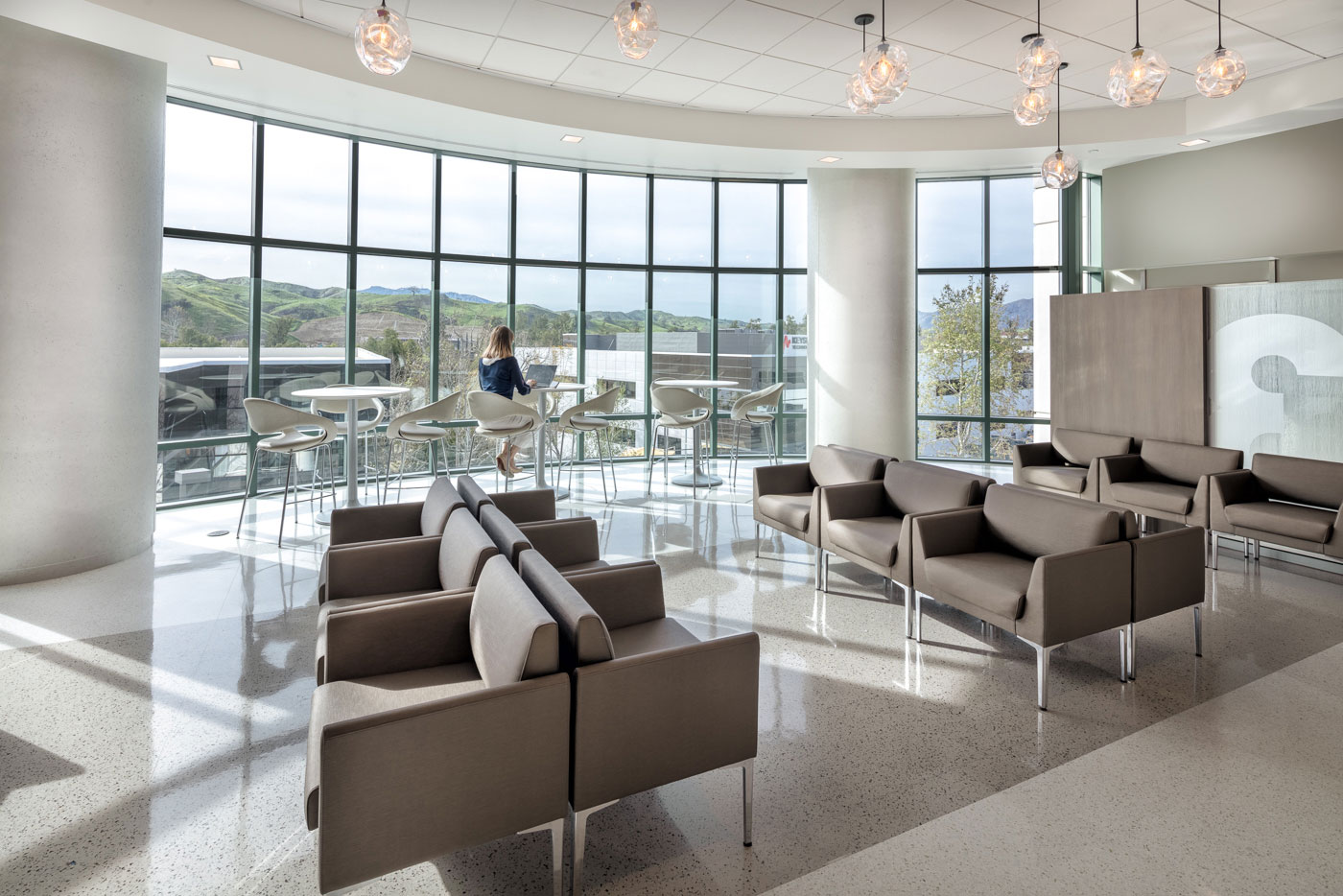
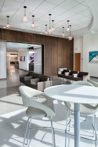
Overhead, lighting is just as important to the experience. Inside Calabasas, hanging glass pendants warm up a light-filled lobby space with large, plentiful windows. The area near the entrance gives patients and their loved ones another place to wait, work, or socialize in between appointments. “Maybe they go to advanced imaging at one point and they see their primary care physician later, and they need to spend a half-hour in between appointments,” Kraft says. “Here they can do so in an environment that allows them to relax.” High tables near windows overlooking rolling hills provide a bit of respite and more of a coffee shop feel, where they can enjoy a snack. “It’s a way to make that area feel special and make it a living room type environment,” Kraft says.
The design team strives to make warm, comfortable spaces like these, but sometimes they’re given the added challenge of no windows. When a windowless room arises they emphasize artwork that invites your mind to wander, and they add soft lighting and natural materials wherever possible. “We try to create an environment you’d want in your home, where you feel like you’re in a quality, comfortable environment,” Kraft says. Interior waiting rooms without natural light incorporate textured walls and added carpet tiles so you feel not like you’re in a clinic space, but in a higher end environment where you’re just waiting your turn, Kraft says.
Changing Nature of Design
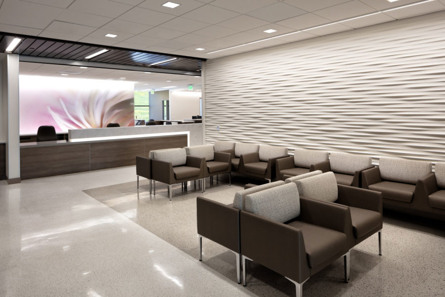
Photo courtesy of UCLA Health
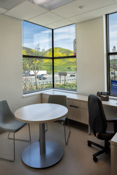
Since the introduction of electronic medical records years ago, the exam room has changed greatly. Design began to emphasize the need for a physician to face the patient rather than have their back turned while entering information into a computer, for example. At first the computer was on the wall, then it moved to a small desk. Kraft says the need for flexibility continues to be great.
“The patients might sit on the exam table for an exam or sit in a chair at a table across from you to discuss next steps or a treatment plan,” she says. “We’ve also gone from private offices for doctors in a primary care setting to what I refer to as hubs, like a hoteling environment where you grab a computer in between patients and do your charting in a huge room as opposed to going back to a private office.”
Much conversation continues around how telehealth is changing the design of clinic environments, but the practitioners Kraft and her team speak with say they’re not necessarily willing to dedicate space solely to telehealth. It all comes back to that flexibility, as they find they can use an exam room both for telehealth and in-person. “We’ve been outfitting our clinic exam rooms with computers for years, and now you incorporate the camera into those technologies and make sure that room is a multipurpose room. That seems to be where our clinic design direction is headed now, which is not a huge leap from where we were before,” Kraft says.
Space Planning
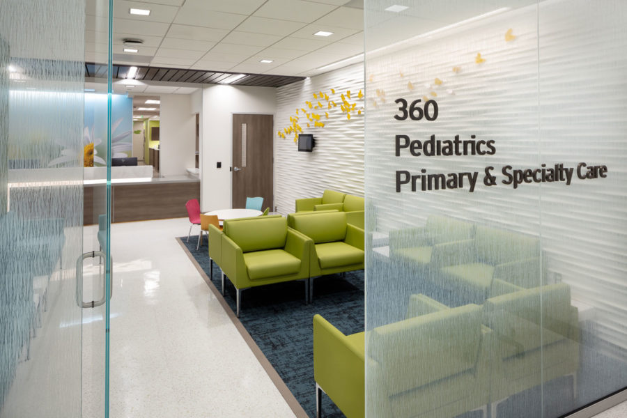
Photo courtesy of UCLA Health
Often design comes down to what space is available, and UCLA Health is always working to minimize patients’ wait time. “Space is always a limiting factor, especially in Los Angeles,” Kraft says. “We always have to be creative with how we use the space, making sure we provide enough staff support space but also enough storage for the clinic environment, and then enough flexibility.”
Sometimes a patient is not just seeing a doctor or nurse during their visit; they could also be speaking with a financial counselor, social worker, or dietitian during any given appointment. Kraft and her team look at continued ways to make that process even smoother. “Do you want that patient to sit in the exam room and have those various groups rotate through? Do you move the patient to a consult type room that maybe is a little more of a conference room environment or small living room? Those are always the challenges we face in each of our clinics—how are we going to maximize our efficiency and yet provide that patient-centered care for all of our populations?”
At UCLA Health you’ll find a variety of patient-centric spaces at Calabasas and beyond. They approach spaces by planning for a variety of rooms with the same footprint. “After construction, whether one’s an exam room with an exam table and a hand-washing station or one has more furniture, we allow for flexibility along the way so if we determine we really need more exams than consults, we can convert that room easily.” Kraft says the growth of the flexible floor plan is one of health care design’s biggest successes in recent years.
“When you’re going in for a clinic appointment, there are times when you’re nervous or you’re unsure of what’s going to happen next. If we can put you at ease, in an environment that feels calm and comfortable, so you feel you’re at the right place for whatever’s about to happen next, then I’ve done my job,” Kraft says. “To me it’s more about creating a feeling for the individual patient that they can take that deep breath and focus on the reason they’re there.”

