Story at a glance:
- GBBN Architects designed the new Cincinnati Ballet building around the idea of movement.
- They wanted the exterior of the building to be equally expressive, so they worked with Ludowici.
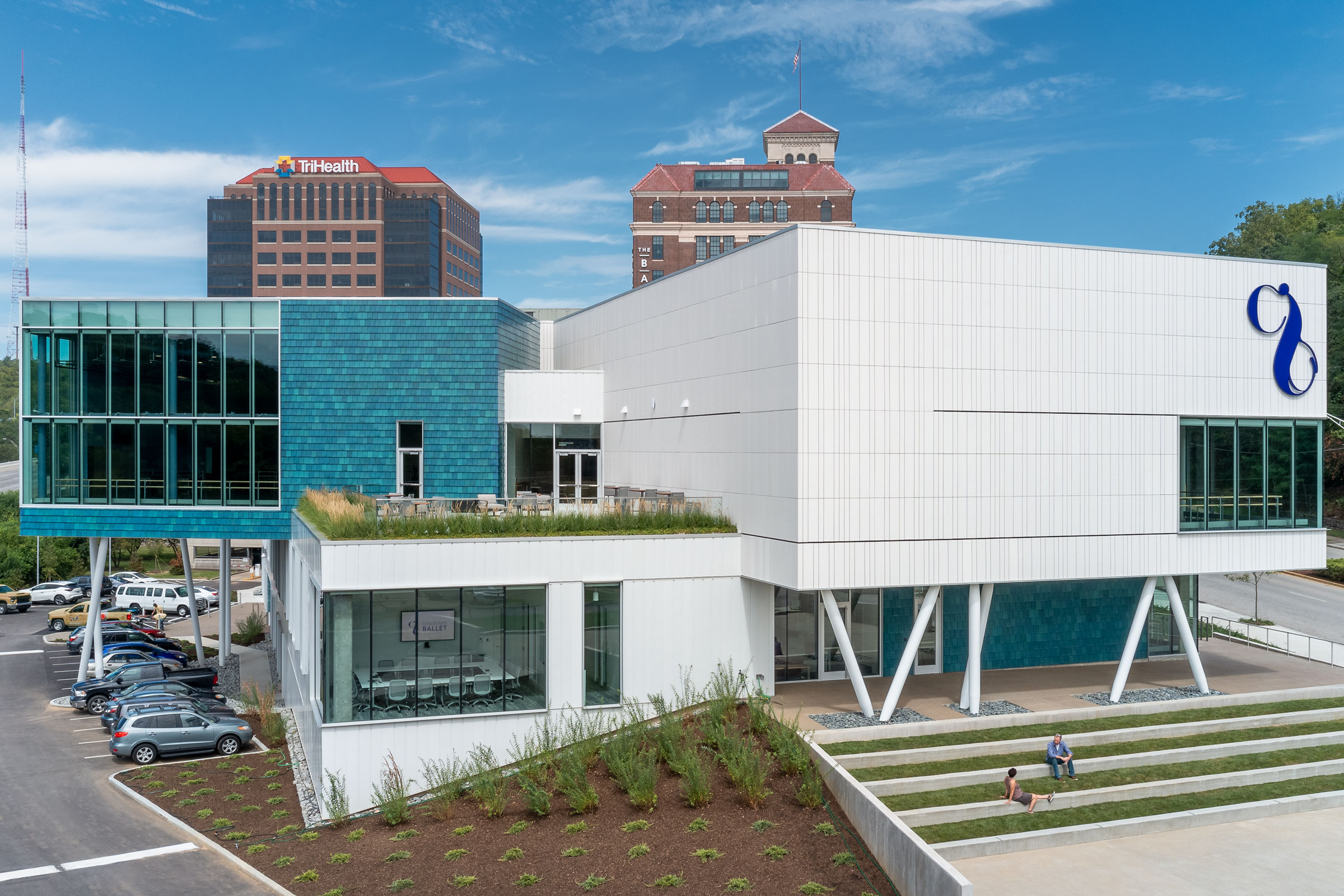
A prominent site with a challenging grade is now home to the Cincinnati Ballet, thanks to a vision brought to life by GBBN Architects and partners. “As much as the site could have been a challenge, it really helped us,” says Daniel Luegering, associate at GBBN Architects.
The ballet sits along a major interstate on one side, fronted by another major public thoroughfare on the other. It’s wonderful for exposure, but a substantial grade change on the site meant the team had to get creative. They worked to create an accessible public entry as well as spaces with incredible views of both downtown and nature.
The finished project fits in seamlessly among its surroundings, inviting the public in with easy pedestrian access, too. “There are no fences around the building. People in the city park there can walk right up to it,” Luegering says.
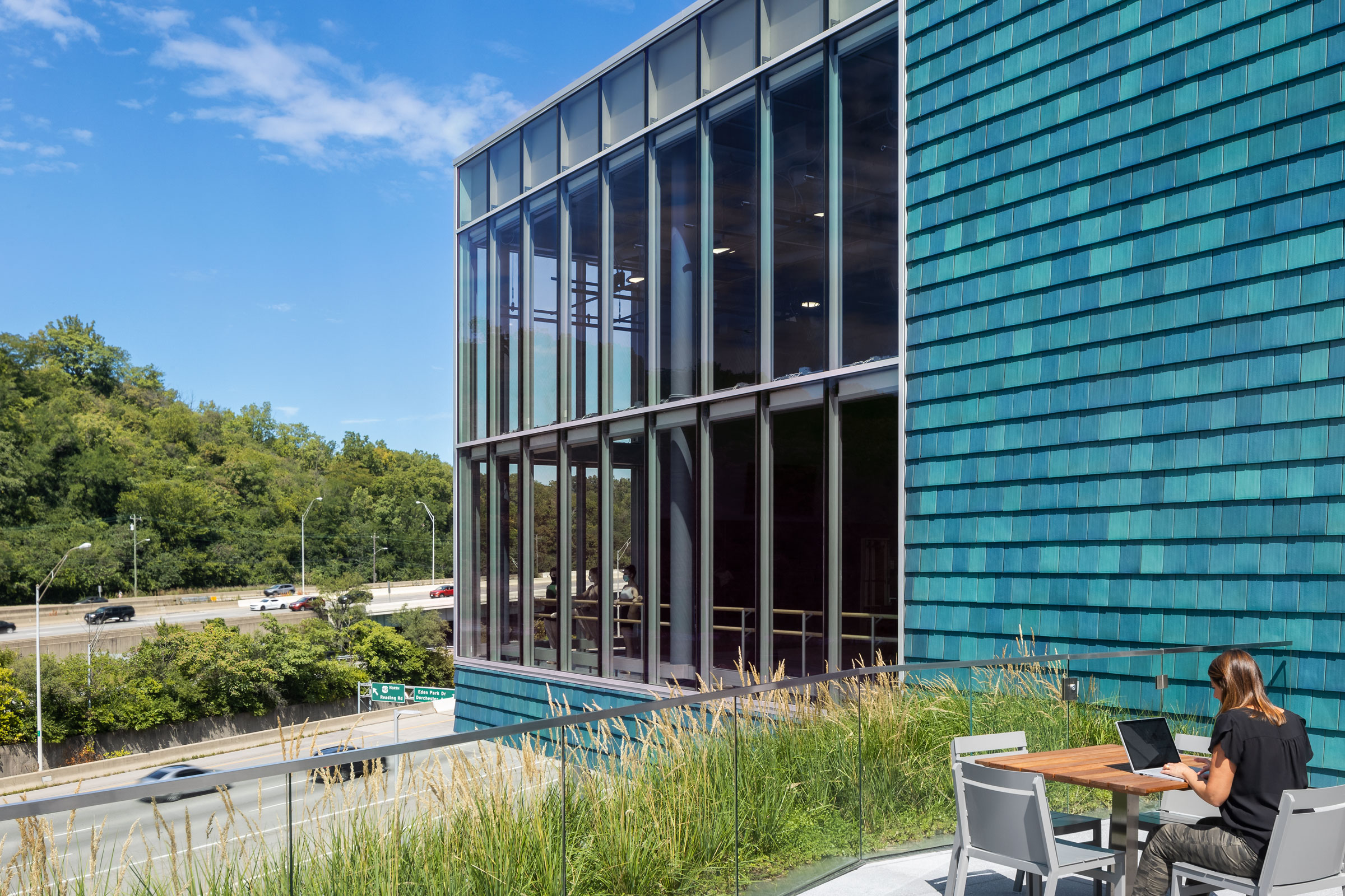
The design team used NeXclad 14 Shingle in Gloss Mediterranean Blue to clad part of the exterior. Photo by Feinknopf Photography
And they do, in part because the exterior itself is so inviting.
- Photo by Feinknopf Photography
- Photo by Feinknopf Photography
GBBN Architects chose Ludowici for help in bringing the outside to life, as they wanted the exterior to further express the energy and athleticism associated with ballet. “They were tremendous,” Luegering says. “To find a company like Ludowici, who really is local to us at 15 or so miles away, knowing they’re creating a natural product with clay and it’s right here, that was awesome.”
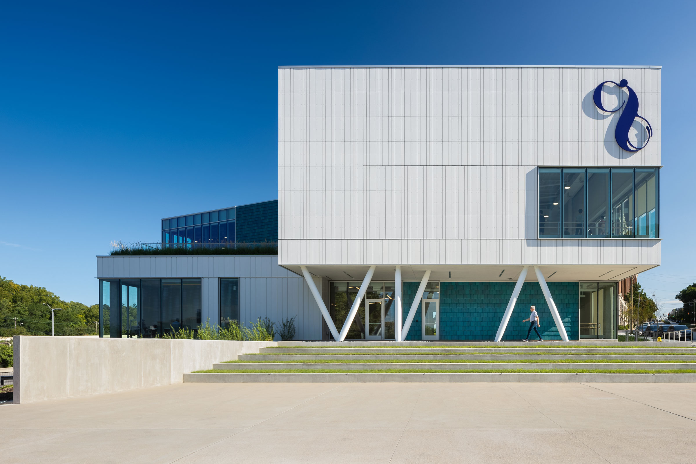
Photo by Feinknopf Photography
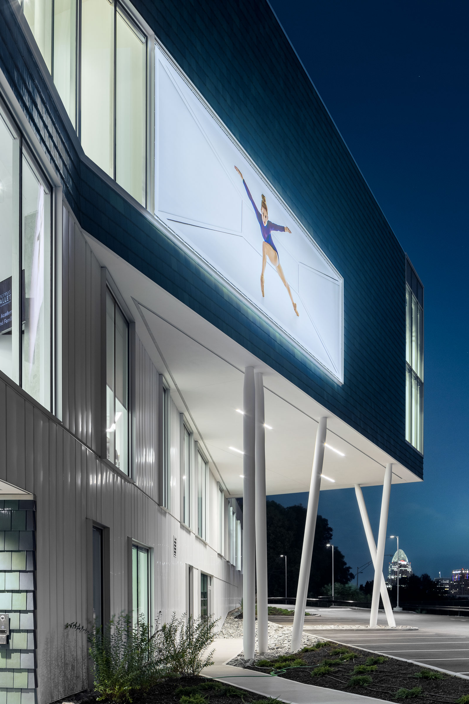
The design team used NeXclad 14 Shingle in Gloss Mediterranean Blue, turning the terra-cotta tiles vertically to clad two sections of the outside of the building. The blue pops against the other portion of the facade, completed in white GFRC panels. “From a very basic standpoint, if you’re walking along the street, people want to go up and touch it,” Luegering says. “It’s another one of those things that get people to engage with the building. It’s got a really nice tactile nature to it.”
Throughout the day, as the light changes and depending on the season, the building also takes on different colors and shades.
The building includes a green rooftop terrace that’s open to the public for events like happy hours, too. A large part of the project’s mission was to ensure everyone felt welcome—whether they were going to the ballet or not. The design team wanted everything to be open and inviting.
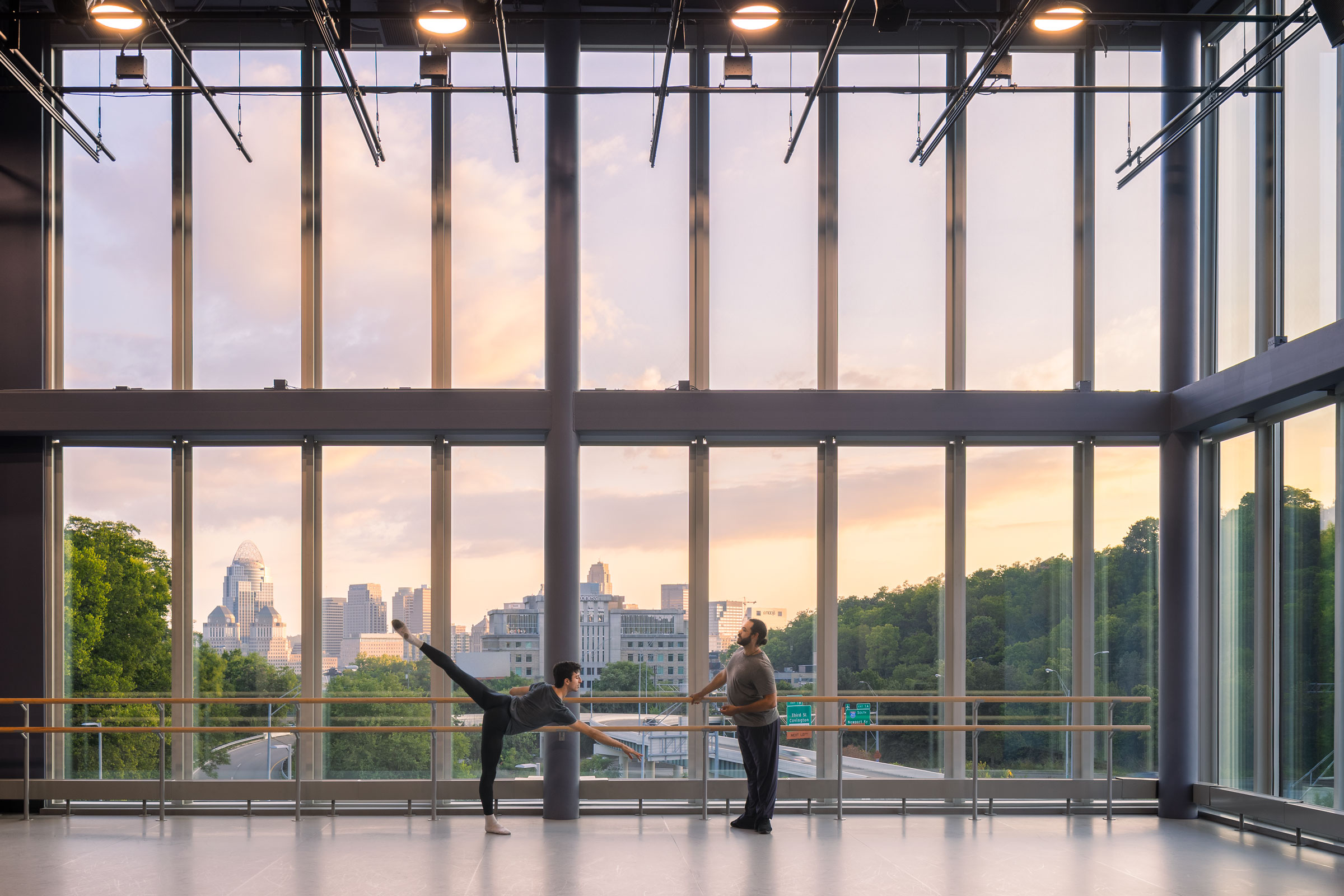
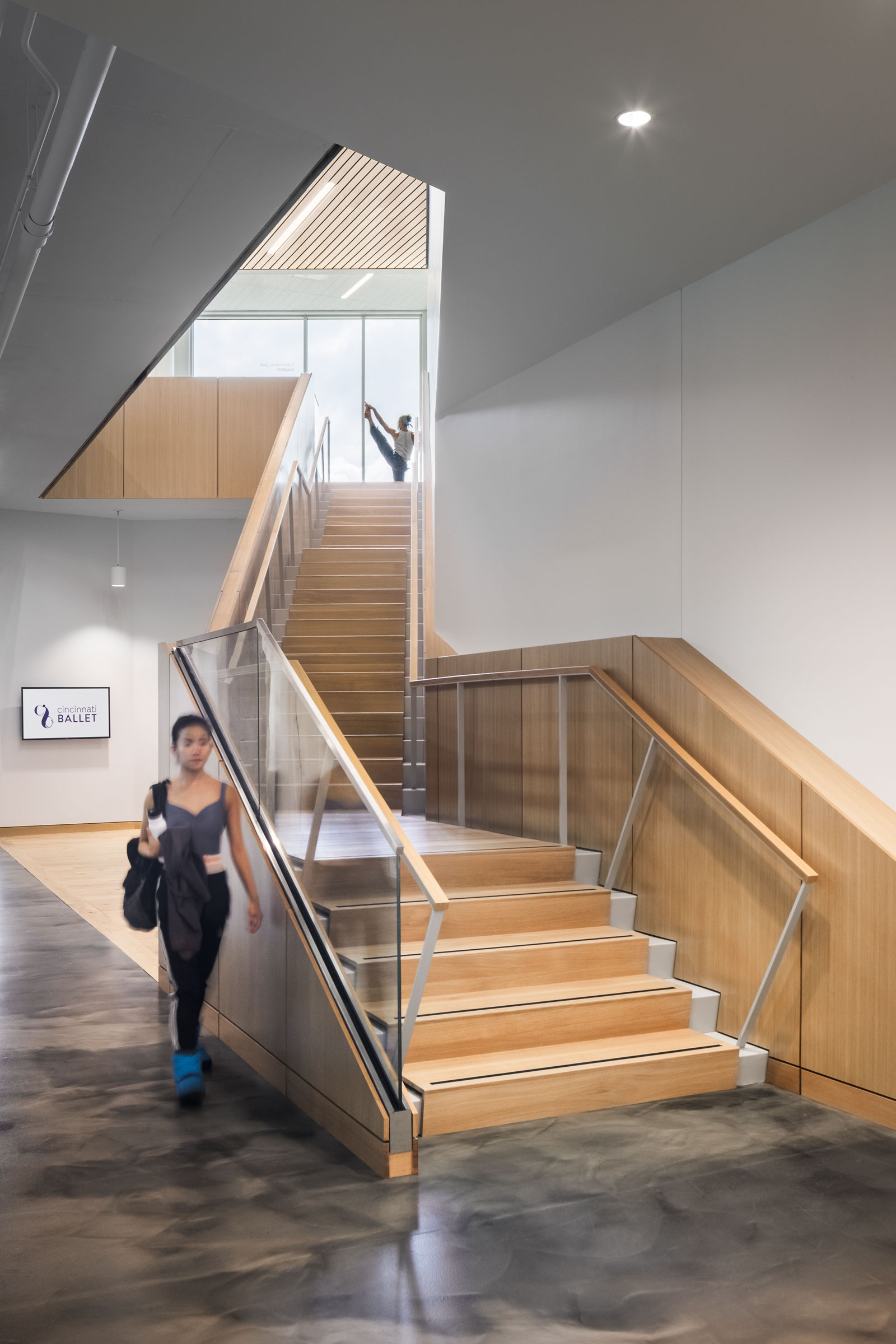
The building is designed around plentiful natural light. “You can exist in that building right now and be completely comfortable without a single light on,” says Daniel Luegering, associate at GBBN Architects. Photo by Feinknopf Photography
“We didn’t want to use stuffy materials. We wanted to use natural woods and natural, honest products—things that are expressive of what they are and also allow dance to be the star of the show.”
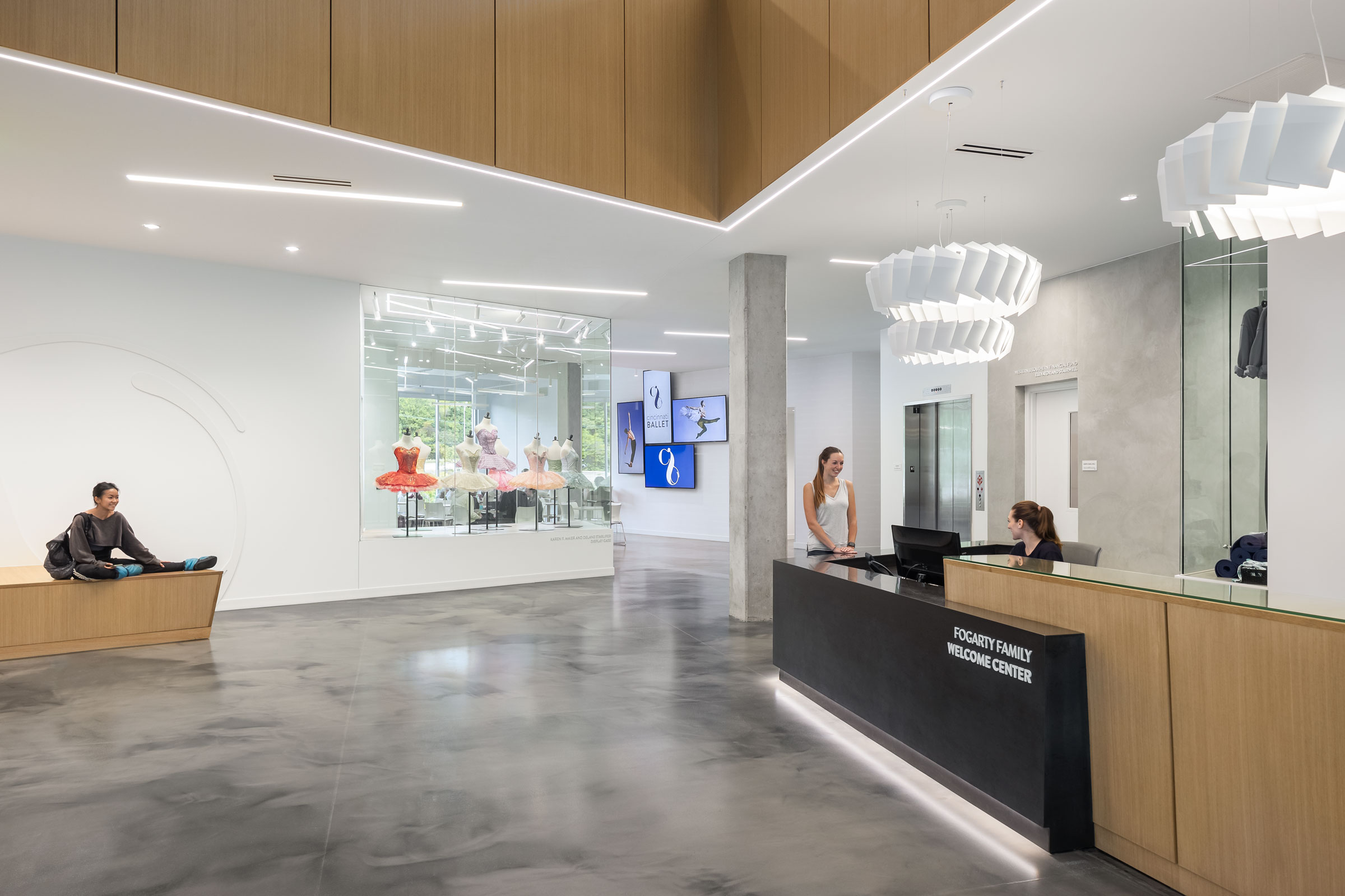
Even the light fixtures inside the Cincinnati Ballet reinforce feelings of movement. Photo by Feinknopf Photography
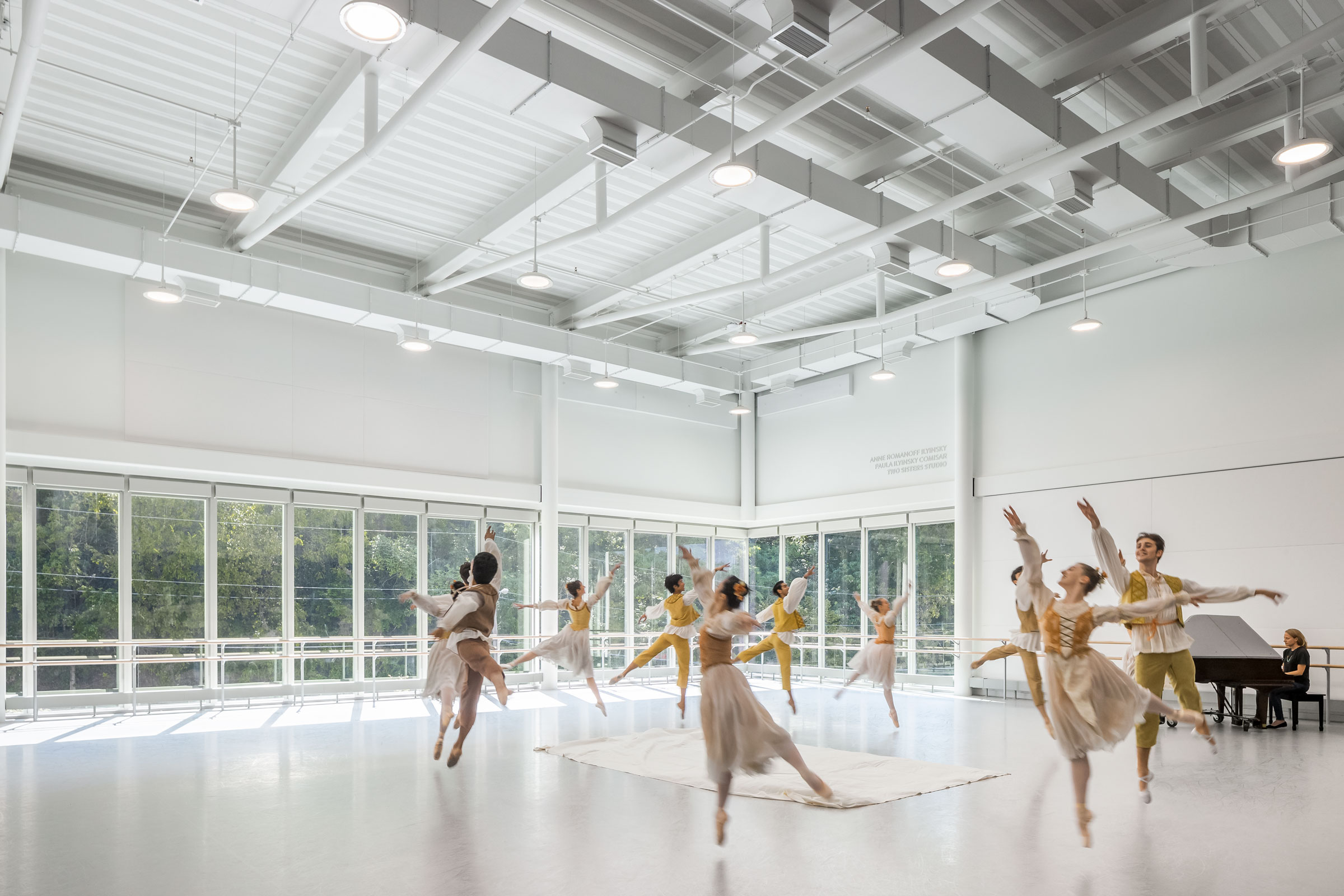
Framed views of nature with room to move and space to create. Photo by Feinknopf Photography
They also wanted to provide plenty of connection to nature. “Biophilia ended up being a pretty big driver of the project. There’s not a single spot in the building, outside of the bathroom, where you aren’t able to completely see through the building to the outside. That was really important—to provide that connection to nature,” Luegering says.

