Story at a glance:
- When constructing hospitals for the modern age, sustainability and patient-centric design go hand-in-hand.
- Daylighting, green spaces, and comfortable furniture are just a few comforting design elements.
- The Lucile Packard Children’s Hospital in Palo Alto is an inspiring example of patient-centric design in action.
It’s no secret hospitals and medical facilities can be incredibly stressful, for both patients and their families. And while there’s no way to completely eliminate that stress, an effectively designed hospital can help to reduce and mitigate it.
But what exactly does patient-centric design look like? And how can it be realized within the parameters of sustainable building? Let’s take a look at a few hospital design elements that help ease patients’ minds and make them feel at home.
Patient-Centric Hospital Design Ideas
In recent years hospital architects and designers have started to move away from the sterile, stark cavernous rooms and corridors of the past, preferring instead to prioritize patients’ well-being and design facilities that incorporate nature, comfortable furniture, natural lighting, and other welcoming elements.
These are some of the design elements architecture teams are telling us they love.
1. Comfortable Waiting Areas
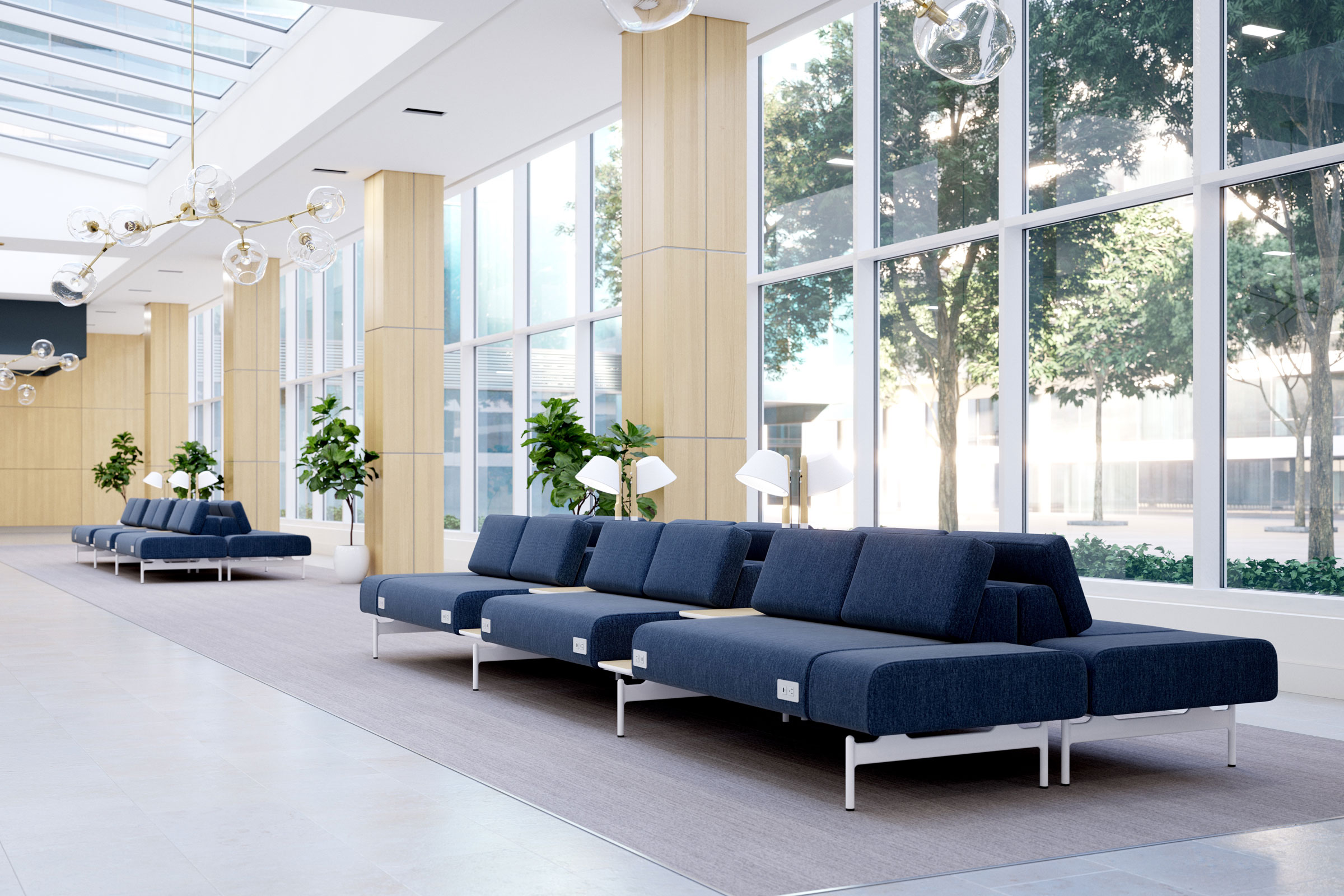
Embra is modern, freestanding, modular community seating from Interwoven, a brand of Kimball International. Photo courtesy of Interwoven
Upon stepping inside a hospital, one of the first things a patient or visitor sees is the reception desk and waiting room—and it is these places that are often the most stressful parts of a visit.
Waiting can be incredibly anxiety inducing. To help patients mitigate this stress, waiting rooms should be comfortable and provide positive distractions. This can be achieved through the inclusion of large windows to provide daylight and views outside, art, murals, or interactive spaces for visitors to focus their attention on, and comfortable furniture.
Kimball International focuses in large part on comfortable furniture and offers a wide variety of flexible options for medical facilities. Their Embra and Whitaker Health product lines of modular, freestanding community seating are easily reconfigured and look more like something you’d find in a living room than a hospital—and that’s on purpose.
“Think about those community spaces as more than just a space to come in and wait for 20 mins before the doctor calls you into the clinic,” Kim Montague, Kimball International’s executive director of applied research and partnerships, previously told gb&d.
2. Ample Daylighting
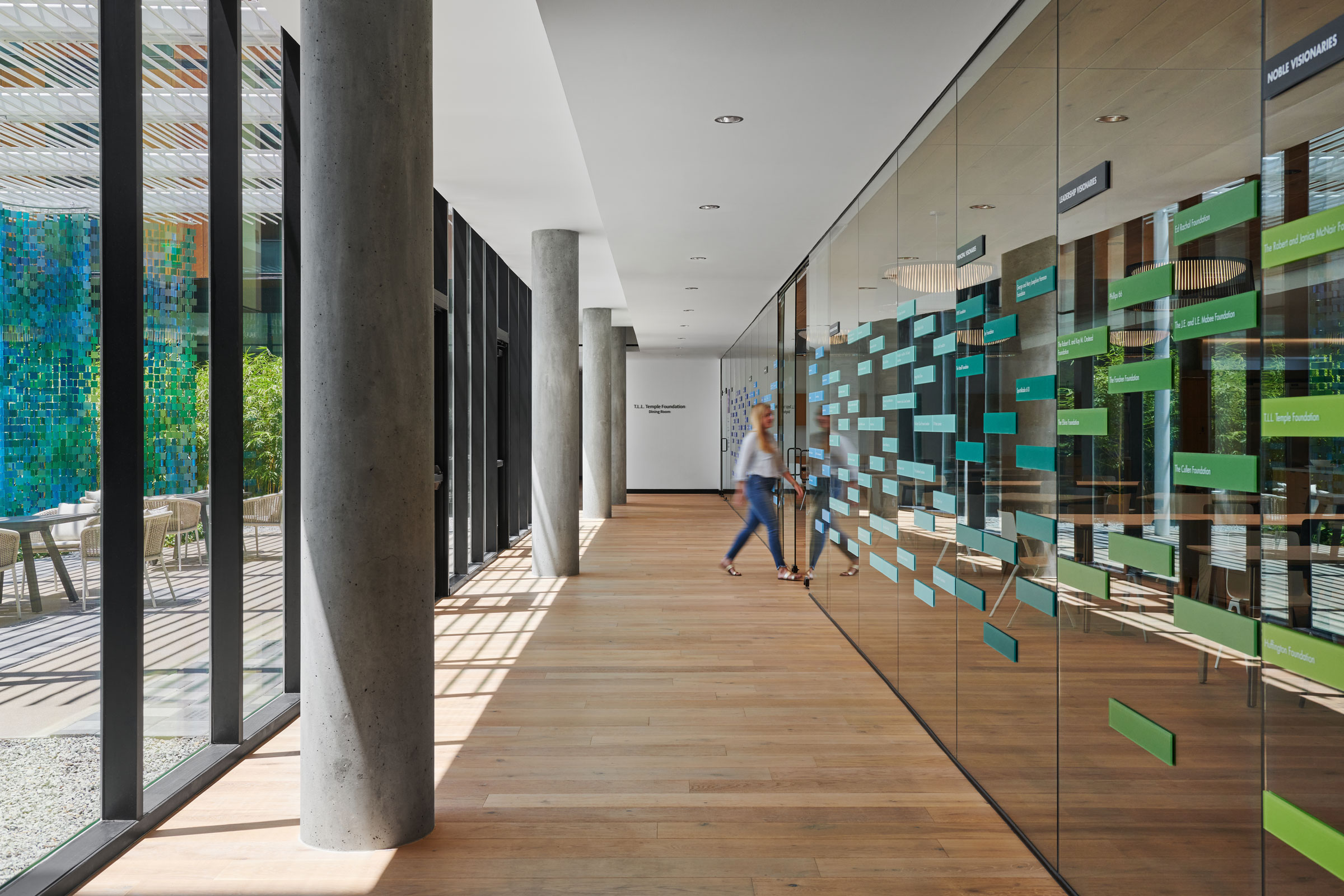
The Hope Lodge Cancer Center relies on large windows and other daylighting strategies for the majority of its daytime illumination. Photo by Peter Molick
While it’s often not possible to illuminate every room in a medical facility with natural light, design experts say special care should be taken to include daylighting solutions wherever possible.
This is especially true for reception areas, patient rooms, waiting rooms, and any other communal rooms in which patients and their families/visitors may spend considerable time. Natural daylight has obvious benefits from a sustainability standpoint, but it can also help boost psychological and physical health.
“Exposure to natural light has been proven time and time again to have numerous benefits for people, from visual comfort to psychological and neurological benefits like improving mood, reducing stress, enhancing the body’s immune response, and allowing for better sleep,” Tori Wickard, senior project architect at Perkins&Will, previously told gb&d.
Indeed, studies have shown that patients who are treated in facilities that prioritize daylighting over electric lighting heal faster and experience less pain, resulting in shorter hospital stays.
3. Internal Wayfinding Tools
Hospitals, especially large ones, often have sprawling, complex layouts that can be difficult to navigate, adding to the stress patients and visitors may feel. For this reason it is important to include appropriate, intuitive wayfinding tools that allow even first-time visitors to find their way with ease.
Historically, signage and maps have been the preferred wayfinding methods in hospitals—and while they certainly have their place, excessive use of these tools can become distracting or even overwhelming, especially for visitors whose first language isn’t English or who don’t speak English at all.
Using images and symbols for wayfinding purposes can prove invaluable in this regard, as many symbols are universal, and our brains process images much faster than words. Incorporating graphics and color-coding can also make wayfinding simpler and less daunting for younger patients or visitors who aren’t in a clear headspace.
If all else fails, using prominent signage to direct visitors and patients to common areas is an easy way for them to find someone who can point them in the right direction. After all, most modern hospitals have visitor support staff, information desks, or even interactive kiosks that can help people find the room they’re looking for.
4. Welcoming Clinical Environments
It’s one thing to design waiting rooms, reception areas, and patient rooms to be warm and inviting, but these characteristics should also extend to the hospital’s clinical areas whenever possible.
Often imaging suites, blood-draw stations, and other clinical rooms designed for conscious procedures lack the welcoming design elements found in other parts of a hospital, adding to patient stress levels. For this reason clinical areas should incorporate daylighting and contain positive distractions—think art, murals, photos, and the like—to facilitate a calm environment.
5. Theming
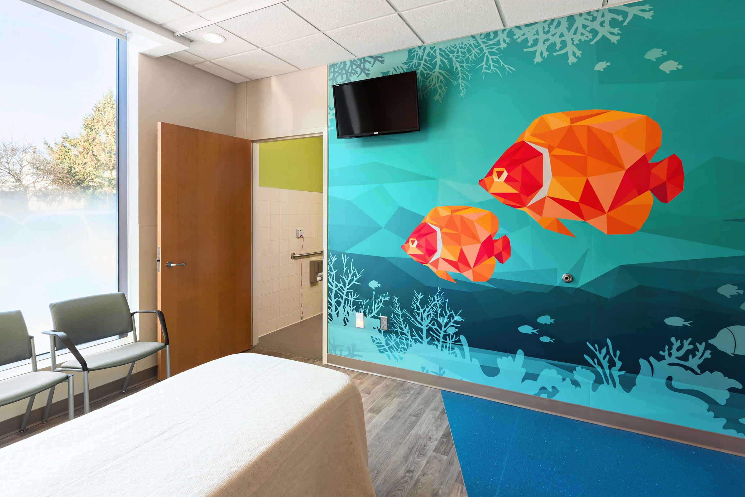
The design options for patient rooms are endless with Koroseal’s wallcovering capabilities. Photo by Kenneth Petersen
Another way to make patients feel at home is by establishing a coherent theme through art, murals, and wallcoverings. Nature is an excellent and widely applicable theme that can be tailored to specific environments, providing a sense of familiarity and locality to combat feelings of anxiety and stress.
“A lot of healing spaces and medical spaces are shifting their focus to provide a positive human experience,” Amy Sweeting, product manager at Construction Specialties, told gb&d in a previous article. “Health care designers are creating environments that lessen the anxiety that people have sitting inside waiting rooms and lobby areas and instead promote positivity about going to the doctor or waiting for a loved one.”
Construction Specialties’ line of Acrovyn Wall Coverings + Panels, for instance, can be embedded with digital imagery and photos of nature scenes and local landscapes, while Koroseal Interior Products offers a range of highly-customizable wall coverings that can incorporate organic patterns, textures, greenery, and other biophilic elements to invoke the natural world.
6. Intentionality of Color
In a similar vein, picking and choosing interior color schemes with intentionality is crucial to making patients—especially those who are children—feel comfortable and at ease with their surroundings.
Neutral and earth tone color palettes are ideal for usage in waiting rooms and common areas, as cool, muted colors have a calming effect on the human mind, but splashes of color and accent walls can also help to draw focus and brighten up a room. In general you’ll want to stay away from bright, bold colors, even though these may be used sparingly and appropriately in areas for children.
When used correctly, adhering to a color scheme can even aid in navigation and wayfinding.
7. Accessible Green Spaces
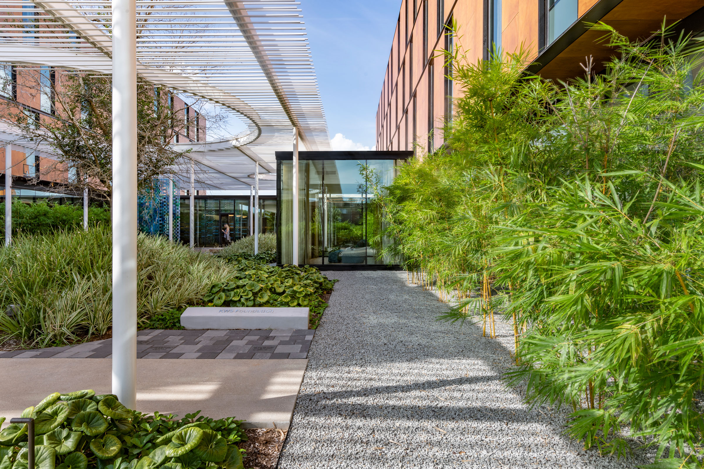
The Perkins&Will Hope Lodge project was designed to locate all of the programs on the building perimeter and put the circulation route around the healing garden. Photo by James Steinkamp
Of course, biophilic design strategies in color and décor have their limits, and nothing beats actually experiencing nature outdoors, which is why having easily accessible green spaces is integral to fostering patient well-being.
Gardens, terraces, and accessible green roofs invite patients, their families, other visitors, and staff to access fresh air and interact with the natural world in a more intimate manner. Studies show that access to these sorts of green spaces can actually improve psychological health and reduce stress, which in turn helps patients recover faster and makes hospital employees more productive.
8. Use of Sustainable Materials
Nothing says “we care about your health and well-being” like constructing a hospital from sustainable materials that won’t leach harmful chemicals or toxins into the air over time.
Taking care to design medical facilities using materials that are Red List-free—or = products that do not include any chemicals deemed concerning by the Living Building Challenge—ensures patients will not be exposed to volatile organic compounds or other potentially damaging materials during their medical stay.
“We define wellness as a state of being and a process that aims to achieve a whole person’s health, or in this case, a patient’s,” Maria Papiez, director of sustainable design for EwingCole, previously wrote for gb&d. “To support that process, optimizing the materials surrounding patients and making up the indoor environment is the highest priority.”
What’s more, sustainable materials like wood and stone are an easy way to incorporate biophilic design strategies and foster connections to the natural world.
9. Ensure Dignity Upon Discharge
Lastly, it’s important for patients to feel confident and dignified upon being discharged from the hospital, especially if they are using mobility aids for the first time or are still recovering from surgery or a procedure. Often this looks like having a dedicated exit specifically for patients who wish to leave discreetly or with added privacy, as opposed to the main entrance.
A separate exit can also have the added benefit of easing the minds of patients who are entering the hospital for the first time.
Examples of Patient-Centric Hospital Design
Now that we have a better idea of some of the hospital design elements that make patients feel at home, let’s take a look at a few real world examples.
Texas Children’s Hospital Austin Campus
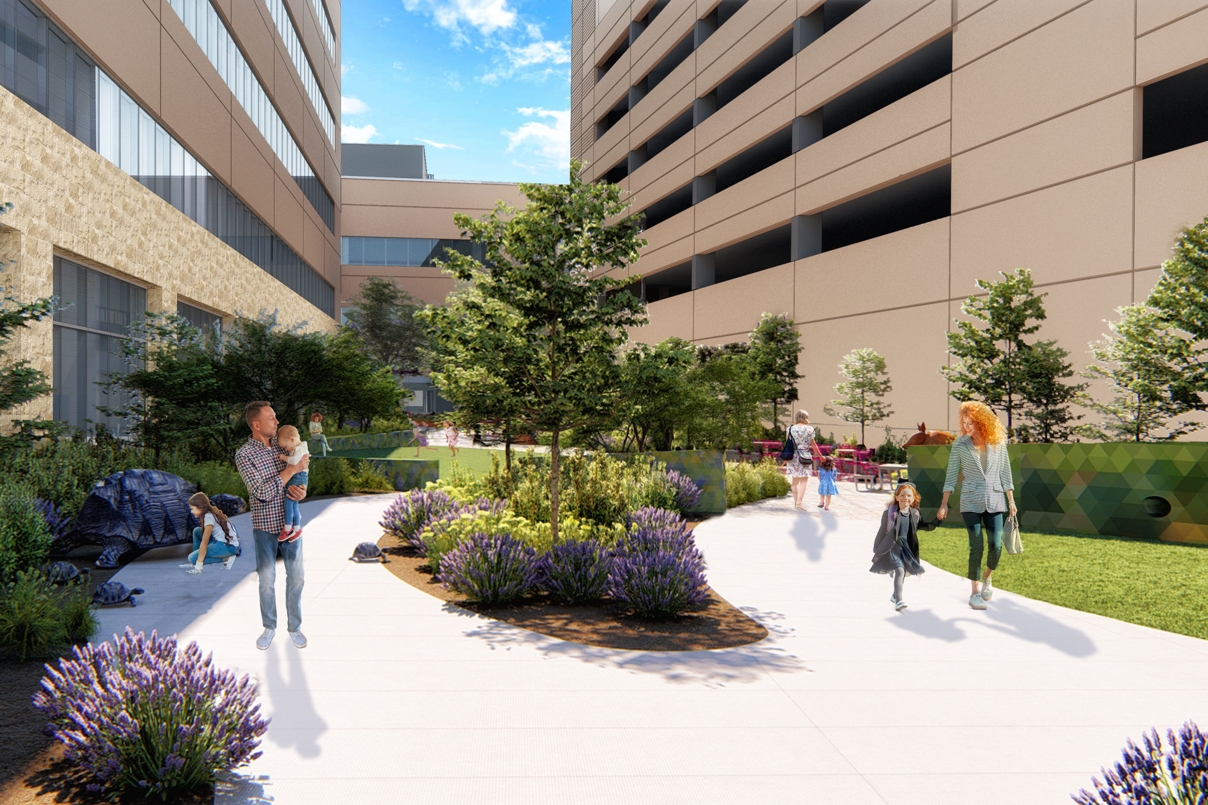
Creating outdoor spaces for rest and rejuvenation for both staff and patients was a critical part of the Texas Children’s Hospital’s design. Rendering courtesy of Texas Children’s Hospital
Designing with patients in mind is important for any medical facility, but even more so when designing a children’s hospital. The Texas Children’s Hospital campus in Austin is shaping up to be the perfect example.
Slated to open in 2024, the Texas Children’s Hospital will provide both women and children with a variety of medical services. The facility is designed to mesh with surrounding landscape and features outdoor spaces where both patients and staff can relax and enjoy the fresh air.
Maximizing the admittance of natural daylight was also important to the developers, resulting in numerous windows being installed to allow patients the opportunity to see outside and take in sunlight even if their condition doesn’t allow them to venture outdoors.
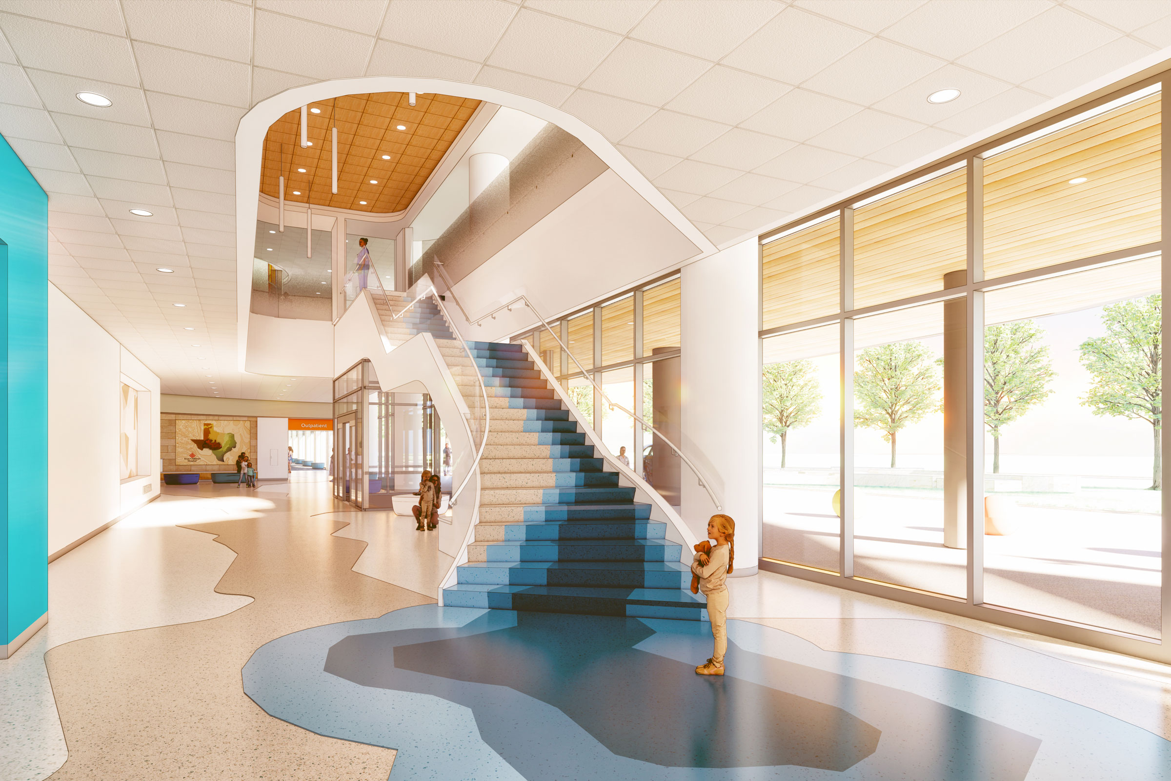
A waterfall stair inspires playful interaction for young patients. Rendering courtesy of Texas Children’s Hospital
Inside, the hospital’s theme centers around Texas’s landscape, with each floor reflecting a different biome. A natural, neutral color scheme was selected for its calming effect, with splashes of color adorning the common areas to draw engagement and serve as wayfinding tools. Interesting and interactive design details are included where children can easily see them, giving them something to focus on other than their fear.
“One of the things that is very important with a children’s hospital is not to be scary,” Jill Pearsall, senior vice president of facilities planning and development at the Texas Children’s Hospital, previously told gb&d. “We’ve engaged the flora and fauna of our themed areas to welcome them—a little salamander in the pavement or peering out from under the welcome desk. He’s there to teach them, to be part of that educational process, and to be diversionary. We don’t want them just sitting there worried about seeing the doctor or having a procedure.”
Lucile Packard Children’s Hospital
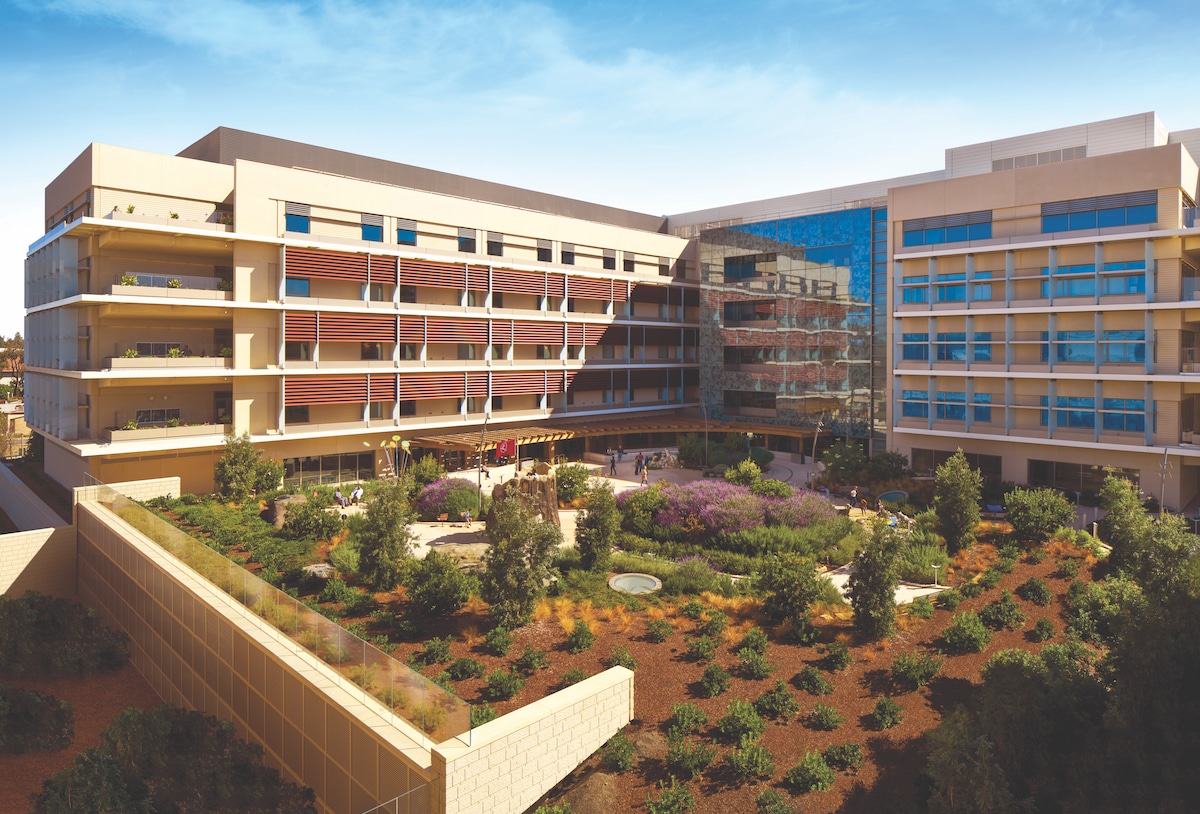
Photo by Steve Babuljak
Designed by Perkins&Will, the Lucile Packard Children’s Hospital in Palo Alto, California knows that kids are often overwhelmed in hospital settings, which is why it practices patient-centric design to the highest degree. Spanning 521,000 square feet and capable of housing nearly 150 patients, the Lucile Packard Children’s Hospital isn’t exactly small, but it’s not intimidatingly large, either—and that’s on purpose.
“There was a lot of attention paid to the scale of the building,” Robin Guenther, sustainable healthcare design leader at Perkins&Will, previously told gb&d. “So the children won’t feel like it’s cavernous and like they’re lost in it.”
A bright, open lobby welcomes patients as soon as they enter the facility, while nature-inspired artwork and educational murals adorn the walls, giving visitors the opportunity to learn about local wildlife and take their mind off of the reason for their visit. This connection to the natural world is reinforced throughout the hospital, both inside and out, in a myriad of ways—each patient’s room features a planter box outside its window and gardens wind through the property, many of which feature animal sculptures and play equipment for the children to enjoy.
Essentia Health’s Vision Northland Hospital
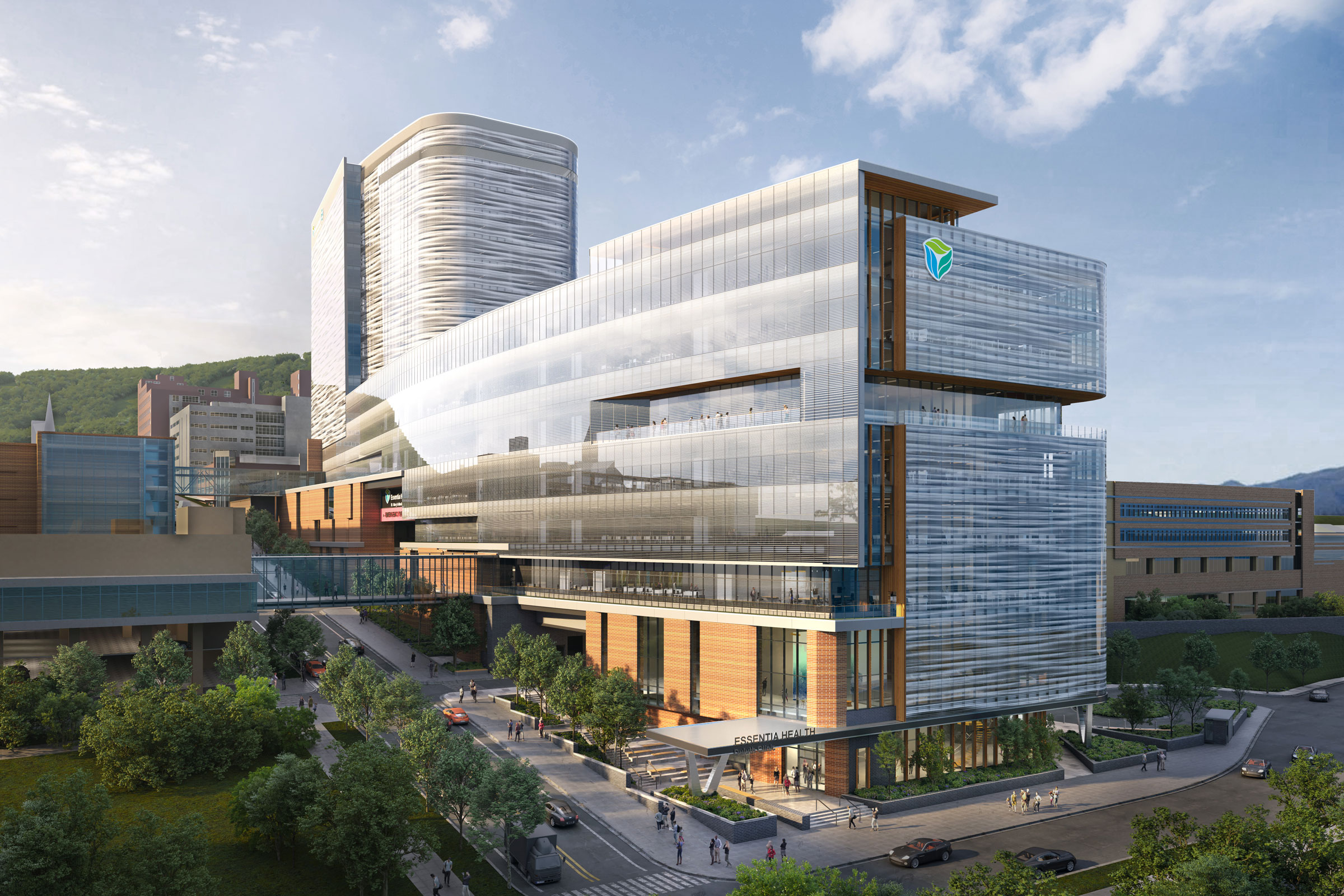
Essentia Health’s new hospital, Vision Northland, is a 950,000 square-foot hospital designed with patients’ well-being in mind. Rendering courtesy of EwingCole
Located in Duluth, Minnesota and designed by the EwingCole architectural firm, Essentia Health’s Vision Northland Hospital puts sustainability and patient well-being at the forefront.
To ensure patients receive adequate exposure to natural light during the day, Vision Northland’s patient tower is clad in a glass envelope, allowing for nearly 360-degree admittance of sunlight throughout the year. Overall the facility uses low-VOC products and natural materials—including wood and stone—wherever possible.
Like the Texas Children’s Hospital, Vision Northland’s interior designers leaned very heavily into establishing a cohesive, nature-inspired theme in the facility’s décor and art, making extensive use of photos and graphics.
“These graphics highlight local landmarks, regional history, flora, and fauna native to the North Shore and familiar to the local community,” writes Papiez. “The graphics are tailored for each floor, some directly representing these elements and others in more abstracted patterns and colors. These beautiful images support patients, family, and staff by building familiarity and comfort and serve the essential purpose of wayfinding throughout the building.”
Biophilic design strategies were also implemented so as to foster an even closer connection to the natural world. Plants can be found throughout the hospital’s interior and a rooftop terrace provides patients with a direct link to the outdoors.


