Story at a glance:
- A 1920s hotel is restored to its original grandeur with restoration and interior design from Thrash Group and Vertikal Collaborative.
- The design team opened up the front bar area to include a plush bar lounge with historic photos and art hotel vibes.
- Custom furniture designs from Thrash Group make up much of Hotel Morgan’s guest rooms.
Built in 1925, the historic Hotel Morgan sits in a bustling West Virginia college town that celebrates all things college football. But here, at the end of High Street—the city’s main downtown thoroughfare—is an escape from fraternity life and tailgating.
When Hotel Morgan opened in 1925 it was a place of splendor, complete with red satin upholstery, crystal chandeliers, and an impressive ballroom. The hotel quickly became the place to stay and has hosted many big names over the years, including Eleanor Roosevelt in 1934 and President Harry Truman in 1954. By the ’80s, though, the design was dated and the hotel had become more of a hub for the college football crowd. It was renovated in 1999 and in 2000 opened with a new color scheme, though still college-centric. It was blue and gold, a nod to nearby West Virginia University.
By 2021 the need for a significant refresh was apparent, and Hotel Morgan was restored to its 1920s-era splendor. It’s now a top boutique luxury hotel. “The renovation truly made a positive impact on the community, and I love seeing people fall in love with the space,” says Ellen Tichenor, creative director at Thrash Group. Tichenor was the lead interior designer on the project.
Interior Design Choices
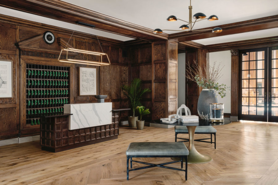
The check-in area at the Hotel Morgan, designed by Thrash Group and Vertikal Collaborative. Photo by Chase Daniel
At check-in, a display of tasseled room keys transports you to another time. Don’t worry, though; that’s just for looks. The rooms, while throwback in style, are still modern, with traditional key card entry and free WiFi.
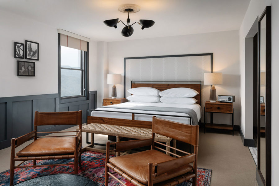
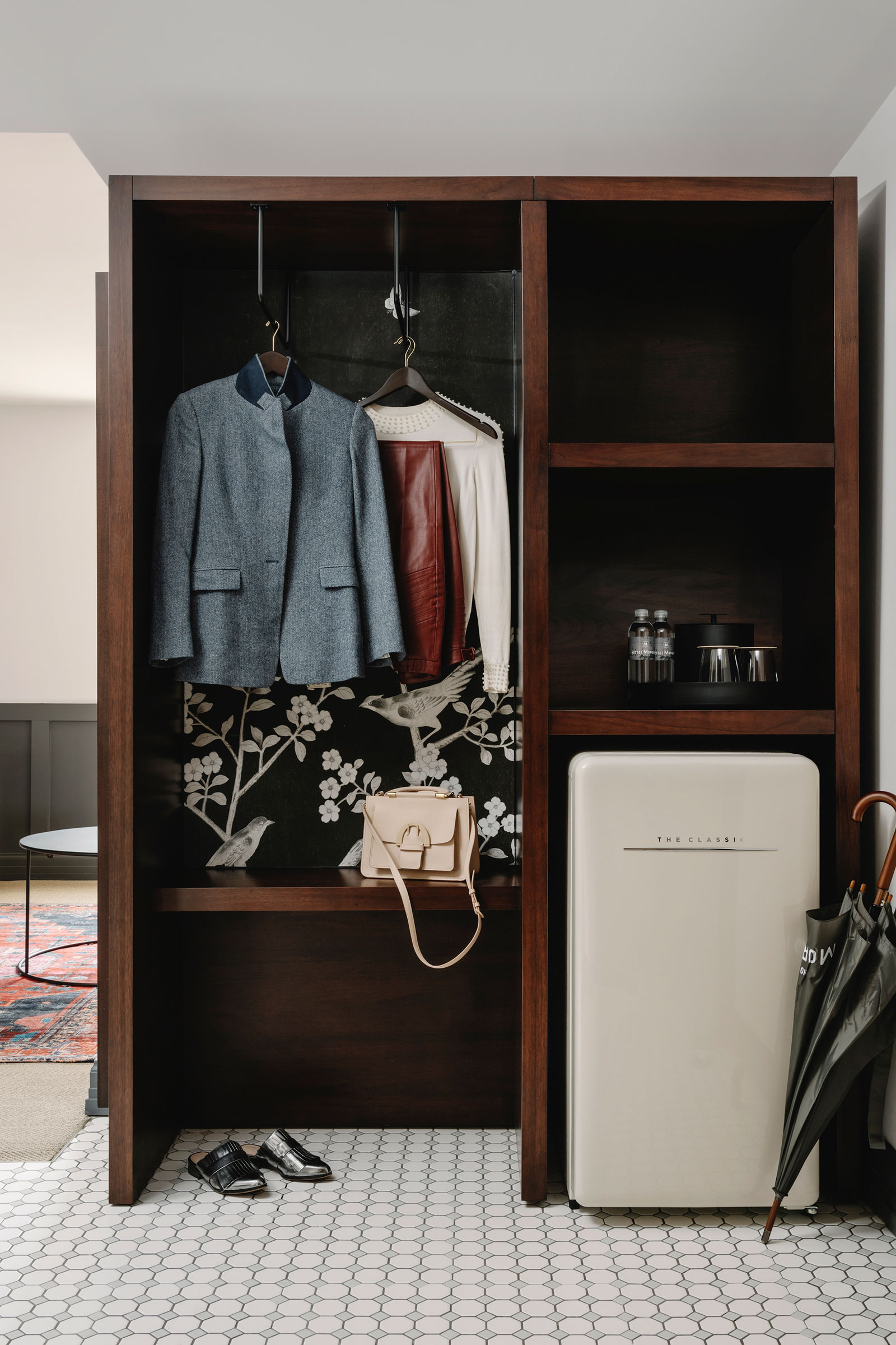
Hotel Morgan’s redesigned guest rooms blend modern design and with timeless details. Photo by Chase Daniel
- Inside a guest room at the historic Hotel Morgan in Morgantown, West Virginia. Photo by Chase Daniel
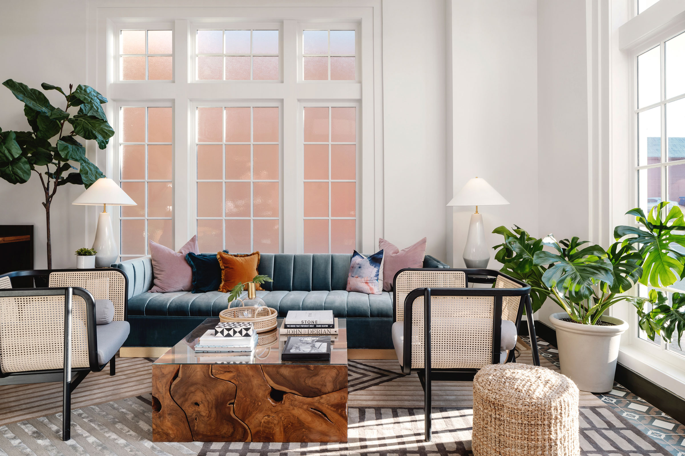
- Plentiful natural light streams in over the Hotel Morgan lobby bar. Photo by Chase Daniel
Timeless charm fills every guest room, with details like vintage books and a Victrola radio. Tichenor says Thrash Group designed most of the furniture you see in the guest rooms, like the custom wardrobes, to fit beautifully alongside designs from bigger brands like Pottery Barn, Rejuvenation, Restoration Hardware, and more.
The loft-like rooms are also outfitted with retro refrigerators, chaise lounges, and luxurious bathrooms. The hotel has more than 80 rooms and two suites in total.
Thoughtful Reuse
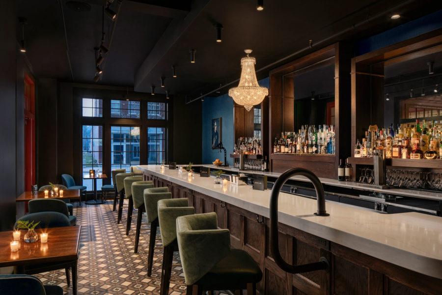
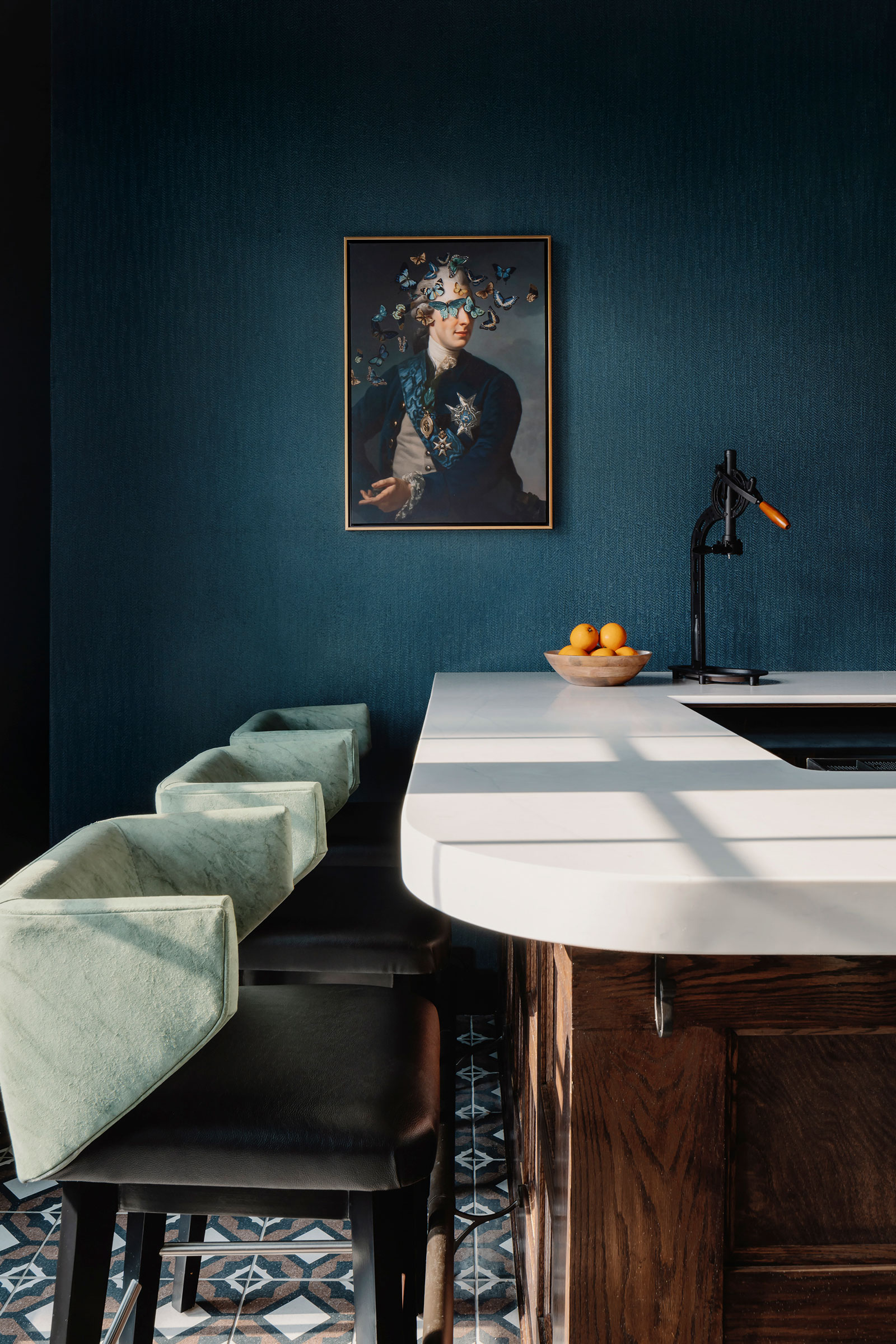
The renovated Hotel Morgan bar features dark wood and a crystal chandelier. Photo by Chase Daniel
Tichenor says adaptive reuse of a pre-existing building reduces the use of new materials and keeps old materials out of the landfill.
“Extending the lifespan of a building preserves examples of construction materials and methods that are being forgotten,” she says. “And preservation of urban historic fabric contributes to the cultural identity and quality of life of a place.”
Sarah Newton of architecture firm Vertikal Collaborative also worked on the project. “As the architect, the goal was to restore the timelessness and sophistication that we imagined the original lobby offered guests,” she says.
Anything original from the building that was still in place was restored, Newton says, including the original wood windows that had been covered up over the years on the front elevation as well as the tall steel windows of the current ballroom.
“A lot of elements had already been replaced, in which case we either kept them if they were still operable and contributed to the restoration efforts or replaced them to what we thought was originally there based on what would have been there at the time the building was originally constructed.”
Solving Challenges
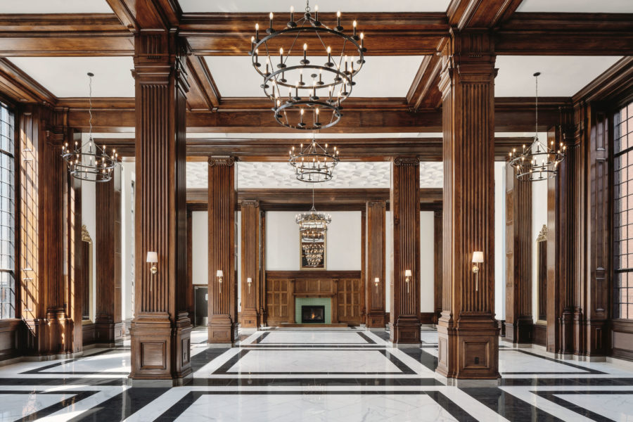
Hotel Morgan’s two-story grand ballroom features soaring windows and a fireplace. Photo by Chase Daniel
“The biggest challenge was the programming of the spaces and adjacencies,” Tichenor says of Hotel Morgan’s many nooks and crannies. “The fact that the main kitchen is positioned behind the ballroom without back of house access, the staff cannot service or run food out while an event is going on without interruption, and this hotel is very event- and wedding-driven.”
The design team took the two smaller rooms at the entry of the hotel and revamped the bar and what was formerly a fitness room to make it an adjacent bar lounge.
“Tying spaces together with finishes, using the same floor tile, and adding glazed openings so the two spaces could visually interact. We also created a self-sufficient AM/PM menu that could be executed within the small space of the bar to satisfy our guests with a F&B outlet, called Anvil + Ax,” Tichenor says.
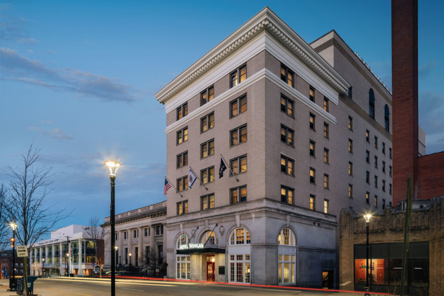
Hotel Morgan is situated at the end of a busy downtown thoroughfare called High Street. Photo by Chase Daniel
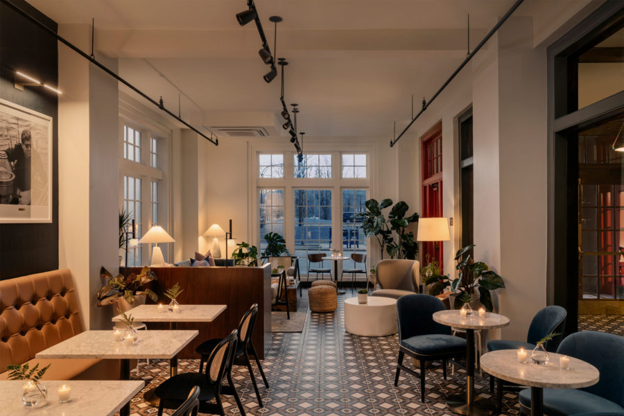
Hotel Morgan’s lounge at Anvil + Ax offers up craft cocktails and elevated dining. Photo by Chase Daniel
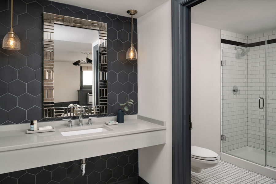
Renovated bathrooms at the historic Hotel Morgan in West Virginia are much larger and more luxurious than their predecessors. Photo by Chase Daniel
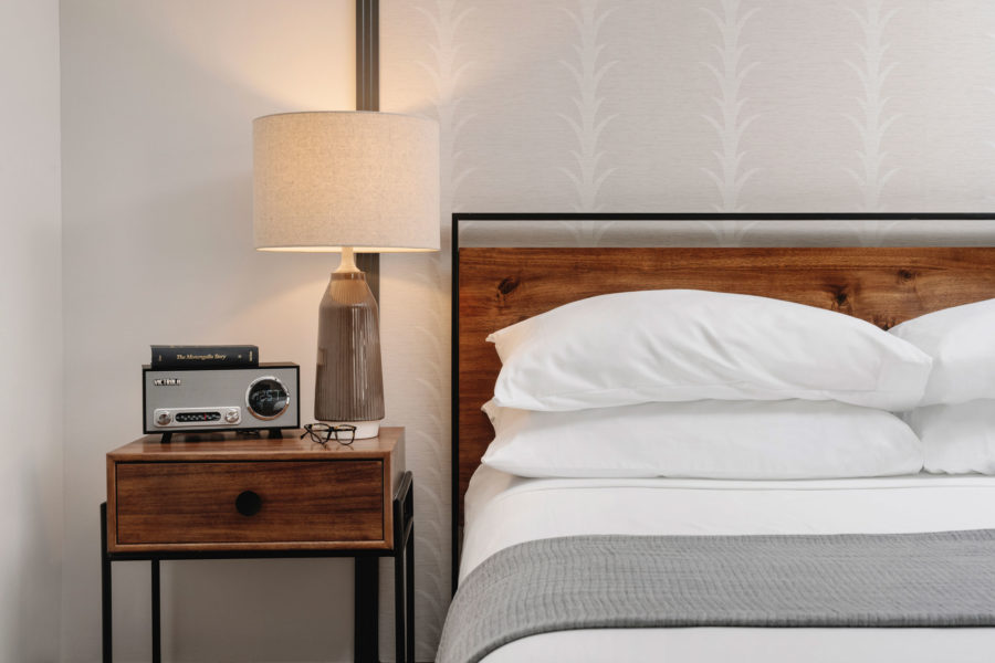
A vintage-style Victrola radio completes the look inside Hotel Morgan guest rooms. Photo by Chase Daniel

