Story at a glance:
- Nike Icons Studios LA is the brand’s flagship photography studio, designed by Lorcan O’Herlihy Architects (LOHA).
- The studio was designed with flexibility, light, and connectivity in mind, ensuring that Nike can arrange the studio and individual photography bays as needed and that employees remained connected throughout.
- The interiors are focused on passive design with an emphasis on cross ventilation.
Nike has long been heralded as an innovator in athletic wear, but behind the swoosh, Nike had a brand imaging problem—namely that all of its product photography processes were isolated in different locations. For a global brand with an extensive product line, the separation was cumbersome at best, highly inefficient at worst.
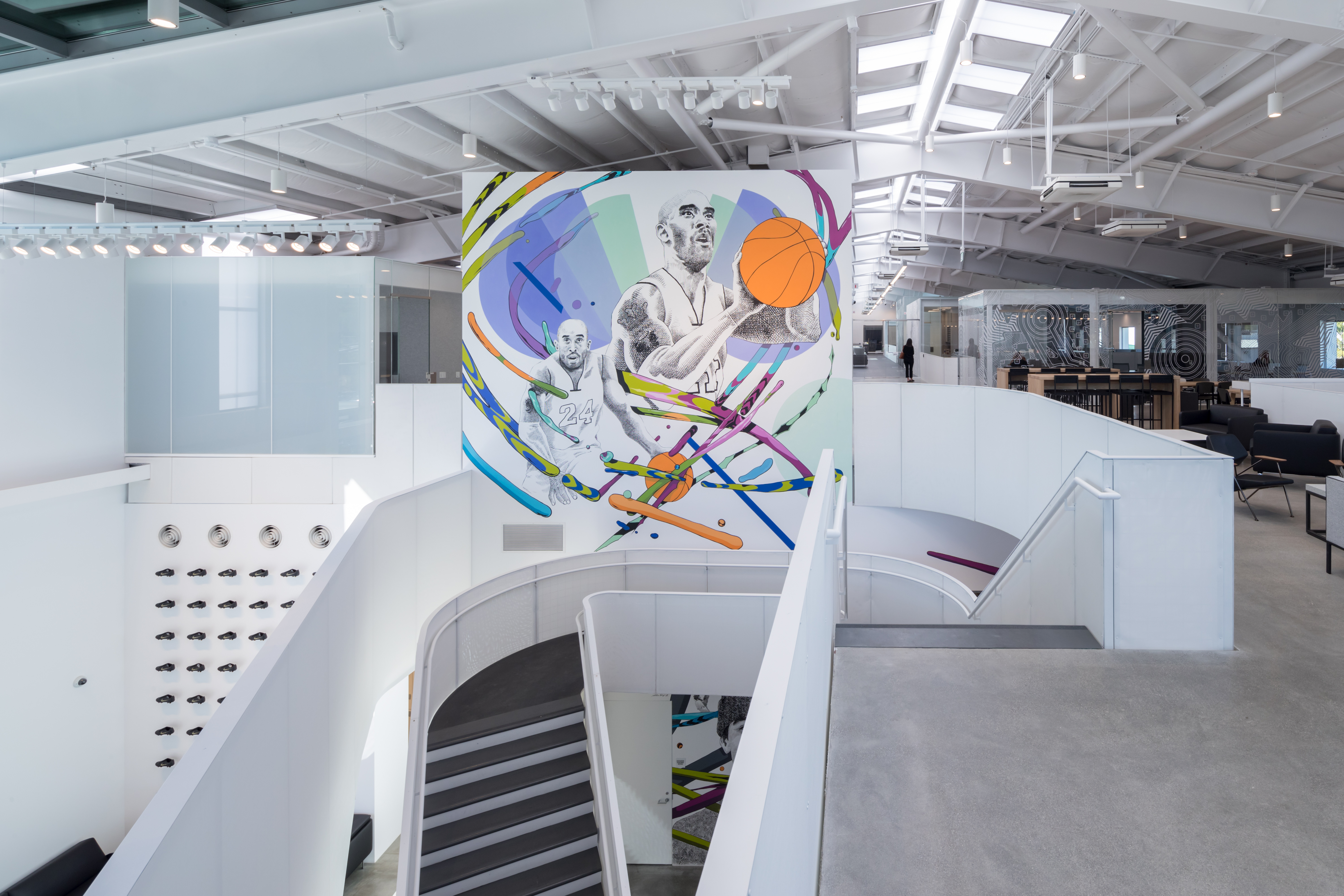
Enter Nike Icon Studios LA, the brand’s flagship photography and creative studio in Los Angeles. Completed in 2019, the space was designed by Lorcan O’Herlihy Architects (LOHA) to bring together all of the company’s brand imaging departments from pre- to post-production into one central hub where Nike’s creative team can, well, just do it—all right then and there.
“Essentially Nike streamlined all of these photography components into a new brand imaging operation for all of the Nike products you know—sneakers, hoodies, Jordans, everything,” says Lorcan O’Herlihy, founder and design principal at LOHA. “The building was designed to accommodate how the products are prepped, primed, dressed on models, photographed, edited, and marketed worldwide.”
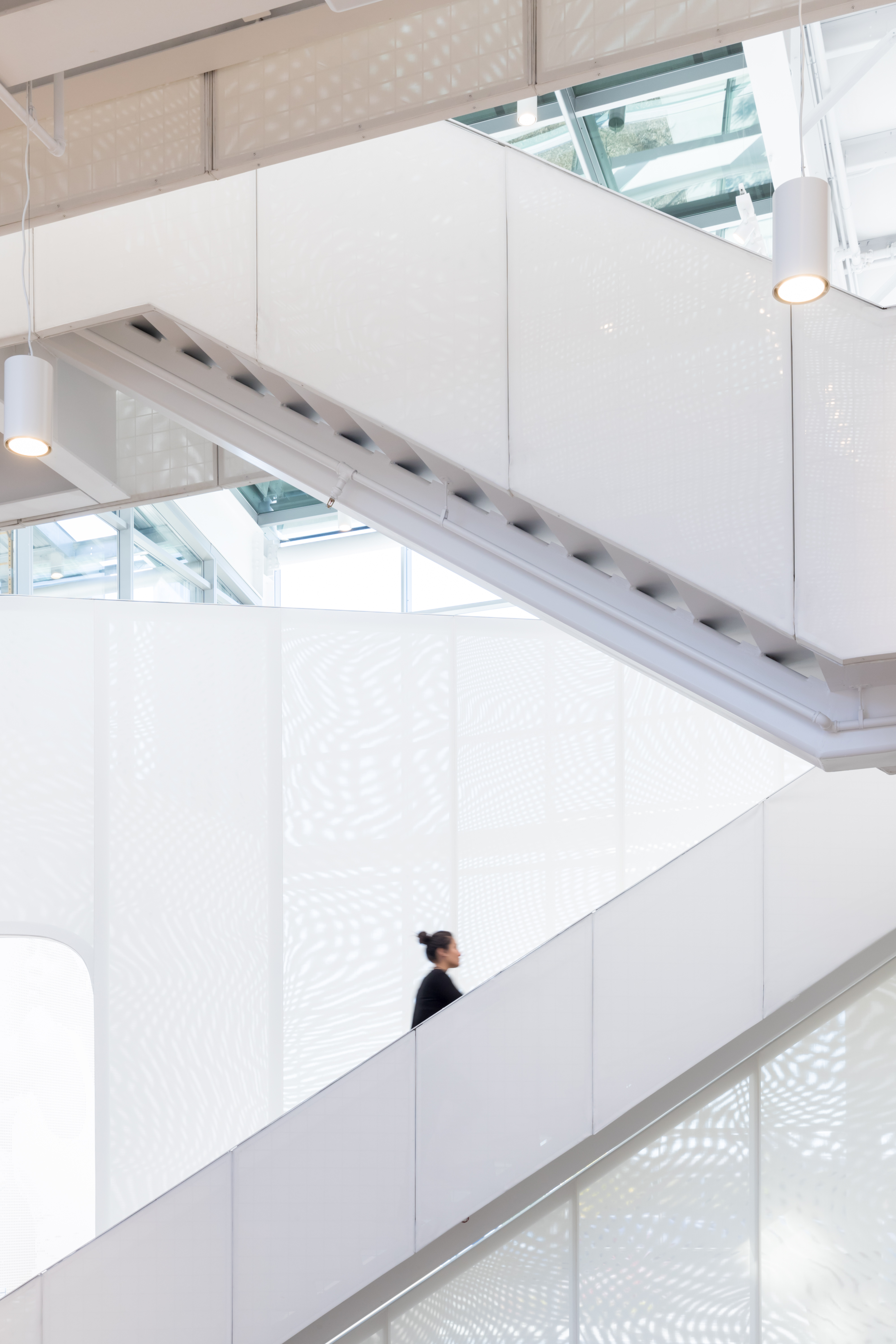
Photo by Iwan Baan
Because the building itself—a core and shell building by Eric Owen Moss Architects—is so linear, LOHA organized the building along its central spine similar to a conveyor belt. Starting on the ground floor, Nike products come into the building at the loading dock, where they then move throughout the various creative zones before ending up in the photography bays. Think of it as an assembly line: a continuous path from the beginning to end, though more principled and natural. “Given the linear building, there was an idea that we can take advantage of getting the product through each step efficiently,” O’Herlihy says. “Every single area has continuity, and the whole process is happening under one roof. So it’s all really about process in a sense, but there are loose boundaries.”
“Loose” being the operative word. As a way to increase creativity and flexibility, all of the photography bays are divided by movable black curtains rather than hard walls, with the intention being that Nike can arrange the studio space as needed. You can remove all of the curtains to create one large space, or keep them in place to designate up to 14 individual studios.
Above the photo bays on the mezzanine level is the post-production and editing hub, as well as various conference rooms, that overlook the studio happenings below. “We didn’t want to fully separate the photo bays; we wanted the opportunity for those working on the mezzanine level to be able to see the products being photographed,” O’Herlihy says. “If you’re upstairs and working, you can look down and see the production happening. You’re not separated completely from the workshops.”
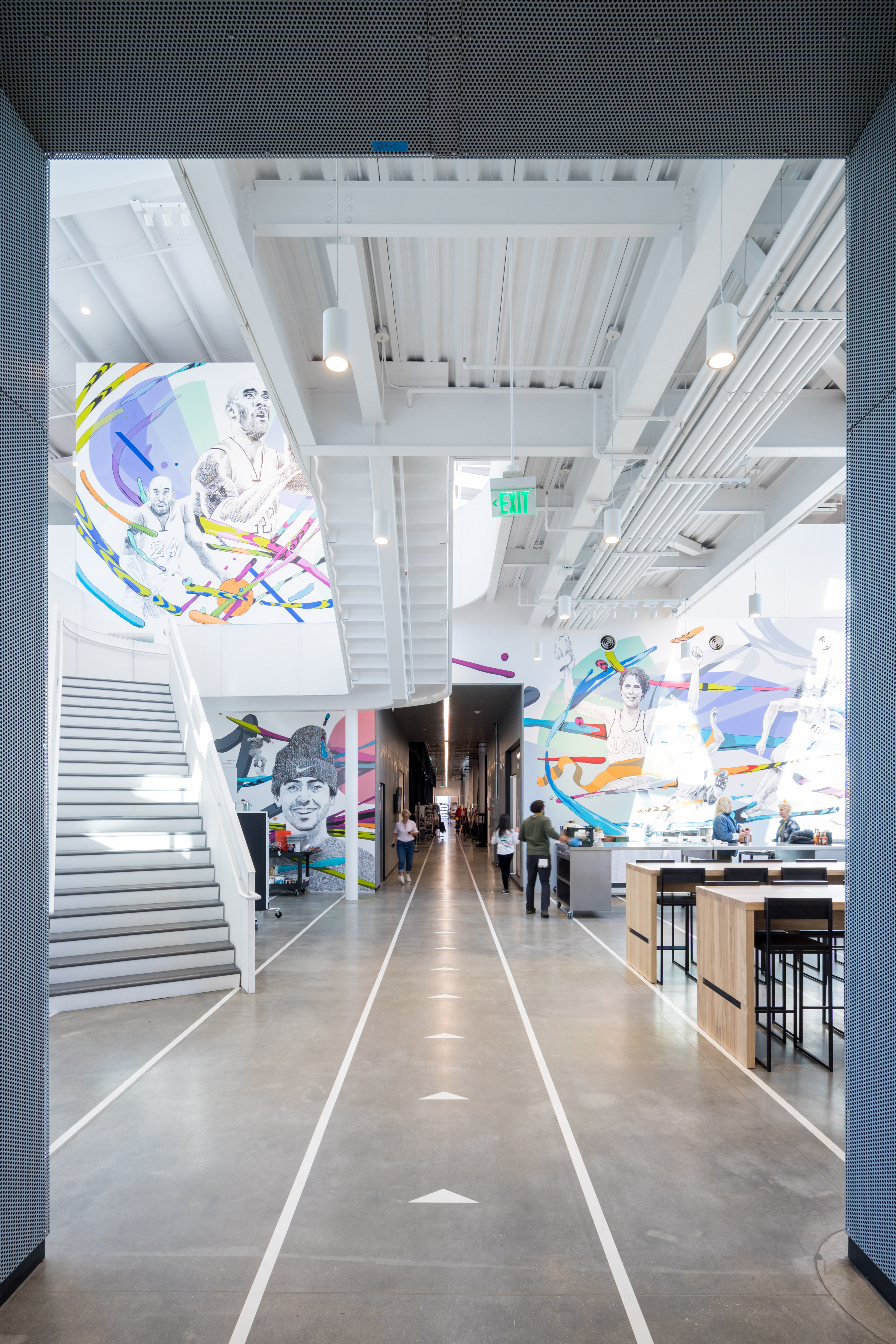
Photo by Iwan Baan
The connectivity between spaces is a prime example of the space’s social agency, something O’Herlihy says is vital to architecture. “I’m convinced that the role of an architect is to create an environment and opportunities for people to gather and hang out,” he says. It’s why, outside of the more function-driven spaces, community was a core tenet of the project. Both levels have what is referred to as a hub, or a common area where employees can come together, eat, or take a break, in addition to the building’s large outdoor patio. “We celebrated gathering spaces and wanted to make sure they had a really nice experience and that we created an opportunity to gather.”
Sustainably speaking, LOHA focused the interiors on passive design with an emphasis on cross ventilation. They took advantage of existing operable windows and skylights and bifold exterior doors to promote natural ventilation throughout.
Because light is crucial to photography, it was crucial to the building’s design. The space has abundant natural light filtered throughout the building so that does not disturb the space’s creative functions. Acoustic felt baffles separate the mezzanine level from the photo bays below, for instance, and are positioned to block southern light and bring in north light, promoting soft indirect sunlight rather than harsh direct rays.
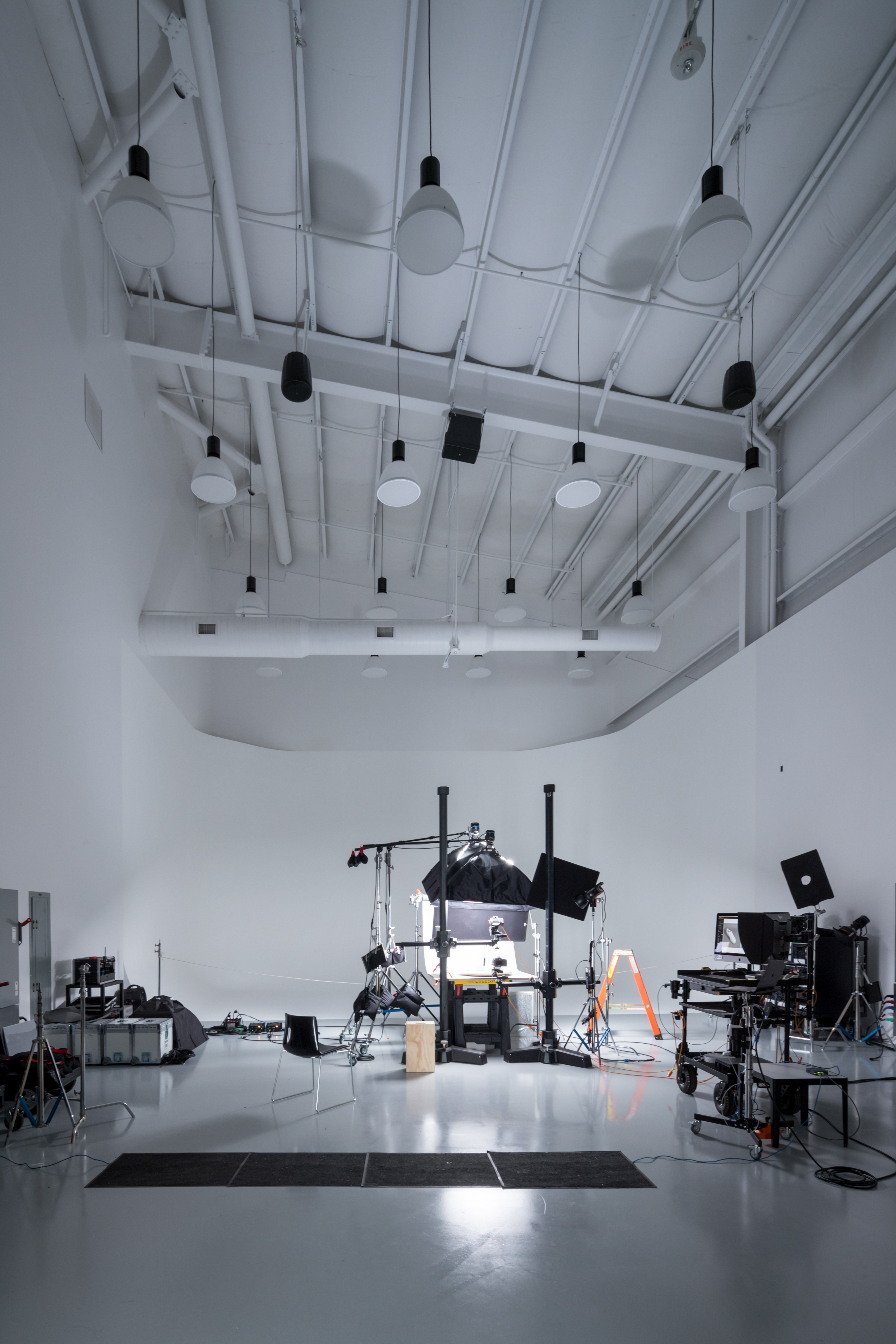
The photography bays were designed with flexibility in mind. They don’t have hard boundaries so that they can be configured to any creative setup or product shoot that Nike may need. Photo by Iwan Baan
Although the studio space is steeped in a need for improved functionality, O’Herlihy says its commitment to artistry is what makes the project successful. “Our work is about science and art. We produce architecture, recognizing that it has to work and function well and is about the culture of people, but we bring artistry to that experience,” O’Herlihy says. “Nike is similar: They create amazing products for athletes to excel in what they do, and they design extraordinary artistic components. In a sense, I felt that was a very interesting parallel in our work and perhaps why they hired us, because we could give them a robust space organized efficiently to distill the whole photographic process from product to print, but we never lost the artistry in that.”
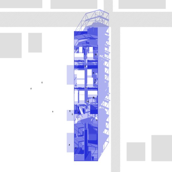
Drawing courtesy of LOHA
Project Credits
Project: Nike Icon Studios LA
Architect: Lorcan O’Herlihy Architects
Location: Los Angeles
Size: 50,000 square feet
Completion: 2019
MEP Engineer: ARUP
Structural Engineers: JRMA
Contractor: Samitaur Constructs
Nike Icon Studios LA designed by LOHA covers Issue 64 of gb&d. Subscribe to get your own copy here.

