Story at a glance:
- The 1982 Portland Building attempted to bring an element of fun back to architecture but had many maintenance issues due to budget constraints.
- DLR Group led the reconstruction to preserve a distinctive building while solving many technical issues.
- The team created a brighter, more open space, improving the experience for occupants.
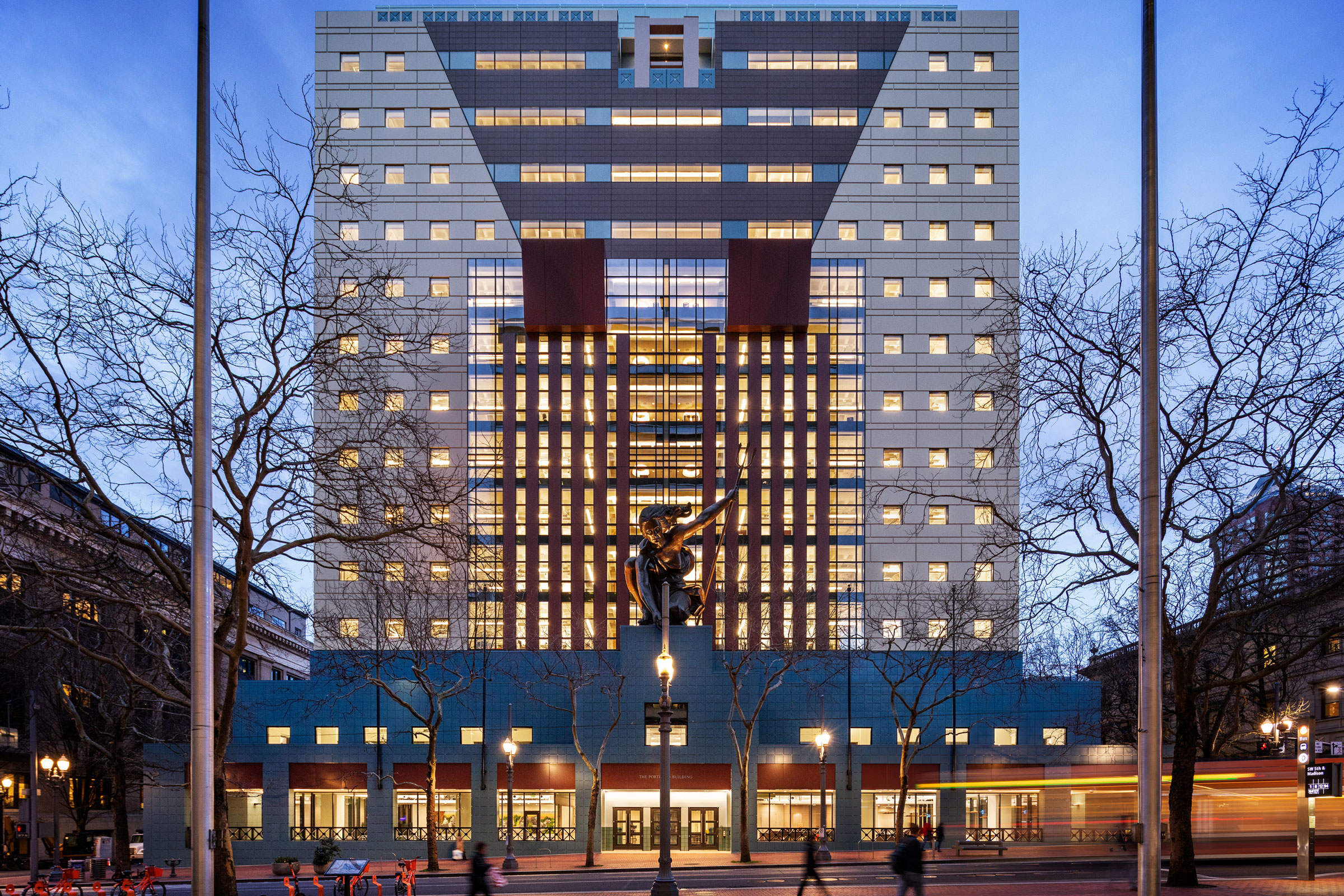
Amid neoclassical government buildings and modern glass towers, the Portland Building is unlike anything else around. Home to administrative offices of the City of Portland, the late American architect Michael Graves’ 1982 building is colorful and ornate—a prominent example of postmodernism. With a large copper statue and cartoonish flourishes, the building’s iconic design has its fans and critics.
But problems started arising almost as soon as the building was completed. For one, the building leaked whenever it rained. Little daylight reached the interior of the building. A recent reconstruction led by DLR Group improved the building’s performance and user experience while keeping the iconic look.
Erica Ceder, an architect at DLR Group, was working at a different firm when the project began. “It was just such an intriguing project to me, I actually decided that I was willing to switch firms to pursue it,” she says. “As someone who works a lot in historic preservation, this represented the next frontier.” In this case, preservation didn’t mean restoring a project to its original condition. The team had to find a way to preserve the original design intent while addressing its technical challenges.
“Preservation usually puts a lot of focus on maintaining historic materials. One of the really challenging parts about the Portland Building is what do you do when there are inherent flaws in the way the building was put together in the first place,” Ceder says.
History
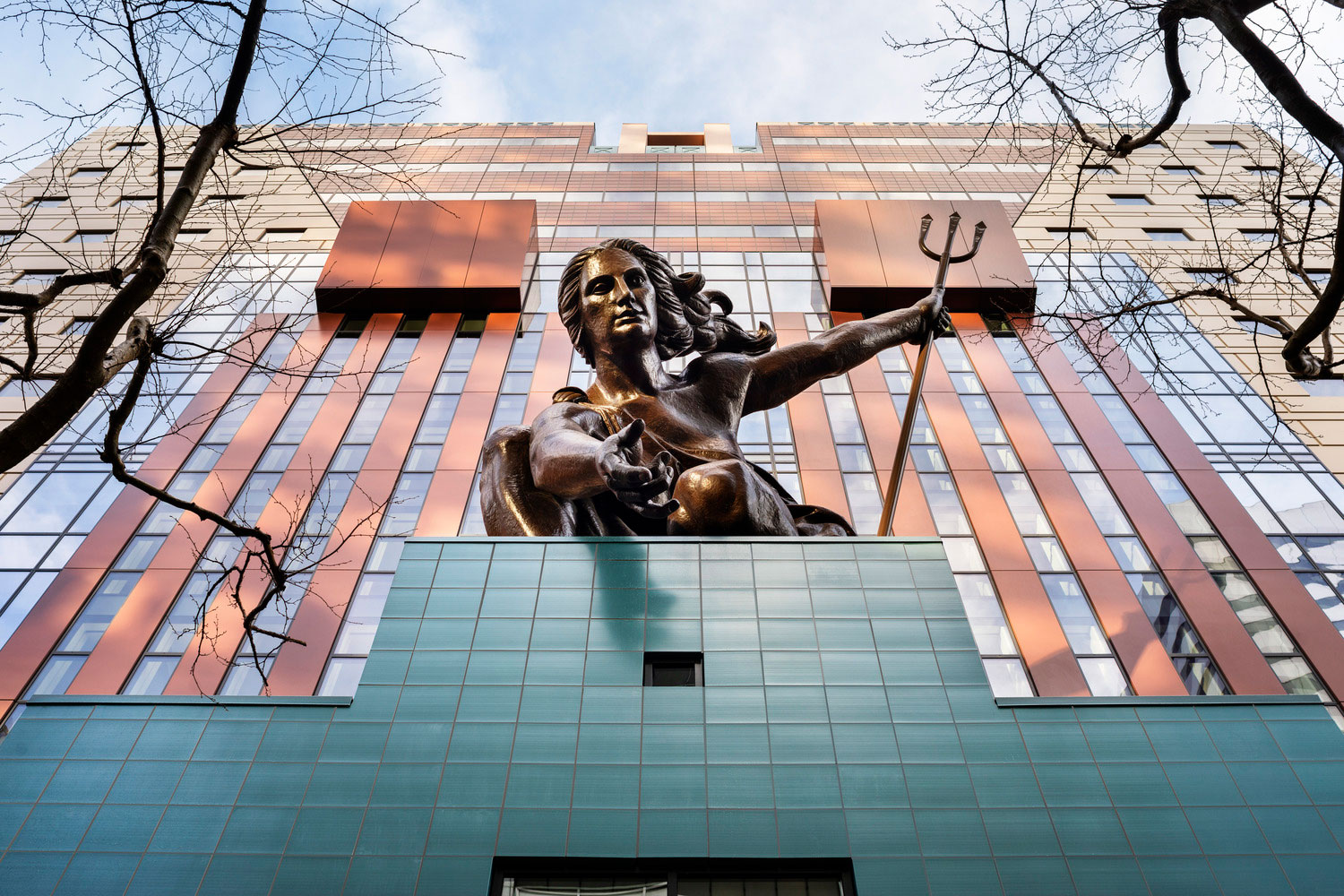
Michael Graves reinterpreted classical elements such as pilasters, garlands, and keystones in his design of the Portland Building. Installed in 1985, Raymond Kaskey’s Portlandia sculpture is the second-largest copper repoussé statue in the United States after the Statue of Liberty. Photo by James Ewing/JBSA
To learn more about how and why the Portland Building was put together the way it was, the reconstruction team talked to Michael Graves Architecture & Design. They learned that many of the material choices they made were a result of the city’s budget constraints. “They were trying to get high design at a cheap budget,” Ceder says. The end product was essentially a painted concrete box, with little attention paid to waterproofing.
“Graves’ office was pretty open about the fact that this was the first time that they had done a high-rise building. This was a big learning experience for them as a firm. To translate something from colorful paper sketches into the built form, they definitely learned a lot about materials. What it came down to was, it was a building that was a lot more about ideas and theories.”
Design Intent
Graves designed the Portland Building as a reaction to the formality and uniformity of modern architecture. “Modernist architecture got to a point where it took itself so seriously that there was really no room for whimsical expression, and postmodernism made room for having a sense of humor about architecture again,” Ceder says. “It’s definitely a polarizing style, but it had a really noble goal to bring the human element back into architecture.”
One way postmodernist architects tried to bring the human element back to architecture was through symbolism and reinterpreted historic elements. “You can definitely see that in the Portland Building with the keystone shape, the columns with the really oversized capitals, and the big medallions and garlands,” Ceder says.
Color
Color was a really important part of Graves’ vision for the project. Patrick Burke, a principal at Graves’ firm who was involved in the original building, described the color palette as “unbridled joy.” Ceder says she really likes this quote because it was an attempt to separate from the modern architecture that used muted materials and saw color as frivolous and unnecessary.
While the colors might seem out of place at first, Graves made several moves to connect it to the surroundings. The teal base represents the natural landscape, while the light blue at the top of the building connects to the sky. The red columns and keystone reference Portland City Hall, a sandstone building with red marble columns just south of the site.
Replica Curtain Wall
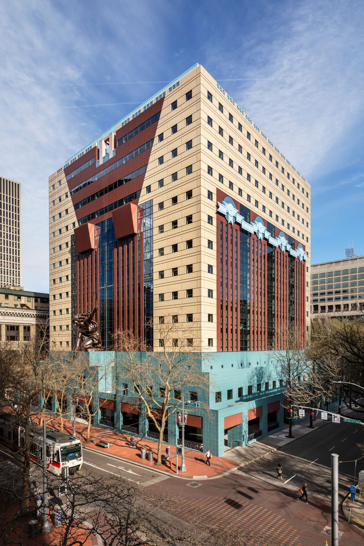
In the reconstruction, unitized curtain wall panels improve the performance of the building, while keeping the visual appearance of the original design. The teal tiles at the base are replaced with a terra-cotta rainscreen system, and the stucco garlands on the side of the building are recreated with aluminum. Photo by James Ewing/JBSA
In the original building, joint sealants were all that provided any sort of waterproofing, but water management practices have improved over the last 60 to 70 years.
Using a unitized curtain wall, the team was able to capture the look of the original design while improving its performance. A rainscreen keeps 99% of the water out, and an internal drainage system gets rid of the remaining water.
This choice also allowed the design team to move the insulation layer outside of the concrete shell, which prevents condensation inside the building. Occupants were concerned about health and air quality because of the history of leaks. “Being able to bring the insulation and water control to the outside, let us expose the concrete on the inside, which I think helped people feel more at ease,” Ceder says.
New Lobby
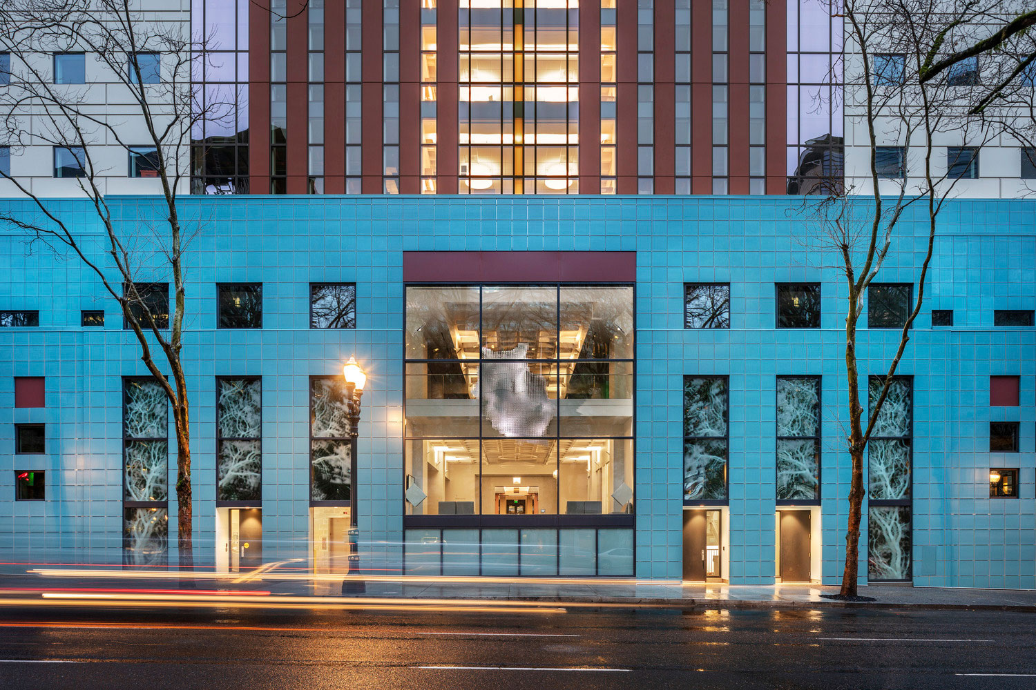
Refik Anado’s digital sculpture Data Crystal: Portland hangs over the former garage entrance. The artist describes it as “1.8 million photographic memories of the city clustered by machine intelligence.” Photo by James Ewing/JBSA
The city requested a parking lot in the original Portland Building, which cut off the building’s connection to the adjacent green space. “That was probably the biggest mistake the city made,” Graves said in a talk in 2014.
The team decided to remove the parking garage entrance and replace it with a two-story glazed window.
“You used to walk in the front door and everything was just very dark all around you. You’re in this lobby, but there was no visual connection to the outside anymore,” Ceder says. “Now when you walk in you see straight through from the front doors to the park across the street.”
Windows
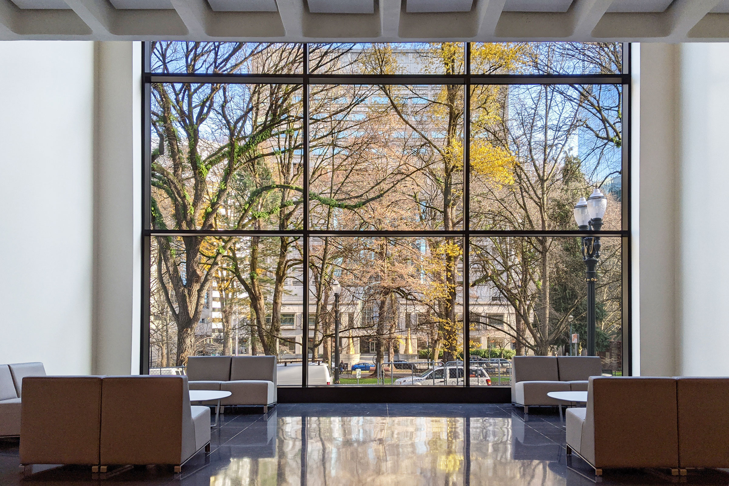
Full-height glass walls at the sidewalk level provide a visual connection to the surrounding cityscape and serve as a symbol of the city’s commitment to transparency. Photo by James Ewing/JBSA
The building was built in the wake of the 1979 oil crisis. “At that time, the response was to use darker glass. The whole idea was darker glass would prevent solar heat gain and therefore reduce your energy consumption,” Ceder says.
The energy performance of the single-glazed, aluminum-frame windows were poor, despite only letting in 7% of the daylight. “It really contributed to a very bleak atmosphere inside. It always felt like you were sitting in a permanent dusk even if it was extremely sunny outside,” she says.
With broken frames and insulated glazing, the new windows let in closer to 80% of the light while improving energy performance.“I think it changed their working environment for the better, and people just seem far more happy than they were in the previous iteration,” Ceder says.
Light
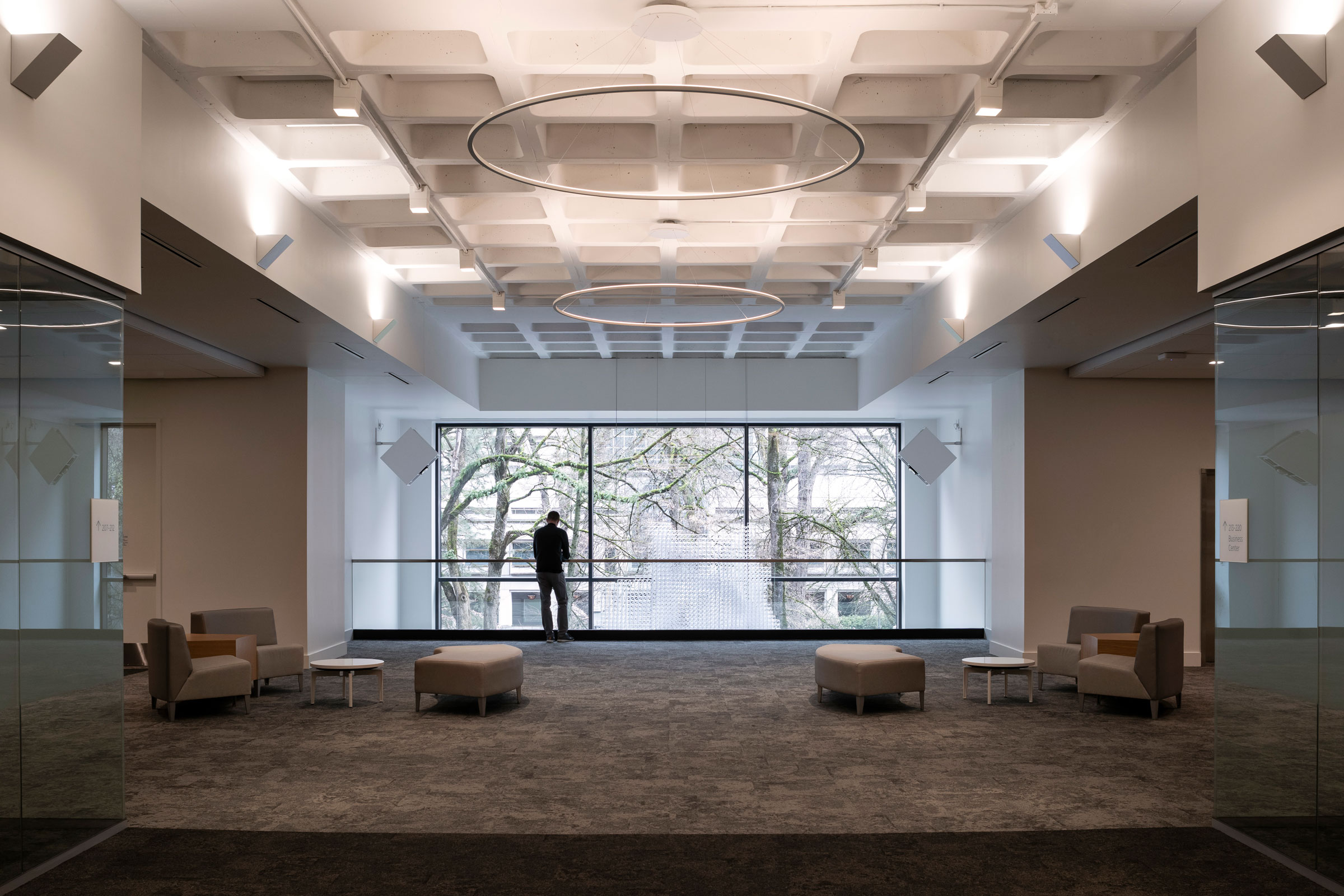
Open office areas and informal gathering and collaboration spaces are located at the perimeter of the building, creating more equitable access to natural light. Photo by James Ewing/JBSA
The high cubicle walls and drop ceilings, typical of 1980s design, also contributed to the feeling of a dark, cramped workspace. It had a floor-to-ceiling height of about eight feet, which is low by today’s standards. They removed the drop ceilings and exposed the waffle slab in many of the spaces. They painted the ceiling white, which also helps to bounce light around. Ceder says that gave the space a more comfortable scale.
“We also took out a lot of the private offices and conference rooms that were taking up some of that really valuable window space, opening up the perimeter,” she says. They moved private offices to the core of the building but included glass windows so they can still benefit from the daylight.
Interiors
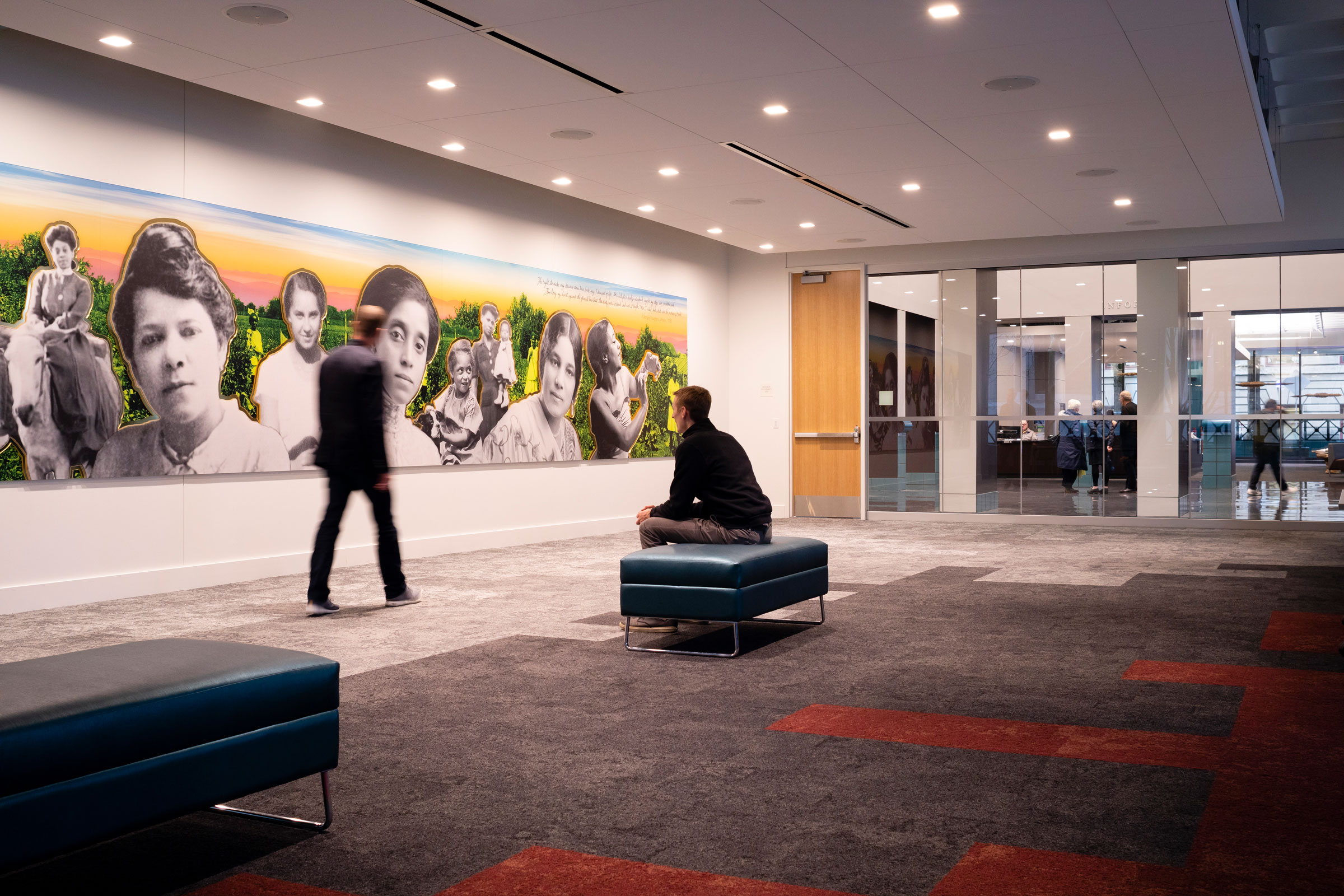
A large mural by Kayin Talton Davis is a centerpiece of the first floor event space. We’ve Been Here highlights Black women who played key roles in Oregon’s history. Photo by James Ewing/JBSA
Standardized hardwall rooms are installed throughout the building. They can be configured as offices, conference rooms, or collaborative spaces. “This is something the city did with an eye on sustainability as well as good, long-term building management,” Ceder says. “They’ve got a lot of flexibility in terms of how they furnish rooms and how they use rooms, but all of those layouts are standard on each floor so over time as bureaus move around there’s less permanent construction that has to be altered, creating less waste.”
The team chose neutral and timeless walls, ceilings, and carpets with pops of color in the furniture and graphics that could change over time. They used low-emitting materials to ensure good indoor air quality. Flooring, gypsum board, insulation, and interior paint are certified for FloorScore, CRI Green Label Plus, or Greenguard Gold. The city is pursuing WELL certification to demonstrate its commitment to employee health, too.
Seismic Improvements
The original building used a moment frame that was mainly designed to resist lateral forces from the wind. The team added a reinforced concrete shear wall to the core of the building to meet seismic code.
The team decided to leave the concrete exposed because many of the city’s engineers work out of the Portland Building and were excited about the upgrade.
Sustainability
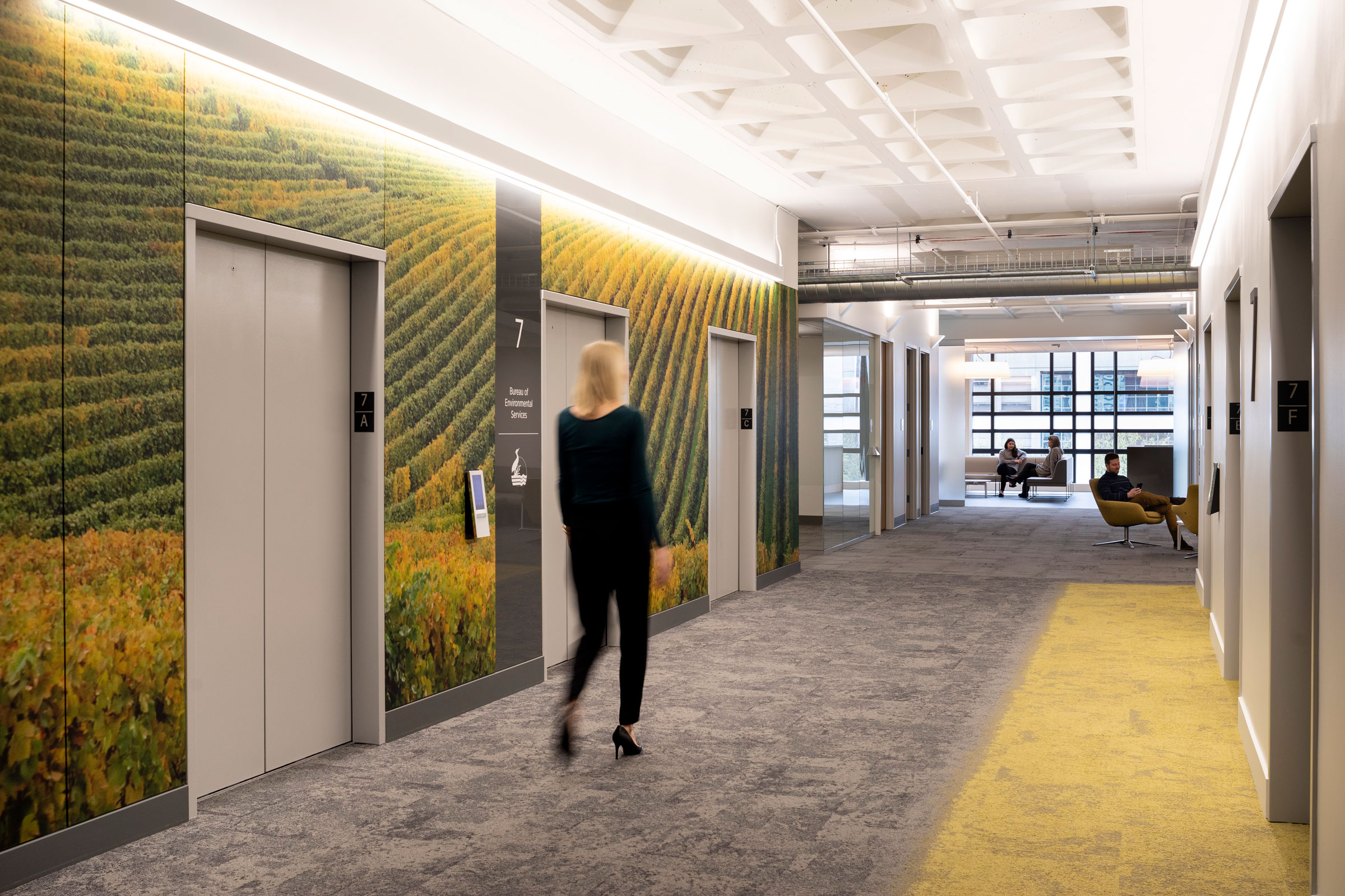
Outside the elevators, experimental graphics and custom-dyed carpets relating to natural elements in Oregon contribute to the identity of each floor. This, as well as two “wellness stairs,” encourages workers to move around and explore the building. Photo by James Ewing/JBSA
The building received a LEED Platinum certificate for its sustainability efforts.
With a more airtight curtain wall that increases access to daylight while decreasing solar heat gain, as well as retrofitted mechanical and electrical systems, the building performs 32% better than Oregon Energy Code and 56% better than the original. The new mechanical system runs entirely on electric energy, making the reconstructed building fossil-fuel-free.
The reconstruction also replaced cooling towers that used 1.2 million gallons of water per year with an air-cooled heat recovery chiller that is more energy- and water-efficient. Paired with a change to low-flow plumbing fixtures, the reconstructed building is estimated to save 2.46 million gallons of potable water each.
The project also saved 80 million pounds of concrete which translates to about 10,000 tons of carbon.
“I actually came to historic preservation from a standpoint of sustainability,” Ceder says. “I started thinking about the amount of existing building stock in the country and how wasteful it was to continually build new when we have so much existing that could be rehabilitated and given a new life.”

