Story at a glance:
- Sustainable health care design aims to construct efficient, environmentally friendly health care facilities while also improving patient comfort.
- The Hope Lodge in Houston is a home away from home for cancer patients and emphasizes the importance of daylighting in care.
- The VA Puget Sound Mental Health & Research Building in Seattle uses passive solar strategies to reduce HVAC use and recycles rainwater for a portion of its plumbing needs.
With the built environment responsible for approximately 40% of the world’s annual carbon emissions and the construction and design sector as a whole responsible for extracting more than 30% of the planet’s natural resources, it’s imperative that all buildings strive for improved sustainability. The health care sector is no exception.
Achieving sustainability in health care design is often easier said than done, as the very nature of health care facilities often requires that they consume more energy and produce more waste than the average building. This can require outside-the-box thinking and the need for innovative strategies to improve building performance and reduce energy load requirements.
What is Sustainable Health Care Design?
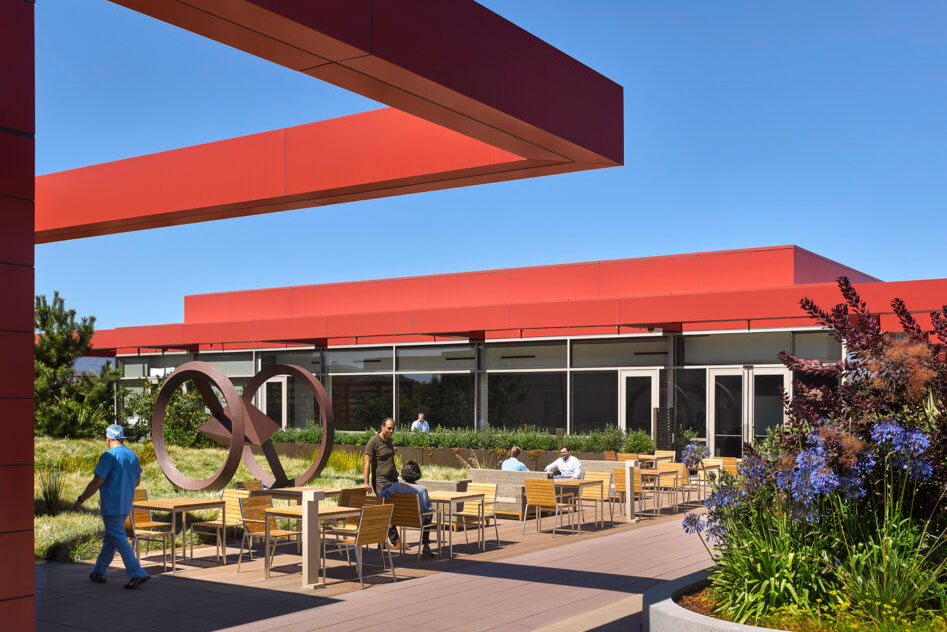
The third floor garden area at the new Stanford Hospital provides a place of respite. Photo by Will Pryce
Sustainable health care design is a subset of sustainable architecture dedicated to the design and construction of healthy, efficient, environmentally friendly health care facilities whose operations have a positive impact on both people and the planet.
WHO defines a sustainable health care facility as one that “improves, maintains, or restores health while minimizing negative impacts on the environment and leveraging opportunities to restore and improve it, to the benefit of the health and well-being of current and future generations.”
Sustainable health care design ultimately aims to reduce the overall environmental impact of the facility itself while at the same time improving social equity, patient comfort, and the productivity of health care providers. Strategies for achieving these goals typically include:
- Integration of renewable energy sources
- Implementation of daylighting solutions
- Inclusion of vegetation and green spaces
- Rainwater harvesting and reuse
- Installation of cool or green roofs
- Use of passive solar design principles
- Energy-efficient systems and appliances
Different types of health care facilities may have varied goals or methods when it comes to sustainability, but the foundational principles are the same. Here are 16 inspiring examples of sustainable health care design in action.
16 Sustainable Health Care Design Examples
1. Richard M. Schulze Family Foundation ACS Hope Lodge, Houston
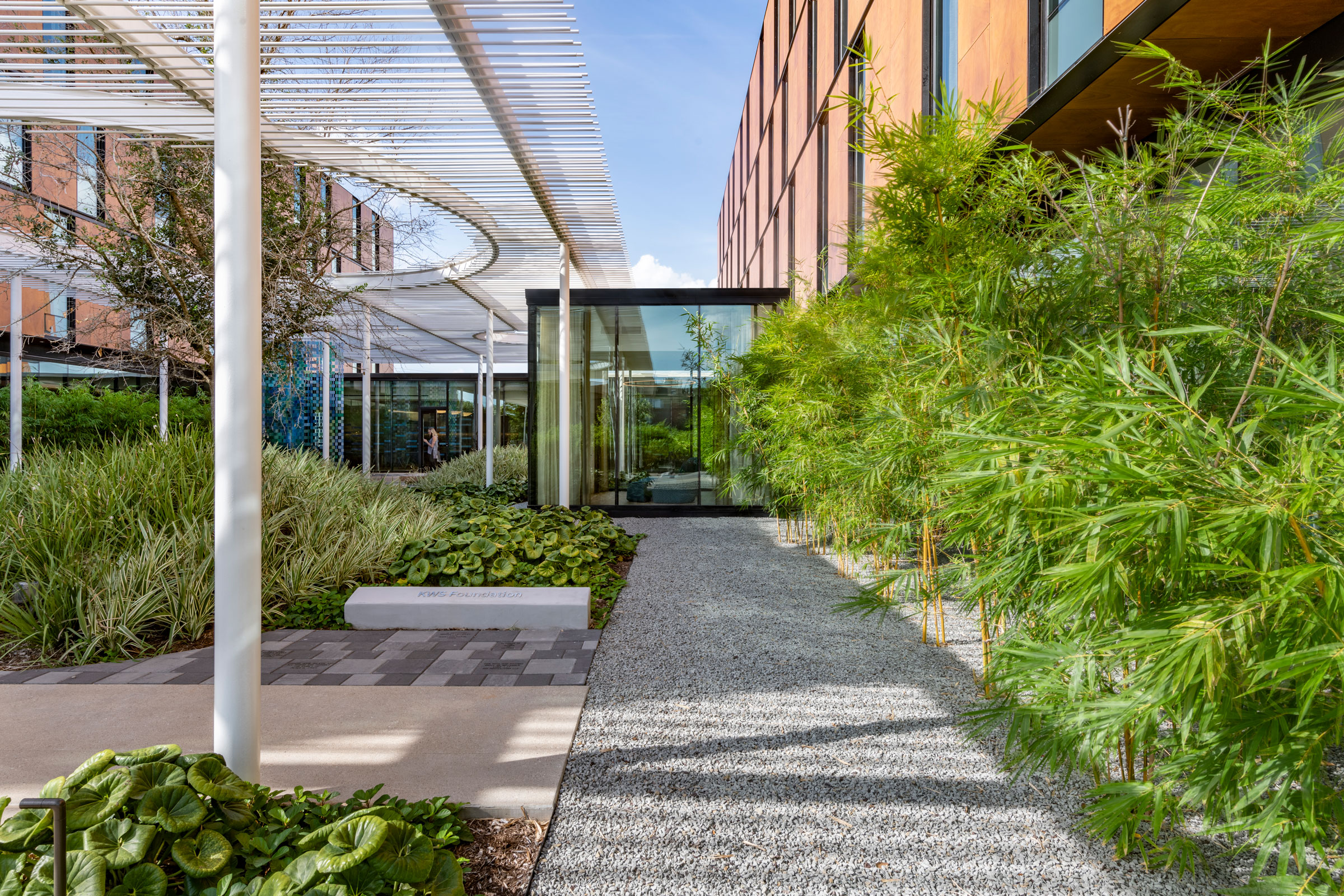
The Perkins&Will Hope Lodge project was designed to locate all of the programs on the building perimeter and put the circulation route around the healing garden. Photo by James Steinkamp
Designed by Perkins&Will to the WELL Building Standard for the American Cancer Society, the Richard M. Schulze Family Foundation Hope Lodge acts as a supportive home away from home for cancer patients and exemplifies the importance of daylighting when it comes to designing sustainable health care facilities. Daylighting is an element that Kingspan Light + Air’s Neall Digert calls “the number one amenity we can apply to a building that drives human satisfaction and comfort.”
Featuring a footprint similar to that of the traditional cloister, Hope Lodge encompasses 64,000 square feet and includes two towers wrapped around a central healing garden landscaped with native plants. Large windows flood the interior with natural sunlight, drastically reducing the building’s energy consumption, while advanced air cleaning and water filtration systems ensure a healthy indoor environment for patients.
Aside from helping to reduce energy loads, daylight is also extremely beneficial from a health care standpoint. “Exposure to natural light has been proven time and time again to have numerous benefits for people, from visual comfort to psychological and neurological benefits like improving mood, reducing stress, enhancing the body’s immune response, and allowing for better sleep,” Tori Wickard, senior project architect at Perkins&Will, previously told gb&d.
All of the lodge’s communal spaces are positioned around the central healing garden, allowing patients to take in the natural sunlight and enjoy biophilic views. Biophilia is also present within the lodge’s interior, which evokes and fosters a connection to the natural world through the use of wood, earth-tone colors, and natural geometries.
2. Rancho Los Amigos Recuperative Care Campus, Downey, CA
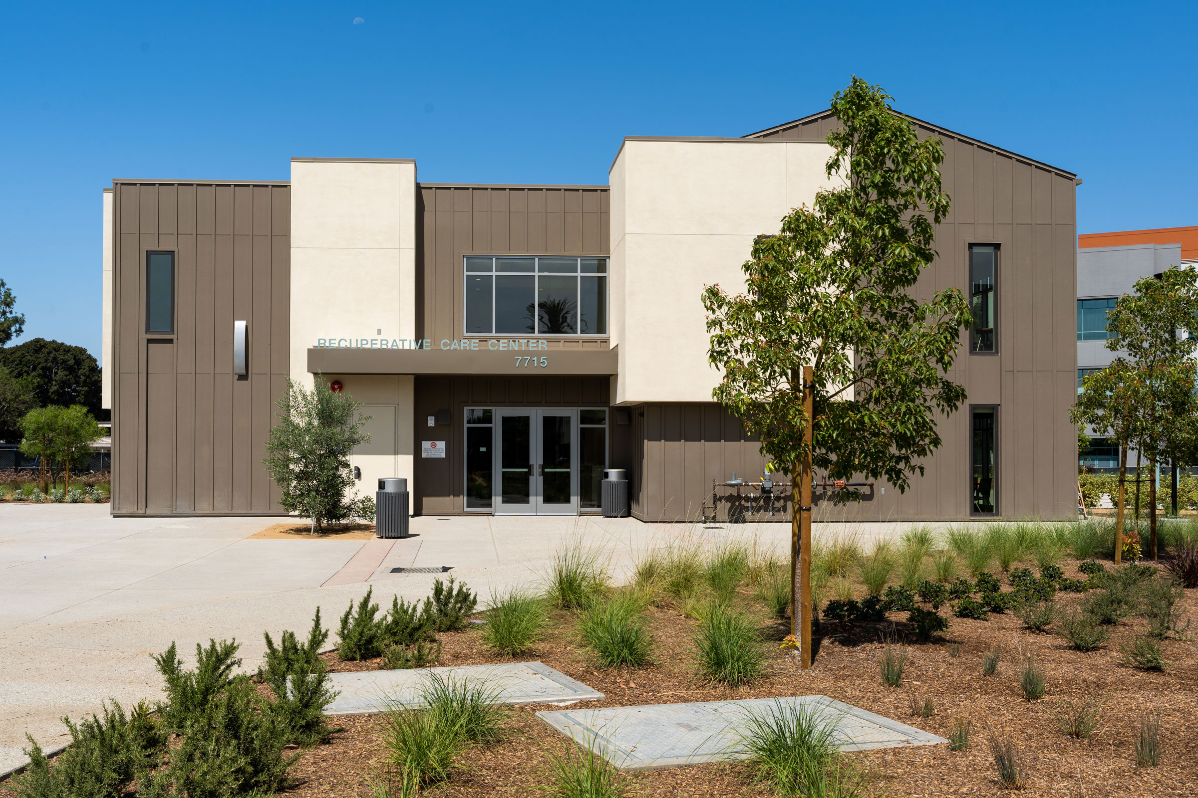
Photo by Ric Berryman
Designed by GGA+ to LEED Gold standards, the Rancho Los Amigos Recuperative Care campus in Downey, California provides physical rehabilitation services to the greater Los Angeles County community in a mindful, sustainable manner. Encompassing 6.8 acres, the park-like Ranchos Los Amigos includes a central Recuperative Care Center, five residential treatment program buildings, and several outdoor spaces.
“Conceptually the GGA+ team referenced a farming village as a site planning prototype appropriate to the history and culture of the campus,” Staci Nesbitt, principal architect at GGA+, wrote in a previous gb&d article. “Respecting the rich context of existing mature trees at the site, the proposed plan created an informal and organic organization of the buildings and associated outdoor spaces.”
Due to California’s propensity for droughts and prolonged dry spells, Rancho Los Amigos also practices water-wise landscaping to reduce its irrigation needs and on-site water requirements. A gray water recycling system supplies water to the campus’ few grass lawn areas, and the rest of the property features hardscape elements and pollinator gardens seeded with native, drought-tolerant plants—all of which allow the site to double as a habitat restoration project.
Other sustainability features include the production of onsite renewable energy via photovoltaic panels, use of high-efficiency VRF mechanical systems, and advanced building-level energy metering. Reflective roofing PVC, prefabricated wall panels with high levels of insulation, and energy-efficient siding and windows further serve to reduce Rancho Los Amigos’ energy needs.
3. Cedars-Sinai’s Los Feliz Urgent Care Clinic, Los Angeles
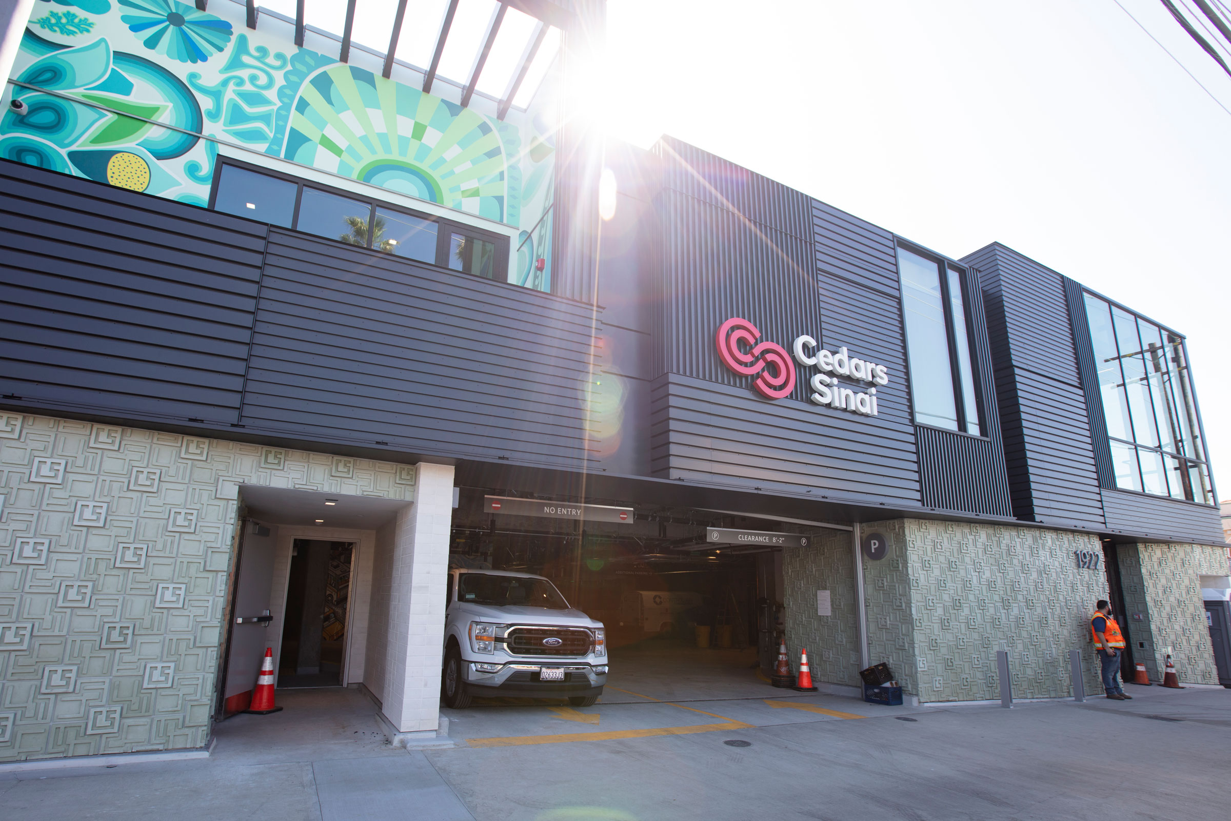
A new urgent care facility in the Los Feliz/Silver Lake area has a mural from a local artist inspired by the indigenous people who lived there and the local flower marts. Photo courtesy of Cedars-Sinai
Situated in Los Angeles’ Los Feliz neighborhood and designed by Abramson Architects, the new Cedars-Sinai Urgent Care Clinic takes design inspiration from the area’s historic monuments and landmarks—namely the Samuel Novarro House and Ennis House, both designed by Frank Lloyd Wright—to match the diverse aesthetics and architectural styles of the surrounding area.
“Cedars-Sinai envisioned a building that is grounded in the neighborhood,” Zeke Triana, vice president of facilities and design at Cedars-Sinai, previously told gb&d. “You could never duplicate that building elsewhere in the community. It’s rooted in the Los Feliz/Silver Lake area and inspired by some of the beautiful architecture.”
Colorful murals were painted by local artists to reference the neighborhood’s iconic flower marts and pay homage to the region’s Indigenous peoples. The murals adorn the clinic’s street-facing facade, bringing life to the building and further grounding it within the community.
Non-structural matte black corrugated metal panels wrap around the clinic’s second floor exterior and serve as a rainscreen, helping to protect the building’s stucco finish and passively regulate temperatures. Large windows and a two-story atrium flood the interior with natural light to create a welcoming clinical environment.
“When you walk in, you feel the total environment has been curated for you, and the details really matter,” Triana says. “From how you access the campus to how you park to how you get to your destination to the artwork, landscaping, lighting—everything has been curated so you get that total experience. That really does create, we believe, an environment where healing can take place.”
4. Texas Children’s Hospital, Austin
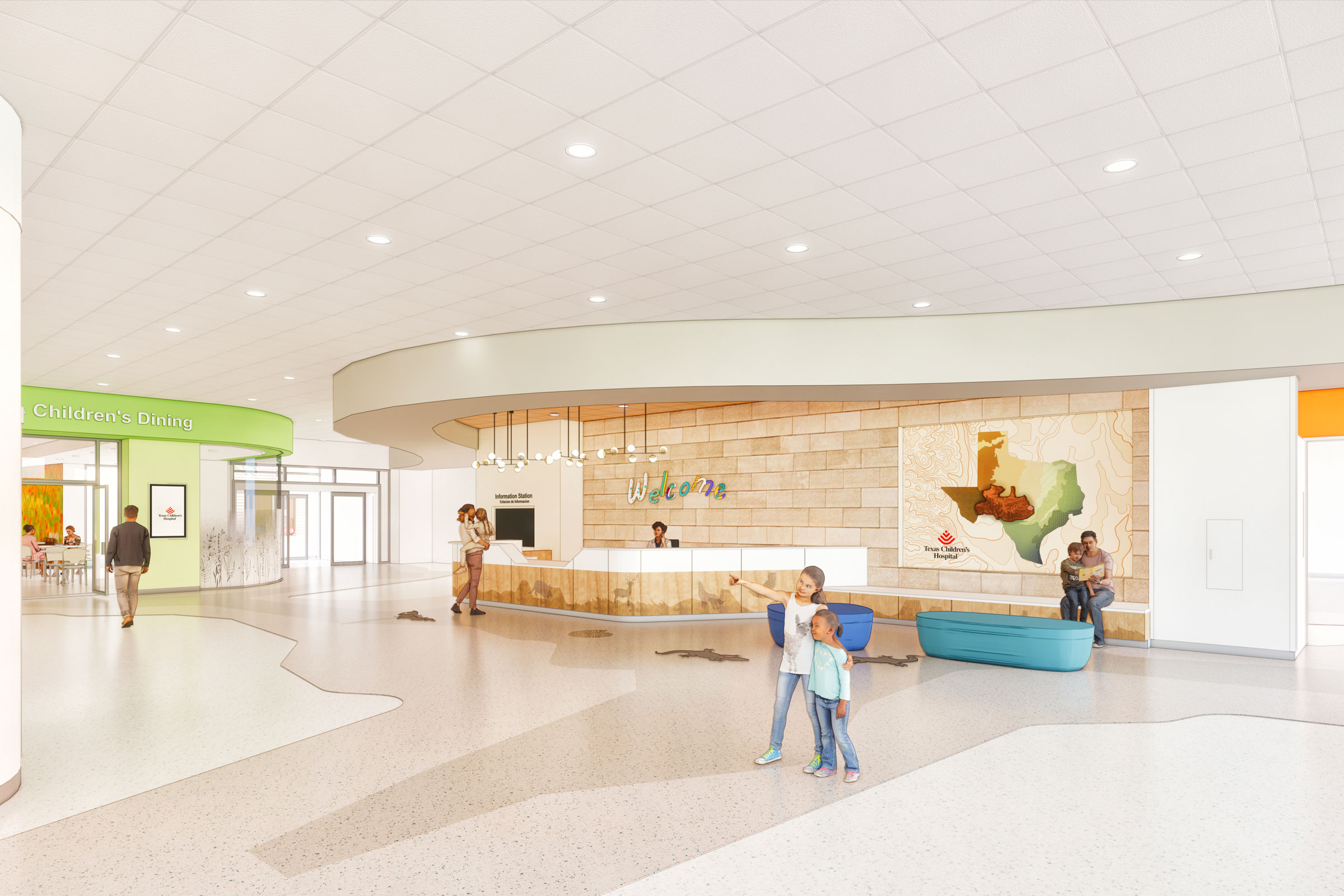
The new Texas Children’s Hospital is being designed with a calming neutral palette and splashes of color. Rendering courtesy of Texas Children’s Hospital
Slated to open in 2024, the Texas Children’s Hospital will provide both women and children with a variety of medical services. The facility is designed to mesh with surrounding landscape and features outdoor spaces where both patients and staff can relax and enjoy the fresh air.
Maximizing natural light was also important to the developers, resulting in numerous windows to allow patients the opportunity to see outside and take in sunlight even if they can’t get outdoors.
Inside the hospital’s theme centers around Texas’s landscape, with each floor reflecting a different biome. A neutral color scheme was selected for its calming effect, with splashes of color adorning the common areas to draw engagement and serve as wayfinding. Interesting and interactive design details are included where children can easily see them, giving them something to focus on other than their fear.
“One of the things that is very important with a children’s hospital is not to be scary,” Jill Pearsall, senior vice president of facilities planning and development at the Texas Children’s Hospital, previously told gb&d. “We’ve engaged the flora and fauna of our themed areas to welcome them—a little salamander in the pavement or peering out from under the welcome desk. He’s there to teach them, to be part of that educational process, and to be diversionary. We don’t want them just sitting there worried about seeing the doctor or having a procedure.”
5. UCLA Health’s Calabasas Campus, Calabasas, CA
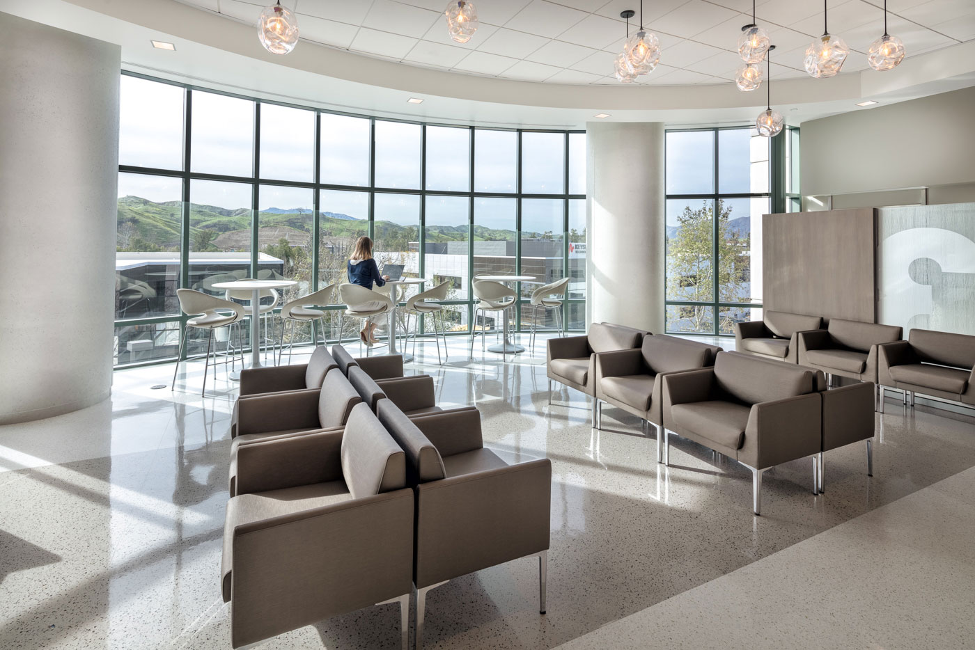
Inside UCLA Health’s Calabasas facilities. Photo courtesy of UCLA Health
UCLA Health’s Calabasas Campus expertly marries patient-centric design with sustainable architecture to create a health care facility that is both friendly to the people and to the environment.
Large windows allow natural light to illuminate the building’s interior and serve to provide views to patients, helping to reduce feelings of stress and anxiety. In rooms where windows are not possible, soft LED lighting is employed, as are biophilic elements like nature-themed artwork and natural materials.
One of the things UCLA wanted to ensure with the Calabasas Campus was long-term design flexibility. “After construction, whether one’s an exam room with an exam table and a hand-washing station or one has more furniture, we allow for flexibility along the way so if we determine we really need more exams than consults, we can convert that room easily,” Amy Kraft, director of UCLA Health Real Estate Planning, Design & Construction, told gb&d in a previous article.
Being able to easily convert rooms without necessitating a complete renovation is not only extremely convenient, but it also helps prevent future construction waste—reducing the project’s overall environmental footprint and life cycle impact.
6. Virtua Samson Cancer Center, Moorestown, NJ
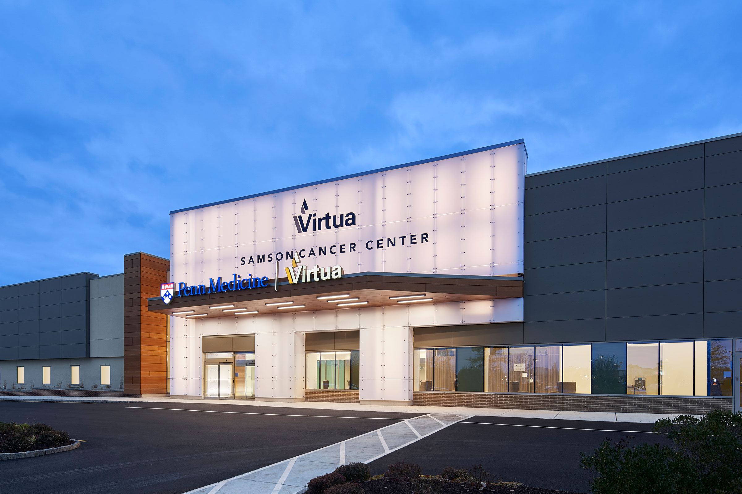
The Virtua Samson Cancer Center in New Jersey. Photo courtesy of FCA
The Virtua Samson Cancer Center (VSCC) in New Jersey exemplifies how project teams can successfully repurpose an existing building for even more sustainable health care design.
Designed by Francis Cauffman Architects the VSCC is an inspiring example of how adaptive reuse may be implemented within health care architecture as a means of reducing waste. Originally built as an ACME supermarket, the VSCC now serves the community in another way, encompassing everything from radiation oncology to an infusion treatment and cancer administrative suite.
“Choosing to repurpose an existing building is a socially responsible and sustainable way to bring care closer to the communities that need it,” Aran McCarthy, principal of health care at FCA, previously wrote for gb&d.
To foster a sense of hope and healing while also prioritizing sustainability, VSCC uses high ceilings, vibrant artwork with nature scenes, and daylighting strategies to allow ample natural slight. Skylights are positioned above the building’s central concourse and the main gallery, helping to both improve internal wayfinding and the patient experience as a whole. A nearby garden further serves to connect patients to the natural world and is visible from the infusion treatment spaces.
7. Lucile Packard Children’s Hospital, Palo Alto, CA
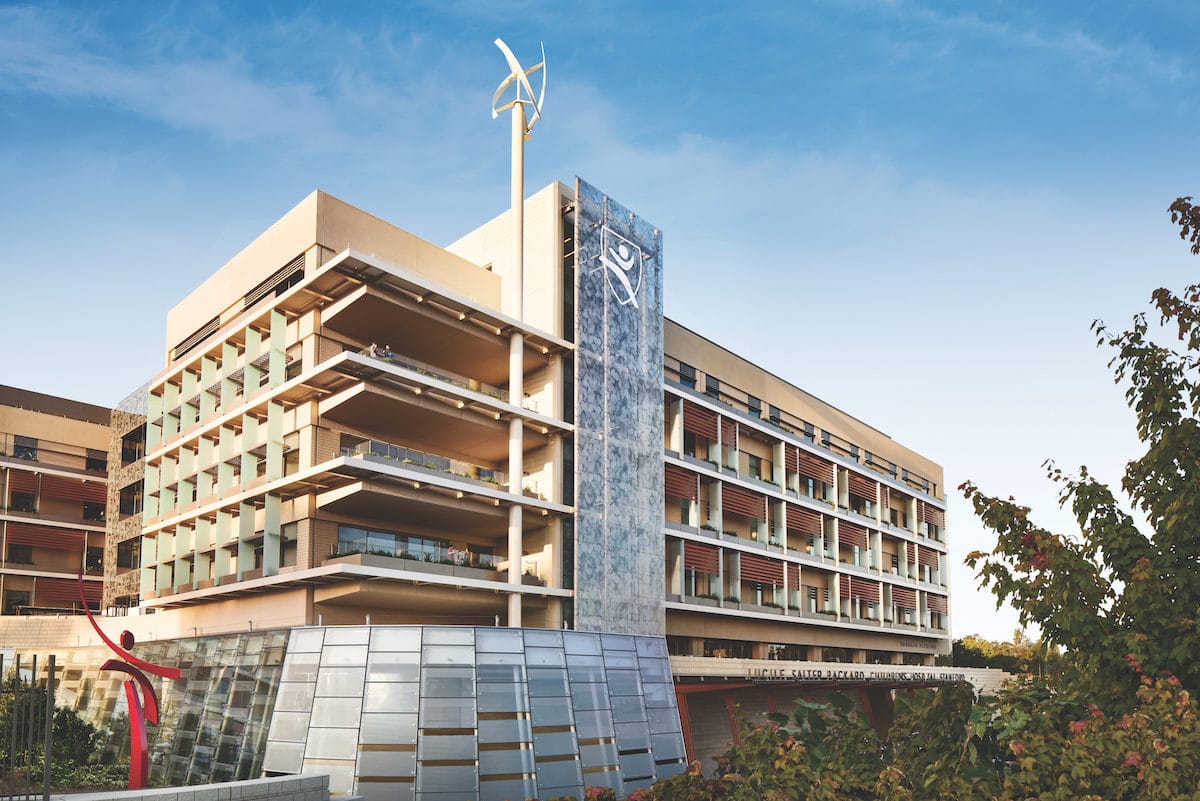
A system of horizontal louvers and vertical fins breaks the building into smaller pieces, visually shrinking it for almost a residential feel. Photo by Steve Babuljak
Designed by Perkins&Will, the team behind the Lucile Packard Children’s Hospital in Palo Alto knows kids are often overwhelmed in hospital settings, which is why it practices patient-centric design to the highest degree. Spanning 521,000 square feet, the hospital is capable of housing nearly 150 patients.
“There was a lot of attention paid to the scale of the building,” Robin Guenther, sustainable health care design leader at Perkins&Will, previously told gb&d. “So the children won’t feel like it’s cavernous and like they’re lost in it.”
A bright, open lobby welcomes patients as soon as they enter the facility, while nature-inspired artwork and educational murals adorn the walls, giving visitors the opportunity to learn about local wildlife and take their mind off of the reason for their visit.
This connection to the natural world is reinforced throughout the hospital, both inside and out, in a myriad of ways. Each patient’s room features a planter box outside its window and gardens wind through the property, many of which feature animal sculptures and play equipment for the children to enjoy.
8. VA Puget Sound Mental Health & Research Building, Seattle
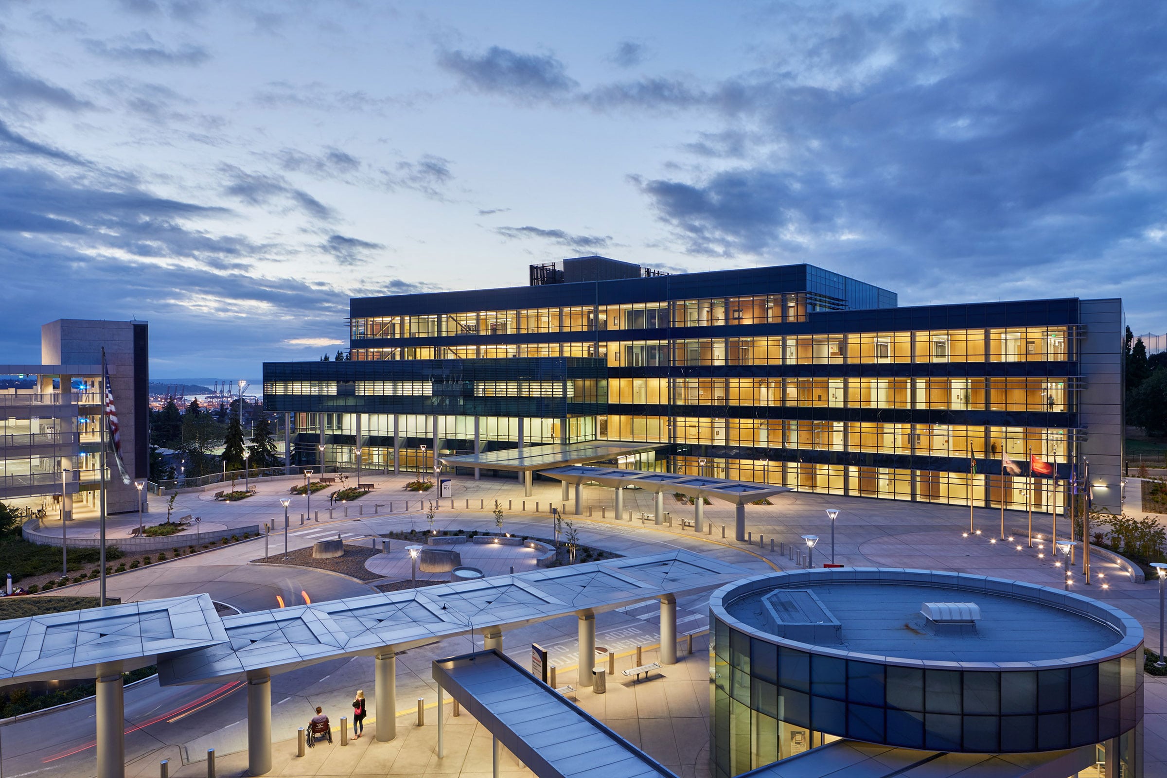
The VA Puget Sound Mental Health & Research Building in Seattle. Photo by Ben Benschneider
The US Veterans Affairs (VA) helps approximately 9 million veterans and their families nationwide, with more than 110,000 of those veterans residing in the Pacific Northwest alone. To better serve the region’s veteran population, the VA commissioned Stantec to design its VA Puget Sound Mental Health & Research (MH&R) Building in Seattle.
At 220,000 square feet, the MH&R building features the labs and patient rooms one might expect from a medical research facility and also includes group counseling spaces, a landscaped plaza, indoor rock garden, other quiet spaces, and three green roofs. These roofs are visually pleasing to patients, aid in reducing the amount and flow-rate of stormwater runoff, and help absorb heat and carbon dioxide. They also serve to collect and store rainwater that is then reused for flushing the building’s systems.
The MH&R building also employs ground-level stormwater mitigation and recycling tactics to help conserve water. “In the landscape out on the site there are bioswales and various means of dumping the water into the landscape, rather than sending it into storm drains and making it Seattle’s issue,” Ian Lawlor, project director at Stantec, told gb&d in a previous article. “We use very efficient irrigation systems to reduce the amount of water that we’re spreading into the landscape.”
Large, energy-efficient windows allow daylight to illuminate the MH&R building’s interior while also providing views, reducing feelings of stress, anxiety, and paranoia in patients. Some of these windows are designed to be operable so as to facilitate natural ventilation and bring in fresh air. “You’re not only getting daylight, you’re getting air circulation on a passive level,” Lawlor says. “Our approach is one of passive first, active second.”
Exterior solar shades help prevent excessive solar heat gain while radiant floors help heat and cool public spaces, providing optimal thermal comfort and reducing energy loads throughout the year.
9. Blackburn Center, Portland, OR
Ankrom Moisan Architects designed the Blackburn Center for Central City Concern (CCC)—a nonprofit that provides social services for the homeless and other vulnerable populations.
The center includes long-term and temporary affordable single-occupancy housing units, public gathering areas, fitness rooms, therapy and rehabilitation spaces, medical exam rooms, and more. The six-story Blackburn Center is intentionally located in Portland’s Hazelwood neighborhood to provide a closer alternative to the CCC’s clinic in downtown Portland. This location was also chosen for its proximity to bus and light-rail services, eliminating the need for large, space-devouring parking lots and allowing the addition of a small gathering space outside the front of the building.
To make the space more welcoming and inviting to a population increasingly targeted by hostile spikes-and-studs architecture, the Blackburn Center sports a bright front plaza, home-like gabled roof, and uses natural daylight throughout the building. “We’ve remained very cognizant that this is a pathway for mental and physical support,” Mariah Kiersey, project leader and a principal architect at Ankrom Moisan, previously told gb&d. Fresh air is supplied by a tempered air system while operable windows and efficient ceiling fans help keep the center cool without extensive reliance on mechanical heating and cooling.
Energy-efficient slotted windows, solar shades, and a rooftop solar panel array help offset the building’s energy usage, resulting in lower operating costs for CCC. Blackburn Center is also working towards Earth Advantage Platinum certification, further solidifying its commitment towards sustainability in all its forms.
10. St. Mary’s Medical Center (formerly Vision Northland), Duluth, MN
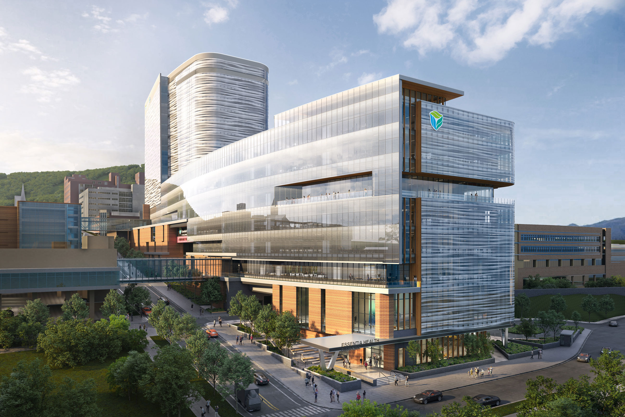
Essentia Health’s new hospital in Duluth. Rendering courtesy of EwingCole
In Duluth, EwingCole designed Essentia Health’s Vision Northland Hospital, now St. Mary’s Medical Center, with sustainability and patient well-being at the forefront.
To ensure patients receive adequate exposure to natural light during the day, Vision Northland’s patient tower is clad in a glass envelope, allowing for nearly 360-degree admittance of sunlight throughout the year. Overall the facility uses low-VOC products and natural materials—including wood and stone—wherever possible.
Like the Texas Children’s Hospital, Vision Northland’s interior designers leaned very heavily into establishing a cohesive, nature-inspired theme in the facility’s décor and art, with plentiful photos and graphics. “These graphics highlight local landmarks, regional history, flora, and fauna native to the North Shore and familiar to the local community,” Maria Papiez, director of sustainable design for EwingCole, previously wrote for gb&d. “The graphics are tailored for each floor, some directly representing these elements and others in more abstracted patterns and colors. These beautiful images support patients, family, and staff by building familiarity and comfort and serve the essential purpose of wayfinding throughout the building.”
Biophilic design strategies were also implemented so as to foster an even closer connection to the natural world. Plants can be found throughout the hospital’s interior and a rooftop terrace provides patients with a direct link to the outdoors.
11. SCVMC’s Sobrato Pavilion, Fruitdale, CA
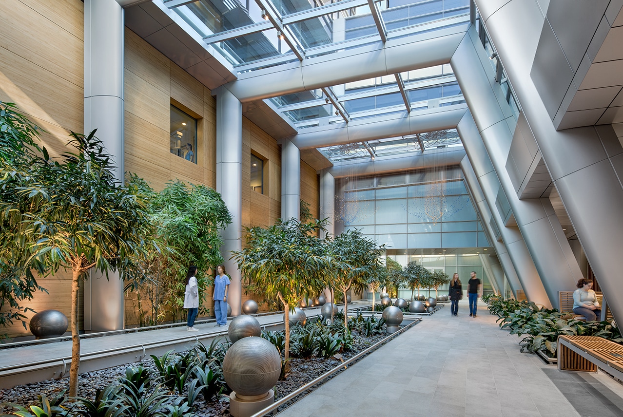
Santa Clara Valley Medical Center’s Sobrato Pavilion treats victims of traumatic brain and spinal cord injury in a LEED certified, eco-friendly rehabilitation center. Photo by David Wakely
The Sobrato Pavilion is a state-of-the-art health care facility designed by Stantec that treats victims of traumatic brain and spinal cord injuries. The LEED Gold project encompasses 370,000 square feet and includes rehabilitation rooms, a large-scale aquatic therapy pool, 168 single-occupancy patient rooms, and other amenities.
Sobrato Pavilion is connected to other existing buildings on SCVMC’s campus by a green atrium lobby that functions as a “conservatory space,” according to Alan Codd—a member of the pavilion’s design team. Ample daylighting strategies are implemented throughout Sobrato Pavilion, with each patient room featuring large windows, giving patients as much control as possible over their environment.
To maximize the Sobrato Pavilion’s energy savings, Stantec reached out to Arup to provide the building’s mechanical, electrical, and plumbing engineering services. “Health care is being very stringent [about energy consumption] on new constructions,” Jude Chakraborty, an associate at Stantec, previously told gb&d. “And as architects at Stantec, our advice helps guide those decisions. We’re getting them to where they should be, and things are looking good.”
Instead of a recirculating air system, the pavilion uses a 100% outdoor air heat recovery ventilation system to supply the interior with fresh air. Zone control technology with exhaust air valves and volumetric tracking supply was also implemented to reduce heating energy demand. Low-flow fixtures were also installed to reduce the Sobrato Pavilion’s water requirements. Arup estimates the facility’s energy cost savings to be approximately 33% and domestic hot water savings to be about 45%.
12. Taussig Cancer Center, Cleveland
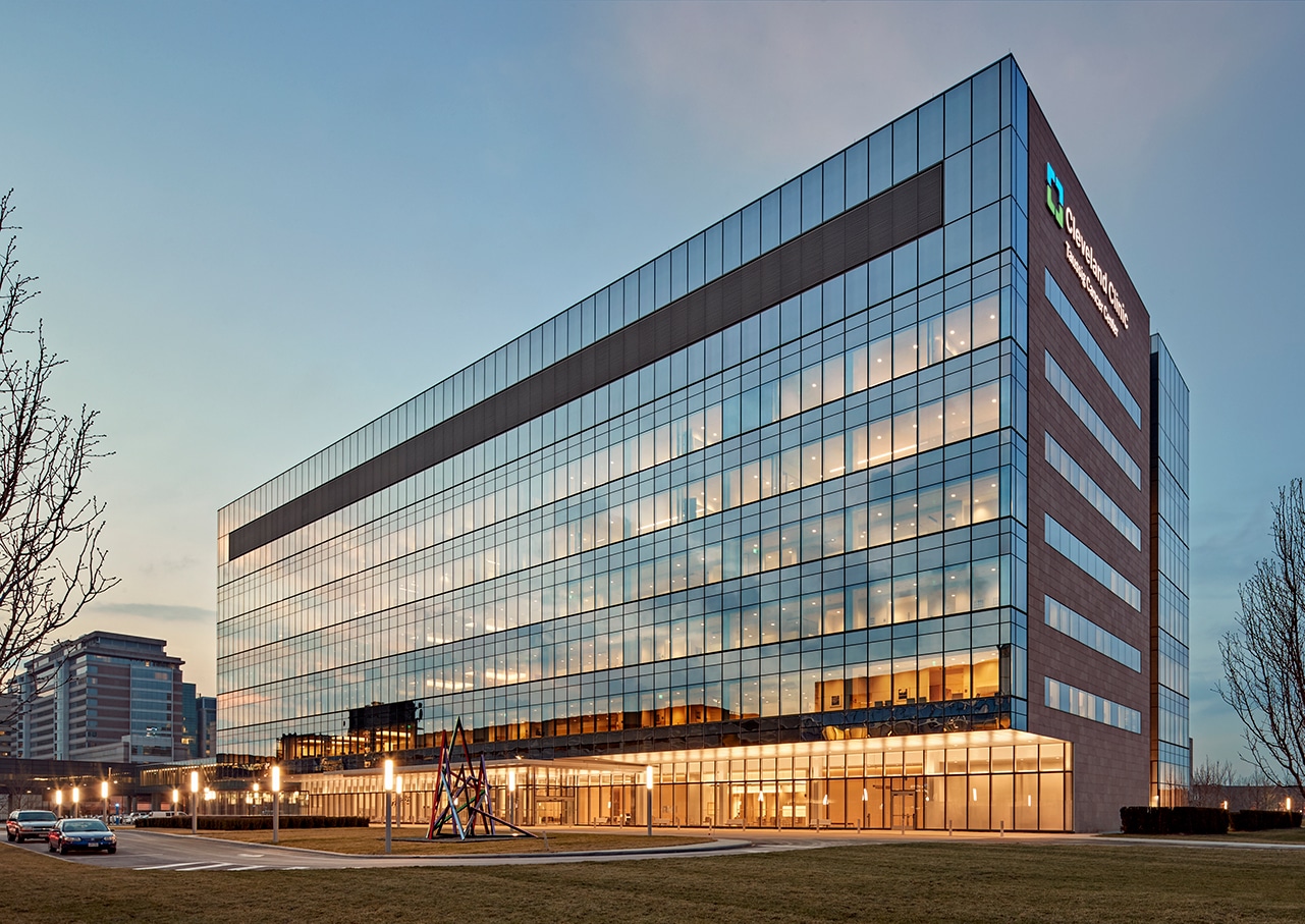
Cleveland Clinic takes a holistic approach to design for patients’ well-being. Photo by Robert Benson Photography
Completed in 2016, the 377,000-square-foot Taussig Cancer Center in Cleveland is a master class in sustainable, patient-centric design. It is one of the many health care facilities owned and operated by the Cleveland Clinic Foundation, and it shares the nonprofit’s holistic approach to creating simple, welcoming, and practical medical spaces.
“Nothing is physically daunting about coming into the space,” Chris Connell, chief design officer at Cleveland Clinic’s Center for Design, previously told gb&d. “It doesn’t have to be extravagant architecture. These are very basic architecture principles that are very near and dear to our hearts but have a big impact.”
Designed by William Rawn Associates in collaboration with Stantec, the LEED Silver center includes traditional treatment and infusion rooms as well as patient amenities like a pharmacy, cafe, meditation space, music/art therapy, and more—all with ample daylight throughout the year. Skylights and high ceilings create an open, airy, and well-lit environment while floor-to-ceiling windows flood the center’s treatment rooms with natural light, giving patients and staff with a view to the green courtyard outside.
13. Maggie’s Centre Barts, London
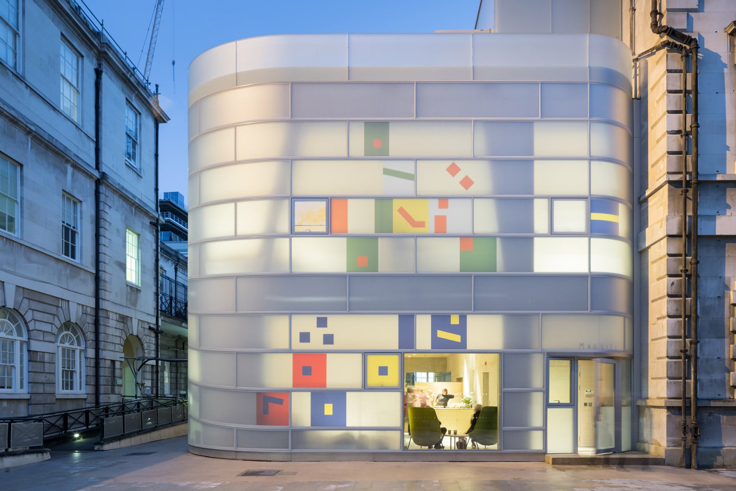
Maggie’s Centre Barts cancer center in London. Photo courtesy of Steven Holl Architects
Next to St. Bartholomew’s Hospital and designed by Steven Holl Architects, Maggie’s Centre Barts is a welcoming space where people suffering from cancer and their families can receive emotional and social support.
Characterized by its matte-white finish and colorful inserts, the exterior is clad in polychrome insulating glass that minimizes solar gains and maximizes natural light, making it appear almost as though the building is glowing from the inside. Zoned LED lighting helps provide supplementary illumination in a controlled, efficient manner when necessary.
In an effort to maintain Maggie’s Centre Barts’ home-like feel, the design team elected to remove as many large mechanical systems as possible. It’s for this reason that the building uses natural ventilation strategies and sources its heat from the hospital next door. Exposed concrete was used to construct the center’s branching frame to leverage its high thermal mass, further reducing energy consumption. Inside the design team made extensive use of bamboo, with the walls, ceiling, and much of the loose and built-in furniture being built from this fast-growing, nontoxic renewable building material.
Maggie’s Centre Barts also boasts a green roof (something of a rarity in London) and a rooftop terrace, helping to improve the site’s overall air quality, ecological biodiversity, and stormwater management, while also fostering psychological well-being—an often overlooked benefit of urban green spaces.
“There are not just ecological advantages to having a green roof; it is also a nice thing for the user,” Dominik Sigg, associate at Steven Holl Architects, previously told gb&d. “The roof is on a slope so you can see it from the vantage point of the terrace, and it becomes part of the garden.” Both the green roof and terrace provide visitors with a connection to the natural world and offer spaces to participate in meditation, yoga, and other mindfulness activities.
14. Jack Byrne Center for Palliative & Hospice Care, Lebanon, NH
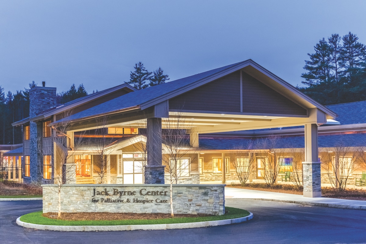
Photo courtesy of E4H
Designed by E4H Architecture and made possible by a $10 million donation from the Jack and Dorothy Byrne Foundation, the Jack Byrne Center for Palliative & Hospice Care in Lebanon, New Hampshire provides dignified end-of-life care while also serving as a hub for education and research on hospice and palliative care.
Completed in 2017, the 30,000-square-foot Jack Byrne Center encompasses 12 single-occupancy patient rooms, spaces for overnight guests, a kitchen, dining room, library, spa, meditation and exercise rooms, and more. Large windows supply the interior with natural sunlight while an earth-tone color palette, nature motifs, and natural materials like wood and stone serve as intentional biophilic design strategies, connecting patients with the natural world.
Prioritizing green building materials was a no-brainer for the E4H design team. “Why would we use products that emit toxic gas or are not friendly to the touch, if the environment that we’re creating is geared toward wellness?” Charles Rizza, associate partner at E4H, previously told gb&d.
To reduce the center’s carbon footprint and energy consumption, E4H elected to install a geothermal heating and cooling system, with an energy-efficient gas boiler acting as the building’s back-up power system. Combined with low-maintenance materials, these systems will allow the Jack Byrne Center to operate cost-effectively for years to come.
15. Family House, San Francisco
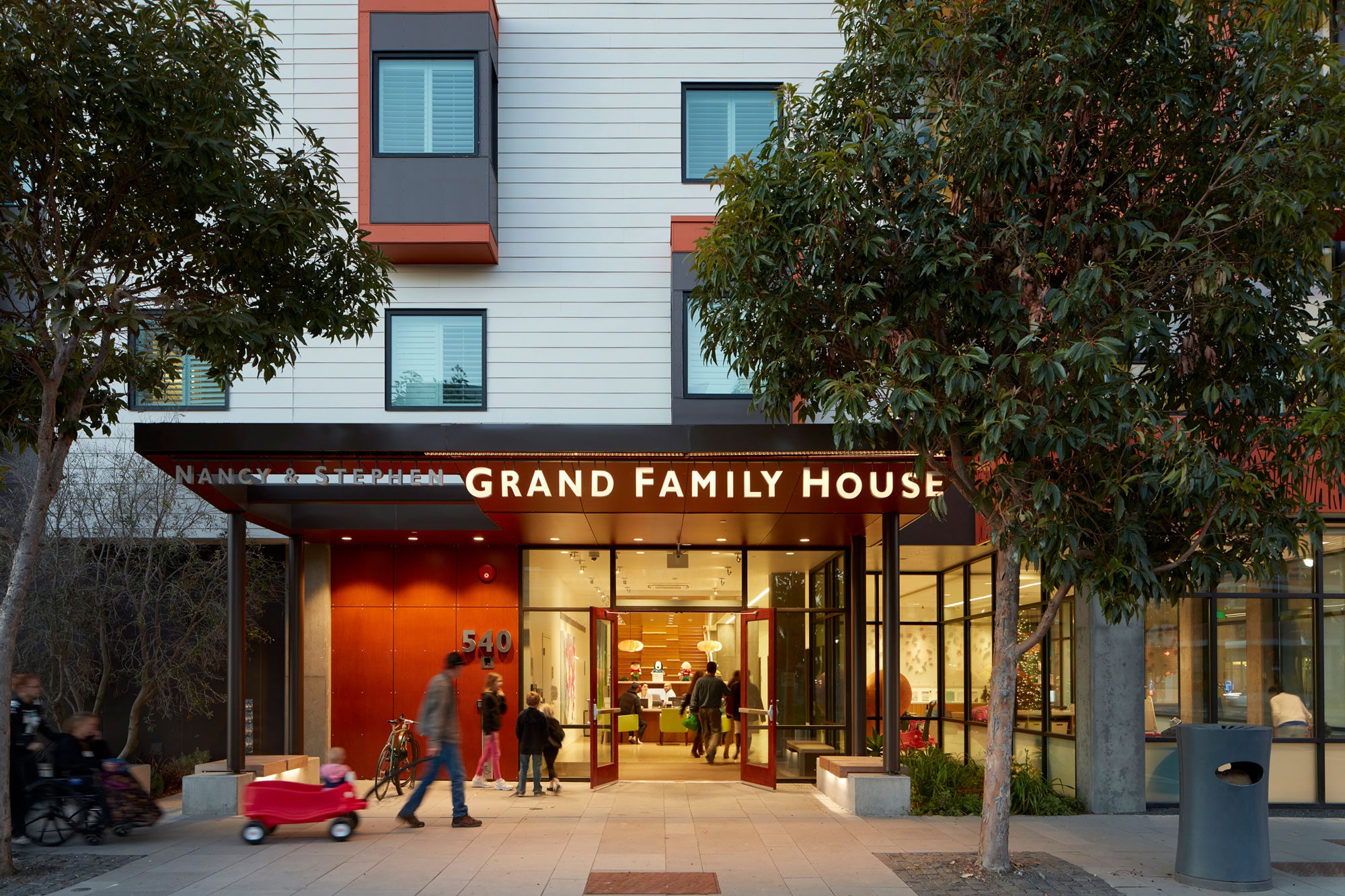
The Family House, completed in 2016, was designed by Leddy Maytum Stacy Architects. Photo by Bruce Damonte
Designed by Leddy Maytum Stacy Architects (LMSA) to LEED Platinum standards, Family House—owned and operated by the nonprofit of the same name—provides temporary free housing for low-income families whose children are being treated at the nearby UCSF Benioff Children’s Hospital.
The building can accommodate 80 families and is constructed from low-VOC materials. It’s designed using eight “neighborhoods,” each with 10 guest rooms with shared facilities to foster relationship-building while making efficient use of the space available.
“Instead of building 80 apartments with their own kitchens with refrigerators, sinks, cooktop, and dishwashers, we were able to build eight larger kitchens that could be shared amongst the cluster of families,” Gregg Novicoff, associate principal for LMSA, previously told gb&d. “Sharing resources allows for building less and furthers the building’s goals of creating community—where each of the families might have been making meals in the privacy of their own apartment, now they share in making food cooperatively.”
Family House relies on daylighting to bring natural sunlight into 100% of the public spaces and utilizes motion-sensor lighting, Energy Star appliances, a solar hot water system, and a cool roof to reduce energy use by 48%. A continuous filtered outdoor air ventilation system supplies the building with fresh, clean air while a low-pressure, high efficiency irrigation system delivers water to the biodiverse green roof, minimizing the loss of water through evaporation.
16. Khoo Teck Puat Hospital, Singapore
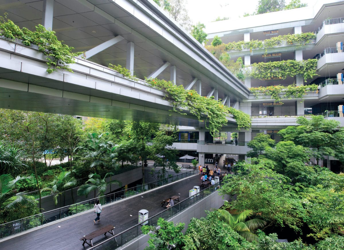
Photo courtesy of International Living Future Institute
Khoo Teck Puat Hospital (KTPH) is as much a garden as it is a health care facility—incorporating biophilia in almost every aspect of its design. In total, 18% of the hospital’s floor area accounts for blue-green space, with 40% of that space being publicly accessible—characteristics that helped KTPH earn the first-ever Stephen R. Kellert Biophilic Design Award. The project was designed by Robert Matthew Johnson Marshall (RMJM) Architects in collaboration with CPG Consultants.
Greenery extends from the hospital’s central courtyard into the open-to-sky basement and up into the upper levels of the buildings, with balconies featuring scented plants to bring the experience directly to patients’ bedsides. Multiple rooftop gardens—and even one rooftop farm that provides produce for the hospital kitchen—can be found across the campus. These plants help improve air quality, mitigate stormwater runoff, cool the surrounding air, and attract crucial bird and insect species.
The plentiful plants aren’t just good for the environment, though. They’re great for patients, too. “With Khoo Teck Puat we see that biophilic design elements and attributes should not only be considered as part of the design process, but also as part of the healing process,” architect Stephen Kieran, a juror for the Stephen R. Kellert Biophilic Design Award, told gb&d in a previous article. Studies show access to vegetation and green spaces has a calming effect on the mind and reduces feelings of stress, which can in turn help lower blood pressure, heart rate, and cortisol levels.
KTPH also adopted the existing stormwater pond adjacent to the initial build site, converting it into a park that now serves the greater community. Native plant species were introduced to help clean the pond and foster biodiverse habitat growth, while walking trails were established in order to link the pond to the hospital and a nearby residential development.
Due to the KTPH’s V-shaped layout, breezes are able to first skim over the stormwater pond before bringing cool, fresh air to the hospital’s patients via natural ventilation. KTPH’s subsidized ward tower is also oriented so as to make the most of prevailing North and South East winds, reducing mechanical ventilation loads by approximately 60%.

