Story at a glance:
- Architect Side Angle Side and entrepreneur Steph Steele reimagined a 1960s-era post office into a specialty grocer and French bistro.
- The new space, along with a large outdoor seating area, serves as a hub for the community, and people love dining on offerings from Chef Jo Chan.
- Reused materials and an eye toward minimalist design help reduce the project’s carbon footprint.
Even in bustling cities, each neighborhood needs an anchor—a hub where the community can congregate around a shared space, the doors are open to all, and chance meetings can take place.
Recreating this concept of a community hub was a critical piece of the vision behind the second iteration of Tiny Grocer, which in September 2023 opened in a rehabilitated mid-century post office in the Hyde Park neighborhood of Austin, Texas.
“The beauty of reusing a post office is the central location post offices have historically taken within neighborhoods,” says Annie-Laurie Grabiel, who co-owns and operates the architecture firm Side Angle Side with her husband Arthur Furman. “This neighborhood has so many people walking and riding their bikes that the space became a natural community center.”
Tiny Grocer is a small-format market that carries curated specialty items alongside a full cafe and deli as well as a wine and coffee bar. The new location—which, while still tiny, is considerably larger than the original—also includes a full-service restaurant, Bureau de Poste, which serves modern French cuisine by celebrity chef Jo Chan.
The concept is the brainchild of entrepreneur Steph Steele, who commissioned Side Angle Side for the project after Grabiel and Furman designed her home. Rather than create a new vision from scratch, the original Tiny Grocer offered the architects a successful template to build off of while integrating their own touches.
“In a way our assignment was to take that success and grow it,” Furman says. “When a client has such strong ideas and a strong vision, it’s our job to listen and make sure we can bring that concept to life.”
Project Focus
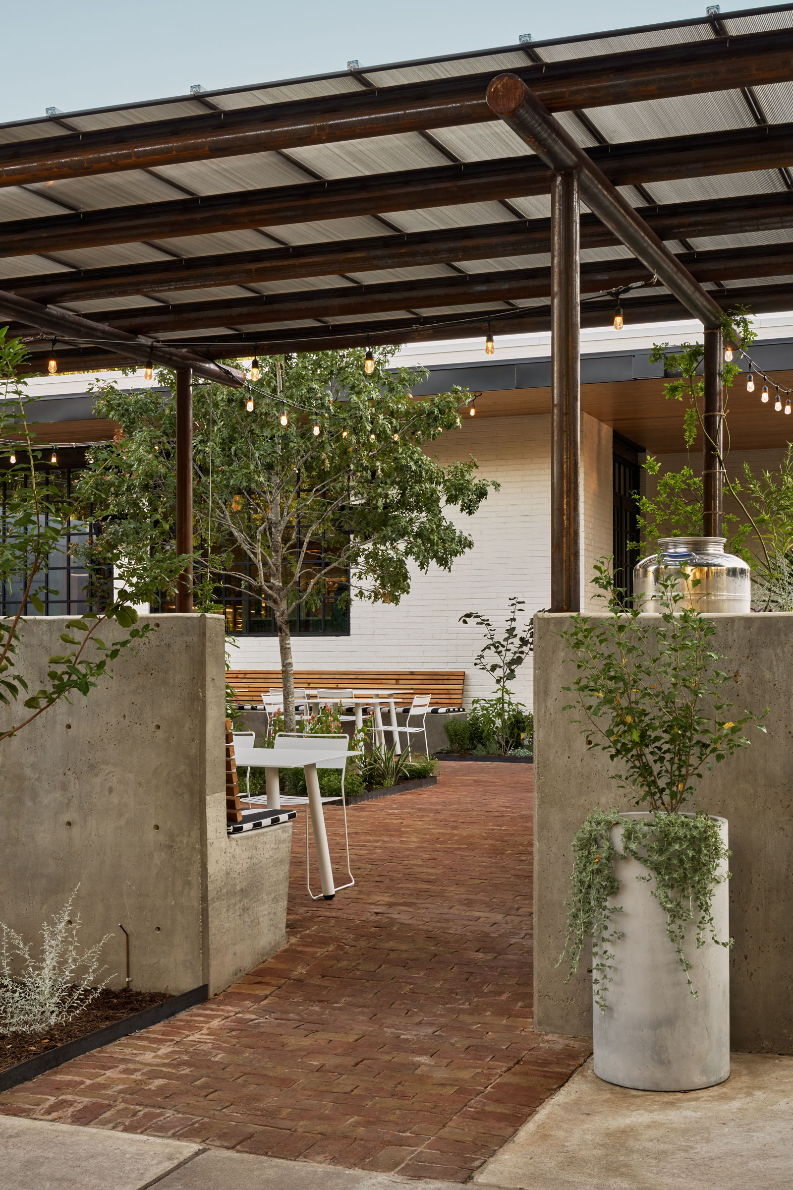
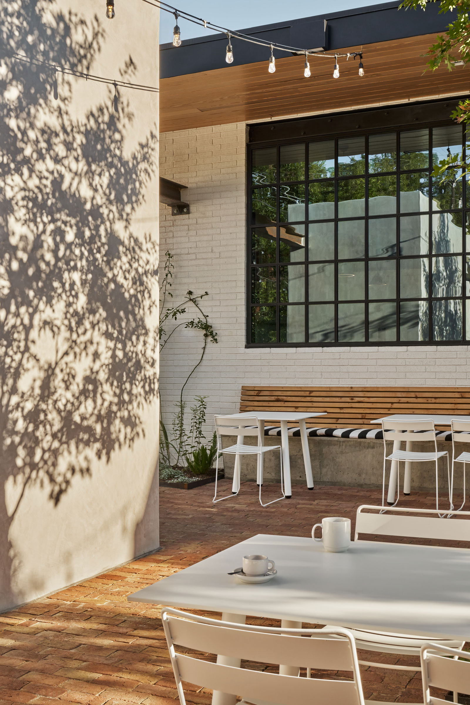
- The outdoor dining space was once a loading zone for the former post office; now customers can enjoy fine French cuisine in a courtyard setting reminiscent of the Riviera. Photo by Likeness Studio
- Tables by Portofino and chairs by Isimar provide plenty of space beyond the limited indoor seating. Photo by Likeness Studio
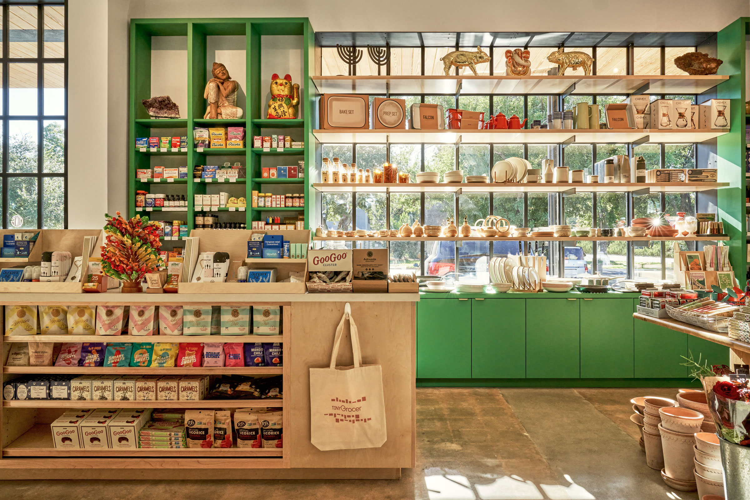
Furman and Grabiel approached the project’s design with an understanding that there would be three focal points to the space. The first—and foremost, from a commercial perspective—were the products themselves. “We had to ensure the merchandise was highlighted front-and-center,” Grabiel says.
To accomplish this the team defined the grocery aisles with custom white oak cabinets that complemented the character of the merchandise without stealing the spotlight. “The quality of the millwork indicates that these are premium, highly considered products,” Furman says.
The architect duo designed the display shelves to span the large steel windows in the front of the market so potential customers could catch a glimpse of the products from the sidewalk outside, enticing them to enter the store.
The second focal point Furman and Grabiel worked with was the Tiny Grocer coffee and wine bar. Located at the center of the indoor space, the bar needed to be open and inviting so customers could easily navigate around what was expected to be a high-traffic area.
“We knew there was going to be a lot of activity here throughout the day, so we wanted to make sure it was visually accessible and that the flow worked well,” Grabiel says. Like much of the rest of the space, the coffee and wine bar are light, open, and airy. Even the countertops are a sparkling white and gray quartz.
Outdoor Addition
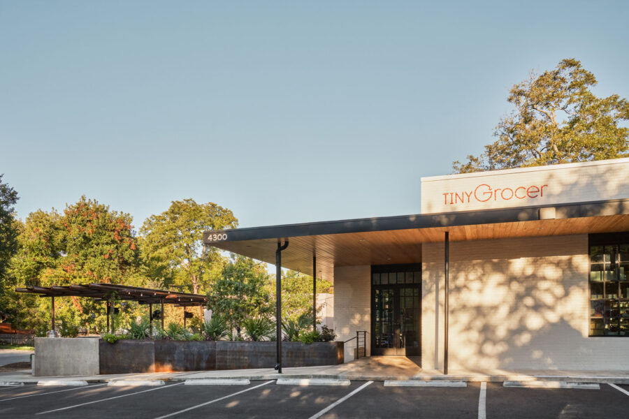
In Austin, Tiny Grocery & Bureau de Poste was designed by Side Angle Side. Photo by Likeness Studio
The third and final focal point of the rehabbed space—the 1,500-square-foot outdoor dining area—came into conception later in the project timeline. “The full-service restaurant wasn’t part of the original scope,” Furman says. “We were almost ready to submit the permit for the interior renovation for the store and cafe.”
The post office’s loading area had originally presented Furman and Grabiel with perhaps their biggest challenge. “It was a street-facing facade that everyone could see and was sort of a blight on the neighborhood,” Grabiel says.
Around the time when the design team was considering whether and how to activate the outdoor space, Steele began discussing the idea of potentially incorporating a full-service restaurant into the project with Chan.
Given that the indoor cafe seating area was limited, the design team knew they would need to add outdoor seating to accommodate a busy dinner rush. “We thought about adding some picnic tables outside, but as our discussions became more serious and the idea of the restaurant moved forward, we knew we would have to be more intentional,” Grabiel says.
If the former delivery zone was to become the restaurant and cafe’s main dining area, Grabiel and Furman wanted to ensure diners felt casual and comfortable. They therefore conceived of the space as an outdoor room—enclosed yet open. “We wanted to make you feel that you were in a space, not just out on the street,” Furman says.
On the street-facing side of the lot the architects added a concrete wall with a banquette and trellis to give the space a courtyard feel. Integrating a long, steel planter on the adjacent side of the lot created another edge for the space. “This not only covers any disturbance from the cars in the parking lot, but also allows customers to peek past the planter into this intriguing space,” Grabiel says.
Aside from adding more seating, the patio space also presented an opportunity to incorporate more bathrooms and back-of-house space for the restaurant, like busser and wait staff stations.
Sustainable Rehab
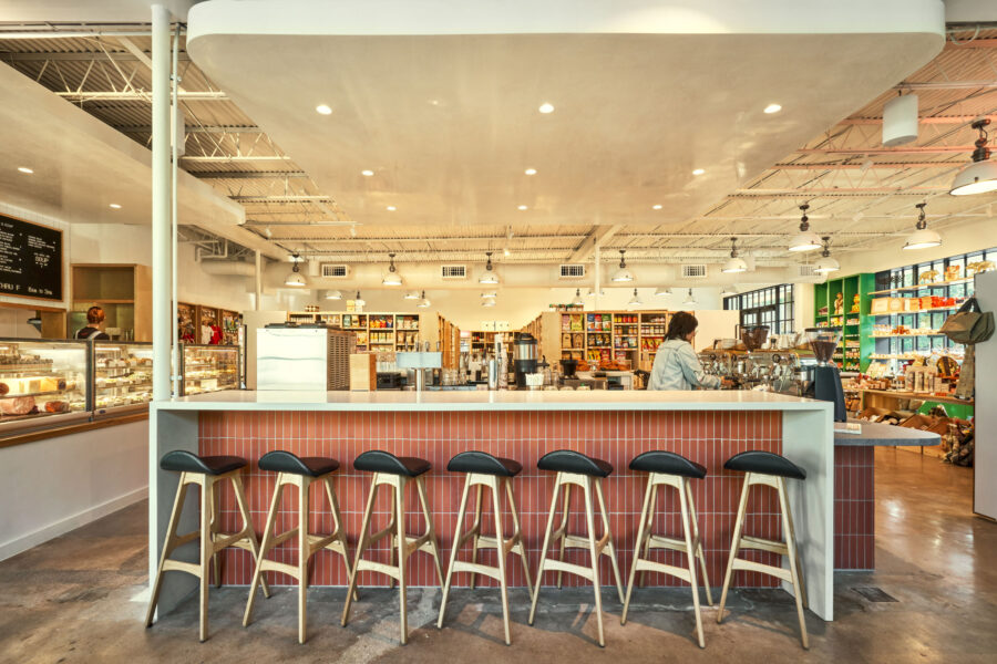
The coffee and wine bar serves as the central focus of the interior space, offering customers a place to grab a quick drink or spend time catching up with friends. Wooden Soule stools line the quartz bar. Photo by Likeness Studio
For architects historic preservation and rehabilitation projects offer more than a vintage canvas to work off of; they are also far more sustainable than building from scratch. The notion of using recycled materials to reduce the burden on current resources is central to Side Angle Side’s philosophy on green design.
“We think the most sustainable thing an architect can do is to reuse an existing building and give it another life,” Furman says. “When designing new construction, designing for long life and loose fit allows for our work to be reused in the future.”
The original building structure itself was the single biggest reused material of the project, but Side Angle Side incorporated other reclaimed materials as well, including the quartz countertops and the brick pavers adorning the patio.
“I think it’s important to make the distinction that not adding in new materials to a project is very sustainable,” Grabiel adds. The decision to leave the original concrete slab uncovered and the ceiling rafters open, rather than sheathe both with new materials, was not only a design choice but a conscious effort to reduce the project’s carbon emissions.
If there are lessons for other designers in this project, Furman says it’s that “if you can remodel or reuse a building, don’t knock it down and start over.”
Project Details
Project: Tiny Grocery & Bureau de Poste
Location: Austin, TX
Completion: September 2023
Size: 5,000 total square feet
Architect: Side Angle Side
MEP Engineer: ATS Engineers
Structural Engineer: Creative Engineering
Builder: Archive Properties
Building Shell: Thought Barn Studio
Landscape Design: Side Angle Side and Wild Heart Dirt

