Story at a glance:
- With wellness and equity at the core of its practice, WRNS Studio examines the ways design contributes to physical and mental well-being.
- Lilian Asperin, partner at WRNS Studio, talks a lot about designing higher education spaces that work for everyone.
- Flexible, multi-functional, healthy, and welcoming indoor/outdoor spaces that accommodate a wide spectrum of schedules, learning requirements, and activities put student wellness first.
When Lilian Asperin, partner at WRNS Studio, thinks about where she is today, she gets emotional.
She’s been doing this work for nearly 25 years, but still it’s sometimes hard to believe.
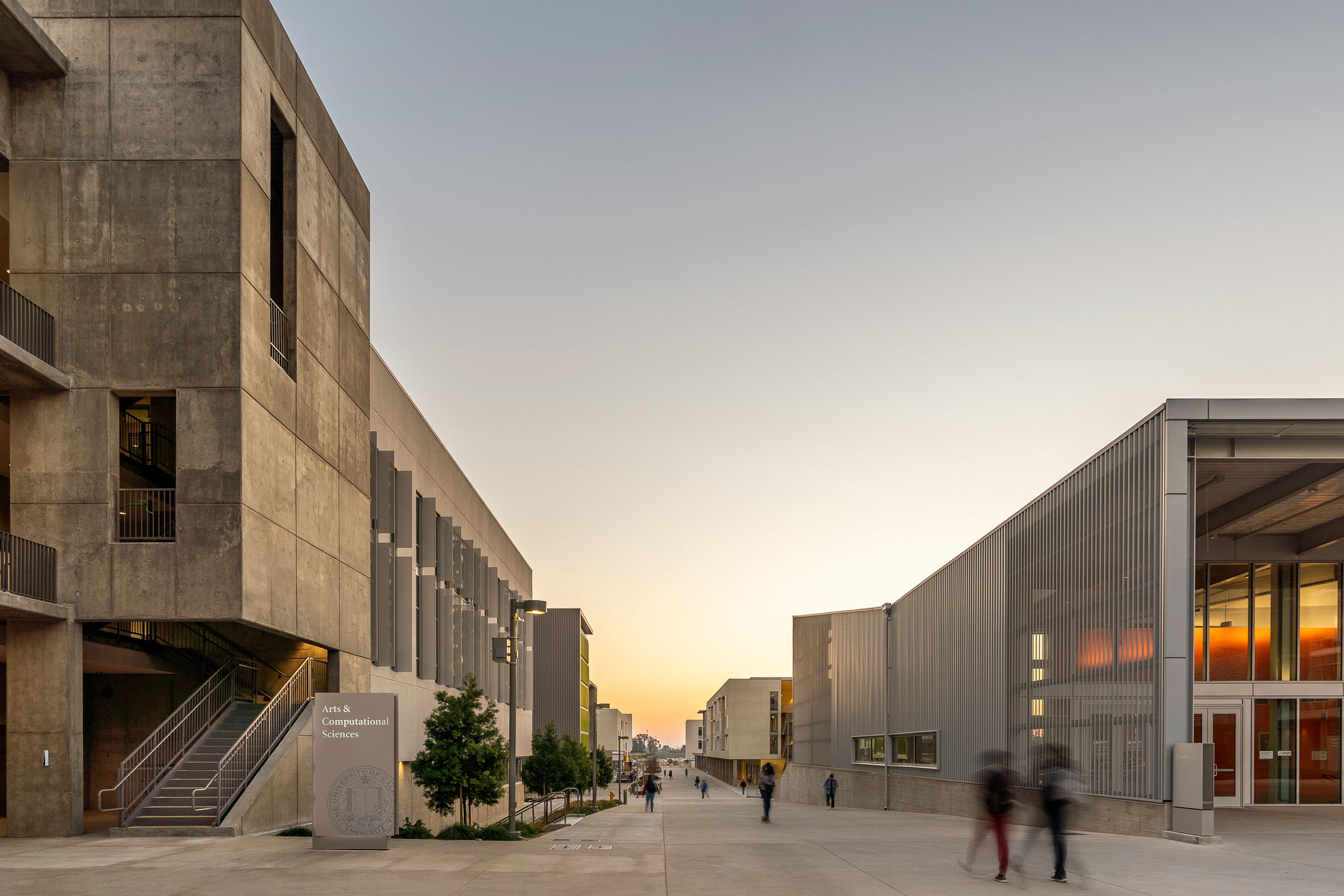
Today she plays a pivotal role in the designing, developing, and decision-making that results in some of the most groundbreaking designs happening in higher education—including the new UC Merced Arts and Computational Sciences Building in Merced, California.
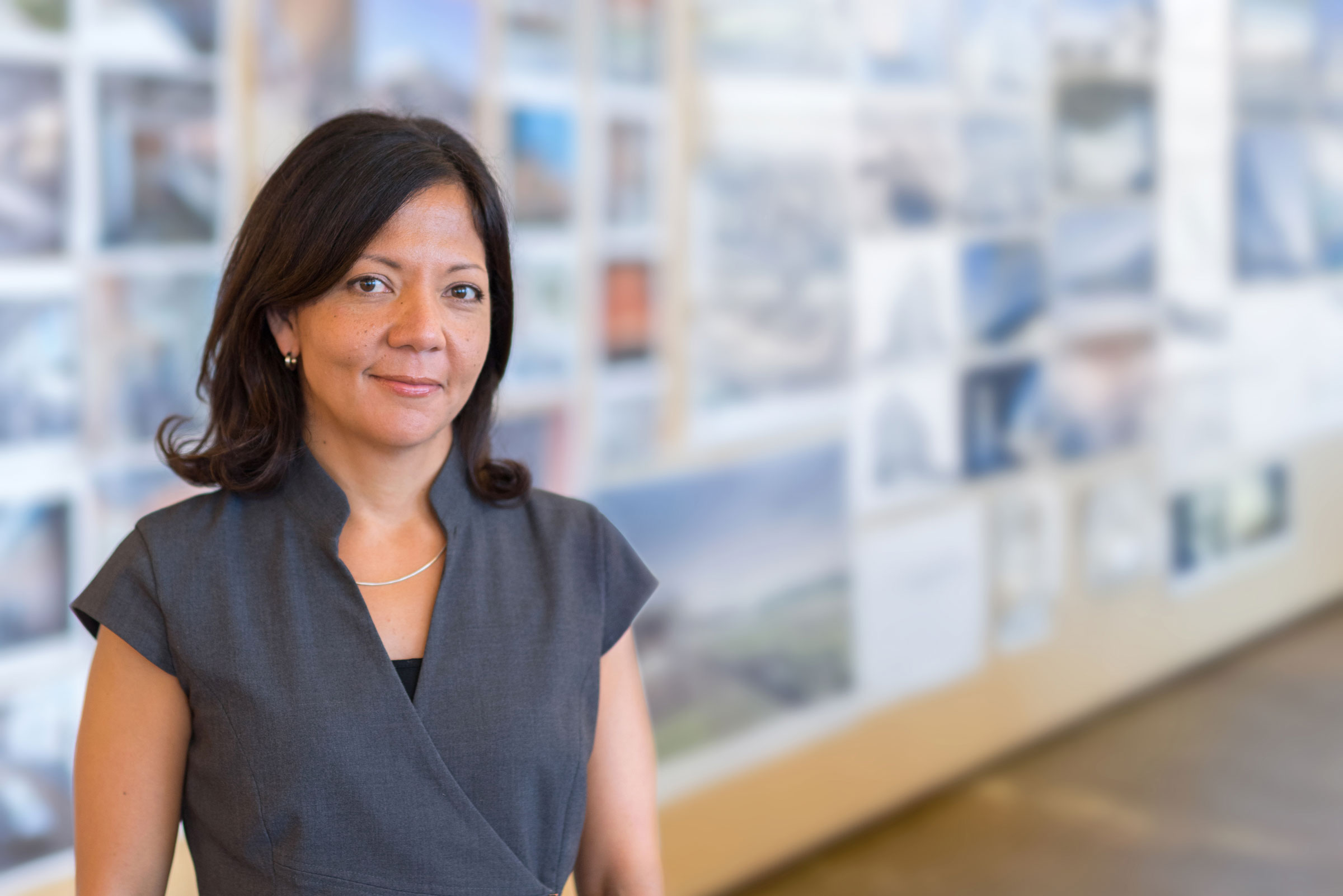
Lilian Asperin is partner at WRNS Studio and co-chair of the AIA’s Equity by Design committee. Photo courtesy of WRNS Studio
“I come from a biracial background, born and raised in Puerto Rico, so I’ve always wanted to be of greatest service to the greater community, knowing not all of us are the same,” she says. “As a Latinx person, I was part of the 1%. There were not too many of us women going through architecture.”
Asperin is also co-chair of the AIA’s Equity by Design Committee, a group that’s committed to thinking about how architects impact much more than the built environment. They affect justice, too. “My practice has to do with paying it forward and connecting as many dots as I can—architecture-based education, wellness, opportunity. All of those things to me are synchronous.”
A key goal of the UC Merced project was to offer students an engaging, inclusive campus experience that supports evolving learning modalities with flexible, mixed-use spaces that blend student life with education.
The work is part of a Public Private Partnership (P3) delivery model and included a Triple Zero Commitment—zero net energy consumption, zero waste production, and zero net greenhouse gas emissions by 2020. We talked to Asperin about this project and designing for wellness overall.
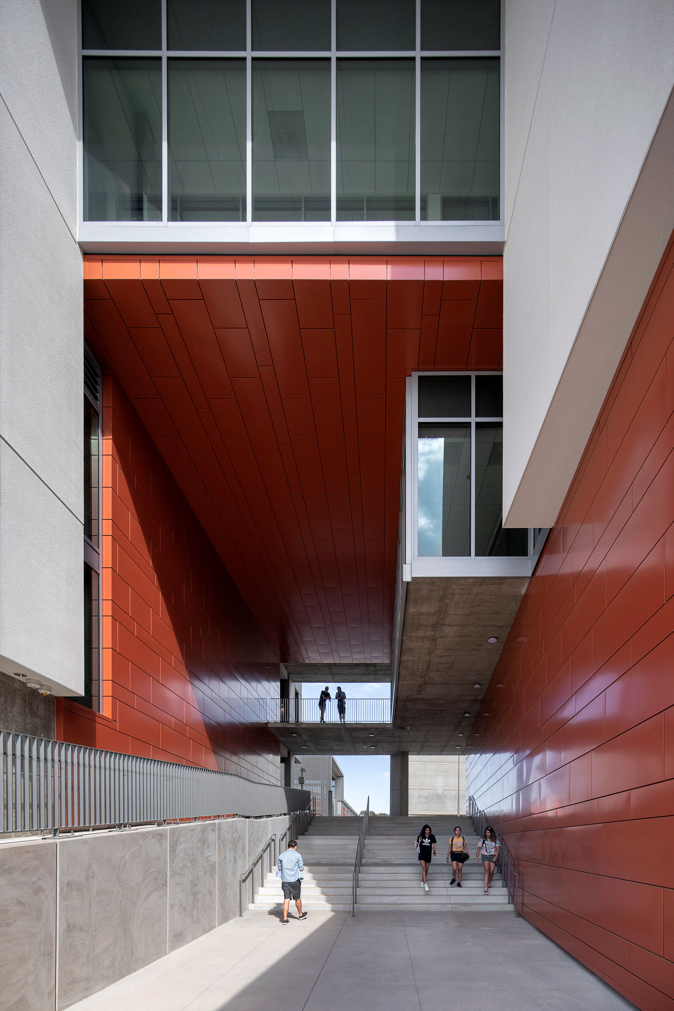
Photo by Jeremy Bitterman
How does wellness and well-being fit into design?
Wellness, to me, is health. Being healthy, having opportunities, having an ability to see a future for yourself in a profession and a way for you and your family to have generational wealth and knowledge and wisdom is something that we should be all striving toward.
As architects we’re natural pattern-seekers and system-makers. All of these things really have to do with how we nurture ourselves as humans and as networks of communities across generations. And now, making sure there’s justice, that all of these things are working together to elevate gaps where folks have not had the same level of opportunity.
With education it’s the same idea. The more you can turn information into data, data becomes knowledge, then knowledge becomes the reason for your activism. I see them as connected. When I think about higher education I think about: How are people learning? But I also think about how the faculty is teaching. What are people learning? How are campuses coming together, and how is an experience on-campus really building on all those smaller scales of education, like wellness and growing and becoming part of this world?
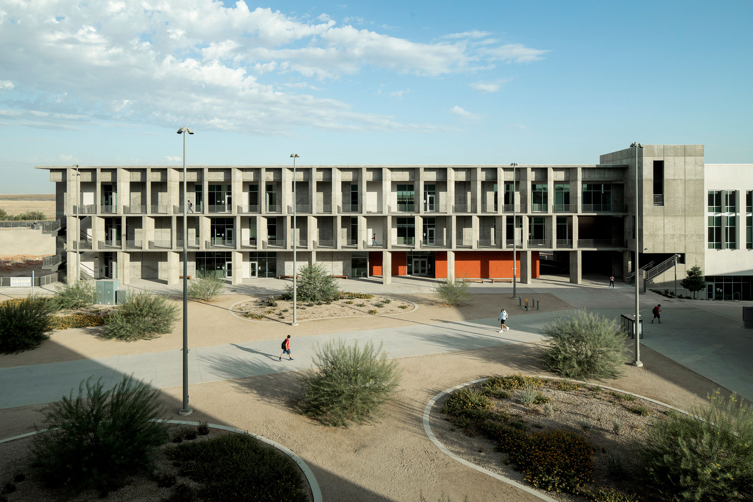
A brise-soleil, with angled cast-in-place concrete columns, runs along the south side of the building, offering students an outdoor, sheltered gathering space and comfortable transition from the quad to the interior. Photo by Jeremy Bitterman
How do you build that into the design process?
It starts with asking better questions at the beginning and then thinking, “Who else should we be asking?” Are we really engaging the broadest number of people to help us discover? Ask better questions and have a broader group of people to engage with. As architects we need to suspend thinking that we need to have the answer earlier. We need to train ourselves to listen longer and more attentively.
Yes, the physical space is the outcome, but do we have the right ingredients to reach that outcome? The process is a design opportunity. How are we getting to the components? How are we listening? How are we playing things back? That also has to do with equity and diversity and inclusion. We need to create spaces that welcome everyone.
Buildings have a great impact on the environment. I can’t not feel enormous responsibility for healing the planet and making better decisions and, frankly, not building more if we can adaptively reuse space. That’s a better answer—thinking about materials and carbon footprints, thinking about daylight. Do we need energy to turn on the light when you can plan the building in a way that it has more natural daylight?
That whole campus is the youngest campus in the University of California system. By definition, it’s out there—in a town called Merced, which is in the valley. The demographics in the valley are primarily Latinx, and a lot of the students are first-generation. So this building exists as part of a campus that is creating enormous opportunity for generations. It’s exciting.
Thinking about the valley, it’s very hot out there. How do you create a building where people want to hang out? When you hang out on campus you meet people and you learn and you create this whole learning experience. But how do you create a community that has nothing else around it? And how do you create a building that doesn’t harm the landscape and also make sure students and their families have a positive experience?
What about designing in a hot climate?
Because it’s super hot we designed exterior circulation. Our facade to the building envelope is called a brise-soleil, which is a shading device. We use the materials in the depth of the building to create a sheltered environment that’s outdoors. You’re not spending a lot of money conditioning the space, and you work with the natural environment and the winds to create a space where people feel comfortable hanging out in the shade. The brise-soleil is like a habitable space that creates shelter.
And every room has natural light?
Every single space in the building has access to natural daylight. That was really hard to do because there are deep, long spaces and spaces that are simply storage rooms. But if a human goes in there, we were considering a day in the life, so every single room has access to daylight and views, which is a huge commitment to wellness. Why should the professors in the corner office be the only ones who have a pleasant space?
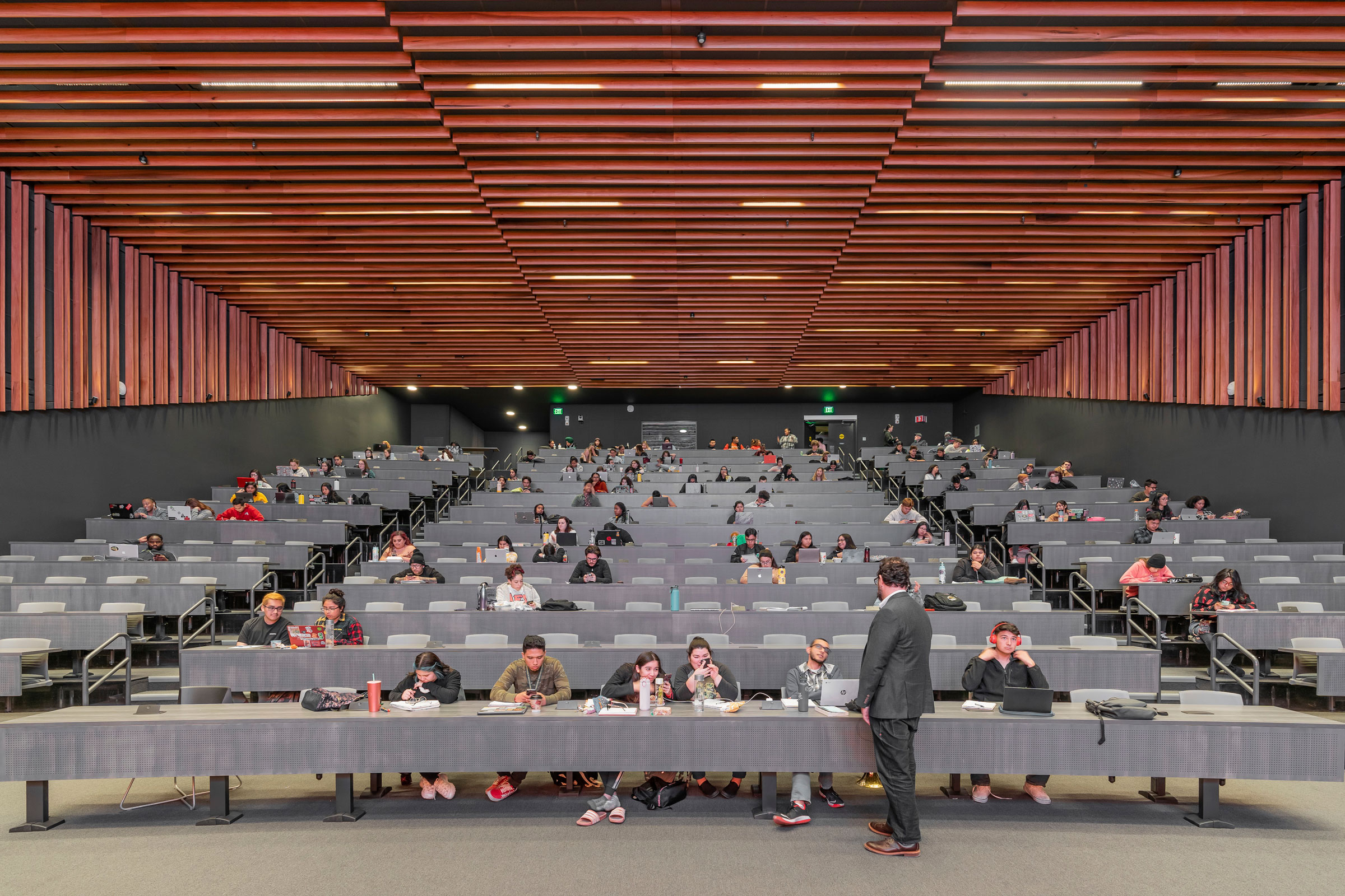
an acoustical system inside the lecture hall is based on the geometry of wooden components, like piano bars, to create a 3D framework on the vertical and horizontal surfaces. Photo by Celso Rojas
Tell me about the lecture hall.
We designed an acoustical system inside the lecture hall that is based on the geometry of wooden components, sort of like piano bars that create a three-dimensional framework on the vertical and horizontal surfaces. We worked with the local community to find wood that was regional to the valley, and we designed the lecture hall around that species, which celebrates community. We used poplar, a regional FSC-certified wood species, so we can keep the contract and the economic benefits in the region.
How was color important to the UC Merced Arts and Computational Sciences Building?
We talked a lot about the quality of light in the selection of colors. Every color we considered we asked: Is it reflective of heat? The concrete itself is gray, and we left it natural because the lighter the color the more reflective it is, but also we didn’t want to spend any money on painting concrete. Concrete can be very beautiful.
The one color we picked was red; it’s in great contrast to the valley. It’s a very agrarian landscape. In some ways red to us was like the color of energy, like student life and the joy of learning and growing. This sort of celebrated life, and the red is really a good neighbor to green, or the agrarian landscape, and a simple alternative to the blue of the sky. The only dark elements you see are the shadows created by the light.
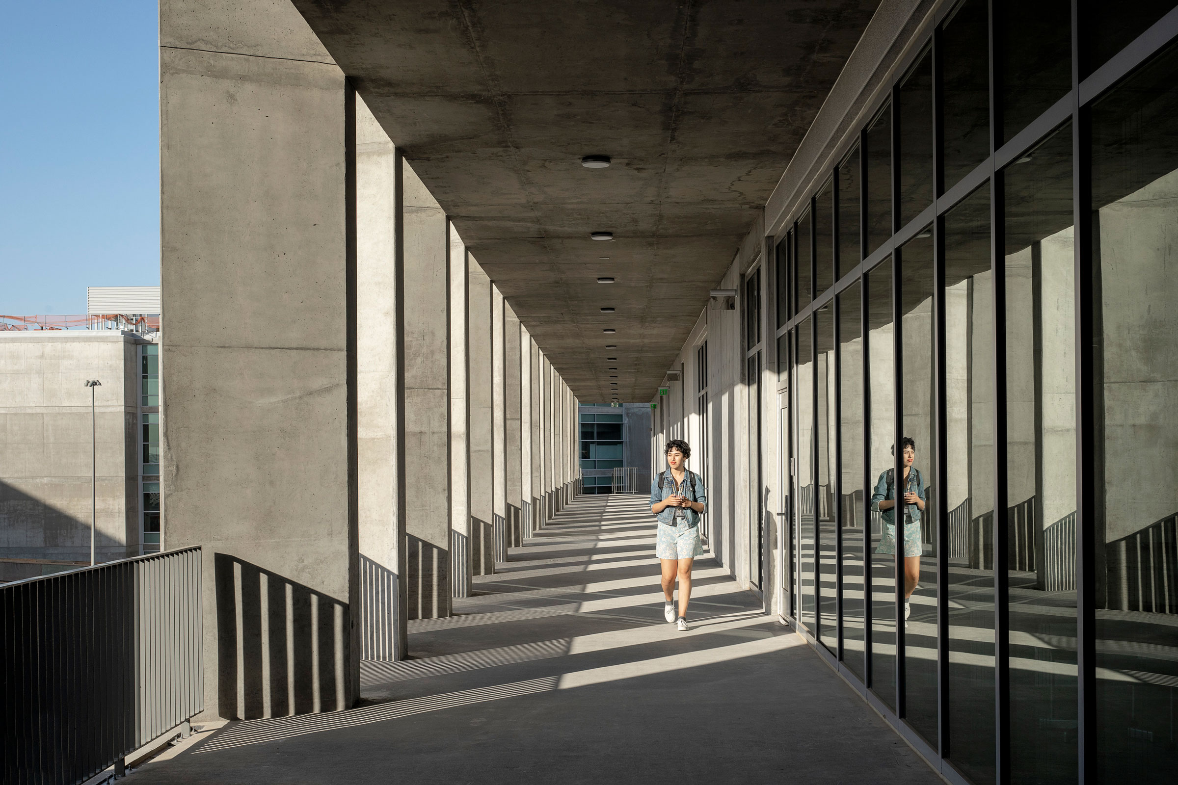
Photo by Jeremy Bitterman
Talk to me more about your love of concrete.
We love concrete. It’s such an honest material. It’s very sculptural. It’s very tactile. We actually built models to study how we were going to sculpt the concrete. When you look at the project from the front, it’s kind of like a lattice work. And the depth of the lattice work has to do with how much we want to use that to mitigate the sun. The deeper it is, the more shadow it creates, so the shadow is much more comfortable to be under.
We also varied the angle of those columns from floor to floor. As you’re walking down the brise-soleil, it’s a shaded walkway. We have a physical model of it, we reviewed the shop drawings, we looked at the concrete itself to make sure it was the right mix. Sometimes you can get concrete and it could be quite harmful for the environment. We paid attention to what is this material doing? It doesn’t absorb a lot of heat or retain it. It’s a really good—a naturally occurring way of avoiding heat gains or heat loss.
What is the future of design for higher ed spaces?
What about indoor/outdoor space? I’ll share a little from what’s in my head since a (SCUP, Society for College and University Planning) workshop I had this morning. We had a workshop with 60 people and 13 institutional leaders talking about what they’ve learned in the past year, what students need, and how are things changing after COVID. How are we thinking about campuses?
For me, I started thinking not just about indoor and outdoor space, but about designing through another lens. Of course we can design spaces, like a porch, or you can open doors or windows, but campuses are these incredible natural assets. Everybody remembers a beautiful tree they would go to after a class or a park where they used to talk to their professor. I think we should talk to the gardener and the groundskeeping crew. What do they know about the campus that we should be thinking about? Wouldn’t it be wonderful to have class under a tree that’s 100 years old?
If you’re a commuter student and you’re on campus for eight hours, and you have class for three hours, what are you going to do in between? Let’s think about the fact that you’re learning in between classes; you’re learning outside of the classroom. That’s wellness, too, right? Being outside lowers your stress. You’re breathing clean air.
Especially after COVID we love parks again. I think there’s going to be a renaissance. It’s another reason to build less—shouldn’t there be more open landscapes on campuses? I want us to have healthy campuses. Just imagine; maybe there’s a migratory bird path. You wouldn’t see that unless you were sitting out in the yard. And maybe that’s what you want to learn.

