Story at a glance:
- The home of former SOM design partner Walter Netsch was preserved and updated with LED lights and more.
- A house overlooking Puget Sound is one of the world’s first renovated residences to achieve the Living Building Challenge.
- Concrete and metal combine in surprising ways in a California desert design.
At gb&d, we get to see inspiring sustainable interior design examples almost every day. From projects that incorporate healthy building materials like low-VOC paints or eco-friendly carpet to projects that think outside of the box with a circus or desert theme, we’ve certainly seen it all.
These are some of our favorite sustainable interior design examples.
1. Inspired by the Circus, Seattle
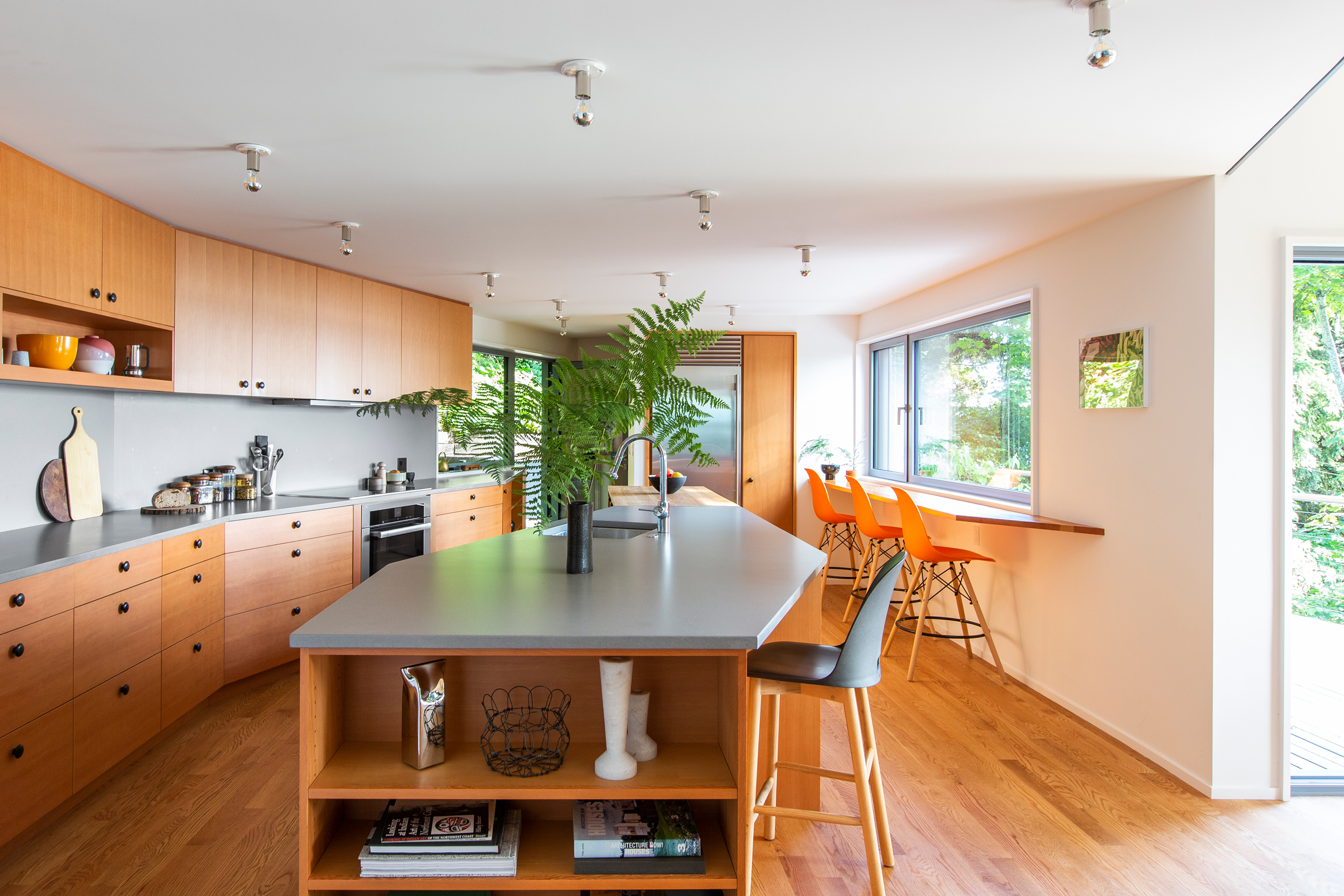
The design team wanted to connect to views of the greenbelt and Puget Sound, while improving interior flow. Photo by Rafael Soldi
The design for this West Seattle home was inspired by the main tent of a circus—a nod to the homeowners’ backgrounds as circus performers.
The home includes minimalist, Japanese design elements like a tatami nook and Japanese soaking tub.
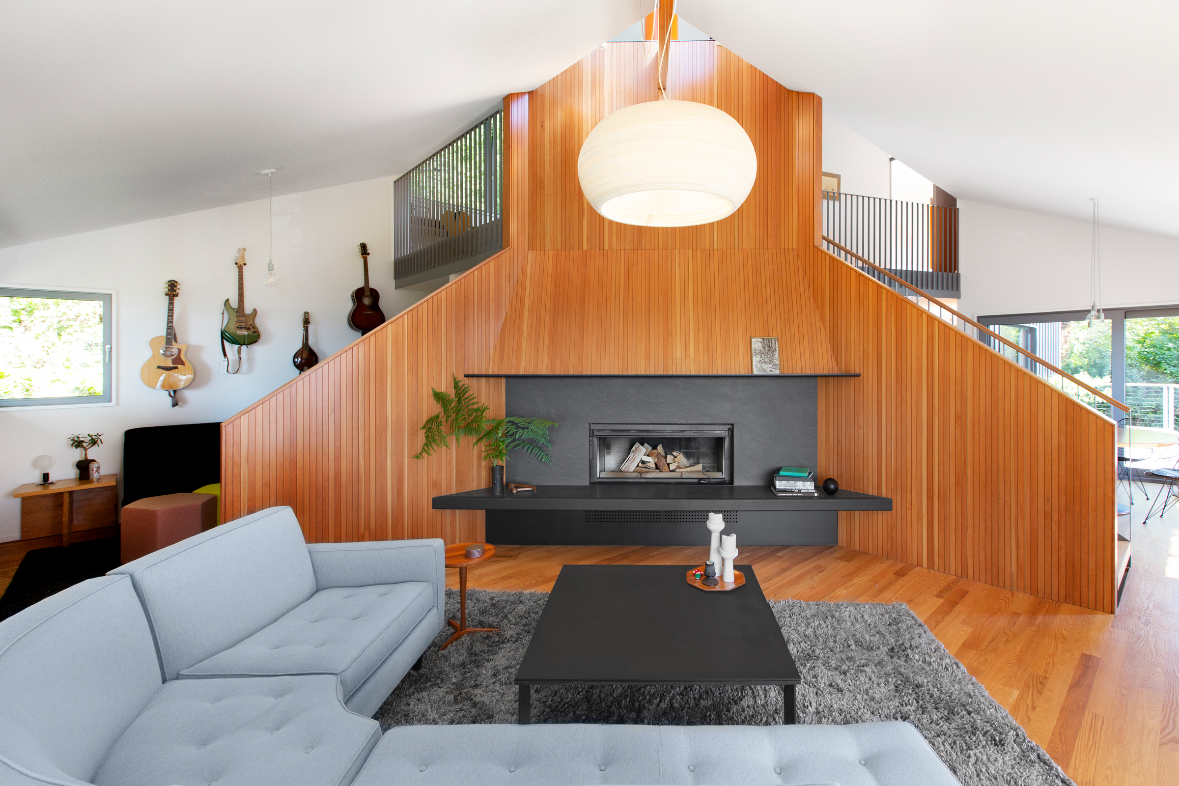
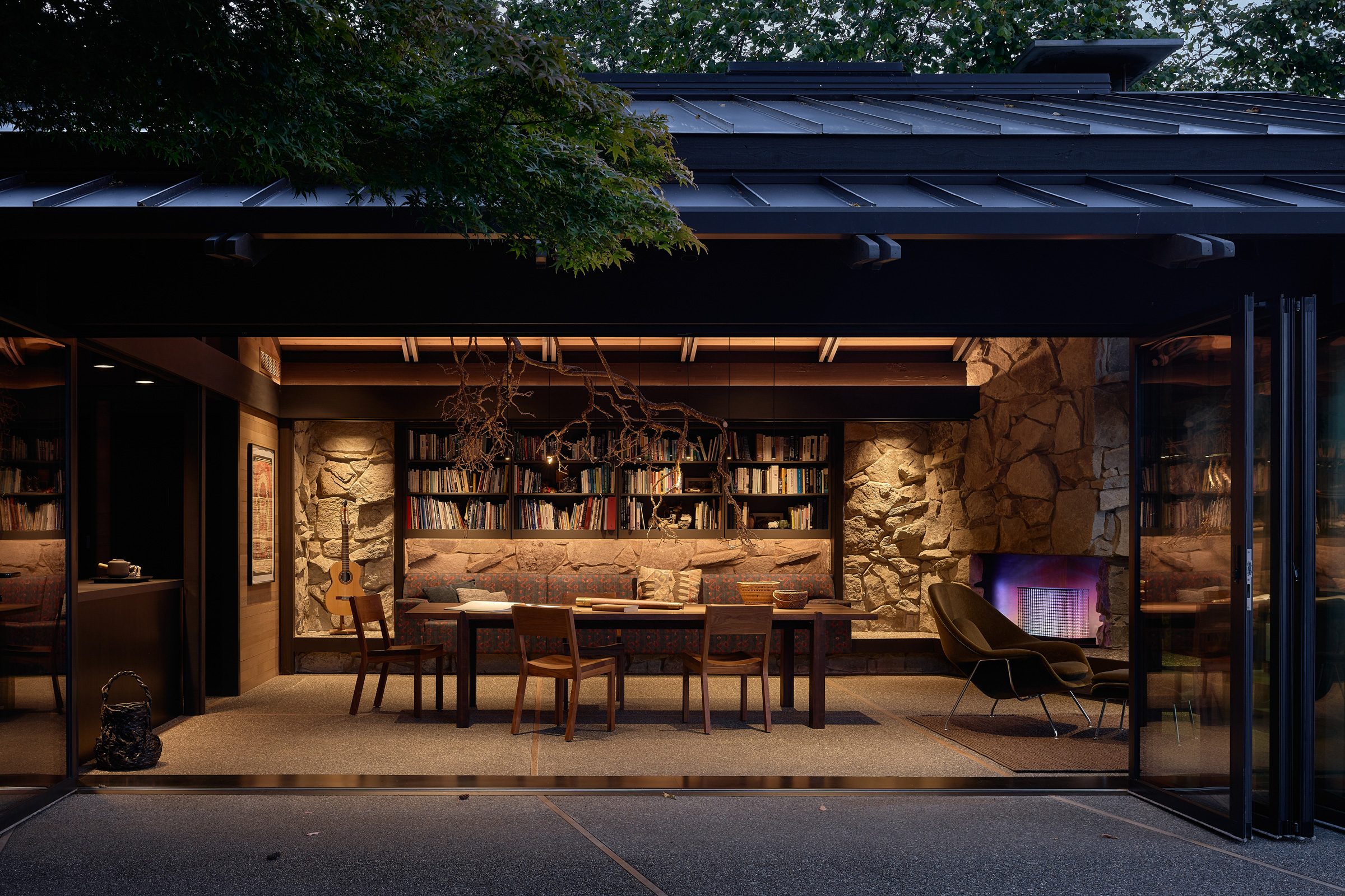
The dining room, living room, and music room were each organized around the hearth and the corner windows that opened them to their immediate surroundings. Photo by Rafael Soldi
In the main room, the SHED design team designed around the central hearth.
2. The Netsch Residence, Chicago
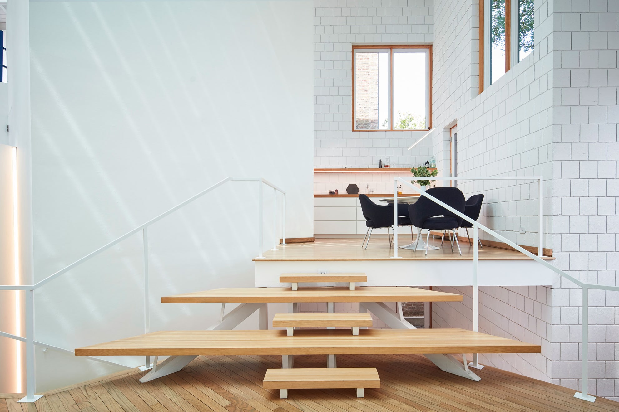
Photo by Dave Burk
The Netsch Residence, renovated by SOM, was designed to honor the late SOM design partner Walter Netsch with a modern twist. Brian Lee, the design partner at SOM who led the project team, renovated the space with a light touch to preserve as much as possible.
The house is based on a 40-by-40-foot square and rotating squares, with the kitchen, bathrooms, and utilities in the center. Rotating around this is a series of trays for various living spaces that step up or step down, forming a corkscrew-like shape. “The trays act as a series of platforms that are open to each other, supporting his idea of ‘one big space,’” Lee previously told gb&d.
Netsch originally included plenty of wall space to showcase his art collection, but the new homeowners wanted more of a clean space to appreciate the beauty of the light, the walls, and the house itself, Lee said. Tying Netsch’s love of art together with the new couple’s love of technology, they commissioned Chicago-based Luftwerk to create a digital art installation. “The house was painted all white, so it really becomes a theatrical backdrop/screen for this digital piece that can work during both the day and evening.”
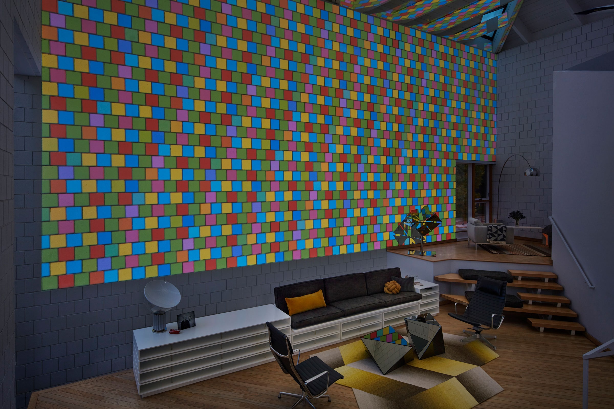
Photo by Dave Burk
Other renovations included LED lighting and new efficient heating, cooling, and water systems.
3. Jason McLennan’s House, Bainbridge Island
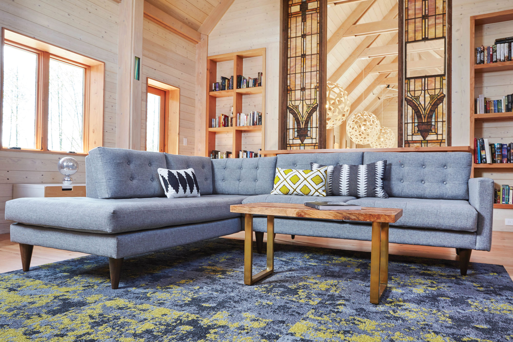
Jason McLennan’s Bainbridge Island house, Heron Hall. Photo by Daniel Banko
The 3,200-square-foot home of the creator of the Living Building Challenge incorporates open living space, plentiful natural light, and rooms designed to nurture connection and family.
“The kids’ bedrooms open up into the family room directly. I really wanted to encourage sibling connections and family connections. There are different spaces, but they’re all open to each other,” McLennan, himself an esteemed architect, previously told gb&d.
Outside, acres of Pacific Northwest scenery and a convenient walking distance to the local pool have created a South Bainbridge neighborhood kids’ hub. “That’s been kind of fun,” McLennan said. “We love the whole house.”
Now deemed one of the world’s greenest homes, this house, called Heron Hall, was designed using some of the latest and greatest sustainable building materials, including Neil Kelly cabinets made with 100% FSC-certified wood and plywood with special reclaimed wood and stone options and are free of red-listed chemicals including all paints and finishes.
4. At Home in the Desert, Pioneertown, CA
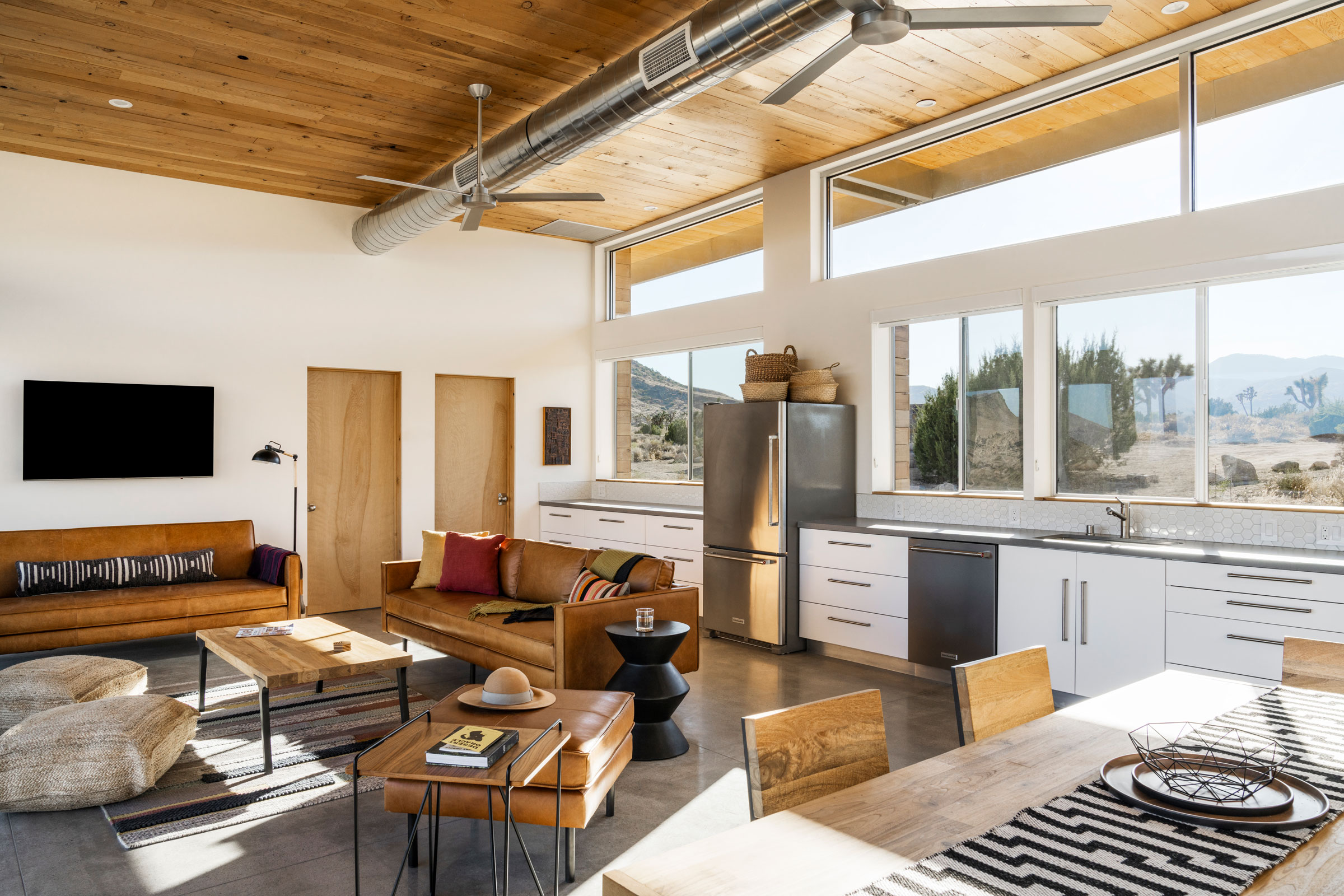
Photo by Lance Gerber
Pioneertown’s Old West architecture and the stark desert landscape inspired the design of this 1,200-square-foot, two-bedroom, two-bath home designed by Jeremy Levine Design.
The family getaway also known as the Cowboy Modern Desert Retreat emphasizes sustainable living with biophilic design—complete with large windows and doors that allow for cross breezes, plentiful natural light, and desert views all around them.
Inside, the home features polished concrete floors, white walls, and exposed metal ducts. The kitchen lines one wall of the open-concept great room, which is bookended by a bedroom and bathroom on each side. The main living space is kept free of walls and any other barriers to allow wind to passively ventilate the house. The angle of the large standing-seam metal roof was pitched to echo the long, low, sloping silhouette of the surrounding mountains. The team also incorporated locally reclaimed weathered lumber for all interior and exterior wood.
5. A Waterfront Oasis, Bainbridge Island
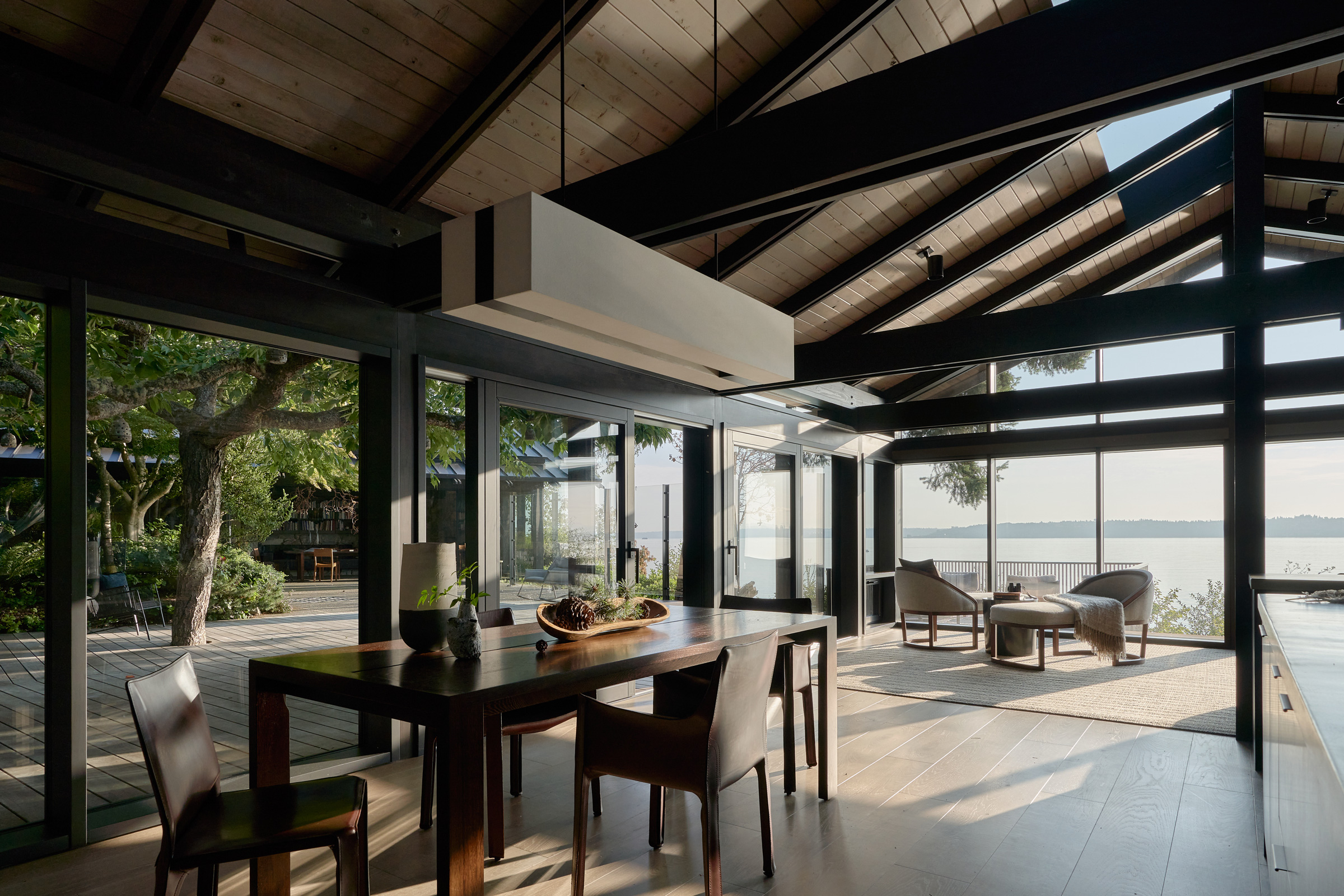
Photo by Kevin Scott
Charlie Hellstern Interior Design is responsible for the beauty that is Loom House. Designed with The Miller Hull Partnership, this renovation of a classic 1960s mid-century home is located on a bluff overlooking Washington’s Puget Sound.
Charlie Hellstern Interior Design worked with the project team to go beyond Living Building Challenge requirements and extend Red List-free materials into all the home’s furniture and furnishings, permanently eliminating chemicals of concern from a wider group of craftspeople, installers, vendors, and manufacturers.
6. Playing with Light and Dark, Santo Tirso, Portugal
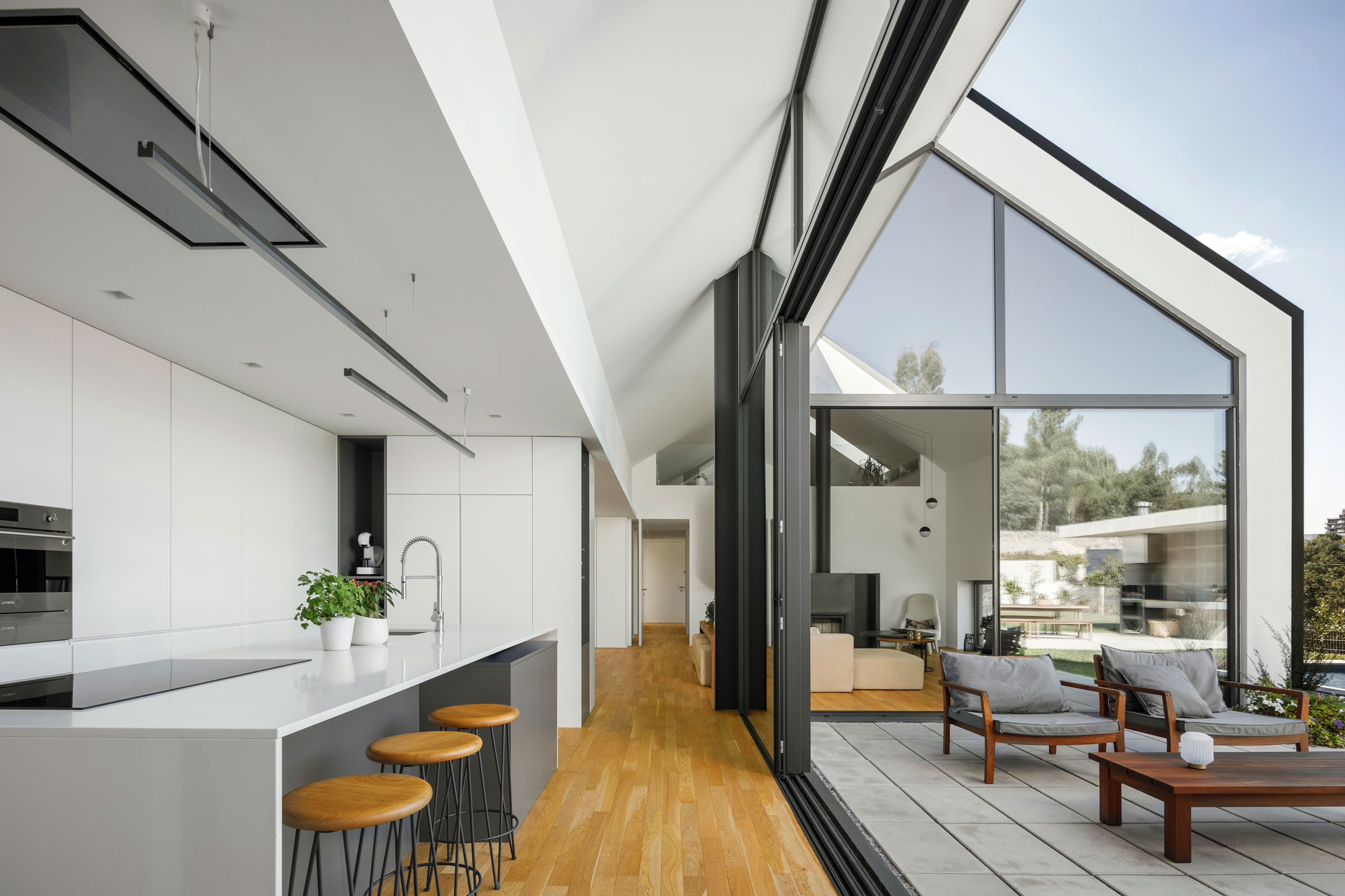
“We wanted to be in the living room, in a familiar environment, and to have an experience of colors throughout the day through the immense patio and double height that exists here,” says Architect Fábio Costa, founder of HOUS3 architecture firm, who designed Santo Tirso House. Photo by Ivo Tavares Studio
An elegant staircase is the focal point of this house in Santo Tirso, Portugal.
“It was something that came up practically at the end of the project because we thought, ‘What if we gave them a library, a lounge area?’” said Architect Fábio Costa, founder of HOUS3 architecture firm, who designed the house, in a previous gb&d article.
They started with the idea of stairs and thought: How could they make it more than a staircase without taking away from the interior?
“We wanted it to be a kind of sculpture.” The architects suggested a thin, white, simple staircase.
The kitchen island is done in silestone, and the whole kitchen has SMEG appliances. Costa says the design team wanted the space to feel neutral but just as important as the rest of the space.
The team wanted to design the house to be full of sustainable building materials that are low maintenance throughout its useful life. “All materials were chosen in order to create harmony, both in terms of construction and sustainability, as well as economically,” Costa says.
7. A Townhouse in NYC
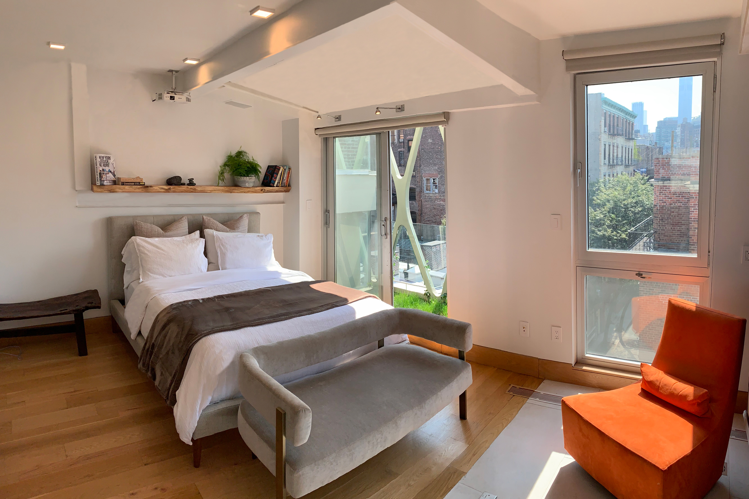
Photo courtesy of Kushner Studios
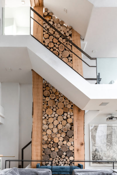
Kushner Studios spent eight years designing 16 Minetta Lane in Greenwich Village. Adam Kushner previously wrote for gb&d about the design—from its stacked cord woodpile wall to the home’s nine fireplaces.
- Photo courtesy of Kushner Studios
- Photo courtesy of Kushner Studios
“The home’s spatial organization is a smaller service space, working in tandem with adjacent larger served spaces,” he wrote. “The bedrooms, for example, have secondary work or office spaces alongside them. A mid-level convertible open space demarcates the original home from the new floors added.”
The townhome also includes a rooftop deck and cooking space with incredible views.
8. A Stone House in Spain, Minorca
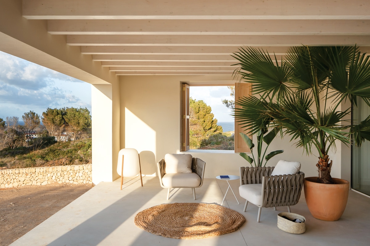
Photo by Joan Guillamat
Inside this house in Minorca, a combination of continuous sand-colored concrete pavement, whitewashed walls, pine wood carpentry, and white-veiled wooden beams remind us of nature.
All built-in kitchen furniture and wardrobes were custom-made by a local carpenter. Details like a solid hovering stair with integrated handrail-lighting create an interesting dialogue between traditional and contemporary architecture.
“We really like how the walls of the plot merge into the facade of the house and how everything blends with nature,” Architect Karl Johan Nyqvist told gb&d.
9. Three in One, Gondomar, Portugal
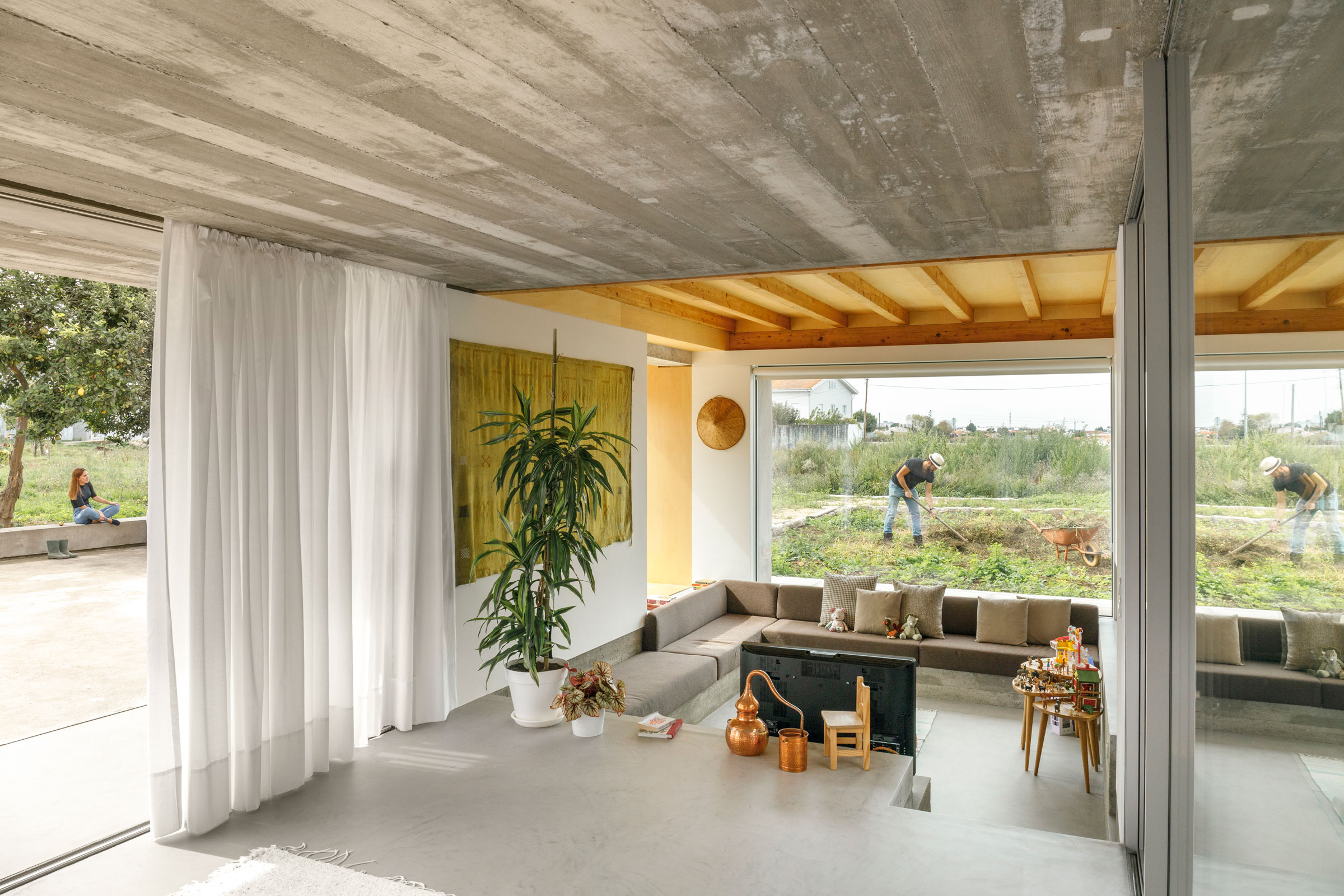
Photo by Ivo Tavares Studio
A Paulo Merlini Portugal-designed farmhouse called Casa Rio is actually a combination of three original houses onsite. The interior slabs of the upper floors were executed as a wooden structure to keep the farmhouse’s original characteristics.
Wood also breaks up the coldness of the granite and concrete seen throughout the project.
The original eucalyptus beams, which were rotten at the ends, were removed and replaced by wooden laminated beams. The architects reused the original beams to cover the floor of the central patio. Elsewhere for flooring, they chose treated pine, just like the original.
10. Rosedale Renovation, Toronto
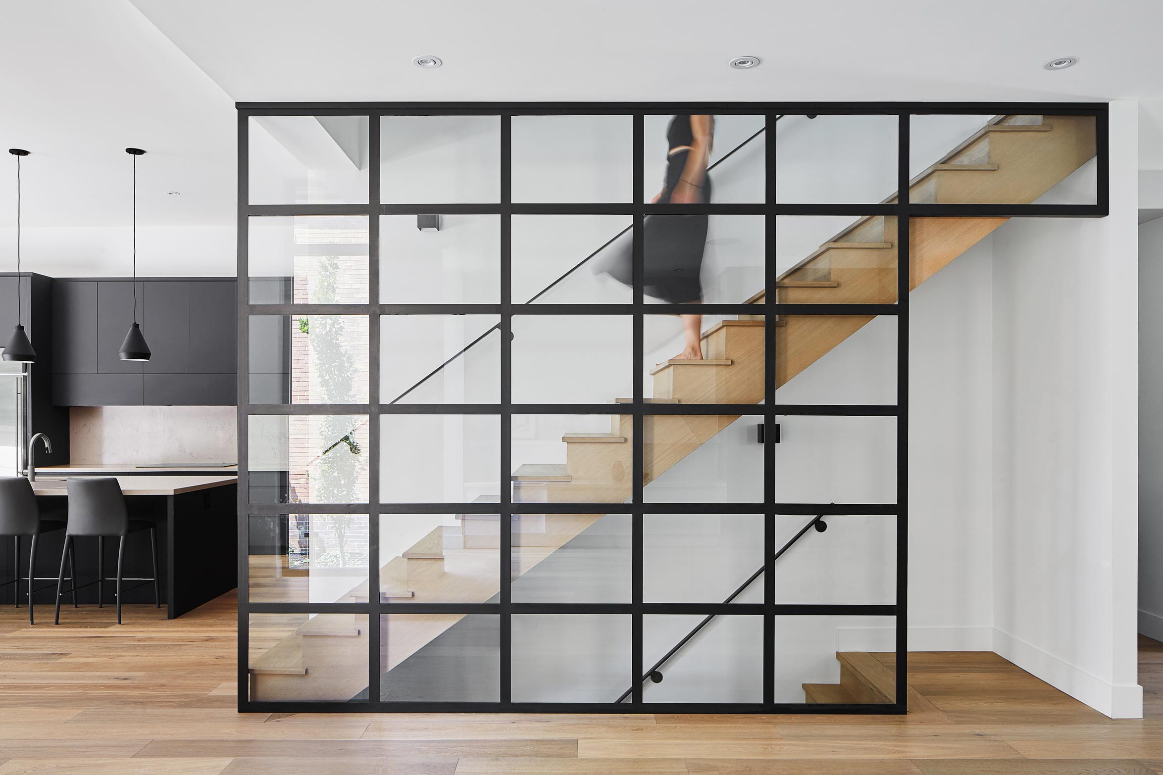
Solares Architecture revamped a pre-war home in a Toronto neighborhood to become a modern classic featuring high ceilings, dramatic windows, and fluid spaces. Photo by Nanne Springer
Interior Designer Greg Mathers and Interior Decorator Emily Hollis Interiors worked with Solares Architecture on this historic renovation of a 1920s home in Toronto.
Mathers, of Ciarcelluti Mathers Architecture, had designed the homeowners’ London home as well. Connection to the outdoors and a modern aesthetic were key to this project.
The airy kitchen features nine-and-a-half-foot ceilings and a sliding glass wall. A large island serves as a sort of “home base,” and the space is outfitted with dual sinks and a modern cooktop. Special touches like super-matte black appliances round out the design.

