Story at a glance:
- Community architecture projects like these in San Francisco, Oslo, Vancouver, Amsterdam, and more invite people to actively participate in the spaces they live, work, and shop in.
- An affordable housing complex for disabled veterans in Los Angeles uses natural light and airflow to maximize healing for the many formerly homeless residents.
- The Momentary in Bentonville, Arkansas, is a cheese factory turned art museum that retains 80% of its original structure from 1947.
In a world increasingly dominated by commercial development projects and inaccessible public housing, it can be difficult to find examples of architecture that take into account the concerns, needs, and livelihoods of the communities they serve.
The best community architecture draws people in and brings them to the table, giving them a real sense of ownership and agency when it comes to the buildings they work, shop, play, and live in.
In this article we explore some of our favorite community architecture projects that employ a variety of design techniques—from floor-to-ceiling windows and colorful highlights to green roofs and renewable energy—elevating environmental and personal connection.
What is Community Architecture?
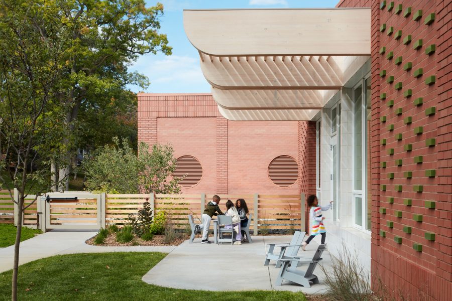
Community architecture refers to those buildings and projects designed for and/or in collaboration with the communities they serve. Photo by Kendall McCaugherty
When it comes to conceptualizing the built environment, community architecture describes an approach to planning, designing, and building that prioritizes and sees the value in involving those communities funding, using, or otherwise impacted by the proposed project throughout the preconstruction and construction processes.
In a broader sense community architecture can also simply refer to buildings that have been designed for the public to use or that stimulate participation and involvement within the local community—that is, their function and very existence facilitates community engagement and/or fulfills a necessary social service.
An ideal community architecture project encompasses both of these definitions—e.g. the project was designed in collaboration with relevant community members and ultimately serves to better the community upon completion. When implemented correctly community architecture gives people greater control and input into the design of buildings they live in or use on a daily basis and often does a better job at addressing and fulfilling a community’s needs overall.
22 Examples of Community Architecture
Let’s take a look at a few inspiring examples of community architecture from around the world.
1. Blake School Early Learning Center, Hopkins, MN
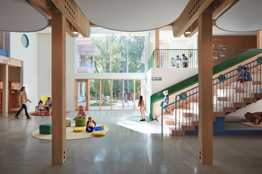
The Blake School Early Learning Center’s split-level design and commons encourage community among schoolchildren. Photo by Kendall McCaugherty
While one could make the argument that all educational buildings are, by definition, examples of community architecture, it’s rare for schools to be designed explicitly with community building in mind—but then, the Blake School isn’t your everyday educational institution.
Now in its second century of operation, the Blake School is a private, non-sectarian, coeducational college preparatory day school that looks to provide children with a rigorous education rooted in community and shared values. These sentiments are apparent even in how campus buildings are designed, as evidenced by the Blake School’s new Early Learning Center (ELC) at their Hopkins location.
Designed by HGA, the child-centered ELC aims to encourage learning through exploration and observation as part of a supportive community. To ensure that all design needs and expectations were met, HGA engaged with client and user groups early on in the planning process to determine just how the school wanted to present its brand and philosophy.
Informed by the Reggio Emilia Approach, the Blake School and HGA elected to organize the center around a communal indoor/outdoor plaza, creating a town square of sorts where multiple activities and demonstrations can take place. “What’s so cool about Reggio is the spatial implications of these ideas,” Nat Madson, design principal at HGA, told gb&d in a previous article. “This was a huge opportunity to explore and develop that.”
To help break down barriers further, the building makes use of a largely open floor plan where classrooms orbit the common spaces and certain rooms—like the library and cafeteria—overlap with one another. Such an arrangement makes the space more inviting, encourages interaction, and aids in creating a strong sense of belonging in young students.
2. Building 207, Los Angeles
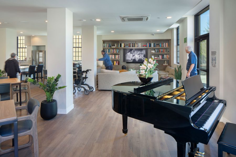
Inside one of Building 207’s community spaces. Photo by Jim Simmons Photography
Redesigned by KFA for the West Los Angeles VA Campus, Building 207 is part of an expansive campus revitalization effort and helps provide affordable housing, health care access—and perhaps most importantly, community—for at-risk veterans and their families. Originally built in the 1940s, the Mission Revival style structure now houses 59 residential units, with 13 reserved for formerly chronically homeless senior veterans.
The design of Building 207 is ultimately rooted in the idea of placemaking, a multi-faceted, community-oriented approach to the planning, development, and management of public and semi-public spaces. “Placemaking begins with listening—listening at all levels,” Lise Bornstein, partner at KFA, told gb&d in a previous interview. “Listening to clients, to future residents—and really distilling down what home means to them, and how our building or project will become a good neighbor within the community, and how we can create community within the building.”
In addition to housing, the building includes community gathering rooms, lounges, and amenities like a modern kitchen, computer lab, library, billiard table, and television lounge. Outside, resident gardens and a large landscaped courtyard provide space for relaxing and visiting. The project is also conveniently located so as to provide easy access to public transportation, community services, retail stores, and restaurants.
Building 207 also helps connect veterans with health care services—an extremely important feature considering that approximately 30% of all veterans have a service-related disability. “There are so many ways people can feel part of the community, and the idea is to try to give them access to as many as we can, as well as health care,” Bornstein says. “The campus has health care embodied within it. There’s the large VA Medical Center campus to the south, but then there’s also clinics and more one-on-one spaces on the North Campus, which is where Building 207 lives.”
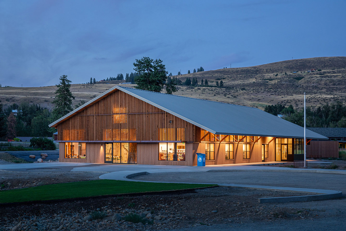
3. Winthrop Public Library, Winthrop, WA
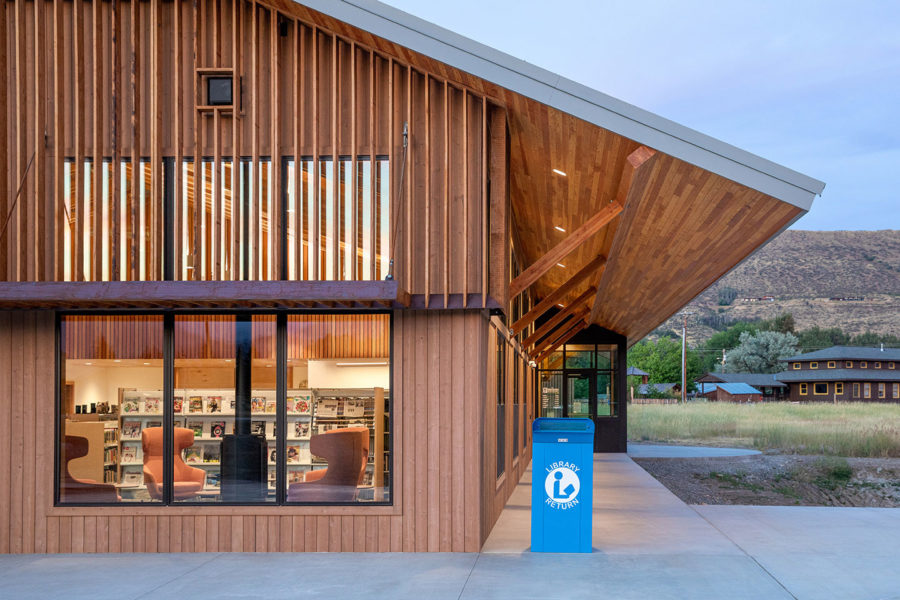
The Winthrop Public Library was designed specifically around comments and requests fielded by the local community. Photo by Benjamin Drummond
Having long been underserved by a small library with poor access to essential services and multimedia resources, Winthrop—a small town in the heart of Washington’s Methow Valley—was in dire need of a library capable of meeting the community’s education, entertainment, and general enrichment needs.
With help from Prentiss Balance Wickline Architects and Friends of the Winthrop Library, Johnston Architects was able to come up with a solution. Hundreds of comments and requests were collected as a part of the firm’s Hopes & Dreams charrette process and used to design a library that fulfilled the community’s goals and addressed those aspects that simply weren’t working.
“We designed the building with an open floor plan to be flexible and continuously adapt its space layout to the evolving needs for programmed activity,” Harmony Cooper, former project architect at Johnston Architects, told gb&d in a previous interview. “Spaces range from intimate reading window seats and quiet study areas to more active teen and children’s areas, flexible meeting halls that can be subdivided, a main stack space where larger events can also happen, and a maker space that is fit for 3D printing and digital fabrication.”
The completed Winthrop Public Library is capable of holding a collection of more than 20,000 materials and houses a large community room available after hours for events, meetings, and other programming.
4. Casa Adelante (2828 16th Street), San Francisco
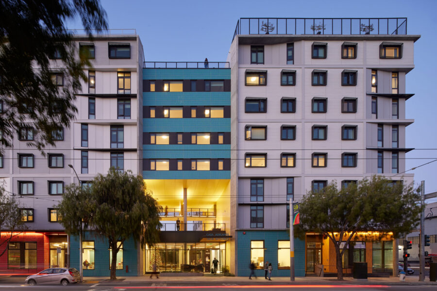
Leddy Maytum Stacy Architects worked with Mission Economic Development Agency and the Tenderloin Neighborhood Development Corporation to foster and celebrate an interconnected and vibrant community as part of the Casa Adelante 2828 16th Street project. The colorful tiles seen on the exterior are from Daltile’s Natural Hues Collection. Photo by Bruce Damonte
Designed by Leddy Maytum Stacy Architects (LMSA), the Casa Adelante 2828 16th Street housing project in San Francisco’s Mission District—an area populated largely by families of Latin American descent—is an excellent example of how community architecture can work to preserve cultural heritage.
Casa Adelante encompasses 143 affordable apartment units, a childcare center, art gallery, community room, and a youth organization. Residents of Casa Adelante also have the opportunity to grow their own food as both the seventh floor and roof are dedicated to urban agricultural and food production. “Food insecurity is a very big and valid concern for the populations the building serves,” Ryan Jang, principal at LMSA, told gb&d in a previous article. “This idea of combining food and housing security together helps with these huge housing issues that are present in San Francisco and elsewhere.”
Casa Adelante’s exterior has colorful murals while the interior is welcoming, airy, and illuminated largely by natural light. All of the rooms on the building’s ground floor are open and interconnected to facilitate interaction and engagement amongst families; the kid-friendly community room, for example, opens to the outdoor courtyard and into the lobby, allowing easy transition between rooms and providing space for children to run around.
“This is a building for families and children and all sorts of people. We wanted the community room and the furniture to be a little bit more playful—like the color on the outside of the building, a little more fun and less serious,” Jang says. “We really wanted the life of the interior building to be as dynamic and vibrant as the neighborhood itself.”
5. Schoonschip Amsterdam, Amsterdam, the Netherlands
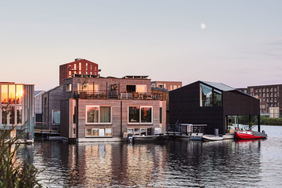
As an urban ecosystem embedded within the city, Schoonschip Amsterdam provides a new model for sustainable living. Photo by Alan Jensen
Initiated and developed by the residents with assistance from architectural firm Space&Matter, the Schoonschip Amsterdam floating community in the Netherlands houses more than 100 people in more than 40 homes. Founded on the principles of self-sufficiency and circularity, Schoonschip Amsterdam prioritizes collaboration and communal sharing in all aspects of its design.
An interconnected grid of 500 solar panels, for example, supplies electricity to all residences and uses blockchain technology to exchange energy between households, operating similarly to an energy cooperative. Greywater from showers, washing machines, dishwashers, and other appliances is treated onsite and reused while blackwater is collected, fermented, and converted into energy at a biorefinery.
Green roofs take up at least a third of each household’s roof, allowing residents to grow their own food while also serving as passive cooling features, reducing the need for interior heating and cooling. Schoonschip Amsterdam’s jetty serves to connect all of the houses together, creating a social pathway where residents can meet, play, and interact with one another.
Schoonschip residents even formed a shared mobility hub that allows them to reserve an electric car or scooter from the neighborhood’s communal parking lot, helping to reduce overall vehicle usage—and some of their neighbors from outside the community have joined in, too.
“Schoonschip is transformed into thriving neighborhoods based on regenerating existing nature and ensuring social, ecological, and financial value remains with the community. This ensures a network of stewardship and care, which will keep the neighborhoods operating in a circular way for perpetuity,” Sascha Glasl, cofounder of Space&Matter, previously told gb&d.
6. La Conner Swinomish Library, La Conner, WA
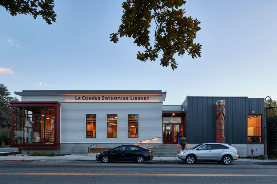
An 18-foot tall cedar story pole was hand-carved with traditional iconography from Coast Salish culture for the front of the La Conner Swinomish Public Library. Photo by Doug Scott
When the small maritime town of La Conner, Washington decided to upgrade its 1,500-square-foot one-room library, the neighboring Swinomish Indian Tribal Community became one of the project’s largest benefactors. This partnership is reflected in the completed La Conner Swinomish Public Library—designed by the BuildingWork architect team—whose design honors elements of both Coast Salish culture and the town’s historic past.
The first thing patrons see when they arrive at the new library is the 18-foot tall cedar story pole standing outside the front entrance. Designed by Kevin Paul, a Swinomish elder and master carver, the story pole depicts a traditional Salish person with outstretched hands at its base, two salmon to represent sustenance and resources, and an eagle at its peak to represent wisdom.
When it comes to the building itself the library is constructed almost entirely from locally-sourced cross laminated timber, a low-carbon engineered wood product with a high compression strength similar to that of concrete. Wood cladding and detailing, along with decorative cornices and vertically proportioned windows, helps the building emulate the style of La Conner’s historic 1800s-era architecture.
“We’re proud of how it came out from a design standpoint,” Matt Aalfs, founder and principal architect of BuildingWork, told gb&d in a previous article. “It was a wonderful opportunity to figure out how the architecture could reflect native culture in a really authentic way and present a public space that is welcoming to everyone.”
The completed La Conner Swinomish Library is LEED Silver–certified and provides the community with public access computers, dedicated reading spaces, and a large meeting room for programming opportunities. Library staff also have new areas to work in and the building as a whole has the capacity to host more patrons and hold more books than the old location.
7. Edwin M. Lee Apartments, San Francisco
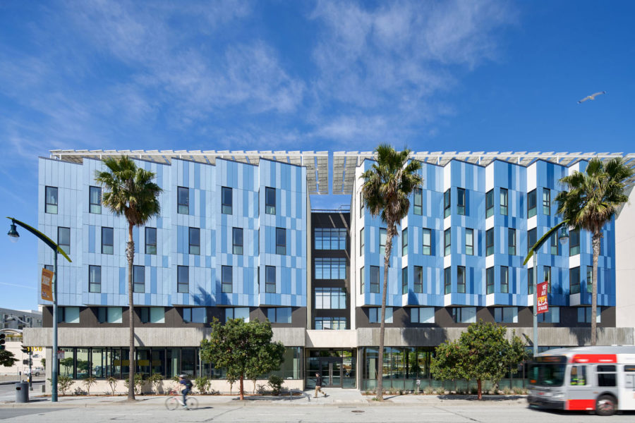
Photo by Bruce Damonte
Also designed by LMSA, the Edwin M. Lee Apartments (EMLA) is the first combined homeless veteran and low-income family development in San Francisco. Located in the post-industrial Mission Bay neighborhood, the residential complex is operated by nonprofits Chinatown Community Development Center and Swords to Plowshares; EMLA provides 47 apartments for families earning between 50% and 60% AMI and 62 apartments for formerly homeless veterans.
The building’s ground floor provides services for residents, neighbors, and the greater community at large; amenities include a computer lab, onsite resident services, laundry facilities, separate community rooms for kids and teens, a large community room and kitchen, central courtyard, and communal garden.
In order to address the needs of both veterans and families the EMLA complex prioritized trauma-informed design and universal design principles. This can be seen especially in the central multi-layered courtyard, which contains a pet and service-animal relief area, semi-private seating options, a ball wall for kids, extra-wide sloped paths, and allows for both passive and active programming opportunities.
“The Edwin M. Lee Apartments has set a new standard for community-forward, equitable design,” Gwen Fuertes, architect and building scientist for LMSA, wrote in a previous gb&d article. “The integrated design creates a healthy, energy-efficient, resilient, and regenerative complex that provides social, economic, and environmental value to the residents and the greater community.”
8. Bergami Center, West Haven, CT
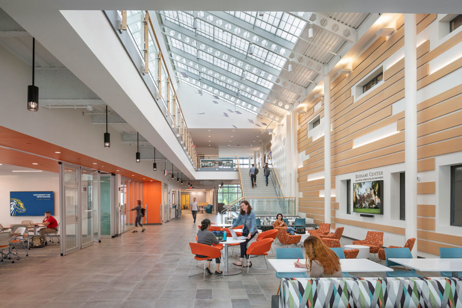
University stakeholders played a large role in determining the function and services offered by the Bergami Center for Science, Technology, and Innovation. Photo by Peter Aaron/OTTO
When the University of New Haven (UNH) concluded in 2018 that a new academic building was needed to support campus growth, they weren’t entirely sure what kind of building would be most beneficial—so UNH, with the help of New Haven-based architectural firm Svigals + Partners, turned to the university’s stakeholder community for ideas.
“We had a stakeholder group composed of the deans of each of the schools, professors, administration, the design team—a little bit of everyone from campus,” Katelyn Chapin, associate at Svigals + Partners, told gb&d in a previous interview. “We brainstormed what types of spaces would be required for their campus. Being a community-oriented person, this was my favorite part of the process.”
The end result was the Bergami Center for Science, Technology, and Innovation, an interdisciplinary hub dedicated to learning, co-creation, and the betterment of society. Intended as a space where students of all majors could come to learn, create, and collaborate, the Bergami Center encompasses science classrooms, technology-supported “smart” classrooms, multimedia production studios, a makerspace, as well as an atrium and café.
From a sustainability standpoint the center features copious daylighting strategies, low-flow fixtures, high-efficiency boilers and chillers, on-demand controlled ventilation, exterior sun shades, and was partially constructed from recycled materials—all of which helped it earn LEED Gold certification.
9. Florence Mills Apartments, Los Angeles
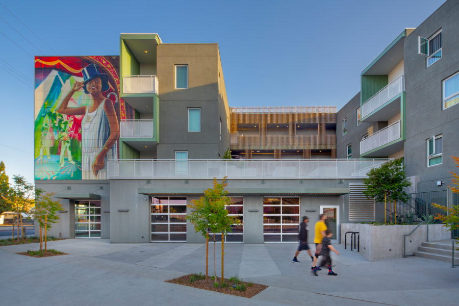
Photo by Jim Simmons Photography
Developed by the Hollywood Community Housing Corporation and designed by KFA, the Florence Mills Apartments complex was always intended to be a different kind of housing project. “From the beginning we sought for the building to be open, engaging, and optimistic,” John Arnold, partner at KFA, previously told gb&d. Careful planning ensured every aspect of the building—from the orientation to the balconies, fenestration, and corridors—was designed to embrace the community rather than isolate or close residents off from it.
The most captivating aspect of the apartment building is its large, colorful murals—of whose design the community had 100% control over. Long-term residents of the area chose local artist Myisha Arellano to paint the murals, both of which depict Florence Mills, the iconic Black vaudeville singer, dancer, and actress for whom the building is named..
To ensure that the apartments remain affordable and accessible, all 74-units are restricted to households at the low-, very low-, and extremely low-income levels, with rents set between $507 and $1,171 per month. The building itself is intentionally located within walking distance of shops, grocery stores, essential services, and public transit.
Florence Mills Apartments is not, however, just a residential space. The property also includes 5,000 square feet of commercial retail space leased to the Young Musicians Foundation, an organization that provides free music classes, workshops, concerts, a music technology and recording lab, and multi-disciplinary arts programming to FMA residents.
10. Austin Central Library, Austin
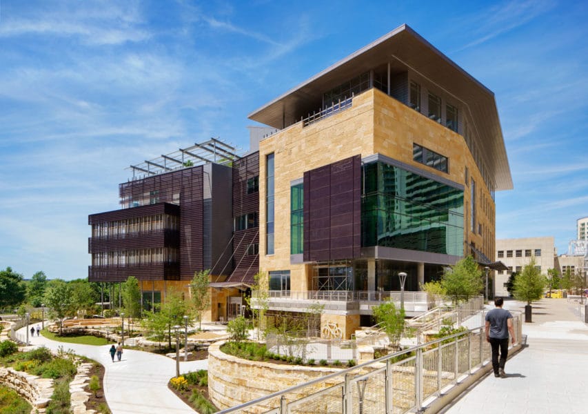
The Austin Central Library, sometimes referred to as “Austin’s living room,” provides the community with a range of services and resources. Photo courtesy of Lake|Flato
Designed by Lake|Flato in collaboration with the Shepley Bulfinch architecture firm, the Austin Central Library paved the way for a once uninhabitable landscape to become a bustling neighborhood with a thriving, diverse community.
Built atop a former brownfield site that once belonged to the now-decommissioned Seaholm Power Plant, the LEED Platinum-certified Austin Central Library encompasses 198,000 square feet and services an estimated 4,500-plus people each day. The library includes collaborative learning spaces, community rooms, a bookstore, coffee shop, as well as a demonstration kitchen and is lit almost entirely by natural daylight.
Today the Austin Central Library is affectionately referred to as “Austin’s living room,” a title both the library and Lake|Flato actively embrace. “Libraries are where we exchange information and build community, and they are integral places for learning and sharing,” David Lake, principal in charge of Lake|Flato, previously told gb&d. “It has been a joy for both firms to design a place that builds upon the local character of Austin and aspires to be a very resource-efficient, welcoming city living room.”
Since the library’s completion in 2017 bike trails and pedestrian walkways have been added to the surrounding area and the site as a whole has become Austin’s first EcoDistrict, pioneering a range of environmentally sustainable, restorative, and people-centric practices.
11. The Munch Museum, Oslo, Norway
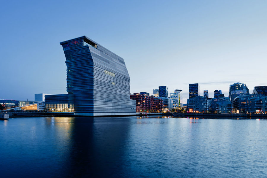
EstudioHerreros designed the Munch Museum to fit in an area of meaningful development—near the Oslo Opera House, the new National Museum, and more. Photo by Einar Aslaksen
When Edvard Munch, the Norwegian artist who painted “The Scream,” died in 1944, he donated more than 27,000 of his works to the city of Oslo on the condition that they were made accessible to all people and housed in a single space. Designed by EstudioHerreros, the Munch Museum is the city’s fulfillment of that wish—as well as an inspiring example of sustainable community architecture.
Located along Oslo’s coast, The Munch Museum was conceptualized first and foremost as a place where people, regardless of economic status, could gather, appreciate art, and enjoy the sights of the promenade; a place where people would visit multiple times, rather than as a one-time experience. As a result, the museum isn’t just a gallery but also contains an auditorium, a cinema, library, café, a children’s department that offers classes, and even a restaurant on the 12th floor.
“The idea is of the museum as a house where everybody can come, where the threshold is so low people are not afraid to come in,” Jens Richter, partner at EstudioHerreros, previously told gb&d. “The whole vestibule section is open to the public. It is an extension of the public space, where you can meet a friend for coffee. That was very important to us.”
12. Family House, San Francisco
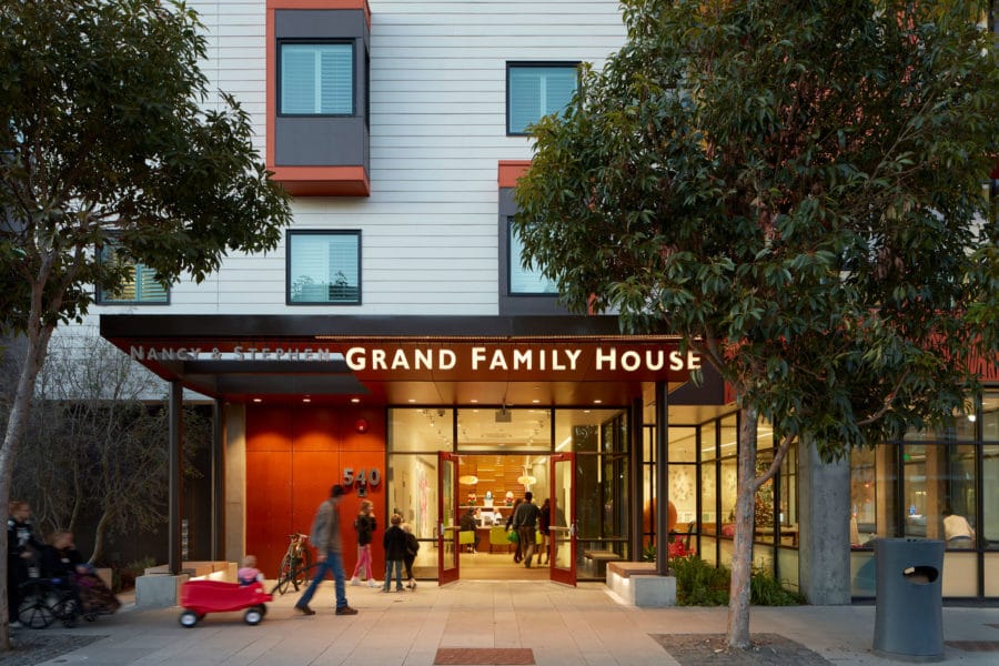
Family House in San Francisco unites families of children fighting life-threatening illnesses. Photo by Bruce Damonte
With 100% natural daylight in all public spaces, The Family House in San Francisco offers families of severely sick children a temporary escape from the typically cold hospital environment.
Up to 80 low-income families seeking treatment at UCSF Benioff Children’s Hospital can enjoy access to temporary, free housing at the 92,000-square-foot project. With the key concept of wellness and sustainability in mind, designers prioritized communal gathering spaces, a healthy filtered air system, and natural light.
“Whether there is story time in the lobby, art in the conference room, or a children’s sack race in the courtyard, the architecture supports and provides new opportunities for programs,” Gregg Novicoff, associate principal for Leddy Maytum Stacy Architects, said in a previous interview with gb&d. The building was broken down into “neighborhoods” to create smaller groups, each “neighborhood” having 10 guest rooms with shared facilities that encourage families to get to know one another as they go through difficult times.
13. Losæter Bakehouse, Oslo, Norway
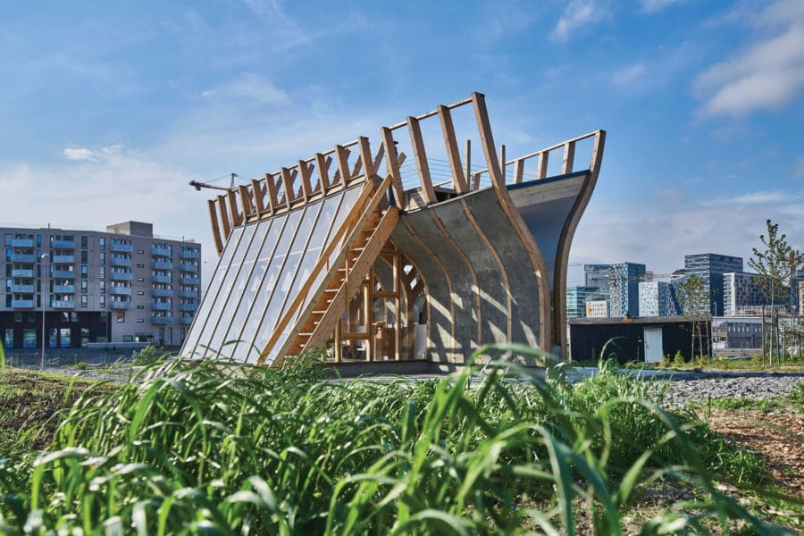
Flatbread’s ship-shaped “bakehouse” is located in Losæter, a former container port in Oslo. Photo by Monica Løvdahl
Originally established in 2011 as an art project, the Losæter urban farm and community space in Oslo, Norway has since grown to include ancient grain fields, garden plots, living soil, compost, and most notably, the Flatbread Society Bakehouse.
At the former Bjørvika container port, the Flatbread Society Bakehouse’s boat-like design is a reverent nod to the area’s history and references the Norwegian rescue boats that once aided people along the coast. The Bakehouse encompasses two enclosed areas—a propagation house and an earthen meeting room that houses three traditional bread ovens—and functions both as a classroom and maker-space.
“This place makes it possible for a lot of people to be creative,” Anne Beate Hovind, Losæter’s former project manager, said in a previous interview with gb&d. Beyond the physical act of bread-making and farming, Hovind emphasizes the wider-reaching cultural impact of Losæter. “We’re also building a cultural institution—without walls—for the more immaterial, tacit kind of knowledge about farming and baking.”
14. The Duke, Vancouver, Canada
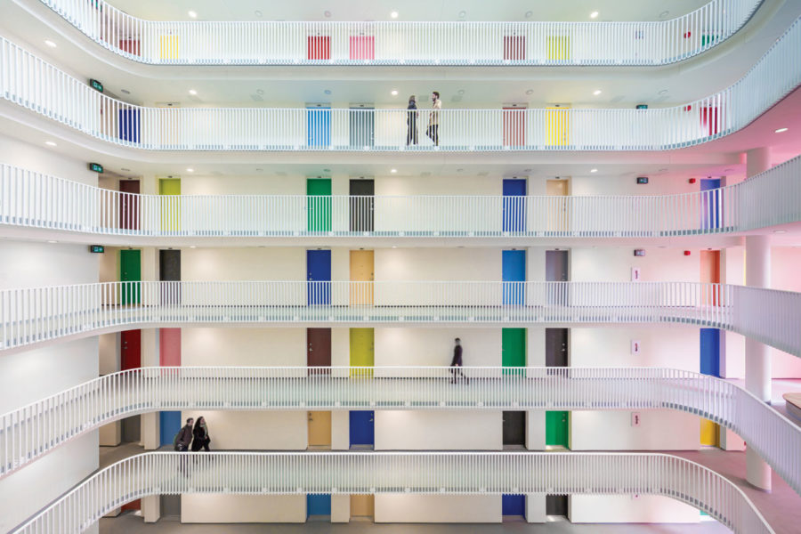
The Duke Apartments in Vancouver offer sustainable, affordable housing with a central atrium animated with doors in colors inspired by Le Corbusier. Photo by Michael Elkan
In Canada’s eighth-largest city, it can be difficult to find an affordable housing project—let alone a colorful and engaging one. In 2018 Acton Ostry Architects helped make affordable housing in Vancouver a little bit more animated and sustainable with the LEED Gold-certified 14-story Duke rental residential project.
The project is in the busy Mount Pleasant neighborhood and has 201 rental units with a small ground floor retail component, all compactly contained in an open-air atrium court building typology that’s new to Vancouver. The characteristic open-air atrium was designed for circulation and to enhance a sense of community, and the multi-colored entrance doors breathe life into the atrium space against a backdrop of brilliant white surfaces.
“High-density rental housing serves a significant population who wants to live in the city but who either cannot afford or choose not to own a home,” Mark Ostry, principal of Vancouver-based Acton Ostry Architects, previously told gb&d.
The Duke encourages limited vehicle use with its convenient location near transit, along with amenities like bicycle maintenance space and a car share program. Its building materials and rooftop green space also enhance energy performance and water efficiency.
15. The Green Square Complex, Raleigh, NC
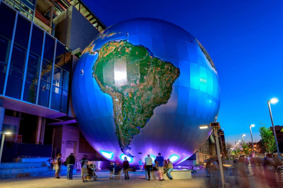
A key feature of The Green Square Complex is the “Daily Planet,” which has become a popular meeting place for staff and visitors. Photo by Matt Robinson
Fentress Architects’ LEED Platinum Green Square Complex in Raleigh, North Carolina is a striking example of how architecture can bring together science, environmentalism, and the community. The complex augmented the already-existing Museum of Natural Sciences with a new Nature Research Center and a headquarters for the North Carolina Department of Environment and Natural Resources. Fentress Architects also added public plazas and landscaped open spaces.
“Sustainable design requires more than a check-box approach in ensuring the design meets necessary benchmarks,” Curtis Fentress, founder and principal in charge of design at Fentress Architects, said in a previous gb&d article. “To create inherently sustainable designs that encourage people to think more deeply about the environment, architects must form a bond between individuals, the community, and the building.”
With this in mind, Fentress Architects felt it was important to create a public space where the community could gather. A key feature among the plazas and open spaces is the “Daily Planet,” a four-story spherical auditorium that breaks free of the building and has become a popular meeting place.
To significantly reduce energy consumption, multiple daylighting strategies are implemented throughout the complex. Some of these strategies include Low-E glass, light shelves, and light tubes. Further, the complex takes into account water-efficiency and optimization of natural resources. Fentress Architects installed two green roofs and a permeable pavement to reduce stormwater runoff.
16. The Six, Los Angeles
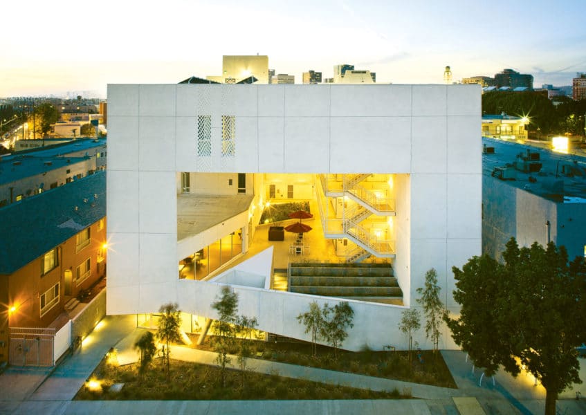
The Six is an affordable housing complex designed for disabled and formerly homeless veterans. Photo by Tara Wucjik
In the military “got your six” means “I’ve got your back.” That supportive philosophy informs The Six, a 52-unit affordable housing complex for disabled veterans in LA, designed by Brooks + Scarpa. The Six was designed to provide the maximal comfort and healing to residents, many of whom have experienced homelessness.
The building includes both private studios and one-bedroom apartments, along with a communal living room, community gathering spaces, and a rooftop garden. These communal and outdoor spaces are meant to provide a sense of connection among residents.
By maximizing natural light and airflow, among other design decisions including structural orientation, The Six is 50% more energy-efficient than a conventionally designed building.
17. Solar Carve (40th Tenth Ave), New York City
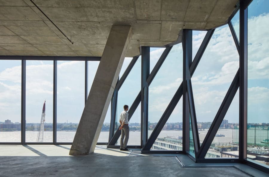
Solar Carve’s unusually high ceilings provide natural light and dramatic views of the High Line and Hudson River. Photo by Tom Harris
With added density in New York City following the introduction of the High Line in 2009 there came a need for more high-quality open spaces. Solar Carve (40 Ave), a 12-story commercial/office building, was Studio Gang’s first ground-up building in New York. Located at the edge of Manhattan between the High Line park and the Hudson River, Solar Carve is sculpted by the angles of the sun through its striking gem-like appearance.
Due to NYC zoning regulations designed to protect fresh air and light on the street, the studio design team had to think creatively when determining how to best use sunlight. The team employed solar carving—a body of research on how to shape architecture in response to solar access to have a positive impact on its environment.
The building is sculpted at the angle of the sun in order to preserve solar exposure on the adjacent High Line Park, and it boasts unusually high ceilings and floor-to ceiling glazing. “We articulated the carved areas of the building with a faceted glass facade that rationalizes the complex geometry of the solar carve and also lends the building a striking gem-like appearance,” Weston Walker, partner and design principal at Studio Gang, told gb&d in a previous publication.
“We recognize the prominence of the site along the park, and that people come here to look at buildings. With so many eyes on this project we knew it was an opportunity to demonstrate a new kind of relationship between architecture and open space,” says Walker.
18. The Momentary, Bentonville, AR
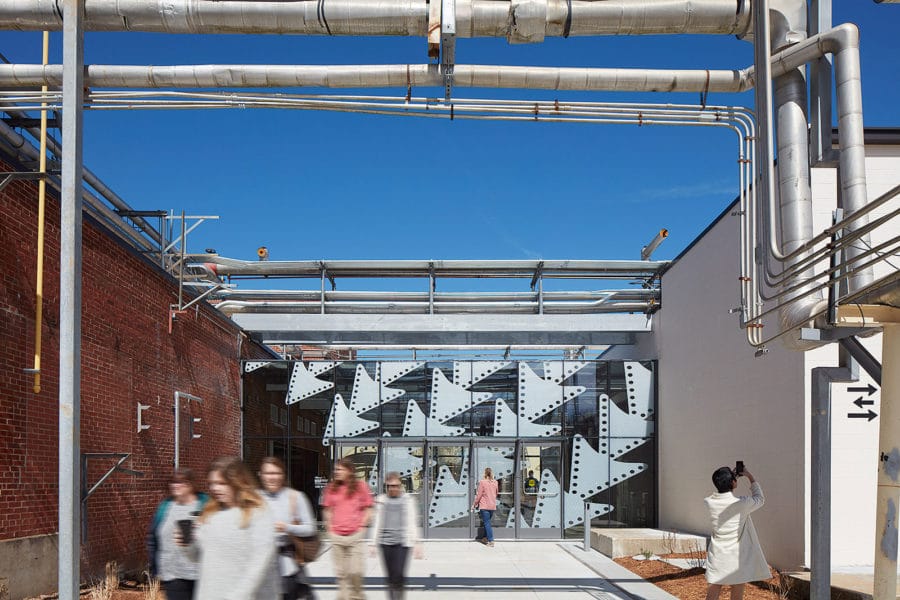
At The Momentary outdoor and indoor spaces flow into one another. Photo by Tom Harris
The Momentary in Bentonville, Arkansas, was once a cheese factory. Before that it served as a hunting group for the indigenous Osage nation. Now The Momentary—designed by Wheeler Kearns Architects—is an adaptive reuse art museum with a relaxed atmosphere not found in many museums.
Nearly 80% of the original structure, built in 1947, was preserved by the time The Momentary was completed in February 2020. Additions to the structure focused on creating accessible space, adding insulation to the roof, and updating to more energy-efficient heating and cooling.
“Instead of trying to smooth over those layers of history, we tried to look at each space in terms of what the other layers would support—in terms of cultural programming that was going in there,” Calli Verkamp, Wheeler Kearns’ lead architect, said in a previous interview with gb&d.
Often museums are regarded as formal spaces but The Momentary is different; outdoor and indoor spaces flow into one another and the glass allows direct sunlight and natural engagement. “We wanted The Momentary to be a hub where anyone felt like they could wander in and have a new interaction with contemporary art and the community—to feel like a neighborhood place rather than a museum,” Verkamp says.
19. Springdale Library, Toronto, Canada
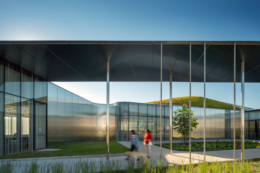
The Toronto Springdale Library’s fluid architecture allows it to blend into the surrounding green spaces. Photo by Nic Lehoux
The Toronto Springdale Library’s eco-friendly and eye-catching design reflects a new age in public spaces. Rather than holding shelves full of dusty books libraries are being reimagined as friendly gathering spaces meant for the 21st century.
Designed by RDH Architects, the library is targeting LEED Gold certification through its green roof, geothermal heating and cooling, and greywater systems. On top of that, the library has daylight harvesting systems and electric car charging stations. The team also tried to specify all locally available materials, from doors, lighting, and furniture to concrete and steel work.
The triangular building sits on a flat suburban plot of land adjacent to a naturally occurring ravine, which inspired the building’s fluid design and surrounding green spaces.
The library also invites people in with its floor-to-ceiling glass windows. “It’s an approach of heightline, view, and perception that the public can see what’s happening inside the building, and it sort of draws them in,” Tyler Sharp, principal and design director at RDHA, previously shared with gb&d.
20. DADA Distrikt, Brno, Czech Republic
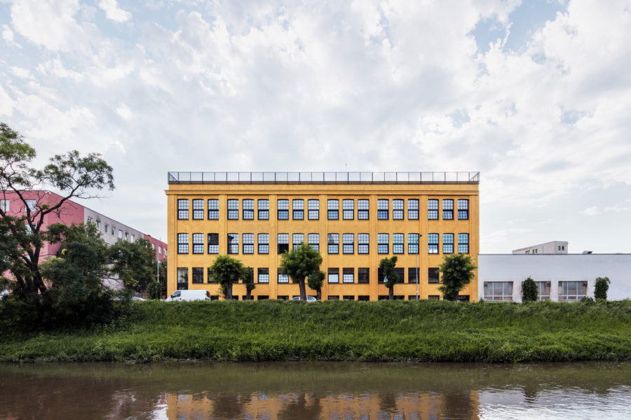
DADA Distrikt, designed by KOGAA Architects. Photo by Kubicek Studio
Surrounded by the brownfields of an industrial area in the Brno region of the Czech Republic, a former storage facility was adapted into the DADA Distrikt, an affordable housing project that stands out with its gold finish and rooftop garden.
The architecture firm KOGAA built the four-story affordable housing unit with the goal of emphasizing the already-existing industrial character of the space. To both aesthetically and sustainably advance the industrial building, the firm created a rooftop garden.
“In response to the issue with floods in the country and the building’s sensible closeness to the riverside, we designed a green roof as a tool for water management,” KOGAA cofounder Alexandra Georgescu previously told gb&d. “The roof becomes a filter for the rainwater, slowing down the flow and therefore making the building a responsible player at the urban level of the area. A greywater system is also used for the building’s washrooms and irrigation.
21. The Night Ministry, Chicago
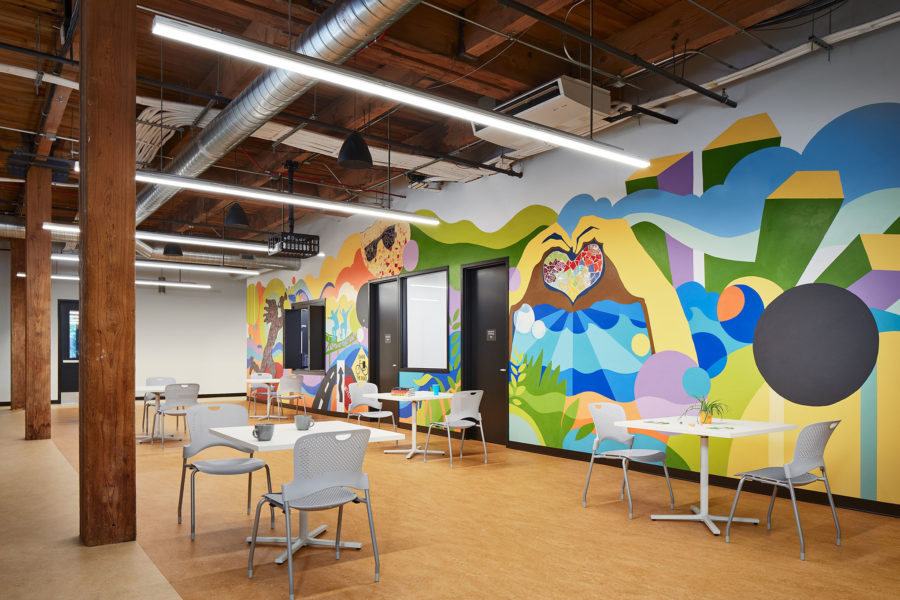
Bright murals in The Night Ministry’s multipurpose/dining bring vibrancy to the shelter. Photo by Kendall McCaugherty, Hall + Merrick Photographers
Wheeler Kearns Architects renovated a former manufacturing facility in the Bucktown neighborhood into a headquarters and shelter for The Night Ministry—a Chicago-based organization that works to provide refuge for community members facing poverty or homelessness.
The Night Ministry’s headquarters offers an overnight shelter called “The Crib,” which includes a serving kitchen and dining space, administrative offices, meeting rooms, and multi-purpose programming space for social services, job assistance, and social activities.
The Crib repurposes the heavy timber masonry of the four-story building to sequester the carbon and embodied energy it holds. The floors and windows were repurposed to reduce waste as well. The building tends to overall wellness and openness through an abundance of natural light and colorful walls and furniture. Throughout the building, 95% of public spaces have connection to natural light.
22. 9th and Thomas, Seattle, WA
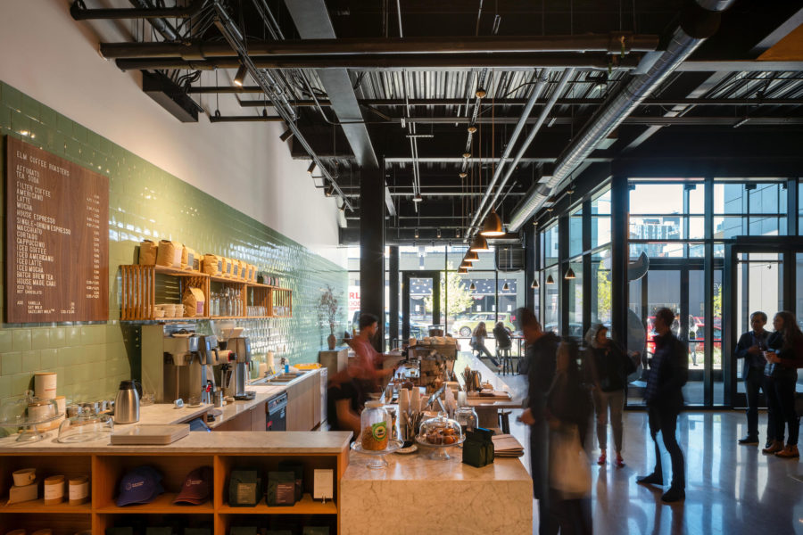
The LEED Gold 9th & Thomas was designed to be both an office and neighborhood gathering place. A public lobby is home to retail and a range of curated arts programming. Photo by Nic Lehoux
Olson Kundig’s 9th and Thomas in Seattle reflects what workspaces have the potential to be—a gathering spot that goes beyond the classic cubicle.
9th and Thomas is a mixed-use building with retail and office spaces in South Lake Union—an industrial turned technology hub. “This area of Seattle, South Lake Union, has seen a lot of change in recent years as industry moves out and technology moves in,” Tom Kundig, principal and owner of Olson Kundig, told gb&d. “It was important to us that the building ultimately contribute to the culture of the neighborhood.”
The building has operable windows and movable shutters to offer natural ventilation, and the green roof cuts down on the heat island effect, while also inviting people to gather both inside and out.
Samantha Stevens contributed to this article.

