Story at a glance:
- Biophilic design has become one of the most prominent recent trends in architecture.
- Biophilia may involve incorporating timber and installing living walls or simply referencing organic patterns and using natural color palettes.
- Biophilic design increases the health and productivity of a building’s occupants.
It’s been said time and again: Americans spend approximately 90% of their time indoors, according to a study conducted by the EPA. This, coupled with the known benefits of proximity to nature, has led architects to find ways to blur the lines between nature and the built environment.
Saying nature is good for someone is hardly a groundbreaking revelation, even for the most devoted urbanite. But public health researchers have found that besides reducing stress and improving mood, exposure to nature “contributes to your physical well-being, reducing blood pressure, heart rate, muscle tension, and the production of stress hormones.”
While the modern notion of biophilia has existed since the 1970s, its application to the design of the built world is largely an emerging trend in architecture, one that has evolved rapidly in the last couple of years.
What is Biophilic Design?
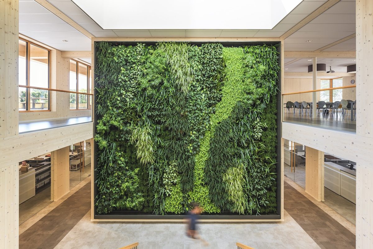
This Netherlands office combines greenery and high ceilings with abundant natural light to achieve biophilic design. Photo courtesy of Geelen
First popularized by psychoanalyst Erich Fromm in his 1973 book The Anatomy of Human Destructiveness, biophilia was originally defined as—and could be translated to—“the passionate love of life and all that is alive.” Biologist Edward O. Wilson would broaden this conceptualization in his 1984 book Biophilia to include the idea that, like food and water, humans have an innate, genetic need to connect with the natural world to ensure a healthy, fulfilling existence.
In the architectural sense biophilic design intentionally seeks to connect a building’s occupants directly or indirectly to the environment and the natural world at large. The implementation of biophilic design principles is intended to foster a greater relationship with—along with a responsibility to protect—nature by promoting positive interactions between people and the environment. An enormous green wall combine with plentiful natural light at Geelen Counterflow’s Netherlands office, to great biophilic success.
A Brief History of Biophilic Design
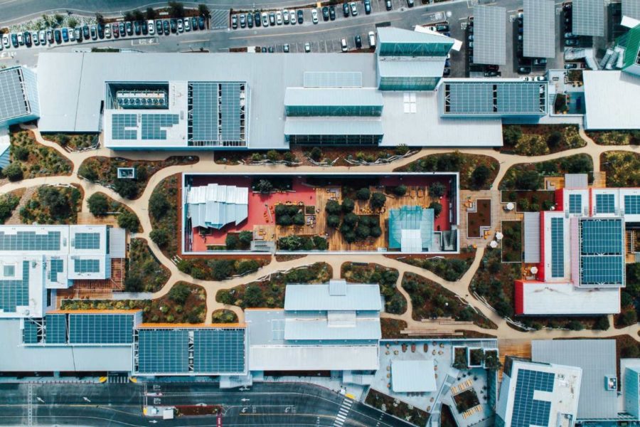
Facebook’s Menlo Park headquarters, completed in 2018, is 525,236 square feet. A 1.4-megawatt photovoltaic solar panel system on the roof supplies solar power to the structure. Photo courtesy of Facebook
Humankind has always sought a connection with nature, but Fromm and Wilson helped to bring the idea into the public consciousness and laid the groundwork for what would become the biophilic design movement of the 21st century.
The first true instances of what we might consider modern biophilic architecture in the US, however, coincide with the advent of organic architecture and can actually be traced back to the early-20th century, before the term had even been coined.
Biophilic Design in the 20th Century
Some of the earliest examples of contemporary biophilic architecture may be attributed to famed architect Frank Lloyd Wright, whose design philosophy emphasized the integration of nature into the built environment, exemplified by projects like Fallingwater.
Often lauded as the perfect union of man and nature, the aptly named Fallingwater was built in the late 1930s partially overtop a waterfall in Pennsylvania; the sound of running water can be heard throughout the house and is considered an intentional design feature. Fallingwater also features locally sourced stone—both raw and processed—in its construction and makes extensive use of both windows and balconies for illumination and to offer views of the surrounding landscape.
Architectural biophilia would become slightly more mainstream during the mid-20th century when, in an attempt to escape the rapid urbanization of the 1950s and safeguard themselves from industrial spies, multinational corporations like John Deere, General Electric, and AT&T Bell began moving their campuses out of cities and into rural areas. These rural campuses were valued primarily for the views they offered and often included accessible green spaces embedded within the surrounding landscapes.
Once Fromm’s and Wilson’s writings on biophilia emerged in the late-20th century, the ideas behind biophilic design began to solidify into a much more coherent philosophy.
Biophilic Design in the 21st Century
Over the last few decades biophilic design has become much more commonplace in large part thanks to the work of Stephen Kellert, whose writings on biophilia in architecture serve as the framework for which many architects follow. The International Living Future Institute’s Kellert Biophilic Design Award acknowledges Kellert’s legacy as a pioneer in applying biophilic design principles to the built environment.
Biophilic design has become especially prevalent within the tech sector. Apple, for example, recently converted a parking lot into a 20-acre forest for its new Cupertino headquarters and trees can now be found in many of their retail stores. The Gehry-designed extension to Facebook’s headquarters in Menlo Park boasts a 3.6-acre rooftop garden that blurs the inside and outside of the office.
This embrace of biophilic architecture is good for both society and the planet, but there’s another big reason companies are willing to spend so much on these projects: Biophilia improves employee’s physical and mental health, making them happier and more productive.
But it’s not just tech companies who are capitalizing on the benefits of biophilia. In recent years biophilic design has slowly started to branch out even further, influencing the planning of everything from residential complexes and hospitals to offices and commercial buildings.
Why is Biophilic Design Important?
In a society growing increasingly disconnected from the natural world, biophilic design is considered important for a number of reasons. These include:
Environmental Consciousness
Incorporating direct biophilic features like living walls, green roofs, rainwater gardens, and other green spaces is good for the environment because they help reduce stormwater runoff, improve air quality, combat the urban heat island effect, and provide habitats for birds, bees, butterflies, and other crucial species, facilitating a return of biodiversity to the urban hardscape.
Implementation of passive biophilic systems like daylighting and natural ventilation both help to reduce energy consumption and reliance on fossil fuels, resulting in fewer GHG emissions and a lower carbon footprint. Indirect biophilic strategies like the use of natural materials can also help promote resource conservation and ethical procurement of materials, reducing the rate of non-renewable resource extraction and synthetic building material manufacturing.
Regular and consistent exposure to nature also helps instill a sense of responsibility in people to protect their local environments, ensuring that future generations maintain an affinity with the land and have the ability to meet their own resource needs.
Improves Mental & Physical Health
Biophilic design’s provisioning of proximity and access to nature is known to have a positive effect on both mental and physical health as well. Biophilic features like nature imagery, passive ventilation, running water, and organic color palettes have been proven to help reduce feelings of stress and anxiety, improve alertness, and even stimulate the production of dopamine and serotonin.
“The calming effect of being within nature has a significant impact on mental wellness, and the opportunity to be outside walking or riding a bike on nature trails contributes to physical wellness,” Christopher Janson, architect and urban designer at LRK, previously wrote for gb&d.
Studies show that urban areas with a higher concentration of green spaces tend to have lower levels of asthma and other respiratory illnesses, as well as reduced mortality rates. Biophilic design elements like daylighting, access to green spaces, and views of nature have also been observed to improve the body’s ability to heal and reduce patient stays in hospitals.
Increases Productivity & Retention Rates
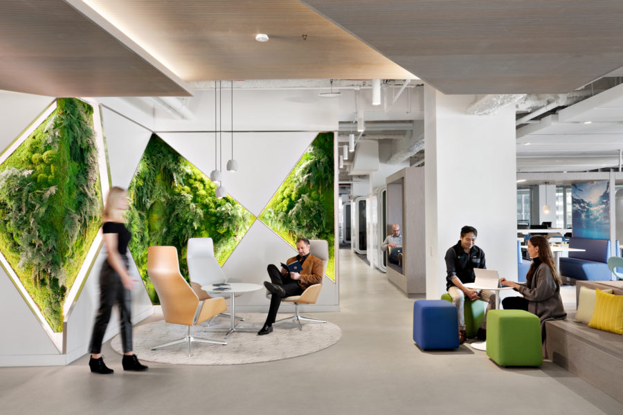
Biophilic workplaces can improve physical and mental health as well as overall well-being. Photo courtesy of Ted Moudis Associates
As an added bonus the positive physiological and psychological effects of biophilic design subsequently translate to increased productivity and retention rates in the workplace.
“Some of the effects of incorporating it [biophilic design] into the workplace include reduced absenteeism and mental fatigue, improved emotional satisfaction, and increased productivity, all of which directly contribute to the company’s bottom line,” Michelle Beganskas, senior manager of workplace strategy at Ted Moudis Associates, previously wrote for gb&d. “In essence, the benefits of investing in smart biophilic design helps boost employee wellness and financially aids the corporation.”
Even something as simple as adding plants around the office can help reduce short term employee absenteeism and improve productivity by 15%, according to a 2014 study conducted by Exeter University.
Bolsters Resiliency
When implemented at the macro level biophilic design helps improve the overall resilience of cities and other urban spaces, especially when it comes to phenomena such as heatwaves, flooding, severe storms, and other climatic events.
“Nature based solutions such as planting trees, adding green roofs and walls, maintaining natural river systems, and implementing coastal-based storm surge protection like mangroves and wetlands to combat storm surges can have a significant effect on cities,” Charlene Mortale, division vice president of project management at Greenscreen, wrote in a previous gb&d article. “At the same time these additions provide other benefits such as cooling the street level, adding pleasurable biophilic elements to our hardscapes, and making our cities livable.”
How to Incorporate Biophilic Design
Biophilic design manifests itself in many ways. Indeed, any step made to connect a building to the natural world is considered to be biophilic design in action. The International Living Future Institute curates an extensive list of resources for how to push biophilic design even further in urban environments.
Here are just a few ways to incorporate biophilic design in your projects to help foster direct, indirect, and spatial experiences with nature.
Direct Experiences
Ideally biophilic design is implemented in such a way as to foster direct experiences with the natural world through physical, tangible contact with natural features and phenomena. Terrapin Bright Green, a leading environmental consultant, refers to these direct experiences as “nature in the space.”
Methods for directly incorporating biophilic design include:
Passive Ventilation
Natural airflow is an often overlooked component of biophilic design but one that has serious implications for human health and productivity. Studies have shown that breathing in fresh air helps improve oxygen flow to the brain, which in turn promotes enhanced cognitive function, memory retention, and concentration.
Mechanical HVAC systems can help circulate air throughout a building but they don’t do a very good job of expelling indoor air pollutants and can actually contribute to a stale interior environment. Passive ventilation systems, on the other hand, continuously pull in fresh air, circulate said air, and then remove that air without the aid of mechanical devices.
Instead, passive ventilation systems use one of two natural processes—wind or thermal buoyancy—to facilitate the movement of air through a building by way of natural vacuums and volumetric pressure differences.
Add Plants or a Living Wall
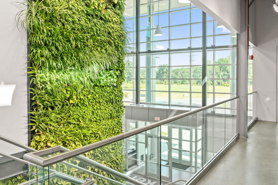
A large living green wall brings life to a commercial space. Photo courtesy of Ambius
Using greenery as a means of implementing biophilic design can be as simple as adding a variety of potted plants throughout a building’s interior or as intensive as installing an entire living wall.
Also referred to as green walls, living walls are vertical planting surfaces intentionally covered in vegetation and typically make use of either soil, some other sort of substitute substrate, or hydroculture felt as a growing medium. Unlike green facades, living walls can support a wide variety of both vining and non-vining plant and moss species and may be installed both indoors and outdoors.
Increasing occupants’ exposure to plants has a positive effect on the brain and even contributes to reduced feelings of anxiety and stress, lowered blood pressure, and improved alertness. “When you see a green wall you’re immediately drawn to it. It’s alive, it’s interesting, and it fulfills our biophilic needs. Plants make places nicer to hang out in, and they also help clean the air,” Matt Hills, a vertical garden and green wall expert at Ambius, previously told gb&d.
As Hills states, the benefits of plants and living walls go beyond the psychological—they also act as organic purifiers and significantly improve indoor air quality by filtering out pollutants and increasing oxygen levels.
Add Water Features
While not the easiest biophilic design element to implement, water features are nevertheless important to consider when planning an interior space. Like exposure to daylight and plants, features like fountains, water walls, and aquariums can help reduce stress and anxiety, making for happier, more productive occupants.
What’s the science behind this? Well, researchers have found that the very sight and sound of water induces a flood of neurochemicals and stimulates the parasympathetic nervous system, leading to increased blood flow to the heart and brain and inducing feelings of calm and relaxation.
Maximize Daylighting
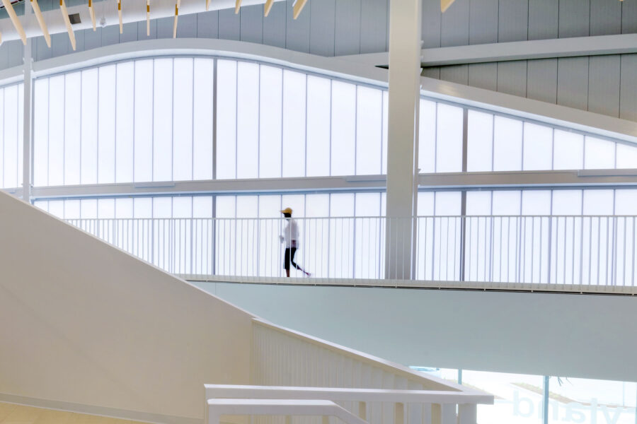
KLA’s UniQuad Poly Wall System brings light into the Maryland Heights Community Center. Photo courtesy of Kingspan Light + Air
Maximizing natural light versus artificial light isn’t just good for plants, but for people as well. In fact it’s crucial to regulating the body’s circadian rhythm. “The human circadian rhythms are the body’s natural clock. When your brain detects daylight and the changing spectral content over the course of the day, it tells your body to wake you up, and when darkness hits, it triggers your body to fall asleep,” Neall Digert, vice president of innovation and market development at Kingspan Light + Air, previously wrote for gb&dPRO.
Most of us, however, spend a large portion of our days inside with little-to-no exposure to natural lighting for hours on end, resulting in feelings of premature tiredness and reduced productivity. Daylighting, or the practice of using windows, skylights, and other light-admitting features to illuminate a room, presents a solution to this problem, especially when implemented to scale throughout an entire building.
“By exposing your body to daylight throughout the day, your healthy human circadian rhythm will have a significant role in regulating your sleep-wake cycle and have a positive influence on your eating habits and digestion, body temperature, hormone release, and other important bodily functions,” Digert says.
Add a Green Roof
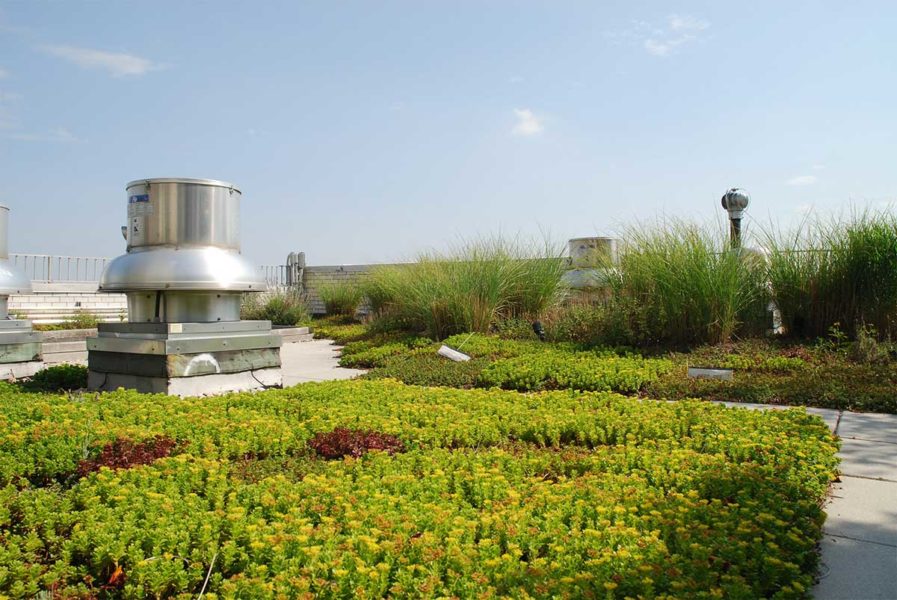
Accessible green roofs can help reduce occupant stress and improve employee productivity. Photo courtesy of Greensulate
Green roofs can be the ultimate biophilic amenity for buildings and possess a range of desirable traits. “By offering an aesthetically pleasing landscape, green roofs can reduce stress and increase worker productivity for both building residents and the occupants of nearby buildings,” Michael T. Kozak, vice president of building materials and environmental products for Minerals Technologies, previously wrote for gb&d.
Hospital systems with multimillion-dollar capital budgets are looking at neighboring and parking garage roofs, seen from patient rooms, as a way to reduce hospital stays and employee turnover. Some studies show patients who look at gardens and plants experience more favorable clinical outcomes and faster recovery times.
Many projects also want green roofs for their economic benefits, such as improving ROI through reducing energy costs and increasing property value, according to Adrian Wilton, CEO of Greensulate, a leading designer, manufacturer, and installer of green roof systems.
Perhaps most importantly, however, green roofs—especially those seeded with native plants—provide habitats for birds, insects, and other animal species, aiding in the return of biodiversity to overdeveloped urban areas. They also help mitigate stormwater runoff and reduce the risk of urban flooding.
Indirect Experiences
Biophilic design can also evoke nature indirectly through the use of imagery and symbolic representations of the natural world—or what Terrapin Bright Green calls “natural analogues.” These indirect biophilic design features can be extremely beneficial in places where incorporating live plants or water features is simply not feasible.
“Rather than literal natural features, representational physical properties of nature can take the form of displayed images of nature, a natural color palette, biomorphic shapes, patterns, and even circadian lighting,” Beganskas writes. “These design elements are meant to mimic aesthetic qualities of nature without actually using the real thing.”
Some of the most common examples of indirect biophilic design include:
Use of Natural Materials
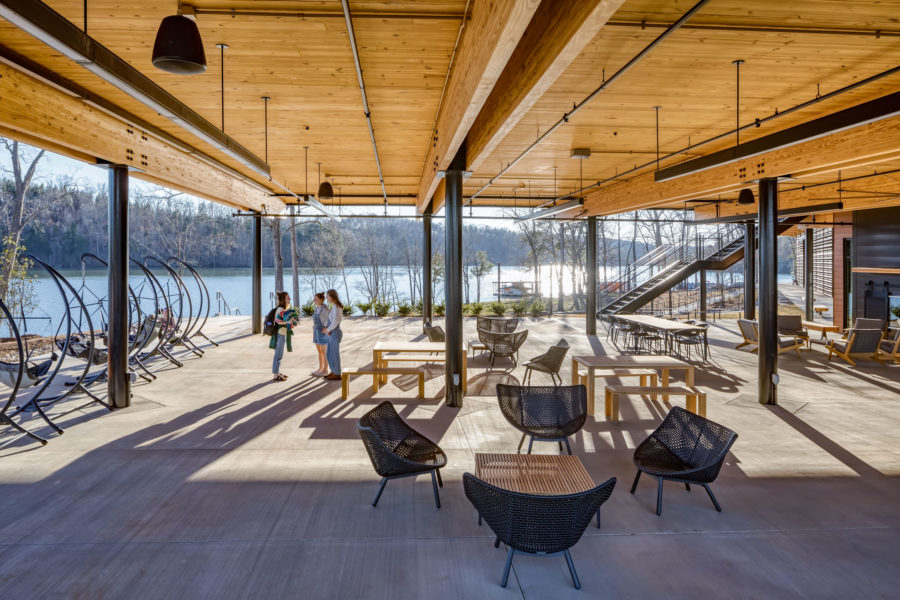
The Andy Quattlebaum Outdoor Recreation Center at Clemson University. Photo by Jonathan Hillyer
Building with natural materials—such as wood, bamboo, and stone—and leaving those materials exposed can help foster a deeper connection to nature on a subliminal level. “The use of a natural material stimulates an innate and positive biophilic response in building occupants,” Scott Mooney, senior assistant at SRG Partnership, wrote in a previous gb&d article.
This is especially true of timber as it provides an inviting warmth that less sustainable materials—namely concrete and steel—simply can’t contend with or replicate. At Clemson University in South Carolina, the Wood Utilization + Design Institute looks to combine the state’s overabundance of locally sourced timber with new applications in construction.
Nature Imagery & Graphics
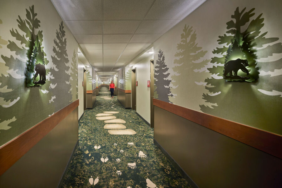
Photo courtesy of Koroseal
One of the easiest ways to incorporate nature into a building’s design is through the use of imagery and graphics. This can be in the form of conventional photographs, paintings, murals, wall art, and more. Koroseal, for example, offers a range of nature-inspired wall coverings that support a variety of biophilic designs, macrophotography, and other graphical applications,
Including imagery of local landscapes and environments is an excellent way to create a real sense of place and makes it easier for occupants to connect and relate to the world around them. Natural imagery also helps provide the brain with both emotional and intellectual stimulation.
Organic Shapes & Patterns
In lieu of imagery and graphics, nature may be invoked in an even subtler manner by way of organic shapes and patterns. These geometries are reminiscent of those commonly found in nature, and as such, are typically imperfect and irregular. Organic shapes and patterns are generally characterized by curved lines as well as soft and uneven edges—qualities that tend to communicate comfort, familiarity, and approachability.
“Now you’re seeing these shapes and forms be extracted from nature and applied in innovative ways to things like flooring to truly have an impactful psychological effect on how you experience the space,” Ariel Lumry, interior project designer at Perkins&Will, previously told gb&d. “It’s the softness and the curves and repetition of patterns that are natural in origin. We automatically relate to it without even realizing it.”
Arktura’s Atmosphera line of acoustic baffles, for example, includes several designs inspired by various organic geometries found in nature including waves, billowing clouds, and the flowing undulation of rolling hills.
There are, however, also examples of more perfect organic geometries, such as the hexagonal, honeycomb patterns found in beehives or the complex fractals observed throughout the natural world.
Natural Color Palettes
One can also invoke the natural world through the use of organic color palettes. Often referred to as “earth tones,” colors such as muted or subdued greens, browns, blues, and purples are commonly found in nature and help promote a sense of peace and calm. Brighter pigments may be used, albeit sparingly, as complimentary or accent colors in spaces where activity happens or to brighten up a room.
Spatial Relationships
Finally, a project’s spatial relationships—or what Terrapin Bright Green considers the “nature of a space”—can also invoke the natural world in a few meaningful ways. Terrapin identifies four core spatial experiences, or conditions, as being integral to biophilic design: refuge, prospect, mystery, and risk/peril.
Refuge
Spaces of refuge focus on providing safe spaces where individuals may withdraw from the main flow of activity for protection, work, rest, or healing. These places of refuge are meant to feel separate from the surrounding environment without being entirely disengaged, typically by providing the occupant with overhead protection and shielding them on three sides.
There are three basic levels or degrees of refuge:
- Modular. Offers relatively small protection but provides a sense of security (e.g. a high-backed chair).
- Partial. Provides coverage on several sides (e.g. bay window seats, booths, reading nooks, fireside inglenooks, covered walkways, gazebos, et cetera).
- Extensive. Offers complete or near-complete concealment (e.g. private offices, tree houses, reading and sleeping pods).
Refuge conditions may be designed to function as protective spaces from weather, act as privacy spaces, encourage meditation or reflection, shield from physical danger, or some combination thereof. Spaces that serve a diverse array of occupants may need to provide a range of refuge areas and/or provide additional control—e.g. lighting controls—in order to accommodate user preferences.
Prospect
A space that has a good prospect condition emphasizes horizons, unobstructed sightlines, open expanses, and other factors reminiscent of the African savannahs in which we as a species evolved. Such characteristics impart a sense of safety, control, and freedom—even if the environment itself is unfamiliar—while also helping to reduce feelings of stress, fatigue, boredom, and perceived vulnerability.
Good prospect can be achieved through the use of focal lengths greater than 20 feet and by integrating features like open floor plans, transparent materials, balconies, staircase landings, elevated planes, and other elements that allow users to visually survey and contemplate their surroundings. Views that include bodies of water, shade trees, and evidence of human habitation can further enhance the prospect condition.
Mystery
The idea of mystery recognizes that a place needs to entice individuals to explore and travel deeper into their environments by employing features that partially obscure/reveal or through hidden sensory stimuli. This experience is based on the idea that people need to be able to both understand and explore their surroundings.
Good mystery conditions inspire curiosity but do not evoke a fear response. The differentiation between the two is largely rooted in a space’s visual depth of field. An obscured view and shallow depth of field, for example, is likely to result in unwanted surprise. Terrapin recommends a medium (≥20 ft) to high (≥100 ft) depth of field for achieving optimum mystery within a space.
Other spatial attributes that contribute to a positive mystery condition include:
- Winding pathways
- Curved edges
- Auditory stimulation generated by an imperceptible source
- Strategic use of shade and shadow
Mystery conditions are most effective in transitory spaces where people pass through rather than linger for long periods of time, although features that make effective use of revolving content can make mystery viable even in spaces routinely occupied by the same group of people.
Risk/Peril
Though it may at first sound counterintuitive, instilling a sense of risk/peril in occupants is not about actually putting them in any sort of danger—rather, these spaces are designed to have identifiable threats or perceived risks that are in turn rendered inert by the presence of reliable safety features. The presence of these controllable risks is fundamentally intended to arouse one’s curiosity and attention.
One of the most common examples of a perceived risk within the built environment is the fear of falling, something that may be instilled via balconies, catwalks, or a transparent floor plane/railing. Spaces with a good risk/peril condition feel exhilarating and the awareness of controlled risks can even result in strong dopamine or pleasure responses.
12 Projects that Incorporate Biophilic Design
Projects all over the world are incorporating biophilic design in innovative ways. Here are 12 projects that blur the line between the built and natural environment.
1. Salesforce Tower, Chicago
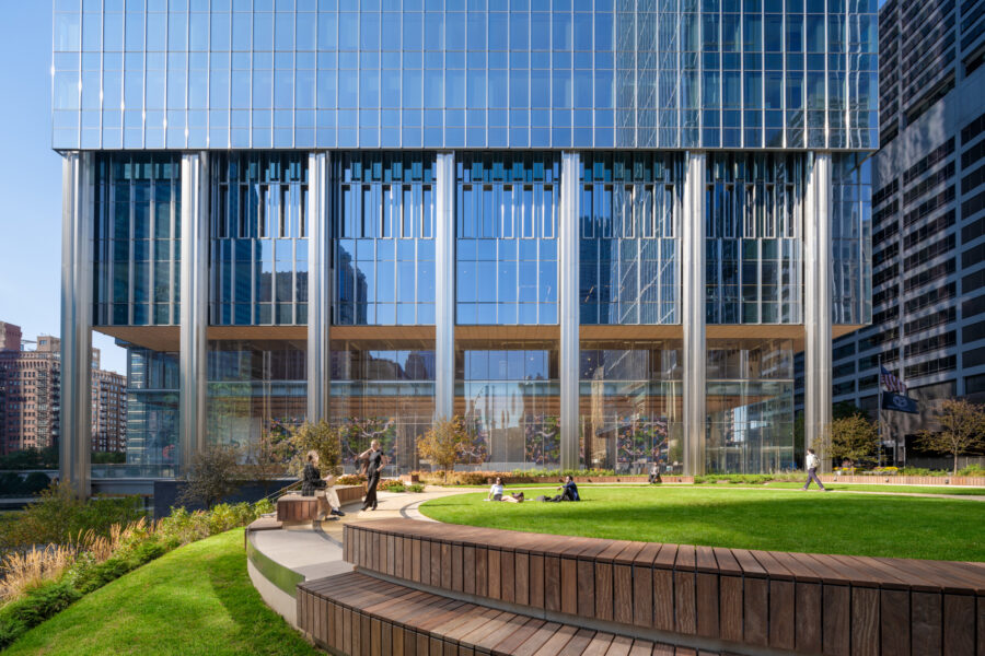
“In the very beginning of the project we recognized the unique aspect of this site, and we said, ‘This is going to be a park. We’re putting all the parking below-grade and expanding the green space wherever we can,’” says Darin Cook, partner at Pelli Clarke & Partners and the lead architect for the Chicago Salesforce project. The team committed to a minimal footprint and to touch the ground lightly. Photo by Jason O’Rear
Conceptualized as part office, part park, the recently completed Salesforce Tower in Chicago is a monumental contribution to the Windy City’s ever-increasing portfolio of green, sustainable buildings.
Designed by Pelli Clarke & Partners, Salesforce Tower is located at the confluence of the Chicago River’s three branches and includes both roof terrace and ground level outdoor green spaces. The building also provides employees with direct access to the Riverwalk, a 1.25-mile pedestrian and bike path that offers expansive views of the river and opportunities for physical activity. “People want to get out and have fresh air. They want to get a sense of the seasons, the time of day. They want to exercise,” Darin Cook, partner at Pelli Clarke & Partners, previously told gb&d.
Clad entirely in insulated floor-to-ceiling glass from Viracon, the tower maximizes views and daylight admittance while still maintaining a high level of energy efficiency and indoor thermal comfort. A folding glass wall high on the tower also allows occupants to enjoy the benefits of fresh air and natural ventilation on fair-weather days.
Nature is further invoked throughout the building’s interior via wood details and art to create a warm, welcoming environment grounded in local ecologies. Vertical, rolling strips of eucalyptus accents—inspired by the nearby Chicago River—adorn the end wall of each elevator lobby while a large art installation in the main lobby cycles through landscape photographs and biophilic-inspired digital artwork throughout the day.
2. UC Davis Admin Health Building, Rancho Cordova, CA
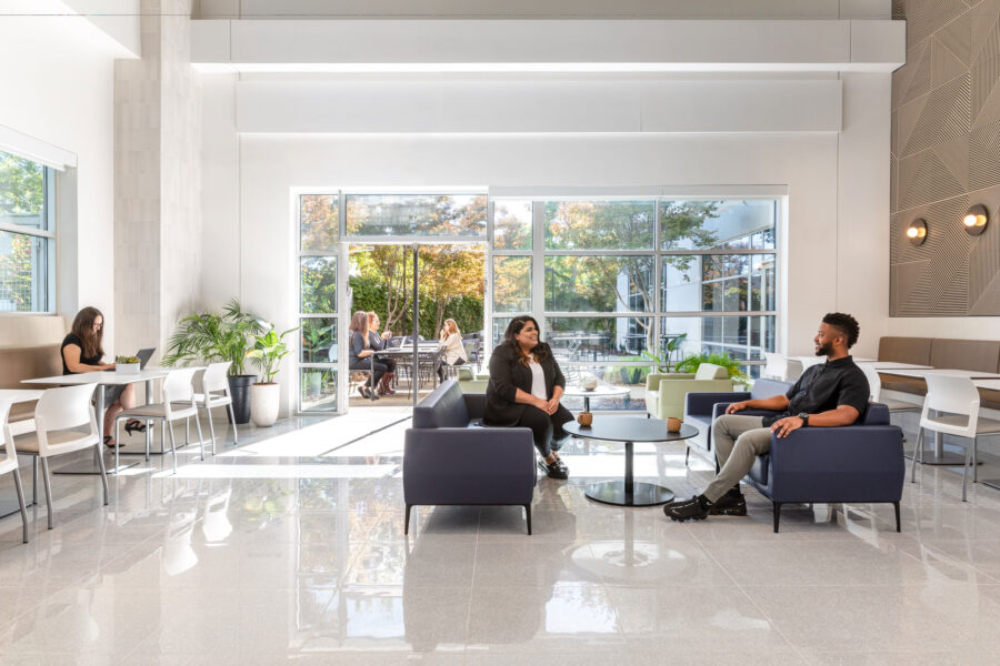
Incorporating the appearance of greenery, open natural light, and connectivity creates a sense of well-being and calm inside the UC Davis Health Admin Building. Photo by Kat Alves
Stantec redesigned the UC Davis Admin Health Building to meet LEED Gold certification and the University of California’s Carbon Neutrality Initiative standards. It’s an inspiring example of both adaptive reuse and modern biophilic design.
Built in the 1990s as a call center, the building was largely bereft of natural light and provided few open spaces for employees to socialize or gather. To remedy the daylighting issue, Stantec added new light wells and selected bright, neutral colors to help draw light into the interior. Outdoor patios and green spaces now provide employees with places to conduct informal meetings, work independently, or take a break from work and enjoy the fresh air, offering views of nature from every direction.
“This building is surrounded on three sides by mature trees. While this is a more of a suburban setting, you can see from the cafeteria, we allow for views to this greenery,” Brian Crilly, design principal at Stantec, previously told gb&d. “That’s very important from the standpoint of human health, and that gets back to the textures and colors we’re using as well—a little bit more natural and not just white everywhere.”
Hanging and wall-mounted greenery provide pops of color throughout the interior while wood and wood-like textures—amongst other high-quality tactile material choices—serve as subtle reminders of the natural world. “We’re not designing based on fad. It’s a variation of patterns and textures, it’s access to daylight, and it’s the celebration of shadows,” Crilly says. “It’s timeless in the sense that it’s based in nature.”
3. Kempegowda International Airport Terminal 2, Bengaluru, India
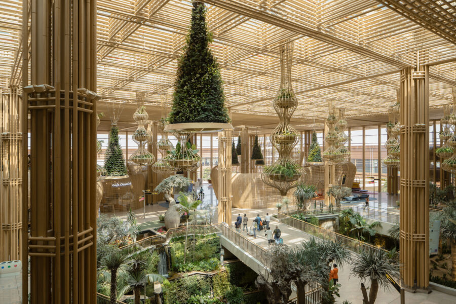
SOM worked closely with landscape architects at Grant Associates and lighting designers at BPI to balance the daylighting requirements of the plants and the energy loads of the Terminal 2 (T2) project at Kempegowda International Airport in India. Photo by Ekansh Goel, Studio Recall
Designed by Skidmore, Owings & Merrell (SOM), the Kempegowda International Airport Terminal 2 (T2) flips the concept of the modern airport terminal on its head and forces us to reevaluate how we think airports should look and feel.
Conceptualized first and foremost as a “terminal in a garden,” T2 was designed from the ground-up with biophilia in mind and the goal of connecting passengers to the natural world along each step of their journey. Hanging gardens greet travelers at check-in while plants, water features, and outdoor walkways can be found in abundance throughout the terminal as a whole. Rather than relying on artificial lighting, most of the terminal is illuminated almost exclusively by natural sunlight that filters in through an extensive network of skylights. All of the vegetation is irrigated with rainwater harvested on-site and indoor waterfalls help passively regulate interior temperatures.
Natural, locally sourced building materials like brick, stone, rattan, and engineered bamboo further reinforce a connection to nature while reducing the terminal’s overall environmental footprint. “We also focused our engineering on reduced embodied carbon and designing a structure that maximizes the use of locally sourced materials,” Peter Lefkovits, design principal at SOM, previously wrote for gb&d. “We designed a small structural grid (only 18 meters by 18 meters) that supports the program spaces needed for 25 million annual passengers. Our smaller grid reduces the material needed and creates a lightness in the structure.”
4. The Child Care Center, Villeta, Paraguay
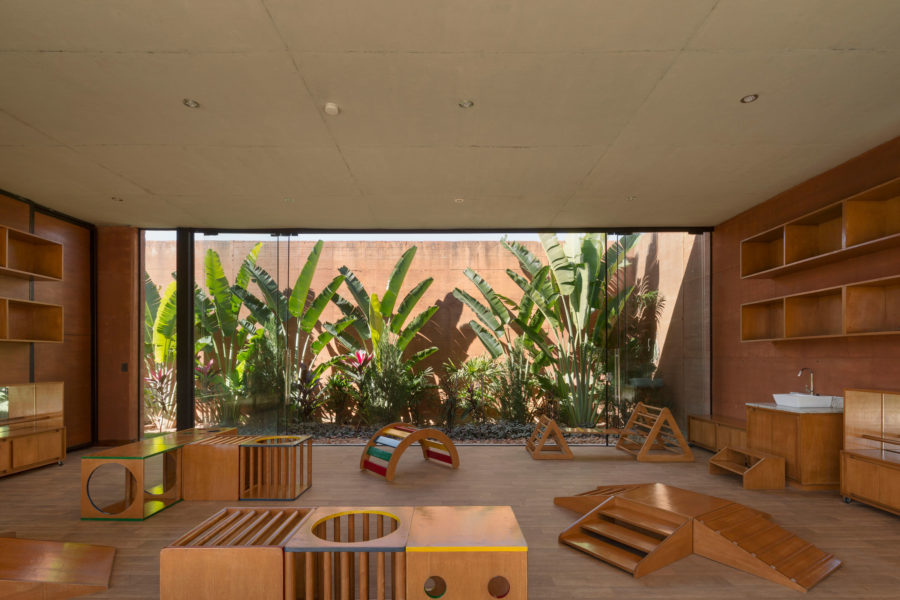
Classroom walls open to green courtyard spaces. “We intended to make the experience of the place feel very comfortable and connected to nature,” says Horacio Cherniavsky of Equipo de Arquitectura. Photo by Federico Cairoli
Designed by Equipo de Arquitectura, the Child Care Center in Paraguay aims to encourage independent sensory learning and connect children with the natural world from a young age via biophilic design elements. “We wanted children to be in contact with nature and natural materials at all times,” Horacio Cherniavsky, a founding member of Equipo de Arquitectura, told gb&d in a previous article. “We did not want to create the typical classroom where you feel you are inside a closed space.”
Operating as both a school and daycare, the Child Care Center encompasses two classrooms, a dining room, and an administrative area, each of which is open to the outdoors on two sides. This unique design allows sunlight and fresh air to move through the classrooms, greatly reducing the need for mechanical heating and cooling, ventilation, and artificial lighting. Sliding glass walls may be drawn across these openings during periods of inclement weather, offering protection without obscuring views of the surrounding landscape.
The walls are made primarily from rammed earth and are incredibly resilient—grounding the building within the environment while creating diverse colors, textures, and even smells that enrich the occupant experience. “It’s a sensory type of learning,” Cherniavsky says. “The experience of the space is what helps the child learn from his or her senses.” Indoor plants, courtyard gardens, and green rooftops further reinforce the center’s commitment toward biophilic design, with the latter also helping to mitigate stormwater runoff and passively regulate interior temperatures.
5. Center of Developing Entrepreneurs, Charlottesville, VA
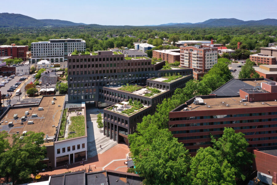
The LEED Platinum–certified Center of Developing Entrepreneurs (CODE) is a new mixed-use project in Downtown Charlottesville that creatively combines co-working and retail. Photo by Alan Karchmer
In Charlottesville, Virginia and designed by EskewDumezRipple, the LEED Platinum certified Center of Developing Entrepreneurs (CODE) is a mixed-use shared co-working space that contains nods to nature at every turn, often in unexpected ways.
Because the building is situated on a steep surrounding incline, EskewDumezRipple decided to take design inspiration in part from geologic strata. “Various program elements celebrate these different layers, like the layers of earth and stone that build up over time and are revealed through excavation,” Jose Alvarez, principal architect at EDR, previously told gb&d. Interior elements and materials are left exposed or appear to gradually emerge, as though being carved away.
This naturalistic theme also carries over into CODE’s color palette, which features bronze metal tones, charcoal textures, and warm wood colors. A passive ventilation system supplies the building with twice the standard flow of fresh air while numerous inset windows allow ample admittance of natural sunlight.
Where CODE really shines is its extensive green roof system, which spans a total of eight cascading garden roofs and terraces. These gardens are accessible to both tenants and visitors and feature approximately 7,500 plants across 90+ distinct species of grasses, perennials, shrubs, and trees. An exterior courtyard, complete with sunken water feature, further serves to provide direct access to natural elements and acts as a place of rest and rejuvenation.
6. San Francisco International Airport, San Francisco
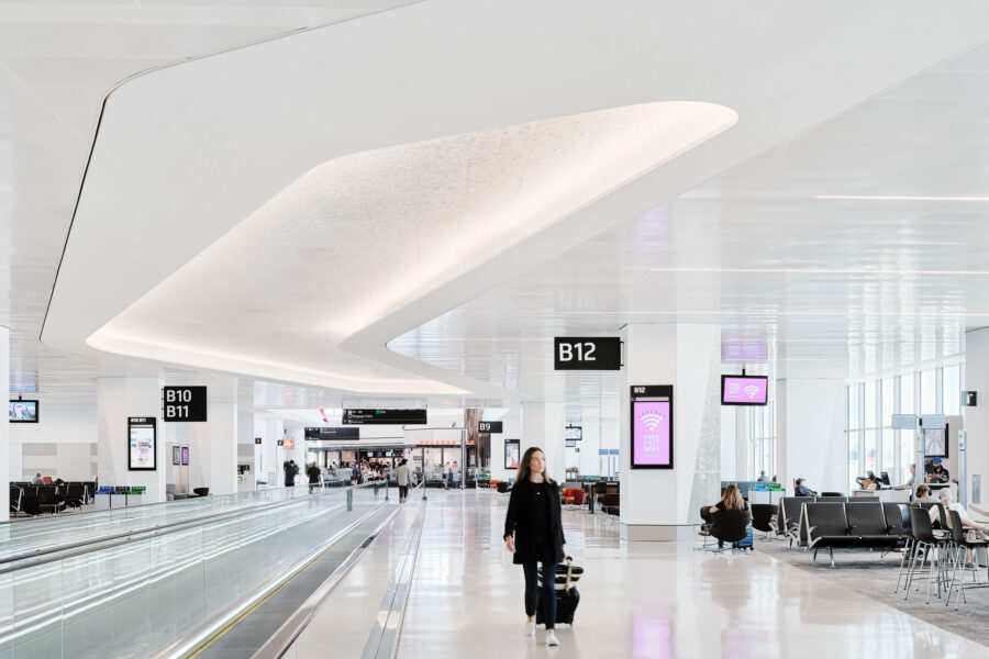
The HKS-designed San Francisco International Airport Terminal 1 project earned LEED Gold and WELL Platinum certification. Photo by Joe Fletcher
When the San Francisco International (SFO) Airport decided to replace the aging Terminal 1 in 2015, they reached out to HKS Architects, a firm well-known for both its people- and earth-friendly designs.
In collaboration with Woods Bagot, ED2, and the Kya Design Group, HKS designed the SFO Harvey Milk Terminal 1, the first LEED Gold and WELL Platinum certified airport terminal in the world. SFO Harvey Milk Terminal 1’s most prominent biophilic feature is its expansive use of daylighting techniques—large windows flood the terminal with natural light, reducing the need for electric lighting and helping passengers maintain their natural circadian rhythm.
In an attempt to reduce the amount of artificial noise in the terminal and combat noise pollution, HKS used sound-dampening surfaces and installed quieter mechanical systems—SFO took this a step further by implementing a “quiet airport” program that cut back on music and PA announcements.
Despite the sub-par air quality outside of the airport, HKS still found a way to bring fresh air into the terminal by way of displacement ventilation—fresh air is brought into the terminal near the floor at a low velocity and slowly drifts upwards, taking smells and pollutants with it.
7. Collection 14, Washington, DC
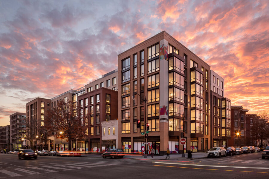
The block-long Collection 14, designed by Perkins Eastman, is framed by two apartment towers and incorporates several historic structures and facades. Photo by Andrew Rugge
Designed by Perkins Eastman, Collection 14 provides insight into how biophilic design may be integrated into the creation of sustainable, walkable communities—even those located in bustling urban centers
Occupying an entire city block, Collection 14 houses more than 230 residential units as well as retail, event, and office spaces; it’s also highly sustainable and is served by public transportation. The entire development features accessible green roofs and the property even contains a bioretention pond planted with marsh grasses. Collection 14 also uses a VRV and dedicated outdoor air system to provide fresh air to the building’s occupants.
“The creation of a place that has places to live, places to work, and places to shop and visit takes advantage of the asset,” Tim Bertschinger, Collection 14’s associate principal and project manager, previously told gb&d. “That kind of urbanism is a big part of sustainability.”
8. Texas Children’s Hospital, Austin
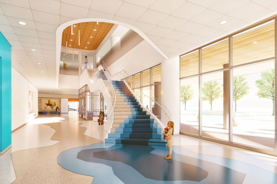
A waterfall stair inspires playful interaction for young patients. Rendering courtesy of Texas Children’s Hospital
Opened in 2024, the new Texas Children’s Hospital campus in Austin will provide both women and children with acute, urgent, and intensive care medical services. From the very beginning the facility was designed to mesh with the surrounding landscape rather than simply sit atop it. “We approached the design of the exterior as being synergistic with the central Texas environment,” Jill Pearsall, senior vice president of facilities planning and development at the Texas Children’s Hospital, previously told gb&d.
In order to take advantage of Austin’s fairer weather (compared to Houston, that is), the hospital features plenty of outdoor spaces where both staff and patients can relax, breathe the fresh air, and take their minds off the day’s worries. Maximizing the admittance of natural daylight was also important to the developers, resulting in numerous windows being installed to allow patients the opportunity to see outside and take in sunlight even if their condition doesn’t allow them to venture outdoors.
Inside the hospital’s theme centers around the Texas landscape, with each floor reflecting a different biome. “We have caverns, waterways, limestone ridge, woods, highlands, horizon, Texas sky,” Pearsall says. A natural, neutral color scheme was selected for its calming effect, with splashes of color adorning the common areas to draw engagement and serve as wayfinding tools. Interesting and interactive design details are included where children can easily see them, giving them something to focus on other than their fear.
“One of the things that is very important with a children’s hospital is not to be scary,” Pearsall says. “We’ve engaged the flora and fauna of our themed areas to welcome them—a little salamander in the pavement or peering out from under the welcome desk. He’s there to teach them, to be part of that educational process, and to be diversionary. We don’t want them just sitting there worried about seeing the doctor or having a procedure.”
9. Fifth + Tillery, Austin
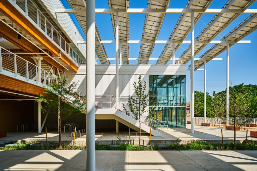
Today’s workplace is turned inside out with Fifth + Tillery, designed by Gensler. Its palette was kept intentionally utilitarian and natural, with a hybrid timber structural system. Photo by Ryan Conway
Designed by Gensler, Fifth + Tillery is a reimagined a post-industrial site in East Austin with a large, outdoor entry plaza that seeks to invert the program of a typical office building by effectively turning it inside out. A central courtyard carves through the space and a large entry plaza—positioned so as to make the most effective use of southerly winds—replaces the traditional office lobby.
“To urge employees to go outdoors and engage with each other, we created a series of varying outdoor spaces on each level—from the ground level courtyard to third floor roof terraces that overlook downtown,” Michael Waddell, design director at Gensler’s Austin office, previously wrote for gb&d. These green spaces provide opportunities for interpersonal connection as well as habitats for vital bird and insect species.
Gensler also made a point to incorporate water features into the design of Fifth + Tillery, a fact exemplified by the building’s central courtyard, which doubles as an integrated rain garden. “To tell the story of water onsite, our team introduced a continuous runnel that brings the soothing sound of running water to the space and connects a central fountain to a reflecting pool at the building’s entry,” Waddell wrote. “The water feature uses a combination of captured rainwater and condensate to run year-round without depending on potable water, which is often restricted during the hot summer months.”
Fifth + Tillery largely features glulam in its construction, a type of engineered timber that gives the building a warm, inviting appearance.
10. Essentia Health Vision Northland Hospital, Duluth, MN
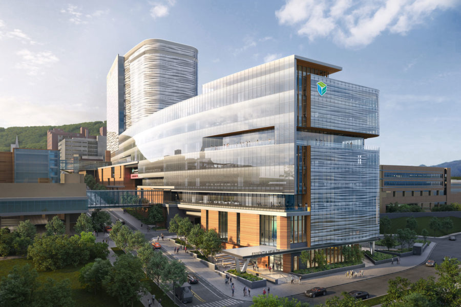
Essentia Health’s new hospital in Duluth. Rendering courtesy of EwingCole
Located in Duluth and designed by the EwingCole, Essentia Health’s Vision Northland Hospital puts biophilia and patient well-being at the forefront of its design.
To ensure patients receive adequate exposure to natural light during the day, Vision Northland’s patient tower is clad in a glass envelope, allowing for nearly 360-degree admittance of sunlight throughout the year. Overall the facility uses low-VOC products and natural materials—including wood and stone—wherever possible.
Vision Northland’s interior designers also leaned very heavily into establishing a cohesive, nature-inspired theme in the facility’s décor and art, making extensive use of photos and graphics.
“These graphics highlight local landmarks, regional history, flora, and fauna native to the North Shore and familiar to the local community,” Maria Papiez, director of sustainable design for EwingCole, previously wrote for gb&d. “The graphics are tailored for each floor, some directly representing these elements and others in more abstracted patterns and colors. These beautiful images support patients, family, and staff by building familiarity and comfort and serve the essential purpose of wayfinding throughout the building.”
Other direct biophilic design strategies were also implemented in the hospital—plants can be found throughout the interior and a rooftop terrace provides patients with a direct link to the outdoors.
11. Burwood Brickworks, Melbourne, Australia
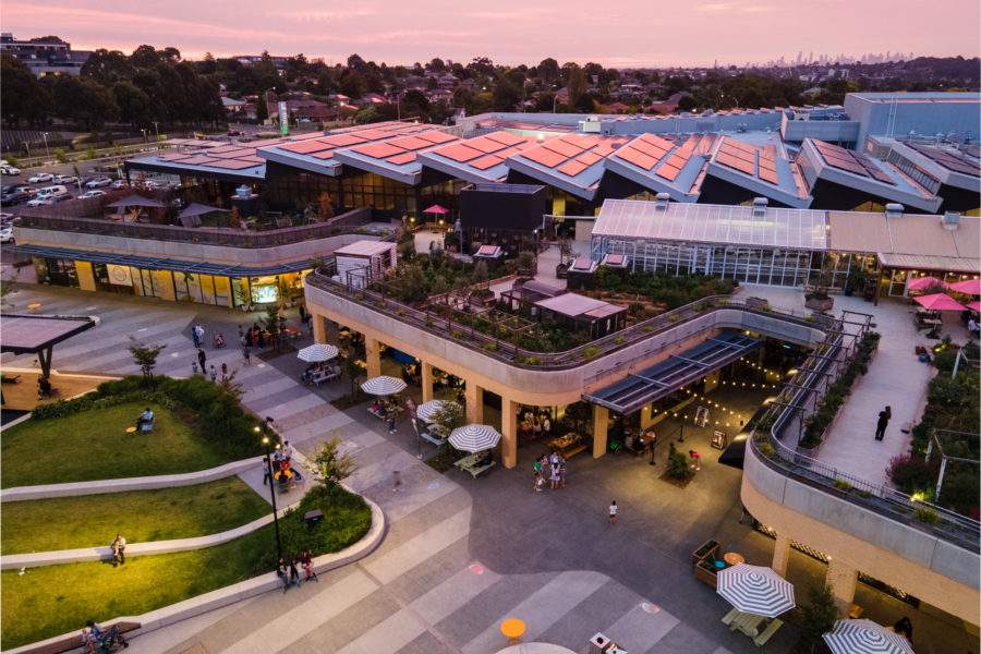
Home to Australia’s first rooftop farm in a shopping center environment, Burwood Brickworks was designed around a civic boulevard fronting the al fresco dining precinct of the integrated retail center. Photo courtesy of Frasers Property Australia
Some have called this project the world’s most sustainable shopping center, and with a 6,500-square-foot rooftop urban farm, solar panels, and a bevy of sustainable building materials, Burwood Brickworks in East Melbourne, Australia may well be.
The Burwood Brickworks shopping center, designed by Melbourne-based NH Architecture, incorporates sensory elements inspired by the Living Building Challenge. The building itself addresses four of the challenge’s seven petals: Place, Materials, Health & Happiness, and Beauty. The other three—Water, Energy, and Equity—are earned over time with the building’s operation.
12. Andy Quattlebaum Outdoor Recreation Center, Clemson, SC
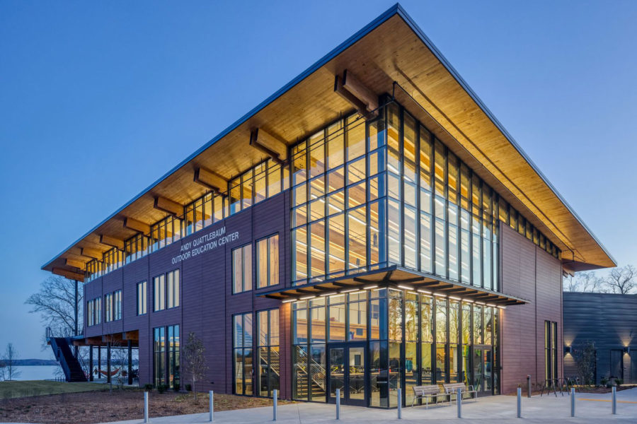
The Andy Quattlebaum Outdoor Education Center at Clemson University, a 2021 WoodWorks Design Award winner. Photo by Jonathan Hillyer
Designed for Clemson University by the Cooper Carry architectural firm in collaboration with the CU Wood Utilization and Design Institute, the Andy Quattlebaum Recreation Center (AQRC) aims to instill a healthy appreciation for nature at every turn.
On an expansive forested site with lakefront access, the AQRC is built almost entirely from ethically-sourced mass timber and is designed as two wings that stretch along the lake’s edge. Large porches and patios are located along the building to encourage outdoor socialization.
Sporting a facade wrapped in tall vertical windows, the AQRC receives plentiful sunlight throughout the year and offers stellar views of the surrounding landscape. Adequate admittance of natural sunlight was a priority for the recreation center in large part due to daylight’s role in maintaining a healthy body and mind.
No matter where you look, inside or out, you’re reminded of nature. “These biophilic elements are emphasized to encourage student wellness, activity, and interaction. We believe the center will become a hub for those looking for an on-campus escape,” Brian Campa, principal at Cooper Carry, previously told gb&d.
The Future of Biophilic Design
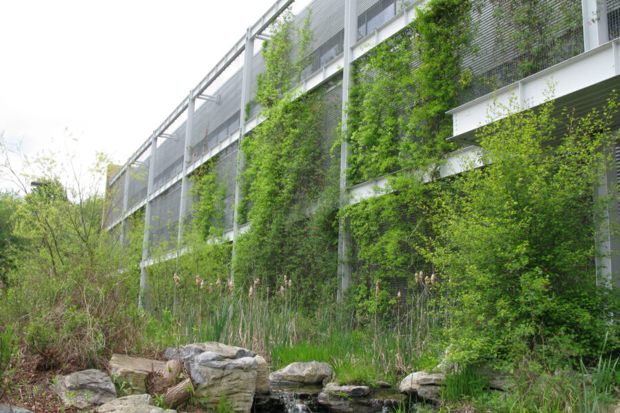
National Wildlife Federation in Reston, Virginia. Photo courtesy of Greenscreen
People today are thinking about their interior spaces differently, and biophilic design is no longer a luxury for most; it’s a must. A recent Ambius survey of 3,000 North American adults showed 93% of Americans want companies to invest more in healthy indoor environments.
As biophilic design continues to become even more popular, it’s important to note that it’s not necessarily synonymous with environmental sustainability.
Biologist Anna Zakrisson researches the quantitative return on investment from incorporating biophilic design in projects. She has found that it’s more than just an amenity. Views of and access to nature increases the desirability of a home, increasing rental rates. Studies have indicated patients spend 8% less time in hospitals that are biophilic, and “that 10% of employee absence could be attributed to a failure of the architectural design to provide the employees with the five most vital requirements for basic functioning, established by the American Association for Psychology.”
Spencer Allan contributed to this article.

