Story at a glance:

  • The Blackburn Building’s health care design, with its bright and inviting six-story building, serves Portland, Oregon’s homeless and drug-recovering population.
  • Santa Clara Valley Medical Center’s Sobrato Pavilion treats victims of traumatic brain and spinal cord injury in its LEED certified, eco-friendly rehabilitation center.
  • The 207,000-square-foot University of Washington Life Sciences Building encourages physical movement and embraces natural daylight in innovative ways.

Truly thoughtful architecture is capable of facilitating health—and can even directly contribute to saving lives. Here are just a few examples of health care design at its finest, starting with Central City Concern’s (CCC) Blackburn Building in Portland, Oregon. It will serve the city’s homeless and drug-recovering population.

Blackburn Building. Portland, OR

blackburn building ankrom moisan architecture 02

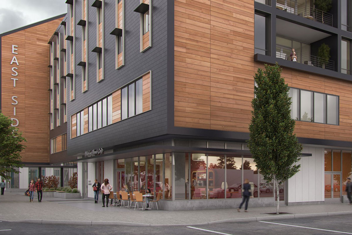
Blackburn Building’s novel health care design. Rendering courtesy of Ankrom Moisan Architecture

The six-story development is set to combine affordable housing (temporary and long-term), therapy spaces, public gathering areas, fitness rooms, and medical exam rooms to serve Portland’s most vulnerable. The CCC operates roughly 20 properties, including a clinic in downtown Portland.

Ahead of the new Blackburn project, the nonprofit ran a heat-map study to determine where the people who access the downtown clinic actually stay. That research led the organization to situate the new facility in the Hazelwood neighborhood, so people who access the downtown facility will soon be able to continue their existing services—getting clean from drugs, continuing rehabilitation programs—much closer to where they are.

Levels one and two of the center, slated to open in July 2019, will be public, providing space for group therapy and recovery sessions like Alcoholics or Narcotics Anonymous. Lower levels will have space for yoga and acupuncture, plus exam rooms where people can check in and receive urgent care if necessary, according to Mariah Kiersey, project leader and a principal architect at Ankrom Moisan, which designed the center. The third floor will offer short-term respite care.

“That space is particularly useful for a patient who’s been discharged from the hospital but is still in need of a place to recuperate further,” Kiersey says.

Upper floors will include 10 palliative care rooms, 80 transitional single rooms (“where people can go to get off drugs or get on the drugs they need”) for longer-term residents, and studios designed for those who need a short-term stay at the facility.

Project: Blackburn Building
Location: Portland, OR
Completion: 2019
Size: 112,218 square feet
Architect: Ankrom Moisan Architects 
Engineers: Miller Consulting Engineers, HHPR,
Shapiro Didway, Glumac 
Contractor: Walsh Construction

Truth be told, though medical care is a crucial component, “facility” somehow rings too clinical. From the gabled roof and aversion to long dark corridors to noise-controlling acoustic separation and a focus on natural light, the sense of homeyness is very much by design.

The bright, inviting front plaza is designed to welcome homeless Portlanders rather than push people along as increasingly common spikes-and-studs architecture does. “We’ve remained very cognizant that this is a pathway for mental and physical support,” Kiersey says.

There is one usual health care design, however, that you shouldn’t expect to see: space-devouring surface lots. The Blackburn Building is close to bus and light-rail service and qualifies for transit-oriented-development designation. TriMet, the Portland area mass transit agency, will also be updating a nearby stop as Blackburn is under construction.

But it’s the less traditional design elements that captivate most. Take the bathrooms. Since so much of the homeless population that CCC serves is grappling with drug addiction, they knew they had to design a better bathroom—one that doesn’t double as a magnet for users, a place to get high.

Once a restroom guest flips the occupancy lock, a timer begins to silently tick off. If a significant amount of time passes, a light that’s visible from a nearby staffed desk illuminates, notifying the help.

“They can then check on the occupant to make sure there’s no emergency. We’re trying to literally save lives,” Kiersey says.

Sobrato Pavilion, Fruitdale, CA


Photo: david wakely health care design

An emphasis on natural lighting helps make the Sobrato Pavilion one of the least energy- and water-consumptive facilities of its kind. It also reflects a conscious decision to provide a sense of welcome in health care design. Photo by David Wakely

A few hundred miles south of Portland, a recent addition to the Santa Clara Valley Medical Center similarly prioritizes the potential for eco-friendly building design within the life-saving business.

The SCVMC’s Sobrato Pavilion, which opened last winter, treats victims of traumatic brain and spinal cord injury—and it does so by giving doctors and patients access to groundbreaking treatment advancements in a unique health care design.

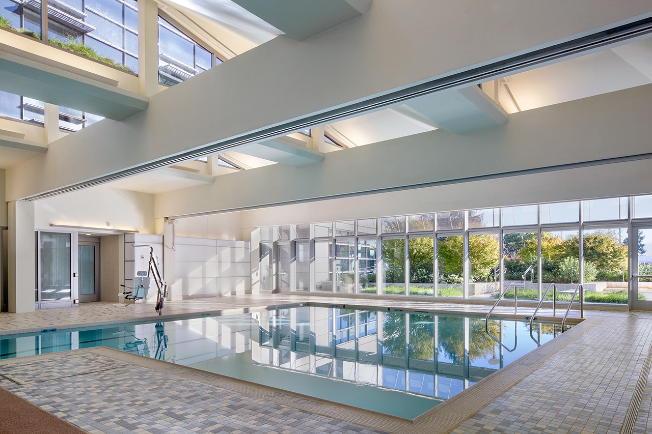
Along with state-of-the-art rehabilitation systems, the facility also boasts a large-scale aquatic therapy pool. The pavilion, which was designed by Stantec and opened in 2018, is able to provide such first-rate resources while still maintaining energy efficiency. In fact, the pavilion has been certified LEED Gold with 41 points and has measured 42% energy savings over the state’s baseline.

Patient rooms here are exclusively single-occupancy, with 168 such rooms—a key example of how the building’s works hand-in-hand with promoting health and recovery.

The rooms were designed to provide as much patient privacy and dignity as possible: Each space has an outside view and ample natural daylight, and they provide patients with as much direct control over their environment as possible, especially in terms of light and shade.

While the cost of building single-occupancy rooms is higher than shared spaces, those costs are offset over time, according to Alan Codd, a Stantec project coordinator who contributed during the design phase as the team developed the pavilion’s sustainability features. It’s a claim borne out by a 2015 Journal of Critical Care study, which found that SRO-style rooms save hospitals money by limiting potential for infection to spread.

Project: Sobrato Pavilion
Location: Fruitdale, CA
Completion: 2018
Size: 546,000 square feet
Architect: Stantec
Engineers: Rutherford & Chekene,
Sandis, Arup, Teecom
Contractor: Turner

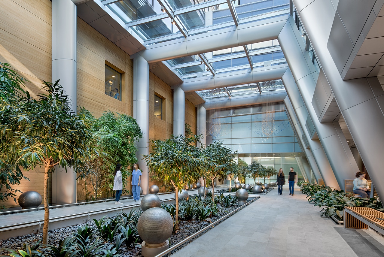
Another feature worthy of highlight is the new lobby link, a beautiful, two-story lit atrium full of greenery (“basically a conservatory space,” Codd says) that connects the pavilion to an existing building on-campus.

“It’s a place where patients, if they’re able to on their own, and general visitors can gather and contemplate. It’s elements like that that go above and beyond garden variety clinical care,” Codd says.

Blending the facility smoothly into the landscaping was also a paramount concern, with a notable illustration being the pavilion’s extensive green roofing.

The project could also be seen as emblematic of the political will that exists in California, at both the legislative level and the ballot box, to tackle climate change. Governor Jerry Brown signed into law in 2018 a pledge to make the state carbon-neutral by 2045, and as pointed out by Jude Chakraborty, an associate at Stantec who helped ensure the project’s LEED certification, every facility, old and new, will need to assess its energy usage vis-à-vis that criteria.

“Health care is being very stringent [about energy consumption] on new constructions,” Chakraborty says. “And as architects at Stantec, our advice helps guide those decisions. We’re getting them to where they should be, and things are looking good.”

Photo: David Wakely

Aquatic therapy pool in the Sobrato Pavilion promotes a unique health care design. Photo by David Wakely

On a more local level, the pavilion was funded by a ballot measure in which voters elected to maintain an existing one-eighth-cent sales tax, which also helps fund law enforcement, affordable housing, and other services in Santa Clara.

Despite a long process—from idea to funding to fruition the project took nearly 10 years—the pavilion gathered the support it needed and now can provide top-flight support to those in need.

UW Life Sciences Building, Seattle

Photo: Kevin Scott health care design

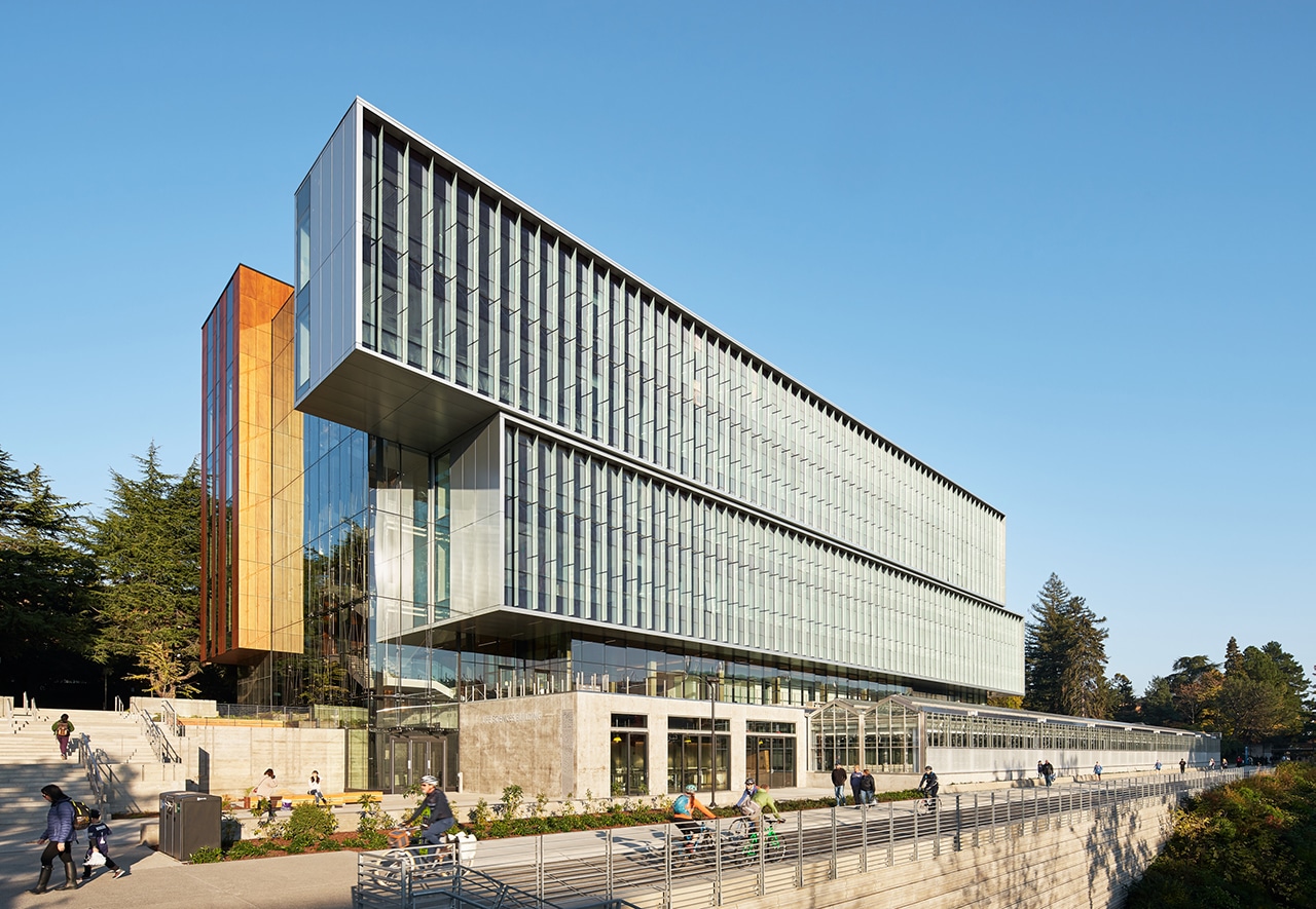
University of Washington Life Sciences Building. Photo by Kevin Scott

Project: UW Life Sciences Building
Location: Seattle
Completion: 2018
Size: 207,000 square feet
Architect: Perkins+Will 
Engineers: Coughlin Porter Lundeen, Affiliated Engineers
Contractor: Skanska USA

Of course, a building need not be tailored toward saving lives in order to promote wellness and healthy habits. The recently opened University of Washington Life Sciences Building, in Seattle, encourages physical movement, embraces natural daylight in an innovative way, and reactivates visitors’ appreciation of the natural world.

The 207,000-square-foot project incorporates natural ventilation cooling, chilled heating and cooling beams, and solar roofs, but the most noteworthy feature might be the building’s anchor: a 20,000 square-foot greenhouse that gathers together 9,000-plus plants across 3,400 species.

Students at the university study the plant life, of course, but the facility also opens its doors to the general public and hosts K-12 visits. It’s positioned next to the largest commuter trail in Seattle, and the site “further promotes sustainability with a water reclamation system that directs surplus water from the building to irrigate the plants,” according to Devin Kleiner, the project architect and a senior associate at Perkins+Will.

Photo: Kevin Scott

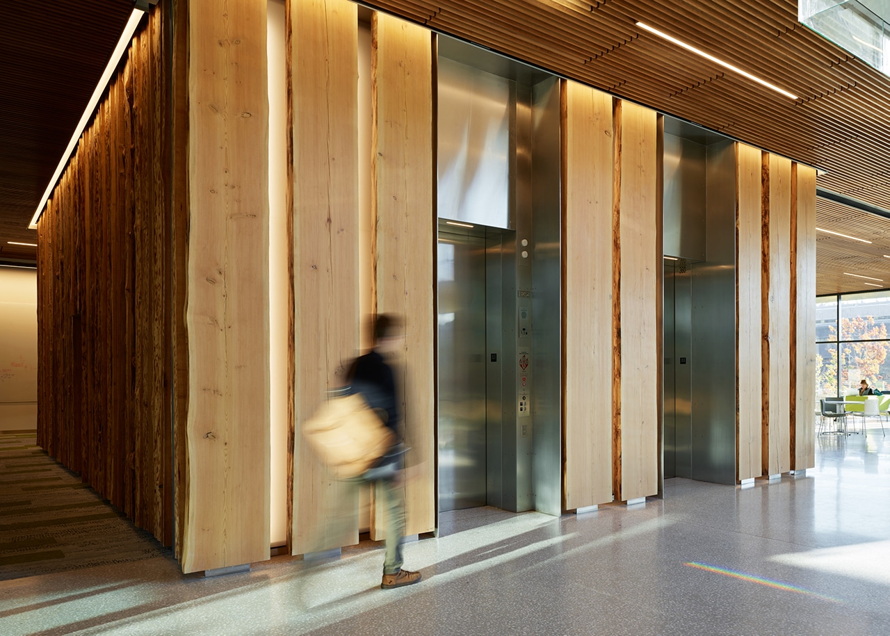
Instead of the usual ding sound, the elevator makes birdsong sounds that correspond with the height at which a particular bird would actually nest. Lights are positioned to glow through the slabs, “recreating the experience of the sun shining between the silhouettes of backlit trees,” Kleiner says. Photo by Kevin Scott

It encourages you to walk around, too. The architects designed the suspended open stair with the specific intention to “lure people up the six flights” and take in views of nature and the campus.

The stairs were made visible from outside in order to draw visitors’ attention and encourage their use. But if you must take the elevator, your ride will at least be transportive in more than just the up or down sense.

The core was enveloped in custom-milled wood slabs, culled from nine 200-foot Douglas firs, that taper as they rise, mimicking the natural bloom of the trees—which were donated by UW biology professor Scott Freeman and his wife, Susan Leopold Freeman, who happens to be the granddaughter of iconic conservationist Aldo Leopold.

The elevator sports two more irresistible design novelties. Instead of the usual ding sound, the elevator makes birdsong sounds that correspond with the height at which a particular bird would actually nest, and lights are positioned to glow through the slabs, “recreating the experience of the sun shining between the silhouettes of backlit trees,” Kleiner says.

Photo: Kevin Scott

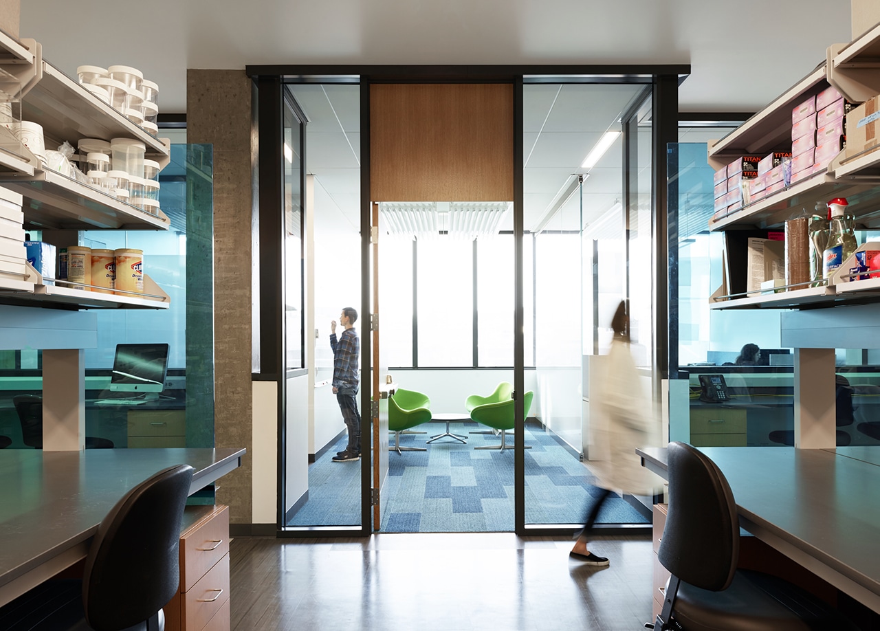
Inside the University of Washington Life Sciences Building. Photo by Kevin Scott

The wood design brought about some unexpected interactions as well.

“One of the surprising wellness benefits of the elevator core design is that people seem unable to resist touching the wood. This … raised a thought-provoking hypothesis that in today’s urban society, we are disconnected from nature and therefore crave making physical contact with it,” Kleiner says.