Story at a glance:
- Colorful buildings can radically change the mood and ambience of a space.
- Calming colors bring a sense of ease and relaxation, and colorful buildings can stand out among their surroundings.
- The Washington, D.C. citizenM hotel, The Night Ministry, and Toronto’s Springdale Library are just a few of the colorful buildings that elevate design.
Sustainable building materials, construction, and function—these are just a few of the top priorities for architects and designers. Color, on the other hand, can sometimes fall toward the latter end of the list.
However, color is more than merely decoration: It can evoke emotion, convey meaning, and influence how people interact in a space. Different colors can generate a range of sensory responses, so it’s important to choose colors that best complement the building’s intended function.
These are just a few of the colorful buildings that bring design to life.
1. Church of Beatified Restituta in Brno, Czech Republic
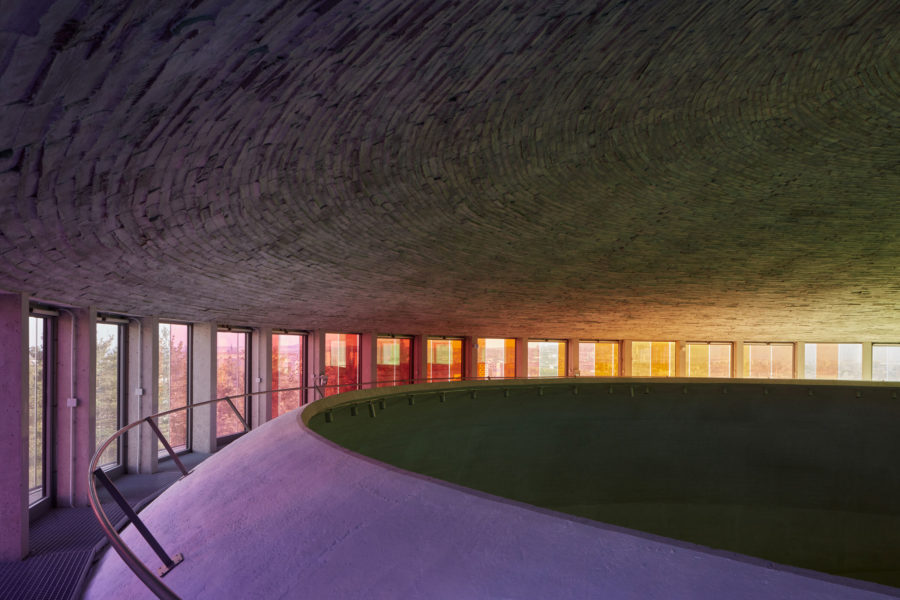
The church’s rainbow annular windows diffuse light around the building’s circular design. Photo by BoysPlayNice
In Brno, Czech Republic, the Church of Beatified Restituta evokes community and spirituality with its mystical display of color and light.
Sometimes called “The Rainbow Church” or “Inner Universe,” light diffuses through the building’s 80-foot rainbow annular window, just below the roof, to create a divine and visceral effect.
The church’s circular floor plan symbolizes heaven and eternity, enabling parishioners to release their daily struggles and envelope themselves in the outworldly rainbow display that transcends around them.
In addition to the building’s innovative use of color, it is also environmentally friendly and includes a geothermal pump, passive air circulation, and thermal insulation.
2. CitizenM’s Washington, D.C. Hotel
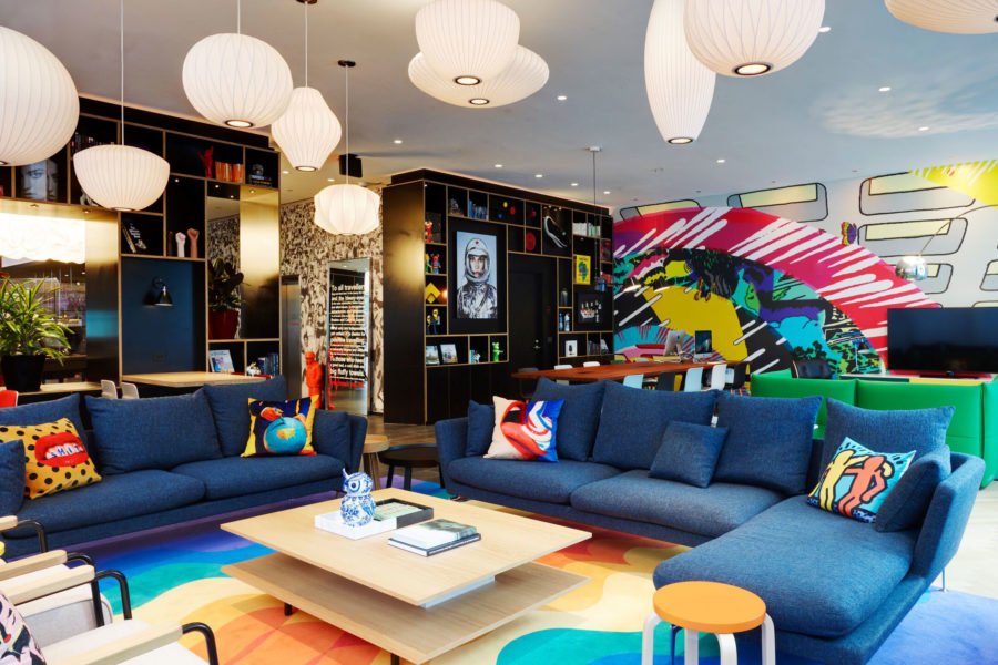
CitizenM in Washington, D.C. opened in 2020 and was designed by Concrete Amsterdam and FX Collaborative. Photo courtesy of citizenM
The new Washington, D.C. citizenM hotel, which opened in October 2020, is one of the vibrant buildings that combines color and sustainability in a playful and inviting way.
The green hotel features numerous floor-to-ceiling window panels created by local artists, and the lobby’s vibrant colors and pop art accents create an enticing environment for guests. Elsewhere, a red spiral staircase leads to meeting rooms, where bold colors, fun chairs, and eclectic decorations help to spark inspiration and creativity.
Heading up to the guest rooms, you’ll find a variety of colorful and symbolic artwork inspired from queer culture, social activism, the environmental crisis, and more.
The citizenM hotel is also expected to achieve LEED Gold certification for its thermal envelope design, water use reduction, and overall energy efficiency.
3. Springdale Library in Toronto
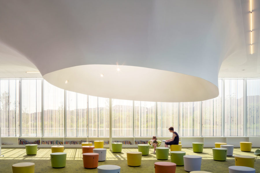
The Toronto Springdale Library is targeting a LEED Gold rating with its green roof, geothermal heating and cooling, and gray water systems. Photo by Nic Lehoux
In the suburbs of Toronto, Springdale Library brings contemporary, nature-inspired design to community space. The eye-catching, triangular-shaped building includes floor-to-ceiling glass windows and organic, fluid architecture inspired by its surroundings.
Inside the library, a calming palette of greens and yellows further combine the surrounding greenery into its design. Hanging globe pendants and embedded LED lights resemble a nighttime sky. In the children’s area, a moss-inspired carpet extends towards the windows, removing the barrier between inside and out.
The green accents and design elements create a soothing and relaxing atmosphere, while also connoting the library’s impressive sustainability efforts.
Targeting LEED Gold, the green library includes a number of other sustainable details, including geothermal heating and cooling, daylight harvesting systems, and electric car charging stations.
4. Duke Rental Residential Project in Vancouver
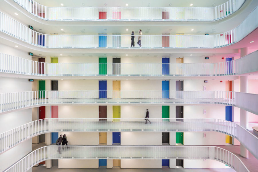
The Duke Apartments in Vancouver offer sustainable, affordable housing with a central atrium animated with doors in colors inspired by Le Corbusier. Photo by Michael Elkan
The LEED Gold–certified, 14-story Duke rental residential project in Vancouver combines color with simplicity, as the multi-colored entrance doors contrast the white railings and open-air atrium.
The multi-colored doors were intended to animate the atrium space, says Mark Ostry, principal of the project. The colors were chosen from Le Corbusier’s 1959 architectural polychromy color palette, and the open-air atrium was designed for circulation and to enhance a sense of community.
While a suspended, high-tensile steel and Teflon membrane structure protects the atrium from the elements, a 18-meter high, pink-colored art installation washes in colored light. The building also boasts a multifunctional rooftop with plenty of amenities for residents.
The architects’ sustainability strategy emphasized using eco-friendly building materials, enhanced energy performance, and water efficiency.
5. The Night Ministry in Chicago
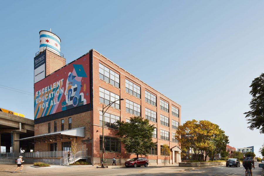
Wheeler Kearns Architects designed The Night Ministry in Chicago, renovating three floors of a former manufacturing facility in the Bucktown neighborhood. Photo by Kendall McCaugherty, Hall + Merrick Photographers
Wheeler Kearns Architects designed The Night Ministry’s new home: a three-floor renovation of a former manufacturing facility to provide refuge for 18- to 24-year-olds facing poverty or homelessness.
Located in Chicago’s “Mural Building,” the brick facade conveys an opening and welcoming environment with large, colorful murals on three sides. The murals also make their way inside the building to the multipurpose/dining room.
“We carry the artistic legacy of the building inside, where bright and colorful interior mural walls help create an inviting and optimistic space for The Night Ministry’ staff, volunteers and clients,” says Erica Ulin, the project lead at Wheeler Kearns Architects.
The adaptive reuse promotes sustainability within its design: the new space is furnished with variable refrigerant flow systems for heating and cooling, non-toxic paints and low VOC sealants, and more.
6. Monash University in Australia
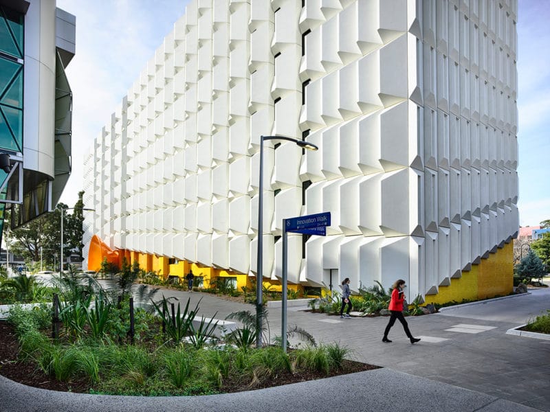
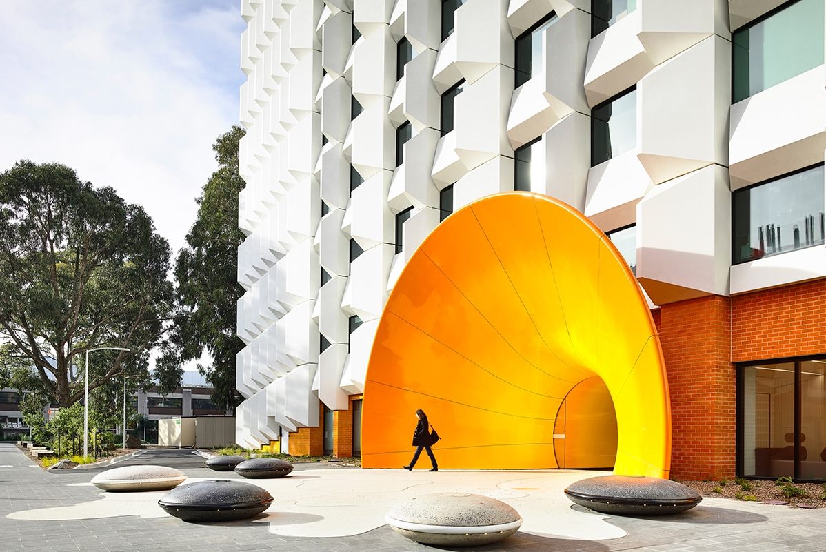
The Monash University’s new energy-efficient and colorful facade involved an intensive remodeling without needing to displace the building’s users. Photo by Derek Swalwell
In 2019 the eight-story, brick-clad Monash University research building in Australia received a colorful new facade. A 30-foot-wide, 20-foot-tall steel tunnel welcomes guests at the building’s entrance, fading from warm orange to bright yellow.
The building’s massive, three-dimensional white panels contrast its vibrant entrance. Each panel is made of glass fiber-reinforced concrete and molded as a shell with varying depths.
The wave-like panels, combined with the grand, sweeping entrance, create an incredibly fluid facade that utilize color and contrast to the utmost extent.
However, one of the most impressive aspects of the remodel is that it was completed without displacing any of the research building’s users, even temporarily.
“The design of this building supports our belief that the practice of architecture needs to be fundamentally driven by our responsibility to the environment and that adaptive reuse, rather than to discard, is at the forefront of this approach,” says Julian Kosloff, cofounder of Kosloff Architecture.
7. Children’s Ability Center in Florida
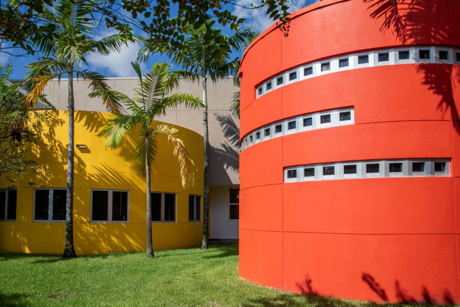
With the help of Restore Construction Group and APV Engineered Coatings, the Children’s Ability Center will be able to keep its colorful facade for years to come. Photo courtesy of APV Engineered Coatings
Jewish Adoption and Foster Care Options (JAFCO), which provides homes, foster care, adoption, and support services to abused, neglected, and at-risk children in South Florida, built the large Children’s Ability Center in 2014. While the 43,000-square-foot facility initially featured a sweeping canopy and vibrant facade, the striking colors started to fade and deteriorate after five years of intense weather exposure.
Hoping to keep the bright, welcoming appearance, JAFCO turned to coating contractor Restore Construction Group. For extreme wearability and color retention, they recommended upgrading from an acrylic-based coating to a more durable and longer-lasting fluoropolymer topcoat finish.
As exterior coating restorations went underway, APV Engineered Coatings matched JAFCO’s trademark deep red, orange, yellow, and blue custom color scheme. Now, the Children’s Ability Center has a fresh and bright new look.
“Our intent was to be budget conscious while providing a long-lasting, beautiful aesthetic,” said Michael Moran, facilities director at JAFCO. “The high-performance coating will not only retain its vibrant colorful appeal for a very long time but also provide significant cost savings by not having to repaint the facility every five years, which is a typical coating lifecycle in Florida.”
8. Maggie’s Centre Barts in London
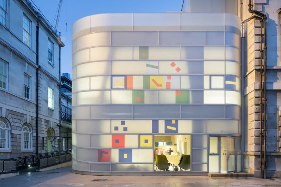
Steven Holl Architects created a healthy, home-like atmosphere for the sick to find solace in hard times. Photo courtesy of Iwan Baan
Light and airy colorful buildings can ease pain and facilitate healing, which is exactly what architects aimed for with Maggie’s Centre Barts, a London drop-in facility where people suffering with cancer and their families can receive emotional and social support.
For the exterior, designers opted for a white matte finish, made with polychrome insulating glass, instead of the shiny glass windows typically seen in corporate buildings. The glass also includes colorful inserts that are organized like a music staff and inspired by the “neume notation” of medieval music.
“This was about creating hope and joy of living in the face of fear,” says Laura Lee, chief executive of Maggie’s Centres.
The architects’ meticulous approach to color and sustainable building materials is vital for creating a sense of safety and security.
“Immediately you have a place you are curious about and distracted and happy to be in. You can grieve more easily and are more open to difficult conversation. The building helps make our job at Maggie’s easier,” Lee says.

